
Studying Multivariate Categorical Data
Most statistical tables are parchingly dry in the reading.
Herman Melville (Moby Dick)
Summary
Chapter 7 discusses ways of displaying combinations of categorical variables using various types of mosaicplot.
7.1 Introduction
One-dimensional displays for categorical data like barcharts and piecharts were discussed in Chapter 4. Displays for multivariate categorical data have been discussed in research publications, but have received less attention in applications. The many splendid books on the analysis of categorical data generally include few graphics. The ideal is to display the counts of cases in the multivariate combinations in an informative and easy to interpret way.
When there are several variables, each with a few categories, there can be an unexpectedly large number of possible orderings of variables and categories and it is a challenge to find an effective display. For J nominal variables {Xj, j = 1,...,J} with numbers of categories {cj, j = 1,...,J}, the variables can be ordered in J! ways and the categories within the variables in ∏Jj=1cj!
Now that modern computing power and software have made drawing graphics much easier, you can explore a range of displays to identify the ones that work best. Many types of graphics have been suggested for multivariate categorical data, including mosaicplots, doubledecker plots, fluctuation diagrams, treemaps, association plots, and parallel sets/categorical parallel coordinate plots ([Friendly, 2000], [Meyer et al., 2006], [Kosara et al., 2006], and [Pilhoefer and Unwin, 2013]). In this chapter mosaicplots and their variants will be used. They provide a wide range of possibilities for the display of multivariate categorical data.
7.2 Data on the sinking of the Titanic
doubledecker(Survived ~ Sex, data = Titanic,
gp = gpar(fill = c("grey90", "red")))
doubledecker(Survived ~ Class, data = Titanic,
gp = gpar(fill = c("grey90", "red")))
The dataset Titanic was used in Chapter 1 Exercise 5 and discussed in §4.3. Barcharts of the dataset's four variables were displayed in Figure 4.4 to give a simple overview. The differing survival rates by groups are of more interest and Figure 7.1 shows spineplots (see §7.3 below) of how they vary by Sex and Class individually. As we all know, a much higher proportion of females survived than males and it is perhaps no surprise that the survival rate was higher for the first class than the second class and that the third class rate was lower again. Does the same class effect apply separately for males and females? A doubledecker plot (§7.4), a generalisation of spineplots, and a form of mosaicplot, can be drawn to investigate.

Survival rates on the Titanic. Females and first class passengers had the best survival chances.
Figure 7.2 reveals what happened. The four bars to the left show that the male rates do not decline with class and that the males in second class had the lowest survival rate of all groups. The four bars to the right show that for the females, the survival rate declined with class, although of the few females in the crew a high proportion survived. It is fairly easy to see that all female survival rates are higher than all male survival rates. However, if the main aim was to compare female and male rates directly by class, another plot would be better. How to choose which mosaicplot to draw in any given situation is discussed in §7.5.

A doubledecker plot of the Titanic survival rates by class for each sex. The width of each bar is proportional to the number of cases for that sex and class. All female survival rates were higher than all male survival rates and the male survival rate was lowest for second class passengers.
7.3 What is a mosaicplot?
In a mosaicplot the graphics area is divided up into rectangles proportional in size to the counts of the combinations they represent. Lengths are easier to judge and compare than areas, so it is best to use displays where each rectangle has the same width or the same height.
Mosaicplots are drawn by starting with an empty rectangle to represent the whole dataset, then taking the first variable and dividing the horizontal axis into sections proportional to the sizes of its categories. In the second step each of the rectangles is divided along its vertical axis according to the sizes of the second variable categories, as in the two examples in Figure 7.1. In theory you can continue to divide up the rectangles alternately horizontally and vertically for as many variables as you have. In practice, the display can quickly have too many combinations and it becomes impossible to see what is going on.
Figure 7.3 shows a sequence of default mosaicplots for the Alligator dataset mentioned in §7.1, beginning with the lake variable and adding the variables sex, size, and food in turn. The category names have been abbreviated to improve the legibility of the labelling, that is always a problem with high-dimensional mosaicplots. The first plot shows that the lakes each provide about the same amount of data; the second that Lake Hancock has more female alligators than the others; the third that generally there are more small alligators than large ones, except for the males in Lakes Oklawaha and Trafford; the fourth plot that the feeding patterns vary. A different ordering of the variables might reveal other information.

A sequence of mosaicplots for the Alligator dataset. The first plot is a spineplot of the variable lake, the second adds the variable sex, the third size, and the fourth food. The category labels have already been abbreviated, so only drawing the plots bigger would alleviate the overplotting of the labels. The first three plots give information on the relative importance of the four lakes in the study, on the sex distribution across the lakes, and on the distribution of alligator sizes by lake and sex. The final plot attempts to present the four-dimensional information.
The study concerned the eating preferences of alligators in four different lakes, determined by examining the contents of their stomachs. The webpage [Brain, 2004] has this to say about alligators’ feeding habits: “Once a week is a typical feeding schedule for alligators living in the wild. Excess calories are stored in fat deposits at the base of the alligator’s tail. Incredibly, by burning fat reserves, it is possible for an alligator to last more than two years between feedings.” This dataset was first used in one of Agresti’s excellent textbooks on categorical data analysis [Agresti, 2007]. The final plot with all four variables displays rectangles for each of the 80 possible combinations and dotted lines for combinations that were not observed. You can see that some combinations did not arise in the dataset, but not a lot else.
This example exemplifies the difficulty of displaying multivariate categorical data effectively and also the difficulty of labelling mosaicplots. In general, there are too many awkwardly aligned combinations to provide a well-defined labelling. The vcd package usually does a reasonable job under difficult circumstances.
For a limited number of variables with only a few categories, mosaicplots can work well, although they need careful design. So what is to be done? Given the number of different orderings calculated in §7.1, the various alternative mosaicplots defined in §7.4, and the additional options outlined in §7.6, there are many, many possibilities for finding a better plot and it is necessary to make informed choices and do more than just use a default.
A reasonable strategy is to begin with barcharts of the individual variables to get an initial overview of the dataset. Often some of the features you can discern with difficulty in higher dimensional displays are directly visible in lower dimensional ones. For the Alligator dataset you could use code such as
data(Alligator, package="vcdExtra")
Alg1a <- aggregate(count~food, data=Alligator, sum)
ggplot(Alg1a, aes(food, count)) + geom_bar(stat="identity")
to draw each of the barcharts. If you did, you would see that there were more males than females and more small alligators than large ones, that the numbers were roughly equal for the four lakes, and that fish and invertebrates were clearly the most frequently found foods.
data(Alligator, package="vcdExtra")
Alg1 <- Alligator
levels(Alg1$lake) <- abbreviate(levels(Alg1$lake), 3)
levels(Alg1$size) <- abbreviate(levels(Alg1$size), 3)
levels(Alg1$food) <- abbreviate(levels(Alg1$food), 2)
par(mfrow=c(2,2), mar=c(4 ,4, 0.1, 0.1))
mosaicplot(xtabs(count ~ lake, data=Alg1), main="")
mosaicplot(xtabs(count ~ lake + sex, data=Alg1), main="")
mosaicplot(xtabs(count ~ lake + sex + size, data=Alg1),
main="")
mosaicplot(xtabs(count ~ lake + sex + size + food, data=Alg1),
main="")
Alternatively you could use the pairs function in vcd, giving Figure 7.4. This produces a matrix display with the barcharts of the individual variables down the diagonal as well as all six mosaicplots both above and below the diagonal. Labelling is kept to a minimum for space reasons and, while efficient, the plot is hard to read. Nevertheless, it can be seen that apart from the two variables sex and food, each pair of variables looks related in one way or another. There are more large males, small alligators eat more invertebrates, the lakes have different patterns of alligators’ food preferences. It is always worthwhile to check results in more detail, just to be sure, and so it would be good practice to pick out some of the interesting mosaicplots in Figure 7.4 and draw them individually. Figure 7.5 shows two examples, doubledecker plots of sex and lake and of size and food.

A plot matrix of barcharts and two-dimensional mosaicplots for the Alligator dataset. All pairs of variables barring sex and food appear to be related, since the corresponding bivariate plots do not take the form of a grid.

Doubledecker plots for the Alligator dataset. From the left-hand plot you can see that the sex distribution varies by lake and from the right-hand plot that the variables size and food are associated.
At this stage, rather than drawing versions of the four possible three-dimensional mosaicplots it would be practical to incorporate the aim of the study, to see how food depends on the other three variables. As food has five categories with no particular order a multiple barcharts view (§7.4) could be best. Figure 7.6 shows how food depends on sex and size of the alligators.
doubledecker(xtabs(count ~ lake + sex, data = Alligator),
gp = gpar(fill = c("grey90", "steelblue")))
doubledecker(xtabs(count ~ food + size, data = Alligator),
gp = gpar(fill = c("grey90", "tomato")))
Alg2 <- aggregate(count~sex + food + size, data=Alligator, sum)
ggplot(Alg2, aes(food, count, fill=sex)) +
geom_bar(stat = "identity") +
facet_grid(size ~ sex) + theme(legend.position="none")

A multiple barcharts view showing how food depends on sex and size in the Alligator dataset. Males and females of the same size have similar patterns, but large alligators prefer fish while smaller ones like invertebrates too.
A further step would be to include the lake variable and Figure 7.7 shows a multiple barcharts view with the food distributions for the four combinations of sex and size for each of the four lakes separately.

A multiple barcharts view showing how food depends on sex, size and lake in the Alligator dataset. There are different patterns for the four lakes, but numbers are quite small.
Figure 7.7 is obviously a better choice of display than the default mosaicplot for all four variables in Figure 7.3, as it is much easier to recognise features of the dataset. While the differences between the lakes are substantial, it is necessary to be careful in drawing too firm conclusions given the small numbers involved. Loglinear modelling would be helpful in determining which features of the data have strong support in the data, while graphical displays provide an appreciation of the raw data and an understanding of model results. As always, graphics and modelling complement each other.
To improve the display clarity of mosaicplots, narrow gaps are left between the category rectangles. With two variables you have a kind of barchart called a spineplot [Hummel, 1996]; with spineplots there are no gaps between the categories of the second variable. Without gaps the conditional rates of the second variable, P(B|A), are directly displayed. As in a barchart, the areas of the bars are proportional to the counts, but instead of the bars having equal widths and differing heights, they all have equal heights and differing widths. Spineplots were designed primarily for interactive graphics to display rates by category for a second linked variable. Gaps are useful if you are to divide the resulting rectangles according to the category proportions of a third variable.
ggplot(Alg1, aes(food, count, fill=sex)) +
geom_bar(stat = "identity") +
facet_grid(lake ~ sex + size) +
theme(legend.position="none")
The construction of mosaicplots is hierarchical and the order of the variables has a big impact on the display. There are other options to consider as well. Instead of the classical alternating horizontal and vertical divisions, mainly horizontal divisions might be used, as is the case with doubledecker plots (cf. Figure 7.2), or indeed any sequence of horizontal and vertical divisions might be used.
Classical mosaicplots go back to the paper [Hartigan and Kleiner, 1981] and aim to make the most efficient use of the space available. This means that the area representing each case is maximised, while the ease of interpretation suffers, as the rectangles representing the combinations are not aligned for direct comparison. Even with a small number of combinations a classical mosaicplot may prove to be ineffective. With a large number of combinations, no mosaicplot is likely to work. For anything from 4 to 24 combinations, mosaicplots can be very good. Above that, their usefulness depends on the structure of the data.
7.4 Different mosaicplots for different questions of interest
We have already seen examples of classical mosaicplots, doubledecker plots and multiple barcharts. There are other alternatives too. Each mosaicplot variant presents the data in a slightly different way and is useful for different purposes. Sometimes counts are emphasised, sometimes rates, and sometimes distributions. In all cases it is essential to remember that we are looking at conditional distributions and that the order of the conditioning matters.
Which subgroups appear most often? (Fluctuation diagrams, Figure 7.8)

A fluctuation diagram of eight binary variables (hair, eggs, milk, airborne, aquatic, predator, toothed, backbone) for the 101 cases of the Zoo dataset in the package seriation. A few combinations arise relatively often, most not at all.
In this display, the axes are divided up equally for each category of a variable irrespective of size, and the rectangles representing the combination counts are drawn at their appropriate grid points. The rectangle for the combination with the highest count determines the scale, given the variables and the size of the window.
Fluctuation diagrams are good for representing large contingency tables or transition matrices, where there is no reason to differentiate between the row variable and the column variable. Another application is displaying confusion matrices (e.g., [Pilhoefer et al., 2012]).
If there is a large number of combinations and only a few occur at all, then a fluctuation diagram is valuable for revealing this information and for identifying categorical clusters. Figure 7.8 shows a fluctuation diagram for eight binary variables of the Zoo dataset in the package seriation. Several distinct groupings stand out and there are many feature combinations for which there are no animals in the dataset.
Fluctuation diagrams can be drawn in R using the fluctile function in the package extracat. You could compare this fluctuation diagram with a mosaicplot of the same data using the code
data(Zoo, package="seriation")
mosaic(table(select(Zoo, c(hair, eggs:backbone))))
data(Zoo, package="seriation")
fluctile(table(select(Zoo, c(hair, eggs:backbone))),
label=FALSE)
Comparing rates across subgroups (Doubledecker plots, Figure 7.9)
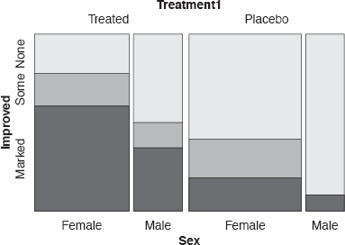
A doubledecker plot of Improvement for arthritis patients conditional on Treatment and Sex. The treated group did better than the placebo group and females did better than males.
If only horizontal divisions are used for all but the last variable, you get a doubledecker plot, which is a multivariate spineplot. Each bar has the same height and therefore both its area and its width are proportional to its count. The plot’s name comes from how it sometimes looks when you colour the bars by a final binary dependent variable. This is shown in Figure 7.2 for the Titanic dataset. Doubledecker plots are excellent for comparing rates across all groups (the heights in the shaded sections of the bars), while conveying some information on the relative sizes of the groups.
Another example, this time with an ordinal dependent variable, can be seen in Figure 7.9 for the Arthritis dataset in the package vcd. Improvement can be “marked”, “some”, or “none” and is dependent on Treatment and Sex. Note how the ordering of the variables, the ordering of the Treatment categories, and the direction of splitting have all been chosen to reflect a clear pattern in the data. Treated patients did better than the placebo patients and females did better than males within those groups. Hardly any males in the placebo group showed any improvement at all.
Doubledecker plots can be drawn in R using the doubledecker function in vcd or the rmb function in extracat.
data(Arthritis)
Arthritis <- within(Arthritis,
Treatment1 <- factor(Treatment,
levels=levels(Treatment)[c(2,1)]))
mosaic(Improved ~ Treatment1 + Sex, data = Arthritis,
direction = c("v", "v", "h"), zero_size = 0)
How do patterns compare by subgroup? (Multiple barcharts, Figure 7.10)

A multiple barcharts view showing how food depends on lake in the Alligator dataset. The distributions for Lake George and Lake Hancock are quite different from those for the other two lakes.
Complex contingency tables with several rows and columns can be awkward to work with. Tests based on χ2
If one variable can be regarded as dependent and the other explanatory, then multiple barcharts are good. They show the distributions of the dependent variable conditional on the explanatory one. Consider the mosaicplots for the two variables lake and food for the Alligator dataset in the bottom left and top right corners of Figure 7.4 and compare them with the multiple barcharts version in Figure 7.10. Note that the barcharts have been aligned vertically to make comparing distributions easier. Aligning the barcharts horizontally taking up less space would not be as effective.
Allig3 <- aggregate(count~food + lake, data=Alligator, sum)
ggplot(Allig3, aes(food, count)) +
geom_bar(stat = "identity") + facet_grid(lake ~.)
If there is a final dependent variable that has several categories, then colour can be used to fill the rectangles representing the explanatory variable combinations, and what you get is a stacked barchart display. For certain data patterns this will work well, cf. Figure 7.9. More commonly, the result is difficult to interpret, as there is no cumulative pattern, and so one alternative is to use a grid structure for the explanatory variables and to plot the final dependent variable as a barchart. The resulting display is a trellis plot as in Figures 7.6 and 7.7. These plots can be drawn using the rmb function in extracat or with ggplot2 or lattice.
Just showing the rates (Same binsize plots, lower plot in Figure 7.11)

Rates of high satisfaction for the housing dataset in the MASS package. The upper plot is a mosaicplot, which shows the different group sizes, and the lower one a same binsize plot, which only shows the rates.
This form is different from the others in that each combination is represented by a rectangle of the same size. Combinations with zero counts are drawn empty. This plot is useful for two reasons, firstly for showing the pattern of combinations which do not arise in the data, the missings, and secondly for comparing rates of a binary dependent variable. Rates can be seen by colouring the rectangles up to a height equivalent to the appropriate values. The disadvantage of the plot is the lack of count information, but when the conditioning groups are of equal size or all large this is irrelevant.
The upper plot of Figure 7.11 is a mosaicplot of the rates of high satisfaction for the 24 combinations of the three variables Infl, Type, and Cont in the housing dataset. The order of variables and their alignment (whether horizontal or vertical) has been chosen to emphasise the pattern of generally increasing rates of high satisfaction for increasing influence given contact and type. Because the groups have different sizes, they are not aligned, which makes it more difficult to see the pattern. The lower plot shows the identical data in a same binsize plot. Now the rate patterns are easier to compare, while the differences in group sizes are ignored. Same binsize plots with highlighting can be drawn in R using the rmb function in the package extracat, using the freq.trans = ”const” option. The coding and options for the two plots are rather different, as they are drawn with different packages, vcd and extracat. The various ways R packages go about achieving their goals can be frustrating as well as fruitful.
data(housing, package="MASS")
mosaic(xtabs(Freq ~ Cont + Type + Infl + Sat, data = housing),
direction = c("h", "v", "v", "h"),
gp = gpar(fill = c("grey", "grey", "red")),
spacing = spacing_highlighting)

rmb(formula = ~Type+Cont+Infl+Sat, data = housing, cat.ord = 3,
spine = TRUE, freq.trans = "const")
Comparing patterns for subgroups of very different frequencies (Relative multiple barcharts, rmb, Figure 7.12)

rmb plots of the housing dataset. In the upper plot each barchart has the same vertical scale, but its own horizontal scale, and its total area reflects the size of the group in that cell. In the lower plot each barchart has the same vertical and horizontal scales and the intensity of colouring reflects the cell group size.
Like trellis plots, all subplots in a multiple barchart have the same vertical scale. If the underlying groups are of very different sizes, some of the individual plots will have too small a height to see any pattern. The rmb plots in the package extracat offer two solutions.
One solution is to adjust the horizontal scale of each subplot, so that the total area of the bars in the plot is proportional to the sample size and the full range of the vertical scale is used. This results in barcharts from small groups being very thin. The distributions represented by the barcharts formerly had comparable horizontal scales but not comparable vertical scales, with this approach it is vice versa.
The other alternative offered is to draw all the barcharts with individual vertical scales and use the colour intensity of the plots to represent the group sizes. Plots from small groups are drawn with lighter shadings than plots from large groups and this can be very helpful when it is the distributions that you want to compare and the absolute values are not so relevant.
The two options are shown for the housing dataset in Figure 7.12. There is evidence that satisfaction increases with increasing influence, that within the influence subgroups satisfaction is slightly higher with more contact, and that the tower group have higher satisfaction levels than the other three housing types.
data(housing, package="MASS")
rmb(formula = ~Type+Infl+Cont+Sat, data = housing,
col.vars = c(FALSE,TRUE,TRUE,FALSE),
label.opt = list(abbrev = 3, yaxis=FALSE))

rmb(formula = ~Type+Infl+Cont+Sat, data = housing,
eqwidth=TRUE, col.vars = c(FALSE,TRUE,TRUE,FALSE),
label.opt = list(abbrev = 3, yaxis=FALSE))
Graphics supporting modelling (Residual plots)
Mosaicplots can be very helpful for displaying raw data and they can also be used to support modelling. The rectangles may be drawn with sizes proportional to the expected values under a particular model and then coloured or part-filled according to the model residuals. The resulting display is a good way to see if the model fits and, if it doesn’t, where the problems lie. Some recommend drawing the rectangles with sizes proportional to the raw data values, so that the shape of the plot remains unchanged, whichever model is fitted. However, this can mean that there are rectangles with zero size, making it difficult to plot residuals. Using expected values is more consistent with other statistical plots. The vcd package includes examples of applying mosaicplots in modelling and offers some alternative displays.
7.5 Which mosaicplot is the right one?
There are some obvious principles to follow in choosing a suitable mosaicplot form and structure, but that does not mean that you can find an ‘optimal’ plot. It is best to look at several different ones and consider using more than one to display all the information in a dataset.
Choice of plot form Classic mosaicplots are good for ordinal dependent variables as you can see cumulative patterns if they exist. For dependent variables with more than two categories multiple barcharts are often a good choice. If there are very many possible combinations, then a fluctuation diagram will be helpful for identifying clusters in the data. Doubledecker plots are good for comparing rates for a binary dependent variable across all possible groupings. Same binsize plots are useful for identifying missing combinations and for comparing rates when all groups are much the same size, while rmb plots are best for comparing conditional distributions for groups of very different sizes.
Choice of ordering of variables A binary dependent variable should be the last variable in the plot and is best included as colouring in a vertical split, just like highlighting in interactive graphics, rather than as a separate variable. Variable ordering establishes what conditional relationships are shown. Figure 7.2 shows survival rates for Class within Sex for the Titanic dataset. Another ordering would be better for comparing survival rates by Sex within Class:
doubledecker(Survived ~ Class + Sex, data = Titanic)
Sometimes there is a natural hierarchical ordering that should be used, otherwise it can be sensible to use data-driven orderings, if they lead to recognisable patterns. An example can be seen in Figure 7.11 for the housing dataset, where the ordering Cont, Type, Infl was chosen because of the rising pattern that is revealed.
Choice of ordering of variable categories The categories of ordinal variables must be kept in the correct sequence, either increasing or decreasing. If there is no sensible default ordering for the categories of a nominal variable, then ordering by frequency is often best.
Choice of display form Mosaicplots are complex and need a lot of space, too large is better than too small. The aspect ratio chosen can be crucial in determining what can be seen in a plot and various sizes should be tried. Restrained use of colour can be valuable for emphasising particular features. Labelling is difficult, and so captions and additional annotations can be more important for mosaicplots than for other kinds of plot.
7.6 Additional options
Aspect ratio All graphics displays look different when the window aspect ratio is varied and mosaicplots are especially sensitive. For fluctuation diagrams and the same binsize variant, varying the aspect ratio to produce squarish rectangles seems to work best. This could be said to be related to Cleveland’s principle for line charts [Cleveland, 1993], that the slopes should be around 45°, as the rectangle diagonals are then at 45°. For the other forms, taller, thinner rectangles are better. This is in line with another of Cleveland’s recommendations, given we want to compare lengths. Deciding what aspect ratio is most informative can be a subjective judgement and so it is a sensible plan to experiment a little, resizing the window with the mouse, to find the most effective view.
Gaps between rectangles The most efficient use of space would be to leave no gaps between the rectangles (as treemaps [Johnson and Shneiderman, 1991] do). This makes comparisons and alignment difficult, so it is usual to leave gaps between the categories whenever a split is made, and it is possible to vary the gap size according to the order of the variables. The higher in the hierarchy the variable appears, the larger the gaps. The choice of gap sizes and how much they are reduced as you go down the hierarchy influence the way the graphic looks and how easy it is to recognise features. Unusually, this is not a situation in which it is easy to experiment. More research is needed.
Rotation Rotating individual variables (i.e. splitting vertically instead of horizontally and vice versa) alters the display layout and can aid interpretation. If there are three binary variables and one variable with eight categories, it will usually be better to split the three binary variables in the same direction. Sometimes it can be helpful to rotate the whole plot at once. The same effect can be achieved by rotating each variable individually. As far as possible layouts should be chosen to emphasise the comparisons you want to make.
Censored zooming There are two kinds of censored zooming to aid the understanding of fluctuation diagrams and multiple barcharts. Censored zooming works best as an interactive tool.
Ceiling-censored When there are many possible combinations, some will have zero counts, some will have very low counts, and it becomes difficult to distinguish between them. This is immaterial if interest is only in the large groupings, but often categorical outliers can convey important information or it can be useful to be able to examine differences between small groups. With ceiling-censored zooming, a maximum rectangle size is set and any combinations with larger counts are drawn to that size. This magnifies the smaller combinations, while limiting the larger ones. For example, we can convert the Titanic dataset to a data frame with count variable Freq and then construct a new count variable with a specified ceiling in the following way:
t1 <- as.data.frame(Titanic)
ceil <- 100
t1$Fc <- ifelse(t1$Freq > ceil, ceil, t1$Freq)
and then the plot can be drawn with the new count variable.
Floor-censored When interest is concentrated on larger groups, combinations with small frequencies may distract rather than help. They can be suppressed by only displaying cells with counts larger than a specified floor. The preparatory code would be
floor <- 5
t1$Ff <- ifelse(t1$Freq < floor, 0, t1$Freq)
Colour Colour is good for displaying rates in subgroups. It is also valuable for displaying residuals, using separate colours for positive and negative residuals, and for emphasising particular subgroups. All plots can be improved with a judicious use of colour while many plots can be made worse by an injudicious use of colour. Colour should emphasise information or add to the attractiveness of a graphic, there has to be a definite reason for using it.
7.7 Modelling and testing for multivariate categorical data
- Contingency tables
The standard for checking the association of two categorical variables is the χ2—test. In some situations Fisher’s exact test is appropriate. There are also tests for special situations like McNemar’s and statistics for certain kinds of sets of tables like Mantel-Haenszel.
- Associations between categorical variables
If there is a small number of variables with only a few categories and with not too many sparsely occupied combinations, then loglinear models can be used to assess independence structures amongst the variables. Loglinear models can be difficult to interpret and there are usually several that might be considered acceptable. If the necessary conditions hold, and loglinear models can be fitted, then mosaicplots are helpful in understanding the results, both in displays of the raw data and in displays of model residuals.
- Binary dependent variables
For a binary dependent variable, logistic regression is a good approach. For an ordinal dependent variable with more than two categories, cumulative link models can be used, as for instance implemented in the R package ordinal.
Main points
- It is difficult to display multivariate categorical data (§7.3).
- Start with low-dimensional plots to get to know the basic data structure in a dataset (Figures 7.3 and 7.4).
- Mosaicplots and their variants offer many good alternatives (§7.4).
- The order of variables in a plot and the orderings of the categories of variables strongly influence what information can be found (§7.5).
- There are many different kinds of mosaicplots and many different options for them (§7.6). Try out several plots and be prepared to use more than one.
Exercises
- Cancer
The vcdExtra package includes a data table for an old breast cancer study on the survival or death of 474 patients, Cancer.
- (a) Convert the data to a data frame and draw plots to compare the survival rates firstly by degree of malignancy and secondly by diagnostic center.
- (b) Which plot would you draw to compare survival rates by both degree of malignancy and diagnostic center? Does the order of explanatory variables matter?
- Titanic
None of the chapter’s graphics for the Titanic dataset make use of the Age variable. What mosaicplot would you draw to include this variable and what are your conclusions?
- Death penalty
A summary table of death penalty verdicts in Florida over a number of years is reported in [Agresti, 2007]. There are three binary variables, whether the victim was black or white, whether the defendant was black or white, and whether the verdict was the death penalty. The dataset can be found in the packages asbio (death.penalty) and catdata (deathpenalty). What conclusions would you draw from the data? Choose an appropriate mosaicplot to support your argument.
- Berkeley admissions
The dataset on graduate admissions to Berkeley was introduced in §1.3 with bar-charts of the three variables, Dept (Department), Gender, and Admit. Draw plots to show how Admit varies by Dept and Gender separately and then a plot showing how it varies by the different combinations of Dept and Gender.
- Airline arrivals
The dataset airlineArrival in the package fastR includes details of 11000 arrivals at five different airports for two airlines. Compare a spineplot of the rate of delay by airline with a mosaicplot of the rates of delay by airline for each airport separately. Which mosaicplot is most effective here? (This is an example of Simpson’s paradox. The data were originally reported in [Barnett, 1994].)
- Knowledge of cancer
The vcdExtra package includes the dataset Dyke about how 1729 survey respondents’ knowledge of cancer depended on whether they listened to the radio, read newspapers, did ‘solid’ reading, or attended lectures.
- (a) What plots would you draw to present the information in this dataset of five binary variables?
- (b) If you were restricted to one plot showing all the variables, which one would you choose and why?
- Punishment
A dataset on attitudes to corporal punishment of children in Denmark, Punishment, is provided in the vcd package. What plot or plots would you recommend for analysing this dataset and how would you summarise the information from the dataset?
- Hair and eye colour
The HairEyeColor dataset in R has often been used to illustrate mosaicplots. Data on hair and eye colour of 592 students were published by Snee [Snee, 1974].
- (a) Compare a classical mosaicplot with a fluctuation diagram and with a multiple barcharts version for studying the association between hair colour and eye colour. What information do you find and which plot displays it best?
- (b) How important are the orderings of the categories for the two variables?
- (c) The data were later extended by Friendly “for didactic purposes” (R Help), where, as [Friendly, 1994] puts it, “the division by sex is contrived”. Which plot would you choose for looking at hair and eye colour by sex and does the variable sex make a difference?
- Clothing and intelligence
A classic example of a larger contingency table is the Gilby dataset in the package vcdExtra. In his 1911 paper Gilby [Gilby, 1911] reported on a study of 1725 children’s standard of clothing (5 categories with the worst two combined from worst/insufficient to very well clad) and teachers’ rating of their intelligence (7 categories combined into 6 from mentally defective/slow dull to very able). The χ2 statistic for the table is extremely significant and we can guess why, but you cannot easily see from the table. Compare a classic mosaicplot, a spineplot, a fluctuation diagram, and a multiple barcharts view for these data. Which do you think conveys the information best?
- Dinosaurs in North Dakota and Montana
The HCD dataset in the MCPAN package contains counts of dinosaur families in three stratigraphic levels of the Cretaceous period in the Hell Creek formation in North Dakota and Montana. The table in R is based on a subset of the data used in [Sheehan et al., 1991], reported in [Rogers and Hsu, 2001].
- (a) Draw barcharts of the numbers found at each of the three levels and of the counts for each family. (You may find it helpful to reformat the dataset using the package reshape2 or in some other way.)
- (b) Choose a suitable mosaicplot to display the data for families by level. The aim of the original study [Sheehan et al., 1991] was to study whether dinosaur family diversity changed across levels.
- Intermission
Piet Mondrian’s Broadway Boogie Woogie is in the Museum of Modern Art in New York. Does the title complement the picture?