
Chapter 12
Ensemble Graphics and Case Studies
Common expression
Summary
Chapter 12 discusses using ensembles of graphics to explore datasets and contains a set of case studies for readers to investigate.
12.1 Introduction
When you first look at a dataset it is a good idea to draw many graphics to get a feel for the data. It is unnecessary to worry about labelling, legends, and the like, the aim is to quickly gain understanding of the information available. Resizing windows, varying aspect ratios, and redrawing displays with other formatting options all aid the process, and the windows can be casually spread around the screen or discarded. The many displays are for a single analyst’s use, your own.
Saving graphics for future use or for presenting any features discovered to others is quite a different matter. Then you have to think about choosing effective versions of each graphic, of grouping them in a structured order, and of combining them in an ensemble, possibly linking them with text to tell a story. Carefully laid out combinations of graphics are primarily for presentation purposes. Tidying up graphics and planning a good layout can take up too much time during an exploratory analysis and, more importantly, a different kind of thinking is involved. Deciding on the technical details of drawing a display is not the same activity as studying the content of graphics displays to discover information. Drafting issues and computing concerns should not hamper graphical reasoning during exploratory analyses.
The examples in this chapter are all for presentation, intended to be readily understandable and to look reasonably presentable. A display of a whole raft of exploratory graphics would be complicated to explain and would represent only a momentary snapshot of an exploratory analysis. It is rarely crucial to describe how a result was obtained, but it is essential to be able to draw graphics which show that there is evidence to support the result.
Figure 12.1 shows three plots from the coffee dataset in the package pgmm. There are 43 coffees of two varieties, Arabica and Robusta, and the Robusta coffees are marked in red. The barchart shows how many coffees of each type there are, and that the great majority are Arabica. The parallel coordinate plot shows that there are several variables on which the two types differ and that the differentiation is particularly obvious on the variables Fat and Caffine [sic]. Finally, the scatterplot of those two variables confirms the main conclusion drawn from the pcp and presents it more definitively. In principle, all the information in the three graphics can be seen in the pcp. In practice, the barchart and scatterplot are valuable for emphasising the conclusions.
![Figure showing an ensemble of plots of the coffee dataset. Most coffees are of type Arabica (barchart). The Robusta variety coffees, coloured red in all three plots, are clearly different from the Arabica ones on two variables and fairly different on two others (pcp). The Robusta coffees have high levels of Caffine [sic] and low levels of Fat (scatterplot).](http://images-20200215.ebookreading.net/24/3/3/9781498786775/9781498786775__graphical-data-analysis__9781498786775__image__012x001.png)
An ensemble of plots of the coffee dataset. Most coffees are of type Arabica (barchart). The Robusta variety coffees, coloured red in all three plots, are clearly different from the Arabica ones on two variables and fairly different on two others (pcp). The Robusta coffees have high levels of Caffine [sic] and low levels of Fat (scatterplot).
The code for Figure 12.1 is involved. Some of it is to specify the colours, some to reduce the amount of labelling, and some to draft the layout. The most important component of the pcp plot is the use of order to ensure that the lines for the group of interest are plotted on top of the lines for the rest of the data. Note that the spatial arrangement of the graphics and using a consistent style for them are just as important as the drawing of the individual graphics. For presentation you have to think of graphics as part of a story, not in isolation.
data(coffee, package="pgmm")
coffee <- within(coffee, Type <- ifelse(Variety==1,
"Arabica", "Robusta"))
names(coffee) <- abbreviate(names(coffee), 8)
a <- ggplot(coffee, aes(x=Type)) + geom_bar(aes(fill=Type)) +
scale_fill_manual(values = c("grey70", "red")) +
guides(fill=FALSE) + ylab("")
b <- ggplot(coffee, aes(x=Fat, y=Caffine, colour=Type)) +
geom_point(size=3) +
scale_colour_manual(values = c("grey70", "red"))
c <- ggparcoord(coffee[order(coffee$Type),], columns=3:14,
groupColumn="Type", scale="uniminmax",
mapping = aes(size = 1)) +
xlab("") + ylab("") +
theme(legend.position = "none") +
scale_colour_manual(values = c("grey","red")) +
theme(axis.ticks.y = element_blank(),
axis.text.y = element_blank())
grid.arrange(arrangeGrob(a, b, ncol=2, widths=c(1,2)),
c, nrow=2)
To get a feeling for an exploratory analysis, think about how you might take a first look at the coffee dataset. Everyone will draw their own set of initial graphics, possibly including some of the following. You have to open a new graphics device for each new plot (e.g., with dev.new()) or earlier ones will just be overwritten. Not all of these graphics are nice to look at, although they can be improved by resizing the windows appropriately and you can then better gain information from them.
#Barcharts of the categorical variables
ggplot(coffee, aes(factor(Variety))) + geom_bar()
#Comment: More Arabica than Robusta
ggplot(coffee, aes(Country)) + geom_bar()
#Comment: Many different countries (with odd spellings)
#Checking for missings
visna(coffee) #Comment: There are no missings
#Mosaicplot of the categorical variables
mosaic(Variety ~ Country, data=coffee)
#Comment: Only one country has both varieties
#Distributions of the continuous variables
boxplot(scale(coffee[,3:14]))
#Comment: A few outliers, mainly symmetric, try histograms?
#Scatterplot matrix of the continuous variables
pairs(coffee[,3:14], pch=16)
#Comment: A few interesting patterns, too many plots
12.2 What is an ensemble of graphics?
Many of the examples up till now have used single graphics, sometimes in conjunction with alternative graphics. It is overly ambitious to think you can discover or represent all the interesting information in a dataset with one graphic, and for real applications it is certain that you will have to draw a large number of them. Perhaps everyone does this in practice, even if it is rarely described or discussed. In the distant past this may have been due to the difficulty of drawing graphics, when that had to be done by hand, and in the more recent past to restrictions of space for printing graphics in published work. Neither of these constraints exists today. Graphics may be drawn quickly and easily, and printed publications may be supplemented by material provided on supporting webpages.
Ensemble modelling methods have become increasingly used in statistics and machine learning. Combining many models, sometimes quite simple ones, is often more effective than a single complex model. The same applies to graphics. Ensembles of graphics are groups of displays for presenting several different aspects of a dataset simultaneously. They should be viewed as a group, with each contributing something else to the overall picture. You might have
- Several plots of the same type for the same variable(s)
It is often informative to draw several histograms with different binwidths, for example Figures 3.2 and 3.3. Groups, modes, and favoured values stand out with some scalings more than with others.
- Several different plots for the same variable(s)
Boxplots, histograms and density estimates emphasise different features of the data, for example Figures 3.11 and 3.12.
- Several plots of the same type for different subgroups (small multiples)
Trellis plots are the standard when the combined subgroups cover all the dataset, e.g., Figures 10.12 and 10.14. Sets of subgroup plots are good for making comparisons.
- Several plots of the same type for different though comparable variables
If exam marks are available for a number of different subjects (as in the math-marks dataset in SMPracticals), then a set of histograms, one for each exam, all scaled the same, give a good overview and enable comparisons across subjects. Plots of multiple time series also fall into this category when they are plotted individually (as in Figure 11.7).
- Several plots of the same type for different variables
Figure 3.9 presents all the one-dimensional marginal distributions for the Boston housing dataset. The distributional shapes give an initial impression of the types of information the variables provide, some grouped, some with outliers, some skewed. Scatterplot matrices are another example and can be seen in Figures 1.9 and 5.13.
- A variety of plots for different variables
Information derived from studying one set of variables may be checked by looking at other variables. Sometimes the same types of displays are useful, sometimes others are. The information you discover in different parts of the dataset should be put together to construct an overall picture. Examples include Figure 9.6 and Figure 12.1. Many scientific reports use ensembles of plots and you can find plenty of examples in issues of the weekly scientific journal Nature. For presentation purposes it can be helpful to combine plots to tell a story. Some of the best information visualisation presentations use this approach, as you can see in the work done by the New York Times graphics group [New York Times, 2011]. Some of these presentations are put together to form a narrative flow, an attractive way of presenting information in a convincing manner.
Combining graphics of different sizes and aspect ratios in one display needs planning. It is probably best to sketch what you want first and then choose suitable units to match the layout. Histograms tend to be wide and not high, scatterplots square, boxplots narrow and high, pcp’s short and very wide, and the form of barcharts depends on the number of categories. R is flexible enough to allow any mixture, but the success of the design depends on you.
The term ‘ensemble of graphics’ implies a static collection of graphics put together to present a coherent story. In practice, with exploratory graphics, ensembles are more a matter of keeping several balls in the air at once, keeping track of a range of lines of thought in parallel as a graphical analysis proceeds. How is the feature apparent in one graphic expressed in another? Are the changes in one variable consistent with the changes in another? Is there an interesting feature, which needs to be checked with a new display? Which features are most striking and should be followed up? What additional graphics are needed to attempt to answer the new questions which have arisen? With the benefit of the knowledge you have discovered, it can be simple enough to put together the graphics that reveal the information clearly and convincingly, you just have to find the information first.
12.3 Combining different views—a case study example
The Fertility dataset in the AER package concerns a study of women with at least two children. It was a large study with some 250,000 women involved. The interest was in which mothers had more than two children. The explanatory variables provided include the genders of the first two children, the mother’s age and race, and how many weeks she worked in the previous year (1979).
Figure 12.2 shows an ensemble of plots for the dataset. The code makes use of ggplot2 objects to simplify drawing several plots of similar type and uses the gridArrange function from the gridExtra package to design the somewhat elaborate layout.
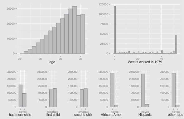
Plots of the variables in the Fertility dataset. The numbers of women with two or more children rose steadily with age, except for the eldest two years. The majority of women worked every week of the year or not at all. Fewer women had more than two children than had exactly two. There were slightly more boys than girls for both the first and second child. Most women in the study were Caucasian.
As expected, the numbers of women with two or more children rise with age, although it is perhaps surprising that the pattern is so regular before dropping off for the two oldest cohorts. The same pattern exists for all race groups (because of overlaps there are six), as can be seen using
data(Fertility, package="AER")
ggplot(Fertility, aes(x=age)) + geom_bar(binwidth=1) +
facet_wrap(~ afam+hispanic+other, scales="free_y", ncol=8)
The function facet_wrap ignores any empty combinations while the option scales="free_y" scales the y axis of each graph individually, so that distributional shapes are compared rather than absolute frequencies.
That the majority of women either work or do not work is to be expected. Using a function like
with(Fertility, prop.table(table(work)))}
shows that just over a third reported something in-between.
From the barcharts in Figure 12.2 you can see that most of the women had just two children, that boys were as usual slightly more common than girls, and that most women in the study were Caucasians.
The numbers of women in the study increase with age and so does the proportion of them with more than two children. This can be seen in Figure 12.3. Interestingly, more women have three children if the first two have the same sex and this is irrespective of whether the first two were boys or girls (Figure 12.4).

A spinogram of age with the proportion of women having more than two children highlighted. This proportion increases with age.

A doubledecker plot showing the numbers of women having two girls, girl boy, boy girl, or two boys for their first two children. The proportion of women having more than two children is highlighted. Mothers of same sex children are more likely to have more than two.
The Fertility dataset is very large and so it is possible to look at the combination of the effects of age and the gender of the first two childen. Figure 12.5 shows that the pattern is pretty much the same for all ages.
data(Fertility, package="AER")
p0 <- ggplot(Fertility) + geom_bar(binwidth=1) + ylab("")
p1 <- p0 + aes(x=age)
p2 <- p0 + aes(x=work) + xlab("Weeks worked in 1979")
k <- ggplot(Fertility) + geom_bar() + ylab("") + ylim(0,250000)
p3 <- k + aes(x=morekids) + xlab("has more children")
p4 <- k + aes(x=gender1) + xlab("first child")
p5 <- k + aes(x=gender2) + xlab("second child")
p6 <- k + aes(x=afam) + xlab("African-American")
p7 <- k + aes(x=hispanic) + xlab("Hispanic")
p8 <- k + aes(x=other) + xlab("other race")
grid.arrange(arrangeGrob(p1, p2, ncol=2, widths=c(3,3)),
arrangeGrob(p3, p4, p5, p6, p7, p8, ncol=6),
nrow=2, heights=c(1.25,1))
doubledecker(morekids ~ age, data = Fertility,
gp = gpar(fill =c("grey90", "green")),
spacing=spacing_equal(0))
doubledecker(morekids ~ gender1 + gender2, data = Fertility,
gp = gpar(fill = c("grey90", "green")))
doubledecker(morekids ~ age + gender1 +gender2,
data = fertility,
gp = gpar(fill = c("grey90", "green")),
spacing=spacing_dimequal(c(0.1,0,0,0)))

doubledecker plot by gender pattern for the first two children and age. The proportion of women having more than two children is highlighted and you can see that the same pattern of higher rates for same sex families holds true for all ages.
12.4 Case studies
The following case studies are for you to investigate, so you can test your graphical skills. More information on the datasets involved can be found on the corresponding help pages in R. Full information on how and why the data were collected is sometimes provided. Ideally for any study there should be a clear set of goals and close cooperation with subject area experts. Even if you have well-defined goals, it is still sensible to do some exploring around. Sometimes issues of data quality become apparent, sometimes a question about an odd minor feature leads to much more information being provided about other parts of the dataset. As Tukey famously put it, data analysis is detective work, and we all know that apparently innocuous clues in detective stories can lead to major discoveries.
Each case study begins with a group of direct questions about the dataset, which should be relatively straightforward to answer. One or more open-ended questions follow that will hopefully encourage you to see what else you can discover. Although analyses should be carried out graphically, you can also think about how any conclusions could be checked with models.
Moral statistics of France
The Guerry dataset in the package HistData includes a range of information for each of the 86 departments of France around 1830.
- There are two variables relating to donations, Donations (to the poor) and Donation_clergy. Draw histograms of the two variables and comment on the differences between them.
- What would you expect the scatterplot of the last two variables, Prostitutes, numbers of prostitutes in Paris by department of birth, and Distance, distance from Paris, to look like? Does a scatterplot of the variables match your expectations?
- Draw a boxplot of the variable Infants, which refers to the population per illegitimate birth. Which of the departments marked as outliers do you think are definitely outliers? If you invert the variable to get a measure of illegitimate births by population and draw a boxplot, other departments are identified as possible outliers. Which of these do you think are definitely outliers? Which variable would you judge to be more appropriate to use?
- Some of the variables are expressed as inverses of rates, so that higher is better. Quite a few variables are only given as ranks, so that lower is better and there is only ordering information, but no distributional information. Draw a parallel coordinate plot of the rank variables and select the departments with big cities (category 3:Lg in the variables MainCity). How do these departments differ from the others, if at all?
- What additional features can you discover in the dataset?
Airbags and car accidents
There are 26217 cases of police-reported car crashes in the nassCDS dataset in the package DAAG.
- Draw a histogram of the variable weight. The R help file for the dataset says that the observation weights are “of uncertain accuracy”. Is there any evidence of this? What graphics would you draw to investigate which cases have high weights and which have very low weights?
- How does the availability of airbags depend on the age of the vehicle?
- How does death rate depend on vehicle speed?
- How does death rate vary with the variables seatbelt, airbag, deploy, and frontal? Which orderings of the variables and of the categories within the variables give the most convincing graphic?
- Are there other interesting patterns in the data worth presenting?
Athletes’ blood measurements
The ais dataset in the package DAAG contains five blood measurements and six physical measurements for 202 male and female athletes.
- Draw histograms of the eleven variables. Are there many different forms or are they all roughly normal?
- Boxplots of the variables suggest that there are a number of outliers. How many of these are outliers on more than one variable?
- Draw a parallel coordinate plot of the eleven variables with the females coloured red. Do the females have lower values than the males on all the variables? Which variables look most promising for distinguishing between males and females?
- There are ten different sports listed, nine for the women and eight for the men. Is there anything particularly distinctive about the patterns for any of the sports, either for both genders together or singly?
- If you were to choose three graphics to represent the most interesting information in this dataset, which would you choose and how would you present them in a summary report?
Marijuana arrests
The Arrests dataset in the package effects contains information on over 5000 arrests on the streets of Toronto over five years. There are six variables describing the arrested person, a variable giving the year, and a binary variable released saying whether the person was released with a summons or not.
- Are there any features worth mentioning in the distributions of the individual variables? Which graphics show these features clearly?
- How does the variable released depend on the others, taking them one at a time? Which graphics would you select to show this?
- What about the dependence of released on the variables colour, employed, and citizen in combination? Which plot would you draw to investigate this?
- Are there other features of the dataset worth reporting?
- If you wanted to summarise the information you have found on one page, which graphics would you choose and how would you present them as a group?
Crohn’s disease
Crohn’s disease is a chronic inflammatory disease of the intestines. The package robustbase includes a small dataset CrohnD of 117 patients in three groups, one placebo group and two different drug groups.
- Draw plots to show there are equal numbers in the three treatment groups, but not equal numbers by gender or country.
- Which plot would you draw to show the counts for all gender, country, and treatment combinations?
- The key outcome variable is the number of adverse events, nrAdvE. What graphic would you choose to display its distribution? What about a set of three graphics, comparing the distributions of the numbers of adverse events for the three treatment groups?
- Draw histograms of the other five variables, including ID. Explain why you chose the binwidths you use and describe what information you can see in the displays.
- If you had to write a short report on your analysis, what would you include? (There is some interesting background information in [Brant and Nguyen, 2008] and there are plenty of other sources of information you might find useful.)
Footballers in the four major European leagues
Statistics has even reached soccer nowadays and the dataset EURO4PlayerSkillsSep11 in the package SportsAnalytics includes 43 pieces of information on 1851 soccer players in September 2011.
- Draw a scatterplot of the variables Attack and Defence. Are there any obvious outliers? What might be done about them?
- There is a variable called Position saying whether players are goalkeepers, defenders, midfielders, or forwards. Which group of players scores highest on the variable Agression?
- Draw a graphic showing the relationship between the variables Foot and Side. What are your conclusions? Do your conclusions vary depending on a player’s position?
- How would you display graphically how goalkeepers differ from other players?
- Consider only the subset of players who are goalkeepers. What sort of values are they given for variables such as the four concerned with passing? Do these distributions depend on the league in any way?
- The dataset has many variables and so there is much that might be investigated. Choose one of the four leagues and investigate if there are any noteworthy differences between the teams. If teams are distinctive in some way, check whether they are also distinctive if you take the other leagues into account as well. (The data are provided to support a soccer video game and the way the players are evaluated is not clearly documented. This may account for some of the minor features you can find.)
Decathlon
Both from a sporting point of view and from a statistical point of view, the decathlon is a fascinating event. Athletes must compete in ten different disciplines over two days. Their performances in each event are transformed to a common scale and summed to produce a total score.
The transformation formulae [IAAF, 2001] were last changed in 1985 by a committee including the academic and former decathlete, Viktor Trkal. That their recommendations have continued to be used for so many years is a tribute to their work. Viktor Trkal [personal communication] reported that the committee used principles they believed a satisfactory system should follow and data provided by various countries on decathlon performances to guide their work. One principle that was not respected by the previous system was that an improvement in performance should be worth more points the higher the level that is improved on.
There is an excellent webpage for decathlon results, based in Estonia, where individual scores and much additional information can be found for performances over many years [Salmistu, 2013]. The dataset used here, the Decathlon dataset in the package GDAdata, is a subset of that data for the years 1985 to 2006 covering almost 8000 performances. The criteria for a score being recorded is that the total points should be higher than 6800 and that it should be the best performance of an athlete in a particular year. This means that the top decathletes can only appear at most once a year, although they can and do appear in several different years.
- What plots would you choose to study the variable Totalpoints and how would you describe the distribution?
- Use boxplots to examine how the distribution of Totalpoints develops over time. What conclusions would you draw?
- Draw a scatterplot of the variables m100 and P100m, the actual times in seconds, and the points awarded for the 100 metres. How close is the formula to a linear function in the range covered by the data? Does the same apply to the pole vault event?
- Draw parallel coordinate plots of the raw data (m100 to m1500) and the points data (P100m to P1500). Draw boxplots for the points variables. What information can you see in each plot? Which plot is most useful for comparing the performances in the different disciplines?
- Pcp’s of the points variables on a common scale could be sorted by the maximum values, the medians, the IQR’s, or by those statistics for a selection, such as for the most recent year. Choose any two you find interesting and explain your choice.
- For the second question you looked at the development of the total points scored over the 22 years. What about the development of scores for the individual disciplines? You might compare the maximum, the median, the 95% quantile, the tenth best performance or the twenty-fifth best performance for each year. Which do you think would be suitable? Create the necessary dataset to plot the statistics you chose over time. What conclusions do you draw from your plot?
Intermission
Rembrandt’s The Night Watch hangs in the Rijksmuseum in Amsterdam. How might you divide it up into individual groups and scenes? How well do individual scenes combine to form the whole?