
Drop-down menus are often used in web applications to show extended functionality. Actions that are used less often or useful to a small number of users can be added to the menu, resulting with a cleaner interface.
HTML5 and CSS3 allow us to build drop-down menus written entirely in CSS. We're going to create such a menu in this recipe.
Let's analyze the structure of a drop-down menu. A drop-down menu has an activation button that displays it and one or more items from the following:
- A regular (action) item
- A separator item
- A submenu item (that activates a sub-menu)
Our HTML element structure should reflect the drop-down menu structure. Our CSS code will control the positioning and display of the menu.
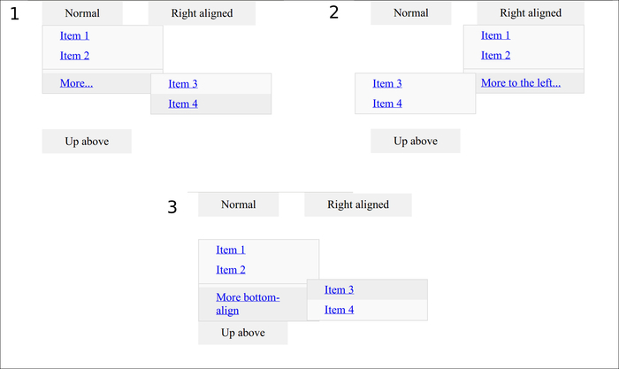
We're going to have three buttons showing slightly different, yet structurally same, menus.
The first will have the default behavior—drops down, is left-aligned with a submenu appearing on the right-hand side.
The second will have a modified behavior—right-aligned with a submenu appearing on the left-hand side.
Finally, the third will have a very different behavior; it will come above the button with submenus appearing to the right-hand side, but going up.
To create the menu, we will use HTML and CSS.
- Let's first create the menu structures in the HTML file. Essentially, it's the same structure discussed previously, copied three times with slight variations in styles, particularly on the unordered list elements that contain menus and submenus:
<!DOCTYPE HTML> <html> <head> <title>Dropdown menu</title> <link rel="stylesheet" type="text/css" href="example.css"> <style type="text/css"> .screen-bottom { position:fixed; bottom:3em; } </style> </head> <body> <div class="dropdown-menu"> <a class="btn">Normal</a> <ul class="menu"> <li><a href="item1">Item 1</a> <li><a href="item2">Item 2</a> <li class="separator"></li> <li class="dropdown-menu"> <a href="#" class="submenu">More...</a> <ul class="menu"> <li><a href="item3">Item 3</a> <li><a href="item4">Item 4</a> </ul> </li> </ul> </div> <div class="dropdown-menu"> <a class="btn">Right aligned</a> <ul class="menu right-align"> <li><a href="item1">Item 1</a> <li><a href="item2">Item 2</a> <li class="separator"></li> <li class="dropdown-menu"> <a href="#" class="submenu">More to the left...</a> <ul class="menu left-side"> <li><a href="item3">Item 3</a> <li><a href="item4">Item 4</a> </ul> </li> </ul> </div> <div class="screen-bottom"> <div class="dropdown-menu"> <a class="btn">Up above</a> <ul class="menu up"> <li><a href="item1">Item 1</a> <li><a href="item2">Item 2</a> <li class="separator"></li> <li class="dropdown-menu"> <a href="#" class="submenu">More bottom-align</a> <ul class="menu bottom-align"> <li><a href="item3">Item 3</a> <li><a href="item4">Item 4</a> </ul> </li> </ul> </div> </div> </body> </html> - Then let's add the appropriate CSS for this menu in
example.css. We're going to use aborder-boxsizing model. Unlike the regular model, where the borders and padding are outside the specified dimensions of the element (width or height), in theborder-boxmodel the padding and borders are included in the specified dimensions:.dropdown-menu * { -webkit-box-sizing: border-box; /* Safari/Chrome, WebKit */ -moz-box-sizing: border-box; /* Firefox, other Gecko */ box-sizing: border-box; } div.dropdown-menu { display:inline-block; position:relative; margin:0 1em; } - We're going to add styling to the menu items that display the dropdowns as well as the menu itself. By default, the inner menu is absolutely positioned below the rest of the content:
a.btn { padding: 0.5em 2em; background-color:#f1f1f1; } .dropdown-menu ul.menu { width:auto; background-color:#f9f9f9; border: solid 1px #ddd; display:none; position:absolute; top:50%; left:0; list-style:none; padding:0; min-width:170px; } - We need to make the menu show on hover when the button is active:
.dropdown-menu:hover > ul.menu, .dropdown-menu:active > ul.menu { display:block; } - We need submenus to be positioned relative to their parent items:
.dropdown-menu > ul.menu > li { position:relative; } - We'll set the style of a regular items and a separator item:
.dropdown-menu > ul.menu > li:hover { background-color:#eee; } .dropdown-menu > ul.menu > li > a { padding:0.3em 1.5em; display:block; } .dropdown-menu > ul.menu > li.separator { height:0.01em; margin:0.3em 0; border-bottom: solid 1px #ddd; } - Regular submenus will be positioned slightly differently: in-line with their parent item but 90% from the left-hand side:
li.dropdown-menu ul.menu { left:90%; right:auto; top:0em; } - Lastly, we apply the specialized styles for right-aligned and roll-up menus, as well as submenus that are bottom-aligned with their parent:
.dropdown-menu ul.menu.right-align {
    left:auto;
    right:0;
}
.dropdown-menu ul.menu.up {
    top: auto;
    bottom:50%;
}
li.dropdown-menu ul.menu.left-side {
    right: 90%;
    left: auto;
}
li.dropdown-menu ul.menu.bottom-align {
    top:auto;
    bottom:0;
}
To display our menus dynamically, we use the hover and active CSS pseudo-selectors. They enable us to style elements differently when the cursor is hovering over them or when the elements are marked as active. Putting the entire menu inside the menu item allows us to display it by using these selectors on the menu item.
To position the menus and submenus, we use a combination of a position:relative parent menu item and position:absolute submenu child items. When we use this combination, our child positioning attributes are relative to the first relative parent, namely, the item.
This allows us to place the menu anywhere: below the parent by default or above as an option (for submenus, to the right by default, to the left as an option). It also allows us to align the submenu any way we like: left by default, right as an option (for submenus, top-aligned by default, bottom-aligned as an option).
These combinations should allow us to construct menus at arbitrary locations without worrying that the menu might go off-screen.