So far, we have already used some of the built-in validation mechanisms. Now we are going to take a deeper look at some of them, and how we can add our own customization. We will change the style and apply some more advanced checks as well, when we will see how we can disable validation on certain elements by creating a form that has most of these features.
Note
The current working draft version for the form validation can be found at http://www.whatwg.org/specs/web-apps/current-work/multipage/forms.html#client-side-form-validation.
We will create a form that will have error messages styled using CSS, and custom validation using HTML and JavaScript as follows:
- We will start off by creating the head section, where we will include
example.css, where the CSS file will contain selectors for theinputelements with valid, invalid, optional, and required state:<head> <title>Built In Validation</title> <link rel="stylesheet" href="example.css"> </head> - The next step is to create the
example.cssfile. Thevalid.pngimage can be found in the source examples. In real life, you would probably not use all of these states to style the look of the forms, but we added it here in order to show what can be done:input:invalid { background-color: red; outline: 0; } input:valid { background-color: green; background: url(valid.png) no-repeat right; background-size: 20px 15px; outline: 0; } input:required{ box-shadow: inset 0 0 0.6em black; } input:optional{ box-shadow: inset 0 0 0.6em green; }Note
CSS
box-shadowis not fully supported in legacy browsers, for example IE 8. The specification forbox-shadowcan be found at http://www.w3.org/TR/css3-background/#box-shadow. - Following the
headsection, we will start with adding the form elements in thebodysection. First, we will add thenameandnicknamefields, making themrequired, and for which later we will ensure not to have the same value:<div> <label> Name <input required name="name" x-moz-errormessage="We need this."/> </label> </div> <div> <label> Nickname <input required name="nickname"/> </label> </div> - We can also include two date/time related inputs, one for
weekand other formonth, where we will limit the weeks from second week of 2013 to second week of 2014 and allow every other month to be selected:<div> <label> Start week <input type="week" name="week" min="2013-W02" max="2014-W02" required /> </label> </div> <div> <label> Best months <input value="2013-01" type="month" step="2" name="month" /> </label> </div> - Also, we will add three buttons: one for submitting the form, another for checking the validity using JavaScript, and one more for submitting without validation and constraint checks:
<button type="submit">Save</button> <button type="submit" formnovalidate>Save but don't validate</button> <button type="button">Check Validity</button> - Outside the form, we will add one
divelement for displaying some log information:<div id="validLog"></div>
- As for the JavaScript, we add the dependency for jQuery and include
example.js:<script src="//cdnjs.cloudflare.com/ajax/libs/jquery/1.8.3/jquery.min.js"></script> <script src="example.js"></script> - In the
example.jsfile, we will add an event for the check validity button, where we will print theValidityStatevalue tovalidLog, on the validation errors of each of the form elements:$(function() { var attemptNumber = 1; $("button[type=button]").click(function(){ var message = (attemptNumber++)+"#<br/>"; var isValid = $('form')[0].checkValidity(); if(isValid){ message += "Form is valid"; }else{ $("input").each(function( index ) { var validityState = $(this)[0].validity; var errors = ""; If(!validityState.valid){ message += "Invalid field <b> " + $(this).attr("name")+"</b>: "; for(key in validityState){ if(validityState[key]){ errors += key+" "; } } message += " " + errors + " <br />"; } }); } message += "<hr />"; $("#validLog").prepend(message); }); - To add custom validation, we will use the
.setCustomValidity()method, so it will check if thenameandnicknamevalues are the same, and if so, we will add validation error, and if they are not, we will remove the custom check:$("input[name='nickname']").change(function(){ if($(this).val() === $("input[name='name']").val()){ $(this)[0].setCustomValidity("You must have an awesome nickname so nickname and name should not match"); }else{ $(this)[0].setCustomValidity(""); }); $("input[name='name']").change(function(){ if($(this).val() === $("input[name='nickname']").val()){ $(this)[0].setCustomValidity("Nickname and name should not match"); }else{ $(this)[0].setCustomValidity(""); } });
The
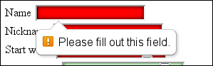
required attribute marks the HTML element inside the form, required to have a value before the form can be submitted. The first field that will not have a value would get focused upon submission and a hint with a message would be shown to the user:
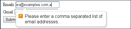
There are several ways to customize the message displayed to the user on Firefox; we can use the x-moz-errormessage attribute. In our case, this is x-moz-errormessage="We need this.", but this will only work there. On Chrome, the title attribute gets additionally displayed beside the standard message, but the original message stays. Another way for changing the message would be to set the value using JavaScript:
<input type="text" required="required" oninvalid="this.setCustomValidity('Please put some data here')">As for styling the form elements, there are the CSS pseudo class selectors :required and :optional.
The min, max, and step attributes can be used on date-related input types and not just on numbers. The default step is one day for date type, one week for week types, and so on. If we set a different step than the default one, for example on the month input if we have the step with value two, the user will not be able to select every other month from the DatePicker control, but he or she can still enter the wrong date in text, triggering stepMismatch.
Because validation is triggered before the form is submitted, and if the input is invalid, the submit event is never called. If we need to have a way of submitting data without validation, we can do that by using the formnovalidate attribute as follows:
<button type="submit" formnovalidate>Save but don't validate</button>
We may sometimes need to access the validityState value of an element from JavaScript; for that purpose there is a
checkValidity() method executed on the form and the input elements in the form. As the name suggests, it checks the state of elements, and when it is called on the form, all the child elements are checked for validation and additionally, we can call the method on each individual element, for example input, select, or textarea. In our case for the form, it was as follows:
$('form')[0].checkValidity();The $('form')[0] element gives us the wrapped DOM element of the selected jQuery's object, this can also be done by calling .get() on the selected element. Each element has a validitystate value that we can read as follows:
       $("input").each(function(index) {
          var validityState = $(this)[0].validity;
       …
There are several built-in checks we can access at this point that are properties of the validityState object: valueMissing, typeMismatch, patternMismatch, tooLong, rangeUnderflow, rangeOverflow, stepMismatch, badInput, and customError. Each of these will return true if there is such constraint violation. In the example code for this recipe, we just print out the name of the constraint violation to the log.
What happens if we have fields that depend on each other or when we need to implement some custom validation logic? No problem there we are covered, we can use the setCustomValidity() method on each of the fields that depend. In our case, we wanted the input for the name and nickname variables to be different. So we added change listener and if they are the same we just set the message with customValidity("your message here") and when we need to remove the violation, we set the message to be an empty string:
    $("input[name='nickname']").change(function(){
      if($(this).val() === $("input[name='name']").val()){
      $(this)[0].setCustomValidity("You must have an awesome nickname so nickname and name should not be the same");
      }else{
      $(this)[0].setCustomValidity("");
      }
    });
Additionally, there are two more CSS pseudo selectors for :valid and :invalid that we will be used to style elements, depending on their validityState value.
Note
The specification for client-side form validation can be found at: http://www.whatwg.org/specs/web-apps/current-work/multipage/forms.html#client-side-form-validation. As for the constraints API, more info is found at http://www.whatwg.org/specs/web-apps/current-work/#the-constraint-validation-api.
One important thing to note is that all the browsers do not have full support for all the features. IE 9, for example, has no support for any of the constrains as well as none of the new input types. More on current browsers support can be found at http://caniuse.com/#search=form%20vali and http://www.quirksmode.org/compatibility.html.
If we want to use some of the attributes to disable the entire form from validating, we can set the form attribute called novalidate. For example, this will disable the checks, but allow use of min and max for input type range.
There is an another way to disable the standard browser hint box and create a custom one:
    $('form').each(function(){
      $(this)[0].addEventListener('invalid', function(e) {
        e.preventDefault();
        console.log("custom popup");
      },true);
    });
Several questions should be thought through before using built-in constraints:
- Do we need to know when the user has clicked on the Submit button?
- Do we need client-side validation for browsers that don't support the Form Validation API yet?
If we need to know when the user has tried to submit the form, we can attach event listener for click rather than submit. As for legacy browsers, we may choose to rely on server-side validation that must be present, but if we don't want to lose functionality at the client side, there are some ways of doing this by adding webshim, http://afarkas.github.com/webshim/demos/index.html.