
5
Interactive Visual Analysis of Big Data
Carlos Scheidegger
CONTENTS
5.1 Introduction .................................................................... 61
5.2 Binning ......................................................................... 64
5.3 Sampling ....................................................................... 67
5.4 Graphical Considerations ...................................................... 68
5.5 Outlook and Open Issues ...................................................... 68
References ............................................................................. 69
5.1 Introduction
In this chapter, we discuss interactive visualization of big data. We will talk about why this
has recently become an active area of research and present some of the most promising recent
work. We will discuss a broad range of ideas but will make no attempt at comprehensiveness;
for that, we point readers to Wu et al.’s vision paper [25] and Godfrey et al.’s survey [9]. But
before we get there, let us start with the basics: why should we care about visualization,
and why should it be interactive?
The setting we are considering is that of data analysis,wherethedata analyst hopes to
understand and learn from some real-world phenomenon by collecting data and working with
a variety of different techniques, statistical and otherwise. As the analyst creates different
hypothesis in his or her head to try and understand the data, he or she will generate possibly
many different visualizations from the dataset. We also restrict ourselves here to big data,
and we use the term somewhat loosely to mean “big enough that repeated full scanning
through the dataset is painful.” As a consequence (and this is a good thing), whether or
not you have big data depends on the computer that will be generating the visualizations.
It is also why only recently have we truly had to care about big data visualization as a
research problem: for the past 40 years or so, computer technology has outpaced our ability
to gather data for analysis. But this has now changed. The main constraint in interactive
analysis is one of latency: if it takes significantly longer to wait for a command than it does
to express this command to the computer, the analyst risks missing important information
about the dataset [16].
Even in the smallest of cases, visual presentation is a powerful means to understanding.
We follow Tukey’s philosophy here that data graphics force us to ask questions we did not
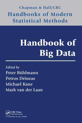
even know we wanted to ask [23]. Consider the venerable example of Anscombe’s quartet [3].
Anscombe famously observed that numeric summaries of a dataset can be highly mislead-
ing: with as few as 11 observations, it is possible to create different datasets with exactly
the same means, medians, linear fits, and covariances (see Figure 5.1). Looking at the plots
61
62 Handbook of Big Data
Summaries
x1
Coeffificients:
(Intercept)
3.0001
×1
0.5001
Coeffificients:
(Intercept)
3.001
×2
0.500
Coeffificients:
(Intercept)
3.0025
×3
0.4997
Coeffificients:
(Intercept)
3.0017
×4
0.4999
5
12.5
12
34
7.5
10.0
5.0
12.5
7.5
10.0
5.0
10 15 x
y
51015
y1 x2 y2 x1 y1 x2 y2
Tabular views
Graphical displays
Min. : 4.0
1st Qu. : 6.5
Median : 9.0
Mean : 9.0
3rd Qu. :11.5
Max. :14.0
Min. : 4.0
1st Qu. : 6.5
Median : 9.0
Mean : 9.0
3rd Qu. :11.5
Max. :14.0
Min. : 4.260
1st Qu. : 6.315
Median : 7.580
Mean : 7.501
3rd Qu. : 8.570
Max. :10.840
Min. :3.100
1st Qu. :6.695
Median :8.140
Mean :7.501
3rd Qu. :8.950
Max. :9.260
1
2
3
4
5
6
7
8
9
10
11
10
8
13
9
11
14
6
4
12
7
5
10
8
13
9
11
14
6
4
12
7
5
x3 y3 x4 y4
1
2
3
4
5
6
7
8
9
10
11
10
8
13
9
11
14
6
4
12
7
5
6.58
5.76
7.71
8.84
8.47
7.04
5.25
12.50
5.56
7.91
6.89
8
8
8
8
8
8
8
19
8
8
8
7.46
6.77
12.74
7.11
7.81
8.84
6.08
5.39
8.15
6.42
5.73
8.04
6.95
7.58
8.81
8.33
9.96
7.24
4.26
10.84
4.82
5.68
9.14
8.14
8.74
8.77
9.26
8.10
6.13
3.10
9.13
7.26
4.74
x3 y3 x4 y4
Min. : 4.0
1st Qu. : 6.5
Median : 9.0
Mean : 9.0
3rd Qu. :11.5
Max. :14.0
Min. : 8
1st Qu. : 8
Median : 8
Mean : 9
3rd Qu. : 8
Max. :19
Min. : 5.39
1st Qu. : 6.25
Median : 7.11
Mean : 7.50
3rd Qu. : 7.98
Max. :12.74
Min. : 5.250
1st Qu. : 6.170
Median : 7.040
Mean : 7.501
3rd Qu. : 8.190
Max. :12.500
FIGURE 5.1
Anscombe’s quartet [3] shows a fundamental shortcoming of simple summaries and numeric
tables. Summaries can be exactly the same, and numeric tables all look similar, but the
data they hold can be substantially different. This problem is sharply accentuated in big
data visualization, where the number of data points easily exceeds the number of pixels in
a computer screen.
makes it clear that the different datasets are generated by fundamentally different processes.
Even though tables of the raw numeric values area in this case are small, they do not convey
for human consumers, in any effective way, the structure present in the data. As we here are
going to talk about datasets with arbitrarily large numbers of observations (and, in current
practice, easily in the range of billions), the numeric tables are more obviously a bad idea.
Still, can we not just draw a scatterplot? No, unfortunately we cannot: the first problem
naive scatterplots create is that the straightforward implementation requires at least one
entire pass over the dataset every time the visualization is updated (and, at the very least,
one pass over the set of points to be plotted). In an exploratory setting, we are likely to
try different filters, projections, and transformations. We know from perceptual experiments
that latencies of even a half-second can cause users to explore a dataset less thoroughly [16].
Big data visualization systems need to be scalable: aside from some preprocessing time,
systems should run in time sublinear on the number of observations.
Suppose even that scanning were fast enough; in that case, overplotting becomes a
crippling problem, even if we had infinite pixels on our screens: there are just too many
observations in our datasets and too few photoreceptors in the human eye. Using semi-
transparent elements, typically via alpha blending [19], is only a solution when the amount
of overplotting is small (see Figure 5.2). A better solution is to use spatial binning and visual
encodings based on per-bin statistics. Binning has two desirable characteristics. First, if the
binning scheme is sensible, it will naturally pool together similar observations from a dataset
into a single bin, providing a natural level-of-detail representation of a dataset. In addition,
binning fits the pixel-level limitations of the screen well: if we map a specific bin to one single
pixel in our scheme, then there is no need to drill down into the bin any further, because
all the information will end up having to be combined into a single pixel value anyway. As
we will see, one broad class of solutions for big data visualization relies on binning schemes
of varying sophistication. More generally, we can think of binning as a general scheme to
apply computational effort in a way more aligned to human perceptual principles: if we are
unable to perceive minute differences between dataset values in a zoomed-out scatterplot,
it is wasteful to write algorithms that treat these minute differences as if they were as big
as large-scale ones.

Interactive Visual Analysis of Big Data 63
10.0
7.5
2.5
5.0
Log (votes)
Alpha = 0.01
Alpha = 0.01
Alpha = 0.005
Alpha = 0.005
Overplotting amount
10.07.52.5 5.0
Rating
750
Count
500
250
10.0
10.0
7.5
7.5
2.5
2.5
5.0
5.0
Log (votes)
Rating
1.00
0.75
0.25
0.50
Total opacity
0.00
1.00
0.75
0.25
0.50
Total opacity
0.00
0 250 500 750 1000
Overplotting amount (log scale)
100010
10.0
10.0
7.5
7.5
2.5
2.5
5.0
5.0
Log (votes)
Rating
FIGURE 5.2
Overplotting becomes a problem in the visualization of large datasets, and using
semitransparent shapes is not an effective solution. The mathematics of transparency and
its perception work against us. Most of the perceptual range (the set of different possible
total opacities) is squeezed into a small range of the overplotting amount, and this range
depends on the specific per-point opacity that is chosen (left column). As a result, different
opacities highlight different parts of the data, but no single opacity is appropriate (middle
column). Color mapping via bin counts, however, is likely to work better (right column).
Finally, any one single visualization will very likely not be enough, again because there
are simply too many observations. Here, interactive visualization is our current best bet. As
Shneiderman puts it, overview first, zoom, and filter the details on demand [20]. For big data
visualizations, fast interaction, filtering, and querying of the data are highly recommended,
under the same latency constraints for visualization updates.
Besides binning, the other basic strategy for big data visualization is sampling. Here, the
insight is similar to that of resampling techniques such as jackknifing and bootstrapping [7]:
it is possible to take samples from a dataset of observations as if the dataset were an
actual exhaustive census of the population, and still obtain meaningful results. Sampling-
based strategies for visualization have the advantage of providing a natural progressive
representation: as new samples are added to the visualization, it becomes closer to that of
the population.
This is roughly our roadmap for this chapter, then. First, we will see how to bin datasets
appropriately for exploratory analysis and how to turn those bins into visual primitives that
are pleasing and informative. Then we will briefly discuss techniques based on sampling, and
finally we will discuss how exploratory modeling fits into this picture. Table 5.1 provides a
summary of the techniques we will cover in this chapter.
With the material presented here, you should be able to apply the current state-of-the-art
techniques and visualize large-scale datasets, and also understand in what contexts the avail-
able technology falls short. The good news is that for one specific type of approach, many
open-source techniques are available. The techniques we present in this chapter have one
main idea in common: if repeated full scans of the dataset are too slow to be practical, then
we need to examine the particulars of our setting and extract additional structure. Specifi-
cally, we now have to bring the visualization requirements into our computation and analysis
infrastructure, instead of making visualization a separate concern, handled via regular SQL
queries or CSV flat files. One crucial bit of additional structure is that of the visualization
technique itself. Although not explored to its generality in any of the techniques presented

64 Handbook of Big Data
TABLE 5.1
A summary of the three techniques discussed in the chapter.
Technique Software Type Speed Interaction Binning Scheme
Bigvis R package Good No Per-analysis, dense
imMens HTML + WebGL Best Active brush
limited to two
attributes
Fixed, dense
Nanocubes HTTP server Better Yes Hierarchical,
sparse
Technique Table Scan Memory Usage Modeling Num ber of Data
Dimensions
Bigvis Per-analysis Good Some Does not care
imMens Once Best None Does not care
Nanocubes Once Worst
(for server)
None Uses progressively
more memory
Technique Data Insertion Data Deletion Scan Speed
Bigvis Yes, rescan Yes, rescan 1–3MB rows/s
imMens No No Unreported
Nanocubes Yes No 10–100KB rows/s
Note: See text for a more thorough discussion. Categories are meant to be neither objective
nor exhaustive.
here, a large opportunity for future research is to encode human perceptual limitations
computationally, and design algorithms that quickly return perception approximate results
(an example of this technique is the sampling strategy used by Bleis et al., to be further
discussed in Section 5.3 [14]. Combined with our (limited, but growing) knowledge of the
visual system, this would enable end-to-end systems that quickly return approximate results
indistinguishable from the exact ones.
Because of space limitations, this chapter will not touch every aspect of large-scale
data visualization. Specifically, there is one large class of data visualization techniques
that is not going to be covered here, namely visualization of data acquired from imaging
sensors and numerical simulations of physical phenomena. These include, for example, 3D
tomography datasets, simulations of the Earth’s atmospheric behavior, or magnetic fields
in a hypothetical nuclear reactor. Researchers in scientific visualization have for a long time
developed techniques to produce beautiful images of these very large simulations running on
supercomputers; see, for example, the recent work of Ahrens et al. [2]. By contrast, we will
here worry about large-scale statistical datasets, which we are going to assume are either
independent samples from a population, or in fact the entire population itself, where each
observation is some tuple of observations.
5.2 Binning
Histograms have been used as a modeling and visualization tool in statistics since the field
began; it is not too surprising, then, that binning will play a central role in the visual-
ization of big data. All techniques in this section produce histograms of the datasets. The
main innovation in these techniques, however, is that they all preprocess the dataset so
Interactive Visual Analysis of Big Data 65
that histograms themselves can be computed more efficiently than a linear scan over the
entire dataset.
All techniques in this section exploit one basic insight: at the end of the day, when
a visualization is built, there are only a finite number of pixels in the screen.Ifanytwo
samples were to be mapped to the same pixel, then we will somehow have to combine these
samples in the visualization. If we design a preprocessing scheme that does some amount of
combination ahead of time, then we will need to scan the samples individually every time
they need to be plotted. This observation is simple, but is fruitful enough that all techniques
in this section exploit it differently. As a result, no one technique dominates the other, and
choosing which one to use will necessarily depend on other considerations.
We will go over three techniques. Bigvis is an R package developed by Hadley Wickham
that, in addition to visualization of large datasets, allows for a limited amount of effi-
cient statistical modeling [24]. Liu et al. have created imMens, a JavaScript-based library
that leverages the parallel processing of graphics processing units (GPUs) to very quickly
compute aggregate sums over partial data cubes [17]. Finally, Lins et al. have developed
nanocubes, a data structure to represent multiscale, sparse data cubes [15]. Both imMens
and nanocubes are built on data cubes [10]. In a relational database, a data cube is a mate-
rialization of every possible column summarization of a table (Microsoft Excel’s pivot tables
are a simple form of data cubes) (see Figure 5.3 for an example).
The biggest disadvantage of general data cubes is their resource requirements. Just in
terms of space usage, an unrestricted data cube will take space exponential in the number
of dimensions. This is easy to see simply because for each of n columns, an entry in a
column of a datacube table can be either All or one of the entries in the original table,
giving a potential blowup of 2
n
. There have been many papers that try to improve on this
worst-case behavior [21], and the biggest difference between imMens and nanocubes lies on
the trade-offs they choose to take in order to curb the resource usage.
We start our discussion with imMens. The basic representation of imMens is that of a
dense, partial data cube: out of all possible aggregations in n dimensions, the preprocessing
Relation
Country LanguageDevice
e United States enAndroid
Country LanguageDevice
All All
Count
5All
Country LanguageDevice
All
All
Count
5All
All All 2Android
All
All
3
iPhone
All
en 4All
All ru 1All
All ru 1iPhone
All en 2Android
All en
2
iPhone
Country LanguageDevice
All en
Count
2Android
All
en
2
iPhone
All
ru
1iPhone
e United States ruiPhone
Australia eniPhone
India enAndroid
South Africa eniPhone
A
Aggregation
Equivalent to group by on
all possible subsets of
{Device, Language}
B
Group by on Device, Language
C
Cube on Device, Language
D
FIGURE 5.3
A simple relation from a database and some of its possible associated aggregations and
data cubes. (Data from Lins, L. et al., IEEE Trans. Vis. Comput. Graphics, 19, 2456–2465,
2013.)
..................Content has been hidden....................
You can't read the all page of ebook, please click here login for view all page.