A Visualization Tool for Mining Large Correlation Tables 83
Frame 1: n = 1887
Corr = 0.824 (pval = 0)
ssc_diagnosis_verbal_iq_p1.CDV
Frequency
0
50
100
150
200
250
0 50 100 150
ssc_diagnosis_nonverbal_iq_p1.CDV
Frequency
0 50 100 150
0
50
100
200
300
0 50 100 150
0
50
100
150
ssc_diagnosis_verbal_iq_p1.CDV
ssc_diagnosis_nonverbal_iq_p1.CDV
Frame 2: n = 1880
Corr = 0.707 (pval = 0)
ados_module_p1.CDV
Frequency
0
200
400
600
800
1000
12
34
Frequency
0
50
100
200
300
ssc_diagnosis_vma_p1.CDV
0 100 200 300
0
100
200
300
ados_module_p1.CDV
ssc_diagnosis_vma_p1.CDV
1234
ssc_diagnosis_verbal_iq_type_p1.CDV
Frequency
0
500
1000
1500
12
Frequency
0
500
1000
1500
12
ssc_diagnosis_nonverbal_iq_type_p1.CDV
ssc_diagnosis_verbal_iq_type_p1.CDV
ssc_diagnosis_nonverbal_iq_type_p1.CDV
12
1
2
Frame 3: n = 1887
Corr = 0.76 (pval = 0)
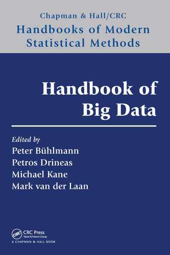
FIGURE 6.7
Scatterplots and histograms/barplots for three variable pairs. Corr, correlation; pval,
p-value.
marginal histograms (for quantitative variables) and barcharts (for categorical variables).
From Figure 6.7, we can draw a few conclusions and recommendations:
• A most basic use of the plots is to note the type of the variables: In Figure 6.7,
both variables on the left (
..nonverbal iq.. and ..verbal iq..)andthey-variable in
the center (
..vma..)arequantitative;thex-variable in the center (ados module..)is
apparently ordinal with four levels, and both variables on the right (nonverbal
iq type and
verbal
iq type)arebinary. Quantitative variables can have strong marginal features: it might
b e of interest to observe that the x-variable on the left is slightly bimodal, with a major mode
around x = 90 and a minor mode around x = 30.
∗
The y-variable in the center scatterplot is
partially censored on the upper side at about y = 210, as can be seen both in the scatterplot
and in the (lower) histogram.
• Categorical variables, when scored numerically, can be gainfully displayed in scatterplots. It is
useful to jitter them to avoid b eing misled by overplotting. I n Figure 6.7, jittering is applied
to the x-variable in the center scatterplot and to both binary variables in the right-hand
scatterplot.
∗
The bimodality of the IQ distribution is a measurement artifact: for cognitively highly impaired
probands, a different and more appropriate IQ test is administered. In theory, this alternative test should
be scaled to cohere with the test administered to the majority, but in practice it creates a minor mode in
the low end of the IQ distribution, more so for verbal IQ than for nonverbal IQ.

84 Handbook of Big Data
• To enhance the p erception of the association, the scatterplots can be decorated with smo oths
for continuous variables and with tr aces of group means when the x-variable is categorical with
few er than, say, eight groups (default, can be changed). In the left and center scatterplots of
Figure 6.7, the associations of the y-variables with the x-variables are seen to be somewhat
nonlinear, but compared to the linear component of the association, the nonlinearities are
relatively modest.
∗
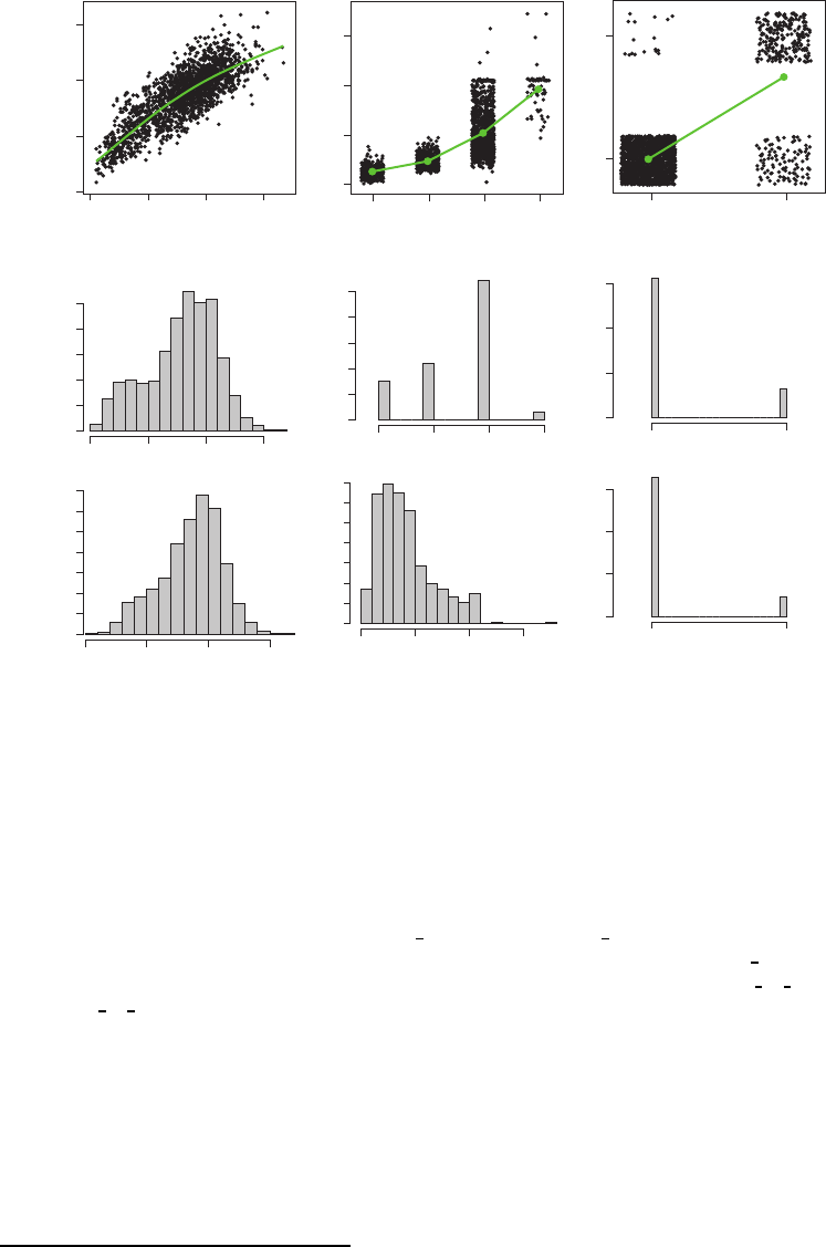
The AN shows scatterplots and histograms/barcharts in a window separate from the
blockplot window, one triple of plots at a time. To overcome the one-at-a time limitation,
the AN also offers scatterplot matrices (sometimes called sploms) of arbitrary numbers of
variables. An example, involving four variables (different from those in Figure 6.7), is shown
in Figure 6.8. For readers not familiar with scatterplot matrices, note that each variable pair
is shown twice, in plots located symmetrically off the diagonal, and with reverse roles as
x-andy-variables. Each diagonal cell shows a variable label that indicates (1) the common
x-axis in the column of the cell and (2) the common y-axis in the row of the cell. For
the reader familier with scatterplot matrices, note that we show the vertical order of the
variables ascending from bottom to top, the reason being consistency with the convention
we use in the blockplots.
20 40 60 80 100 120
0246
40 50 60 70 80 90
ados2
algorithm
p1.OCUV
srs
teacher
t
score
p1.CDV
40 50
60
70
80 90
40 50 60 70 80 90
srs
parent
t
score
p1.CDV
vineland
ii
composite
standard
score
p1.CDV
40 50 60 70 80 90 0 2 4 6
20 40 60 80 100 120
FIGURE 6.8
Scatterplot matrix of four variables. (Note the convention for the vertical order of the
variables: bottom to top, for consistency with the blockplots.)
∗
The nonlinearity on the left could be due to the marginal distributions. The nonlinearity in the center
is expected by the expert: verbal mental age (vma)onthey -axis should be considerably higher on average in
ADOS modules 3 and especially 4 because these modules or levels are formed from a simple test of language
competence.
A Visualization Tool for Mining Large Correlation Tables 85
As for particulars of the scatterplot matrix shown in Figure 6.8, the visually most striking
features concern marginal distributions, not associations: The first variable is capped at the
maximal value +90, and the fourth variable is binary. Otherwise the associations look simply
monotone and seem well summarized by correlations.
6.3.6 Variations on Blockplots
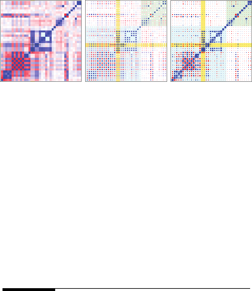
Blockplots are not the most common visualizations of correlation tables. As a Google search
of correlation plot reveals, the most frequent visual rendering of correlation tables is in terms
of heatmaps where square cells are always filled and numeric values are coded on a gray or
color scale. An example is shown in the left frame of Figure 6.9; for comparison, the right
frame shows the corresponding blockplot. Here are a few observations about the two types
of plots:
• Color or gray scale is generally a weaker visual cue than size. This argument favors
blockplots as long as the blocks are not too small, that is, as long as the view is not
zoomed out too much. The superiority of blockplots over heatmaps is also noted by
Wickham et al. (2006, Figure 2).
• In heatmaps, color fuses adjacent cells when they are close in value. This may or may
not be a problem for the trained eye, but there is a loss of identity of the rows and
columns in heatmaps.
• Heatmaps do not permit markup with background color because they fill the square or
rectangular cells completely. This problem can be overcome by shrinking the heatmap
cells somewhat to allow some surrounding space to be freed up that can be filled with
background color for markup, as shown in the center frame of Figure 6.9. This method
of rendering, however, seems to further decrease the crispness of heatmaps.
• Heatmaps perform nicely when the view is heavily zoomed out, in which case the
individual blocks are so small that size is no longer visually functional as a cue. In this
case, color coding works well and gives an accurate impression of global structure. We
solve this problem for blockplots by showing only 10,000 or so of the largest correlations
when heavily zoomed out. Thinning the table in this manner works well even when the
visible table is so large that each cell is strictly speaking below the pixel resolution of a
raster screen.
Because none of the two types of plots—blockplots or heatmaps—may be uniformly superior
at all scales, the AN provides both, and with one keystroke, one can toggle between the two
rendering methods. Varying block size allows for the mixed variant shown in the center of
Figure 6.9.
Visualization of correlation tables has a small literature in statistics. An early reference
that addresses large correlation tables is Hills (1969), who applies half-normal plots to
tell statistically significant from insignificant correlations and clusters variables visually
in two-dimensional projections. Closer to the present work are articles by Murdoch and
Chow (1996) and Friendly (2002). Both propose relatively complex renderings of correlations
with ellipses or augmented circles that may not scale up to the sizes of tables we have in
mind but may be useful for conveying richer information for tables that are smaller, yet too
large for numeric table display. Blockplot coding, which uses squares, has the advantage
that these shapes can completely fill their cells to represent extremal correlations as these
are geometrically similar to the shapes of the containing cells (at least if the the default
aspect ratio of the blockplot is maintained), whereas all other shapes leave residual space
even when maximally expanded.
What we prefer to call descriptively blockplots, possibly contracted to blots,has
previously been named fluctuation diagrams (Hofmann 2000). Under this term, one can find
a static implementation in the R-package extracat on the CRAN site authored by Pilhoefer
86 Handbook of Big Data
FIGURE 6.9
Aheatmap(left) compared with a corresponding blockplot (right), as well as a shrunk
heatmap (center).
and Unwin (2013). Static software for heatmaps is readily available, for example, in the
R-function heatmap(). Heatmaps are often applied to raw data tables, but they can be
equally applied to correlation tables. Many variations of glyph coding can be found in the
classic book by Bertin (1983).
An interesting aspect of blockplots is that there exists science regarding the perception
of area size. A general theory holds that most continuous stimuli (continua such as length,
area, volume, weight, brightness, and loudness) result in perceptions according to Stevens’
power law (Stevens 1957; Stevens and Galanter 1957; Stevens 1975). That is, a quantitative
stimulus x translates to a quantitative perception p(x) through a law of the form p(x)=
cx
β
. As discussed by Cleveland (1985, p. 243) with reference to Stevens (1975), for area
perception the power is about β =0.7, meaning that an actual area ratio of 2:1 is on
average perceived as a ratio of (2:1)
0.7
≈ 1.62. This law can be leveraged to determine
the transformation that should be used to map correlations to squares in a blockplot. In
R the symbol size is parametrized in terms of a linear expansion factor called cex (character
expansion). Our goal is to use block sizes such that their perceived ratios faithfully reflect the
ratios of respective correlations. This results in the condition cor ∼ p(cex
2
)=(cex
2
)
0.7
=
cex
1.4
; hence, cex ∼ cor
1/1.4
≈ cor
0.7
. This is indeed the default power transformation
in the AN, although users can change it (see Appendix B). If most correlations are very
small, a power closer to zero will expand the range of small values, resulting in enhanced
discrimination at the low end at the cost of attenuated discrimination at the high end.
6.4 Op eration of the AN
The purpose of the AN is to generate the displays described above in rapid order and
even with real-time motion. Numerous real-time operations are under mouse and keyboard
control, while a few text-based operations are under dialog and menu control. Further
parameters can be controlled from the R language (see Appendix B), but this will not be
necessary for most users. This section describes the operations of the AN, the purposes they
serve, as well as a minimal set of R-related instructions that concern one-time setup, regular
starting up, and saving of state. The software will be available as an R-package, but the
instructions below do not reflect this and get the reader going by sourcing the software from
the first author’s site.
A Visualization Tool for Mining Large Correlation Tables 87
6.4.1 Starting Up the AN
In order to simply see some AN running, the reader may paste the following code into an
R interpreter:
source("http://stat.wharton.upenn.edu/~buja/association-navigator.R")
p<-200
mymatrix <- matrix(rnorm(20000),ncol=p)
colnames(mymatrix) <- paste("V", 1:p, "_", c(rep("A",p/2),rep("B",p/2)), sep="")
a.n <- a.nav.create(mymatrix)
a.nav.run(a.n)
This code will download and source the software, generate an artificial data matrix of normal
random numbers, generate an instance of an AN from it, and start up by creating a window
showing a blockplot of correlations as they arise from pure random association among 100
variables given a sample size of 200, divided into two blocks of 100 variables each, suffixed
A and B, respectively. The reader may left-drag the mouse in the plot to see a first real-time
response.
To prevent confusion in the operation of an AN, users should note the following
fundamental points:
• Important: While the AN is running, the R interpreter (R Gui) is blocked by the
execution of the AN’s event loop! All interactions must be directed at the master window
of the AN, which usually shows a blockplot.
• Quitting the AN and returning to the R interpreter is done by typing the capital letter Q
into the AN master window. The master window will remain as a passive R plot window.
It will no longer respond to user input, but the R interpreter (R Gui) will be responsive
again. (A live AN can also be stopped violently by typing interrupt characters ctrl-C
into the R interpreter or by killing the AN master window, but an educated R user
wouldn’t be this crude.)
• Help: On typing the letter h into a live AN, a help window will appear with terse
documentation of all AN interactions. The window is meant to give reminders to
previously initiated AN users, not introductions to beginners. The help window is
actually a menu such that selecting a line documenting a keystroke will emulate the
effects of the keystroke. Because the help window is a menu, it must be closed in order
to regain the AN’s attention. (This behavior will be changed in a future version.)
• Notion of state: An AN instance has an internal state. As a consequence, whenever a
user stops a live AN and restarts it, it will resume in the exact state in which it was
stopped.
• Saving state: From the previous point follows that state of an AN is saved across R ses-
sions if the core image has been saved (save.image()) before quitting the R sessions.
6.4.2 Moving Around: Crosshair Placement, Panning, and Zooming
When an AN is run for the first time, it shows an overview of the complete correlation
table, which may comprise hundreds of variables. Most likely the variables will be organized
in variable groups that are characterized by shared suffixes of variable names and visually
form a series of highlight squares along the ascending diagonal. The first order of business
is to zoom in and pan up and down the ascending diagonal to gain an overview of these
sub-tables. Here are the steps:
..................Content has been hidden....................
You can't read the all page of ebook, please click here login for view all page.