
First, we use two-dimensional data to see whether there is a cluster. The two-dimensional attributes are averageRating and episodeNumber.
We need to set an index column for clustering. To do so, let's use tconst for clustering:
#set 'tconst' to the index column
pre=re.set_index('tconst')
To see the relationship between the number of episodes and ratings, we drop numVotes and seasonNumber since we only need the other variables:
ratingandepisode=pre.drop('numVotes',1)
ratingandepisode=ratingandepisode.drop('seasonNumber',1)
After that, let's preprocess the data and get the arrays we need:
processed=preprocessing.scale(ratingandepisode)
Now, let's plot the scaled data:
x,y=processed.T
plt.scatter(x,y)
The preceding snippet should plot a scatter graph as seen in the following screenshot:
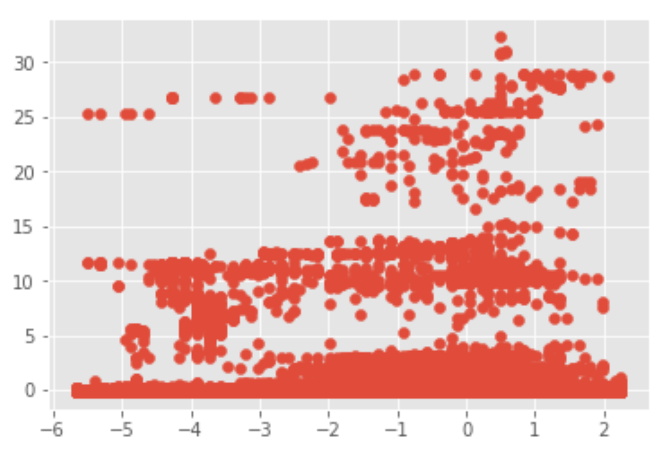
Figure 15.7 shows three distinct clusters: top, middle, and bottom. So, let's set n_clusters=5 for the number of clusters and use the K-means clustering algorithm:
#We use K-means clustering
X=processed
kmeans = KMeans(n_clusters=5) #what if n_clusters=3 or 4?
kmeans.fit(X)
y_kmeans = kmeans.predict(X)
Now, the model has been trained. Let's plot the scatter diagram:
#scatter plot for n=5
plt.scatter(X[:, 0], X[:, 1], c=y_kmeans, s=50, cmap='viridis')
The output should look like the following screenshot:

As we can see, there are three big clusters: top, middle, and bottom. The top cluster shows that its data has a high average rating and many episodes. The middle cluster shows that, although the number of episodes increases, the average rating is still in the middle. The bottom cluster shows that, although the number of episodes increases, the average rating is still at the bottom. That is to say, more episodes don't lead to a higher rating.
To plot the center of the clusters, we can run the entire snippet in one cell:
#scatter plot for n=5
plt.scatter(X[:, 0], X[:, 1], c=y_kmeans, s=50, cmap='viridis')
#name the centers of the clusters
centers = kmeans.cluster_centers_
#plot centers
plt.scatter(centers[:, 0], centers[:, 1], c='black', s=200, alpha=0.5);
Our graph should show the center of the clusters:

So far, we have assumed n_clusters = 5 for the cluster. We can repeat the process for n_clusters=3 and n_clusters=4.
For n_clusters=4, consider the following code:
#We use K-means clustering
X=processed
kmeans = KMeans(n_clusters=4)
kmeans.fit(X)
y_kmeans = kmeans.predict(X)
#scatter plot for n=4
plt.scatter(X[:, 0], X[:, 1], c=y_kmeans, s=50, cmap='viridis')
#name the centers of the clusters
centers = kmeans.cluster_centers_
#plot centers
plt.scatter(centers[:, 0], centers[:, 1], c='black', s=200, alpha=0.5);
The scatter diagram should look something like this:

Try to continue the exercise with n_clusters=3 and see the difference.
Let's say we want to see the relationship between averageRating and numVotes. First of all, let's reassign the DataFrame to a different variable and set the index:
rn=re
#set index
rnpre=rn.set_index('tconst')
This time, let's drop seasonNumber and episodeNumber:
#drop seasonNumber and episodeNumber
ratingandnum=rnpre.drop('seasonNumber',1)
ratingandnum=ratingandnum.drop('episodeNumber',1)
And now, we preprocess and scale the data:
#scale data
processedrn=preprocessing.scale(ratingandnum)
xnew2,ynew2=processedrn.T
And now, let's plot the graph:
#plot data
plt.scatter(xnew2,ynew2)
It should output the following graph:

Now, let's apply the K-means clustering algorithm and see whether we can detect some clusters:
#see the data, we set n_cluster=5 first
X2=processedrn
kmeans = KMeans(n_clusters=5)
kmeans.fit(X2)
y2_kmeans = kmeans.predict(X2)
plt.scatter(X2[:, 0], X2[:, 1], c=y2_kmeans, s=50, cmap='viridis')
#name the centers of the clusters
centers = kmeans.cluster_centers_
#plot centers
plt.scatter(centers[:, 0], centers[:, 1], c='black', s=200, alpha=0.5);
Figure 15.12 shows that, if the number of votes is low, they cannot get a higher rating, and if the number of votes is high, there might be a chance of a very high rating:
