Chapter 16. Typography
The one thing that truly separates the amateurs from the experts in page layout is the control they take over their text. Amateurs are pleased if they can apply simple formatting such as fonts, sizes, alignment, tracking, and so on.
Experts, though, want more from a page-layout program. They want sophisticated control over kerning. This includes the ability to move one character in so that it tucks under the stroke of another.
They want to control how lines are justified within a text frame. This means that if one line looks too crowded and the next has big gaps between the words, the experts tell the program to reapportion the spaces.
The experts also want to work with the newest typefaces that give more choices for how letters look and act together.
These are advanced text effects. Once you apply these features, you move from being an ordinary designer to a typographer.
Optical Margin Alignment
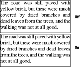
One of the most sophisticated text effects in InDesign is the ability to apply hanging punctuation to justified text, in which a slight adjustment of the margin creates a more uniform appearance for the edge of the text. Hanging punctuation is applied by setting the optical margin alignment. This moves punctuation characters slightly outside the text margin ![]() . In addition, optical margin alignment moves the serifs of letters outside the margin
. In addition, optical margin alignment moves the serifs of letters outside the margin ![]() .
.
![]() To create the effect of a straight edge, optical margin alignment moves punctuation outside the margin edges.
To create the effect of a straight edge, optical margin alignment moves punctuation outside the margin edges.
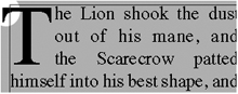
![]() The Optical Margin Alignment setting also moves the serifs of letters slightly outside the margin.
The Optical Margin Alignment setting also moves the serifs of letters slightly outside the margin.
Optical margin alignment is set using the Story panel.
To set optical margin adjustment:
- Select the text.
- Choose Type>Story. This opens the Story panel
 .
.
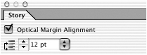 The Story panel lets you set the Optical Margin Alignment to hang punctuation in the margin.
 - Check Optical Margin Alignment. The text reflows so that the punctuation and serifs lie outside the margin edges.
- Enter a size for the amount of overhang.
Using Adobe Paragraph Composer
InDesign has two ways of composing (laying out) text. Single-line composition looks at the current line and evaluates the best place to break the line or apply hyphenation. Paragraph composition looks at all the text in a paragraph—forward and backward—when it evaluates the best place to break lines. When paragraph composition is turned on, the result is more even spacing for the text and fewer hyphens ![]() .
.
![]() Turn on Adobe Paragraph Composer to improve the spacing between words.
Turn on Adobe Paragraph Composer to improve the spacing between words.
To apply paragraph composition:
- Select the text.
- Choose Type > Paragraph to open the Paragraph panel.
- Choose Adobe Paragraph Composer from the Paragraph panel menu. The text reflows.
Tip
Adobe Paragraph Composer is a paragraph attribute and is applied to all the text in a paragraph.
Applying Justification Controls
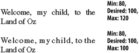
Justification determines how lines fit between margins. (See the sidebar below for information on how justification affects text.) InDesign provides three different ways to control justification: word spacing, letter spacing, and glyph spacing. Word spacing changes the space between words.
- Select the text.
- Choose Type > Paragraph to open the Paragraph panel.
- Choose Justification from the Paragraph panel menu. This opens the Justification dialog box
 .
.
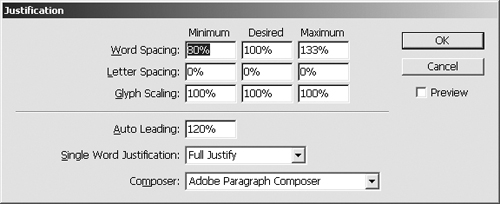
 The Justification dialog box controls word and letter spacing.
 - Set the Word Spacing options as follows
 :
:
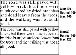
• Minimum controls the smallest amount of space you want between words. For instance, a value of 80% means that you are willing to allow the space to be 80% of the normal space.
• Desired controls the preferred amount of space between words. A value of 100% indicates that you want the same amount that the designer of the typeface created.
• Maximum controls the largest amount of space you want between words. A value of 120% means that you are willing to allow the space to be 120% of the normal space.
 The spacing controls in the Justification dialog box.
 - Click OK to apply the changes
 .
.
 The effect of changing the word spacing. Notice the change in the amount of space between the words.
Tip
The Minimum, Desired, and Maximum settings apply only to text that is set to one of the Justified settings. Other alignments, such as left-aligned text, use only the Desired setting.
The space between letters is letter spacing, sometimes called character spacing. InDesign lets you change the letter spacing for text whether justified or not.
- Select the text.
- Choose Type > Paragraph to open the Paragraph panel.
- Choose Justification from the Paragraph panel menu.
- Set the Letter Spacing options as follows:
• Desired controls the preferred amount of space between letters. A value of 0% indicates that you do not want to add or subtract any space.
• Minimum controls the smallest amount of space between letters. A value of –5% allows the space to be reduced by 5% of the normal space.
• Maximum controls the largest amount of space between letters. A value of 5% allows the space to be increased by 5% of the normal space.
- Click OK to apply the changes
 .
.
 The effect of changing the letter spacing. Notice how there is less space between the characters within the words.
Tip
If a paragraph cannot be set according to the justification controls you choose, InDesign violates the settings by adding or subtracting spaces. Set the Composition preferences to have those violations highlighted.
Another way to control justification is to use glyph scaling. (Glyph is the proper term for all the letters, numbers, punctuation marks, and other parts of text.) Glyph scaling applies horizontal scaling to the letters themselves so that the text takes up more or less space within the line.
- Select the text.
- Choose Type > Paragraph to open the Paragraph panel.
- Choose Justification from the Paragraph panel menu.
- Set the Glyph Scaling options as follows:
• Desired controls the preferred amount of scaling. A value of 100% indicates that you do not want to apply any scaling to the character shape.
• Minimum controls the smallest amount of scaling that you are willing to apply to the text. A value of 98% means that you are willing to allow the characters to be reduced by 2% of their normal width.
• Maximum controls the amount that you are willing to expand the space between words. A value of 105% means that you are willing to allow the characters to be increased by 5% of their normal width.
- Click OK to apply the changes
 .
.
 The effects of changing the glyph scaling.
Tip
Glyph scaling distorts the shape of letters. Most people say you can’t see the slight distortion. However, typographic purists (such as this author) try to avoid distorting the letterforms whenever possible ![]() .
.

![]() The black area shows the original shape of the character. The gray area shows the effects of 80% glyph scaling.
The black area shows the original shape of the character. The gray area shows the effects of 80% glyph scaling.
The Auto Leading field controls how much space is put between the lines whenever automatic leading is chosen.
To set the Auto Leading percentage:
- Choose Justification from the Paragraph panel menu.
- Enter an amount in the Auto Leading field
 .
.
 The Auto Leading field controls how InDesign calculates the leading when set to Auto.
Tip
The Auto Leading percentage is based on the point size of the text. So an Auto Leading of 120% applied to 12-point text creates a leading of 14.4 points (12 × 1.20 = 14.4).
Tip
Most professional designers use an absolute amount for leading by entering a specific number, rather than relying on the automatic leading.
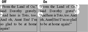
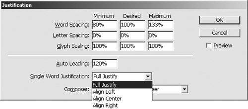
Have you ever seen a paragraph of justified text where a single word stretched out along the entire line? InDesign lets you control what happens to a single word in a justified paragraph.
To set the single word justification:
- Choose Justification from the Paragraph panel menu.
- Choose a setting from the Single Word Justification menu
 . Any text that is set to Justify in the Paragraph panel will be set according to the menu command
  .
.
 The Single Word Justification menu controls what happens when a single word occupies a line of justified text.
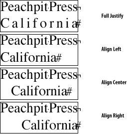 The effects of the Single Word Justification settings.
Controlling Hyphenation
InDesign lets you turn on hyphenation in the Paragraph panel. Once hyphenation is turned on, you can then control how the hyphenation is applied.
- Select the text.
- Check Hyphenate in the Paragraph panel
 .
.
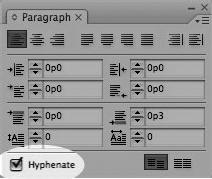 Click the Hyphenate checkbox to turn on automatic hyphenation for a paragraph.
- Choose Hyphenation from the Paragraph panel menu. The Hyphenation Settings dialog box appears
 .
.
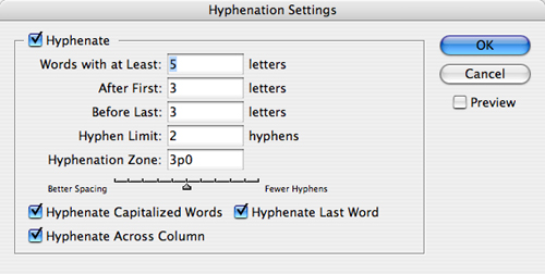 The Hyphenation Settings dialog box lets you control how hyphenation is applied.
 - Click the Hyphenate checkbox to set the following controls
 :
:
• Words with at Least controls the minimum number of letters a word must contain before it can be hyphenated.
• After First sets the minimum number of letters before the hyphen.
• Before Last sets the minimum number of letters after the hyphen.
• Hyphen Limit sets how many consecutive lines can end with hyphens.
• Hyphenation Zone controls the amount of whitespace at the end of a nonjustified line.
 The Hyphenation controls let you enter values for how words are hyphenated.
 - Check Hyphenate Capitalized Words to allow those words to be hyphenated.
- Check Hyphenate Last Word to let the last word in a paragraph be hyphenated.
- Check Hyphenate Across Column to let words that break across a column be hyphenated.
- Adjust the hyphenation slider to control the total number of hyphens in the paragraph.
Sometimes you may want to prevent words or phrases from being hyphenated or breaking across lines. For instance, you might not want the words Mr. Cohen to be separated at the end of a line. You might not want a compound word such as self-effacing to be broken with another hyphen ![]() .
.
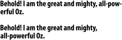
![]() In the bottom example the word powerful was selected and the No Break command was applied to prevent the text from hyphenating.
In the bottom example the word powerful was selected and the No Break command was applied to prevent the text from hyphenating.
To apply the No Break command:
- Select the text.
- Choose Type > Character to open the Character panel.
- Choose No Break from the Character panel menu.
You can also control hyphenation by inserting a discretionary hyphen, which forces the word to hyphenate at that point if it breaks at the end of a line.
To use a discretionary hyphen:
- Place the insertion point where you want the hyphen to occur.
- Press Command/Ctrl-Shift-(hyphen).
or
Control-click (Mac) or Right-click (Win) and choose Insert Special Character > Hyphens and Dashes > Discretionary Hyphen from the contextual menu.
Tip
The discretionary hyphen prints only when it appears at the end of the line ![]() .
.

![]() A discretionary hyphen appears within the word but prints only when it appears at the end of a line.
A discretionary hyphen appears within the word but prints only when it appears at the end of a line.
Tip
Insert a discretionary hyphen before a word to prevent that instance of the word from being hyphenated.
You can control where a word is hyphenated.
To edit the hyphenation in the dictionary:
- Choose Edit > Spelling > Dictionary.
- Type the word you want to modify in the Word field as follows
 :
:
• One tilde (~) indicates the best possible hyphenation position.
• Two tildes (~~) indicates the next best possible position.
• Three tildes (~~~) indicates the least acceptable position.
• A tilde before the word prevents the word from being hyphenated.
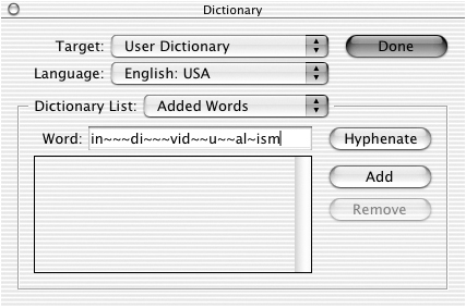 The tilde characters control the preference for where hyphenation should occur.
 - Click Add to add the new hyphenation preferences to the dictionary.
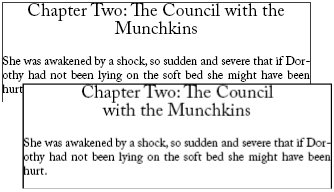
Baseline Grid
InDesign has an electronic grid that you can force text to align to. This ensures that text lines up correctly in two separate frames ![]() .
.
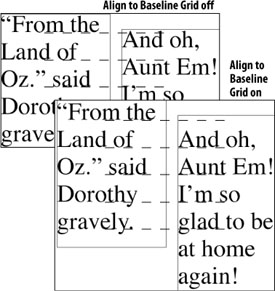
![]() When Align to Baseline Grid is turned on, the text in two different frames lines up.
When Align to Baseline Grid is turned on, the text in two different frames lines up.
- Choose Edit > Preferences > Grids (Win) or InDesign > Preferences > Grids (Mac). This opens the Grids dialog box
 .
.
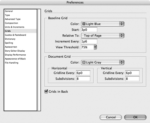 The Baseline Grid settings in the Grids preferences.
 - Use the Color menu to set the grid color.
- Use the Start field to control where the grid should start vertically in the document.
- Use the Relative To menu to choose between the top of the page or the top margin
 .
.
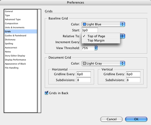 The Relative To field lets you choose where the baseline grid should start.
 - Use the Increment Every field to control the space between the gridlines.
- Set View Threshold for the magnification amount above which the grid is visible.
To align text to a baseline grid:
- Select the text.
- Click the Align to Baseline Grid icon in the Paragraph panel
 . The text aligns to the grid.
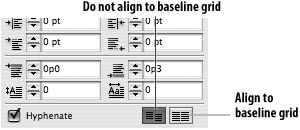 The Align to Baseline Grid buttons in the Paragraph panel.
Tip
When you align to the baseline grid, the grid setting overrides the leading. Most designers set the baseline grid to the same amount as the leading for the text ![]() .
.
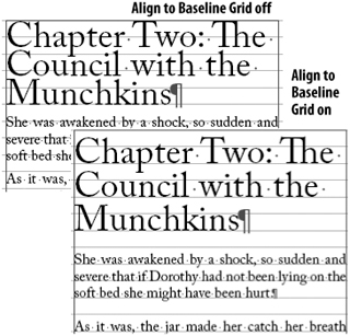
![]() When text is aligned to the baseline grid, the leading may increase. Also the space between paragraphs may adjust.
When text is aligned to the baseline grid, the leading may increase. Also the space between paragraphs may adjust.
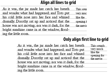
In addition to setting the baseline grid, you can choose to set just the first line of a paragraph to the baseline grid.
To align just the first line to the baseline grid:
- Select the text.
- Click the Align to Baseline Grid icon in the Paragraph panel. All the lines in the paragraph will be aligned to the baseline grid.
- Choose Only Align First Line to Grid in the Paragraph panel menu.
or
Choose First Line Only from the Align to Grid menu in the Indents and Spacing area of the Paragraph Style Options dialog box.
Tip
This forces the first line of a paragraph to align to the grid but allows the other lines in the paragraph to be controlled by the leading ![]() .
.
![]() Use the Only Align First Line to Grid command to align just the first line of a paragraph without affecting the leading.
Use the Only Align First Line to Grid command to align just the first line of a paragraph without affecting the leading.
You can also set a custom baseline grid for a text frame. This is especially helpful for formatting margin notes alongside text ![]() .
.
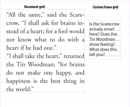
![]() A custom frame grid allows you to have multiple grids in a document.
A custom frame grid allows you to have multiple grids in a document.
To create a custom grid for a text frame:
- Select the text frame.
- Choose Object > Text Frame Options and then click Baseline Options. This opens the text frame baseline controls
 .
.
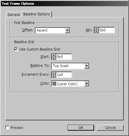 The Baseline Grid settings in the Text Frame Options.
 - Check Use Custom Baseline Grid to set the options.
- Use the Start field to control where the grid should start vertically in the document.
- Use the Relative To menu to choose between the top of the page or the top margin.
- Use the Increment Every field to control the space between the gridlines.
- Use the Color controls to set the color of the grid.
- Don’t forget to set the text to align to the baseline grid.
Balancing Ragged Lines
Another nuance for good typography is to make sure that there are no uneven line breaks, especially in headlines or centered type. InDesign’s Balance Ragged Lines command makes this easier ![]() .
.
![]() The Balance Ragged Lines command rearranges text so there is a more equal number of words in the lines.
The Balance Ragged Lines command rearranges text so there is a more equal number of words in the lines.
To balance uneven line breaks:
- Select the text.
- Choose Balance Ragged Lines from the Paragraph panel menu.
or
Choose Balance Ragged Lines in the Indents and Spacing area of the Paragraph Style Options dialog box.
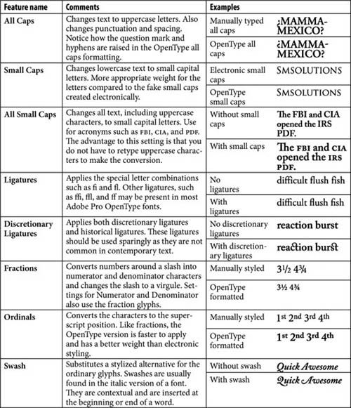
Using OpenType
Instead of the paltry 256 glyphs (characters) in ordinary fonts, OpenType fonts can have thousands of glyphs. InDesign has special commands that help you get the most out of OpenType fonts. For instance, you can set the commands to automatically swap ordinary characters with special OpenType glyphs.
To set automatic OpenType alternate characters:
- Select the text.
- Choose Type > Character to open the Character panel.
- Choose the options from the OpenType submenu in the Character panel menu. InDesign automatically swaps characters with the alternate glyphs in each category
 .
.
 As you add more letters to an OpenType font, the previous letters change.
You can also manually choose alternate glyphs for each character in the font.
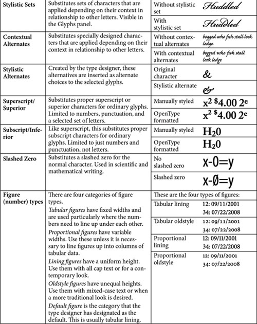
To choose the alternate glyphs:
- Select the character in the text.
- Choose Type > Glyphs to open the Glyphs panel.
- Press the triangle next to the selected character in the panel
 . The alternate glyphs for the selection appear.
 Press a character or letter that has a triangle to see the alternate glyphs.
 - Choose one of the alternate characters. This replaces the selected text with the alternate character in the Glyphs panel.
You can also set the Glyphs panel to display just certain categories of glyphs.
To view certain categories in the Glyphs panel:
- Press the Show list in the Glyphs panel.
- Choose the category of OpenType characters that you want to display
 .
.
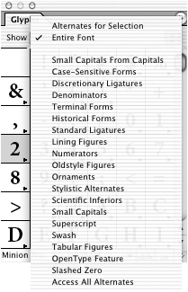 The Show list in the Glyphs panel lets you choose to see the categories of specialized glyphs.
Tip
Not all OpenType fonts contain all the possible glyph features. So the Show list will display different categories depending on the OpenType font chosen.
Open Type Categories