
Chapter 17. Color Management
I remember when my family got our first color television set. Back then, there weren’t many programs broadcast in color, so a color television was a strange and mysterious thing.
No one in the family knew how to make the pictures look realistic. We jumped up to adjust the image whenever we changed channels. My sister and I spent more time fiddling with the TV controls than watching the shows.
Well, not many people understand how color is managed in desktop publishing. They don’t know how to make colors look better or how to control images from different applications. They spend most of their time fiddling with the knobs.
Color management is a very complex subject—far too deep for the scope of this book. This chapter covers only the most basic steps for managing color in InDesign. Fortunately, the controls are similar to those in other Adobe products. So if you’ve set your color management in Photoshop, you will find the same settings in InDesign.
If you are interested in learning more about color, I suggest Real World Color Management, by Bruce Fraser, Fred Bunting, and Chris Murphy, published by Peachpit Press.
Choosing Color Settings
The first step for color management is to set up the color system. Fortunately, Adobe provides predefined color settings that are suitable for many users.
- Choose Edit > Color Settings. This opens the Color Settings dialog box
 .
.
 The Color Settings dialog box contains the controls for managing how colors are displayed and printed.
 - Check Enable Color Management. This opens the color settings controls.
- Choose one of the predefined settings from the Settings menu
 :
:
• Choose General Purpose if you are printing to an office printer.
• Choose Prepress if you are sending files out to a high-end service provider.
• Choose Web/Internet if you will be outputting to the Web.
• Choose CMS Off to minimize the effects of color management. (Color management is never really completely off.)
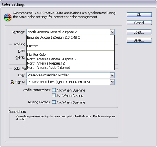 The Settings menu lets you choose one of the predefined color management settings.
 - Click OK to apply the color settings. In many cases, this is all you need to do to set color management in InDesign.
The working space applies the default color profiles for RGB and CMYK colors (see Chapter 5, “Working in Color”).
To set the RGB working space:
• Use the RGB menu to choose one of the following RGB display settings ![]() :
:
• Adobe RGB (1998) has a large color gamut. Use it if you do print work with a broad range of colors.
• Apple RGB reflects the characteristics of the Apple Standard 13-inch monitor. Use for files displayed on Mac os monitors or for working with older desktop publishing files.
• ColorMatch RGB matches the color space of Radius PressView monitors.
• SRGB IEC61966-2.1 reflects the characteristics of the average pc monitor. It is recommended for Web work, but is too limited for prepress.
• Monitor RGB sets the working space to the color profile of your monitor. Use this if your other applications do not support color management.
• ColorSync RGB (Mac) matches the RGB space specified in the control panel for Apple ColorSync 3.0 or later.
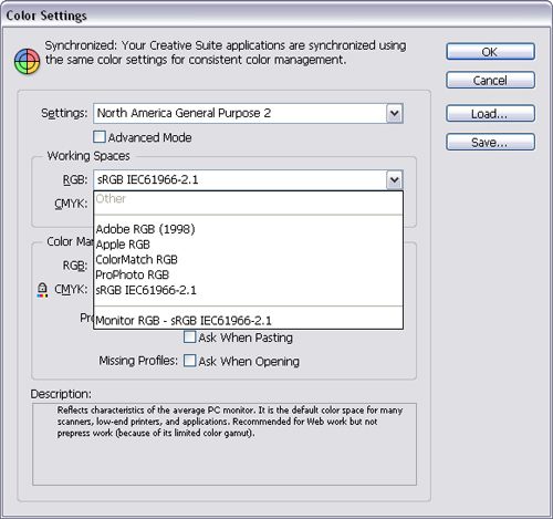
![]() The Working Space RGB menu lets you choose the display options for RGB colors.
The Working Space RGB menu lets you choose the display options for RGB colors.
To set the CMYK working space:
• Use the CMYK menu to choose the CMYK output settings ![]() .
.
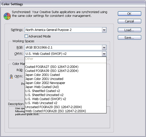
![]() The Working Space CMYK menu lets you choose the output destination for printing CMYK colors.
The Working Space CMYK menu lets you choose the output destination for printing CMYK colors.
You can also set what happens when placed images contain different color profiles than the current working spaces.
To set the Color Management Policies:
- Choose a setting in the RGB and CMYK Color Management Policy menus
 and
and  as follows:
• Off turns off color management for imported images or documents.
• Preserve Embedded Profiles maintains the profile in the imported image or document.
• Preserve Numbers maintains the actual color values without applying any profiles.
• Convert to Working Space converts placed images and documents to the working spaces you set for the InDesign document.
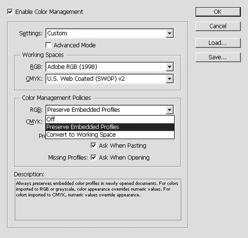 The RGB Color Management Policy menu lets you choose what to do with different RGB color profiles.
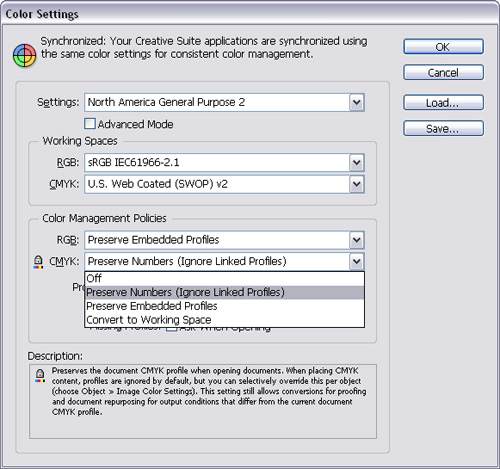 The CMYK Color Management Policy menu lets you choose what to do with different CMYK color profiles.
 - Check Ask When Opening (under Profile Mismatches) to give a choice when opening documents with different profiles
 .
.
 The Profile Mismatches and Missing Profiles options control what happens when different profiles are in the same document.
 - Check Ask When Pasting (under Profile Mismatches) to give a choice when pasting information from documents with different profiles.
- Check Ask When Opening (under Missing Profiles) to give a choice when pasting information from documents that have no color profiles.
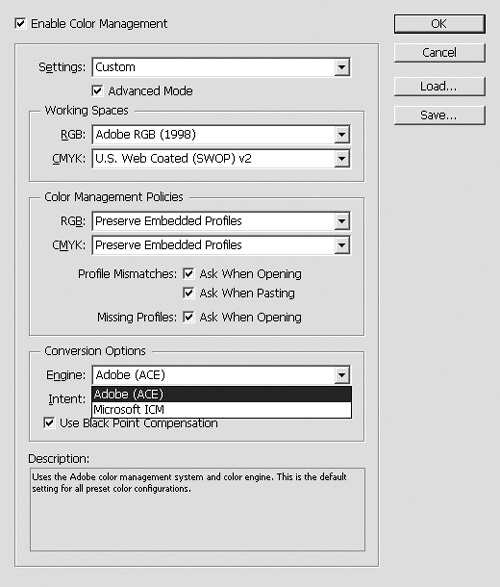
The Conversion Options, in the Advanced Mode, control how objects and color data are converted ![]() .
.

![]() The Conversion Options are displayed in the Color Settings when the Advanced Mode is checked.
The Conversion Options are displayed in the Color Settings when the Advanced Mode is checked.
To set the conversion options:
- Choose one of the settings in the Engine menu
 and
and  :
:
• Adobe (ACE) uses the Adobe color management system and color engine. This is the default setting for most preset color configurations.
• Apple ColorSync (Mac) or Apple CMM (Mac) uses the color management system provided for Mac OS computers. Unless you have an optional color module installed, there is no difference between the two settings.
• Microsoft ICM (Win) uses the color management system provided for Windows computers.
 The Engine menu (Win) lets you choose the Adobe Color Engine or the Microsoft Image Color Management for color management.
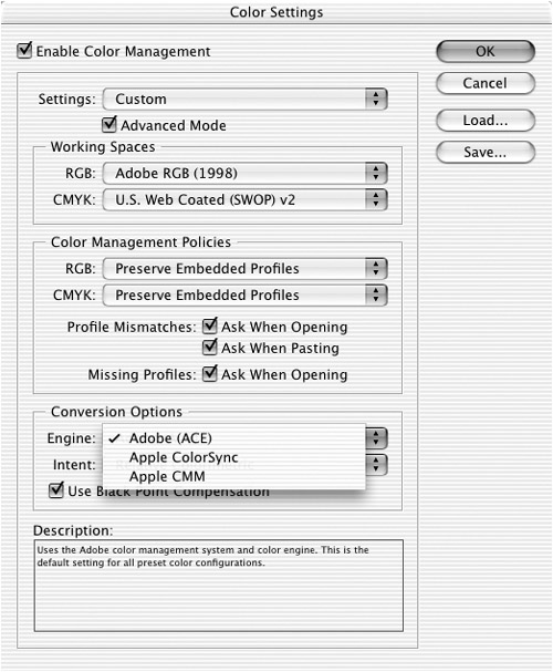 The Engine menu (Mac) lets you choose the Adobe Color Engine or the Apple ColorSync or Apple Color Management Module for color management.
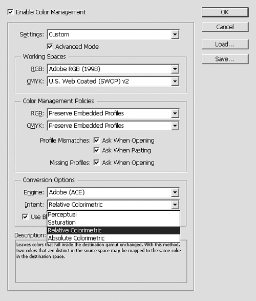
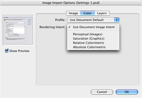
 - Choose one of the settings in the Intent menu
 :
:
• Perceptual preserves the relationships between colors in a way that is perceived as natural by the human eye.
• Saturation is suitable for business graphics, where the exact relationship between colors is not as important as having vivid colors.
• Relative Colorimetric is the default rendering intent used by all predefined color management configurations.
• Absolute Colorimetric maintains color accuracy at the expense of preserving relationships between colors.
 The Intent menu lets you choose how the final color display should look.
 - Check Use Black Point Compensation to adjust for differences in black points.
Saving and Loading Color Settings
One of the things that drives my students crazy is when a color in Adobe InDesign looks different when displayed in Adobe Illustrator or Adobe Photoshop. Fortunately, it is easy to synchronize your Adobe application color settings so the color looks the same.
- Set your color settings as described in the previous section.
- Click the Save button in the Color Settings dialog box.
- Name the color settings file (.csf) and save it in the following location
 :
:
• Disk: Users: [User]: Library: Application Support: Adobe: Color: Settings (Mac).
• Disk: Documents and Settings: [User]: Application Data: Adobe: Color: Settings (Win).
 Use the Save Color Settings dialog box to save your own color settings file.
Tip
This saves the setting in a location where the other Adobe applications can use the settings file.
Once you have saved the color settings, you can open or load them into InDesign or another Adobe application.
- Click Load in the Color Settings dialog box.
- Navigate to the Color: Settings folder as described in the previous exercise.
- Choose the color settings file.
Tip
If you have chosen the same color settings for all your Adobe applications, a message appears at the top of the Color Settings dialog box stating that your settings are synchronized ![]() .
.

![]() A message in the Color Settings dialog box lets you know if all your Adobe applications are using the same color settings.
A message in the Color Settings dialog box lets you know if all your Adobe applications are using the same color settings.
If your copy of InDesign is part of the Adobe Creative Suite, you have an additional feature that allows you to easily synchronize all the applications in the suite.
To synchronize color settings using Adobe Bridge:
- Open Adobe Bridge.
- Choose Edit > Creative Suite Color Settings. This opens the Suite Color Settings dialog box.
or
Click the Color Management button in the Adobe Bridge Center
 . This opens the Suite Color Settings dialog box.
 The Adobe Bridge Center allows you to synchronize color management settings across all the Adobe Creative Suite applications.
 - Choose the color setting from the list and then click Apply. This synchronizes the color management across the Adobe Creative Suite applications
 .
.
 Use the Suite Color Settings dialog box to choose the color settings file you want to apply to all the applications.
Tip
If you have chosen the same color settings for all your Adobe applications, a message appears at the top of both the Suite Color Settings and the Color Settings dialog boxes stating that your settings are synchronized.
Working with Profiles
You can also set profiles and color management for individual imported images.
To control a placed image’s color management:
- If the graphic has already been placed into the layout, select it, and then choose Object > Image Color Settings to open the Image Color Settings dialog box
 .
.
 The Image Color Settings dialog box allows you to assign a specific profile and rendering intent to an imported image.
or
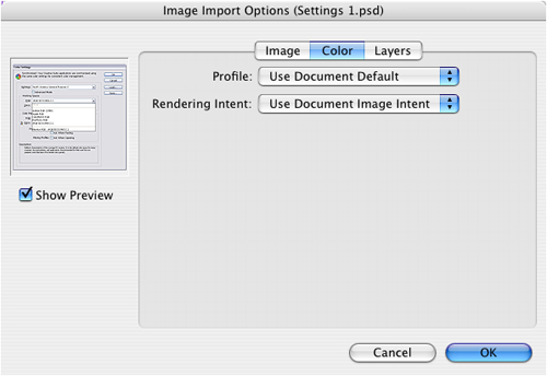
If you’re about to import the graphic, click the Color tab of the Image Import Options dialog box. This displays the Profile and Rendering Intent menus
 .
. The Color tab in the Image Import Options dialog box allows you to assign a specific profile and rendering intent to an image that is about to be imported.
 - Use the Profile menu to choose the source profile to apply to the graphic.
- Use the Rendering Intent menu to choose a rendering intent.