Contents
Launch the Multivariate Platform
Launch the Multivariate platform by selecting Analyze > Multivariate Methods > Multivariate.
Figure 17.1 The Multivariate Launch Window

|
Y, Columns
|
Defines one or more response columns.
|
|
Weight
|
(Optional) Identifies one column whose numeric values assign a weight to each row in the analysis.
|
|
Freq
|
(Optional) Identifies one column whose numeric values assign a frequency to each row in the analysis.
|
|
By
|
(Optional) Performs a separate matched pairs analysis for each level of the By variable.
|
|
Estimation Method
|
Select from one of several estimation methods for the correlations. With the Default option, Pairwise is used for data tables with more than 10 columns or more than 5000 rows. REML is used otherwise. For details, see Estimation Methods.
|
Estimation Methods
Several estimation methods for the correlations options are available to provide flexibility and to accommodate personal preferences. REML and Pairwise are the methods used most frequently. You can also estimate missing values by using the estimated covariance matrix, and then using the Impute Missing Data command. See Impute Missing Data.
Default
The Default option uses either the REML, Row-wise, or Pairwise methods:
• Row-wise is used for data tables with no missing values.
• Pairwise is used for data tables that have more than 10 columns or more than 5000 rows, and that have no missing values.
• REML is used otherwise.
REML
REML (restricted maximum likelihood) estimates are less biased than the ML (maximum likelihood) estimation method. The REML method maximizes marginal likelihoods based upon error contrasts. The REML method is often used for estimating variances and covariances.The REML method in the Multivariate platform is the same as the REML estimation of mixed models for repeated measures data with an unstructured covariance matrix. See the documentation for SAS PROC MIXED about REML estimation of mixed models. REML uses all of your data, even if missing cells are present, and is most useful for smaller datasets. Because of the bias-correction factor, this method is slow if your dataset is large and there are many missing data values. If there are no missing cells in the data, then the REML estimate is equivalent to the sample covariance matrix.
ML
The maximum likelihood estimation method (ML) is useful for large data tables with missing cells. The ML estimates are similar to the REML estimates, but the ML estimates are generated faster. Observations with missing values are not excluded. For small data tables, REML is preferred over ML because REML’s variance and covariance estimates are less biased.
Robust
Robust estimation is useful for data tables that might have outliers. For statistical details, see Robust.
Row-wise
Rowwise estimation does not use observations containing missing cells. This method is useful in the following situations:
• checking compatibility with JMP versions earlier than JMP 8. Rowwise estimation was the only estimation method available before JMP 8.
• excluding any observations that have missing data.
Pairwise
Pairwise estimation performs correlations for all rows for each pair of columns with nonmissing values.
The Multivariate Report
The default multivariate report shows the standard correlation matrix and the scatterplot matrix. The platform menu lists additional correlation options and other techniques for looking at multiple variables. See Multivariate Platform Options.
Figure 17.2 Example of a Multivariate Report

To Produce the Report in Figure 17.2
1. Open Solubility.jmp in the sample data folder.
2. Select all columns except Labels and click Y, Columns.
3. Click OK.
About Missing Values
In most of the analysis options, a missing value in an observation does not cause the entire observation to be deleted. However, the Pairwise Correlations option excludes rows that are missing for either of the variables under consideration. The Simple Statistics > Univariate option calculates its statistics column-by-column, without regard to missing values in other columns.
Multivariate Platform Options
|
Correlations Multivariate
|
Shows or hides the Correlations table, which is a matrix of correlation coefficients that summarizes the strength of the linear relationships between each pair of response (Y) variables. This option is on by default.
This correlation matrix is calculated by the method that you select in the launch window.
|
|
CI of Correlation
|
Shows the two-tailed confidence intervals of the correlations. This option is off by default.
The default confidence coefficient is 95%. Use the Set α Level option to change the confidence coefficient.
|
|
Inverse Correlations
|
Shows or hides the inverse correlation matrix (Inverse Corr table). This option is off by default.
The diagonal elements of the matrix are a function of how closely the variable is a linear function of the other variables. In the inverse correlation, the diagonal is 1/(1 – R2) for the fit of that variable by all the other variables. If the multiple correlation is zero, the diagonal inverse element is 1. If the multiple correlation is 1, then the inverse element becomes infinite and is reported missing.
For statistical details about inverse correlations, see the Inverse Correlation Matrix.
|
|
Partial Correlations
|
Shows or hides the partial correlation table (Partial Corr), which shows the partial correlations of each pair of variables after adjusting for all the other variables. This option is off by default.
This table is the negative of the inverse correlation matrix, scaled to unit diagonal.
|
|
Covariance Matrix
|
Shows or hides the covariance matrix for the analysis. This option is off by default.
|
|
Pairwise Correlations
|
Shows or hides the Pairwise Correlations table, which lists the Pearson product-moment correlations for each pair of Y variables. This option is off by default.
The correlations are calculated by the pairwise deletion method. The count values differ if any pair has a missing value for either variable. The Pairwise Correlations report also shows significance probabilities and compares the correlations in a bar chart. All results are based on the pairwise method.
|
|
Simple Statistics
|
This menu contains two options that each show or hide simple statistics (mean, standard deviation, and so on) for each column. The univariate and multivariate simple statistics can differ when there are missing values present, or when the Robust method is used.
Univariate Simple Statistics
Shows statistics that are calculated on each column, regardless of values in other columns. These values match those produced by the Distribution platform.
Multivariate Simple Statistics
Shows statistics that correspond to the estimation method selected in the launch window. If the REML, ML, or Robust method is selected, the mean vector and covariance matrix are estimated by that selected method. If the Row-wise method is selected, all rows with at least one missing value are excluded from the calculation of means and variances. If the Pairwise method is selected, the mean and variance are calculated for each column.
These options are off by default.
|
|
Nonparametric Correlations
|
This menu contains three nonparametric measures: Spearman’s Rho, Kendall’s Tau, and Hoeffding’s D. These options are off by default.
For details, see Nonparametric Correlations.
|
|
Set α Level
|
You can specify any alpha value for the correlation confidence intervals. The default value of alpha is 0.05.
Four alpha values are listed: 0.01, 0.05, 0.10, and 0.50. Select Other to enter any other value.
|
|
Scatterplot Matrix
|
Shows or hides a scatterplot matrix of each pair of response variables. This option is on by default.
For details, see Scatterplot Matrix.
|
|
Color Map
|
The Color Map menu contains three types of color maps.
Color Map On Correlations
Produces a cell plot that shows the correlations among variables on a scale from red (+1) to blue (-1).
Color Map On p-values
Produces a cell plot that shows the significance of the correlations on a scale from p = 0 (red) to p = 1 (blue).
Cluster the Correlations
Produces a cell plot that clusters together similar variables. The correlations are the same as for Color Map on Correlations, but the positioning of the variables may be different.
These options are off by default.
|
|
Parallel Coord Plot
|
Shows or hides a parallel coordinate plot of the variables. This option is off by default.
|
|
Ellipsoid 3D Plot
|
Shows or hides a 95% confidence ellipsoid around three variables that you are asked to specify the three variables. This option is off by default.
|
|
Principal Components
|
This menu contains options to show or hide a principal components report. You can select correlations, covariances, or unscaled. Selecting one of these options when another of the reports is shown changes the report to the new option. Select None to remove the report. This option is off by default.
Principal components is a technique to take linear combinations of the original variables. The first principal component has maximum variation, the second principal component has the next most variation, subject to being orthogonal to the first, and so on. For details, see the chapter Analyzing Principal Components and Reducing Dimensionality.
|
|
Outlier Analysis
|
This menu contains options that show or hide plots that measure distance in the multivariate sense using one of these methods: the Mahalanobis distance, jackknife distances, and the T2 statistic.
For details, see Outlier Analysis.
|
|
Item Reliability
|
This menu contains options that each shows or hides an item reliability report. The reports indicate how consistently a set of instruments measures an overall response, using either Cronbach’s α or standardized α. These options are off by default.
For details, see Item Reliability.
|
|
Impute Missing Data
|
Produces a new data table that duplicates your data table and replaces all missing values with estimated values. This option is available only if your data table contains missing values.
For details, see Impute Missing Data.
|
Nonparametric Correlations
The Nonparametric Correlations menu offers three nonparametric measures:
Spearman’s Rho
is a correlation coefficient computed on the ranks of the data values instead of on the values themselves.
Kendall’s Tau
is based on the number of concordant and discordant pairs of observations. A pair is concordant if the observation with the larger value of X also has the larger value of Y. A pair is discordant if the observation with the larger value of X has the smaller value of Y. There is a correction for tied pairs (pairs of observations that have equal values of X or equal values of Y).
Hoeffding’s D
A statistical scale that ranges from –0.5 to 1, with large positive values indicating dependence. The statistic approximates a weighted sum over observations of chi-square statistics for two-by-two classification tables. The two-by-two tables are made by setting each data value as the threshold. This statistic detects more general departures from independence.
The Nonparametric Measures of Association report also shows significance probabilities for all measures and compares them with a bar chart.
Note: The nonparametric correlations are always calculated by the Pairwise method, even if other methods were selected in the launch window.
For statistical details about these three methods, see the Nonparametric Measures of Association.
Scatterplot Matrix
A scatterplot matrix helps you visualize the correlations between each pair of response variables. The scatterplot matrix is shown by default, and can be hidden or shown by selecting Scatterplot Matrix from the red triangle menu for Multivariate.
Figure 17.3 Clusters of Correlations
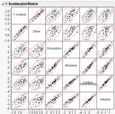
By default, a 95% bivariate normal density ellipse is shown in each scatterplot. Assuming the variables are bivariate normally distributed, this ellipse encloses approximately 95% of the points. The narrowness of the ellipse shows the correlation of the variables. If the ellipse is fairly round and is not diagonally oriented, the variables are uncorrelated. If the ellipse is narrow and diagonally oriented, the variables are correlated.
Working with the Scatterplot Matrix
Re-sizing any cell resizes all the cells.
Drag a label cell to another label cell to reorder the matrix.
When you look for patterns in the scatterplot matrix, you can see the variables cluster into groups based on their correlations. Figure 17.3 shows two clusters of correlations: the first two variables (top, left), and the next four (bottom, right).
Options for Scatterplot Matrix
The red triangle menu for the Scatterplot Matrix lets you tailor the matrix with color and density ellipses and by setting the α-level.
|
Show Points
|
Shows or hides the points in the scatterplots.
|
|
Density Ellipses
|
Shows or hides the 95% density ellipses in the scatterplots. Use the Ellipse α menu to change the α-level.
|
|
Shaded Ellipses
|
Colors each ellipse. Use the Ellipses Transparency and Ellipse Color menus to change the transparency and color.
|
|
Show Correlations
|
Shows or hides the correlation of each histogram in the upper left corner of each scatterplot.
|
|
Show Histogram
|
Shows either horizontal or vertical histograms in the label cells. Once histograms have been added, select Show Counts to label each bar of the histogram with its count. Select Horizontal or Vertical to either change the orientation of the histograms or remove the histograms.
|
|
Ellipse α
|
Sets the α-level used for the ellipses. Select one of the standard α-levels in the menu, or select Other to enter a different one. The default value is 0.95.
|
|
Ellipses Transparency
|
Sets the transparency of the ellipses if they are colored. Select one of the default levels, or select Other to enter a different one. The default value is 0.2.
|
|
Ellipse Color
|
Sets the color of the ellipses if they are colored. Select one of the colors in the palette, or select Other to use another color. The default value is red.
|
Outlier Analysis
The Outlier Analysis menu contains options that show or hide plots that measure distance in the multivariate sense using one of these methods:
• Mahalanobis distance
• jackknife distances
• T2 statistic
These methods all measure distance in the multivariate sense, with respect to the correlation structure).
In Figure 17.4, Point A is an outlier because it is outside the correlation structure rather than because it is an outlier in any of the coordinate directions.
Figure 17.4 Example of an Outlier

Mahalanobis Distance
The Mahalanobis Outlier Distance plot shows the Mahalanobis distance of each point from the multivariate mean (centroid). The standard Mahalanobis distance depends on estimates of the mean, standard deviation, and correlation for the data. The distance is plotted for each observation number. Extreme multivariate outliers can be identified by highlighting the points with the largest distance values. See Computations and Statistical Details, for more information.
Jackknife Distances
The Jackknife Distances plot shows distances that are calculated using a jackknife technique. The distance for each observation is calculated with estimates of the mean, standard deviation, and correlation matrix that do not include the observation itself. The jack-knifed distances are useful when there is an outlier. In this case, the Mahalanobis distance is distorted and tends to disguise the outlier or make other points look more outlying than they are.
T2 Statistic
The T2 plot shows distances that are the square of the Mahalanobis distance. This plot is preferred for multivariate control charts. The plot includes the value of the calculated T2 statistic, as well as its upper control limit. Values that fall outside this limit might be outliers.
Saving Distances and Values
You can save any of the distances to the data table by selecting the Save option from the red triangle menu for the plot.
Note: There is no formula saved with the distance column. This means that the distance is not recomputed if you modify the data table. If you add or delete columns, or change values in the data table, you should select Analyze > Multivariate Methods > Multivariate again to compute new distances.
In addition to saving the distance values for each row, a column property is created that holds one of the following:
• the distance value for Mahalanobis Distance and Jackknife distance
• a list containing the UCL of the T2 statistic
Item Reliability
Item reliability indicates how consistently a set of instruments measures an overall response. Cronbach’s α (Cronbach 1951) is one measure of reliability. Two primary applications for Cronbach’s α are industrial instrument reliability and questionnaire analysis.
Cronbach’s α is based on the average correlation of items in a measurement scale. It is equivalent to computing the average of all split-half correlations in the data table. The Standardized α can be requested if the items have variances that vary widely.
Note: Cronbach’s α is not related to a significance level α. Also, item reliability is unrelated to survival time reliability analysis.
To look at the influence of an individual item, JMP excludes it from the computations and shows the effect of the Cronbach’s α value. If α increases when you exclude a variable (item), that variable is not highly correlated with the other variables. If the α decreases, you can conclude that the variable is correlated with the other items in the scale. Nunnally (1979) suggests a Cronbach’s α of 0.7 as a rule-of-thumb acceptable level of agreement.
See Computations and Statistical Details for computations for Cronbach’s α.
Impute Missing Data
To impute missing data, select Impute Missing Data from the red triangle menu for Multivariate. A new data table is created that duplicates your data table and replaces all missing values with estimated values.
Imputed values are expectations conditional on the nonmissing values for each row. The mean and covariance matrix, which is estimated by the method chosen in the launch window, is used for the imputation calculation. All multivariate tests and options are then available for the imputed data set.
This option is available only if your data table contains missing values.
Examples
Example of Item Reliability
This example uses the Danger.jmp data in the Sample Data folder. This table lists 30 items having some level of inherent danger. Three groups of people (students, nonstudents, and experts) ranked the items according to perceived level of danger. Note that Nuclear power is rated as very dangerous (1) by both students and nonstudents, but is ranked low (20) by experts. On the other hand, motorcycles are ranked either fifth or sixth by all three judging groups.
You can use Cronbach’s α to evaluate the agreement in the perceived way the groups ranked the items. Note that in this type of example, where the values are the same set of ranks for each group, standardizing the data has no effect.
1. Open Danger.jmp from the Sample Data folder.
2. Select Analyze > Multivariate Methods > Multivariate.
3. Select all the columns except for Activity and click Y, Columns.
4. Click OK.
5. From the red triangle menu for Multivariate, select Item Reliability > Cronbach’s α.
6. (Optional) From the red triangle menu for Multivariate, select Scatterplot Matrix to hide that plot.
Figure 17.5 Cronbach’s α Report

The Cronbach’s α results in Figure 17.5 show an overall α of 0.8666, which indicates a high correlation of the ranked values among the three groups. Further, when you remove the experts from the analysis, the Nonstudents and Students ranked the dangers nearly the same, with Cronbach’s α scores of 0.7785 and 0.7448, respectively.
Computations and Statistical Details
Estimation Methods
Robust
This method essentially ignores any outlying values by substantially down-weighting them. A sequence of iteratively reweighted fits of the data is done using the weight:
wi = 1.0 if Q < K and wi = K/Q otherwise,
where K is a constant equal to the 0.75 quantile of a chi-square distribution with the degrees of freedom equal to the number of columns in the data table, and
where yi = the response for the ith observation, μ = the current estimate of the mean vector, S2 = current estimate of the covariance matrix, and T = the transpose matrix operation. The final step is a bias reduction of the variance matrix.
The tradeoff of this method is that you can have higher variance estimates when the data do not have many outliers, but can have a much more precise estimate of the variances when the data do have outliers.
Pearson Product-Moment Correlation
The Pearson product-moment correlation coefficient measures the strength of the linear relationship between two variables. For response variables X and Y, it is denoted as r and computed as

If there is an exact linear relationship between two variables, the correlation is 1 or –1, depending on whether the variables are positively or negatively related. If there is no linear relationship, the correlation tends toward zero.
Nonparametric Measures of Association
For the Spearman, Kendall, or Hoeffding correlations, the data are first ranked. Computations are then performed on the ranks of the data values. Average ranks are used in case of ties.
Spearman’s ρ (rho) Coefficients
Spearman’s ρ correlation coefficient is computed on the ranks of the data using the formula for the Pearson’s correlation previously described.
Kendall’s τb Coefficients
Kendall’s τb coefficients are based on the number of concordant and discordant pairs. A pair of rows for two variables is concordant if they agree in which variable is greater. Otherwise they are discordant, or tied.
The formula

computes Kendall’s τb where:

Note the following:
• The sgn(z) is equal to 1 if z>0, 0 if z=0, and –1 if z<0.
• The ti (the ui) are the number of tied x (respectively y) values in the ith group of tied x (respectively y) values.
• The n is the number of observations.
• Kendall’s τb ranges from –1 to 1. If a weight variable is specified, it is ignored.
Computations proceed in the following way:
• Observations are ranked in order according to the value of the first variable.
• The observations are then re-ranked according to the values of the second variable.
• The number of interchanges of the first variable is used to compute Kendall’s τb.
Hoeffding’s D Statistic
The formula for Hoeffding’s D (1948) is

where:

Note the following:
• The Ri and Si are ranks of the x and y values.
• The Qi (sometimes called bivariate ranks) are one plus the number of points that have both x and y values less than the ith points.
• A point that is tied on its x value or y value, but not on both, contributes 1/2 to Qi if the other value is less than the corresponding value for the ith point. A point tied on both x and y contributes 1/4 to Qi.
When there are no ties among observations, the D statistic has values between –0.5 and 1, with 1 indicating complete dependence. If a weight variable is specified, it is ignored.
Inverse Correlation Matrix
The inverse correlation matrix provides useful multivariate information. The diagonal elements of the inverse correlation matrix, sometimes called the variance inflation factors (VIF), are a function of how closely the variable is a linear function of the other variables. Specifically, if the correlation matrix is denoted R and the inverse correlation matrix is denoted R-1, the diagonal element is denoted  and is computed as
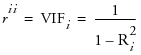
where Ri2 is the coefficient of variation from the model regressing the ith explanatory variable on the other explanatory variables. Thus, a large rii indicates that the ith variable is highly correlated with any number of the other variables.
Distance Measures
The Outlier Distance plot shows the Mahalanobis distance of each point from the multivariate mean (centroid). The Mahalanobis distance takes into account the correlation structure of the data as well as the individual scales. For each value, the distance is denoted di and is computed as
where:
Yi is the data for the ith row
Y is the row of means
S is the estimated covariance matrix for the data
The reference line (Mason and Young, 2002) drawn on the Mahalanobis Distance plot is computed as  where A is related to the number of observations and number of variables, nvars is the number of variables, and the computation for F in formula editor notation is:
F Quantile(0.95, nvars, n–nvars–1, centered at 0).
If a variable is an exact linear combination of other variables, then the correlation matrix is singular and the row and the column for that variable are zeroed out. The generalized inverse that results is still valid for forming the distances.
The T2 distance is just the square of the Mahalanobis distance, so Ti2 = di2. The upper control limit on the T2 is
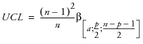
where
n = number of observations
p = number of variables (columns)
α = αth quantile
β= beta distribution
Multivariate distances are useful for spotting outliers in many dimensions. However, if the variables are highly correlated in a multivariate sense, then a point can be seen as an outlier in multivariate space without looking unusual along any subset of dimensions. In other words, when the values are correlated, it is possible for a point to be unremarkable when seen along one or two axes but still be an outlier by violating the correlation.
Caution: This outlier distance is not robust because outlying points can distort the estimate of the covariances and means so that outliers are disguised. You might want to use the alternate distance command so that distances are computed with a jackknife method. The alternate distance for each observation uses estimates of the mean, standard deviation, and correlation matrix that do not include the observation itself.
Cronbach’s α
Cronbach’s α is defined as

where
k = the number of items in the scale
c = the average covariance between items
v = the average variance between items
If the items are standardized to have a constant variance, the formula becomes
r = the average correlation between items
The larger the overall α coefficient, the more confident you can feel that your items contribute to a reliable scale or test. The coefficient can approach 1.0 if you have many highly correlated items.
..................Content has been hidden....................
You can't read the all page of ebook, please click here login for view all page.