
Contents
Introduction to Profiling
It is easy to visualize a response surface with one input factor X and one output factor Y. It becomes harder as more factors and responses are added. The profilers provide a number of highly interactive cross-sectional views of any response surface.
Desirability profiling and optimization features are available to help find good factor settings and produce desirable responses.
Simulation and defect profiling features are available for when you need to make responses that are robust and high-quality when the factors have variation.
Profiling Features in JMP
There are five profiler facilities in JMP, accessible from a number of fitting platforms and the main menu. They are used to profile data column formulas.
|
|
Description
|
Features
|
|
Profiler
|
Shows vertical slices across each factor, holding other factors at current values
|
Desirability, Optimization, Simulator, Propagation of Error
|
|
Contour Profiler
|
Horizontal slices show contour lines for two factors at a time
|
Simulator
|
|
Surface Profiler
|
3-D plots of responses for 2 factors at a time, or a contour surface plot for 3 factors at a time
|
Surface Visualization
|
|
Custom Profiler
|
A non-graphical profiler and numerical optimizer
|
General Optimization, Simulator
|
|
Mixture Profiler
|
A contour profiler for mixture factors
|
Ternary Plot and Contours
|
Profiler availability is shown in Table 24.2.
|
Location
|
Profiler
|
Contour Profiler
|
Surface Profiler
|
Mixture Profiler
|
Custom Profiler
|
|
Graph Menu (as a Platform)
|
Yes
|
Yes
|
Yes
|
Yes
|
Yes
|
|
Fit Model: Least Squares
|
Yes
|
Yes
|
Yes
|
Yes
|
|
|
Fit Model: Logistic
|
Yes
|
|
|
|
|
|
Fit Model: LogVariance
|
Yes
|
Yes
|
Yes
|
|
|
|
Fit Model: Generalized Linear
|
Yes
|
Yes
|
Yes
|
|
|
|
Nonlinear: Factors and Response
|
Yes
|
Yes
|
Yes
|
|
|
|
Nonlinear: Parameters and SSE
|
Yes
|
Yes
|
Yes
|
|
|
|
Neural Net
|
Yes
|
Yes
|
Yes
|
|
|
|
Gaussian Process
|
Yes
|
Yes
|
Yes
|
|
|
|
Custom Design Prediction Variance
|
Yes
|
|
Yes
|
|
|
|
Life Distribution
|
Yes
|
|
|
|
|
|
Fit Life by X
|
Yes
|
|
Yes
|
|
|
|
Choice
|
Yes
|
|
|
|
|
|
Note: In this chapter, we use the following terms interchangeably:
• factor, input variable, X column, independent variable, setting
• response, output variable, Y column, dependent variable, outcome
The Profiler (with a capital P) is one of several profilers (lowercase p). Sometimes, to distinguish the Profiler from other profilers, we call it the Prediction Profiler.
|
When the profiler is invoked as (main menu) a platform, rather than through a fitting platform, you provide columns with formulas as the Y, Prediction Formula columns. These formulas could have been saved from the fitting platforms.
Figure 24.2 Profiler Launch Window
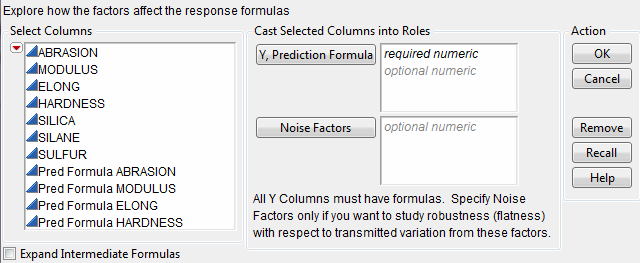
The columns referenced in the formulas become the X columns (unless the column is also a Y).
Y, Prediction Formula
are the response columns containing formulas.
Noise Factors
are only used in special cases for modeling derivatives. Details are in Noise Factors (Robust Engineering).
Expand Intermediate Formulas
tells JMP that if an ingredient column to a formula is a column that itself has a formula, to substitute the inner formula, as long as it refers to other columns. To prevent an ingredient column from expanding, use the Other column property with a name of "Expand Formula" and a value of 0.
The Surface Plot platform is discussed in a separate chapter. The Surface Profiler is very similar to the Surface Plot platform, except Surface Plot has more modes of operation. Neither the Surface Plot platform nor the Surface Profiler have some of the capabilities common to other profilers.
The Profiler
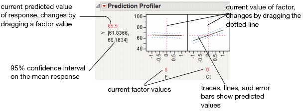
The Profiler displays profile traces (see Figure 24.3) for each X variable. A profile trace is the predicted response as one variable is changed while the others are held constant at the current values. The Profiler recomputes the profiles and predicted responses (in real time) as you vary the value of an X variable.
• The vertical dotted line for each X variable shows its current value or current setting. If the variable is nominal, the x-axis identifies categories. See Interpreting the Profiles, for more details.
For each X variable, the value above the factor name is its current value. You change the current value by clicking in the graph or by dragging the dotted line where you want the new current value to be.
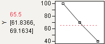
• The horizontal dotted line shows the current predicted value of each Y variable for the current values of the X variables.
• The black lines within the plots show how the predicted value changes when you change the current value of an individual X variable. In fitting platforms, the 95% confidence interval for the predicted values is shown by a dotted blue curve surrounding the prediction trace (for continuous variables) or the context of an error bar (for categorical variables).
The Profiler is a way of changing one variable at a time and looking at the effect on the predicted response.
Figure 24.3 Illustration of Traces
The Profiler in some situations computes confidence intervals for each profiled column. If you have saved both a standard error formula and a prediction formula for the same column, the Profiler offers to use the standard errors to produce the confidence intervals rather than profiling them as a separate column.
Interpreting the Profiles
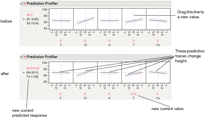
The illustration in Figure 24.4 describes how to use the components of the Profiler. There are several important points to note when interpreting a prediction profile:
• The importance of a factor can be assessed to some extent by the steepness of the prediction trace. If the model has curvature terms (such as squared terms), then the traces may be curved.
• If you change a factor’s value, then its prediction trace is not affected, but the prediction traces of all the other factors can change. The Y response line must cross the intersection points of the prediction traces with their current value lines.
Note: If there are interaction effects or cross-product effects in the model, the prediction traces can shift their slope and curvature as you change current values of other terms. That is what interaction is all about. If there are no interaction effects, the traces only change in height, not slope or shape.
Figure 24.4 Changing one Factor From 0 to 0.75
Prediction profiles are especially useful in multiple-response models to help judge which factor values can optimize a complex set of criteria.
Click on a graph or drag the current value line right or left to change the factor’s current value. The response values change as shown by a horizontal reference line in the body of the graph. Double-click in an axis to bring up a dialog that changes its settings.
Thinking about Profiling as Cross-Sectioning
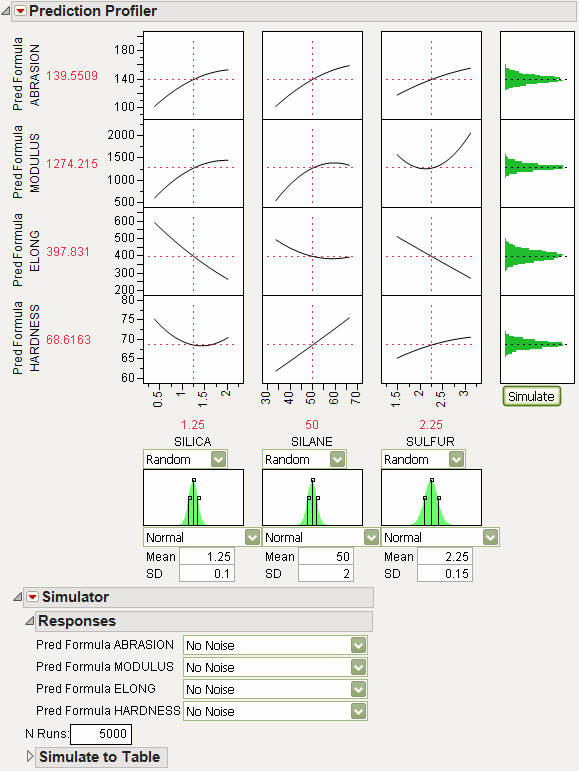
In the following example using Tiretread.jmp, look at the response surface of the expression for MODULUS as a function of SULFUR and SILANE (holding SILICA constant). Now look at how a grid that cuts across SILANE at the SULFUR value of 2.25. Note how the slice intersects the surface. If you transfer that down below, it becomes the profile for SILANE. Similarly, note the grid across SULFUR at the SILANE value of 50. The intersection when transferred down to the SULFUR graph becomes the profile for SULFUR.
Figure 24.5 Profiler as a Cross-Section
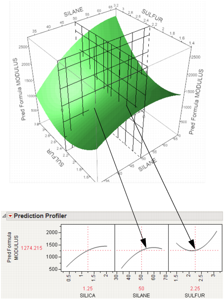
Now consider changing the current value of SULFUR from 2.25 down to 1.5.
Figure 24.6 Profiler as a Cross-Section

In the Profiler, note the new value just moves along the same curve for SULFUR, the SULFUR curve itself doesn't change. But the profile for SILANE is now taken at a different cut for SULFUR, and is a little higher and reaches its peak in the different place, closer to the current SILANE value of 50.
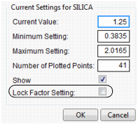
Setting or Locking a Factor’s Values
If you Alt-click (Option-click on the Macintosh) in a graph, a dialog prompts you to enter specific settings for the factor.
Figure 24.7 Continuous Factor Settings Dialog
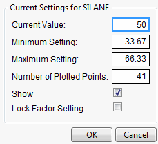
For continuous variables, you can specify
Current Value
is the value used to calculate displayed values in the profiler, equivalent to the red vertical line in the graph.
Minimum Setting
is the minimum value of the factor’s axis.
Maximum Value
is the maximum value of the factor’s axis.
Number of Plotted Points
specifies the number of points used in plotting the factor’s prediction traces.
Show
is a checkbox that allows you to show or hide the factor in the profiler.
Lock Factor Setting
locks the value of the factor at its current setting.
Profiler Options
The popup menu on the Profiler title bar has the following options:
Profiler
shows or hides the Profiler.
Contour Profiler
shows or hides the Contour Profiler.
Custom Profiler
shows or hides the Custom Profiler.
Mixture Profiler
shows or hides the Mixture Profiler.
Surface Profiler
shows or hides the Surface Profiler.
Save As Flash (SWF)
allows you to save the Profiler (with reduced functionality) as an Adobe Flash file, which can be imported into presentation and web applications. An HTML page can be saved for viewing the Profiler in a browser. The Save as Flash (SWF) command is not available for categorical responses. For more information about this option, go to http://www.jmp.com/support/swfhelp/.
The Profiler will accept any JMP function, but the Flash Profiler only accepts the following functions: Add, Subtract, Multiply, Divide, Minus, Power, Root, Sqrt, Abs, Floor, Ceiling, Min, Max, Equal, Not Equal, Greater, Less, GreaterorEqual, LessorEqual, Or, And, Not, Exp, Log, Log10, Sine, Cosine, Tangent, SinH, CosH, TanH, ArcSine, ArcCosine, ArcTangent, ArcSineH, ArcCosH, ArcTanH, Squish, If, Match, Choose.
Note: Some platforms create column formulas that are not supported by the Save As Flash option.
Show Formulas
opens a JSL window showing all formulas being profiled.
Formulas for OPTMODEL
Creates code for the OPTMODEL SAS procedure. Hold down CTRL and SHIFT and then select Formulas for OPTMODEL from the red triangle menu.
Script
contains options that are available to all platforms. See Using JMP.
The popup menu on the Prediction Profiler title bar has the following options:
Prop of Error Bars
appears under certain situations. See Propagation of Error Bars.
Confidence Intervals
shows or hides the confidence intervals. The intervals are drawn by bars for categorical factors, and curves for continuous factors. These are available only when the profiler is used inside certain fitting platforms.
Sensitivity Indicator
shows or hides a purple triangle whose height and direction correspond to the value of the partial derivative of the profile function at its current value. This is useful in large profiles to be able to quickly spot the sensitive cells.
Figure 24.8 Sensitivity Indicators
Desirability Functions
shows or hides the desirability functions, as illustrated by Figure 24.17 and Figure 24.18. Desirability is discussed in Desirability Profiling and Optimization.
Maximize Desirability
sets the current factor values to maximize the desirability functions.
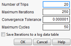
Maximization Options
allows you to refine the optimization settings through a dialog.
Figure 24.9 Maximization Options Window
Maximize for Each Grid Point
can only be used if one or more factors are locked. The ranges of the locked factors are divided into a grid, and the desirability is maximized at each grid point. This is useful if the model you are profiling has categorical factors; then the optimal condition can be found for each combination of the categorical factors.
Save Desirabilities
saves the three desirability function settings for each response, and the associated desirability values, as a Response Limits column property in the data table. These correspond to the coordinates of the handles in the desirability plots.
Set Desirabilities
brings up a dialog where specific desirability values can be set.
Figure 24.10 Response Grid Window
Save Desirability Formula
creates a column in the data table with a formula for Desirability. The formula uses the fitting formula when it can, or the response variables when it can’t access the fitting formula.
Reset Factor Grid
displays a dialog for each value allowing you to enter specific values for a factor’s current settings. See the section Setting or Locking a Factor’s Values for details on these dialog boxes.
Factor Settings
is a submenu that consists of the following options:
Remember Settings adds an outline node to the report that accumulates the values of the current settings each time the Remember Settings command is invoked. Each remembered setting is preceded by a radio button that is used to reset to those settings.
Set To Data in Row assigns the values of a data table row to the Profiler.
Copy Settings Script and Paste Settings Script allow you to move the current Profiler’s settings to a Profiler in another report.
Append Settings to Table appends the current profiler’s settings to the end of the data table. This is useful if you have a combination of settings in the Profiler that you want to add to an experiment in order to do another run.
Link Profilers links all the profilers together, so that a change in a factor in one profiler causes that factor to change to that value in all other profilers, including Surface Plot. This is a global option, set or unset for all profilers.
Set Script sets a script that is called each time a factor changes. The set script receives a list of arguments of the form
{factor1 = n1, factor2 = n2, ...}
For example, to write this list to the log, first define a function
ProfileCallbackLog = Function({arg},show(arg));
Then enter ProfileCallbackLog in the Set Script dialog.
Similar functions convert the factor values to global values:
ProfileCallbackAssign = Function({arg},evalList(arg));
Or access the values one at a time:
ProfileCallbackAccess = Function({arg},f1=arg["factor1"];f2=arg["factor2"]);
Output Grid Table
produces a new data table with columns for the factors that contain grid values, columns for each of the responses with computed values at each grid point, and the desirability computation at each grid point.
If you have a lot of factors, it is impractical to use the Output Grid Table command, since it produces a large table. In such cases, you should lock some of the factors, which are held at locked, constant values. To get the dialog to specify locked columns, Alt- or Option-click inside the profiler graph to get a dialog that has a Lock Factor Setting checkbox.
Figure 24.11 Factor Settings Window
Output Random Table
prompts for a number of runs and creates an output table with that many rows, with random factor settings and predicted values over those settings. This is equivalent to (but much simpler than) opening the Simulator, resetting all the factors to a random uniform distribution, then simulating output. This command is similar to Output Grid Table, except it results in a random table rather than a sequenced one.
The prime reason to make uniform random factor tables is to explore the factor space in a multivariate way using graphical queries. This technique is called Filtered Monte Carlo.
Suppose you want to see the locus of all factor settings that produce a given range to desirable response settings. By selecting and hiding the points that don’t qualify (using graphical brushing or the Data Filter), you see the possibilities of what is left: the opportunity space yielding the result you want.
Alter Linear Constraints
allows you to add, change, or delete linear constraints. The constraints are incorporated into the operation of Prediction Profiler. See Linear Constraints.
Save Linear Constraints
allows you to save existing linear constraints to a Table Property/Script called Constraint. SeeLinear Constraints.
Default N Levels
allows you to set the default number of levels for each continuous factor. This option is useful when the Profiler is especially large. When calculating the traces for the first time, JMP measures how long it takes. If this time is greater than three seconds, you are alerted that decreasing the Default N Levels speeds up the calculations.
Conditional Predictions
appears when random effects are included in the model. The random effects predictions are used in formulating the predicted value and profiles.
Simulator
launches the Simulator. The Simulator enables you to create Monte Carlo simulations using random noise added to factors and predictions for the model. A typical use is to set fixed factors at their optimal settings, and uncontrolled factors and model noise to random values and find out the rate that the responses are outside the specification limits. For details see The Simulator.
Interaction Profiler
brings up interaction plots that are interactive with respect to the profiler values. This option can help visualize third degree interactions by seeing how the plot changes as current values for the terms are changed. The cells that change for a given term are the cells that do not involve that term directly.
Arrange in Rows
Enter the number of plots that appear in a row. This option helps you view plots vertically rather than in one wide row.
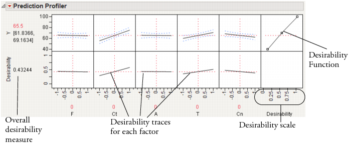
Desirability Profiling and Optimization
Often there are multiple responses measured and the desirability of the outcome involves several or all of these responses. For example, you might want to maximize one response, minimize another, and keep a third response close to some target value. In desirability profiling, you specify a desirability function for each response. The overall desirability can be defined as the geometric mean of the desirability for each response.
To use desirability profiling, select Desirability Functions from the Prediction Profiler red triangle menu.
Note: If the response column has a Response Limits property, desirability functions are turned on by default.
This command appends a new row to the bottom of the plot matrix, dedicated to graphing desirability. The row has a plot for each factor showing its desirability trace, as illustrated in Figure 24.12. It also adds a column that has an adjustable desirability function for each Y variable. The overall desirability measure shows on a scale of zero to one at the left of the row of desirability traces.
Figure 24.12 The Desirability Profiler
About Desirability Functions
The desirability functions are smooth piecewise functions that are crafted to fit the control points.
• The minimize and maximize functions are three-part piecewise smooth functions that have exponential tails and a cubic middle.
• The target function is a piecewise function that is a scale multiple of a normal density on either side of the target (with different curves on each side), which is also piecewise smooth and fit to the control points.
These choices give the functions good behavior as the desirability values switch between the maximize, target, and minimize values. For completeness, we implemented the upside-down target also.
JMP doesn’t use the Derringer and Suich functional forms. Since they are not smooth, they do not always work well with JMP’s optimization algorithm.
The control points are not allowed to reach all the way to zero or one at the tail control points.
Using the Desirability Function
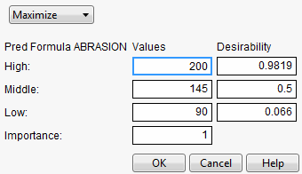
To use a variable’s desirability function, drag the function handles to represent a response value.
As you drag these handles, the changing response value shows in the area labeled Desirability to the left of the plots. The dotted line is the response for the current factor settings. The overall desirability shows to the left of the row of desirability traces. Alternatively, you can select Set Desirabilities to enter specific values for the points.
The next illustration shows steps to create desirability settings.
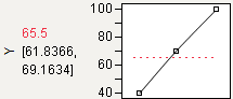
Maximize
The default desirability function setting is maximize (“higher is better”). The top function handle is positioned at the maximum Y value and aligned at the high desirability, close to 1. The bottom function handle is positioned at the minimum Y value and aligned at a low desirability, close to 0.
Figure 24.13 Maximizing Desirability
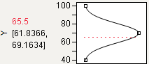
Target
You can designate a target value as “best.” In this example, the middle function handle is positioned at Y = 70 and aligned with the maximum desirability of 1. Y becomes less desirable as its value approaches either 45 or 95. The top and bottom function handles at Y = 45 and Y = 95 are positioned at the minimum desirability close to 0.
Figure 24.14 Defining a Target Desirability
Minimize
The minimize (“smaller is better”) desirability function associates high response values with low desirability and low response values with high desirability. The curve is the maximization curve flipped around a horizontal line at the center of plot.
Figure 24.15 Minimizing Desirability
Note: Dragging the top or bottom point of a maximize or minimize desirability function across the y-value of the middle point results in the opposite point reflecting, so that a Minimize becomes a Maximize, and vice versa.
The Desirability Profile
The last row of plots shows the desirability trace for each factor. The numerical value beside the word Desirability on the vertical axis is the geometric mean of the desirability measures. This row of plots shows both the current desirability and the trace of desirabilities that result from changing one factor at a time.
For example, Figure 24.16 shows desirability functions for two responses. You want to maximize ABRASION and minimize MODULUS. The desirability plots indicate that you could increase the desirability by increasing any of the factors.
Figure 24.16 Prediction Profile Plot with Adjusted Desirability and Factor Values
Desirability Profiling for Multiple Responses
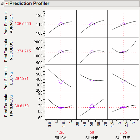
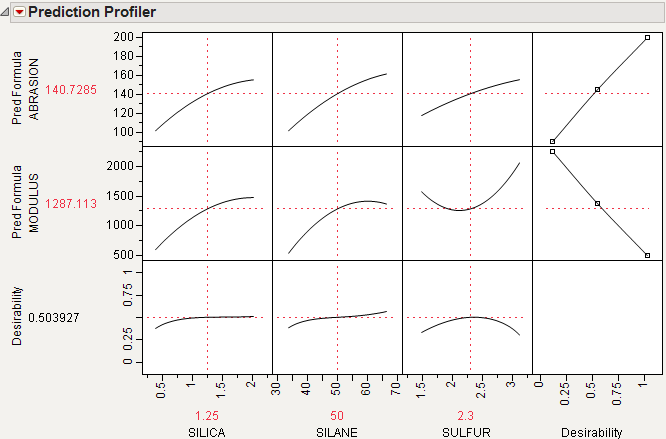
A desirability index becomes especially useful when there are multiple responses. The idea was pioneered by Derringer and Suich (1980), who give the following example. Suppose there are four responses, ABRASION, MODULUS, ELONG, and HARDNESS. Three factors, SILICA, SILANE, and SULFUR, were used in a central composite design.
The data are in the Tiretread.jmp table in the Sample Data folder. Use the RSM For 4 responses script in the data table, which defines a model for the four responses with a full quadratic response surface. The summary tables and effect information appear for all the responses, followed by the prediction profiler shown in Figure 24.17. The desirability functions are as follows:
1. Maximum ABRASION and maximum MODULUS are most desirable.
2. ELONG target of 500 is most desirable.
3. HARDNESS target of 67.5 is most desirable.
Figure 24.17 Profiler for Multiple Responses Before Optimization
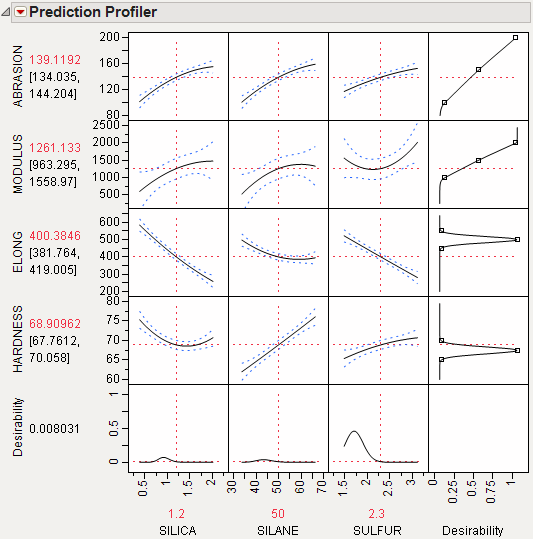
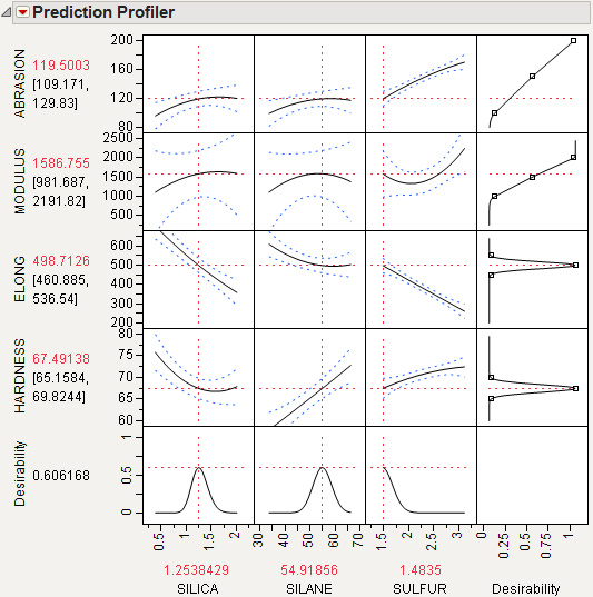
Select Maximize Desirability from the Prediction Profiler pop-up menu to maximize desirability. The results are shown in Figure 24.18. The desirability traces at the bottom decrease everywhere except the current values of the effects, which indicates that any further adjustment could decrease the overall desirability.
Figure 24.18 Profiler After Optimization
Special Profiler Topics
Propagation of Error Bars
Propagation of error (POE) is important when attributing the variation of the response in terms of variation in the factor values when the factor values are not very controllable.
In JMP’s implementation, the Profiler first looks at the factor and response variables to see if there is a Sigma column property (a specification for the standard deviation of the column, accessed through the Cols > Column Info dialog box). If the property exists, then the Prop of Error Bars command becomes accessible in the Prediction Profiler drop-down menu. This displays the 3σ interval that is implied on the response due to the variation in the factor.
Figure 24.19 Propagation of Errors Bars in the Prediction Profiler
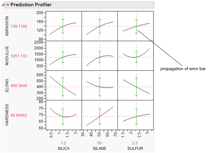
The POE is represented in the graph by a green bracket. The bracket indicates the prediction plus or minus three times the square root of the POE variance, which is calculated as
where f is the prediction function, xi is the ith factor, and N is the number of factors.
Currently, these partial derivatives are calculated by numerical derivatives:
centered, with δ=xrange/10000
POE limits increase dramatically in response surface models when you are over a more sloped part of the response surface. One of the goals of robust processes is to operate in flat areas of the response surface so that variations in the factors do not amplify in their effect on the response.
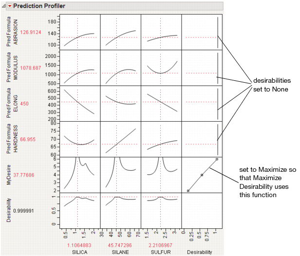
Customized Desirability Functions
It is possible to use a customized desirability function. For example, suppose you want to maximize using the following function.
Figure 24.20 Maximizing Desirability Based on a Function
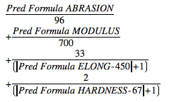
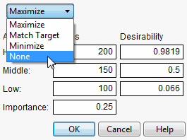
First, create a column called MyDesire that contains the above formula. Then, launch the Profiler using Graph > Profiler and include all the Pred Formula columns and the MyDesire column. Turn on the desirability functions by selecting Desirability Functions from the red-triangle menu. All the desirability functions for the individual effects must be turned off. To do this, first double-click in a desirability plot window, then select None in the dialog that appears (Figure 24.21). Set the desirability for MyDesire to be maximized.
Figure 24.21 Selecting No Desirability Goal
At this point, selecting Maximize Desirability uses only the custom MyDesire function.
Figure 24.22 Maximized Custom Desirability
Mixture Designs
When analyzing a mixture design, JMP constrains the ranges of the factors so that settings outside the mixture constraints are not possible. This is why, in some mixture designs, the profile traces appear to turn abruptly.
When there are mixture components that have constraints, other than the usual zero-to-one constraint, a new submenu, called Profile at Boundary, appears on the Prediction Profiler popup menu. It has the following two options:
Turn At Boundaries
lets the settings continue along the boundary of the restraint condition.
Stop At Boundaries
truncates the prediction traces to the region where strict proportionality is maintained.
Expanding Intermediate Formulas
The Profiler launch dialog has an Expand Intermediate Formulas checkbox. When this is checked, then when the formula is examined for profiling, if it references another column that has a formula containing references to other columns, then it substitutes that formula and profiles with respect to the end references—not the intermediate column references.
For example, when Fit Model fits a logistic regression for two levels (say A and B), the end formulas (Prob[A] and Prob[B]) are functions of the Lin[x] column, which itself is a function of another column x. If Expand Intermediate Formulas is selected, then when Prob[A] is profiled, it is with reference to x, not Lin[x].
In addition, using the Expand Intermediate Formulas checkbox enables the Save Expanded Formulas command in the platform red triangle menu. This creates a new column with a formula, which is the formula being profiled as a function of the end columns, not the intermediate columns.
Linear Constraints
The Prediction Profiler, Custom Profiler and Mixture Profiler can incorporate linear constraints into their operations. Linear constraints can be entered in two ways, described in the following sections.
Pop-up Menu Item
To enter linear constraints via the pop-up menu, select Alter Linear Constraints from either the Prediction Profiler or Custom Profiler pop-up menu.
Choose Add Constraint from the resulting dialog, and enter the coefficients into the appropriate boxes. For example, to enter the constraint p1 + 2*p2 ≤ 0.9, enter the coefficients as shown in Figure 24.23. As shown, if you are profiling factors from a mixture design, the mixture constraint is present by default and cannot be modified.
Figure 24.23 Enter Coefficients
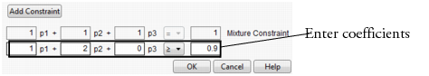
After you click OK, the Profiler updates the profile traces, and the constraint is incorporated into subsequent analyses and optimizations.
If you attempt to add a constraint for which there is no feasible solution, a message is written to the log and the constraint is not added. To delete a constraint, enter zeros for all the coefficients.
Constraints added in one profiler are not accessible by other profilers until saved. For example, if constraints are added under the Prediction Profiler, they are not accessible to the Custom Profiler. To use the constraint, you can either add it under the Custom Profiler pop-up menu, or use the Save Linear Constraints command described in the next section.
Constraint Table Property/Script
If you add constraints in one profiler and want to make them accessible by other profilers, use the Save Linear Constraints command, accessible through the platform pop-up menu. For example, if you created constraints in the Prediction Profiler, choose Save Linear Constraints under the Prediction Profiler pop-up menu. The Save Linear Constraints command creates or alters a Table Script called Constraint. An example of the Table Property is shown in Figure 24.24.
Figure 24.24 Constraint Table Script
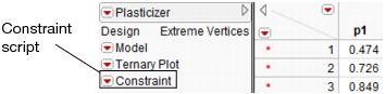
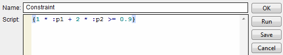
The Constraint Table Property is a list of the constraints, and is editable. It is accessible to other profilers, and negates the need to enter the constraints in other profilers. To view or edit Constraint, right click on the pop-up menu and select Edit. The contents of the constraint from Figure 24.23 is shown below in Figure 24.25.
Figure 24.25 Example Constraint
The Constraint Table Script can be created manually by choosing New Script from the pop-up menu beside a table name.
Note: When creating the Constraint Table Script manually, the spelling must be exactly “Constraint”. Also, the constraint variables are case sensitive and must match the column name. For example, in Figure 24.25, the constraint variables are p1 and p2, not P1 and P2.
The Constraint Table Script is also created when specifying linear constraints when designing an experiment.
The Alter Linear Constraints and Save Linear Constraints commands are not available in the Mixture Profiler. To incorporate linear constraints into the operations of the Mixture Profiler, the Constraint Table Script must be created by one of the methods discussed in this section.
Contour Profiler
The Contour Profiler shows response contours for two factors at a time. The interactive contour profiling facility is useful for optimizing response surfaces graphically. Figure 24.26 shows an example of the Contour Profiler for the Tiretread sample data.
Figure 24.26 Contour Profiler
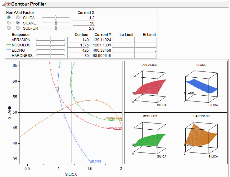
• There are slider controls and edit fields for both the X and Y variables.
• The Current X values generate the Current Y values. The Current X location is shown by the crosshair lines on the graph. The Current Y values are shown by the small red lines in the slider control.
• The other lines on the graph are the contours for the responses set by the Y slider controls or by entering values in the Contour column. There is a separately colored contour for each response (4 in this example).
• You can enter low and high limits to the responses, which results in a shaded region. To set the limits, you can click and drag from the side zones of the Y sliders or enter values in the Lo Limit or Hi Limit columns. If a response column’s Spec Limits column property has values for Lower Spec Limit or Upper Spec Limit, those values are used as the initial values for Lo Limit and Hi Limit.
• If you have more than two factors, use the radio buttons in the upper left of the report to switch the graph to other factors.
• Right-click on the slider control and select Rescale Slider to change the scale of the slider (and the plot for an active X variable).
• For each contour, there is a dotted line in the direction of higher response values, so that you get a sense of direction.
• Right-click on the color legend for a response (under Response) to change the color for that response.
Contour Profiler Pop-up Menu
Grid Density
lets you set the density of the mesh plots (Surface Plots).
Graph Updating
gives you the options to update the Contour Profiler Per Mouse Move, which updates continuously, or Per Mouse Up, which waits for the mouse to be released to update. (The difference might not be noticeable on a fast machine.)
Surface Plot
hides or shows mesh plots.
Contour Label
hides or shows a label for the contour lines. The label colors match the contour colors.
Contour Grid
draws contours on the Contour Profiler plot at intervals you specify.
Factor Settings
is a submenu of commands that allows you to save and transfer the Contour Profiler’s settings to other parts of JMP. Details are in the section Factor Settings.
Simulator
launches the Simulator. See The Simulator.
Up Dots
shows or hides dotted lines corresponding to each contour. The dotted lines show the direction of increasing response values, so that you get a sense of direction.
Mixtures
For mixture designs, a Lock column appears in the Contour Profiler (Figure 24.27). This column allows you to lock settings for mixture values so that they are not changed when the mixture needs to be adjusted due to other mixture effects being changed. When locked columns exist, the shaded area for a mixture recognizes the newly restricted area.
Figure 24.27 Boxes to Lock Columns
Constraint Shading
Specifying limits to the Y's shades the areas outside the limits as shown in Figure 24.28. The unshaded white area becomes the feasible region.
Figure 24.28 Settings for Contour Shading
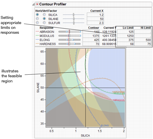
If a response column’s Spec Limits column property has values for Lower Spec Limit or Upper Spec Limit, those values are used as the initial values for Lo Limit and Hi Limit.
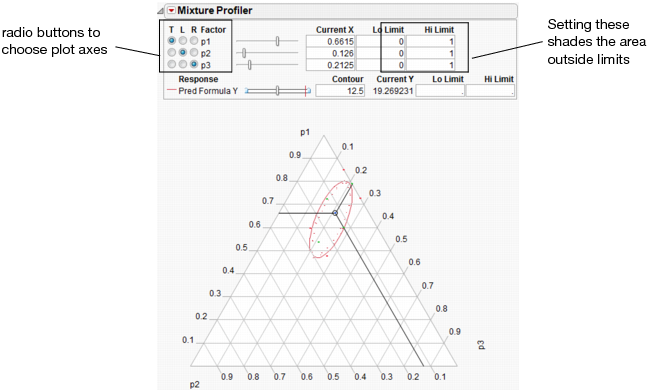
Mixture Profiler
The Mixture Profiler shows response contours for mixture experiment models, where three or more factors in the experiment are components (ingredients) in a mixture. The Mixture Profiler is useful for visualizing and optimizing response surfaces resulting from mixture experiments.
Figure 24.29 shows an example of the Mixture Profiler for the sample data in Plasticizer.jmp. To generate the graph shown, select Mixture Profiler from the Graph menu. In the resulting Mixture Profiler launch dialog, assign Pred Formula Y to the Y, Prediction Formula role and click OK. Delete the Lo and Hi limits from p1, p2, and p3.
Many of the features shown are the same as those of the Contour Profiler and are described on Contour Profiler Pop-up Menu. Some of the features unique to the Mixture Profiler include:
• A ternary plot is used instead of a Cartesian plot. A ternary plot enables you to view three mixture factors at a time.
• If you have more than three factors, use the radio buttons at the top left of the Mixture Profiler window to graph other factors. For detailed explanation of radio buttons and plot axes, see Explanation of Ternary Plot Axes
• If the factors have constraints, you can enter their low and high limits in the Lo Limit and Hi Limit columns. This shades non-feasible regions in the profiler. As in Contour Plot, low and high limits can also be set for the responses.
Figure 24.29 Mixture Profiler
Explanation of Ternary Plot Axes
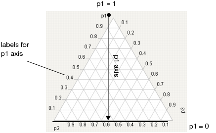
The sum of all mixture factor values in a mixture experiment is a constant, usually, and henceforth assumed to be 1. Each individual factor’s value can range between 0 and 1, and three are represented on the axes of the ternary plot.
For a three factor mixture experiment in which the factors sum to 1, the plot axes run from a vertex (where a factor’s value is 1 and the other two are 0) perpendicular to the other side (where that factor is 0 and the sum of the other two factors is 1). See Figure 24.30.
For example, in Figure 24.30, the proportion of p1 is 1 at the top vertex and 0 along the bottom edge. The tick mark labels are read along the left side of the plot. Similar explanations hold for p2 and p3.
For an explanation of ternary plot axes for experiments with more than three mixture factors, see More than Three Mixture Factors.
Figure 24.30 Explanation of p1 Axis.
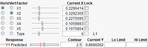
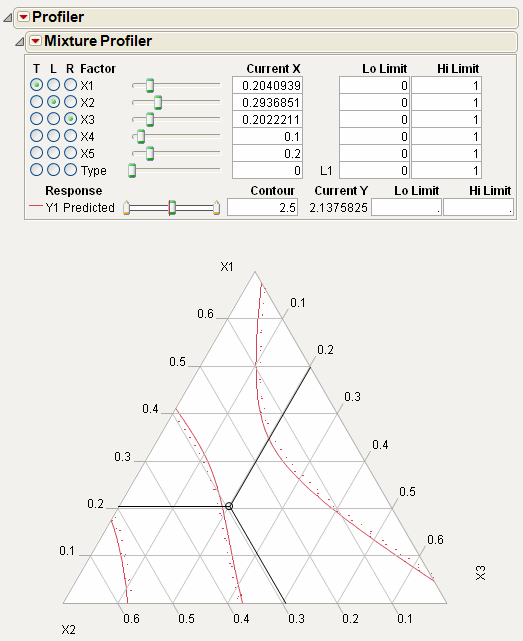
More than Three Mixture Factors
The ternary plot can only show three factors at a time. If there are more than three factors in the model you are profiling, the total of the three on-axis (displayed) factors is 1 minus the total of the off-axis (non-displayed) factors. Also, the plot axes are scaled such that the maximum value a factor can attain is 1 minus the total for the off-axis factors.
For example Figure 24.31 shows the Mixture Profiler for an experiment with 5 factors. The Five Factor Mixture.jmp data table is being used, with the Y1 Predicted column as the formula. The on-axis factors are x1, x2 and x3, while x4 and x5 are off-axis. The value for x4 is 0.1 and the value for x5 is 0.2, for a total of 0.3. This means the sum of x1, x2 and x3 has to equal 1 – 0.3 = 0.7. In fact, their Current X values add to 0.7. Also, note that the maximum value for a plot axis is now 0.7, not 1.
If you change the value for either x4 or x5, then the values for x1, x2 and x3 change, keeping their relative proportions, to accommodate the constraint that factor values sum to 1.
Figure 24.31 Scaled Axes to Account for Off-Axis Factors Total
Mixture Profiler Options
The commands under the Mixture Profiler popup menu are explained below.
Ref Labels
shows or hides the labels on the plot axes.
Ref Lines
shows or hides the grid lines on the plot.
Show Points
shows or hides the design points on the plot. This feature is only available if there are no more than three mixture factors.
Show Current Value
shows or hides the three-way crosshairs on the plot. The intersection of the crosshairs represents the current factor values. The Current X values above the plot give the exact coordinates of the crosshairs.
Show Constraints
shows or hides the shading resulting from any constraints on the factors. Those constraints can be entered in the Lo Limits and Hi Limits columns above the plot, or in the Mixture Column Property for the factors.
Up Dots
shows or hides dotted line corresponding to each contour. The dotted lines show the direction of increasing response values, so that you get a sense of direction.
Contour Grid
draws contours on the plot at intervals you specify.
Remove Contour Grid
removes the contour grid if one is on the plot.
Factor Settings
is a submenu of commands that allows you to save and transfer the Mixture Profiler settings to other parts of JMP. Details on this submenu are found in the discussion of the profiler on Factor Settings.
Linear Constraints
The Mixture Profiler can incorporate linear constraints into its operations. To do this, a Constraint Table Script must be part of the data table. See Linear Constraints for details on creating the Table Script.
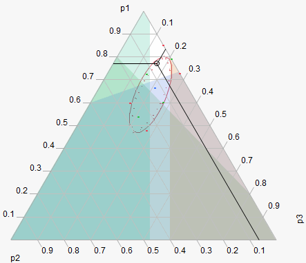
When using constraints, unfeasible regions are shaded in the profiler. Figure 24.32 shows an example of a mixture profiler with shaded regions due to four constraints. The unshaded portion is the resulting feasible region. The constraints are below:
• 4*p2 + p3 ≤ 0.8
• p2 + 1.5*p3 ≤ 0.4
• p1 + 2*p2 ≥ 0.8
• p1 + 2*p2 ≤ 0.95
Figure 24.32 Shaded Regions Due to Linear Constraints
Examples
Single Response
This example, adapted from Cornell (1990), comes from an experiment to optimize the texture of fish patties. The data is in Fish Patty.jmp. The columns Mullet, Sheepshead and Croaker represent what proportion of the patty came from that fish type. The column Temperature represents the oven temperature used to bake the patties. The column Rating is the response and is a measure of texture acceptability, where higher is better. A response surface model was fit to the data and the prediction formula was stored in the column Predicted Rating.
To launch the Mixture Profiler, select Graph > Mixture Profiler. Assign Predicted Rating to Y, Prediction Formula and click OK. The output should appear as in Figure 24.33.
Figure 24.33 Initial Output for Mixture Profiler.
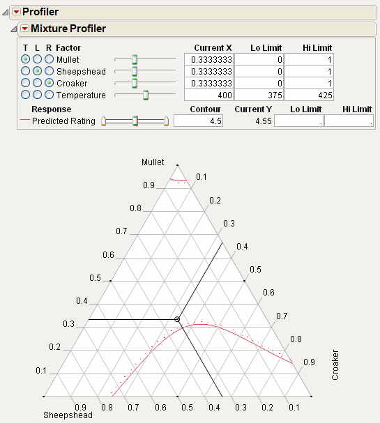
The manufacturer wants the rating to be at least 5. Use the slider control for Predicted Rating to move the contour close to 5. Alternatively, you can enter 5 in the Contour edit box to bring the contour to a value of 5. Figure 24.34 shows the resulting contour.
Figure 24.34 Contour Showing a Predicted Rating of 5
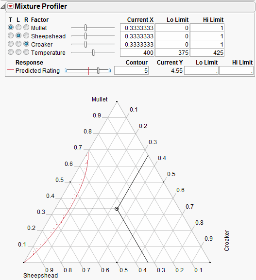
The Up Dots shown in Figure 24.34 represent the direction of increasing Predicted Rating. Enter 5 in the Lo Limit edit box. The resulting shaded region shown in Figure 24.35 represents factor combinations that will yield a rating less than 5. To produce patties with at least a rating of 5, the manufacturer can set the factors values anywhere in the feasible (unshaded) region.
The feasible region represents the factor combinations predicted to yield a rating of 5 or more. Notice the region has small proportions of Croaker (<10%), mid to low proportions of Mullet (<70%) and mid to high proportions of Sheepshead (>30%).
Figure 24.35 Contour Shading Showing Predicted Rating of 5 or more.
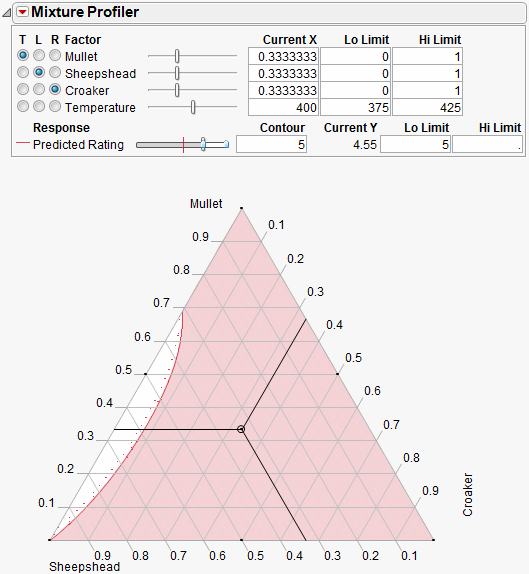
Up to this point the fourth factor, Temperature, has been held at 400 degrees. Move the slide control for Temperature and watch the feasible region change.
Additional analyses may include:
• Optimize the response across all four factors simultaneously. See The Custom Profiler or Desirability Profiling and Optimization.
• Simulate the response as a function of the random variation in the factors and model noise. See The Simulator.
Multiple Responses
This example uses data from Five Factor Mixture.jmp. There are five continuous factors (x1–x5), one categorical factor (Type), and three responses, Y1, Y2 and Y3. A response surface model is fit to each response and the prediction equations are saved in Y1 Predicted, Y2 Predicted and Y3 Predicted.
Launch the Mixture Profiler and assign the three prediction formula columns to the Y, Prediction Formula role, then click OK. Enter 3 in the Contour edit box for Y3 Predicted so the contour shows on the plot. The output appears in Figure 24.36.
Figure 24.36 Initial Output Window for Five Factor Mixture
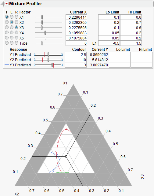
A few items to note about the output in Figure 24.36.
• All the factors appear at the top of the window. The mixture factors have low and high limits, which were entered previously as a Column Property. See Using JMP for more information about entering column properties. Alternatively, you can enter the low and high limits directly by entering them in the Lo Limit and Hi Limit boxes.
• Certain regions of the plot are shaded in gray to account for the factor limits.
• The on-axis factors, x1, x2 and x3, have radio buttons selected.
• The categorical factor, Type, has a radio button, but it cannot be assigned to the plot. The current value for Type is L1, which is listed immediately to the right of the Current X box. The Current X box for Type uses a 0 to represent L1.
• All three prediction equations have contours on the plot and are differentiated by color.
A manufacturer desires to hold Y1 less than 1, hold Y2 greater than 8 and hold Y3 between 4 and 5, with a target of 4.5. Furthermore, the low and high limits on the factors need to be respected. The Mixture Profiler can help you investigate the response surface and find optimal factor settings.
Start by entering the response constraints into the Lo Limit and Hi Limit boxes, as shown in Figure 24.37. Colored shading appears on the plot and designates unfeasible regions. The feasible region remains white (unshaded). Use the Response slider controls to position the contours in the feasible region.
Figure 24.37 Response Limits and Shading
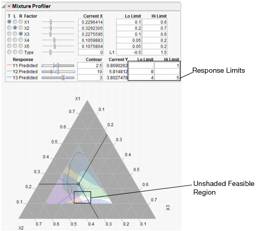
The feasible region is small. Use the magnifier tool  to zoom in on the feasible region shown with a box in Figure 24.37. The enlarged feasible region is shown in Figure 24.38.
Figure 24.38 Feasible Region Enlarged
The manufacturer wants to maximize Y1, minimize Y2 and have Y3 at 4.5.
• Use the slider controls or Contour edit boxes for Y1 Predicted to maximize the red contour within the feasible region. Keep in mind the Up Dots show direction of increasing predicted response.
• Use the slider controls or Contour edit boxes for Y2 Predicted to minimize the green contour within the unshaded region.
• Enter 4.5 in the Contour edit box for Y3 Predicted to bring the blue contour to the target value.
The resulting three contours don’t all intersect at one spot, so you will have to compromise. Position the three-way crosshairs in the middle of the contours to understand the factor levels that produce those response values.
Figure 24.39 Factor Settings
As shown in Figure 24.39, the optimal factor settings can be read from the Current X boxes.
The factor values above hold for the current settings of x4, x5 and Type. Select Factor Settings > Remember Settings from the Mixture Profiler pop-up menu to save the current settings. The settings are appended to the bottom of the report window and appear as shown below.
Figure 24.40 Remembered Settings
With the current settings saved, you can now change the values of x4, x5 and Type to see what happens to the feasible region. You can compare the factor settings and response values for each level of Type by referring to the Remembered Settings report.
Surface Profiler
The Surface Profiler shows a three-dimensional surface plot of the response surface. The functionality of Surface Profiler is the same as the Surface Plot platform, but with fewer options. Details of Surface Plots are found in the Plotting Surfaces.
The Custom Profiler
The Custom Profiler allows you to optimize factor settings computationally, without graphical output. This is used for large problems that would have too many graphs to visualize well.
It has many fields in common with other profilers. The Benchmark field represents the value of the prediction formula based on current settings. Click Reset Benchmark to update the results.
The Optimization outline node allows you to specify the formula to be optimized and specifications about the optimization iterations. Click the Optimize button to optimize based on current settings.
Figure 24.41 Custom Profiler
Custom Profiler Options
Factor Settings
is a submenu identical to the one covered on Factor Settings.
Log Iterations
outputs iterations to a table.
Alter Linear Constraints
allows you to add, change, or delete linear constraints. The constraints are incorporated into the operation of Custom Profiler. See Linear Constraints.
Save Linear Constraints
allows you to save existing linear constraints to a Table Property/Script called Constraint. SeeLinear Constraints.
Simulator
launches the Simulator. See The Simulator.
The Simulator
Simulation allows you to discover the distribution of model outputs as a function of the random variation in the factors and model noise. The simulation facility in the profilers provides a way to set up the random inputs and run the simulations, producing an output table of simulated values.
An example of this facility’s use would be to find out the defect rate of a process that has been fit, and see if it is robust with respect to variation in the factors. If specification limits have been set in the responses, they are carried over into the simulation output, allowing a prospective capability analysis of the simulated model using new factors settings.
In the Profiler, the Simulator is integrated into the graphical layout. Factor specifications are aligned below each factor’s profile. A simulation histogram is shown on the right for each response.
Figure 24.42 Profiler with Simulator
In the other profilers, the Simulator is less graphical, and kept separate. There are no integrated histograms, and the interface is textual. However, the internals and output tables are the same.
Specifying Factors
Factors (inputs) and responses (outputs) are already given roles by being in the Profiler. Additional specifications for the simulator are on how to give random values to the factors, and add random noise to the responses.
For each factor, the choices of how to give values are as follows:
Fixed
fixes the factor at the specified value. The initial value is the current value in the profiler, which may be a value obtained through optimization.
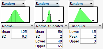
Random
gives the factor the specified distribution and distributional parameters.
See the Using JMP book for descriptions of most of these random functions. If the factor is categorical, then the distribution is characterized by probabilities specified for each category, with the values normalized to sum to 1.
Normal weighted is Normally distributed with the given mean and standard deviation, but a special stratified and weighted sampling system is used to simulate very rare events far out into the tails of the distribution. This is a good choice when you want to measure very low defect rates accurately. See Statistical Details.
Normal truncated is a normal distribution limited by lower and upper limits. Any random realization that exceeds these limits is discarded and the next variate within the limits is chosen. This is used to simulate an inspection system where inputs that do not satisfy specification limits are discarded or sent back.
Normal censored is a normal distribution limited by lower and upper limits. Any random realization that exceeds a limit is just set to that limit, putting a density mass on the limits. This is used to simulate a re-work system where inputs that do not satisfy specification limits are reworked until they are at that limit.
Sampled means that JMP picks values at random from that column in the data table.
External means that JMP pickes values at random from a column in another table. You are prompted to choose the table and column.
The Aligned checkbox is used for two or more Sampled or External sources. When checked, the random draws come from the same row of the table. This is useful for maintaining the correlation structure between two columns. If the Aligned option is used to associate two columns in different tables, the columns must have equal number of rows.
In the Profiler, a graphical specification shows the form of the density for the continuous distributions, and provides control points that can be dragged to change the distribution. The drag points for the Normal are the mean and the mean plus or minus one standard deviation. The Normal truncated and censored add points for the lower and upper limits. The Uniform and Triangular have limit control points, and the Triangular adds the mode.
Figure 24.43 Distributions
Expression
allows you to write your own expression in JMP Scripting Language (JSL) form into a field. This gives you flexibility to make up a new random distribution. For example, you could create a censored normal distribution that guaranteed non-negative values with an expression like Max(0,RandomNormal(5,2)). In addition, character results are supported, so If(Random Uniform() < 0.2, “M”, “F”) works fine. After entering the expression, click the Reset button to submit the expression.
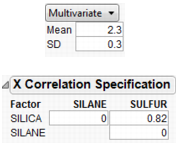
Multivariate
allows you to generate a multivariate normal for when you have correlated factors. Specify the mean and standard deviation with the factor, and a correlation matrix separately.
Figure 24.44 Using a Correlation Matrix
Specifying the Response
If the model is only partly a function of the factors, and the rest of the variation of the response is attributed to random noise, then you will want to specify this with the responses. The choices are:
No Noise
just evaluates the response from the model, with no additional random noise added.
Add Random Noise
obtains the response by adding a normal random number with the specified standard deviation to the evaluated model.
Add Random Weighted Noise
is distributed like Add Random Noise, but with weighted sampling to enable good extreme tail estimates.
Add Multivariate Noise
yields a response as follows: A multivariate random normal vector is obtained using a specified correlation structure, and it is scaled by the specified standard deviation and added to the value obtained by the model.
Run the Simulation
Specify the number of runs in the simulation by entering it in the N Runs box.
After factor and response distributions are set, click the Simulate button to run the simulation.
Or, use the Make Table button to generate a simulation and output the results to a data table.
The table contains N Runs rows, simulated factor values from the specified distributions, and the corresponding response values. If spec limits are given, the table also contains a column specifying whether a row is in or out of spec.
The Simulator Menu
Automatic Histogram Update
toggles histogram update, which sends changes to all histograms shown in the Profiler, so that histograms update with new simulated values when you drag distribution handles.
Defect Profiler
shows the defect rate as an isolated function of each factor. This command is enabled when spec limits are available, as described below.
Defect Parametric Profile
shows the defect rate as an isolated function of the parameters of each factor’s distribution. It is enabled when the Defect Profiler is launched.
Simulation Experiment
is used to run a designed simulation experiment on the locations of the factor distributions. A dialog appears, allowing you to specify the number of design points, the portion of the factor space to be used in the experiment, and which factors to include in the experiment. For factors not included in the experiment, the current value shown in the Profiler is the one used in the experiment.
The experimental design is a Latin Hypercube. The output has one row for each design point. The responses include the defect rate for each response with spec limits, and an overall defect rate. After the experiment, it would be appropriate to fit a Gaussian Process model on the overall defect rate, or a root or a logarithm of it.
A simulation experiment does not sample the factor levels from the specified distributions. As noted above, the design is a Latin Hypercube. At each design point, N Runs random draws are generated with the design point serving as the center of the random draws, and the shape and variability coming from the specified distributions.
Spec Limits
shows or edits specification limits.
N Strata
is a hidden option accessible by holding down the Shift key before clicking the Simulator popup menu. This option allows you to specify the number of strata in Normal Weighted. For more information also see Statistical Details.
Set Random Seed
is a hidden option accessible by holding down the Shift key before clicking the Simulator popup menu. This option allows you to specify a seed for the simulation starting point. This enables the simulation results to be reproducible, unless the seed is set to zero. The seed is set to zero by default. If the seed is non-zero, then the latest simulation results are output if the Make Table button is clicked.
Using Specification Limits
The profilers support specification limits on the responses, providing a number of features
• In the Profiler, if you don’t have the Response Limits property set up in the input data table to provide desirability coordinates, JMP looks for a Spec Limits property and constructs desirability functions appropriate to those Spec Limits.
• If you use the Simulator to output simulation tables, JMP copies Spec Limits to the output data tables, making accounting for defect rates and capability indices easy.
• Adding Spec Limits enables a feature called the Defect Profiler.
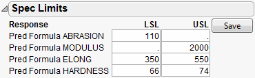
In the following example, we assume that the following Spec Limits have been specified.
|
Response
|
LSL
|
USL
|
|
Abrasion
|
110
|
|
|
Modulus
|
|
2000
|
|
Elong
|
350
|
550
|
|
Hardness
|
66
|
74
|
To set these limits in the data table, highlight a column and select Cols > Column Info. Then, click the Column Properties button and select the Spec Limits property.
If you are already in the Simulator in a profiler, another way to enter them is to use the Spec Limits command in the Simulator pop-up menu.
Figure 24.45 Spec Limits
After entering the spec limits, they are incorporated into the profilers. Click the Save button if you want the spec limits saved back to the data table as a column property.
With these specification limits, and the distributions shown in Figure 24.42, click the Simulate button. Notice the spec limit lines in the output histograms.
Figure 24.46 Spec Limits in the Prediction Profiler
Look at the histogram for Abrasion. The lower spec limit is far above the distribution, yet the Simulator is able to estimate a defect rate for it. This despite only having 5000 runs in the simulation. It can do this rare-event estimation when you use a Normal weighted distribution.
Note that the Overall defect rate is close to the defect rate for ELONG, indicating that most of the defects are in the ELONG variable.
To see this weighted simulation in action, click the Make Table button and examine the Weight column.
JMP generates extreme values for the later observations, using very small weights to compensate. Since the Distribution platform handles frequencies better than weights, there is also a column of frequencies, which is simply the weights multiplied by 1012.
The output data set contains a Distribution script appropriate to analyze the simulation data completely with a capability analysis.
Simulating General Formulas
Though the profiler and simulator are designed to work from formulas stored from a model fit, they work for any formula that can be stored in a column. A typical application of simulation is to exercise financial models under certain probability scenarios to obtain the distribution of the objectives. This can be done in JMP—the key is to store the formulas into columns, set up ranges, and then conduct the simulation.
|
Inputs
(Factors)
|
Unit Sales
|
random uniform between 1000 and 2000
|
|
Unit Price
|
fixed
|
|
|
Unit Cost
|
random normal with mean 2.25 and std dev 0.1
|
|
|
Outputs
(Responses)
|
Revenue
|
formula: Unit Sales*Unit Price
|
|
Total Cost
|
formula: Unit Sales*Unit Cost + 1200
|
|
|
Profit
|
formula: Revenue – Total Cost
|
The following JSL script creates the data table below with some initial scaling data and stores formulas into the output variables. It also launches the Profiler.
dt = newTable("Sales Model");
dt<<newColumn("Unit Sales",Values({1000,2000}));
dt<<newColumn("Unit Price",Values({2,4}));
dt<<newColumn("Unit Cost",Values({2,2.5}));
dt<<newColumn("Revenue",Formula(:Unit Sales*:Unit Price));
dt<<newColumn("Total Cost",Formula(:Unit Sales*:Unit Cost + 1200));
dt<<newColumn("Profit",Formula(:Revenue-:Total Cost), Set Property(“Spec Limits”,{LSL(0)}));
Profiler(Y(:Revenue,:Total Cost,:Profit), Objective Formula(Profit));
Figure 24.47 Data Table Created from Script
Once they are created, select the Simulator from the Prediction Profiler. Use the specifications from Factors and Responses for a Financial Simulation to fill in the Simulator.
Figure 24.48 Profiler Using the Data Table
Now, run the simulation which produces the following histograms in the Profiler.
Figure 24.49 Simulator
It looks like we are not very likely to be profitable. By putting a lower specification limit of zero on Profit, the defect report would say that the probability of being unprofitable is 62%.
So we raise the Unit Price to $3.25 and rerun the simulation. Now the probability of being unprofitable is down to about 21%.
Figure 24.50 Results
If unit price can’t be raised anymore, you should now investigate lowering your cost, or increasing sales, if you want to further decrease the probability of being unprofitable.
The Defect Profiler
The defect profiler shows the probability of an out-of-spec output defect as a function of each factor, while the other factors vary randomly. This is used to help visualize which factor’s distributional changes the process is most sensitive to, in the quest to improve quality and decrease cost.
Specification limits define what is a defect, and random factors provide the variation to produce defects in the simulation. Both need to be present for a Defect Profile to be meaningful.
At least one of the Factors must be declared Random for a defect simulation to be meaningful, otherwise the simulation outputs would be constant. These are specified though the simulator Factor specifications.
Important: If you need to estimate very small defect rates, use Normal weighted instead of just Normal. This allows defect rates of just a few parts per million to be estimated well with only a few thousand simulation runs.
About Tolerance Design
Tolerance Design is the investigation of how defect rates on the outputs can be controlled by controlling variability in the input factors.
The input factors have variation. Specification limits are used to tell the supplier of the input what range of values are acceptable. These input factors then go into a process producing outputs, and the customer of the outputs then judges if these outputs are within an acceptable range.
Sometimes, a Tolerance Design study shows that spec limits on input are unnecessarily tight, and loosening these limits results in cheaper product without a meaningful sacrifice in quality. In these cases, Tolerance Design can save money.
In other cases, a Tolerance Design study may find that either tighter limits or different targets result in higher quality. In all cases, it is valuable to learn which inputs the defect rate in the outputs are most sensitive to.
This graph shows the defect rate as a function of each factor as if it were a constant, but all the other factors varied according to their random specification. If there are multiple outputs with Spec Limits, then there is a defect rate curve color-coded for each output. A black curve shows the overall defect rate—this curve is above all the colored curves.
Figure 24.51 Defect Profiler
Graph Scale
Defect rates are shown on a cubic root scale, so that small defect rates are shown in some detail even though large defect rates may be visible. A log scale is not used because zero rates are not uncommon and need to be shown.
Expected Defects
Reported below each defect profile plot is the mean and standard deviation (SD). The mean is the overall defect rate, calculated by integrating the defect profile curve with the specified factor distribution.
In this case, the defect rate that is reported below all the factors is estimating the same quantity, the rate estimated for the overall simulation below the histograms (i.e. if you clicked the Simulate button). Since each estimate of the rate is obtained in a different way, they may be a little different. If they are very different, you may need to use more simulation runs. In addition, check that the range of the factor scale is wide enough so the integration covers the distribution well.
The standard deviation is a good measure of the sensitivity of the defect rates to the factor. It is quite small if either the factor profile were flat, or the factor distribution has a very small variance. Comparing SD's across factors is a good way to know which factor should get more attention to reducing variation.
The mean and SD are updated when you change the factor distribution. This is one way to explore how to reduce defects as a function of one particular factor at a time. You can click and drag a handle point on the factor distribution, and watch the mean and SD change as you drag. However, changes are not updated across all factors until you click the Rerun button to do another set of simulation runs.
Simulation Method and Details
Assume we want a defect profile for factor X1, in the presence of random variation in X2 and X3. A series of n=N Runs simulation runs is done at each of k points in a grid of equally spaced values of X1. (k is generally set at 17). At each grid point, suppose that there are m defects due to the specification limits. At that grid point, the defect rate is m/n. With normal weighted, these are done in a weighted fashion. These defect rates are connected and plotted as a continuous function of X1.
Notes
Recalculation
The profile curve is not recalculated automatically when distributions change, though the expected value is. It is done this way because the simulations could take a while to run.
Limited goals
Profiling does not address the general optimization problem, that of optimizing quality against cost, given functions that represent all aspects of the problem. This more general problem would benefit from a surrogate model and space filling design to explore this space and optimize to it.
Jagged Defect Profiles
The defect profiles tend to get uneven when they are low. This is due to exaggerating the differences for low values of the cubic scale. If the overall defect curve (black line) is smooth, and the defect rates are somewhat consistent, then you are probably taking enough runs. If the Black line is jagged and not very low, then increase the number of runs. 20,000 runs is often enough to stabilize the curves.
Defect Profiler Example
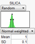
To show a common workflow with the Defect profiler, we use Tiretread.jmp with the specification limits from Table 24.3. We also give the following random specifications to the three factors.
Figure 24.52 Profiler
Select Defect Profiler to see the defect profiles. The curves, Means, and SDs will change from simulation to simulation, but will be relatively consistent.
Figure 24.53 Defect Profiler
The black curve on each factor shows the defect rate if you could fix that factor at the x-axis value, but leave the other features random.
Look at the curve for SILICA. As its values vary, its defect rate goes from the lowest 0.001 at SILICA=0.95, quickly up to a defect rate of 1 at SILICA=0.4 or 1.8. However, SILICA is itself random. If you imagine integrating the density curve of SILICA with its defect profile curve, you could estimate the average defect rate 0.033, also shown as the Mean for SILICA. This is estimating the overall defect rate shown under the simulation histograms, but by numerically integrating, rather than by the overall simulation. The Means for the other factors are similar. The numbers are not exactly the same. However, we now also get an estimate of the standard deviation of the defect rate with respect to the variation in SILICA. This value (labeled SD) is 0.055. The standard deviation is intimately related to the sensitivity of the defect rate with respect to the distribution of that factor.
Looking at the SDs across the three factors, we see that the SD for SULFUR is higher than the SD for SILICA, which is in turn much higher than the SD for SILANE. This means that to improve the defect rate, improving the distribution in SULFUR should have the greatest effect. A distribution can be improved in three ways: changing its mean, changing its standard deviation, or by chopping off the distribution by rejecting parts that don’t meet certain specification limits.
In order to visualize all these changes, there is another command in the Simulator pop-up menu, Defect Parametric Profile, which shows how single changes in the factor distribution parameters affect the defect rate.
Figure 24.54 Defect Parametric Profile
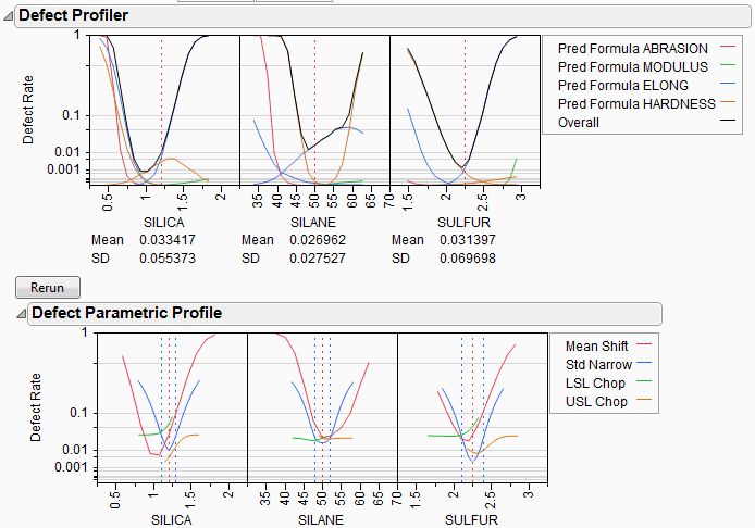
Let’s look closely at the SULFUR situation. You may need to enlarge the graph to see more detail.
First, note that the current defect rate (0.03) is represented in four ways corresponding to each of the four curves.
For the red curve, Mean Shift, the current rate is where the red solid line intersects the vertical red dotted line. The Mean Shift curve represents the change in overall defect rate by changing the mean of SULFUR. One opportunity to reduce the defect rate is to shift the mean slightly to the left. If you use the crosshair tool on this plot, you see that a mean shift reduces the defect rate to about 0.02.
For the blue curve, Std Narrow, the current rate represents where the solid blue line intersects the two dotted blue lines. The Std Narrow curves represent the change in defect rate by changing the standard deviation of the factor. The dotted blue lines represent one standard deviation below and above the current mean. The solid blue lines are drawn symmetrically around the center. At the center, the blue line typically reaches a minimum, representing the defect rate for a standard deviation of zero. That is, if we totally eliminate variation in SULFUR, the defect rate is still around 0.003. This is much better than 0.03. If you look at the other Defect parametric profile curves, you can see that this is better than reducing variation in the other factors, something we suspected by the SD value for SULFUR.
For the green curve, LSL Chop, there are no interesting opportunities in this example, because the green curve is above current defect rates for the whole curve. This means that reducing the variation by rejecting parts with too-small values for SULFUR will not help.
For the orange curve, USL Chop, there are good opportunities. Reading the curve from the right, the curve starts out at the current defect rate (0.03), then as you start rejecting more parts by decreasing the USL for SULFUR, the defect rate improves. However, moving a spec limit to the center is equivalent to throwing away half the parts, which may not be a practical solution.
Looking at all the opportunities over all the factors, it now looks like there are two good options for a first move: change the mean of SILICA to about 1, or reduce the variation in SULFUR. Since it is generally easier in practice to change a process mean than process variation, the best first move is to change the mean of SILICA to 1.
Figure 24.55 Adjusting the Mean of Silica
After changing the mean of SILICA, all the defect curves become invalid and need to be rerun. After clicking Rerun, we get a new perspective on defect rates.
Figure 24.56 Adjusted Defect Rates
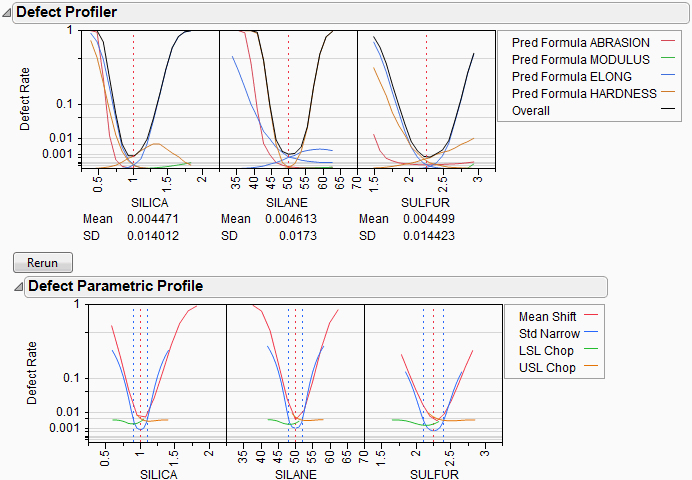
Now, the defect rate is down to about 0.004, much improved. Further reduction in the defect rate can occur by continued investigation of the parametric profiles, making changes to the distributions, and rerunning the simulations.
As the defect rate is decreased further, the mean defect rates across the factors become relatively less reliable. The accuracy could be improved by reducing the ranges of the factors in the Profiler a little so that it integrates the distributions better.
This level of fine-tuning is probably not practical, because the experiment that estimated the response surface is probably not at this high level of accuracy. Once the ranges have been refined, you may need to conduct another experiment focusing on the area that you know is closer to the optimum.
Stochastic Optimization Example
This example is adapted from Box and Draper (1987) and uses Stochastic Optimization.jmp. A chemical reaction converts chemical “A” into chemical “B”. The resulting amount of chemical “B” is a function of reaction time and reaction temperature. A longer time and hotter temperature result in a greater amount of “B”. But, a longer time and hotter temperature also result in some of chemical “B” getting converted to a third chemical “C”. What reaction time and reaction temperature will maximize the resulting amount of “B” and minimize the amount of “A” and “C”? Should the reaction be fast and hot, or slow and cool?
Figure 24.57 Chemical Reaction
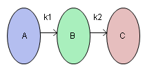
The goal is to maximize the resulting amount of chemical “B”. One approach is to conduct an experiment and fit a response surface model for reaction yield (amount of chemical “B”) as a function of time and temperature. But, due to well known chemical reaction models, based on the Arrhenius laws, the reaction yield can be directly computed. The column Yield contains the formula for yield. The formula is a function of Time (hours) and reaction rates k1 and k2. The reaction rates are a function of reaction Temperature (degrees Kelvin) and known physical constants θ1, θ2, θ3, θ4. Therefore, Yield is a function of Time and Temperature.
Figure 24.58 Formula for Yield
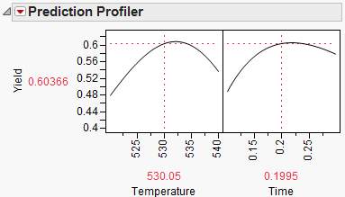
You can use the Profiler to find the maximum Yield. Open Stochastic Optimization.jmp and run the attached script called Profiler. Profiles of the response are generated as follows.
Figure 24.59 Profile of Yield
To maximize Yield use a desirability function. See Desirability Profiling and Optimization. One possible desirability function was incorporated in the script. To view the function choose Desirability Functions from the Prediction Profiler pop-up menu.
Figure 24.60 Prediction Profiler
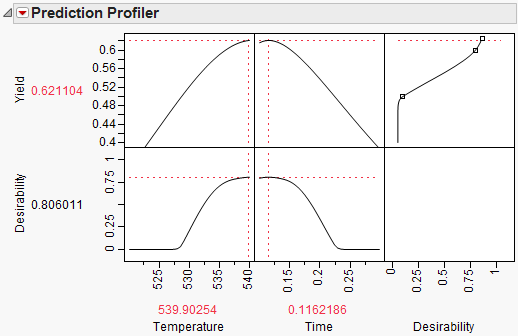
To maximize Yield, select Maximize Desirability from the Prediction Profiler pop-up menu. The Profiler then maximizes Yield and sets the graphs to the optimum value of Time and Temperature.
Figure 24.61 Yield Maximum
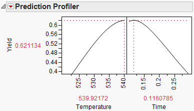
The maximum Yield is approximately 0.62 at a Time of 0.116 hours and Temperature of 539.92 degrees Kelvin, or hot and fast. [Your results may differ slightly due to random starting values in the optimization process. Optimization settings can be modified (made more stringent) by selecting Maximization Options from the Prediction Profiler pop-up menu. Decreasing the Covergence Tolerance will enable the solution to be reproducible.]
In a production environment, process inputs can’t always be controlled exactly. What happens to Yield if the inputs (Time and Temperature) have random variation? Furthermore, if Yield has a spec limit, what percent of batches will be out of spec and need to be discarded? The Simulator can help us investigate the variation and defect rate for Yield, given variation in Time and Temperature.
Select Simulator from the Prediction Profiler pop-up menu. As shown in Figure 24.62, fill in the factor parameters so that Temperature is Normal weighted with standard deviation of 1, and Time is Normal weighted with standard deviation of 0.03. The Mean parameters default to the current factor values. Change the number of runs to 15,000. Yield has a lower spec limit of 0.55, set as a column property, and shows on the chart as a red line. If it doesn’t show by default, enter it by selecting Spec Limits on the Simulator pop-up menu.
Figure 24.62 Initial Simulator Settings
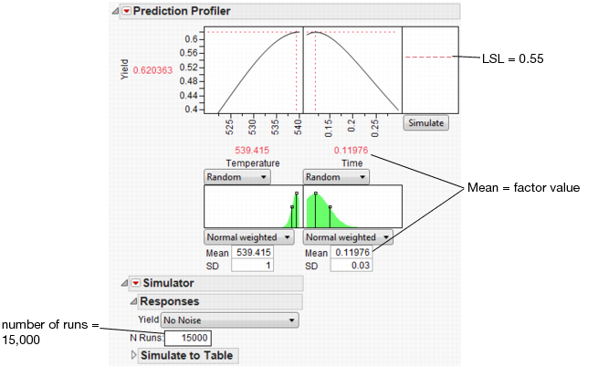
With the random variation set for the input factors, you are ready to run a simulation to study the resulting variation and defect rate for Yield. Click the Simulate button.
Figure 24.63 Simulation Results
The predicted Yield is 0.62, but if the factors have the given variation, the average Yield is 0.60 with a standard deviation of 0.03.
The defect rate is about 5.5%, meaning that about 5.5% of batches are discarded. A defect rate this high is not acceptable.
What is the defect rate for other settings of Temperature and Time? Suppose you change the Temperature to 535, then set Time to the value that maximizes Yield? Enter settings as shown in Figure 24.64 then click Simulate.
Figure 24.64 Defect Rate for Temperature of 535
The defect rate decreases to about 1.8%, which is much better than 5.5%. So, what you see is that the fixed (no variability) settings that maximize Yield are not the same settings that minimize the defect rate in the presence of factor variation.
By running a Simulation Experiment you can find the settings of Temperature and Time that minimize the defect rate. To do this you simulate the defect rate at each point of a Temperature and Time design, then fit a predictive model for the defect rate and minimize it.
Before running the Simulation Experiment, save the factor settings that maximize Yield so you can reference them later. To do this, re-enter the factor settings (Mean and SD) from Figure 24.62 and select Factor Settings > Remember Settings from Prediction Profiler pop-up menu. A dialog prompts you to name the settings then click OK. The settings are appended to the report window.
Figure 24.65 Remembered Settings

Select Simulation Experiment from the Simulator pop-up menu. Enter 80 runs, and 1 to use the whole factor space in the experiment. A Latin Hypercube design with 80 design points is chosen within the specified factor space, and N Runs random draws are taken at each of the design points. The design point are the center of the random draws, and the shape and variance of the random draws coming from the factor distributions.
A table is created with the results of the experiment. The Overall Defect Rate is given at each design point. You can now fit a model that predicts the defect rate as a function of Temperature and Time. To do this, run the attached Guassian Process script and wait for the results. The results are shown below. Your results will be slightly different due to the random draws in the simulation.
Figure 24.66 Results of Gaussian Process Model Fit
The Gaussian Process platform automatically starts the Prediction Profiler. The desirability function is already set up to minimize the defect rate. To find the settings of Temperature and Time that minimizes the defect rate, select Maximize Desirability from the Prediction Profiler pop-up menu.
Figure 24.67 Settings for Minimum Defect Rate
The settings that minimize the defect rate are approximately Temperature = 527 and Time = 0.27. Select Factor Settings > Copy Settings Script from the Prediction Profiler pop-up menu. Return to the original Profiler report window and select Factor Settings > Paste Settings Script. This sets Temperature and Time to those settings that minimize the defect rate. Use Remember Settings as before to save these new settings.
Figure 24.68 Minimum Defect Settings
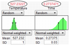
With the new settings in place, click the Simulate button to estimate the defect rate at the new settings.
Figure 24.69 Lower Defect Rate
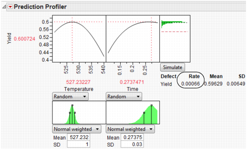
At the new settings the defect rate is 0.066%, much better than the 5.5% for the settings that maximize Yield. That is a reduction of about 100x. Recall the average Yield from the first settings is 0.60 and the new average is 0.59. The decrease in average Yield of 0.01 is very acceptable when the defect rate decreases by 100x.
Because we saved the settings using Remember Settings, we can easily compare the old and new settings. The Differences report summarizes the difference. Click the Remembered Settings radio buttons to view the profiler for each setting.
Figure 24.70 Settings Comparison
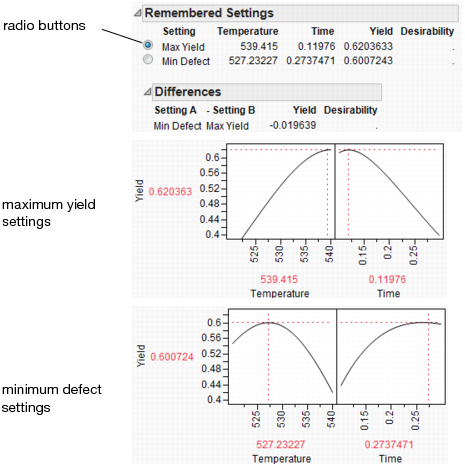
The chemist now knows what settings to use for a quality process. If the factors have no variation, the settings for maximum Yield are hot and fast. But, if the process inputs have variation similar to what we’ve simulated, the settings for maximum Yield produce a high defect rate. Therefore, to minimize the defect rate in the presence of factor variation, the settings should be cool and slow.
Noise Factors (Robust Engineering)
Robust process engineering enables you to produce acceptable products reliably, despite variation in the process variables. Even when your experiment has controllable factors, there is a certain amount of uncontrollable variation in the factors that affects the response. This is called transmitted variation. Factors with this variation are called noise factors. Some factors you can’t control at all, like environmental noise factors. Some factors can have their mean controlled, but not their standard deviation. This is often the case for intermediate factors that are output from a different process or manufacturing step.
A good approach to making the process robust is to match the target at the flattest place of the noise response surface so that the noise has little influence on the process. Mathematically, this is the value where the first derivatives of each response with respect to each noise factor are zero. JMP, of course, computes the derivatives for you.
To analyze a model with noise factors,
• Fit the appropriate model (using, for example, the Fit Model platform).
• Save the model to the data table with the Save > Prediction Formula command.
• Launch the Profiler (from the Graph menu).
• Assign the prediction formula to the Y, Prediction Formula role and the noise factors to the Noise Factor role.
• Click OK.
The resulting profiler shows response functions and their appropriate derivatives with respect to the noise factors, with the derivatives set to have maximum desirability at zero.
• Select Maximize Desirability from the Profiler menu.
This finds the best settings of the factors, balanced with respect to minimizing transmitted variation from the noise factors.
Example
As an example, use the Tiretread.jmp sample data set. This data set shows the results of a tire manufacturer’s experiment whose objective is to match a target value of HARDNESS= 70 based on three factors: SILICA, SILANE, and SULFUR content. Suppose the SILANE and SULFUR content are easily (and precisely) controllable, but SILICA expresses variability that is worth considering.
For comparison, first optimize the factors for hardness without considering variation from the noise factor.
• Select Graph > Profiler to launch the Profiler.
• Assign Pred Formula HARDNESS to the Y, Prediction Formula role. Click OK.
• Select Desirability Functions in the Prediction Profiler menu.
• Double-click in the Desirability plot to open the Response Goal window. Change the pull-down menu to Match Target.
• Select Maximize Desirability to find the optimum factor settings for our target value of HARDNESS.
We get the following Profiler display. Notice that the SILICA factor’s optimum value is on a sloped part of a profile curve. This means that variations in SILICA are transmitted to become variations in the response, HARDNESS.
Note: You may get different results from these because different combinations of factor values can all hit the target.
Figure 24.71 Maximizing Desirability for HARDNESS
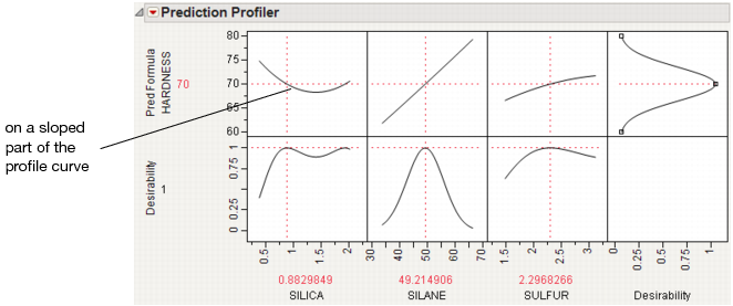
Now, we would like to not just optimize for a specific target value of HARDNESS, but also be on a flat part of the curve with respect to Silica. So, repeat the process and add SILICA as a noise factor.
1. Select Graph > Profiler.
2. Select Pred Formula HARDNESS and click Y, Prediction Formula.
3. Select SILICA and click Noise Factors.
4. Click OK.
5. Change the Pred Formula Hardness desirability function as before.
The resulting profiler has the appropriate derivative of the fitted model with respect to the noise factor, set to be maximized at zero, its flattest point.
Figure 24.72 Derivative of the Prediction Formula with Respect to Silica
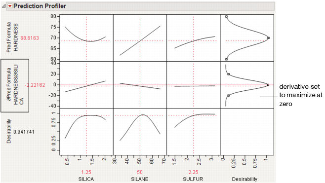
6. Select Maximize Desirability to find the optimum values for the process factor, balancing for the noise factor.
This time, we have also hit the targeted value of HARDNESS, but our value of SILICA is on its flatter region. This means variation in SILICA will not transmit as much variation to HARDNESS.
Figure 24.73 Maximize Desirability
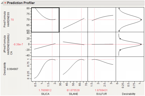
You can easily see the effect this has on the variance of the predictions by following these steps for each profiler (one without the noise factor, and one with the noise factor):
1. Select Simulator from the platform menu.
2. Assign SILICA to have a random Normal distribution with a standard deviation of 0.05.
Figure 24.74 Setting a Random Normal Distribution
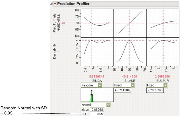
3. Click Simulate.
4. Click the Make Table button under the Simulate to Table node.
Doing these steps for both the original and noise-factor-optimal simulations results in two similar data tables, each holding a simulation. In order to make two comparable histograms of the predictions, we need the two prediction columns in a single data table.
5. Copy the Pred Formula HARDNESS column from one of the simulation tables into the other table. They must have different names, like Without Noise Factor and With Noise Factor.
6. Select Analyze > Distribution and assign both prediction columns as Y.
7. When the histograms appear, select Uniform Scaling from the Distribution main title bar.
Figure 24.75 Comparison of Distributions With and Without Noise Factors
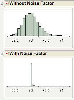
The histograms show that there is much more variation in Hardness when the noise factor was not included in the analysis.
It is also interesting to note the shape of the histogram when the noise factor was included. In the comparison histograms above, note that the With Noise Factor distribution only has data trailing off in one direction. The predictions are skewed because Hardness is at a minimum with respect to SILICA, as shown in Figure 24.76. Therefore, variation in SILICA can only make HARDNESS increase. When the non-robust solution is used, the variation could be transmitted either way.
Figure 24.76 Profiler Showing the Minima of HARDNESS by SILICA
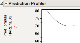
Other Platforms
Noise factor optimization is also available in the Contour Profiler, Custom Profiler, and Mixture Profiler.
Profiling Models Stored in Excel
The JMP Add-In for Excel uses the JMP Profiler to visualize models (or formulas) stored in Excel worksheets. The Excel add-in is automatically installed when you install JMP. Profiling in the Excel Add-In is a two-step process:
1. Click the Create/Edit Model button (Excel 2007 and 2010) or the Profiler Configuration button (Excel 2003) to enter information about the model that JMP needs. This needs to be done only once per model. For more information, refer to the help in the Create/Edit Model window.
2. Click the Run Model button (Excel 2007 and 2010) or the Run Profiler button (Excel 2003) to launch the JMP Profiler and run the Excel model. For more information, see Running the JMP Profiler.
Note: The Preferences, Data Table, Graph Builder, and Distribution buttons are not needed to profile an Excel model. For more information about these features, see Using JMP.
Running the JMP Profiler
Once you create the model using the Excel Add-In, you can run it in the JMP Profiler. From the Excel Add-In, perform the following actions:
1. Click the Run Model button (Excel 2007 and 2010) or the Run Profiler button (Excel 2003).
2. Select the model that you want to run.
3. Click Profile in JMP.
Note: To ensure that your original Excel spreadsheet is not altered, JMP runs a hidden copy of Excel in the background that controls all of the Profiler calculations.
Example of an Excel Model
An Excel model is one or more Excel formulas. Each formula must be a function of one or more other cells. This example uses the Demand.xls file, located within the Import Data folder (normally found at C:Program FilesSASJMP10SamplesData).
Figure 24.77 Demand Model in Excel
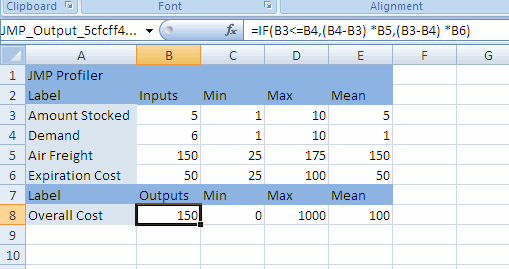
The formula is in cell B8, and is a calculation of the Overall Cost associated with having different amounts of product in stock. The formula can be seen in the Formula Bar, and is a function of four cells:
• Amount Stocked is the amount of product in stock.
• Demand is the customer demand for the product.
• Air Freight is the cost per unit to ship additional product by air when the demand exceeds the amount in stock.
• Expiration Cost is the cost per unit of disposing of unused product when the demand is less than the amount in stock.
The calculations of the formula are as follows:
• If Amount Stocked is less than Demand, then the company has to ship additional units, at a cost of (Demand-Amount Stocked) x Air Freight. For example, if the demand is 8, but the company has only 6 in stock, then it has to ship 8-6=2 units at a cost of 2x150=300.
• If Amount Stocked is greater than Demand, then the company has to dispose of unused product, at a cost of (Amount Stocked-Demand) x Expiration Cost. For example, if the demand is 5, but the company has 8 in stock, then it has to dispose of 8-5=3 units at a cost of 3x50=150.
• If Amount Stocked is equal to Demand, then there is no shipping cost or disposal cost.
• There is never both a shipping cost and a disposal cost at the same time.
Using the model in Excel, you can get the cost for only a given set of inputs at once. It is difficult to visualize how changing the value of one input affects the output. You can choose a different combination of the inputs to see how the cost is affected, but doing so for many combinations can take a long time.
Use the JMP Profiler to simultaneously see the effect of all inputs on the output. Also, you can quickly simulate a range of input combinations to see the resulting range of output values.
Figure 24.78 Example of the Profiler Using Excel Models
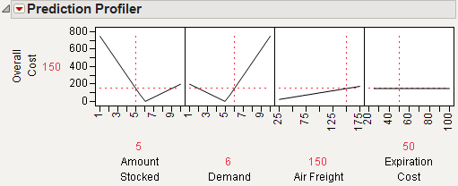
Using Linear Constraints
Within the JMP Profiler, you can alter the linear constraints in order to restrict the model input values. You are prompted to save the constraints to the Excel workbook. After constraints are saved to the Excel workbook, whenever the model is profiled from the Excel Add-In, the constraints are incorporated.
1. From the red triangle menu next to Prediction Profiler, select Alter Linear Constraints.
2. Click Add Constraint.
3. Type in the constraining values.
4. Click OK.
5. From the red triangle menu next to Prediction Profiler, select Save Linear Constraints.
You are prompted to save the constraints to the Excel workbook.
6. Click Yes.
Note: When you save the .xls file in Excel 2007, you might see a compatibility error. If so, click Continue to save the file.
The workbook opens in Excel. When you run the model, the constraints are reflected in the JMP Profiler. For more information about linear constraints, see Linear Constraints.
Tip: To delete a linear constraint, set all constraint values to zero.
Resolution of Profile Lines
The Default N Levels option on the red triangle menu next to Prediction Profiler affects the resolution of the profile lines. Note the following information:
• This option defaults to 17 when the Profiler runs a model stored in Excel.
• This option defaults to 41 when the model is stored directly in JMP.
If the same model is stored in both Excel and JMP, then the profile lines can appear differently when the models are profiled. Increasing this value causes the Excel Profiler to run slower.
Using the Excel Profiler From JMP
Once an Excel file has the model inputs and outputs defined, you can profile the model from within JMP.
1. Select Graph > Excel Profiler.
2. Locate the Excel file containing the model and then click Open.
3. If the Excel file contains multiple models, you are prompted to select the model that you want to profile.
Note that the Excel Profiler is also scriptable, as follows:
Excel Profiler( "path to workbook", <"model name"> ) ;
If more than one model exists, and no model is specified, a window with the list of available models appears. For more information about scripting the Excel Profiler, see the Scripting Guide.
Fit Group
For the REML and Stepwise personalities of the Fit Model platform, if models are fit to multiple Y’s, the results are combined into a Fit Group report. This enables the different Y’s to be profiled in the same Profiler. The Fit Group red-triangle menu has options for launching the joint Profiler. Profilers for the individual Y’s can still be used in the respective Fit Model reports.
Fit Group reports are also created when a By variable is specified for a Stepwise analysis. This allows for the separate models to be profiled in the same Profiler.
The Fit Group scripting command can be used to fit models in different platforms, and have the individual models profiled in the Profiler. For more details, see the Scripting Guide.
Statistical Details
Normal Weighted Distribution
JMP uses the multivariate radial strata method for each factor that uses the Normal Weighted distribution. This seems to work better than a number of Importance Sampling methods, as a multivariate Normal Integrator accurate in the extreme tails.
First, define strata and calculate corresponding probabilities and weights. For d random factors, the strata are radial intervals as follows.
|
Strata Number
|
Inside Distance
|
Outside Distance
|
|
0
|
0
|
|
|
1
|
|
|
|
2
|
|
|
|
i
|
|
|
|
NStrata – 1
|
previous
|
|
The default number of strata is 12. To change the number of strata, a hidden command N Strata is available if you hold the Shift key down while clicking on the red triangle next to Simulator.
Figure 24.79 Showing the N Strata Menu Option
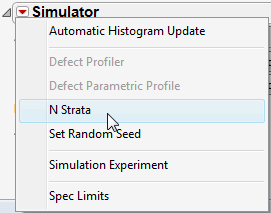
Increase the sample size as needed to maintain an even number of strata.
For each simulation run,
1. Select a strata as mod(i – 1, NStrata) for run i.
2. Determine a random n-dimensional direction by scaling multivariate Normal (0,1) deviates to unit norm.
3. Determine a random distance using a chi-square quantile appropriate for the strata of a random uniform argument.
4. Scale the variates so the norm is the random distance.
5. Scale and re-center the variates individually to be as specified for each factor.
The resulting factor distributions are multivariate normal with the appropriate means and standard deviations when estimated with the right weights. Note that you cannot use the Distribution standard deviation with weights, because it does not estimate the desired value. However, multiplying the weight by a large value, like 1012, and using that as a Freq value results in the correct standard deviation.
..................Content has been hidden....................
You can't read the all page of ebook, please click here login for view all page.