WFMA Data Collection
and Analysis
Introduction
This chapter discusses application of WFMA to the measurement of workflow properties after the completion and validation of a workflow map, and is the second of two “nuts and bolts” chapters on WFMA. Obviously, the most common measures of interest are process characteristics like cost, time consumption, error rates and locations, and similar things, usually with the objective of performance improvement. The general approach to data collection and the use of business metrics in this chapter will be familiar to those who have previous exposure to approaches such as DMAIC (define, measure, analyze, improve, control), including Six Sigma programs and other quality and performance-improvement procedures.1 While these methods all have advocates and critics, nearly all of them agree on the use of metrics, measurement, and analysis of data to select improvement targets and determine results, and as we will see, that approach is often fundamental to what we do with the results of workflow mapping.
There are two broad issues that emerge in the application of workflow maps for analysis and change. The first is the environment in which WFMA is done, which considers the procedure for WFMA projects and some of the issues involved in using a workflow map as a data-collection tool. The collection of data from a workflow map may serve various objectives, one of which is often some type of quantitative analysis as a precursor to process change, and is our first concern here. The second issue is how to analyze and interpret data provided by measurement on the workflow map. Since most of the data analysis methods used in WFMA are well-known and easily supported by spreadsheet functions, and also because simple analytical procedures are best, actual analysis will be given very brief coverage—the greater part of this chapter will discuss the questions involved in collecting data from a workflow map and using that to experiment and collect data for potential changes and improvements.
This chapter will proceed incrementally, by first looking at business metrics in more detail, and then extending this information into a three-phase approach to process improvement.
Business Metrics and Process Workflows
Woven throughout this chapter will be the subject of business metrics. Business metrics are, of course, the measures companies and organizations use to evaluate their operations. We are all familiar with fundamental measures such as financial accounts and ratios, scrap rates, recruiting yields, and so on, and these are valuable for many purposes. As useful as these are, they alone may not always be the most appropriate measures for the evaluation of processes, and here we may want to be more expansive.
Most of the WFMA examples we have considered up to this point have been concerned with operations of one kind or another, implying that “bottom-line” performance is the only kind we need to evaluate. However, as Peter Drucker pointed out years ago,2 there are at least eight different kinds of performance standards companies should judge themselves against: profitability, of course, but also market standing; innovation; productivity; use of physical and financial resources; managerial performance and development; employee performance and attitudes; and public responsibility. His fundamentally sound ideas have been “rediscovered” many times over the years. In a few words, Drucker is saying that companies have to pay attention to a balance of both effectiveness and efficiency.
Of these two major performance indices, efficiency is the easier one to evaluate. Time and cost, the two universal measures that any organization can apply, are primarily concerned with efficiency, as are many other input-to-output measures. Efficiency is necessary for effectiveness, but it is not both necessary and sufficient—to be effective, a company has to perform well on nearly all of the eight criteria Drucker outlined, and this is a long-term process that requires managers to have a vision that extends beyond quarterly “bang for the buck.” Moreover, a company has to establish the right criteria for its purposes, since not all are equally important to every firm.
Two recent large-scale studies illustrate this claim. Both of these were done by consultancies (who excluded client companies from their samples) working with academics to investigate the contribution of management to company performance. In the first one, Joyce et al.3 selected a sample of 160 companies in 40 industries and used extensive public-document archival data to identify the management practices that explained differences in performance among these over the previous 10 years; these practices were extracted from a set of over 200 suggested by a reported survey of management academics. Of these, four mandatory practices were found to be necessary to the success of these firms: clear and focused strategy; flawless operational execution; a performance-oriented culture; and a fast, flexible, flat structure. Two factors from a second group of four also had to be present: keeping high talent; committed leadership; industry-transforming innovation; or growth through mergers and partnerships. Which two of these second four were selected depended on the individual firms. Firms that were successful in the mandatory management practices and two of the secondary ones in effect had an 80% chance of being the best performers over the decade of performance studied. As Joyce et al. point out, however, keeping six balls in the air for that long is no easy feat.
In a McKinsey and Co. study of 700 manufacturers in the United States, the United Kingdom, France, and Germany, Dowdy4 and his colleagues at London Business School concluded that there is a strong relationship between management practices and the return on capital employed (ROCE). They examined three areas of management practice: (1) shop floor operations, particularly the extent to which the companies had adopted “lean management” methods; (2) target setting and performance management, that is, whether companies set and track the right performance measures and take action to correct processes when necessary; and (3) talent management, whether the firms are attracting, hiring, developing, and retaining the right people. Companies were rated on 1-to-5 scale on 18 items to measure these practices, and scores were accumulated from these ratings for the three areas of practice. The bottom line on this study was the title used by McKinsey: “Management Matters.” In all four countries, the quality of management practices was directly and strongly related to bottom-line performance and to the factors that drove that performance. Not only did better-managed companies perform better, they also showed evidence that job satisfaction and general “quality of life” measures were higher for the best performers.
In both of these studies, business metrics that both “measured the right things and measured things right” were fundamental to the success of the best-performing firms. None of the best-performing firms were able to achieve that status by only paying attention to one thing. At the same time, both studies show that there is considerable room for companies to find their own ways to succeed so long as they track appropriate performance indices.
Nonfinancial measures and factors which require indirect or approximation measures were also used in these and other studies of firm performance. Many of the things that are important to long-term firm success, such as customer satisfaction, do not lend themselves either to simple or easy measurement or to direct translation into financial impact. Nevertheless, they are often among the most important factors that affect long-term company health and success, and measures of these are as important to include in business metrics, as are financial ratios. After many years of study of job satisfaction and its relationship to job performance, academic management researchers have come to the conclusion that the two appear to be related, although often moderated by other variables. Job satisfaction is never easy to measure, but it matters.
It is also important to realize that the relationship between many of the metrics we might use is not direct, and that the time between a measured change and an observed effect varies tremendously between factors. Likert5 proposed a very useful model of the time lag between factors contributing to performance and intermediate factors that moderate the relationship. Recognition of the fact that the time lag between many of these variables is a matter of three to five years is an important aspect of the use and interpretation of business metrics in many companies today—it is simply unrealistic to expect change in many situations. For a hospital emergency room to respond to changes in one case required nearly 2½ years.6 Quality is also one of the outcomes for which this kind of lagged relationship is evident.7
Many processes have properties similar to “projects” as we use that term in the context of project management. Milestone measures, used to monitor significant progress and intermediate outcomes in projects, are also an important business metric, even though in many cases they are not “measured” as such—we either hit the intermediate target or we miss. But as indicators of progress and potential problems, these milestones are often of major importance, and should always be used where possible. Performance targets of all kinds are among the most important metrics.
The General WFMA Approach to Data Collection and Analysis
The majority of the discussion that follows assumes that we are working with validated workflow maps, and using these as analytical tools to measure the properties of the workflow. WFMA is therefore usually associated with business metrics at one level or another, meaning that WFMA might be used to assess how well a jobholder is performing on a metric (how long does it take for a customer service call to be handled?), or it might be used to create new data that allow that goal to be assessed. No matter which end of the “analysis” part of WFMA a user starts with, there is typically a rather predictable sequence of steps that must be done. These can be grouped into three phases, as follows. In each of these, we will progressively introduce methods that can be used to analyze and interpret the data our metrics provide.
Phase I. Develop a Valid Baseline of Current Operations
This phase revolves around four basic steps that enable data collection, with the preparation of the workflow maps as discussed in chapter 3 as a critical step. For organizations doing WFMA for the first time, it is important that each step be done and that each be given enough time to be properly completed. How much time that is needs to be answered on a case-by-case basis—for a company under financial pressure, employees may be threatened by the expectation of layoffs, or they may be motivated by the need to regain financial health as quickly as possible. The only thing that can be predicted with accuracy is that a rush through the process will waste a lot of time and accomplish very little.
1. Develop an objective-based approach to WFMA. Do you want to analyze the entire business or begin with a few key processes and then expand? Is the purpose to start a process improvement project, to develop a training document for a job or process, to analyze the effectiveness of alternative approaches to a process, or a myriad of other possibilities?
Many aspects of what you do in the design of the analysis will depend on the objective. For example, if a plant manager is trying to cut down error rates on the part of new trainees in a particular job, the objective of a WFMA project may be to understand how the newcomers do the job and how mistakes happen. This might support development of a better method of training than now used. In another case, the objective might be to determine how the fastest operators in a variable process do what they do, as opposed to others who get the job done correctly, but more slowly. A third example might be to map the documentation of a part of a manager’s job so that others can do it while the manager is on travel. In all three cases, who is selected to be the “subjects” of the project, what kind of map is desired, and what the application of the analysis will be, are determined by the objective of the study. In short, be clear in your own mind about what you are doing and why you are doing it. Large organizations may need to create a team, task force, or committee to agree on an approach, and in some cases, to first agree on the objective.
2. Inform everyone about the plan. Mapping and analysis without explanation is almost always threatening to people, and fear motivates self-protection. That self-protection will result in distorted data and general resistance to the whole WFMA project. Saying nothing is the worst thing to do—silence will be interpreted as a threat.
3. Have everyone in the selected process map what they actually do using the five basic symbols and discipline discussed in chapter 3. The maps should show where materials come from (input) and where they go when finished (output). The map should show what people do, and the information they need to do it.
4. Validate the process maps. Have co-workers, committee or team members, or supervisors actually follow the workflow map and check it for accuracy. Be sure no linkages in the workflow are missing.
Although we introduced the procedure for points 3 and 4 in the previous chapter, there are several particulars of these steps that we should keep in mind as they relate to data collection and measurement of activities in a workflow. Starting with a description of the process as it exists is necessary to get a baseline for accurate measurement or to plan changes and improvements. While it seems logical to many to omit this step when we are trying to improve things (and it is a very American bias to want to “cut to the chase” and move on), it is important to get an accurate initial bearing on where we are before planning the next steps. As noted in chapter 3, mapping the process “as it should be” automatically introduces individual biases and perspectives into the map; no matter how well-intentioned these are, they inevitably are suboptimal for others. What is more, creating a “should be” map shifts everyone’s focus from diagnosing what is actually happening (and the important underlying reasons for that) to trying to install the new order of things, making it unlikely we will stay focused on the question of what existing workflow issues are in the first place. Tradeoffs will usually be necessary in designing the new workflow, but full knowledge of what those tradeoffs mean can only be gained from an accurate baseline.
Four Common Phase I Questions
Validation is the major contributor to getting a map of what we actually do. It is needed for many reasons, but the major one is simply that it takes thought and work to accurately describe what most people do. Again, material flows are the easily described parts of a job or process and are not a challenge to map, as a rule, but when people get into the details of these, there is much that becomes challenging. Four types of questions typically arise at this point: (1) how much detail should be provided; (2) to what extent should the map concentrate on the “normal” process as opposed to exceptions; (3) should the entire job be mapped, or just the part relevant to process X; and (4) how does one deal with the parts of these on either extreme—the routine parts like scheduled staff meetings and the one-time events like crises and emergencies which affect all jobs and processes.
Level of Detail
How much detail is needed is largely dependent on user objectives for the map, and that should be the criterion used to make decisions. What do we plan to do with the map? If we think about the variations in simply checking the oil in one’s car, there are many possibilities. If we need to train someone who has no knowledge of anything that is done on a car, we may need to include steps such as warming the engine, making sure the car is parked on a level surface, locating and pulling the correct dipstick (many cars have several), wiping and reinserting the dipstick to get an accurate measurement, and so on. To someone who knows about cars and engines, most of this would be “intuitively obvious”; to someone who doesn’t, it is the only way to prevent disaster. (As an example,
a young neighbor who was hired to mow my lawn while we were on vacation decided to check the oil in my riding mower; it was low, so he added a quart. Two weeks later, as I was mowing the lawn, the overfilled sump caused a crankcase gasket to blow out, spewing hot oil all over that part of the lawn and costing $300 to repair. That is why most dipsticks have “Do not overfill” stamped into them, and it is necessary to know what that means.)
Graphic software can be very helpful in this capacity, and a number of these programs are shown in Appendix 2. Most programs allow for multiple “layers” of a drawing to be created as we saw in Figure 3.4, or hyperlinking to more detailed views. As one goes to progressively deeper layers or follows the hyperlinks, more detail can be seen. The user who needs the “intuitively obvious” level of detail can easily co-exist with the raw trainee in using the same program, and it may not be necessary to map all the details until the need arises.
An additional consideration here might be regarded as more “strategic.” In developing workflow maps for quality certifications such as ISO 9000, it may be necessary to refrain from including all details in a workflow map, or to be very clear that training or other maps not used as overall guidance in performance of a task are identified as such. Quality certification audits generally live by the rule of “document what you do, and do what you document.” If the fine detail and correction and safeguard procedures used to train someone to check oil (or a far more complex task) are also used as the certification document, it will be necessary to demonstrate that this detailed map is followed in all future audits, and that is probably not what we want to do. Certification documentation needs to be clearly identified, and protected.
Normal Versus Exceptional Tasks
In most cases, the default assumption should be that the “normal” and “exceptional” tasks are all part of the same process, and the most likely case is that both are necessary to have a complete picture of the process. This is especially true when the objective is to create a map that is comprehensive of everything done in a position, as in creating a job description. Many jobholders compartmentalize their daily activities into those that are the “regular” or “real” job, and the tasks that are “problems,” “issues,” “goof-ups,” and many other colorful names. As discussed earlier, these exceptions are often the most important components of the job for many reasons (keeping customers happy, for example), and it is not uncommon that significant time and energy go into them, often more than the “normal” work.
The tendency to consider exception-handling tasks as distractions, “junk work,” or generally things that should not need to be done, can lead to serious distortions in a workflow map, and thus in our ability to accurately measure and understand what goes on in a process. If a job consists entirely of being available to assist customers no one considers time taken to answer inquiries and solve problems to be a distraction; if one’s “primary” job is being a software engineer, however, that same time may seem to be the biggest single “time-waster” an engineer faces in a day. The Disney organization trains its maintenance workers, especially those responsible for routine cleaning while guests are in their parks, to be prepared to answer questions and provide help to them at all times—they are typically one of the first and most visible points of contact, and while talking to guests is not picking up trash, it is very important that responding to guests is done, and done well.
Both job design and reward systems factor into this matter of how the “real” job is perceived. Software engineers who are paid and promoted for being productive, when “productive” really means “average lines of code written each day,” will logically be more likely to consider customer help requests to be distractions. A job design that rewards both coding and customer relations will be less likely to have this perceived bifurcation in task value for the same work. That means both have to be explicitly measured and evaluated in performance appraisals.
This is also a driver in the argument that we want to avoid jumping to the ideal job design when we create a workflow map. Depending on the present design and reward system, that “ideal” may leave customers twisting in the wind when they need help, and over the long run would be a huge mistake. The real issue is to determine what we do and why, and if part of that work is perceived as junk, what do we do with that?
Whole Job or Process-Relevant Tasks
There are cases where the general advice to map the whole job may not be the best path to follow. If a mapping objective is to show only those parts of several jobs which contribute to one process, many positions may be involved in doing the whole process—this is somewhat analogous to an assembly line, except that the workers on the “line” also have things to do other than just put one part into a final product. The tasks of immediate interest are those relevant to the process being mapped.
The same points made above regarding exception-handling activities apply to process-specific maps just as they do to job-specific maps. Exceptions occur in tasks done for specific processes just as they do in off-process work, and both regular and exception-driven process activities should be accounted for in a comprehensive map of either a job or a process.
Ennui and Extremes
“Ennui” may be an overstatement, but at one end of the spectrum of the daily routine are the meetings, mail, and recurring things that organizations require, but which are hardly exciting or interesting. The other end of the spectrum is the extreme and often scary events of life—fires, robberies, acquisitions, and the like. How are these to be handled in a workflow map?
To the extent that these are involved in a job, they may be put into two separate categories, if they are handled at all. The extreme and exceptional cases are often not part of either “the job” or “the process” because they are not a recurring business-driven event. As such, while they happen, they are not something for which ordinary use of resources is an issue, nor are they part of a process ever likely to happen again. They are quite simply not on the map.
The routine stuff of staff meetings and taking care of predictable recurring duties can be shown as one or more processes, usually needing little or no explanation. These are typically shown as a minor part of a job description. If they are part of a process, they may be subsumed by a description of a larger task; for example, they might be part of a coordination procedure used to keep different units in an organization informed of progress and aware of problems. Here, again, it is possible staff meetings may not show up in a process workflow at all, although they are likely to show up as one item in a job description. In no case should we overlook the significance of information from scheduled meetings and the like for coordination; these “ennui” are often absolutely irreplaceable connective tissue in the workflow.
To a considerable extent, these questions are a matter of existing job design. Obviously, an “enlarged” or “enriched” job design is more likely to comprise a number of different tasks and behaviors, and thus likely to be involved in more processes, than a job with a more restrictive design. Partly for this reason, no two organizations ever come to exactly the same answer on many of the questions regarding meetings and the like, and the final answers on how to do it will have to be devised by the user.
It also bears repeating that the primary new content produced in validating workflow maps is information. In the large majority of cases, the new validation content will be maps of how information is acquired, evaluated, and consumed for resolution of the exceptions and issues that validation exposes. Much of the change in the validated map will consist of information flows related to decision making and problem solving necessitated by exceptions rather than the “normal” flow. It should come as no surprise to find that the new information content often creates a larger map, in terms of the number of symbols, the physical size of the map, and the amount of annotation, than the main workflow in the original map.
The answers to these four questions about map content will always be somewhat idiosyncratic to the organization creating the map. Understanding a job or process, and describing it sufficiently for the purposes intended, will guide the decisions to answer them. When the objective is to create a map that supports measurement for process improvement and change, the most important issue in mapping is to enable the collection of data that will support the change.
Before moving on to Phase II, we should again note that validation is necessary because people map what they think they should do, what they think the boss wants to see, or what they think will save their jobs. Validation tends to be threatening—see the discussion of that point earlier. Validation means both accuracy and full disclosure. “Minor” discrepancies may create major costs and problems in the downstream flow of work. Nonvalidated workflow maps prevent meaningful process improvement, effective training, or whatever their purpose might have been—“garbage in, garbage out.”
Phase II. Develop Opportunities for Improvement
We can begin by using the workflow maps themselves to look for process improvement opportunities. We will consider the analysis of data more fully in a moment, but if the workflow map has been carefully developed, it provides a basis for at least three categories of opportunities:
• Examine the workflow maps to look for four nearly universal types of process improvement: (1) physical flow improvements; (2) information processing improvements; (3) cost or resource-consumption improvements; and (4) quality improvements. These are typically not separate or discrete—if you find one, you almost always find another accompanying it.
• Look for points where “hard” data can be extracted or collected. Measures with hard data (actual time used, actual costs, and so on) are preferred to estimates or subjective measures, although in some cases estimates are the only option. When possible, measure key processes and then use distribution diagrams (histograms, bar charts, and so on.) to show where time and costs are consumed, as will be illustrated below.
• There will be some things that appear to be process improvement opportunities for which no clear data are available. The first step may be to measure these (for example, time or cost).
A valid process map enables a large variety of analytical tools to be used. A valid map supports the use of many business metrics which can be associated with the tasks and activities performed on the map, either individually or in related groups. Phase II assumes that a valid map has been developed and that our principal objective is now to use business metrics already in place or to find or create metrics that enable measurement of the workflow, wholly or in part. In addition, some types of analysis require nothing more than careful examination of the steps and actions in a process, and a willingness to ask why things are done as they are. As suggested above, simple inspection of the process and the data that describe it can be a powerful tool.
Opportunities for change and improvement are based on thorough understanding of what we are doing now. The point of departure for improvement in an ongoing organization is to know the situation we are really in (sometimes the “swamp” we’re in), and from this, plan an orderly form of change that will accomplish our objectives. This is a psychological necessity as much as, and sometimes more than, a basis of physical or organizational need. Organizations change incrementally over time, and when we reach a point where it is apparent that things need to change, there will inevitably be one group of stakeholders who see the current process as the best possible, all things considered, and others who see it as the dumbest thing there ever could be. Both will require persuasion, and tradeoffs in the redesign of processes will have to be made. Doing these on the best factual basis we can is a good place to start.
One of the characteristics of many processes and jobs today is that they are directly or indirectly connected to various forms of information and communication technology (ICT), which enables the collection of data either as an automatic byproduct of doing the job, or with a bit of software “tweaking,” expedites such data collection. Other cases require some kind of direct effort or intervention to collect data, and much of the discussion related to this phase assumes that this kind of new data collection is needed. All too often, that is the case.
The validated maps are a framework to measure costs and resource consumption on the workflow. We should acquire data by measuring against the actual workflow; in all cases, time is a universal resource which can always be measured. In the early stages of a process-improvement study, measuring against the workflow may seem difficult because the business metrics used do not match the characteristics of the workflow. That is, there may a major (or complete) mismatch between what has been measured and what we do, to such an extent that connecting existing measures other than time to the workflow map, in a meaningful way, is extremely difficult.
This may seem an unlikely state of affairs, but it is not—over the years I have encountered quite a number of situations that illustrate this reality. In one case involving preparation for the notorious Y2K bug at the turn of this century, a regional utility company sent several participants to my WFMA course, and I learned that their concern was that they did not fully comprehend how sale of their commodity finally resulted in invoices to customers! (This was confirmed by examination of a large color printout they brought to the last class, where politically correct worker symbols along the top of the page performed tasks through organizational units shown along the left side. This “map” connected tasks to workers to show processes that produced the company’s outputs, and the linkages were portrayed by hair-fine colored lines running through this huge sheet. One of these outputs was billings, and several cost-generating inputs literally “trailed out” and simply disappeared, or else merged into others in this “map,” before they got to the invoice!) One consequence was that for the first few months of the year 2000, numerous customers received wildly erroneous billings. Some got credits they later learned were mistaken, and they then had multiple-month bills to pay; others got inflated billings, the most notorious case being a bill exaggerated by a factor of 10,000. It took months for the company to clean up this mess.
In another case, a successful financial services company was growing so fast that very little current or accurate documentation of jobs, functions, or procedures could be created or maintained. By the time someone wrote up these kinds of descriptions, the job content had changed, the jobholder had moved on, a new product had been introduced, or a reorganization had occurred. The problems being created by these issues were not evident for a long time because the rapid growth, and the revenue stream it brought, made it difficult to see (or sometimes to care) about the fact that what was being measured and rewarded often had little discernible relationship to the everyday duties of many people, or to the success of the business.
About halfway through the lifespan of this firm, I was retained to design a WFMA program and train a small group of trainers, so that this company could get internal control over what it was doing. After designing and piloting the company-approved program, the three people I trained were reassigned to different divisions of the company, two in other states. Five years later, a participant in an open-enrollment WFMA course said he was taking it “to learn how to use the program you designed years ago.”
Eventually the stresses from this state of affairs took their toll. What had begun as a highly motivated, highly cohesive team-based firm grew into a large company of different fiefdoms. In these, the reason to work changed from “do it for the team” to “Just [Bleeping] Do It,” known as JFDI; the reason to stay with the company went from being an elite member of a unique team to “golden handcuffs”—they paid so well for so long that it quickly became hard to find comparable compensation elsewhere if you got tired of the pressure, and there was always pressure. This company no longer exists—it became necessary to curb much of the exuberant spending as the firm aged, and eventually the company was forced to sell itself to a competitor.
In chapter 5 we will see how radically intended versus actual (validated) workflow processes differed. This was the aircraft electronics repair process for in the U.S. Naval Air Force during the Cold War that I have mentioned several times. The designed workflow is shown in Figure 5.1, and a composite of the actual workflows is shown in Figure 5.2 for those who would like a peek in advance.
I have never seen an organization that is exempt from issues of “what do we do versus what do we measure.” It is therefore not uncommon that workflow metrics may need to be created or modified to accurately track what gets done in a process. Workflow maps can be used to acquire data on many individual steps and subprocesses, as well as to measure aggregate data for processes as a whole. Examples of the kinds of data that can be collected include:
• who performs each step or process
• how much time is taken for each step or process
• labor costs at each step
• volume of work at each step
• delays and time lags
• quality measurement and other control times and costs
• normal versus exception handling activities and costs
• rework
• turnover rates
• job satisfaction (periodic)
Clearly, different kinds of business metrics can be generated using such information, and the data these metrics provide can be used to test and model different alternatives for processes. We will discuss this below.
As suggested above, information technology is an inherent part of the workflow, and in most organizations today it may be possible to obtain much information directly from the ICT system. In many cases the technology itself records data on individual tasks and activities and allows data to be extracted from existing files (although not always at a level of detail consistent with the workflow map). When this is available, significant additional work to record data may not be necessary. However, a special log is sometimes needed even when information technology is there, to obtain the process-specific data we require.
Activity Logging—Using Workflow Maps to Capture Data
The primary method for setting up a recording device or procedure is known as “activity logging.” There are three basic steps in logging activity data:
Explain the Process
If you are going to do a workflow analysis and log, the first step is always to inform your people of what you are doing and why you are doing it. Workers must know that they are not being watched by “Big Brother,” that we are not trying to get data that can be used against them, and that complete honesty is necessary for accurate analysis. For the great majority of your people this will not be an issue, but as suggested before, for those who are concerned the reassurance is very important.
Create a “Form” to Log Observations
The second step is to create a format to record data in a consistent and organized manner. This needs to be nothing more than a single sheet of paper divided into columns (or a spreadsheet), one row or column for each task, action, or decision, and labeled to record data on these events. Each sheet should be dated and the period of observation (a shift, a number of hours, or whatever time period is chosen) should be recorded. The person working during the time should record his or her name or be noted by the observer. Each person should have a watch or clock that can allow easy measurement of time to the second (computer clocks and smartphones can do this, of course).
There are two basic types of forms—a sequential data sheet and a tally sheet. In a sequential sheet, the observer records the data on events in the order in which they happen, usually using the actual time (number of seconds, for example) for each activity. A tally sheet usually records data as a “tick mark” in predetermined intervals. For example, a fairly short work cycle might be broken down into 10-second intervals, with activities being recorded as from 0 to 10 seconds, from 10.01 to 20 seconds, and so on.
Information technology can also be applied in many cases to record live actions for analysis at a different time or place, with the added benefits of not disrupting actual work to collect data, and being able to review data for accuracy.
Record Data on Observations
Recording the data is relatively simple. The observer needs only to record the time each activity in the workflow diagram starts during the period of observation. Event duration is easily calculated by subtracting the beginning time for an event from the beginning time for the next event in the sequence. Spreadsheet macros can do this easily and automatically.
Who should do the recording? As we noted in chapter 3, data collection is best done by the worker who actually does the job, although it can be done by a supervisor observing the worker, or a specialist or outside observer; but in most cases, it is best to have the worker record the data. Experience with such analyses shows that this method is usually accurate. When it is not, it is usually because the worker has not been trained to record data correctly, or else feels threatened and distorts the data.
In workflows where individual processes and decisions normally happen very quickly, it is a good idea for the person collecting the data to measure the “cycle time”—the time to complete an entire series of events in a segment of the workflow from beginning to end. This avoids adding a significant amount of time (to do the data recording itself) to the entire cycle. The only way to detect this “measurement inflation” is to time the whole cycle without stopping, that is, as it is normally done end-to-end. An outside observer is often the best person to do this.
Differences between full process times and the sum of times for individual activities and decisions may or may not be important. In many cases, the greatest interest is in the individual activities and decisions within the workflow. If there is need to be concerned with full process times, the correct way to evaluate the difference between the full process time and the sum of its parts is to take a sample each way, compute the average for the full processes and the average for the sums of parts, and subtract the difference between the two averages from the sum of individual times. This correction removes additional time to record data and can only be safely used for the full process, not the individual parts.
Practice
A final part of activity logging is very important—it needs to be practiced. Measuring is a skill in its own right, whether recording the time needed for tasks in a process, taking physical measures of products, collecting survey data, or whatever form is used.
When I conduct seminars in WFMA, I use an in-class exercise consisting of playing several hands of poker, and I will have one group of observers time the major steps in playing several games of poker: shuffling, dealing, exchanging cards, and determining the winner. After everyone has both played and logged the process times, we evaluate the data we get. Inevitably, a major source of error in the data comes from the observers themselves—they realize they did not really know when one task ended and the next began; they get caught up in the hand and forget to record times; they record only the part of the task that they believe is “significant,” not the end-to-end time; and many other sources of error.
A conclusion that is universally applicable from this experience is that for activity logging to produce meaningful data, observers need to practice taking measurements. I always recommend at least one trial session,
a detailed assessment of all the things observers can think of that can reduce error in the measures, and if possible a trial of the “new and improved” observation technique before any “real” activity logging is done.
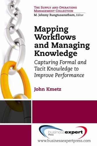
An Example. While this may sound as if it is becoming a complicated process, it seldom actually is. A real example of how simple activity logging of a cash transfer method yielded valuable insight into a process some years ago, and soon thereafter suggested an effective process improvement, is shown in Figures 4.1 and 4.2.
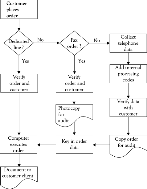
Figure 4.1 shows the workflow map for this process, which is one I had worked with in 1989. This client was a financial services company, and part of its business was to handle large cash transfers for global customers who were generally managing cash flow, engaged in multilateral netting of payables and receivables, and also investing surplus cash in overnight and other investments through open-market operations with the government. Many of the firm’s customers moved large cash deposits in and out of various instruments frequently, so the fees generated from even small charges for this service should have been a very profitable business. Nevertheless, internal audits had revealed that over the years, profitability had eroded to the point where this was barely a break-even operation.
The initial workflow map showed what was generally already known—there were three methods for orders to be taken. One was through a dedicated line on a secure mainframe computer, the second was through fax orders, and the third was through telephone orders. The company prided itself on both speedy and personal service, and over the years its volume of business for many customers had grown because of this service-oriented business model. That was the good news.
When it was agreed that the workflow map in Figure 4.1 was valid, the volume of transactions coming in through each mode of entry was counted, and the steps involved in taking and executing a transfer order were timed. It was found that nearly 50% of orders were being taken by telephone, 32% by fax, and the remaining 28% through dedicated-line connections.
The next step was to measure the average time required for each method of ordering. This was done by observation and logging the activity of a sample of orders and order-takers; the time required for each step for each of the three methods of ordering were summed to generate an overall time for each type of order. The cumulative average time in minutes required for each type of order are shown by the bar graphs in Figure 4.2.
Not surprisingly, the dedicated-line orders shown by the left bar in Figure 4.2 took only three minutes on average since verification of a customer code was the only operator intervention needed (and this, of course, has since been automated). Fax orders (the middle bar) took nine minutes on average, partly because customers had to be called and have orders verified, and then keying time was needed in addition to making copies. Telephone orders (the right bar) were the longest, by far—averaging nearly 23 minutes for each order. This seemed an anomaly, and triggered further investigation. The company soon learned that this was an accurate measurement, and was an unintended consequence of its service orientation. Customers would call in, often toward the end of the business day in their time zone, and over the years many first-name personal relationships had developed. Order-takers would chat about family, weather, upcoming holidays, and all manner of interesting topics as they took the orders, and customers who were surveyed genuinely liked the warm, personal service they received. Customers were known as people and valued clients, not just impersonal sources of revenue.
The bad news was that when the average revenue generated by telephone transactions was converted into equivalent minutes of operator time, it was discovered that the average transfer generated a fee that covered 18 minutes of contact, while the average contact was going on for five minutes longer than that. Hence, the telephone orders were costing the company money on average, not making it, and these were the largest volume of orders!
What to do? The company did not want to risk losing its service reputation, but had to reduce the amount of time spent on the average telephone order. The solution to the problem was to analyze the volume of business arriving by telephone, and send the larger customers a free fax machine with a preprogrammed dedicated number. Some customers took to the fax immediately, and over time those who still called orders in on occasion became accustomed to the convenience of the one-button call, so volume was gradually shifted from telephone to fax. As fax machines became cheaper and cheaper, and more microcomputer support came into the market, this operation returned to profitability; the Internet finished the job in the late 1990s, about 10 years after this study was done. Interestingly, the time needed for the die-hard phone orders never fell very much, and it seems that the social interaction was as important to these clients as completing the transaction; however, that volume is now very small.
As a final observation, it is worth noting that in the near term the processes themselves did not really need to be changed, but rather the volume of orders flowing through each of them. There was active discussion of the possibility of taking immediate steps such as providing incentive awards, price discounting, and the like, to encourage customers to stop placing telephone orders and use other methods. In the end, the company decided to do nothing that would potentially have a negative effect on its reputation as a service-oriented firm, and so a “thanking you by helping you” approach was used—the fax machines were the first wave, followed by more of them as prices fell, and later there was dedicated software and other forms of assistance to encourage movement to the Web, where nearly all business is now conducted. Over time, the process was nearly completely automated through ICT and is now quite different from that shown in Figure 4.1. But by choosing this approach, the company lost neither friends nor a profitable business.
A General Workflow Metric
With this background on what numbers might tell us, I want to suggest a general measure that can be used with any workflow, capitalizing on the fact that every process requires time to complete. This general measure is mean process execution time (MPET). MPET is the sum of two parts: mean primary process time (MPPT) and mean exception handling time (MEHT), or
MPET = MPPT + MEHT.
The mean (average) time to complete a process depends on how long it takes to complete the primary process flow, where nothing goes wrong, and how long it takes to handle exceptions when things do go wrong. Both of these are important in their own right, but neither should be ignored when considering overall performance in a process. A company may be very good at handling normal demands that follow the primary workflow process, while being terrible at handling things that do not go smoothly. Whether this is a “good company to do business with” may well depend on whether the customer we ask was the recipient of the primary process or had to have extraordinary help to deal with an exception; both are important, and adding them together keeps both visible.
This metric can be used in the form suggested here for any workflow; at the same time, it can be modified in many ways. The sum is the simplest version of this metric—we can also examine the two components of MPET individually, of course, or weight the two components by the proportion of production that goes through normal and exception-handling processes; by converting them into a standardized metric on a single scale (zero to one, for example); by normalizing them (expressing them in terms of standard deviations); and others. Each modification yields additional information, but the basic sum of the two reflects how well we do on both the normal and exceptional outputs that make up our total production.
Phase III. Experiment and Implement
The third phase of process improvement is to experiment with potential changes and modifications to the workflow, and to collect data on the results for future decisions. An excellent, well-regarded and well-established basis for this kind of experimentation and data collection is the Shewhart cycle in Figure 4.3, named after Walter A. Shewhart,8 the “father of statistical quality control” (and often referred to as the “Deming cycle”). The fundamental idea is that of scientific experimentation, trying things to find out if they work better than what we have in place now.
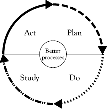
1. Plan a change or test. Define the problem, suggest possible causes.
2. Do the test. Small scale at first; collect data.
3. Study the effects of the test. Let the data speak.
4. Act on what was learned. Improve, test, monitor, improve; recommend and implement.
The logic of the Shewhart cycle is the basis of its long-term success, as has been amply demonstrated by the Japanese automobile industry, and by many in many other industries as well. “Experimentation” is usually better than decreed change, and solves many problems in the change process. One positive psychological aspect of experimentation is that it encourages getting input from the people doing the work and who are affected by the experimental change. After the experiment, we keep what works and abandon what does not, and by having those affected involved in the experiment, it is much more likely that they will regard this as “their” experiment as much as “management’s,” to the benefit of personnel “buy-in.”
Working in an experimental mode eliminates the need to deal with “loss of face” or a need to protect one’s status—that alone can often stop good decisions or perpetuate bad ones. Staying with a bad idea is not a good decision, and neither is failure to accept someone else’s idea when it might work.
Experimentation encourages communication. Keeping people informed about when we are experimenting, what the experiment is, letting them know the results and what we plan to do next, all contribute to successful process improvement. Knowledge drives out fear.
Experimentation allows control of the scale of investigation. Process improvement change can be a major restructuring or a small change in one part of a workflow. Most experiment-based changes will be small and incremental, with the cumulative results being large over time.
Experimentation, finally, creates a specific context in which many business metrics can be used, but more importantly, such metrics must be used if we are to evaluate experimental results on a rigorous basis. The best expression of this is in the statistical design of experiments for quality improvement, but the spirit of experimentation does not require that level of measurement control every time. What is more important is that we follow the four steps in Figure 4.3, that we measure as objectively as we can, and that we look at all the results of the experiment before making final decisions about what we plan to change or implement. No method is perfect, and even the “exact” sciences make mistakes, but this approach has been shown to be an effective way to evaluate process improvements in many organizations.
Process improvement is continuous improvement—it is never “done.” Experimentation establishes a culture of trying new ideas and always looking for a better, cheaper, faster way to do things. It is hard to find any business that is truly the same as it was 10 years ago, or even five years ago, and many die long before reaching that age. Complacency is not an alternative in a competitive world.
Analyzing Data from Workflow Maps
Whatever business metrics we use to collect data, the primary methods of data analysis are familiar to most readers, and so this section will be very brief. Simple data analysis methods found in all spreadsheets are emphasized. Statistical tools (most of which are now embedded in spreadsheets) may be used to analyze data, but our minds and eyes are the most important tools in a great many cases.
The most basic idea to keep in mind when analyzing data from any source is that very few things in the universe come in one form only—there is enormous variability in things, and data from workflow processes and experiments will always be characterized by this variability. Consider a simple “operation” like shuffling a deck of cards. We might take a sample of people from our office or workplace, give each of them a deck of cards, tell them to “thoroughly” shuffle the deck, and time them as they do.
What will we find? In a word, variability, for all kinds of reasons. One person is a regular poker player and can do a thorough shuffle in 10 seconds; another has never played cards, has no idea either how to shuffle or what “thorough” means, and takes two minutes; and so on. If we have
10 people in our sample, we will get 10 different times, varying from 10 to 120 seconds if these are our two extreme cases. Most will take between 15 and 30 seconds to shuffle the deck, with 10 being very fast as a reflection of the practice that person has had, and 120 seconds as an “outlier” value produced by a complete novice to playing cards.
We might decide there is so much variability that we need more data, and so we get another 10 people to do the same thing. In general, the larger the sample, the better; but we have to trade that off against the cost or feasibility of obtaining a large sample. Whatever the decision about sample size, we will eventually have a data set, and from that we can obtain a number of useful items of information about the process.
The first thing to do with any set of data is to describe it—get an overall look at what you have. The best way to do this is to use a few simple lists, tables, and graphic tools to help you see the data. We call these basic methods descriptive statistics, because their primary function is to describe our data. For most analyses we will ever want to do, simple description is all that is needed. The only tools needed to do the analysis of data will be your eyes and your spreadsheet.
At this point, unless the sample of data is really large or many people have somehow shuffled the deck in exactly the same time, no two values will be the same, so the sort will simply be a list of times. We will next use the spreadsheet to sort them from low to high and form a frequency distribution. A frequency distribution shows two things: (1) the values of the things we have measured, and (2) the number of times each value occurs, or the frequency of each value. In this example, “values” refer to the times taken for each person to shuffle the deck of cards, and the “frequency” refers to the number of times each value occurred in our measurements. When arrayed from lowest to highest values (or the other way if it suits our purposes) you literally see a distribution of how often each time occurred.
There are a number of types of frequency distributions, but some of them are especially useful in analysis of WFMA data. One of the most useful is a histogram, which is the best form of distribution for variables that only occur in whole numbers (a family can have two or three children, but not 2.6). A histogram of shuffling data shows the frequency of each time observed on the vertical axis, and the individual times to complete a shuffle on the horizontal axis, as a series of groups. There are usually from three to nine groups, depending on the number of observations and the range. A very simple and useful chart of this kind of data, and one we have seen in Figure 4.2, is a bar chart. It is simple to make, and very informative.
Spreadsheet Versus Manual Construction
The best way to build a histogram is to let a computer do it for you. Spreadsheet software like MS Excel, OpenOffice, and Quattro Pro are all able to do the job, and give the user many choices of types of graphs and different views of the data. In Excel, if one types “histogram” in the Help dialog box, a response for Statistical Analysis Tools will be generated. Following that, guidance will give the user access to a histogram tool, as well as many other statistical tools available in this program.
To build the histogram manually is not difficult, but takes a little bit of time and isn’t as flexible as the computer. To do it manually, one only needs to record the number of occurrences of each value, and arrange these in order from lowest to highest. Observations having the same value are all recorded in the same category, so that one sees a number of “stacks” of values. The height of the stack is the frequency of that value, that is, the number of times that value occurred. A histogram summarizes data which have been grouped on some basis—for example, we might show time for card shuffling in five-second intervals, so that events taking 36, 38, and 39 seconds all fall into the interval of “35.01–40.00 seconds,” and the frequency of that interval is three events. But in all cases, the spreadsheet is the fastest and easiest tool to do this.
How wide each interval should be is a matter of judgment, and there are no fixed rules. You want to have enough groups to see the variation in the data—neither too many nor too few should be used, and you may need to experiment to determine the range of intervals that give you the most useful information. The only mistake to be careful of is that all intervals must be defined so that events fall into one or the other with no ambiguity. For example, an interval of 1–5 seconds cannot be followed by an interval of 5–8 seconds; into which one does an event of exactly 5 seconds fall? The solution is to either make the first interval 1–4.99 seconds and the second 5–8, or else 1–5 and 5.01–8—these are mutually exclusive.
Bar charts are just a special form of grouped data presentation. Many values of things in the world are mutually exclusive by nature: male versus female; day shift versus night shift, and so on. These data are usually shown in discontinuous bar charts (that is, the intervals do not touch each other), with the height of each bar representing the number of each of the values. Again, our friendly local computer is the best way to
make these.
Extracting Information from the Data
Frequency distributions can be built for each of the activities logged in a WFMA study, for a series of them within a job, or for entire workflows. Different frequency distributions can be constructed for individual workers, for different shifts, and for as many different ways of doing the job as there are. An overall frequency distribution, combining data for individuals and shifts for each process, can also be made. A huge benefit of spreadsheets is that they allow us to enter not only the raw data, but also additional data to identify sources and other characteristics that enable further search, through sorting, regrouping, and combination. Whenever possible, entering data into a spreadsheet rather than keeping it on paper allows software support for many additional analyses.
The most basic information to get from a frequency distribution of your data is from visually examining it, and seeing several of its features. This kind of simple observation is often one of the best ways to use data. First, you can observe what the minimum and maximum values are—the shortest and longest times to complete a shuffle if playing cards, or to complete a series of steps in a workflow. The difference between them is called the range of the data. The range gives some idea of how much variability there is in the data, and we will be able to measure this in numerical terms.
The shape may be very informative—for example, are the large majority of the events either very short or very long (that is, is the histogram “piled up” on either end or very symmetrical on both sides)? If piled up in one direction, one can ask what accounts for the extremes. This could be very interesting for many reasons—are the short times low because people are highly skilled, or because they are cutting corners; are the longer times an indication of rework to correct errors, lack of timely delivery of components, or driven by some other cause? Depending on our objective, either or both of these extreme values may be of considerable interest.
Measures of the “middle,” or measures of central tendency are also very useful. Three of these measures are most often used for different purposes:
• the mean or average of a group of data is the most common—it reflects both the number of times something occurs and the range of values. Computing a mean by hand requires only adding all the values and dividing by the number of observations. The mean is often symbolized as ![]() (“x-bar”) or M. This is calculated by selecting a spreadsheet function; in Excel this function is = AVERAGE(range).
(“x-bar”) or M. This is calculated by selecting a spreadsheet function; in Excel this function is = AVERAGE(range).
• the median is the value dividing the number of observations in half—half fall above that value, and half fall below. In Excel this function is = MEDIAN(range).
• the mode is the most frequently observed value in the distribution, the highest bar in the chart (there can be multiple modes). In Excel this function is = MODE(range).
Many of the variables we use to measure processes along workflow maps can only take on whole-number values, like the number of loaves of bread out of 100,000 that fail to rise correctly before baking (they are not what statisticians call “continuous” variables). The histogram discussed above is the appropriate way to portray these data, and the mode and median are the most appropriate measures of the middle. A cumulative table can also be constructed, and these are also informative.
Over the years, I collected data on the time taken to shuffle cards as part of the in-class poker exercise in my WFMA course. Figure 4.4 shows the histogram for 163 card shuffles. Each bar in the histogram is the frequency of shuffles that occurred in a 10-second interval, going from left to right across the horizontal axis. For example, we can see that we had three shuffles done in the 1–10 second interval and three in the 91-second-or-greater interval on the far right; we had 15 shuffles in the 11–20 second interval, 34 in the 21–30 second interval, and so on. As we can see, this histogram is not completely symmetrical, in that there are more high bars in the left half of the histogram as compared with the right half.
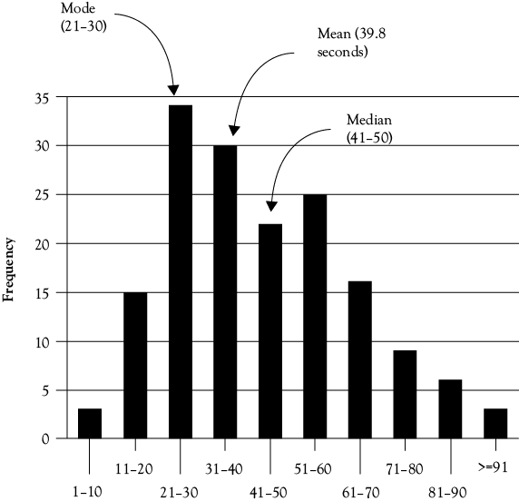
We can easily find the measures of central tendency discussed above, and these are shown in Figure 4.4. The mode is the 21–30 second category, the highest bar in the histogram. Since there are 163 cases, the median is the value for shuffle 82, which falls in the 41–50 category. The mean is simply the average, where you add all the times and divide by 163, and that is 39.8 seconds, in the 31–40 category. (Not having the actual times, the reader cannot check this—the best you could do is multiply the number of shuffles by the midpoint value of each interval, which is 5.5, 15.5, and so on. If you do that, you will get a value of 43.7 seconds for the mean. The reason for the difference is that many of the actual scores in the 21–30 category happened to be on the low side, around 23 seconds.)
Variability can be measured and expressed in numeric terms, and usually is. The measure of variability can be the variance, measured in squared units, or the standard deviation, measured in original units. The reason the variance is expressed as a squared value is that it is measured in terms of differences above and below the mean, and because the mean is the exact weighted middle of the distribution, values above (positive numbers) will cancel values below (negative numbers), and variability would be zero. We square both types of values, add them and average the sum, and this solves the problem, except that variance is expressed as the square of original values. If we want to convert this back to the original units of measurement, we simply take the square root. Better yet, we let MS Excel do both by using = VAR(range) and = STDEVA(range).
Larger values for either variance or standard deviation mean the data are more spread out. Thus, if we collected data for a hospital laboratory process on two shifts and found that while the mean (average) was the same, the standard deviation was considerable larger for one shift, we might want to know what accounts for the greater variability on one shift as opposed to the other. A situation like this would mean that while the averages were the same for the two shifts, one was both completing some processes in less time than the other shift, while some processes were taking more time.
Frequency distributions for different workers, shifts, or processes may vary on any of these characteristics. Some activities may be done either very quickly or after a long time, with few times between the extremes. In all cases, the question to be asked is “Why?” What does the shape, the difference between workers, or other information tell us? Why is the average for one event on the day shift 30 (or 3) percent higher than the average for the night shift? These are questions to be investigated in more detail, and in most cases, all of the questions can be addressed in part by using the data from activity logging and frequency distribution analysis, whether our interest is improving efficiency, quality, or control.
Clues for Performance Improvement
To conclude this chapter, I want to consider how the results of the kinds of analyses we have been discussing can directly contribute clues or leads to performance improvement. The first way to obtain such clues is to examine the measures themselves in detail; the second is to examine the measures and the workflow properties they describe against our organization design and performance objectives at a higher level. This discussion will necessarily be kept somewhat general because the nature of what is measured in workflow analysis is typically very specific to the organization.
What’s in a Number? “True” and “Error” Components
Whenever we use a metric, a first important step is to think about the composition of what has been measured. We noted above that one of the things necessary for data collection was practice, because we want to minimize observer error. This bears repeating here—what this means is that we want the variability we see in our data to tell us what is happening in the workflow, rather than being a measure of observer error.
Any measure of something can be thought of as composed of two parts—a “true” value and an “error” component:
[measure or “value” or “score”] = [true component] + [error component].
In the symbolic language of mathematics, we can call these x, t, and e, so that our expression above simplifies to:
x = t + e.
In the overwhelming majority of working situations, each of these two parts of x, in turn, can be broken down into two smaller parts. First the “true” component t can be thought of as a least practical value (LPV) and some degree of individual variation (INDVAR) in the way a task or process is done; thus,
t = LPV + INDVAR.
What do these mean, and why do we care? Think about our hypothetical poker game. If we are examining the times taken to shuffle, where each x is a time someone takes to shuffle a hand, then the LPV component would be the least time practical for the person shuffling the deck to complete that task. Obviously, this will vary depending on skill and manual dexterity, but for most people who have at least some experience with cards, there will be a time beneath which adequate shuffling cannot be done, and an upper limit beyond which additional shuffling is simply unnecessary. For most people, those two values express upper and lower limits for the LPV time to shuffle cards.
If we observe someone who really wants to be sure that shuffling mixes the deck, that person may go through multiple cuts of the deck followed by several riffle shuffles, several more cuts, and so on. Those additional steps are seen as necessary to that person, but are more than we really want or need for shuffling to produce an acceptable randomization of the cards in the deck; that additional time and effort are that person’s individual variation. INDVAR can also be negative, as in a case where someone is careless and does a minimal job of mixing the deck between hands. A person who simply takes the top half of the deck and puts it on the bottom and says “Done!” is demonstrating a lack of concern for randomizing the deck (INDVAR) as well as violating the minimum time needed to do the job (LPV). Tacit knowledge plays a huge role here.
Thus, in looking at our data, one of the things we might want to think about is what constitutes the LPV for a particular task or process. That may require additional evaluation of data and some work and thought to resolve, but once an LPV is determined (usually in terms of its upper and lower limits rather than a single value), it provides a valuable benchmark to contrast to other scores. In an activity like shuffling cards, values outside the limits for LPV are probably due to INDVAR, and may be reason for a change or intervention to bring the actual times for jobholders within the limits.
It may also be the case that variation outside the limits of LPV occurs because of error, the e term in our equation above. The e term also has two parts: observer error (OBSERR) and individual error (INDERR). In many cases where we must collect raw data, the observer is a significant source of error for many reasons. Anyone who has tried to observe and time task performance realizes this very quickly, as it is very hard not to get involved in whatever is happening; it is also hard not to get distracted by outside events. In many tasks there are ambiguous transitions between one task and another—those transitions may be preconceived to be smooth and easy, but there is very little in the world of work where we find the clear separations between movements as in a symphony. If there is a remote or automated “sensor” used to collect data, there may be errors in these that are very difficult to see or correct.
INDERR is similarly subtle, and in some cases is hard to differentiate from INDVAR (and in some cases there may be no real basis to differentiate it at all). The difference may be of greater psychological than substantive importance; for example, a worker may have learned to shuffle cards in the unnecessarily thorough manner described above by observing another worker who considered this the right way to do it (tacit knowledge, again). Informing that person of the need to change because they are “making a mistake” is probably less acceptable than being informed that they are very good at shuffling, but need not go through so many steps to do the job equally well. In some cases if may be easier to detect and evaluate, such as when a person simply mishandles a deck and unintentionally shuffles by playing “52 pick-up.”
Both types of error suggest important possibilities for improvement. To the extent that OBSERR exists, it is necessary to find ways to improve the ability of observers to get accurate data, because with respect to the actual performance of the work being observed, this is pure “noise” in the measurements. Elimination of this noise gives a clearer picture of job performance. INDERR can occur for many reasons, and to the extent that we can identify and eliminate it, performance is improved, benefiting the company and the worker alike.
The main point to be made here is that metrics and measurement are invaluable to our search for ways to improve performance, but that neither should be taken for granted. Selecting meaningful metrics is important, and so is application of them in collecting data. Both take thought, and the latter takes practice, as well.
What’s in a Number? Accumulated Time in a Workflow
The idea of a distribution sometimes seems a bit abstract, although we have illustrated what is in a distribution in our discussion of Figures 4.1 and 4.2 earlier—we just didn’t use that term. Here is a way of combining both ideas, which may be helpful (although we have to skip ahead a bit to do this).
I have often referred to the study of avionics maintenance in the U.S. Navy that was the beginning point for the WFMA methods explained in this book. A high-level diagram of that process is shown in Figure A1.1 in Appendix 1.
The focal point of the early parts of that study was the versatile avoinics shop test (VAST) shop in the lower-right corner of Figure A1.1, where avionics components (ACs) were actually repaired. There were several predictable and unpredictable steps in the VAST-shop workflow which contributed to the total time it took to process an AC through the shop. This was measured in hours as elapsed maintenance time (EMT), and a typical distribution curve for an AC is shown in Figure 4.5.
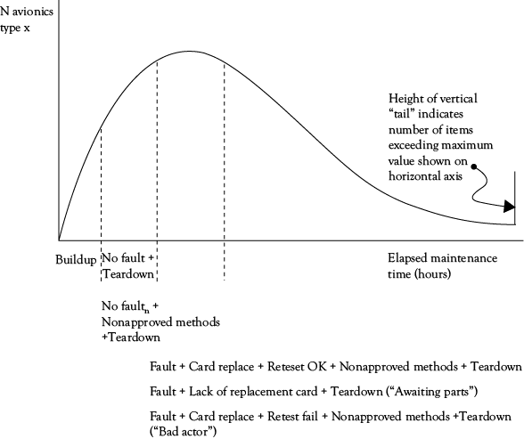
Figure 4.5. What’s in a number? The composition of elapsed
maintenance time (EMT) in avionics maintenance.
Processing an AC as described in Appendix 1 consisted of several required steps, just like taking orders in our example of Figure 4.2. The first step is referred to as “buildup”— the technician got the necessary test program tape and connecting cables specific to the AC being tested from an assigned storage area, and then mounted the tape and connected the cables to the AC and the tester. Next, the technician started the computer test program, which ran until a fault was detected, parts replaced, and the AC passed a retest, or until either all tests were completed and no fault was found (this happened from false error readings on the aircraft, and could be as much as 30% of all items tested), in which case the AC could simply be placed back in the Supply pool. However, a “teardown” was needed to remove the test equipment installed in buildup and return it to its proper storage locations. Buildup, test, and teardown are always needed to test an AC. If we were to test a group of the same ACs, Figure 4.5 shows that for that group, the first part of the time curve will always be Buildup, and in the event of no fault, the test and teardown will make up the next part of time under the curve (this will vary for each AC). This figure simply takes the steps in the process and arranges them from left to right, instead of stacking them as in Figure 4.2.
In most cases, the tester indicated a fault at some point, and this required the requisition of replacement electronic “cards” (very similar to computer parts) from the Supply facility, which replaced the ones the tester had indicated to be the cause of the fault. The AC was then retested, and if the card replacement solved the problem, the AC was now OK to return to Supply to be available for an aircraft when it was needed. These two steps, card replace and retest, were next elements added to the cumulative time curve (with Teardown at the end) in Figure 4.5.
However, life is often not this simple or predictable, and this is where complications could set in. These could add a great deal of time to a test run that ultimately might not result in a repair. There were often test and retest procedures that technicians had learned from experience, but which were not part of the approved Navy process (all of which had been extensively tested and evaluated prior to approval as the correct way to do things); these might be used as “workarounds” to a problem test, and added time that was not expected to be needed for the repair. In some cases, the cards requisitioned by the test program would not be in stock (many factors could influence this, but such stockouts were not intended to occur), and the test would be aborted, with the AC being torn down and sent to an Awaiting Parts holding area until the cards arrived. The AC then had to be built up again and the process resumed until repair, or possibly the next awaiting parts status for some new stockout, was done. Finally, some ACs were just extremely difficult to test and troubleshoot effectively, and after long periods of time these simply did not get repaired; these were usually sent to advanced maintenance facilities on shore, which was contrary to the maintenance plan for these ACs, but there was no choice. These were typically categorized as “bad actors,” because one of their effects was to consume a lot of tester time without anything being repaired.
In Figure 4.5, we see the accumulated times for a group of identical ACs (that is, one type only, not a mix), and how time accumulates from the origin as these parts of the workflow are completed; this accumulation of time can be directly related to steps in the workflow map. Buildup is always the first part and must be done for every AC; at least one test cycle must be completed; every AC has to have one teardown for every buildup, and so on. By having a clear workflow map, our analysis of accumulated times, or any other workflow metric, can be understood more easily and provide more ideas for improvement of that workflow. If we look at different types of ACs we will see different distribution shapes, just as we saw different “stacks” of tasks in Figure 4.2. Each of these ways of portraying data gives us something more to see, and helps us to understand, in our workflow.
Workflow Design Tradeoffs
The final issue to consider is what we want to design a changed or improved workflow to do—the performance criteria we measure, and the tradeoffs we must make to get the multiple but often conflicting outcomes we need. In many ways, this becomes a matter of a tradeoff between efficiency and risk, and the questions this tradeoff raises are best understood in terms of two workflow properties introduced in chapter 2—
convergence and divergence between flows of material and information, and synchronous versus asynchronous flows. Again, the relationships between them are shown in Figure 2.5.
As we noted in chapter 2, the optimal design for many process improvements is to align the flows of information and materials so that they are both convergent, that is, occur in the same place, and synchronous, occurring at the same time. This design approach is the upper-left cell in Figure 2.5; as can be seen, this usually yields the highest efficiency, but also comes with the highest risk, for reasons discussed there.
Relative to the upper left cell, the tradeoff decisions in process improvement can be considered as changes to either convergence or synchronicity. We might separate the flows in time, as is done in much of the scientific method, so that separate examination of results and outcomes can be done after initial results are obtained, thus giving a double-check on a result. This comes at the cost of reduced efficiency and speed of response. An alternative is to manage risk by using divergent paths for materials and information, as done with double blind evaluation procedures in the pharmaceutical industry. This may reduce time delays (as with asynchronous flows), but requires multiple modes of information processing, at higher cost.
What is most important to note when considering changes to processes is that the design tradeoff between risk and efficiency is not simply a linear exchange between them. Moving from the upper-left to lower-right cell does not necessarily reduce risk—you may simply end up with both inefficient and risky processes. Managing risk requires active consideration of workflow design issues, and must always be done with awareness of the inevitability of the tradeoffs as well as awareness of the options. All four cells of Figure 2.5 offer possibilities for discovery or invention of functional changes, and all four bring some inherent risks. Knowing what we know, the subject of chapter 1, becomes very important in making these tradeoff decisions.
Three Things WFMA Is Not
Now that we have seen all of the fundamentals of WFMA that is, both the mapping and analysis, it is helpful to be aware of three things that WFMA is not, even though there are some commonalities between these techniques and WFMA.
Flowcharting
Most methods of charting or mapping workflows are derived from common flowcharting symbols, as mine has been, but there are no truly standardized methods for mapping.9 While well-known flowcharting symbols are used to create workflow maps, workflow mapping is not flowcharting, although the outward similarity at first and the frequent use of that term might make it seem so. There are a number of important differences between WFMA and flowcharting as the latter is applied in programming and information technology environments:
1. Only a limited set of flowcharting symbols and rules are used for workflow mapping, and these are distinctive and easy to learn and apply. This is quite important for workflow maps to be useful to those not trained in flowcharting, and makes the symbols a means to the desired end, which is understanding the workflow and communicating about it. Most flowcharting symbols, in fact, are far too specialized for workflow mapping.
2. Workflow mapping works by capturing and describing an actual process used to accomplish a purpose, whatever steps may be involved. Flowcharting works from a logical program structure and follows rules similar to computer language. In that sense, workflow maps are descriptive, where flowcharts are prescriptive.
3. Workflow maps can vary enormously; it is unlikely that two different workflow mappers would create the same map for any purpose or process; therefore, many different versions of a workflow map can be “correct.” Flowcharting will produce a “right” answer that can vary only to the extent the programming language allows. Unlike a workflow map, it is likely that two skilled programmers would solve a programming problem in relatively similar ways.
4. Levels of detail and presentation format can vary enormously in workflow maps, whereas flowcharts must provide sufficient detail to write code, and must be consistent with the rules and syntax the computer language requires. Workflow maps can and should be tailored to the level of detail most useful and informative to the user.
5. Workflow mapping is an iterative process of discovery and investigation, rather than application of externally determined coding rules; the objective of workflow mapping is to develop a valid map of a process. The objective of flowcharting is to develop an efficient, correct answer to a programming problem, and by definition that means it has to run.
Business Process Reengineering
For better or worse, WFMA data collection and analysis is often associated with business process reengineering (BPR), which became very popular in the 1990s. BPR, in many ways, is a view of organizations in which process automation replaces the information processing capacity of humans, and in which their tacit knowledge is implicitly of little or no value. The slogan Hammer used during the early days of BPR was “don’t automate, obliterate,” the title of his 1990 article in Harvard Business Review. During their presentations on BPR, it was not uncommon for Hammer and Champy10 to simulate pointing a gun at a nonbeliever’s head and say, “Bang! You’re gone!”
BPR was seen as useful for some companies, but certainly not all.11 It quickly became seen as a code word for “downsizing.” The immediate perception of everyone working in a company where BPR was begun was that many of them were going to lose their jobs, and quite often that is what happened. Not only were individuals “laid off” (and it was then that “laid off” became a code word for “let go”), but entire levels of organizations were removed. One acquaintance who went through this process twice likened it to the Grim Reaper being given a broadsword, and entire levels of management and staff were “laid off” en masse, as if the sword were slicing the middle layers out of a cake in two quick blows.
The popularity of BPR was enhanced by the effects these changes had on the bottom line, and of course, not having to pay significant numbers of people cuts costs immediately, so the savings quickly show up on the income statement. Nevertheless, BPR and the frequently thoughtless removal of entire layers of organizations was shown, over time, to cause organizations to “lose their minds”—companies found that they could not cope with exceptions or problems, that overworked survivors could not handle all the work suddenly heaped on them, and that when mistakes were made the emphasis was on hiding them rather than fixing them, lest the offender become the next to be “laid off.”12 The long-term costs were huge, despite the immediate benefits to the bottom line, and BPR seldom had long-term benefits for companies. Hammer and Champy have since acknowledged that they underestimated the effects of the human factor in BPR, and soon changed their approach.13 But the identification of process study with layoffs and downsizing is now entrenched, and anyone who starts WFMA and does not address this issue is making a mistake. Even the most positive stories of successful process change and business turnarounds are saddled with the “chain saw” image.14
As discussed, there are many applications for WFMA. Just because the initiator of a particular WFMA project knows that its objective has nothing to do with staff reductions doesn’t mean that everyone else in the workplace will. The reality is that WFMA typically identifies a number of opportunities for improved efficiency, and unless there is a clear need for additional staff, the result may be some level of staff reduction. Such possibilities are often an unintended consequence of WFMA, but they cannot be ignored, and should never be treated as if they do not exist.
Time Study
One additional comparison that should be added to our discussion of WFMA is that when people map the flow of work through their workplaces, they sometimes confuse workflow mapping with the study of how daily time is spent on the job, or a “time study.” These are not the same. It is obvious that time is a universal resource, and is consumed in every aspect of work; it is therefore logical that how time is consumed in a workflow is a nearly universal metric of interest.
However, WFMA and time study are quite different. The objective of workflow mapping is to identify a valid sequence of activities and decisions used to perform activities or functions in a flow of work. That flow may be contained in one office or workplace, of course. However, most people work on several types of flows in their jobs (not just one), and what is needed in the end is the ability to see how a process integrates activities and decisions to achieve some end result. How long that takes is only part of the question and may or may not be relevant to present WFMA objectives.
A process might be entirely contained in one person’s workplace, as we have noted, but it might cross several workplaces for all activities in it to be completed. A well-known University of Cardiff study (reported by Carson15) investigated how long it took to get a can of Coca-Cola to a supermarket shelf. The entire process took 319 days (to make the can and everything in the soda), going through 14 batch and hold steps until completion. The time to actually make an individual can and its contents was three hours. WFMA looks at the whole process, and can also identify and differentiate between the 319 days and the three hours.
Summary
WFMA not only produces graphic portrayals of workflows, but also enables the application of business metrics and measures to the processes being mapped, in part or in their entirety. The use of business metrics is a much better way to evaluate process maps than reliance on “gut feel” or intuition, and there is always at least one measurable variable in a workflow, which is time. With a bit of thought about what happens in a workflow or a part of it, in terms of both actions and information (as discussed in chapter 2), many metrics may be available for analysis.
The simple, stepwise approach one can use to analyze the data and experiment with improvements to the process has been in use for many decades, and has proven its worth in quality and process improvements around the world. It is basically a model of applied science, and is applicable to any kind of process in any organization.
The basic descriptive statistics used to collect and analyze data derived from workflow maps are powerful because of their simplicity, and from the insights we can gain by careful observation of our data with a spirit of asking questions and experimenting with potentially constructive changes. Using one’s eyes to really see what the data look like rather than going into more complex statistical procedures to analyze the data, along with applying one’s knowledge of the work being done to understand what the numbers we have collected actually tell us, can go a very long way toward potential changes and improvements.
More complex statistical analysis has its place in workflow improvement, and what I am saying here should not be interpreted as an argument against such analyses. But sophisticated analysis is never a substitute for “knowledge of local waters,” and anyone trying to design process improvements without knowledge of the uniqueness of each company and its culture and workforce is likely to incur the same unhappy status as the MIT project. The typical review of a first-time WFMA project includes many “aha” moments, and many of these are based on observation of process steps alone, with no measurements being taken at all. As these easy targets are identified and acted upon, other process improvements may be found by doing more intensive quantitative analysis.
It is worth noting the famous “learning curve” that came from the aircraft industry years ago. In brief, this curve shows that the cost of manufacturing an aircraft tends to fall at a relatively constant rate (20% is commonly used from early papers on the subject) for each doubling in production of a particular aircraft. This happens because so many parts go into an aircraft that given whatever sequences of assembly are being followed at any given time, there are always alternatives. Some of these alternatives are more efficient than others, and as experience is accumulated we learn through experimentation how to do things more cheaply with no loss of quality or other necessary outcomes. The “discovery” of the learning curve was largely an outcome of industrial experience that later led to the expression of a formal relationship between volume of production and unit cost; but careful observation and a willingness to experiment came first. This still holds true, and is a huge opportunity for many of our service industries, an opportunity I personally suspect is not being exploited to nearly the extent it could be.16