
Chapter 18
Creating Symbols and Annotations
Many of the components of an MEP design are represented on drawings as symbols. Having a well-stocked library of symbols can improve your efficiency in creating device families, and reduce the time spent on drafting tasks. Symbols can also be used to create project legends that can be utilized on different project types when required.
Companies have spent many hours and significant funds to develop and maintain their drafting standards. Many think it is important to create construction documents that are recognizable as their work. Annotation styles and symbols can be created in Revit format in order to make the transition to Autodesk® Revit® MEP 2013 without losing the signature look of your company construction documents.
Having a good understanding of how annotative objects can be used in Revit MEP 2013 will enable you to easily optimize content and create documents that align with your company standards.
In this chapter, you will learn to do the following:
- Create symbolic lines and filled regions
- Use symbols within families for representation on drawings
- Work with constraints and parameters for visibility control
- Use labels to create tags
Using Drafting Tools in Revit
It is easy to assume that because Revit MEP 2013 is a BIM solution, it does not have very good tools for drafting tasks. The truth is that the drafting tools available in Revit MEP 2013 are very useful for creating symbolic line work, hatch patterns, and annotation objects. Becoming proficient with these tools will greatly reduce your need to rely on a CAD application for drafting tasks. The more work you can do in Revit MEP 2013, the less work you'll need to do in multiple applications, which will increase your efficiency and make managing standards and content easier.
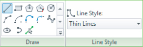
The drafting tools available for use when drawing in a project view are the same as those available in the Family Editor. These tools appear on the Draw panel of the contextual tab when you click the Detail Line button, Symbolic Line button, or Model Line button, depending on the type of file in which you are working. The image shown in Figure 18.1 is of the Draw and Line Style panels as they appear on the Modify | Place Detail Lines contextual tab when the Detail Line button on the Annotate tab is clicked. The Line Style panel allows you to choose the style of line that will be drawn. Only line styles defined in your project will be available.
Figure 18.1 Available shapes and line styles for lines.
You can use the buttons in this panel to draw lines or shapes. Clicking a button for the type of line or shape to be drawn will activate different options for setting conditions for the line work on the Options Bar, depending on what is to be drawn.
When you click the Line button  on the Draw panel, the option to draw a chain of lines appears on the Options Bar. This option will continue the Line command from the last point you click to end a line. This can save extra clicks because you do not need to click the start point for each new line you draw. If you draw a series of lines, they will be joined at their end points. If you deselect the Chain check box on the Options Bar, you will need to click in the drawing area to establish the start point of each new line you draw.
By holding down the Shift key while you are drawing a line, you will force it to snap to the orthogonal axis. The temporary dimensions allow you to see the length and angle of the line you are drawing. You can type in a length that will automatically set the length of a line. You change the angle of a line by selecting it after it is drawn and editing the temporary angle dimension. You can also use the Drag Line End grips that appear when you select a line to change its length and/or angle.
When lines are drawn with Revit and they are connected at their end points, the end points remain connected when either of the lines is moved. There is no “stretch” command in Revit because lines maintain their connections at end points. You can select the Rectangle button  on the panel to click a start point and opposite corner for an end point of a rectangle. Once drawn, the rectangle is treated as four separate lines, not a single entity. When you select any one of the lines and move it, the adjacent lines will adjust to maintain the shape of a rectangle. There are two buttons on the panel for drawing polygons: one for a polygon inscribed in a circle
  and one for a polygon circumscribed around a circle
  . Either one gives you choices on the Options Bar for the number of sides and also to draw at an offset. You can select the Radius box on the Options Bar to set the radius of the imaginary circle that determines the size of the polygon.
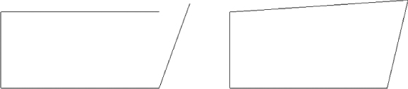
To move or edit a shape as a whole, you must select all the lines that make up the shape. This is easily done by using a selection/crossing window or by placing your mouse pointer over one of the lines and then pressing the Tab key until all the lines are highlighted for selection. Once you have selected a shape, the grips at the end points can be used to edit the shape without breaking the connection of the lines. Figure 18.2 shows two rectangles that have been edited. The rectangle on the left was edited by selecting the line on the right side and dragging the line's end point. The one on the right was edited by selecting the entire shape and dragging the end point in the upper-right corner.
Figure 18.2 Editing options for line work
The Circle button  allows you to draw a circle by selecting the center point and then dragging your cursor to set the radius. You can type in a length for the radius after you click to set the center point, and the circle will be drawn automatically with a radius of your chosen length. The temporary dimension for the radius remains on the screen after you click to set the radius. You can then click the temporary dimension to edit the radius of the circle. When you click a circle that has been drawn, the Drag Line End grip that appears can be dragged to set the size of the circle. The Options Bar also has a radius option to set the size of the circle prior to selecting a center point.
Drawing Arcs
There are four buttons on the Draw panel for drawing arcs. The first two are for drawing arcs whether or not they are connected to any other type of line work, while the other two are for drawing specific types of arcs that relate to lines.
The Start-End-Radius Arc button  is used for drawing an arc by selecting a starting point and an ending point and then dragging your mouse pointer to define the radius. You can preset the radius on the Options Bar. When you set the radius prior to drawing, you need to click to set the start and end points. The third click will determine the direction of the arc instead of the radius. You can input a length for the temporary dimension while drawing to establish the distance between the start and end points and then again to establish the radius. The grips that appear when you select an arc are for changing the radius or the arc length.
The Center-Ends Arc button  is used for drawing an arc by first clicking to establish the center point of the arc and then clicking to set the first end point. From this end point, an arc will be drawn with a radius that is the distance from the center to the selected end point when you click to establish the second end point. You can draw an arc to a maximum 180-degree angle by using this tool. When dragging your mouse pointer to establish the end point and moving it past 180 degrees from the start point of the arc, the direction of the arc will change. Once the center and radius have been defined, you can type in the angle.
The Tangent-End Arc button  can be used to draw an arc from the end point of a line. You must have an end point to start drawing this arc. Once you click the end point to begin drawing the arc, you can drag your mouse pointer, and an arc will appear so that the line remains tangential to it. This tool is useful for transitioning from a straight line to a curve without having to draw separate items and then adjust tangency. You can edit the radius of the arc after it is drawn by editing its temporary dimension. Because the line is tangent to the arc, the larger you make the radius, the shorter the line becomes.
The Fillet Arc button  is for drawing an arc that creates a filleted corner between two lines. Unlike most CAD applications that apply a fillet by using a command, Revit requires that you draw the fillet arc. Clicking the button will prompt you to select the lines for the fillet. Dragging your mouse pointer will reveal the arc to be created between the two lines. You cannot type a radius length while dragging the arc, but you are able to edit the temporary dimension that appears after the fillet arc is drawn. Alternatively, you can preset the radius on the Options Bar.
The Spline button  is used for drawing free-form lines. Each click point creates a vertex that can be edited to change the curve of the line at that point. The Drag Line End grips that appear at the end points of a spline will lengthen or shorten the entire spline when they are dragged to new locations. You cannot type any lengths while drawing a spline, and there are no temporary dimensions to edit after the spline is complete.
The Ellipse button  can be used to draw an ellipse by first selecting the center point and then defining the length of each axis. Once you have drawn the ellipse, you can use the grips that appear at each quadrant to edit the size and shape of the ellipse. You can also edit the temporary dimensions that appear, to adjust the distance from the center to the quadrant (half of the axis length).
The Partial Ellipse button  is used for drawing half an ellipse. This is different from the arc tools because it creates a parabola instead of an arc that has a uniform radius. When using this button, you click to establish the start and end points and then drag your mouse pointer to define the height of the parabola. You can enter dimensions while drawing, or grips and temporary dimensions are available for editing after the partial ellipse is drawn.
The Pick Lines button  is used to create Revit line work by selecting lines that already exist in the view. You can select lines from a linked or imported CAD file, and a Revit line will be drawn in the same location. This tool is very useful for duplicating CAD details or symbols. You cannot use window selection to pick multiple lines, but you can use the Tab key to select multiple lines that are connected. The Offset option on the Options Bar allows you to create lines that are offset by a specified distance from the lines you select.
Creating Filled Regions
Filled regions are useful in the symbols that represent model components. Filled regions can be used to represent different types of an object by controlling their visibility. There are two types of filled region patterns: one for use on model elements and one for use in details and drafting views. The Drafting pattern types should be used when creating filled regions for symbols. Drafting patterns maintain their density despite changes in the view scale.
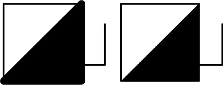
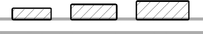
To create a filled region within an annotation family, click the Filled Region button located on the Detail panel of the Create tab. Filled regions cannot be created in component families. When you click the Filled Region button, a contextual tab appears, containing the Draw panel. The same tools discussed earlier can be used to define the boundary of the region. The type of line used for the region boundary can be chosen from the drop-down on the Subcategory panel. You can use invisible lines for the region boundary in order to avoid duplication of line work. Figure 18.3 shows two symbols with filled regions. The region on the right has invisible lines for its boundary, so only the pattern is displayed. The boundary lines of the symbol on the left are thicker than the line work of the symbol, causing the region to appear to be too large.
Figure 18.3 Filled region boundaries in a symbol
Building a Symbol Library
As with most CAD systems, it is helpful to have a library of symbols that are used repeatedly on projects and in details, diagrams, and families. You can create a library of Revit symbols that matches your CAD library, and thereby reduce your dependence on importing CAD data into your projects. These symbols can be nested into component families in order to create construction documents that show your design as you normally would, but also with the benefit of 3D model information.
Generic Annotations
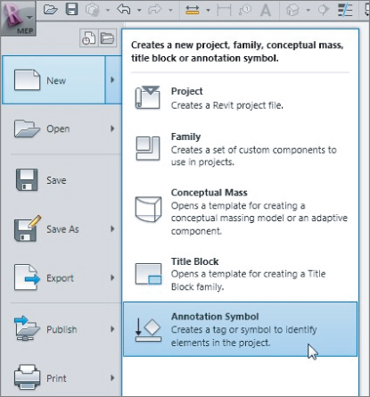
Annotation families are typically tags, but there is one type that can be used to create symbols that can be nested into component families or used directly in your project. The Generic Annotation.rft template can be used to create an annotation family that is not categorized as a tag. To create a new generic annotation, click the New link in the Families section of the Recent Files screen and browse to the Annotations folder. You can also click Annotation Symbol under New on the Application menu, as shown in Figure 18.4.
Figure 18.4 Creating a new Annotation Symbol from the Application menu
The generic annotation family contains a horizontal and vertical reference plane that intersect to define the insertion point of the family. There is also a text object that serves as a reminder to assign the family to a category. When creating a symbol for use in a component family, there is no need to change the category of the annotation family. Delete the text object immediately so as not to forget to do so later. Annotation families are created at a scale of 1:1, so it is important to draw your symbol at its printed size. When used in a project or nested into a component family, the annotation will scale according to the view scale of the project or family.
If you already have a library of CAD symbols, you can use them to create your Revit symbols by importing them into the annotation family and then duplicating the line work with Revit lines. CAD files cannot be linked into families, so you must use the Import CAD button on the Insert tab when working in the Family Editor.
When importing a CAD file, the layers are imported as subcategories, so if you subsequently explode the imported CAD file, any line types defined will also be added with a prefix of IMPORT-. These subcategories are unnecessary and only add extra weight to your files. Both the line patterns and subcategories will remain in your file even if you delete the imported CAD file.
There is a workflow that will allow you to convert your existing CAD symbols to Revit without creating unwanted baggage within the Revit family. Line work that is created in an annotation family can be copied and pasted to another annotation family. You can start by creating a generic annotation family into which you will import your CAD symbols. Once you have created the line work in Revit, you can delete the imported CAD line work and copy the Revit line work to your clipboard. You can then create a new generic annotation family and paste the Revit line work into it. By doing so, you will have an annotation family that does not contain any of the imported subcategories or line patterns.
Subcategories
There is a single annotation category for all generic annotations in a project. To control the visibility and appearance of your symbol lines, you need to create subcategories for them. Otherwise, all symbols for all families will have the same appearance throughout your project. Make subcategories that are specific to the kind of symbol you are creating, so that you can control those specific symbols independently from other generic annotations. Be as specific as you like with the names of subcategories to avoid any confusion as to the subcategory. One example of organizing your Object Styles in your families is to follow the Line Styles in your project. For example, a line style named 01 - Continuous - Black gives you all the information you need for a line, and you can assign it to a specific symbol or a portion of the symbol. If you decide that the line weight thickness is not appropriate, you can switch it from 01 - Continuous - Black to 02 - Continuous - Black. Using this method, your families will have a consistent look. One limitation to using such a generic method of naming the Object Styles is that when you are controlling visibility graphics in your project, you will be controlling them for all annotation symbols assigned to 01 - Continuous - Black.
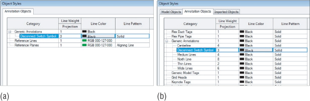
To create a subcategory, access the Object Styles settings in the family file from the Object Styles button on the Manage tab. Click the New button in the Object Styles dialog box, and give the subcategory a name. You can set the line weight, line color, and line pattern for the subcategory. These settings will carry through when the annotation family is loaded into a project or component family file. You can choose to use the default settings for the subcategory and override them in the project or family file into which the annotation is loaded. When you draw line work or a filled region in the annotation family, set the line style to the newly created subcategory in the drop-down on the Subcategory panel. Figure 18.5a shows a subcategory created in an annotation family, and Figure 18.5b shows how the subcategory appears when the annotation family is loaded into a project.
Figure 18.5 Subcategory settings displayed in (a) an annotation family and (b) a project file
With a CAD file from your symbol library imported into a new annotation family file, you can use the Pick Lines button on the Draw panel to duplicate the CAD line work. If you have defined line styles with colors, it may be helpful to invert the colors of the CAD file during import so that it is clear which lines are CAD and which are Revit. As stated earlier, the CAD file should be deleted when all the line work has been duplicated. Save the annotation to your own Revit MEP 2013 library in the appropriate discipline folder within the Annotations folder. It is a best practice to separate your custom families from the Autodesk ones, making it easier to upgrade your families the next time you upgrade your software. The annotation family can now be used in a project file by loading it into your project and clicking the Symbol button on the Annotate tab.
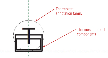
Your annotation family can also be loaded into a component family for use as a schematic symbol representation of the component. Open the component family, and click the Load Family button on the Insert tab. Browse to the annotation family that you want and click Open. On the Annotate tab, click the Symbol button to place the loaded annotation family into the view. You can place an annotation symbol into a family only in floor plan or ceiling plan views, not elevations or 3D views. Place the symbol so that its insertion point matches the insertion point of the component family. When one family is loaded into another, the loaded family is considered to be nested. Figure 18.6 shows a thermostat annotation nested into a thermostat component family.
Figure 18.6 Annotation family loaded into a component family
Based on the purpose and functionality of your component family, the nested annotation may need to show all the time. The symbol for a thermostat family will show all the time, but a symbol for a valve family will show only when the pipe is displayed in a single line. In order to achieve this behavior, select the nested family and click the Visibility Settings button from the Modify | Generic Annotations tab. From the newly opened Family Element Visibility Settings dialog box, you can control in what detail level the nested symbol will display. Pipes display as a single line in Coarse and Medium detail levels, so those two check boxes should remain checked for a valve family, and the Fine check box should be unchecked.
Text and Labels
You can use text or labels in your symbols along with line work and filled regions. Text is simply text within your symbol that does not change. For example, if your thermostat symbol always contains only the letter T, you can use text in the annotation family. The only way to change the text is to modify it directly in the family by clicking it to change its value. If you want to be able to change the value of a text object in the family through the family's properties, you need to use a label. Labels act in a similar manner to attributes in an Autodesk® AutoCAD® block, and they display the value of the parameter to which they are assigned.
To place text into your annotation family, click the Text button on the Create tab within the Family Editor. Select the desired text style from the Type Selector in the Properties palette. If the text style you want to use does not exist, you can create it. When you create a text style in a family and load the family into another family or a project file, the text style does not carry over into the file into which you are loading. This means that if you want to use the text style in the project, you also need to create it within the project. It is possible to have a text style in a family with the same name as a text style in your project while both have different settings, such as font or text height. This can be particularly confusing when it comes to fonts. Your default font and default text heights are important considerations for your implementation. If you want to use anything other than the default font, Arial, you will not only need to set up your project template with all the necessary styles, but also create your own family templates.
This is not as daunting a task as it first seems. Here are the steps:
This method can also be used to add specific shared parameters directly to the family template files, meaning that you will not have to add them each time you create a new family.
Although this task can take a while to accomplish, it's well worth doing and, if you know how, you can do some of the repetitive parts by using the family upgrade tools and editing them for your own purposes with extracts from journal files. This can require a bit of trial and error, so make sure anything you do is backed up, and always work offline. Once you get it right, however, your whole library can become personalized.
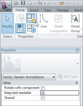
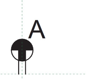
When you place a text object into your family, it is important to consider the orientation of the text when the family is used in your project. Text objects have an instance parameter called Keep Text Readable that allows you to set the orientation of the text to be readable, which is defined as text that is read from left to right or from bottom to top. Annotation families also have a family parameter called Keep Text Readable that applies to any text within the family. You can find this parameter by clicking the Family Category And Parameters button on the Properties panel of the ribbon, as shown in Figure 18.7. It is not necessary to set both parameters to Readable in order for the text to remain readable when the family is inserted into a project.
Figure 18.7 Keep Text Readable parameter of an annotation family
Detail Components
Although you cannot place an annotation family in any view other than a plan view while working in the Family Editor, you can use a detail component family in lieu of an annotation family. This is useful for adding symbol lines or regions to a face-hosted family that does not have the Maintain Annotation Orientation parameter, such as a light fixture or electrical equipment.
A filled region is often used for electrical panels to represent panels with different voltages. You cannot create a filled region directly in the component family, and creating one in an annotation family will not work because it needs to display in the panel's Front or Back elevation view. The Back elevation view is what is displayed when a face-hosted family is hosted to a vertical surface. To show a filled region in the front or back elevation of a face-hosted family, you must create a filled region within a detail component and nest the detail component into the face-hosted family. The nested detail component can be placed in either the Front or Back elevation view to display in a project plan view.
To create a detail component, click the New link in the Families section of the Recent Files screen, or choose New ⇒ Family from the Application menu. Select the Detail Component.rft template, and click Open.
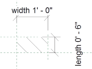
You may want your detail component to change size with the component family that it represents, so you need to create parameters for its size. In the example of a filled region for an electrical panel, you need to make the length and width of the region parametric so that it can change size with the panel model component. Figure 18.8 shows a filled region created in a detail component that has instance parameters that define its length and width. The boundary lines for the filled region are invisible lines.
Figure 18.8 Filled region in a detail component family
The detail component family can then be loaded into the panel family, and the boundaries of the filled region can be constrained to the geometry of the panel object, as shown in Figure 18.9. The boundaries of the filled region can be stretched and locked to the reference planes in the panel family because of the length and width instance parameters in the detail component family.
Figure 18.9 Detail component filled region in a panel family
When the panel family is used in a project, the filled region will adjust to the different sizes of the panel, creating the desired representation for the panel in a plan view, as shown in Figure 18.10.
Figure 18.10 Various sizes of the same panel family
Unlike annotation families, detail components are not drawn at their print size. When you create a detail component family for use as a symbol, such as for a wall-mounted light fixture, you must draw the symbol to scale. The detail component will not adjust to changes in the view scale.
Controlling Visibility of Lines, Regions, and Annotations
Elements in a family have unique visibility control options, and parameters can also be used so that you can control what lines, regions, or text is visible for the various types within your family. This functionality allows you to have multiple symbols drawn within the same annotation family that can be nested into a component family containing multiple types. By doing so, you are able to avoid having numerous separate families for the same kind of component.
Using Visibility Parameters
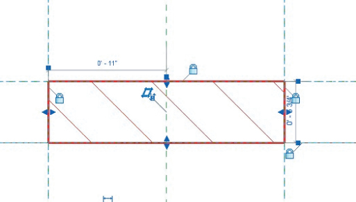
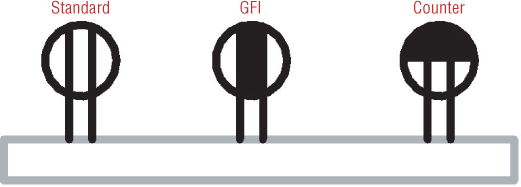
Lines, regions, and text have a parameter called Visible that allows you to designate whether the item can be seen. It is not likely that you will create line work in your family only to turn off its visibility, but you can turn it on or off by associating its Visible parameter with a Yes/No type parameter in the family. This allows you to show certain lines, regions, or text for one family type and then turn them off to show others for another type. The receptacle annotation in Figure 18.11 has two filled regions. The vertical region is displayed to represent a GFI receptacle, while the half-circle horizontal region is for a countertop receptacle.
Figure 18.11 Annotation family with multiple filled regions
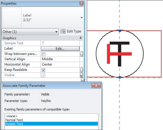
The visibility of each region can be set to the Yes or No (selected or deselected) value of a parameter defined in the family. This is done by associating the value of the parameter with another by clicking the small button at the far right of the parameter value field. When the annotation family is loaded into a component family, its parameters can be associated with parameters in the component family that define the type of component and therefore which region to display. Figure 18.12 shows that the visibility of the vertical region is associated with a parameter in the annotation family called GFI.
Figure 18.12 Visibility of a region associated to a parameter
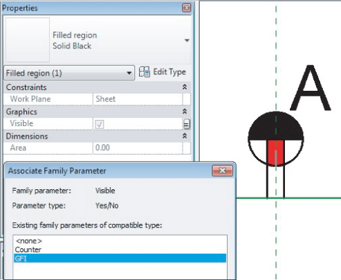
Figure 18.13 shows that when the annotation is used in a component family, the visibility of the regions depends on the family type used in a project. The process of nesting annotation families into component families is described in more detail in Chapter 21, “Creating Devices.”
Figure 18.13 Display of an annotation family based on component type
Another visibility control option for annotation families is the orientation of the symbol. As stated earlier, the orientation of text within an annotation family can be controlled with the Keep Text Readable parameter. However, it may be your standard or preference to keep the text reading from left to right regardless of the symbol position. This can be achieved with a combination of text objects and visibility parameters.
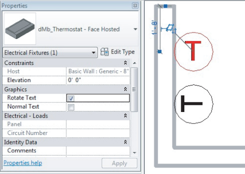
You can copy a label or text in your annotation family and rotate it so that when the family is rotated, the label or text reads from left to right. The visibility of each label or text object can be set to an instance parameter, allowing you to control which label or text to display at each instance of the component. Figure 18.14 shows a thermostat annotation family with two instances of a label. One has been rotated, and its visibility has been associated to a parameter in the family.
Figure 18.14 Annotation family with multiple instances of the same label
When used in a component family, the parameter controlling the visibility of each label can be associated with a Yes/No type parameter of the component. The result is that when the component is used in your model, you can control the visibility of the label to display the annotation symbol in the desired orientation. In Figure 18.15, the topmost thermostat has been modified to display the rotated label in the annotation family, while the thermostat on the bottom is displayed as normal.
Figure 18.15 Multiple display options for a label within a family
This functionality can also be applied to the line work in your annotation family. It may be necessary to create a separate annotation family for the symbol that is to be rotated so that when you insert the families into a component family, the insertion point will be the same. Figure 18.16a shows an annotation family for a light switch, and Figure 18.16b shows an annotation family for a light switch symbol that is to be rotated when inserted into a component family.
Figure 18.16 (a) Light switch annotation; (b) light switch annotation to be rotated
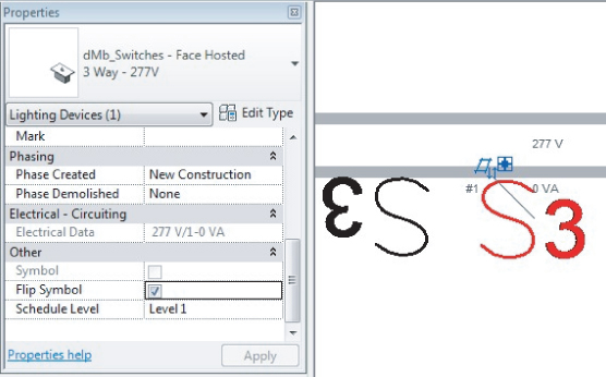
The two annotation families can be placed into a light switch component family with the normal switch annotation placed into the family at the appropriate insertion point and the switch annotation for the rotated symbol placed into the family and rotated 180 degrees. Yes/No parameters are used to control the visibility of each nested annotation. The result is a switch family that can be displayed as desired depending on its orientation in your model. Figure 18.17 shows the switch family mounted to a wall; the switch on the right has been modified to show the rotated (or “flipped”) symbol.
Figure 18.17 Display options for a light switch symbol
Using Constraints
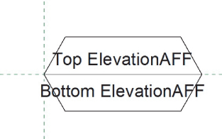
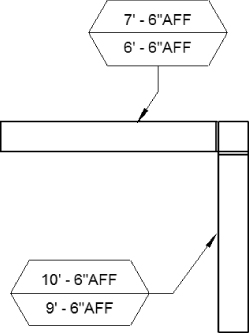
You can create reference lines in your annotation families to which you can constrain the line work. This allows you to make the annotation family parametric, giving you the freedom to move the annotation symbol independently from the component when using nested annotations in component families. This is most useful when working with face-hosted families.
As stated in Chapter 13, “Power and Communications,” it is sometimes necessary to offset the symbol for a component so that it does not interfere with other symbols. For face-hosted items, an offset to the left or right can be created in the component family after the annotation is nested. The offset to show the symbol away from its host needs to be created directly in the annotation family.
To create an offset for a symbol that will show the symbol offset from its host, do the following:
Figure 18.18 Assigning a parameter to dimension
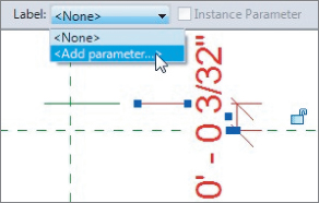
Figure 18.19 Creating a group
Figure 18.20 Aligning and locking the group
Figure 18.21 Placing the annotation symbol
Figure 18.22 Controlling the nested annotation symbol parameters via parameters from the main family
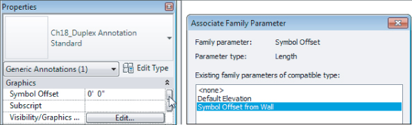
Note that you must use a value for the offset that relates to the actual size of the symbol, because the symbol size in the view is determined by the view scale.
Using Labels and Tags
The most common type of annotation family is a tag. Tags can be created for any category of Revit model element to report information about the element on your sheet views. A tag family can contain a combination of labels and line work. The Generic Tag.rft family template can be used to create a tag, which can then be categorized for a specific element category. There are also category-specific tag templates that can be used, and you can even use the Generic Annotation.rft template and change its category to a tag. Tags are much more useful than plain text, because they will update automatically when the parameters of an element are changed. Using labels in your tag families does this. Using tags in lieu of text objects will save you editing time and improve coordination.
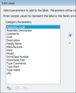
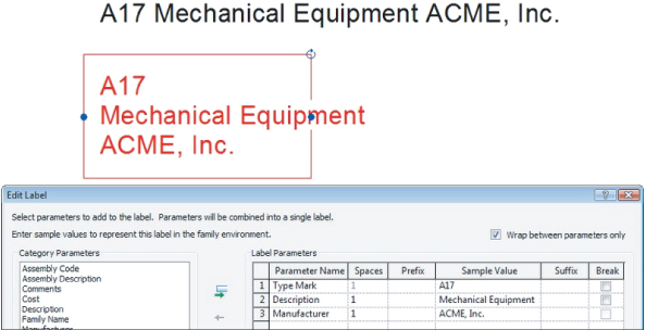
You can place a label into your annotation family by clicking the Label button on the Text panel of the Create tab. When you click in the drawing area to place the label, the Edit Label dialog box will appear. When using the generic annotation template, any parameters that exist in the family will be listed in the box on the left side. If none exist, you can create one by clicking the Add Parameter button in the lower-left corner of the dialog box. After you give the parameter a name and define its type and whether it is an instance or type parameter, it will appear in the list.
When you use the generic tag family template, the parameters that are available in the Edit Label dialog box (see Figure 18.23) are parameters common to all Revit model components.
Figure 18.23 Parameters available in a generic tag
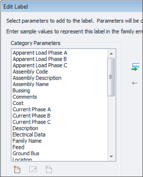
If you categorize your annotation family as a tag for a specific element category, the parameters for that element type will appear in the Edit Label dialog box. Figure 18.24 shows a list of parameters for an electrical equipment tag, including the common parameters. Any shared parameters that you have created for the element category can also be added. See Chapter 6, “Parameters,” for more information about shared parameters.
Figure 18.24 Parameters for an electrical equipment tag
Label Format Options
You can assign a parameter to your label by selecting it from the list and clicking the Add Parameter(s) To Label button (with the green arrow).
You can apply a prefix or suffix to the label. These will appear at every location of the tag in your project. The Sample Value column allows you to input a value that will be seen when you are editing the tag family. If a value is given for the parameter while you are editing the tag family, the sample value will be overwritten.
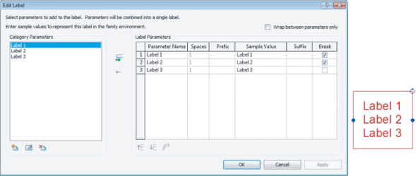
It is possible to add multiple parameters to a single label. Doing so will list the parameter values in the same label object. Selecting the check box in the Break column of the Edit Label dialog box will create a hard return after the value of the parameter when it is displayed in the label. This enables you to have a label with multiple lines of text, as shown in Figure 18.25.
Figure 18.25 Single label with multiple parameters
If you do not use the Break option, the parameter values will display on a single line. If the single line of parameter values exceeds the bounding box of the label, the values will wrap in the same manner as a text object. You can select the box in the upper-right corner of the Edit Label dialog box to wrap the values between parameters only. This prevents values of a single parameter from ending up on multiple lines. Figure 18.26 shows a multi-parameter label on a single line, and the same label with its bounding box shortened and the Wrap Between Parameters Only option selected. Notice that the value for the Description parameter did not wrap.
Figure 18.26 Multi-parameter label
When you click OK to close the Edit Label dialog box, the label will appear with the sample values. The label properties can be edited to display the parameter values as desired. Select the label, and access the Properties palette to edit the alignment of the text and its readability instance properties. The type properties of the label define the text used to display the parameter values. You can assign a color and line weight to the text and define whether the background is transparent or opaque. A tag with a label that has an opaque background will mask out any elements that it is placed over in your project views.
In the Text group of a label's type properties, you can assign a font and text size. You can also make the text bold, italicized, or underlined. You can apply a width factor to the text, as well.
Labels and Line Work
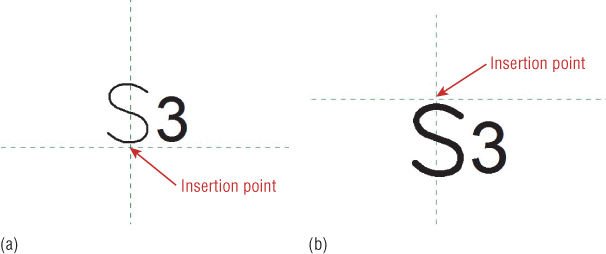
Your tag families can be a combination of labels, text, and line work. It is important to position these items around the family's insertion point. Improper placement of items in a tag family will cause inaccuracies in the location of leader lines when the tag is placed into a project. The same drafting tools used to create an annotation family can be used in tag families.
Figure 18.27 shows a duct tag that contains labels and line work. There are two labels, so they can be positioned independently. A suffix was added to each label. The line work is positioned at the intersection of the reference planes for proper leader orientation when the tag is used in a project.
Figure 18.27 Sample duct tag family with line work and labels
When you properly locate the graphics in your tag families, their leaders will maintain connection with the tag graphics regardless of which direction the leader is pointing, as shown in Figure 18.28.
Figure 18.28 Tags with leaders
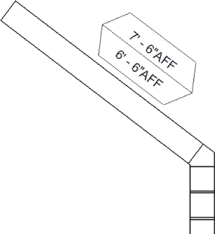
When you place a tag family into your project view, there is an option on the Options Bar to orient the tag vertically or horizontally. If you want your tag to align with its associated item, you can select the box in the Rotate With Component parameter. You can find this by clicking the Family Category And Parameters button on the Properties panel of the ribbon when editing the family. Setting your tag family to rotate with its associated component disables the option to set the tag to horizontal or vertical, because the tag will align with the component, as shown in Figure 18.29.
Figure 18.29 Tag aligned with angled duct
The Bottom Line
Create symbolic lines and filled regions.
Not only is Revit MEP 2013 a modeling application, but it also contains the tools necessary to accomplish drafting tasks.
Master It
Having a good command of the tools available for creating symbols will help you create families that represent your design elements exactly the way you want to see them. What line tool is best suited for duplicating the line work of an imported CAD symbol?
Use symbols within families for representation on drawings.
Given the schematic nature of MEP plans, symbols and annotation objects are important parts of your Revit MEP 2013 workflow, allowing you to represent your model components according to your company standards.
Master It
By having annotation symbols nested into your component families, you can create an accurate 3D model that is displayed schematically on your construction documents. Explain the importance of creating subcategories for the graphics in your annotation families.
Work with constraints and parameters for visibility control.
The parametric modeling capabilities of Revit MEP 2013 make it a powerful BIM solution. These capabilities can be used in annotation families as well.
Master It
A common scenario for a Revit project is to link consultant files into your project file. Because of this, face-hosted families are often used. Face-hosted components can be attached either to a vertical or horizontal host, so the ability to separate the annotation symbol from the host needs to be created in the annotation family.
Use labels to create tags.
Tags are the most commonly used annotation families in a project. They are used to report information about objects in a Revit model.
Master It
The use of labels is a much more effective method than using text objects for keeping documents coordinated.