Another nifty function of pandas is the describe function that gives us a summary statistics of every value inside each column of the Pandas DataFrame object:
>>>  print data.describe()
         EUROSTOXX       VSTOXX
count  4072.000000  4048.000000
mean   3254.538183    25.305428
std     793.191950     9.924404
min    1809.980000    11.596600
25%    2662.460000    18.429500
50%    3033.880000    23.168600
75%    3753.542500    28.409550
max    5464.430000    87.512700
[8 rows x 2 columns]
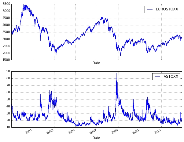
Pandas allows the values in the DataFrame object to be visualized as a graph using the plot function. Let's plot the EURO STOXX 50 and VSTOX to see how they look like over the years:
>>> from pylab import *
>>> data.plot(subplots=True,
...           figsize=(10, 8),
...           color="blue",
...           grid=True)
>>> show()
Populating the interactive namespace from numpy and matplotlib
array([<matplotlib.axes.AxesSubplot object at 0x10f4464d0>,        <matplotlib.axes.AxesSubplot object at 0x10f4feed0>], dtype=object)
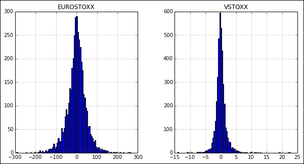
Perhaps we might be interested in the daily returns of both the indexes. The diff method returns the set of differences between the prior period values. A histogram can be used to give us a rough sense of the data density estimation over a bin interval of 100:
>>> data.diff().hist(figsize=(10, 5),
...                  color='blue',
...                  bins=100)
array([[<matplotlib.axes.AxesSubplot object at 0x11083d910>,         <matplotlib.axes.AxesSubplot object at 0x110f3f7d0>]], dtype=object)
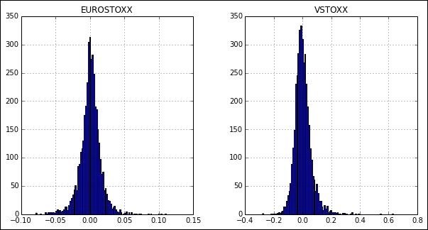
The same effect can also be achieved with the pct_change function that gives us the percentage change over the prior period values:
>>> data.pct_change().hist(figsize=(10, 5),
...                        color='blue',
...                        bins=100)
array([[<matplotlib.axes.AxesSubplot object at 0x11132b810>,         <matplotlib.axes.AxesSubplot object at 0x111ef1f90>]], dtype=object)
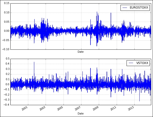
For quantitative analysis of returns, we are interested in the logarithm of daily returns. Why use log returns over simple returns? There are several reasons, but the most important of them is normalization, and this avoids the problem of negative prices.
We can use the shift function of pandas to shift the values by a certain number of periods. The dropna function removes the unused values at the end of the logarithm calculation transformation. The log function of NumPy helps you calculate the logarithm of all values in the DataFrame object as a vector and will be stored in the log_returns variable as a DataFrame object. The logarithm values can then be plotted in the same way as we did earlier, to give us a graph of daily log returns. Here is the code to plot the logarithm values:
>>> from pylab import *
>>> import numpy as np
>>>
>>> log_returns = np.log(data / data.shift(1)).dropna()
>>> log_returns.plot(subplots=True,
...                  figsize=(10, 8),
...                  color='blue',
...                  grid=True)
>>> show()
Populating the interactive namespace from numpy and matplotlib
array([<matplotlib.axes.AxesSubplot object at 0x11553f1d0>,        <matplotlib.axes.AxesSubplot object at 0x117c15990>], dtype=object)