
Chapter 20. Introducing Windows Store Apps
After completing this chapter, you will be able to:
Explain essential features of the Windows Store user interface.
Create user interfaces by using XAML.
Create, deploy, and run a simple Windows Store app.
Describe the essential features of C++/CX.
The release of Windows 8 has presented developers with new opportunities and challenges, enabling them to write applications that make full use of the capabilities of mobile devices, including touch screens and cameras. This chapter introduces you to the world of writing Windows Store applications for the new Windows 8 environment.
A (brief) history of writing Windows user interface applications
The way in which Windows user interface (UI) applications have been written has evolved over the years, from the earliest applications written in C, through a move to C++, then Microsoft .NET, and now Windows 8. This section gives you a brief overview and history and also provides information to help you decide which technology you should consider using for a UI application.
The Win32 API
The earliest Windows UI applications were usually written in C by using the Win32 API. This was an exacting task, somewhat equivalent to writing code in assembly language. There was a tremendous amount of boilerplate code needed to do almost anything, and you had to know just what was going on because there was no higher-level library taking care of the housekeeping for you.
For example, the simple task of creating a window on the screen entailed calling a function that took no fewer than 12 parameters, as demonstrated here:
HWND WINAPI CreateWindowEx(
    DWORD dwExStyle, LPCTSTR lpClassName, LPCTSTR lpWindowName,
    DWORD dwStyle, int x, int y, int nWidth, int nHeight,
    HWND hWndParent, HMENU hMenu,
    HINSTANCE hInstance, LPVOID lpParam);
You can probably guess what some of the parameters mean (x and y are the initial position of the window, and nWidth and nHeight specify its size), but there are some obscure parameters and types here.
Creating applications by using the Win32 API often means copying an existing application to get all the boilerplate startup and housekeeping code, and then editing the business logic parts.
Microsoft Foundation Classes
Microsoft’s first C++ user interface library was Microsoft Foundation Classes (MFC), initially released in 1992 and now at version 10. MFC provides a thin C++ wrapper around the Window APIs, but it does perform most of the tedious housekeeping for you.
MFC made it possible to create applications that looked like Microsoft Office and Windows Explorer, and which could interoperate with Office applications by using a complex technology called Object Linking and Embedding (OLE). MFC 9 introduced a number of new features including support for docking windows similar to those found in Microsoft Visual Studio, and a ribbon toolbar similar to that used in Microsoft Office.
MFC has been deprecated in favor of .NET, but there are many applications that still use it. Versions 7 through 9 were designed to help developers migrate to .NET, and so it is regarded as a legacy framework.
One drawback for MFC developers is that MFC has never had a UI designer in Visual Studio, although there are editors for icons, bitmaps, and other resources.
Windows Forms
The first versions of .NET introduced a new UI library called Windows Forms (or WinForms), which was modeled on the Microsoft Visual Basic way of creating UIs, and (as the name implies) it was targeted at producing form-based applications. Because it was a .NET library, you could write Windows Forms applications in any .NET language.
Windows Forms applications can have multiple windows, menus and toolbars, dialogs, and all the other features that you would expect in a desktop Windows application.
A Windows Forms application consists of one or more windows called forms, and you typically develop it by dragging controls from a toolbox onto a form and then using the Properties editor to set control properties and event handlers. Windows Forms was the first time that C++ developers had a visual designer for creating UIs.
Note
Although you’d usually use the designer in Visual Studio to create Windows Forms applications, Microsoft designed it so that you could create the entire UI in code if you wanted to, and compile from the command line.
A form and its child controls are represented by objects in code, and the Visual Studio designer creates the code that will generate the desired layout at run time. Note that Visual Studio 2012 does not support Windows Forms for C++/CLI. It is possible that support might be added back in a later version, but for the time being if you want to use WinForms, you will need to use Visual Studio 2010.
Windows Presentation Foundation
Version 3.0 of the .NET Framework saw the release of Windows Presentation Foundation (WPF, code-named “Avalon”), which was intended to build on the success of Windows Forms as well as add extra functionality. Microsoft Silverlight is a subset of WPF for writing components to embed in webpages, and which provide the same kind of functionality as Adobe Flash.
Although you can use it to design form-based applications, WPF is very different from Windows Forms. Here are some of the main differences:
WPF uses DirectX rather than the older GDI graphics subsystem, which makes for much faster rendering and offers the ability to use hardware graphics acceleration when available.
WPF uses XAML, an XML language, to describe UI layout. This makes it possible to almost completely separate the presentation and logic parts of an application.
WPF supports many advanced features that do not appear in Windows Forms, including rich support for media (vector and raster images, audio, and video), animation, bitmap effects such as drop shadows, and advanced text rendering.
WPF’s support for data-binding is far more powerful and extensible compared to Windows Forms.
WPF can have a steep learning curve because it is intended as a professional graphics library with which developers can create any UI they want rather than a library that makes it easy to perform common tasks and build simple business applications.
Unfortunately, WPF isn’t easy to use from C++/CLI, because the language lacks support for partial classes, and this feature is essential if you are to work with XAML. I’m not entirely certain why this wasn’t added—it would certainly be possible—but it seems that Microsoft decided that it didn’t want C++/CLI used for modern front-end development. Whatever the reason, there has never been a C++/CLI designer for WPF in Visual Studio, and so there is no “WPF Application” project type.
Windows 8 and Windows Store
Although Windows 8 fully supports the familiar Windows desktop environment, it also provides a new way of writing UI applications. Windows Store apps use a library called Windows RT (or WinRT) which provides a UI library that is aimed at touch devices and the style of interface made popular by the iPad and other tablets. It is called Windows Store because it is envisaged that developers will create applications and sell them online through Microsoft’s Windows Store, in common with the way that many other mobile platforms make content available.
Windows Store applications are very different to traditional Windows applications; they require a different approach to development, as you will see in this and Chapter 21.
So, Windows 8 supports two different styles of UI application: desktop and Windows Store. Note that they are completely separate. Among other things, this means that a Windows Store app won’t appear on the desktop and needs to run in the WinRT environment.
Which UI library to choose?
So, which UI library should you choose for your applications? For most developers, the choice will come down to Windows Forms, WPF, or Windows Store.
At this point, Win32 and MFC are really legacy technologies, and there are few times when you would consider starting a new project using either of them (although MFC does have some support for interacting with Office that the newer libraries don’t have)
If your application is going to have a traditional form-based UI, consisting mainly of text boxes and buttons, and doesn’t need fancy graphics, animation, or media file support, Windows Forms will be suitable. You will find everything you need in Visual Studio, including a visual designer.
If you want a desktop application but with the advanced features that WPF provides, that is the way to go, although if you are using C++, you will have to jump through quite a few hoops to get there.
And, if you want an up-to-date, tablet-style interface that will suit touch devices as well as desktop computers, consider Windows Store. Oh, and don’t let anyone tell you that Windows Store replaces WPF; they are designed for different types of application. I can’t see anyone producing a Windows Store-style version of Visual Studio any time soon!
Introducing Windows Store apps
The Windows Store UI brings a completely new style of user interface to Windows applications. Many of the ways in which UIs have been constructed since the first versions of Windows are no longer supported. For example, in the Windows Store UI, there are no menus or dialog boxes, so how do you let users make choices? And then there are all the new modes of interaction supported by handheld devices, such as accelerometers and cameras that users will expect to use.
This means that you need to get used to new ways of writing applications. Of course, if you’re new to writing Windows UI applications, you will in some ways have an easier task because you have less to unlearn.
If you read about development with WinRT, you will hear talk of the “green and blue stacks.” This phrase arose from how Microsoft described how WinRT was going to fit with the existing Windows development technologies, and they produced a diagram similar to the following illustration:
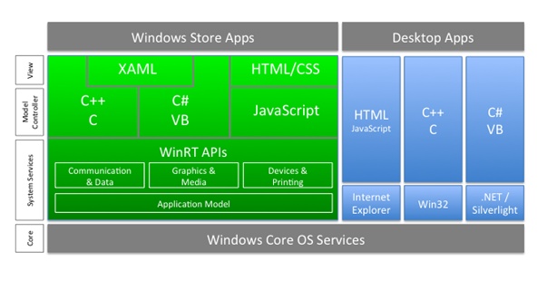
The area on the left, in green in the original diagram, is the new WinRT technology stack, whereas the area on the right (originally in blue) shows existing technologies. This does mean that developing for Windows 8 now has two distinct models, depending on the stack that you choose.
You will notice that .NET is placed in the older, blue section, but you will find that it is still relevant to writing Windows Store apps.
Main features of Windows Store apps
In this section, I’ll list some of the major features of Windows Store apps. If you think of an app running on a typical tablet device or mobile phone, then you should be able to appreciate why these have been introduced.
App behavior
Apps are secure and sandboxed, and can’t wreck other applications. If users are going to download apps from an online store, they need to be confident that a new one won’t affect what they already have installed. Downloading and installing apps is made simpler by using single-folder installation.
One consequence of sandboxing is that some APIs are not available, such as sockets and file I/O.
Apps load quickly, with none of the waiting common to desktop applications. In fact, you don’t start and stop apps like you do their cousins on the desktop. After you run an app it stays in memory but is suspended if you switch away from it, so you can switch back to it instantly. Suspended apps can be terminated if resources are needed; thus, apps need to handle moving to and from the background and termination gracefully.
Microsoft is setting up a Windows Store for Windows 8 applications, similar to the App Store used on Apple devices. In common with most of these stores, apps must be approved before being accepted, and developers need to obtain a license to be able to create apps. You will see how to do this when you create your first app, later in the chapter. And if you’re going to distribute your apps through the Windows Store, they will also need to be signed with a digital signature because anonymous applications aren’t allowed.
Hardware usage
The WinRT APIs make it possible for developers to take advantage of hardware features such as motion sensors and cameras, and apps can adapt to the hardware context, such as scaling to suit screen resolution or using the mouse and keyboard when touch input is not available.
The UI model
The WinRT UI model is intended for use with touch devices that have a limited display area, so there are some restrictions and unique aspects that you need to keep in mind:
Apps do not support overlapping windows. An app can, however, have more than one window, and you can move from window to window as you would in a browser.
Continuing the browser analogy, there are no menus or dialogs.
Tiles are used to represent programs on the desktop. Unlike icons, tiles are active and can display content (such as weather or a stock report). By doing so, they can turn the desktop into a dashboard.
Two types of UI are supported. Code-based interfaces can be written in C#, C++, or Visual Basic; the UI is usually constructed declaratively by using XAML, although it is possible to create the UI manually in code. Web-based interfaces are written in JavaScript and constructed by using HTML5 and CSS3.
Contracts and charms
Windows 8 apps can work together using contracts, which express capabilities (such as search or copy and paste) in a language-independent way.
Charms are UI elements that invoke contracts, and every app has access to five standard charms.
The WinRT APIs
API calls can be direct or brokered. Brokered calls are those that might have security concerns, such as those that affect data or user settings or use device features. They must be declared by the app, and might need permission from the user in order to run.
WinRT places a premium on app response. Part of this is achieved by suspending apps and letting you resume them quickly. In addition, any API call that might take more than 50 milliseconds is implemented as an asynchronous call so that developers are forced to adopt a responsive coding style.
Writing a Windows Store app
Most people will write Windows Store apps in one of three ways:
Using C# or Visual Basic .NET and a subset of the .NET Framework libraries
Using JavaScript and HTML5
Using C++
We are obviously going to be concentrating on the third option.
Note
When writing .NET applications, all languages are equivalent because they all compile down to Microsoft Intermediate Language (MSIL, or IL for short). In fact, you could say that to a very large extent, the language that you choose reflects the syntax you prefer. This is not the case when writing Windows Store apps, for which there are very real differences in the three aforementioned approaches. There is some functionality available in JavaScript that isn’t available in C# or C++, and vice versa, but the main difference is that if you want to use any Win32 and COM libraries you can only do it from C++. This means that to use DirectX to write games, you will need to use C++.
Creating your first Windows Store app
This exercise shows you how to write the simplest of Windows Store apps, which in this case consists of a single screen and two controls. In Chapter 21, you see how to add more functionality, but this will show you the basics. Remember that to create and run Windows Store apps, you need to have Visual Studio 2012 installed on Windows 8. Be aware that you might also be prompted to get a developer license when you create your first project. For more information about developer licenses, read the sidebar at end of this exercise.
In Visual Studio 2012, open the New Project dialog box.
In the pane on the left, click Windows Store.
In the center pane, click Blank App (XAML), and then name the project HelloXaml.
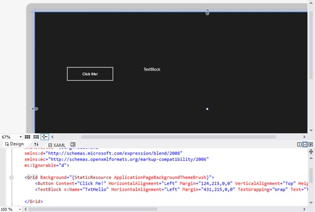
In the Solution Explorer, open MainPage.xaml.
The designer loads (which can take a few seconds), and you then see a screen with a visual representation of the UI in the upper half, and the XAML in the lower half. The UI has a black background because of the default theme that is used for applications.
The XAML is simply an XML document consisting of a Page element that represents the entire page, and which contains a Grid element that will contain the content for the page.
On the left side of the Visual Studio window, click the Toolbox tab to display the Toolbox. If the tab isn’t visible, on the View menu, click Toolbox or press Ctrl+W, X to display it.
Drag a button from the Toolbox to the page.
A button appears, while at the same time a Button element is added to the XAML. You can drag the button around to position it wherever you like, and you can also resize it; the Button’s properties in the XAML are updated to reflect any changes you make. In fact, the upper pane is simply a graphical interpretation of the XAML, so conversely, if you edit the XAML, the upper pane will update itself accordingly.
Note
The Grid control can lay components out using rows and columns, but this example is using absolute positioning. The Margin property determines how much space is left on all four sides of a component, in the order left-top-right-bottom. By specifying the first two, you are effectively defining the position of the button.
In the XAML pane, edit the Button’s Content attribute to something more suitable, such as “Click Me!”
Note
You can provide the content to a control such as a button in two ways, either by using the Content attribute or by providing it as the content of the element, such as in the following example:
<Button Content="First One" ... />
<Button>Second One</Button>
In this example, which style you use is up to you, but if the content is going to be something other than text (such as another XAML element), you’ll need to use the second form.
Drag a TextBlock from the Toolbox to the page, position it next to the button, and adjust its size because the default is rather small.
You might also want to adjust the font size for the TextBlock as well, because the default might be too small when running on a desktop computer. You’ll find the font settings under the Text section in the Properties window.
To work with the TextBlock in code, you need to give it a name. Ensure that the Properties window is visible by selecting Properties Window from the View menu or typing Ctrl+W, P.
Now, select the TextBlock; you should see that the Name field at the top of the Properties window displays <No Name>. Enter a suitable name such as TxtHello and press Enter. The XAML updates with an x:Name attribute, as shown in the following figure:
You now want the TextBlock to be updated when you press the button. To do this, you need to add a handler for the Button’s click event. In the designer pane, click the Button, and then, in the Properties window, click the small lightning-bolt button at the upper right.
This displays all the events that the Button can raise. In this case you just want to handle the click event, so double-click inside the text box, next to Click. This adds a handler with a default name to the Page class, which looks like this:
void HelloXaml::MainPage::Button_Click_1(Platform::Object^ sender,
    Windows::UI::Xaml::RoutedEventArgs^ e)
{

}
You’ll learn more about event handling in Chapter 21, but you don’t need much detail for now, because you aren’t going to use either of the arguments.
To change the text in the TextBlock, add this line of code to the handler:
TxtHello->Text = "Hello, XAML!";
The name that you gave the TextBlock is used as the name for the object that represents it in code. Any UI element that you want to interact with in code has to have a name; you didn’t give a name to the Button because you aren’t interacting with it in code, only clicking it in the UI at run time.
On the Build menu, click Build Solution to build the app and ensure that you have no errors.
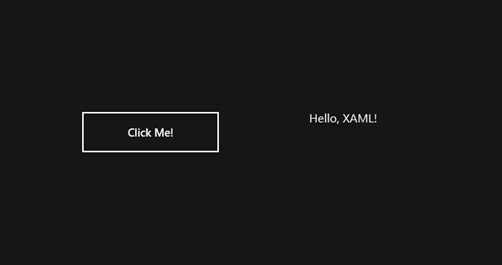
Run the app in the normal way, using Ctrl+F5.
Windows Store apps run full screen, so you’ll see the entire screen taken up with your app’s UI, as depicted in the screen shot that follows. Press the button and check that the TextBlock updates.
Note
Windows Store apps work differently than traditional Windows applications. Running a Windows Store app doesn’t just start it, it also adds it to the Start screen as an installed application.
If you’re new to Windows 8 apps, you might be wondering how you get back to Visual Studio after you’ve performed testing. Moving the mouse to the lower-left corner of the screen displays the Start icon, which you can use to get back to the Start screen. When you get there, you’ll notice that your app has been added to the list of available applications on the right of the page, although it doesn’t look exciting because we haven’t defined any content for the tile yet.
If you click the tile you’ll be back at your app’s UI, and you will probably find that the TextBlock still shows “Hello, XAML!” This is because apps stay active after they’re started. I say “probably” because apps can be terminated if there is pressure on resources, in which case it would be restarted if you clicked it again.
If you decide that you don’t want the app to appear on the Start screen, right-click its tile and then, on the shortcut menu that appears, click Unpin From Start. Even if an application isn’t on the Start screen, you can always execute it by using the All Apps charm on the command bar.
Examining the project
When you create a Windows 8 app in Visual Studio, a lot of files are created. It is useful to know something about what they are, and in particular, which ones you can edit and which you should leave alone.
The following files are those that you can edit:
XAML files App.xaml for the application; MainPage.xaml for the default page. Each page of the application has its own XAML file, whereas App.xaml holds code and XAML that represents the application itself.
Code-behind files A .h and .cpp file for each XAML file; for example, App.xaml.h and App.xaml.cpp.
The manifest file: Package.appxmanifest This contains metadata describing the application. You can double-click this to open it in the Manifest Designer.
The Assets folder This contains Portable Network Graphics (PNG) files containing default images for the application. You can replace these with your own images to customize the appearance of your application.
Precompiled headers: pch.h and pch.cpp You can add your own headers to pch.h, whereas pch.cpp is there simply to include pch.h.
Note
Precompiled headers are a feature of many C++ compilers. A lot of code is included in header files, and in a typical application the same header files can be compiled for each source file. Many of these header files will never change, and so precompiled headers let the compiler process these once, and then reference the compiled version. Different compilers (and even different versions of Microsoft C++) use their own ways of handling precompiled headers, but for Windows Store apps any header files that are included in pch.h will be precompiled.
There are also a number of files that you shouldn’t touch. XAML applications make heavy use of partial classes, and the .g.cpp and .g.h files represent the parts of classes that are generated by Visual Studio:
App.g.h and App.g.cpp The main function and XAML loading code.
StandardStyles.xaml Predefined styles and templates. You can derive from these, but don’t change them.
MainPage.g.h and MainPage.g.cpp Generated partial class definitions for the default page. Another pair of .g.h and .g.cpp files are added for every page you add to the application.
XamlTypeInfo.g.h Type information generated by the XAML editor.
Introducing XAML
Although you can do a lot by just using the drag-and-drop functionality in Visual Studio and letting it generate the XAML for you, understanding how XAML works will make you a much more productive developer, and you’ll also find that there are some things that you can only do by editing the XAML yourself. In this section, I introduce the concepts behind XAML and its grammar.
What is XAML?
XAML (Extensible Application Markup Language) is used in Windows RT and WPF to describe user interfaces. The idea behind XAML is that you create the user interface declaratively in XML, and the compiler then generates the code to create the UI at run time.
Note
Although XAML is mainly used for creating UIs, it provides a general way to describe the relationships and properties of objects; thus, it is also used to describe workflows within Windows Workflow Foundation.
There are three ways by which you can create UIs:
Create the UI completely in XAML. The markup language includes features such as data-binding and triggers, which makes it possible for you to create sophisticated UIs without writing any code.
Create the layout in XAML, with event handling code providing the logic behind the UI. This is the most commonly used approach, the default approach taken by Visual Studio, and the one that we use here.
Create the UI completely in code, with no XAML. This is not the recommended approach, but it can be useful for complex and dynamic UIs.
XAML has a number of features that are especially useful for constructing UIs.
Using XAML for declarative UI layout separates the UI’s look and feel. This way, you can specify the name of a button’s click event handler without having to know in which language it is going to be implemented. This also makes it easy to separate the UI design and business logic implementation, making it possible for designers to work on the XAML without having to be concerned with the code.
XAML’s event handling lets you link control events to handler functions in code, but you can also make event links in XAML itself. For example, you can have a label display the text of whichever item you select in a list box or for the font size of a label to be determined by the position of a slider. This means that for many simple interactions between controls, you don’t need to write any code at all.
Using Control templates, you can define layout and visual behavior templates that can then be applied to controls across one or more applications. When combined with CSS-like styles and triggers that can change styles when events occur, you have a powerful way to create unique and responsive UIs. Template and style details can be defined as resources in XAML, which means that they can be reused easily. If placed in resource dictionaries, resources can be reused across projects.
Finally, data-binding is one of the most powerful features of XAML, making it possible for you to bind properties on objects to data that can come from a variety of sources. I have already mentioned one example, where the font size property of a control can be bound to the position of a slider. You can also bind to collections of objects, so that a list box can display an array of items, or you can bind to data retrieved from a data source.
XAML syntax
In XAML, an object is represented by an XML element, and the object’s properties are defined by attributes. For example:
<Button Content="Click!" Click="Button_Click"/>
This element represents a Button object. It also sets its Content property and the name of the function used to handle the click event. It is easy to use custom classes from XAML, provided the runtime can locate the assembly containing the object code.
Relationships between objects are shown by nesting elements. For example, a ListBox can have a number of ListBoxItems, as demonstrated in the following:
<ListBox>
  <ListBoxItem>Item 1</ListBoxItem>
  <ListBoxItem>Item 2</ListBoxItem>
</ListBox>
If you want to interact with a control from code, it must have a name, and you do this using the x:Name attribute, as shown in this example:
<TextBlock x:Name="txtHello" ... />
The x: prefix indicates that this is the XAML Name attribute, because a control could have its own Name attribute. The prefix will be defined in one of the parent elements of the TextBlock, as shown here:
<Page
    ...
    xmlns:x="http://schemas.microsoft.com/winfx/2006/xaml" />

    <Grid ... >
        <TextBlock x:Name="TxtHello" ... />
    </Grid>
</Page>
In a Windows RT application, each page of a UI is represented by an object of a class derived from Page. The definition of this class is in a code-behind file, and the link between the XAML and the class is provided by the x:Class attribute:
<Page
    x:Class="HelloXaml.MainPage" ... >
XAML also makes use of markup extensions, which are attribute values enclosed in curly brackets, like this:
<Grid Background="{StaticResource ApplicationPageBackgroundThemeBrush}">This syntax informs XAML that the attribute value isn’t simply text; it is normally used to create or manipulate objects.
XAML controls
A XAML UI is made up of controls. Everything is a control, from the top-level window to the image displayed on a button. Here’s an important principle: XAML UIs are constructed by nesting controls within one another, and there is only one control at the top level, which will be a container such as a Window or Page.
We can divide controls into two broad types: content controls (which can only contain one item) and items controls (which can contain more than one).
Note
There are a number of commonly used controls that don’t belong to these two groups (such as the Calendar and DatePicker) but for the purposes of explaining XAML, for the moment, I’ll keep it simple.
A content control can only contain one other item as its content; for instance, a Button can display a piece of text or an image, but this can be an items control. As an example, a Button can contain a StackPanel which holds both an image and some text, as shown in the following illustration:

Here is the XAML to create that button:
<Button HorizontalAlignment="Left" Margin="352,258,0,0"
        VerticalAlignment="Top" Height="120" Width="127">
    <StackPanel Orientation="Vertical">
        <TextBlock Text="Button" HorizontalAlignment="Center" />
        <Image Source="Assets/SmallLogo.png" Height="48" Width="75" />
    </StackPanel>
</Button>
You can see how the Button contains one item—a StackPanel—which contains a TextBlock and an Image stacked atop one another.
Tip
Keep in mind that textboxes aren’t content controls, because they don’t contain text or other controls as content; they implement their own UI that is used for input.
A selection of the most common content controls is shown in the following table:
Control | Description |
A container control that holds UI elements for commands and navigation | |
Provides a border, background, or both around another control | |
Button | A standard Windows button. There are several other types of buttons, such as radio buttons, that look different but work in the same way. |
CheckBox | A control that a user can select (check) or deselect (uncheck) |
ScrollViewerl | A scrollable area that can contain other elements. |
Tooltip |
A selection of the most common items controls is shown in the following table:
Layout controls
There is a special group of items controls that are used for UI layout. This group inherits from the Panel class. In both Windows Store and WPF applications, special controls are used to determine the layout of UI elements within a window or page. For instance, a Page might contain a Grid that will lay controls out in rows and columns, or a StackPanel that will create a vertical stack of elements. Separating out the container and layout functions affords greater freedom to UI designers because it is easy to create custom layouts if required. In this section, you’ll look at a few of the most common layout controls.
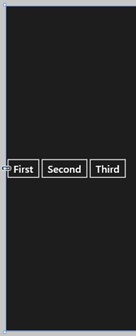
The StackPanel is the simplest layout control. It arranges its child controls into a stack, either vertically or horizontally depending on the value of the Orientation property. The following image shows three buttons in a vertical StackPanel:

The XAML for this layout is very simple:
<StackPanel Background="{StaticResource ApplicationPageBackgroundThemeBrush}"
    Orientation="Vertical">
    <Button Content="First" FontSize="24" />
    <Button Content="Second" FontSize="24" />
    <Button Content="Third" FontSize="24" />
</StackPanel>
Because no other properties have been specified for the StackPanel, the panel fills all the available space, and its child controls are left-justified. Here are the same controls with the Orientation changed to Horizontal:
The StackPanel still fills all the available space, but this time, it lays out its children horizontally. By default, the child controls are centered vertically.
If you have so many items in a StackPanel that they aren’t all visible at one time, you won’t see the controls that fall outside the bounds of the StackPanel, but all of the objects will still be created. The VirtualizingStackPanel manages this efficiently by only creating child controls when they’re visible.
The Grid is one of the most commonly used layouts. Items are arranged by row and column, and cells can have different sizes. You can specify the number of rows and columns as well as which cell a child control should occupy. The illustration that follows displays how three buttons look when displayed in a Grid.
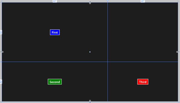
The XAML for this layout shows some interesting features.
<Grid Background="{StaticResource ApplicationPageBackgroundThemeBrush}" >
    <Grid.RowDefinitions>
        <RowDefinition Height="60*" />
        <RowDefinition Height="40*"/>
    </Grid.RowDefinitions>
    <Grid.ColumnDefinitions>
        <ColumnDefinition Width="60*" />
        <ColumnDefinition Width="40*" />
    </Grid.ColumnDefinitions>
    <Button Content="First" FontSize="24" Background="Blue" Grid.Row="0"
        HorizontalAlignment="Center"/>
    <Button Content="Second" FontSize="24" Background="Green" Grid.Row="1"
        HorizontalAlignment="Center"/>
    <Button Content="Third" FontSize="24" Background="Red" Grid.Column="1" Grid.Row="1"
        HorizontalAlignment="Center"/>
</Grid>
You can see how RowDefinition and ColumnDefinition elements are used to define the rows and columns in the grid. There are several ways to define the width and height, such as by using percentages or absolute values. In this case, the asterisk (*) denotes a proportion, so the widths of the two columns are distributed proportionally in the ratio 60:40. Like the StackPanel, there is no size specified for the Grid itself, so it fills all the available space. The other important concept shown by this example is the way in which the row and column values are specified for the buttons. This is done by using attached properties, which are explained in more detail in the sidebar that follows.
The VariableSizedWrapGrid is a variant on the Grid. It also lays items out in rows and columns but will automatically wrap items to the next row or column as necessary. This is obviously useful when the viewing area size changes, such as when switching your tablet from landscape to portrait mode. The following image shows five Button controls in a VariableSizedWrapGrid:
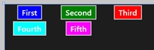
The XAML looks like this:
<VariableSizedWrapGrid Background="{StaticResource ApplicationPageBackgroundThemeBrush}
"
MaximumRowsOrColumns="3" Orientation="Horizontal" ItemWidth
="150
">
<Button Content="First" FontSize="24" Background="Blue" HorizontalAlignment="Center
"/>
<Button Content="Second" FontSize="24" Background="Green" HorizontalAlignment="Cent
er"/>
<Button Content="Third" FontSize="24" Background="Red" HorizontalAlignment="Center"
/>
<Button Content="Fourth" FontSize="24" Background="Cyan" HorizontalAlignment="Cente
r"/>
<Button Content="Fifth" FontSize="24" Background="Magenta" HorizontalAlignment="Cen
ter"/>
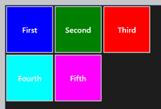
</VariableSizedWrapGrid>The horizontal orientation shows that this control will lay its children out in rows, and the MaximumRowsOrColums says that it will wrap at three items. To achieve a nice layout, each grid cell is 150 wide, and the buttons are centered within their cells. If you decide that you want a layout that looks more like the Windows 8 Start screen, you could change the XAML to the following:
<VariableSizedWrapGrid Background="{StaticResource ApplicationPageBackgroundThemeBrush}
"
    MaximumRowsOrColumns="3" Orientation="Horizontal" ItemWidth="150" ItemHeight="150"
 >
    <Button Content="First" FontSize="24" Background="Blue" HorizontalAlignment="Stretc
h"
        VerticalAlignment="Stretch"/>
    <Button Content="Second" FontSize="24" Background="Green" HorizontalAlignment="Stre
tch"
        VerticalAlignment="Stretch"/>
    <Button Content="Third" FontSize="24" Background="Red" HorizontalAlignment="Stretch
"
        VerticalAlignment="Stretch"/>
    <Button Content="Fourth" FontSize="24" Background="Cyan" HorizontalAlignment="Stret
ch"
        VerticalAlignment="Stretch"/>
    <Button Content="Fifth" FontSize="24" Background="Magenta" HorizontalAlignment="Str
etch"
        VerticalAlignment="Stretch"/>
</VariableSizedWrapGrid>
The difference is that both height and width have been set, and the horizontal and vertical alignments have been set to Stretch, so that the items will fill their respective cells. You can clearly see the difference in the following image:
The last layout control we’ll consider is the Canvas. With this control, you can specify absolute positions for its children, but it isn’t used as often as the others because it doesn’t adapt automatically to changing display conditions. Here is an example of some Buttons laid out on a Canvas:
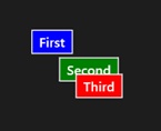
Here’s the XAML for the layout:
<Canvas Background="{StaticResource ApplicationPageBackgroundThemeBrush}">
    <Button Content="First" FontSize="24" Canvas.Left="100" Canvas.Top="100" Background
="Blue"/>
    <Button Content="Second" FontSize="24" Canvas.Left="150" Canvas.Top="150"
        Background="Green"/>
    <Button Content="Third" FontSize="24" Canvas.Left="180" Canvas.Top="180" Background
="Red" />
</Canvas>
You can see that the positions of the Buttons are given by the Canvas.Left and Canvas.Top attached properties. The objects are displayed in the order in which they are declared, resulting in the third Button overlapping the second. If you want to specify the ordering explicitly, you can use the ZIndex property to determine the order in which elements will be rendered.
Event handling
When creating a UI in XAML, you use attributes on controls to link events to event handling functions, such as in the following example:
<Button Content="Click!" Click="Button_Click"/>
Here, the Button’s click event is being handled by a function called Button_Click in the associated code-behind file. Recall the example of an event handler function in the HelloXaml that you saw earlier:
void HelloXaml::MainPage::Button_Click_1(Platform::Object^ sender,
   Windows::UI::Xaml::RoutedEventArgs^ e)
Every event handler has the same signature: the return type is void, the first argument is a handle to the object that raised the event, and the second is a handle to an object, of type RoutedEventArgs or one of its subclasses, which might hold information about the event. For example, handlers for keyboard events will be sent a KeyRoutedEventArgs object whose Key property indicates which key was pressed. In the case of simple click-type notifications, there is no other information, so you can ignore this argument.
Note
Visual Studio will generate a handler for you, whose name is based on the control and event names, as in the previous example, but this is simply a convention, and you are free to use any name you like for event handlers.
The word “routed” in RoutedEventArgs refers to the fact that events can be routed to more than one control. Consider the example you saw earlier in the chapter, in which a Button’s content consisted of a StackPanel containing an Image and a TextBlock. If you click the Image, you’re actually clicking an Image on top of a StackPanel on top of a Button, and you probably want to handle this event in the Button’s click handler. The event is first passed to the Image. Then, it’s passed to its parent (the StackPanel), and so on, bubbling up the tree until it either reaches the top or someone says they’ve handled it.
C++/CX and Windows RT
Writing Windows Store apps exposes you to yet another variety of C++, known as C++/CX (Component Extensions).
You might well wonder (as I have myself on more than one occasion) why Microsoft needed to create yet another set of extensions to C++ when they had only recently introduced C++/CLI.
The main reason for this is that Windows Store apps do not use managed code; thus, they do not make use of the CLR. When you write a Windows Store app, it compiles down to native code rather than IL, so C++/CLI is not appropriate.
This means that you could write Windows Store apps in standard, unmanaged C++, but you’d have to provide a lot of housekeeping code to work with the underlying Component Object Model (COM)-based infrastructure. For this reason, Microsoft decided to add some extensions to C++ to handle these housekeeping tasks, in particular managing object lifetimes.
Note
If you don’t want to use the C++/CX extensions, you can still write WinRT apps in C++ by using a library called Windows Runtime Library (WRL). This can be useful if you want to access low-level features not exposed by C++/CX, but it is more complex to use and beyond the scope of this book.
Unlike C++/CLI, C++/CX does not support garbage collection. This means that objects won’t move around in memory, and so interop with unmanaged code is easier, and you can easily mix C++/CX and native C++ types.
You might also wonder where C++/CLI and .NET fit into the new world of Windows RT applications. It turns out that C++/CX applications can use a subset of the .NET APIs, and there is a client profile provided in Visual Studio so that you can code against this subset. This makes it possible for .NET developers to write Windows RT applications by using familiar APIs.
Windows RT
Windows RT is a new runtime on top of the Windows kernel. It doesn’t use Win32: It is completely new. It covers the same functionality as Win32 (which was introduced in 1993!) but is object-oriented and written in C++.
The WinRT APIs contain a subset of the Win32 and COM APIs. You can use WinRT APIs from several languages, and language bindings are now called projections. There are currently three projections available: native (for C++), JavaScript, and .NET (for C# and VB.NET).
Metadata
All WinRT objects support reflection through metadata, so they can be used from dynamic languages such as JavaScript. WinRT uses the same metadata format as the CLR, which makes it easier and faster to use WinRT APIs from .NET without having to use P/Invoke.
WinRT code compiles down to native code, which has no facility for including metadata. For this reason, the metadata for WinRT code resides in separate files with a .winmd extension. These are CLI assemblies containing only metadata, so you can inspect them by using the IL disassembler tool (ISDASM).
C++/CX syntax
C++/CX is a lightweight set of extensions to C++, so there isn’t too much to cover in this section. To create an object, use the ref new keyword, as demonstrated in the following:
MyClass ^mc = ref new MyClass();
The caret (^) is the same symbol used for managed handles in C++/CLI, but these are different because they are pointing to unmanaged code. We need a handle here rather than a pointer because C++/CX objects are reference counted.
Observe the use of ref new to create objects. This is an example of a compound keyword, formed of two separate tokens, and is not simply new with a ref modifier.
Classes
You create run-time classes by using the ref keyword, as you do with C++/CLI.
public ref class MyClass
{
};
If a class is going to contain WinRT components, it must be declared as a ref class.
C++/CX also introduces the concept of partial classes, by which a class can be split into more than one part and combined by the compiler. This is necessary to support XAML, in which the GUI designer in Visual Studio generates code to represent a page. The developer then creates the second half of the class to add UI logic.
Note
The lack of support for partial classes in C++/CLI is one of the reasons why it is not simple to create WPF applications in that language by using Visual Studio.
Here’s how you might use a partial class. In the following example, one part is declared by using the partial keyword and placed in its own header file:
// MyClass.private.h
#pragma once
partial ref class MyClass  // use the 'partial' keyword
{
private:
    int _implementationDetail;
};
The second part of the class is placed in another header file that includes the first one.
// MyClass.h
#pragma once
#include "MyClass.private.h"

ref class MyClass  // don't use the 'partial' keyword here
{
public:
    int GetDetail();
};
Anyone wishing to use the class will include MyClass.h, but the interesting point is that anyone implementing the public part of the class doesn’t have to see or know any details about the private part.
When Visual Studio creates the code for a XAML user interface, it generates .h and .cpp files. You will find that the .h file (for example, MyPage.h) includes another header (MyPage.g.h). The .g.h file is the partial class generated by the designer containing the private part of the page definition, whereas the .h file is the public part that you can edit. As you might expect, there is also a .g.cpp file, which contains the implementation of the functionality defined in the .g.h file.
Generics
C++/CX supports run-time generics, just like those you’ve met in C++/CLI.
generic <typename T>
public ref class List
{
    property T item;
    ...
};
The generic keyword introduces a generic type, and the typename in angle brackets shows that T is the type parameter which is used in the body of the class.
Strings
Whereas in C++/CLI code you use a System::String to represent strings, in C++/CX you use a Platform::String. Both types of string provide the same basic functionality, and both are immutable.
You create a string like this:
String ^s = "First string";
Or, you can create one like this:
wchar_t *txt = L"Second string";
String ^s2 = ref new Platform::String(txt);
In this example, wchar_t is the standard C++ wide character type, and a string literal is used to construct a String object. This example shows how C++/CX is an extension to standard C++ and can use the same data types.
To extract the underlying data from a String, use the Data function, as illustrated here:
const wchar_t *txt = s->Data();
Common namespaces
When building Windows Store apps you will find yourself working with a number of new namespaces. This final section summarizes the names and purposes of the main ones you need to know about.
The Windows namespaces
The Windows namespaces contain the APIs needed to build Windows Store apps. There are over 100 namespaces in all. The following table lists some those that are the most commonly used:
Namespace | Description |
Provide access to core run-time functionality and run-time information | |
Provide functionality for working with HTML, JSON and XML | |
Enable applications to work with device capabilities such as cameras and geolocation | |
Contain fundamental Windows Runtime functionality | |
Contains generic and specialized collection classes | |
Provide support for locale dependent features such as calendars and number formats | |
Provide support for image display and printing | |
Contain functionality for managing applications | |
Provide classes for creating and working with media such as photos, audio and video recordings | |
Provide support for networking | |
Provide support for authentication and cryptography | |
Provide functionality to work with files, folders and streams | |
The Windows::System namespaces | Provide system-level functions, including application launching, threading, and managing user profiles |
The Windows::UI namespaces | Contain the core UI functionality, including input and notifications |
The Windows::UI::XAML namespaces | Contain the classes, interfaces and enumerations necessary for working with XAML |
Provide access to and help manage web resources, including RSS or Atom syndication feeds |
The Platform namespaces
The Platform namespaces define a number of types that help you work with the Windows Store runtime. The following table lists the ones you might use in your code:
Namespace | Description |
Platform | Contains built-in types that are compatible with the Windows Runtime |
Provides implementations of the types defined in the Windows::Foundation::Collections namespace | |
Contains attributes that modify type declarations |
The Platform namespace defines a number of useful types:
An Object base type
Exception classes
1D array types
A String class
The Platform::Collections namespace contains implementations of the following collection types that are defined in the Windows::Foundation::Collections namespace:
The namespace also contains iterators to work with the collections, such as VectorIterator and VectorViewIterator.
Note
The concrete collections can’t be passed between components written in different languages, such as from C++ to C#. When you need to accept or return a collection, use the corresponding interface type such as Windows::Foundation::Collections::IVector.
The Platform::Metadata namespace defines two attributes that can be used to annotate types:
The DefaultAttribute is used to mark the preferred alternative among a collection of overloaded functions.
The FlagsAttribute declares an enumeration that uses bit fields.
Quick reference
To | Do This |
Create a single-page Windows Store app. | In the New Project dialog box, in the pane on the left, click Windows Store. Then, in the center pane, select the Blank App (XAML) project type. |
Add controls to the page. | Drag controls from the Toolbox to the page, or edit the XAML directly. |
Handle events from controls. | Double-click the control to add a handler for the default event. To add handlers for other events, use the event list in the Property editor. |
Lay out elements in a row, horizontally or vertically. | Use a StackPanel container with the Orientation set appropriately. |
Lay out elements in a grid | Use a Grid container. |