
Chapter 21. More About Windows Store Apps
After completing this chapter, you will be able to:
Create a more complex app by using XAML and code-behind.
Handle events from a more complex user interface.
Use Windows Store app features, such as app bars.
Share content with other applications.
In this chapter you will create a more complex Windows Store app, one that uses a touch interface, and which can be deployed onto any Microsoft Surface tablet device. As well as showing you how to create a realistic Windows 8 app, you will also learn about some of the new features that the Windows Store interface has added to Windows programming.
Building the basic calculator
The app you’ll be building during the course of this chapter is a programmer’s calculator. This will offer the features of a normal calculator, such as arithmetic operations and being able to save values in memory, but it will also add some functions that are often useful to programmers. There is a lot that could be added, but we’re going to limit the additions to the ability to work in different number bases (decimal, hexadecimal, and binary). In addition, programmer’s calculators often work only with integers because they are used to manipulate addresses, so that’s what we’ll do here. The screen shot that follows shows how the finished app will appear.
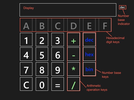
As you design and code this app, you will see how apps with a graphical UI like this are often not that complex in what they’re doing, but you need to expend some effort to ensure that the UI works in the correct way. For example, if the user has selected binary mode, only the “0” and “1” number keys should be enabled. When he switches to hexadecimal, the keys “0” through “9” and “A” through “E” should be enabled.
Laying out the number buttons
Our UI is laid out in typical calculator style, with a TextBlock at the top to display the current value, and below that, number keys laid out in a grid.
Note
There are a lot of features that you need to consider—and lots of ways of implementing them—when designing a touch-based app for the Windows Store and the Microsoft Surface tablet, and we can’t consider all of them without turning this chapter into a book. That means that this app is going to be limited in several respects. First, it is only going to be a single page app. Second, it is designed for use in landscape orientation only; the UI does not adapt itself to portrait mode.
In this first exercise, you will create a project with a single page, and lay out the number buttons and text display.
Start Visual Studio 2012 and create a new “blank XAML” project named ProgCalc.
In the editor, open MainPage.xaml.
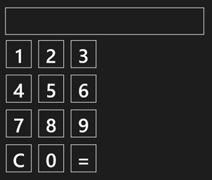
To create an area where the numbers you enter and the results of calculations are displayed, drag a Border from the Toolbox to the main page, positioning it at the top with a left margin of about 430 and a top margin of about 50. Use the handles to resize the area to approximately 90 units high by 730 units wide, set its BorderThickness property to 2, and then set BorderBrush to Gray (or any other color you like).
The numbers you enter into the calculator are going to be displayed in a TextBlock, and it would look good to give the TextBlock a border. The way you do this in XAML is not obvious: you add a Border control to represent the border, and then place the TextBlock inside it.
Drag a TextBlock to the form and drop it into the Border; you should find that it expands to fill the Border control. Add the x:Name attribute to give it a name so that you can interact with it in the code: I’ve called it txtOutput. You should also remove the Text attribute from the XAML and set its FontSize property to a suitable value such as 72.
Note
For this particular app, you actually don’t need to give the Border a name, because you aren’t going to interact with it from code. Only those UI elements with which you interact need to have a name.
The XAML should now look something like this:
<Grid Background="{StaticResource ApplicationPageBackgroundThemeBrush}">
    <Border BorderBrush="Gray" BorderThickness="2" HorizontalAlignment="Left"
            Height="89" Margin="432,48,0,0" VerticalAlignment="Top" Width="731">
        <TextBlock x:Name="txtOutput" TextWrapping="Wrap" FontSize="72"
            HorizontalAlignment="Left"/>
    </Border>
    ...
</Grid>
Don’t worry about the exact sizes and positions: Where the buttons are and how they look isn’t important to the functioning of the app.
Drag buttons to the page to start building up the grid. The buttons display with a preset style, but they are rather small for a calculator. I edited the properties to make them 100 wide by 108 high, and gave them a font size of 72. Ensure that you use the x:Name property to give each button a descriptive name, such as btnOne. You should end up with a grid positioned underneath the Border, and left aligned with it, similar to the following screen shot:
The XAML ought to look similar to the following:
<Grid Background="{StaticResource ApplicationPageBackgroundThemeBrush}">
    <Border BorderBrush="White" BorderThickness="2" HorizontalAlignment="Left"
            Height="100" Margin="431,50,0,0" VerticalAlignment="Top" Width="731">
        <TextBlock x:Name="txtOutput" TextWrapping="Wrap" FontSize="72"/>
    </Border>
    <Button x:Name="btnOne" Content="1" HorizontalAlignment="Left" Margin="431,167,0,0"
            VerticalAlignment="Top" Height="108" Width="100" FontSize="72"/>
    <Button x:Name="btnTwo" Content="2" HorizontalAlignment="Left" Margin="550,167,0,0"
            VerticalAlignment="Top" Height="108" Width="100" FontSize="72"/>
    <Button x:Name="btnThree" Content="3" HorizontalAlignment="Left" Margin="669,167,0,
0"
            VerticalAlignment="Top" Height="108" Width="100" FontSize="72"/>
    <Button x:Name="btnFour" Content="4" HorizontalAlignment="Left" Margin="431,294,0,0
"
            VerticalAlignment="Top" Height="108" Width="100" FontSize="72"/>
    <Button x:Name="btnFive" Content="5" HorizontalAlignment="Left" Margin="550,294,0,0
"
            VerticalAlignment="Top" Height="108" Width="100" FontSize="72"/>
    <Button x:Name="btnSix" Content="6" HorizontalAlignment="Left" Margin="669,294,0,0"
            VerticalAlignment="Top" Height="108" Width="100" FontSize="72"/>
    <Button x:Name="btnSeven" Content="7" HorizontalAlignment="Left" Margin="431,422,0,
0"
            VerticalAlignment="Top" Height="108" Width="100" FontSize="72"/>
    <Button x:Name="btnEight" Content="8" HorizontalAlignment="Left" Margin="550,422,0,
0"
            VerticalAlignment="Top" Height="108" Width="100" FontSize="72"/>
    <Button x:Name="btnNine" Content="9" HorizontalAlignment="Left" Margin="669,422,0,0
"
            VerticalAlignment="Top" Height="108" Width="100" FontSize="72"/>
    <Button x:Name="btnClear" Content="C" HorizontalAlignment="Left" Margin="431,550,0,
0"
            VerticalAlignment="Top" Height="108" Width="100" FontSize="72"/>
    <Button x:Name="btnZero" Content="0" HorizontalAlignment="Left" Margin="550,550,0,0
"
            VerticalAlignment="Top" Height="108" Width="100" FontSize="72"/>
    <Button x:Name="btnEquals" Content="=" HorizontalAlignment="Left" Margin="669,550,0
,0"
            VerticalAlignment="Top" Height="108" Width="100" FontSize="72"/>
</Grid>
Build and run the app to check that everything is OK. Start it by pressing Ctrl+F5 or, on the Debug menu, click Start Without Debugging.
The app starts by showing a gray splash screen, and then shows the UI. If you move the mouse around you will see that buttons highlight as you move over them, and you can also press them, although nothing will happen at this point.
You can get back to the desktop in several ways: you can either go via the Start screen, use the Alt+Tab key combination, or press Windows key+X to bring up a menu from which you can select the desktop.
Handling number input
Now that you have a basic layout in place, you can add the logic behind the buttons. When the user presses the number keys, you want to remember what they have pressed and build up the number. The easiest way to handle this is to realize that you don’t need the actual number until you come to perform an operation: until that point, it can exist as a string on the display. This means that handling digit entry is very simple, as outlined in the following:
Get the current string from the TextBlock
Get the digit character represented by the number key
Add the digit to the string
Put the new string into the TextBlock
The following steps implement this logic in a handler:
Select one of the digit buttons in the XAML. Open the Properties editor by clicking the Properties tab at the side of the Visual Studio window and then click the lightning-bolt button at the upper-right of the editor to display the events for the button.
In the list of events, find the Click entry, which should be at the top. Type NumberButtons_Click in the text box and press Enter.
This causes Visual Studio to create an empty event handler. Edit the handler so that it ends up like this:
void ProgCalc::MainPage::NumberButtons_Click(Platform::Object^ sender,
             Windows::UI::Xaml::RoutedEventArgs^ e)
{
    Button ^btn = (Button^)sender;
    String ^digit = (String^)btn->Content;
    txtOutput->Text += digit;
}
You first need to cast the sender handle to a Button, so that you can use its Content property, which holds the digit you want. You then need to cast the Content to a String. Buttons can have all sorts of things as content, but in this case you know that it is a string, so the cast is safe.
Add the same handler to all 10 number buttons.
You can either do this by using the Property editor or by editing the XAML, adding a Click attribute to the elements for each button. The advantage to doing it this way is that you can cut and paste the text rather than having to type it in the editor.
Build and run the app.
You can click the number buttons to build up a number as a string in the TextBlock. And while we’re thinking about the display, let’s add the logic for the Clear button. All this needs to do for now is to clear the string in the display.
Select the Clear button in the XAML, open the Properties editor, and then display the event list.
Add a handler called ClearButton_Click to the Click event and then press Enter.
Visual Studio creates a new handler for you.
Implement the handler to clear the string in the display, like this:
void ProgCalc::MainPage::ClearButton_Click(Platform::Object^ sender, Windows::UI::Xaml::RoutedEventArgs^ e) { txtOutput->Text = ""; }You should now be able to enter numbers and clear the display.
Adding arithmetic operations
Now that the numbers are displaying correctly, the next step is to add the buttons and logic for the arithmetic operations. When the user presses one of the arithmetic operation buttons, it signals that she has finished entering the first number. This means that you need to perform the following steps:
Get the string from the display, convert it to a number, and then store it as the left operand
Remember which operation was selected
Clear the display and prepare it to accept the right operand
Adding the arithmetic buttons
The following exercise implements the aforementioned steps:
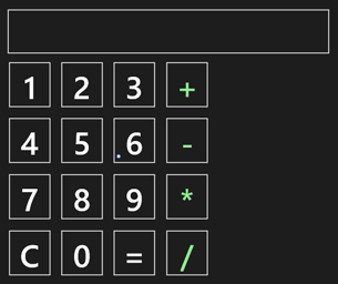
Edit the XAML to add four buttons for the basic arithmetic operations. I placed them in a vertical column, along the right side of the numbers, as illustrated in the following screen shot:
Tip
An easy way to do this is to duplicate a line in the XAML, and then edit it accordingly. For example, I copied the “3” button, renamed it to btnPlus and changed the Content to “+”. You can then select it and drag it to the right to position it correctly; the designer will show you when buttons are aligned correctly.
To differentiate the arithmetic buttons from the number keys, assign them a color.
You can do this by setting the Foreground property, either through the Property editor or by editing the XAML directly. (I set my buttons to LightGreen.)
When you have added all four buttons, pick one and display its events in the Property editor. Type ArithmeticButtons_Click as the handler name and then press Enter
Visual Studio adds an empty handler for you.
Edit the other three arithmetic operation buttons so that they use the same handler.
Getting the number
Now, you need to get the string from the TextBlock, convert it to an integer, and store it for later use.
Start by adding an integer member to the MainPage class in MainPage.xaml.h, remembering to place it in the private section.
int leftOperand;
Add code to the handler to convert the text to an int and store it in the leftOperand.
void ProgCalc::MainPage::ArithmeticButtons_Click(Platform::Object^ sender,
           Windows::UI::Xaml::RoutedEventArgs^ e)
{
    String ^txt = txtOutput->Text;
    int val;
    swscanf_s(txt->Data(), L"%d", &val);
    leftOperand = val;
}
There are a number of ways to perform the string-to-int conversion, and the one I’ve used here will simplify using other number bases later in the program. The swscanf_s function takes a string and converts it according to a format. The first argument is the raw string, which you can get from the String object by using its Data function. The second argument is the format string. The leading L denotes a wide character (as opposed to an ASCII) string literal, and %d alerts the function to expect a string that represents a decimal integer. Finally, the &val passes the address of the variable where the result should be written.
Remembering the operation
What’s the best way to remember which operation has been selected? The obvious solution is to use a variable to store the operation, and the fact that we want to choose one of a small set of values should suggest using an enum for this.
Open the MainPage.xaml.h file and add the declaration for an enum at the top, above the MainPage class declaration but still within the namespace.
namespace ProgCalc
{
    enum class ArithOp
    {
        PLUS, MINUS, TIMES, DIVIDE, NONE
    };

    public ref class MainPage sealed
    {
        ...
    };
}
The enum has one member for each operation, plus one to indicate that there is no operation. The names follow convention by being in capitals.
Add a private member to the MainPage class to represent the current operation.
ArithOp currentOp;
Open the MainPage.xaml.cpp file and set the operation to NONE in the constructor, placing it after the call to InitializeComponent.
MainPage::MainPage()
{
    InitializeComponent();

    currentOp = ArithOp::NONE;
}
You can now see which button was pressed. Edit the ArithmeticButtons_Click function to set the operation accordingly, using a chain of if-else statements.
Button ^btn = (Button^)sender;
if (btn == btnPlus) currentOp = ArithOp::PLUS;
else if ...
Clear the display by setting the Text property for the TextBlock to an empty string.
Build the app to verify that there are no errors.
You can’t see any result at this stage, but you can if you want run the app in the debugger, setting a breakpoint in the arithmetic button handler to check that the conversion is working.
Performing calculations
You can now complete the basic functionality by implementing the logic behind the Equals button. The operations you need to perform are as follows:
Check that there is something to do. If there is no content in the TextBlock or no current operation, return.
Get the text from the display and convert it to a number.
Perform the calculation, using the current operation.
Echo the result to the display.
Adding the handler and getting the number
In MainPage.xaml, bring up the properties for the Equals button and add a handler called EqualsButton_Click.
Add checks at the start of the handler to determine if there is anything to do.
if (currentOp == ArithOp::NONE) return;
if (txtOutput->Text->Length() == 0) return;
Get the string from the display and convert it to a number.
You’ll realize that you need to use the same code that you implemented in the arithmetic button handler, but this would lead to duplication. As a rule, any time that you see duplicated code, you should consider pulling it out into a separate function, a process called refactoring.
Open the MainPage.xaml.h file and add the prototype for a function called ConvertTextToInt, placing it inside the namespace:
int ConvertTextToInt(Platform::String ^str);
Because this is a utility function and doesn’t need access to internal details of MainPage, this doesn’t have to be a member of the MainPage class, although you can make it one if you like.
Add the implementation to the MainPage.xaml.cpp file, as shown in the following:
int ProgCalc::ConvertTextToInt(Platform::String ^str)
{
     int val;
     swscanf_s(str->Data(), L"%d", &val);
     return val;
}
Note
There is nothing in the way of error checking here because we’re sure that the only content of the string is digits, so conversion should not fail. This is reasonable for a tutorial example such as this, but in a real app you’d want to check that the user hadn’t entered a number too large to fit in an integer.
Replace the original code in the arithmetic button handler with a call to your new function, like this:
leftOperand = ConvertTextToInt(txtOutput->Text);
Build the app and confirm that it still works as expected.
Performing the arithmetic operation
At last you can add the code to EqualsButton_Click to perform the operation.
Start by declaring the following two variables, one to hold the number currently in the TextBlock, and another to hold the result:
int rightOperand = 0;
int result = 0;
Store the content of the TextBlock in the rightOperand variable.
rightOperand = ConvertTextToInt(txtOutput->Text);
Add a switch statement that branches based on the operation.
switch(currentOp) {
case ArithOp::PLUS:
    result = leftOperand + rightOperand;
    break;
...
}
Addition, subtraction, and multiplication are simple, but you need to guard against dividing by zero. If you find that you are about to this, display an error message and return.
case ArithOp::DIVIDE:
    if (rightOperand == 0) {
        txtOutput->Text = "Divide by zero";
        Reset();
        return;
    }
    result = leftOperand / rightOperand;
    break;
Observe the call to Reset. If you get a divide by zero, you can’t continue; you want to abandon the calculation and reset everything. But, because this can involve several operations, it makes sense to put it in a separate function.
Add the following declaration of the private Reset function to the MainPage class in MainPage.xaml.h, along with a Boolean member called clearOnNextKey:
void Reset();
bool clearOnNextKey;
Add the definition to the source file, as demonstrated here:
void ProgCalc::MainPage::Reset()
{
    currentOp = ArithOp::NONE;
    leftOperand = 0;
    clearOnNextKey = true;
}
The function clears the operation and saved left operand. The clearOnNextKey variable helps with controlling the UI. At present, the TextBlock is cleared when you press an operator key, ready for you to enter a new number. What we want to do in this case is to leave the message on the display and not clear it until the user taps a number key.
Add the following code to the start of NumberButtons_Click:
if (clearOnNextKey == true) {
    txtOutput->Text = "";
    clearOnNextKey = false;
}
If the flag is set, the TextBlock will be cleared before proceeding.
After you’ve done that, you can complete the equals handler, turning the result into a string and putting it back in the display.
Note
Development is often like this: you start implementing one piece of code and find that there are things you need to do before proceeding. Sometimes it feels as if you’re moving backward, finding that in order to do A, you need to do B, which requires C, and so on. But, eventually you do get back to A again!
wchar_t buff[80];
swprintf(buff, 80, L"%d", result);
txtOutput->Text = ref new String(buff);
This code uses swprintf—which does the opposite to the swscanf_s function that you learned about earlier—taking a value and converting it to a string in a given format. Unlike swscanf_s, swprintf needs an array of wchar_t, which you need to convert to a Platform::String in order to use it with the TextBlock.
Testing the calculator
Have you ever had a problem with a piece of software and found yourself thinking “didn’t anyone test this before they released it?”
We have all experienced buggy software that doesn’t work properly or crashes, and it is very annoying when the problem is something basic that ought to have been caught during development. To avoid inflicting the same frustration on your users, now that you have implemented the basic logic for the calculator, you need to test what you’ve done before proceeding. This will ensure that you are building on a solid foundation.
When testing, you should start by making a test plan. This doesn’t have to be anything complex or grand, but designing a plan helps to avoid the problem of “testing by playing around,” when you test what occurs to you at the time. If you do that, you run the risk of missing out some vital area because it didn’t occur to you.
How do you decide what needs to be tested? Here are several areas that you need to consider:
Does the basic functionality work as it should?
Does the UI render the results correctly and legibly?
Does the app handle mistakes and errors properly?
Does the UI respond to error conditions correctly?
Many developers make the mistake of only testing the first category, not thinking about what mistakes the user could make, which means that surprises might be left in the code for users to find later.
A good place to start is by making a list of what you want to test. Don’t worry about thinking of everything straight off; if another test occurs to you, add it to the list. A first obvious test is for addition: adding two numbers results in another number that represents their sum. If you test this with, say, 1 + 2 and 3 + 3, there is no reason to suspect that other numbers will behave differently. The same is true of the other arithmetic operators, so we can start with the following four tests:
Addition of two numbers
Subtraction of two numbers
Multiplication of two numbers
Division of two numbers
Two things immediately spring to mind when I look more closely at this list. A subtraction such as 5 – 8 will yield a negative number, so I need to test that this displays correctly. I also realize that I’ll have to test for division by zero, so I’ll add that one. My list now looks like this:
Addition of two numbers
Subtraction of two numbers
Display of negative result from subtraction
Multiplication of two numbers
Division of two non-zero numbers
Divide-by-zero results in correct error
Another thing occurs to me: getting zero involved in calculations is not just a special case for division. Multiplying by zero results in zero, and adding or subtracting zero also has to be considered. And so we now end up with the following:
Addition of two numbers
Addition of zero gives right answer
Subtraction of two numbers
Display of negative result from subtraction
Subtraction of zero gives right answer
Multiplication of two numbers
Multiplication by zero gives zero
Division of two non-zero numbers
Divide-by-zero results in correct error
That will do for the basic operation of the calculator. Now, you need to think about the operation of the user interface. Here are a few examples:
Does the Clear button return the calculator to its starting point whenever it is pressed?
What happens if the user keeps pressing the Equals button?
Does Equals handle an empty display or no operation?
There are a number of other conditions that you could add, and you should ensure that you test as many as you can before continuing.
Improving the graphics
When you run the app, you’ll see that it appears on the Start screen as a rather boring, gray square with a white cross in the middle. This is the default image supplied for you, and any serious developer is going to want to update that to something more eye-catching and useful. But first, let’s talk about tiles. Anyone who has worked with a computer is completely familiar with icons—those little square graphics that are used to represent and start applications. Windows 8 has taken the usefulness of icons to a new level by introducing tiles.
By default, tiles are 150x150 pixels in size, but if the app needs to show more information, it can use a wide tile that is 310x150 pixels.
Creating and using a tile
Double-click the Package.appxmanifest file to open the manifest editor. The manifest contains details of the resources used by the app and is arranged on four tabs. The Application UI tab is the one in which we’re interested. This is where you specify details of UI elements such as the tiles and splash screen.
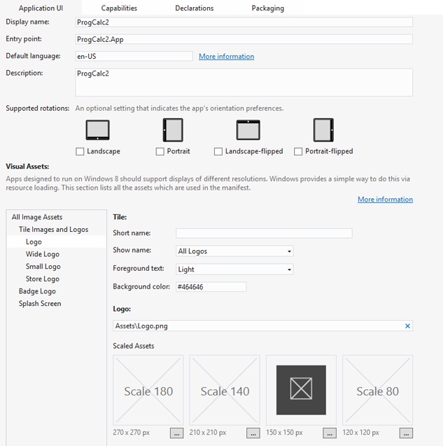
If you’re going to submit your app to the Windows Store, you’ll need to provide several logos and images. At a minimum you need to provide the following:
The standard 150x150-pixel square logo
The store logo (50x50 pixels), used to display your app in search listings in the Windows Store
The small logo (30x30 pixels), used with your app’s display name in various places, such as in search results and in lists of searchable apps.
The splash screen (620x300 pixels) that displays while your app is starting up
Because you’re not going to submit this particular app to the Windows Store, you don’t need to create all of these. But we will address two of them to make the calculator look a bit more realistic.
Note
The Manifest Editor has several entries for some of the logos under the heading Scaled Assets. To get the best UI experience, Microsoft encourages designers to provide properly scaled versions of the various image files because these will look much better than scaling them programmatically.
There are two ways in which you can provide a logo: the first is to edit the default graphic created for the project, and the second is to create another graphic and import it. To edit the logo, in Solution Explorer, double-click the Logo.png file. This opens the file in the built-in graphics editor. I created the logo shown in the following illustration by using a paint program; you can use any program you like, provided you can produce an image that is 150x150 pixels and saved as a Portable Network Graphics (PNG) file.

To use it to represent your app, copy it into the Assets folder for your app. Then, open the Manifest Editor, and type the name of the file into the Logo box, as demonstrated in the following screen shot:
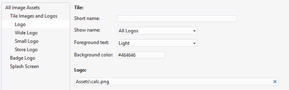
Observe the Background Color entry in the editor. Although you can use any image you want for a tile, it is very common to use white graphics on a colored background, and to make the image background transparent. This makes it possible for users to change the background color of tiles, while still maintaining a consistent look. Here’s how the app looks on the Start screen now:
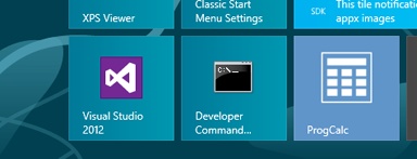
You can see that the custom logo appears alongside the tiles of other apps, and that the name of the app has been added to the tile. You can control whether this name is displayed, because you likely wouldn’t want it to if your logo includes the app name.
The splash screen is displayed while the app is starting up. It consists of an image 620x300 pixels that is displayed on a colored background. Again, the image is often created with a transparent background so that users can change the Windows background color. After you have created an image of the correct size, in the manifest Editor, in the pane on the left, click Splash Screen and then type the name of the image file into the text box. Rebuild and run the app; you should see the splash screen appear before the calculator interface opens.
Although we don’t have the space here to delve into everything that you can do with tiles, there are two features that are worth mentioning in passing.
The first is updating. In a more traditional operating system, program icons are normally static. However, in Windows 8, Microsoft introduced the concept of Live tiles. With Live tiles, not only can you tap them to start the app, just like ordinary desktop icons, but they can also display “live” content when the app isn’t running. For example, the tile for a weather app could display the current temperature and a weather symbol, or an email app could show how many new messages have arrived. Programs can update their own tiles, but they are most useful because they can be updated by background processes even when the app isn’t running. This means that the Start screen is now a dynamic environment, with app tiles reflecting current content.
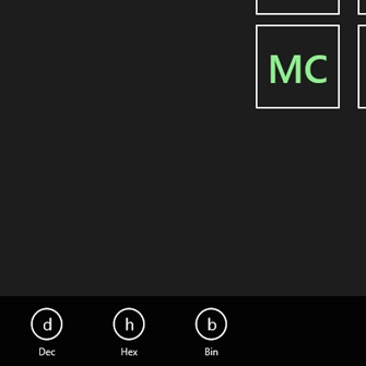
The second item is badges. Badges are small icons that display notifications in the lower-right corner of a tile, as shown in the following:
You pick a badge from a limited set of 11 symbols and the numbers from 0 to 99 (any number greater than 99 displays as “99+”). In the current version of Windows, you can’t define your own badges. As with content, app badges can be updated by background processes.
Handling different number bases
One of the features that distinguish a programmer’s calculator is the ability to work in other number bases. Addresses are often specified in hexadecimal (base 16, and less often nowadays in octal, base 8) and it might be useful to work in binary, as well.
So the next task is to add buttons with which the user can change the current number base, and then implement the logic to make the display and arithmetic work correctly in different bases.
Adding the hexadecimal and base buttons
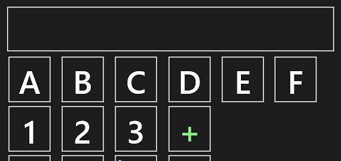
You need to add buttons to represent the three number bases that we’re going to use. You also need to add another six buttons to represent the extra digits required by hexadecimal numbers. The following exercise shows you how to add and arrange the buttons to the UI.
Drag on the UI to select the 16 number and arithmetic operations. Move them down to leave space for another row of buttons below the TextBlock.
Add a row of six buttons in the gap, making them the same size as the number buttons. These represent the hexadecimal digits A through F, so give them the names btnHexA thru btnHexF. You should end up with an arrangement similar to following:
Ensure that they use the same handler as the other number buttons.
Add three buttons next to the arithmetic operation keys and under the “E” key. Label them “dec”, “hex”, and “bin”, from the top downward, and give them the names btnDecimal, btnHex and btnBinary. You’ll need to decrease the font size for the text to fit on the buttons, and you can change the color to make them stand out. Refer back to the first figure in this chapter to see what the arrangement looks like.
You’ll need to a way to determine which base you’re using, so add a TextBlock to the right of the main display. Give it a name (such as txtBase) and set its font size to about 24.
Open the Properties editor, and add a handler called BaseButtons_Click to all three buttons.
Changing the base
Adding the logic for changing the number base requires careful consideration. Here’s what you need to do whenever the user clicks one of the base buttons:
Set the base to the appropriate value: binary, decimal, or hexadecimal.
Ensure that only the appropriate number buttons are enabled. In other words, when in binary mode, only the “0” and “1” keys are enabled, in decimal mode “0” through “9” are enabled, and in hexadecimal mode the “A” through “F” keys are available, as well.
Convert the string in the display to appear in the correct form.
Change the small TextBlock to display which base is being used.
The following exercise shows you how to implement this logic.
You need a way to store the base that has been chosen. Like the arithmetic operation, you are choosing from a small set of values, so another enum is appropriate. Open MainPage.xaml.h and add an enum within the namespace.
namespace ProgCalc
{
    enum class Base
    {
        DEC, HEX, BIN
    };
    ...
};
Add a data member to the MainPage class to hold the current base, and initialize it to decimal in the Reset function.
// In MainPage.xaml.h
Base base;

// In MainPage.xaml.cpp
void ProgCalc::MainPage::Reset()
{
    currentOp = ArithOp::NONE;
    base = Base::DEC;
    leftOperand = 0;
    clearOnNextKey = true;
}
Edit BaseButtons_Click and add the outline of the logic.
void ProgCalc::MainPage::BaseButtons_Click(Platform::Object^ sender,
    Windows::UI::Xaml::RoutedEventArgs^ e)
{
    // Get the button that was pressed
    Button ^btn = (Button^)sender;

    if (btn == btnDecimal)
    {
        // Enable the decimal buttons
        base = Base::DEC;
        txtBase->Text = "dec";
    }
    else if (btn == btnHex)
    {
        // Enable the hex buttons
        base = Base::HEX;
        txtBase->Text = "hex";
    }
    else if (btn == btnBinary)
    {
        // Enable the binary buttons
        base = Base::BIN;
        txtBase->Text = "bin";
    }
}
You can see how each of the cases sets the base variable and displays the current base in the TextBlock. The comments about enabling buttons are there as placeholders, because this is another example of code that is best provided as separate functions.
Add three new members to the MainPage class declaration in MainPage.xaml.h.
void EnableHexButtons(bool enable);
void EnableDecimalButtons(bool enable);
void EnableBinaryButtons();
Notice the slightly different form of the binary function. I’ve added the Boolean argument to the decimal and hexadecimal functions to help avoid code duplication.
Implement the following functions in MainPage.xaml.cpp:
void ProgCalc::MainPage::EnableHexButtons(bool enable)
{
    btnHexA->IsEnabled = enable;
    btnHexB->IsEnabled = enable;
    btnHexC->IsEnabled = enable;
    btnHexD->IsEnabled = enable;
    btnHexE->IsEnabled = enable;
    btnHexF->IsEnabled = enable;
}

void ProgCalc::MainPage::EnableBinaryButtons()
{
    EnableHexButtons(false);
    EnableDecimalButtons(false);
    btnZero->IsEnabled = true;
    btnOne->IsEnabled = true;
}

void ProgCalc::MainPage::EnableDecimalButtons(bool enable)
{
    btnZero->IsEnabled = enable;
    btnOne->IsEnabled = enable;
    btnTwo->IsEnabled = enable;
    btnThree->IsEnabled = enable;
    btnFour->IsEnabled = enable;
    btnFive->IsEnabled = enable;
    btnSix->IsEnabled = enable;
    btnSeven->IsEnabled = enable;
    btnEight->IsEnabled = enable;
    btnNine->IsEnabled = enable;
}
The decimal and hexadecimal functions enable or disable the 0 through 9 and A through F keys, respectively. The binary function only wants the 0 and 1 keys, so the easiest solution is to disable everything and turn on the ones you want.
Call them from the base handler. For the binary case, just call EnableBinaryButtons. For the decimal case, call EnableDecimalButtons(true) and EnableHexButtons(false), and for the hexadecimal case, call both the decimal and hex functions with true as the argument.
if (btn == btnDecimal)
{
    // Enable the decimal buttons
    EnableDecimalButtons(true);
    EnableHexButtons(false);
    base = Base::DEC;
    txtBase->Text = "dec";
}
else if (btn == btnHex)
{
    // Enable the hex buttons
    EnableDecimalButtons(true);
    EnableHexButtons(true);
    base = Base::HEX;
    txtBase->Text = "hex";
}
else if (btn == btnBinary)
{
    // Enable the binary buttons
    EnableBinaryButtons();
    base = Base::BIN;
    txtBase->Text = "bin";
}
Add the default state to the Reset function so that it will be reset to decimal:
void ProgCalc::MainPage::Reset()
{
    currentOp = ArithOp::NONE;
    base = Base::DEC;
    txtBase->Text = "dec";
    leftOperand = 0;
    clearOnNextKey = true;
    EnableDecimalButtons(true);
    EnableHexButtons(false);
}
Call Reset from the OnNavigatedTo function, which means the page will initialize properly.
Build the app to ensure there are no coding errors.
Converting the string in the display
At this point, you can use the buttons to change the number base, but it isn’t affecting the value shown on the display. You need to implement the base handler so that it works like this:
Get the string from the display and convert it to a value, using the current number base
Change the base, according to which button was pressed
Convert the value to a string, using the new number base, and put it back in the display
The first step is to modify the ConvertTextToInt function that you wrote earlier so that it takes account of the number base. Converting from decimal and hexadecimal strings can be done by swscanf_s, but you need to do binary yourself.
Edit the ConvertTextToInt function so that it looks like the following example. Notice how it is now a member of the MainPage class so that it has access to members of the class:
int ProgCalc::MainPage::ConvertTextToInt(Platform::String^ s)
{
    int n;

    if (base == Base::HEX)
        swscanf_s(s->Data(), L"%x", &n);
    else if (base == Base::DEC)
        swscanf_s(s->Data(), L"%d", &n);
    else if (base == Base::BIN)
        n = FromBinary(s->Data());

    return n;
}
The %x descriptor converts a hexadecimal string, and %d handles the decimal case. You will provide your own function to deal with the binary conversion.
Add a prototype for the FromBinary function to MainPage.xaml.h. Because this is a utility function and doesn’t need access to any members of the MainPage class, you don’t have to make it a member.
unsigned long FromBinary(std::wstring s);
Add the implementation to the MainPage.xaml.cpp file
unsigned long ProgCalc::FromBinary(std::wstring s)
{
    wchar_t *stop;
    long l = wcstol(s.c_str(), &stop, 2);

    return l;
}
This function uses the wcstol (Wide Character String To Long) function for the conversion, which will cope with input strings in binary. Here is where you see a good example of the many string conversions that you might need to use in Windows programming: the Data function gets a wstring out of the Platform::String, and the c_str function then gets a wchar_t* that represents the content of the wstring.
Notice the second argument to the function. This returns a pointer to where the number stopped in the string that you passed in. The idea is that the function will convert as much of the string as it can to a number and then stop when it reaches a character it can’t handle; it will then pass you back a pointer to that character, so you can pinpoint where parsing stopped. Because we know that the entire string is valid, we don’t need to use that argument, but we must still supply a variable.
You now need to do the opposite conversion, taking a value and converting it to a string in the correct format. Add a prototype for this function to the header file, such as shown in the following:
Platform::String^ ConvertOutputString(int val);
Add an implementation of the ConvertOutputString function to the source code file.
Platform::String^ ProgCalc::MainPage::ConvertOutputString(int val)
{
    wchar_t buff[80];
    if (base == Base::HEX)
        swprintf(buff, 80, L"%x", val);
    else if (base == Base::DEC)
        swprintf(buff, 80, L"%d", val);
    else if (base == Base::BIN)
    {
        String ^bf = ToBinary(val);
        return bf;
    }
    return ref new String(buff);
}
You can see that the structure of this function now mirrors that of ConvertTextToInt. It also uses another helper function called ToBinary to convert a value to a binary string.
Add the prototype for ToBinary to MainPage.xaml.h.
String^ ToBinary(int n);
Add the implementation to MainPage.xaml.cpp.
String^ ProgCalc::ToBinary(int n)
{
    String ^s = ref new String();

    do {
        s += (n & 1) ? L'1' : L'0';
    }
    while (n >>= 1);

    std::wstring result(s->Data());
    std::reverse( result.begin(), result.end() );

    s = ref new String(result.c_str());
    return s;
}
This function gives you a chance to use the bitwise operators, which is not something you have to do very often, so it is worth taking the opportunity to use them here. The do loop examines the code, bit by bit, adding a “1” or “0” character to a string, depending on whether the bit is set or not. The expression (n & 1) does a bitwise AND of the value and 1: Remember that the AND takes two integer values for each bit position, returning 1 if (and only if) both are set. Because “1” only has a single 1 in the lowest bit position, this is checking whether the lowest bit is set.
The loop condition (n >>= 1) does a right-shift on the value by one position. This shifts all the bits one place to the right, losing the rightmost bit, so that bit 2 becomes bit 1, and a zero is introduced on the far left to fill in. After the loop has examined all the bits, the number will be left as all zeros, so the loop will terminate.
At this point, however, the string is in the wrong order because the character representing the lowest bit is the first, and the others have been added on. So, you need to reverse the string; you could do this by using a loop, but the Standard Library has a useful reverse function, so you can use that, instead.
The final stage is to complete the logic for changing base and updating the display. Add code to the start of the BaseButtons_Click handler to get the number from the display, as illustrated here:
// Get the value from the display
int val = 0;

if (txtOutput->Text->Length() > 0)
    val = ConvertTextToInt(txtOutput->Text);
After changing the base, put the value back in the new format.
// Update the display
txtOutput->Text = ConvertOutputString(val);
clearOnNextKey = true;
Here is the complete handler, for reference:
void ProgCalc::MainPage::BaseButtons_Click(Platform::Object^ sender,
    Windows::UI::Xaml::RoutedEventArgs^ e)
{
    // Get the value from the display
    int val = 0;

    if (txtOutput->Text->Length() > 0)
        val = ConvertTextToInt(txtOutput->Text);

    // Get the button that was pressed
    Button ^btn = (Button^)sender;

    if (btn == btnDecimal)
    {
        EnableDecimalButtons(true);
        EnableHexButtons(false);
        base = Base::DEC;
        txtBase->Text = "dec";
    }
    else if (btn == btnHex)
    {
        EnableDecimalButtons(true);
        EnableHexButtons(true);
        base = Base::HEX;
        txtBase->Text = "hex";
    }
    else if (btn == btnBinary)
    {
        EnableBinaryButtons();
        base = Base::BIN;
        txtBase->Text = "bin";
    }

    // Update the display
    txtOutput->Text = ConvertOutputString(val);
    clearOnNextKey = true;
}
Edit the EqualsButton_Click function so that the output will be converted to the right base. Locate the lines at the end of the function that use swprintf and place the result into a buffer, which should look like this:
wchar_t buff[80];
swprintf(buff, 80, L"%d", result);
txtOutput->Text = ref new String(buff);
Replace them with the following code:
txtOutput->Text = ConvertToOutputString(result);
clearOnNextKey = true;
Build and run the app, and test it thoroughly!
Using app bars
The Windows Store UI model doesn’t support menus or dialog boxes. The idea is that the design should make it easy for the user to navigate his way through the app by using the controls on the page rather than having to pull down menus and use dialog boxes, which could be awkward on a touch device.
There are times, however, when users need to adjust settings or express preferences. For example, in the weather app you might want to switch from Fahrenheit to Celsius, or vice versa. Having these on the main UI would clutter things up, so there is a need for a way to expose these to the user, as needed. Windows Store apps use app bars to present navigation, commands, and tools to users. These are areas that appear when the user swipes from top or bottom of the screen (or by right-clicking or typing Ctrl+Z). They are not intended to hold critical commands: the idea is that anything critical (like the “take a picture” command for a camera app) ought to be in the main UI.
Applications can have two app bars: one at the top of the screen, which is typically used for navigation, and one at the bottom, which is used for commands. In this section, you’ll add a bottom app bar to the calculator, which will hold three buttons, giving you an alternative way to change the number base. Here is what the app will look like with the app bar displayed:
Defining the button styles
The buttons on an app bar are usually round, and this is provided by a set of styles. Before adding the app bar to your app, you need to edit the styles so that they will display correctly.
Open StandardStyles.xaml, and search for Standard AppBarButton Styles.
This is followed by a lot of commented out entries which define styles for various buttons.
Copy one of the style entries, remove the comments, and then edit it so that it looks like this:
<Style x:Key="HexAppBarButtonStyle" TargetType="ButtonBase"
        BasedOn="{StaticResource AppBarButtonStyle}">
    <Setter Property="AutomationProperties.AutomationId" Value="HexAppBarButton"/>
    <Setter Property="AutomationProperties.Name" Value="Hex"/>
    <Setter Property="Content" Value="h"/>
</Style>
This creates a style for the Hex button, which is based on the default AppBarButton style and whose content is an “h”. The Name is the text that will be displayed below the button when it appears on the app bar.
Repeat the previous step to create styles for the decimal and binary buttons.
<Style x:Key="DecAppBarButtonStyle" TargetType="ButtonBase"
        BasedOn="{StaticResource AppBarButtonStyle}">
    <Setter Property="AutomationProperties.AutomationId" Value="DecAppBarButton"/>
    <Setter Property="AutomationProperties.Name" Value="Dec"/>
    <Setter Property="Content" Value="d"/>
</Style>
<Style x:Key="BinAppBarButtonStyle" TargetType="ButtonBase"
        BasedOn="{StaticResource AppBarButtonStyle}">
    <Setter Property="AutomationProperties.AutomationId" Value="BinAppBarButton"/>
    <Setter Property="AutomationProperties.Name" Value="Bin"/>
    <Setter Property="Content" Value="b"/>
</Style>
Save the StandardStyles.xaml file.
Adding an app bar
Now that you have set up the styles for the three buttons, you can add the app bar.
Add this XAML to the bottom of the Page element, immediately after the end of the Grid:
<Page.BottomAppBar>
    <AppBar x:Name="bottomAppBar" Padding="10, 0 10, 0">
        <StackPanel Orientation="Horizontal" HorizontalAlignment="Left">
            <Button x:Name="btnAppBarDec" Style="{StaticResource DecAppBarButtonStyle}"
                Click="BaseButtons_Click"/>
            <Button x:Name="btnAppBarHex" Style="{StaticResource HexAppBarButtonStyle}"
                Click="BaseButtons_Click"/>
            <Button x:Name="btnAppBarBin" Style="{StaticResource BinAppBarButtonStyle}"
                Click="BaseButtons_Click"/>
        </StackPanel>
    </AppBar>
</Page.BottomAppBar>
The BottomAppBar element contains an AppBar, which in turn contains a StackPanel. A StackPanel is a container that contains a stack of items, in this case arranged horizontally and left-aligned. Like menus, it is a convention that commands on a bottom app bar should be left-aligned, and any buttons for help should be right-aligned on the other side of AppBar.
Each button has the appropriate style set and is linked to the base buttons click handler.
Build and run the app. When the UI appears, right-click with the mouse or swipe upward from the bottom of the screen. You should see the app bar appear. Click or touch anywhere else on the screen (or swipe downward), and it will slide away.
Hooking it up
You now have an app bar that you can display and hide, but it doesn’t do anything. Fortunately, it’s a simple matter to edit the base buttons handler so that it reacts properly to the app bar buttons.
Adding sharing
For the final task in this chapter, you’re going to add another feature to the calculator: the ability to share data with other applications. This isn’t going to be very sophisticated, because you’re only going to be able to share the value in the display, but it illustrates an important feature of Windows Store apps.
Contracts and charms
Applications can communicate and share data by using contracts. Windows Store apps use contracts to declare the interactions that they support with other applications.
These contracts are defined by Windows RT, and by using the Windows operating system as an intermediary, apps can communicate without knowing anything about one another.
For example, choosing the Share charm while in an app will display all applications that have registered themselves as targets for sharing. This means that you can send data from your app to any of the sharing targets without the two parties having prior knowledge of one another.
Windows 8 defines the following six contracts:
Share The app can share content with other applications or is ready to accept specific types of data from other applications.
Settings Implements a standard way of defining app settings.
Play To The app can stream audio, video, and images to enabled devices.
File Picker The app is used as a location for saving and loading files.
Cached File Updater The app can track file updates and deliver the latest version to the user.
Charms are a specific and consistent set of buttons that you can access in every app. The charms are Search, Share, Connect, Settings, and Start. They appear on the right side of the screen when you swipe inward from the right edge of the screen, move the mouse pointer to the upper-right or lower-left of the screen, or press Windows key+C.
These buttons provide the following set of core actions that users frequently need:
Search for content located in your app or in another app, and search your app’s content from another app.
Share content from your app with people or services.
Go directly to the Start screen.
Connect to devices and send content, stream media, and print.
Configure the app.
As you can appreciate, implementing contracts and using the charms makes your app a full member of the Windows Store community.
Implementing sharing
Sharing is one of the common contracts supported by apps, letting them share data with other apps in a variety of formats, including the following:
When a request to share data is received, either programmatically or by a user selecting the Share charm, your app receives an event. You implement an event handler in the normal way, which returns the requested data to the caller.
When implementing sharing, you’ll need to use types from the Windows::ApplicationModel.Data Transfer namespace. Depending on the types of data you are sharing, you might also want others, such as Windows::Storage if you are using files.
The DataPackage class
The Windows::ApplicationModel.DataTransfer::DataPackage class is central to any data sharing operation, and a DataPackage object contains the data that the app wants to share, along with a description.
A sharing request comes with an empty DataPackage object. You retrieve it from the arguments passed to the event handler, fill it in with data, and then send it back. If you only want to provide data when the receiver requests it (as opposed to providing it at event handling time) you can add a delegate to the DataPackage, which will be called when the receiver wants the data.
DataPackage has several useful properties, which can be accessed via DataPackage’s Properties property, and which are summarized in the following table:
Name | Mandatory? | Description |
ApplicationName | No | Gets or sets the name of the app that provided this DataPackage |
Description | No | Gets or sets the description for this DataPackage |
Thumbnail | No | Gets or sets the thumbnail image for this DataPackage |
Title | Yes | Gets or sets the title for this DataPackage |
When you choose to share data, the charms show details of the data that is going to be shared. At a minimum, you must supply a title, but you can also add a description to help clarify exactly what is being shared.
DataPackage also has several methods, which are used for populating the data. The following table lists them:
Name | Description |
Sets the bitmap contained in the DataPackage | |
Sets the custom data contained in the DataPackage | |
Sets a delegate to handle requests from the target app | |
Adds HTML content to the DataPackage | |
Sets the RTF content contained in the DataPackage | |
Sets the files and folders contained in the DataPackage | |
Sets the text contained in the DataPackage | |
Sets the URI contained in the DataPackage |
Handling share requests
This final exercise shows you how to implement sharing for the calculator:
At the top of the MainPage.xaml.cpp file, add the following using declaration for the DataTransfer namespace:
using namespace Windows::ApplicationModel::DataTransfer;
Implement the handler that it going to be called when a sharing request arrives. Start by adding a member to the MainPage class declaration in MainPage.xaml.h.
void ShareTextHandler(
    Windows::ApplicationModel::DataTransfer::DataTransferManager^ sender,
    Windows::ApplicationModel::DataTransfer::DataRequestedEventArgs^ e);
As usual with event handlers, the two arguments represent the source of the event and event arguments. A DataTransferManager is an object that implements the sharing functionality within an app; you will shortly create one of these for your app.
Add the implementation of the handler to MainPage.xaml.cpp. Start by getting the Data Request object out of the event args—this is the object that is sent in reply to the request, and you can obtain a DataPackage by using its Data member.
void ProgCalc::MainPage::ShareTextHandler(DataTransferManager^ sender,
        DataRequestedEventArgs^ e)
{
    DataRequest ^request = e->Request;
    DataPackage ^data = request->Data;

    // Now add the data you want to share.
}
You can now fill in the data that you want to share.
Any content must have at least two properties (a title and the content itself). What other properties it has depends first on what you’re sharing, and second on how helpful you want to be!
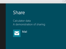
// Set the title and description
data->Properties->Title = "Calculator data";
data->Properties->Description = "A demonstration of sharing";
// Add the data
data->SetText(txtOutput->Text);
Set up the DataTransferManager so that sharing is active for the app. Start by adding a new private member to the MainPage class, as shown here:
Windows::Foundation::EventRegistrationToken dataRequestedToken;
This object is returned to you when you register your event handler with the DataTransfer Manager. It isn’t strictly necessary to include it here, because you only need it when implementing a multipage app. In that case, you will implement the OnNavigatedFrom function, which is called when you move to another page, and you’d use the token to tell the Data TransferManager that you no longer want this page to receive share events. There is, however, no harm in including it, and it will serve to remind you of what to do when you move on to multipage applications.
Add the following code to the OnNavigatedTo function to register for share events, placing it before the call to Reset:
DataTransferManager ^dataTransferManager = DataTransferManager::GetForCurrentView();

dataRequestedToken = dataTransferManager->DataRequested +=
    ref new TypedEventHandler<DataTransferManager^,
        DataRequestedEventArgs^>(this, &MainPage::ShareTextHandler);
Notice the rather compressed form of the second statement. You create a new TypedEvent Handler, which uses generics to create a delegate that will call a handler function. You use the angle brackets to specify the two argument types that the handler will use, and then provide the function that the delegate will call: in this case, it is the ShareTextHandler function on “this” object.
The delegate is hooked to the DataRequested event on the DataTransferManager, and this returns the token that you can use to unregister when navigating away from the page.
Build and run the app and put a number in the display. Then, select the Share charm, which is the second from the top.
After a few seconds initialization, you should see the title and description you provided, together with a list of the applications that can accept the data, as demonstrated in this screen shot:
You can see that the title for the data, along with a description if you supplied one, is shown so that users can decide what they want to do with the data. On the system I’m using, only the Mail app is able to accept shared text data.
Where next?
I’ve run out of space in this chapter, but now that you have seen how to build a more complex Windows Store app, there are several ways in which you could enhance the calculator, building on what you’ve learned. Here are some suggestions:
Add the typical calculator “memory” functionality. The calculator keeps a memory variable, and four buttons let you set it to zero (MC), add the currently displayed value to it (M+), subtract the currently displayed value from it (M–), and put the stored value into the display (MR).
Add a change sign button (+/–) that changes the sign of the value in the display.
Implement some more programmer functionality, such as bitwise operations (AND, OR, XOR, and NOT) and left and right shift.
Add a history mechanism so that you can see what you’ve done up to now.
Quick reference
To | Do This |
Add an app bar to hold command buttons | First create styles for the buttons in StandardStyles.xaml. Add a BottomAppBar to the XAML. Then, add a StackPanel containing the buttons, and link their click events to a suitable handler. |
Implement the sharing contract. | Add a handler for a DataRequestedEvent and put the data into a DataPackage. Then, use the DataTransferManager to make sharing available for that page. |