5 ANNIE LEIBOVITZ INSPIRED
I guess it’s fair to say that if you’re into photography, you have heard of and seen the work of Annie Leibovitz. She is well known for her celebrity portraits and Vanity Fair covers, and who can forget her iconic portrait of then-pregnant Hollywood actress Demi Moore? And, of course, there’s also her series of portraits of HRH Queen Elizabeth II.
Some of her work includes elaborate, purpose-designed and -built sets with multiple lighting rigs, but it’s her simplistic one-light portraits that I’m particularly drawn to, for both the way in which the images are post-processed and the wonderful expressions Annie draws from the subjects in front of her camera.
In early 2016, I had the opportunity to photograph some members of a worldwide organization called the Bearded Villains, which isn’t what you might first think; it is actually an organization for lovers of beards. We’re not talking overnight stubble here, but rather quite substantial facial hair.
It doesn’t stop there. The clothing worn by these guys is very much like the styles worn on a popular TV drama series in the United Kingdom called Peaky Blinders: waistcoats, flat caps, fob watches, you get the idea, right? I was definitely excited about the picture, possibilities, but was undecided about which way to go in terms of lighting, setup, and post-production.
That is, until I saw a picture by Annie Leibovitz of actors Sir Patrick Stewart and Sir Ian McKellen (you can see this image at: http://bit.ly/PLAT_annie). As soon as I saw the picture, I knew the look would be perfect for my Bearded Villains portrait. The pose is unconventional. Both men are looking toward the photographer, but they are seated in such a way that their bodies are facing different directions. Sir Patrick Stewart is leaning sideways a bit, toward Sir McKellen. Sir McKellen is seated with his upper body facing Sir Stewart, but his face is turned toward the photographer.
The color grading in the image really adds to the mood, as does Annie’s use of a textured canvas background. And as for the expressions on the actors’ faces, well, they’re quite perfect!
As is common practice for me, I forwarded a copy of the Annie Leibovitz picture to both of the models I would be photographing so they could get a feel for what we’d be looking to do. Needless to say, they loved it and the date for the shoot was set.
REVERSE ENGINEERING
In the photograph taken by Annie Leibovitz there is a gradual blending of shadows and highlights on the men’s faces, which indicates that soft lighting has been used. There are no harsh, defined areas where the shadows and highlights meet, so for our picture we’ll be using softboxes with both the inner and outer diffusion panels fitted.
Looking at the eyes of the subjects in a photo is always a good way to see how many lights and what types of lights were used. In this picture we can’t get in close enough to see what types of lights were used, but we can see that there’s just one catch light, which tells us that there was one light source. (Of course, there’s always a chance that other catch lights were removed during post-production, but we’ll go with the likelihood that the catch lights have not been touched and will stick with one light source for our image.)
So we know that just one light source was used and it was a soft light, but what about the placement and direction of the light? When we look at the picture we can clearly see which direction the light is coming from by looking at the shadows on both faces. The camera-left side of each man’s face is shaded and the camera-right side is brighter, meaning the light was positioned at camera-right.
To summarize, we can confidently replicate the look of the original Annie Leibovitz picture using just one, soft light source. In this case, we’ll use the Elinchrom Rotalux 135cm Octa Softbox. We’ll place it at camera right, slightly in front of our subjects so that some of the light from the softbox also lights up the opposite sides of the faces a little. We can experiment with this to find the look we’re after in our picture.
THE SETUP
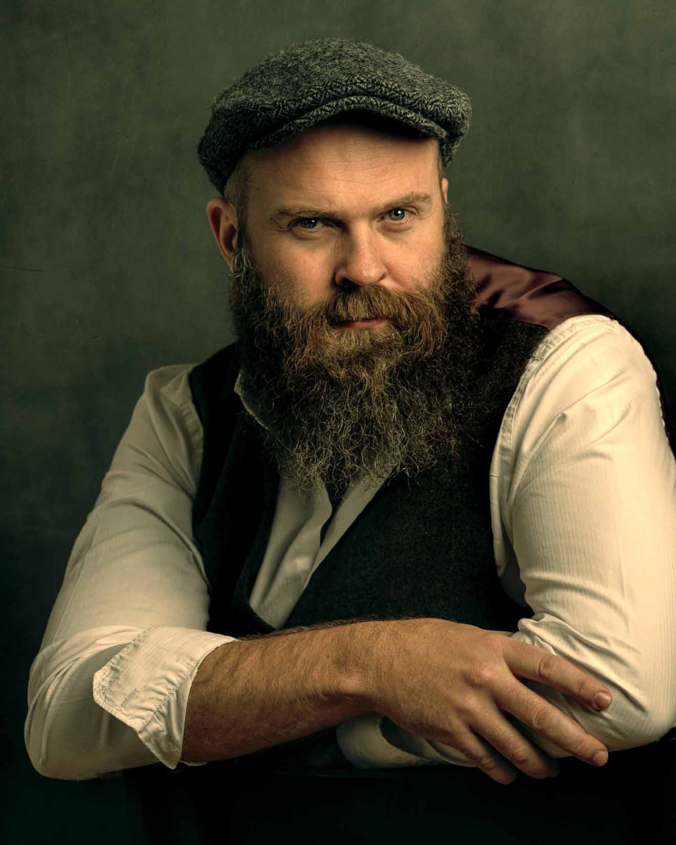
I took what I learned by reverse engineering Annie Leibovitz’s picture and used just one light for my setup (Figure 5.1). Instead of the Oliphant painted canvas background Annie regularly uses, I made use of a gray, seamless roll of paper. In the post-production steps, I’ll show you how to easily fake it and make it look similar to the canvas she uses.
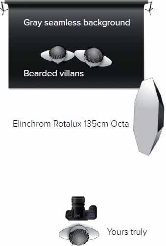
FIGURE 5.1
In Figure 5.2 you can see that I shot the portrait with my camera tethered to my MacBook Pro. I kept the original Annie Leibovitz picture on my computer screen so that I could check back on the posing and lighting.
The gray, seamless paper I used for a backdrop was hung so that it just touched the floor. There was no need to roll it out onto the floor because we were shooting from about waist height upward. In Figure 5.3 you can see a white panel positioned opposite the light. I placed it there to see if we needed to bounce some light onto the subjects, but as it turned out, we didn’t need it for the final picture so we left it out.
Notice how the softbox is positioned slightly in front of the subjects and angled down just a touch. This positioning enabled us to predominantly light one side of the faces and add mainly shadow to the other.
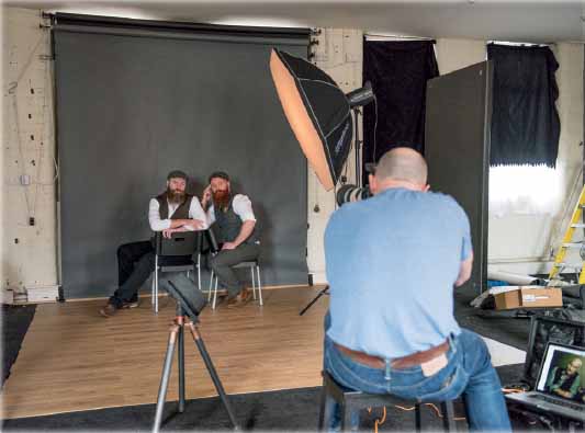
FIGURE 5.2 Shooting tethered to my MacBook Pro with Tether Tools cabling
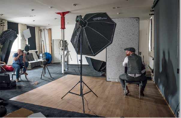
FIGURE 5.3
CAMERA SETTINGS
For this shoot I used my Canon EOS 5D Mark III with the Canon EF 70–200mm f/2.8 IS II lens.
Because the subjects were sitting side by side and roughly in the same focal plane, I opted for an aperture of f/4.5. An aperture of f/4.0 would have been enough but my index finger must have knocked it by accident. Therefore, the light from the Octa was metered at f/4.0. The ISO could have happily been down as low as ISO 100, but ISO 400 still gives us a clean, noise-free file.

FIGURE 5.4
MODE Manual
ISO 400
APERTURE f/4.5
SHUTTER SPEED 1/200 sec.
LENS Canon 70–200mm f/2.8 IS II USM
GEAR GUIDE
For this particular setup I used an Elinchrom Rotalux 135cm Octa Softbox (Figure 5.5) and an Elinchrom ELC Pro HD 1000 flash head (Figure 5.6). I use Elinchrom lights and modifiers most of the time because they’re durable and easy to use.

FIGURE 5.5

FIGURE 5.6
SMALL FLASH GEAR GUIDE
The setup for this picture could certainly be achieved with small flashes or speedlights because nowadays there are so many modifiers and accessories we can use. The only obvious disadvantage of a small-flash setup is the lack of a modeling light to get the position of the light exactly right, but a few test shots should get it sorted out quickly enough.
Based on what is available on the market at the time of writing, you could achieve a similar lighting setup with a small flash or speedlight and a Lastolite Ezybox II Octa Large 1.2m (Figure 5.7).
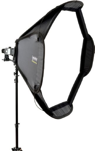
FIGURE 5.7
POST-PROCESSING
The post-processing for this picture is actually quite simple and realistically could be done from start to finish in about 10–15 minutes, so it’s a great image to start with. The use of the gray, seamless paper background is what adds so much to the picture, as you’ll see when we add texture to it to give it a look that’s fairly similar to that of the Oliphant canvas backgrounds Annie likes to use.
We’ll also be color grading the picture, which is what will give the portrait its overall mood and will work so well with the models, what they’re wearing, and their expressions. A really important part of the retouching process is getting everything to work together so that we end up with a great final image.
We’ll kick off by sorting out an issue with sharpness and you’ll see how a filter in Photoshop can really save an image. This isn’t a technique you want to make a habit of using, but it’s incredibly handy when you need it.

NOTE Download all the files you need to follow along step-by-step at: http://www.rockynook.com/photograph-like-a-thief-reference/
- 1. Figure 5.8 is the original, as-shot, RAW image in Lightroom. Even though we’ll be altering the overall color later on, it’s always a good idea to give ourselves the best starting point. To help with this, I used a gray card during the photo shoot (a ColorChecker Passport from X-Rite; Figure 5.9). With this image open in the Develop Module in Lightroom, simply select the White Balance Tool (W) and click on the card.
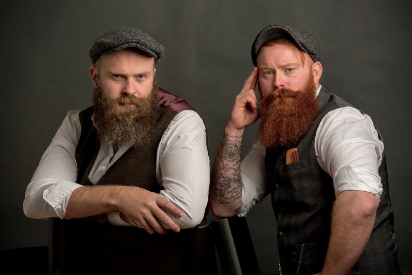
FIGURE 5.8 Original RAW image
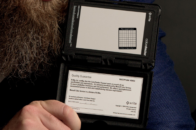
FIGURE 5.9 X-Rite ColorChecker Passport
- 2. Return to the Grid View (G) and with the photograph that contains the gray card selected, hold down the Shift key and click on the original RAW image (the one we want to retouch). With both images now selected, click on Sync Settings in the bottom-right corner of the screen (Figure 5.10) to bring up the Synchronize Settings properties. We only want to sync the white balance, so click Check None to deselect all of the adjustments, and then click on the White Balance and Process Version checkboxes and click OK (Figure 5.11).
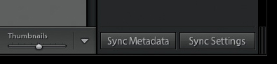
FIGURE 5.10
Figures 5.12 and 5.13 show the image before and after setting the correct white balance.

FIGURE 5.11

FIGURE 5.12 Before (uncorrected white balance)

FIGURE 5.13 After (corrected white balance based on gray card)
- 3. The next thing we want to do is bring out just a little more detail, especially in the shadow areas. To do this, press D to go to the Develop Module, and then in the Basic tab, increase the Shadows slider to around +30 and drag the Highlights slider down to around -60 (Figure 5.14).

FIGURE 5.14
- 4. When I originally worked on this photograph, it was at this stage that I noticed one of the guys was sharper than the other (left-hand side is sharp, right-hand side is ever-so-slightly soft). We will fix this in Photoshop in the next step, but for now let’s just add some overall sharpening to the image. Click on the Detail tab and in the Sharpening section, increase the Amount to around 40 (Figure 5.15). Leave the Radius and Detail sliders at their default settings of 1.0 and 25. Hold down the Option key (Mac) or Alt key (PC) while increasing the Masking slider to around 80 to restrict where the sharpening is applied—we mainly want it on the guys’ faces and hair and not on the background (Figure 5.16).
Now we’ll dive over to Photoshop, sort out that softness issue, and carry on working through the retouching.

FIGURE 5.15
FIGURE 5.16 The white areas indicate where the sharpening is being applied
- 5. Because we only covered a few steps in Lightroom, we aren’t going to send the file over to Photoshop as a Smart Object. If we had made lots of corrections, I would suggest converting the file to a Smart Object because that would give us the flexibility to alter the corrections later if we wanted or needed to. But in this case, we’re good to go, so go to Photo > Edit In > Adobe Photoshop CC, or simply press Command + E (Mac) or Ctrl + E (PC).
In step 6 we’re going to use the Shake Reduction filter, which is only available in the Creative Cloud Subscription version of Photoshop, so it may not be available to you if you are using an older version of the software. Hopefully you won’t make the same mistake I did during your photo shoots, and you won’t ever need to use this filter.
- 6. With the image open in Photoshop, create a duplicate copy by pressing Command + J (Mac) or Ctrl + J (PC). Then go to Filter > Sharpen > Shake Reduction (Figure 5.17). In the Shake Reduction interface, reposition the frame over the face of the man on the right side of the picture. This specifies an area for the Shake Reduction filter to analyze. Leave the settings at their defaults and click OK (Figure 5.18).
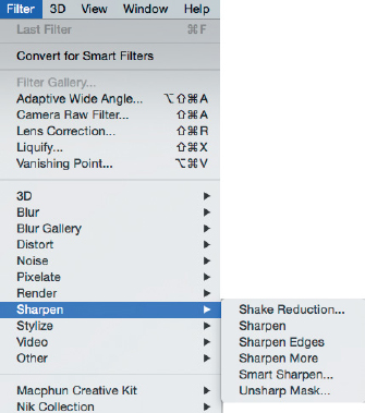
FIGURE 5.17
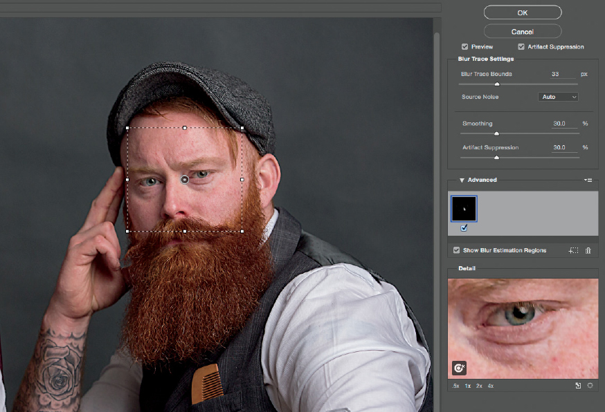
FIGURE 5.18
Depending on the file, the results from the Shake Reduction filter can be quite impressive, and it can certainly help to save a picture.
If you look at Figures 5.19 and 5.20 you can clearly see the difference this filter makes, especially in the eyes.

FIGURE 5.19 Before Shake Reduction

FIGURE 5.20 After Shake Reduction
- 7. Rename the layer “shake reduction” (Figure 5.21). We only want the sharpness over the guy’s face, so first add a black layer mask by holding down the Option key (Mac) or Alt key (PC) and clicking on the Layer Mask icon at the bottom of the Layers panel. This will hide the results of the Shake Reduction filter. Then choose a white foreground color and a soft-edged brush and paint over the face to reveal the results of the filter in the desired areas.
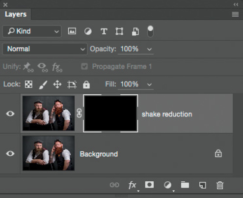
FIGURE 5.21
- 8. Now that we’re back in focus and on track, let’s get on with the creative side of retouching. We’ll start off with the eyes. We’re going to be using a Quick Mask at some point because it’s a great way to see what we’re selecting, but first we need to set it up.
Double-click on the Quick Mask icon in the toolbar (Figure 5.22). In the Quick Mask Options dialog box, make sure that Selected Areas is checked and click OK (Figure 5.23).
Use the Elliptical Marquee Tool to select both eyes of the man on the right side of the picture (Figure 5.24).
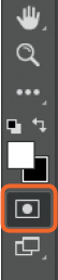
FIGURE 5.22

FIGURE 5.23

FIGURE 5.24 Both eyes are selected

TIP Hold down the Shift key while dragging out an ellipse to make it perfectly round. Once you have made one selection, hold down the Shift key while selecting the other eye to keep both selections active.
- 9. Now we need to tidy up the selections so that they include only the centers of the eyes and not the eyelids or other surrounding areas. Press Q to enter Quick Mask mode. The outline of the red overlay (our selected area) is very defined (Figure 5.25), so we need to soften this. Go to Filter > Blur > Gaussian Blur and add in around 2px Radius of Blur, then click OK (Figure 5.26).
With a white foreground color and a round, soft-edged brush set to about 30% Hardness, paint over the areas of red overlay that you want to remove (eye lids and pupils; Figure 5.27).
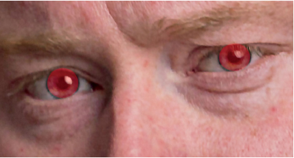
FIGURE 5.25 Defined selection outline
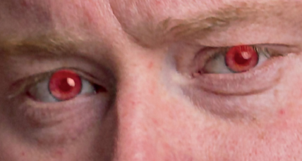
FIGURE 5.26 Selection outline softened with Gaussian Blur
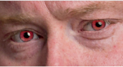
FIGURE 5.27 Painting with white in Quick Mask mode removes the red overlay from unwanted areas
- 10. Press Q to exit Quick Mask mode and click on the Selective Color adjustment layer icon (Figure 5.28). In the Selective Color properties, change the Colors menu to Neutrals (Figure 5.29). Then in the Layers Panel, change the Blend Mode of the Selective Color adjustment layer to Linear Dodge (Add) (Figure 5.30).

FIGURE 5.28

FIGURE 5.29

FIGURE 5.30
- 11. Reduce the Opacity of the Selective Color adjustment layer to around 20% (Figure 5.31). In the Selective Color properties, adjust the sliders to make the eyes bluer. In my example, I set Cyan +22, Magenta +24, and Yellow -14 (Figure 5.32). If you want to add more contrast in the eyes, change the Colors menu from Neutrals to Blacks and drag the Black slider to the right. In this example, I increased the Blacks to +45% (Figure 5.33).
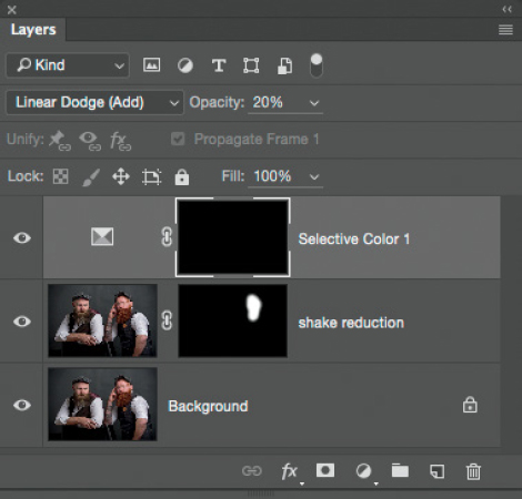
FIGURE 5.31 Opacity of Selective Color adjustment layer lowered to 20%

FIGURE 5.32
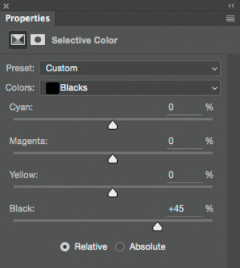
FIGURE 5.33 Increase contrast by choosing Blacks from the Colors menu and dragging the Blacks slider to the right
Repeat steps 8–11 to enhance the other man’s eyes, but choose settings and colors that suit your taste.
- 12. Next we’ll sharpen the eyes a little more to give them some pop. Add a new blank layer to the top of the layer stack and rename it “Sharpen Eyes” (Figure 5.34). Select the Sharpen Tool from the toolbar (Figure 5.35) and in the options bar at the top of the screen, set Strength to 50% and put checkmarks in the Sample All Layers and Protect Detail checkboxes (Figure 5.36). Paint over the middle of the eyes on both gentlemen a few times to add some sharpening.

FIGURE 5.34

FIGURE 5.35

FIGURE 5.36
We can see the effects of the three simple layers by looking at the before and after images (Figures 5.37 and 5.38).

FIGURE 5.37 Before
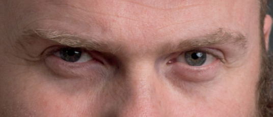
FIGURE 5.38 After
- 13. It’s good to keep things organized, so let’s put all of the eye adjustment layers into a group. With the uppermost layer (Sharpen Eyes) active, hold down the Shift key and click on the Selective Color 1 layer (Figure 5.39). Now both Selective Color adjustment layers and the Sharpen Eyes layer are highlighted. Then go to Layer > New > Group From Layers (Figure 5.40) and name this group “Eyes.”
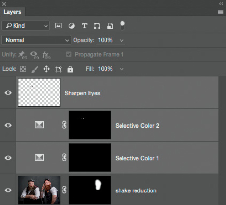
FIGURE 5.39
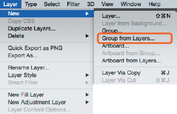
FIGURE 5.40
- 14. Next let’s tidy up both men’s shirts by fixing the double iron lines on the sleeves (Figure 5.41). Add a new blank layer to the top of the layer stack and name it “Shirts.” Then choose the Clone Stamp Tool from the toolbar (Figure 5.42) and in the options bar at the top of the screen, put a checkmark in the Aligned checkbox and select All Layers from the Sample menu (Figure 5.43).
FIGURE 5.41
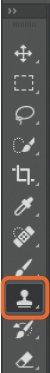
FIGURE 5.42

FIGURE 5.43
Hold down the Option key (Mac) or Alt key (PC) and click to sample a smooth part of the shirt from either side of the iron crease. Place the cursor over the crease and drag upward or downward to cover it with the sampled area of the shirt.
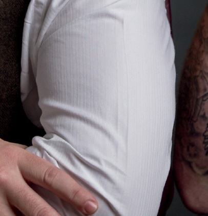
FIGURE 5.44 Before
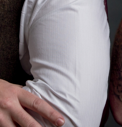
FIGURE 5.45 After
- 15. Next we’ll be doing some dodging and burning to give our subjects added depth and dimension. To do this, we’ll use the technique I use most often, which is the 50% gray layer method I went over in chapter 4 (page 66).
Add a new blank layer to the top of the layer stack by going to Layer > New > Layer. In the New Layer dialog, rename the layer “Dodge & Burn,” change the Mode to Soft Light, place a checkmark next to Fill with Soft-Light-neutral color (50% gray), and click OK (Figure 5.46).
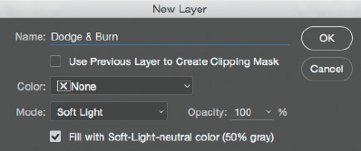
FIGURE 5.46
- 16. Press the D key to set the foreground and background colors in the toolbar to their defaults of black and white. Click on the foreground color and in the Color Picker, set H: 0, S: 0, B: 50; then click OK (Figure 5.47). Next, choose the Dodge Tool (O) and in the options bar at the top of the screen, leave Range set to Midtones, set Exposure to 5–10%, and put in a check in the Protect Tones checkbox (Figure 5.48).
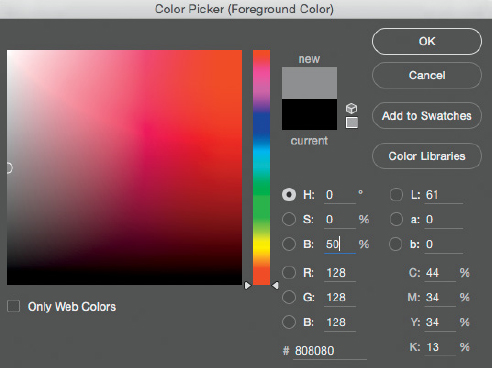
FIGURE 5.47

FIGURE 5.48
- 17. Start working over both faces by increasing highlight (brighter) areas with the Dodge Tool. Hold down the Option key (Mac) or Alt key (PC) to turn the Dodge Tool into the Burn Tool. Toggling between the two tools this way keeps the options bar settings the same for both. Use the Burn Tool to add some midtone or shadow areas on either side of where the Dodge Tool has been used. Release the Option key (Mac) or Alt key (PC) to go back to the Dodge Tool.
As you’re dodging and burning, if you want to see only the gray layer, hold down the Option key (Mac) or Alt key (PC) and click on the eye icon of the Dodge & Burn Layer in the Layers panel. In Figure 5.49 you can see where I applied dodging and burning in my retouching of this image.

FIGURE 5.49
The result is subtle, as it should be when dodging and burning because you want to maintain a natural look. However, you should be able to see that the shadow and midtone areas are now slightly darker and the highlight areas are slightly brighter. For example, notice how the eyebrows and the shadow side of each face are a touch darker. Although this is just a slight change, it does help to add shape and dimension to the men’s faces.
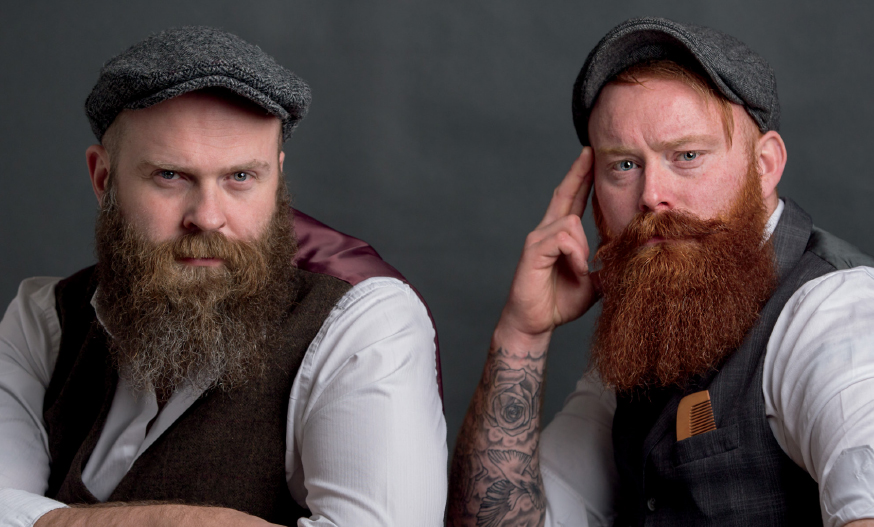
FIGURE 5.50 Before dodging and burning

FIGURE 5.51 After dodging and burning
- 18. There’s a couple of areas we need to tidy up. Add a new blank layer to the top of the layer stack and rename it “Tidy Up.” Select the Clone Stamp Tool, and in the options bar at the top of the screen, ensure that All Layers is selected in the Sample menu. Then hold down the Option key (Mac) or Alt key (PC) and click to sample an area of the background on the far left of the picture, then use this sample to clone away the dark area in the bottom-left corner (Figure 5.52).
Use the Clone Stamp Tool to cover the hole in the back of the left-hand chair and the plastic joint-line going down the side of the right-hand chair (Figure 5.53). In the options bar, change the brush Opacity to 50%, and then clone over the slightly shiny area going down the side of the right-hand chair (Figure 5.54).
FIGURE 5.52
FIGURE 5.53
FIGURE 5.54
- 19. Next we’ll add some texture to the background to give it the look of the Oliphant painted, textured canvas. This is where the gray, seamless-paper backdrop comes in.
Textures can come from literally everywhere: floors, walls, pavement, and so on. For this step, we’ll use a texture that you can get for free from Adobe Add-ons (https://creative.adobe.com/addons) in an Add-on called Adobe Paper Textures Pro. There are many textures available, but we’ll use one called Burnished Clay. I’ve added the Texture file to the book’s webpage: rockynook.com/photograph-like-a-thief-reference/.
Once you’ve downloaded the Texture file, go to File > Place Embedded (or File > Place, depending on the version of Photoshop you are using), navigate to the file on your hard drive, and click OK. The Texture will be added to the top of the layer stack (Figure 5.55).
We need to remove all color from the Texture layer; otherwise, when we blend it onto the gray background it just won’t look good. The layer is currently a Smart Object, so first we need to convert it into a regular layer by going to Layer > Rasterize > Smart Object (Figure 5.56). Now go to Image > Adjustments > Desaturate to remove the color from the layer.
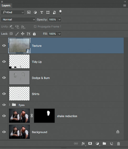
FIGURE 5.55

FIGURE 5.56 Rasterize will convert the Smart Object into a regular layer
- 20. To add the texture to the gray background, change the Blend Mode of the Texture layer from Normal to Overlay. Now we see the two gentlemen again, but the texture is overlaid on them and their clothing in addition to the background. To remove the texture from the men so that it covers only the background, click on the Layer Mask icon at the bottom of the Layers panel (Figure 5.57).
With the foreground color set to black in the toolbar, choose a normal round brush with a Hardness of about 30% (Figure 5.58), and then paint over both gentlemen and the chairs so that the texture is only visible on the background.
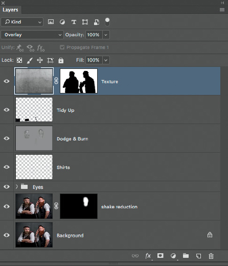
FIGURE 5.57
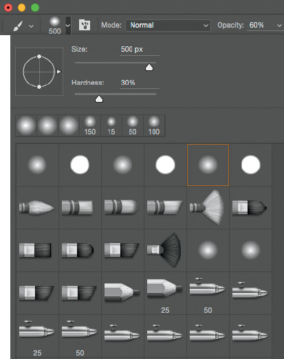
FIGURE 5.58
NOTE You could use the Soft Light Blend Mode instead of the Overlay Blend Mode to add the texture to the gray seamless background. The difference between the two is that Overlay adds more contrast.

FIGURE 5.59 Texture has been added, but it’s visible over the entire picture
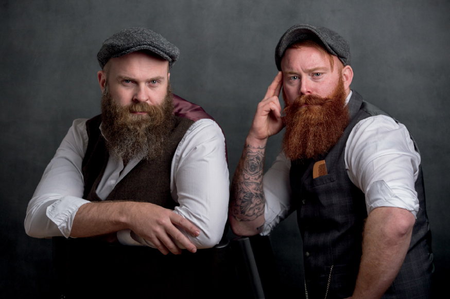
FIGURE 5.60 A Layer Mask has been applied so that the texture is only visible on the gray background
- 21. If we take another look at the picture by Annie Leibovitz, we can see that there’s definitely some color grading that has added a slight green tint. We’ll do something similar to our picture in the following steps.
As I explained in chapter 4 (page 56), there are a few methods I use to color grade my pictures. For this picture we’re going to use some Adjustment layers that also include LUTs (Lookup Tables).
Click on the Color Lookup adjustment layer icon (Figure 5.61) and in the Color Lookup properties, select TensionGreen.3DL from the 3DLUT File menu (Figure 5.62). As with any Adjustment layer in Photoshop, because it’s on its own layer, we can control the strength of the adjustment by changing the Opacity. Lower the Opacity of this first adjustment to around 40% (Figure 5.63).
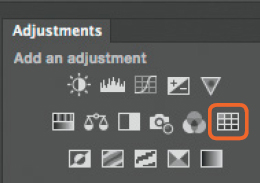
FIGURE 5.61 The Color Lookup adjustment layer icon

FIGURE 5.62

FIGURE 5.63 Lower the Opacity of the Color Lookup adjustment layer to 40%
- 22. Add another Color Lookup adjustment layer and choose EdgyAmber.3DL from the 3DLUT File menu (Figure 5.64). Lower the Opacity of the layer to 15%. Add one more Color Lookup adjustment layer and choose Crisp_Warm.look from the 3DLUT File menu (Figure 5.65). Lower the opacity of the layer to 40%. You can see the Layers panel with the three Color Lookup adjustment layers in Figure 5.66.
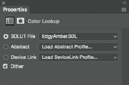
FIGURE 5.64
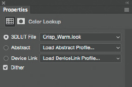
FIGURE 5.65
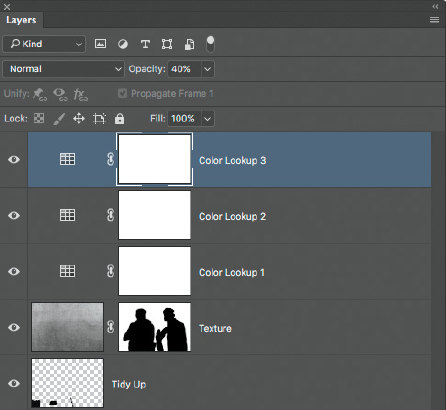
FIGURE 5.66 Three Color Lookup adjustment layers
- 23. Now let’s add a Curves adjustment layer to add a bit of warmth (yellow) to the mix and bring back some detail in the shadow areas.
Click on the Curves adjustment layer icon. By default, the grid within the Curves adjustment properties is 4 × 4 (Figure 5.67), but for this step we need more squares to make an accurate adjustment. To break the grid into more squares (10 × 10; Figure 5.68) hold down the Option key (Mac) or Alt key (PC) and click once on the grid.

FIGURE 5.67 4 × 4 grid

FIGURE 5.68 10 × 10 grid
Now click on the RGB menu in the Curves adjustment properties and select Blue (Figure 5.69). Click on the blue point in the top-right corner of the grid and drag it downward one complete square to add yellow to the picture (Figure 5.70).

FIGURE 5.69 Choose Blue to adjust the blue channel
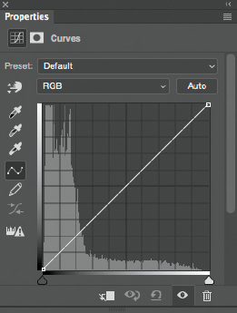
FIGURE 5.70 Add Yellow (warmth) to the picture by dragging the top of the blue line downward
- 24. Change from Blue back to RGB, then click on the point in the bottom-left corner of the grid and drag it upward about half a square to lighten up the darker areas of the image (Figure 5.71).
- 25. At this stage, it’s just a matter of finessing the picture and experimenting to get the final look. Add a merged layer to the top of the layer stack by pressing and holding Shift + Option + Command + E (Mac) or Shift + Alt + Ctrl + E (PC). Rename the layer “FT” (Finishing Touches; Figure 5.72).

FIGURE 5.71 Lighten the shadow areas by dragging the bottom of the RGB line upward

FIGURE 5.72
Let’s add some contrast to give the picture a bit more punch, depth, and dimension. We’ll use one of my favorite plugins, Topaz Clarity. If you don’t have Topaz Clarity, there is an alternative technique you can use that I explain in chapter 4 (page 62); however, the result isn’t quite the same.
Go to Filter > Topaz Labs > Topaz Clarity and in the Topaz Clarity dialog, adjust Micro Contrast to 0.17 and Low Contrast to 0.11 and click OK (Figure 5.73). There’s no magic to these settings; I just think they work well for this picture. I tend to adjust only these two sliders when I use Topaz Clarity.
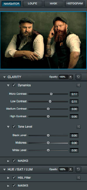
FIGURE 5.73
- 26. Now we’re out of the Topaz Clarity plugin and back in Photoshop. There’s just one little thing I want to do to this picture before it’s pretty much finished, and that’s reduce the annoying (well, I think it is) highlight on the chair on the left (Figure 5.74). Select the Clone Stamp Tool (S) and set the Opacity to 50% in the options bar. Hold down the Option key (Mac) or Alt key (PC) and sample an area under the highlight. Then brush just once across the highlight area to reduce it just enough (Figure 5.75).

FIGURE 5.74 Highlight on the left-hand chair
FIGURE 5.75 The highlight has been reduced by using the Clone Stamp Tool at 50% Opacity
Okay, I think we’re pretty much finished now. However, just to be sure, at this stage I ALWAYS save the file, step away, and come back to it a few hours later, or maybe even the next morning. When I come back to the picture I see it with fresh eyes and I can determine whether I need to do more. For this chapter, we’re all done.
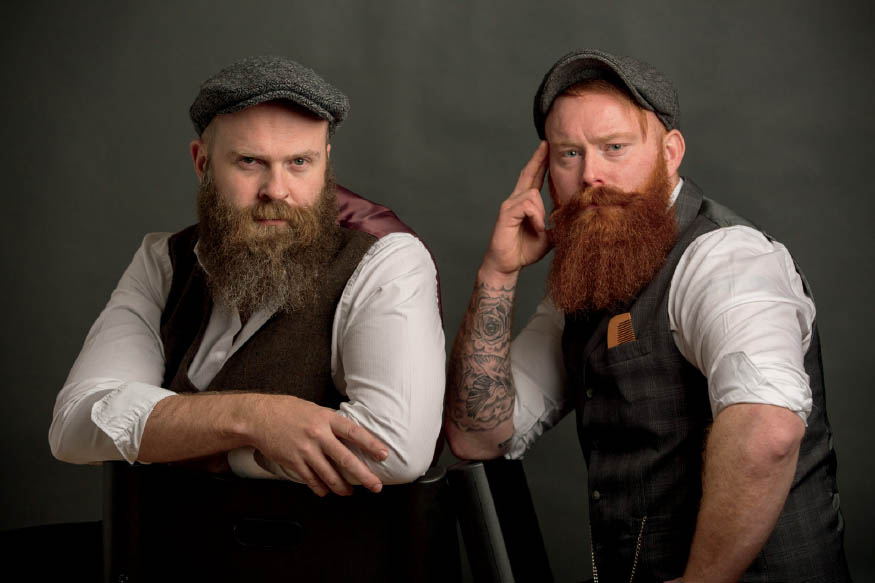
FIGURE 5.76 Original RAW image
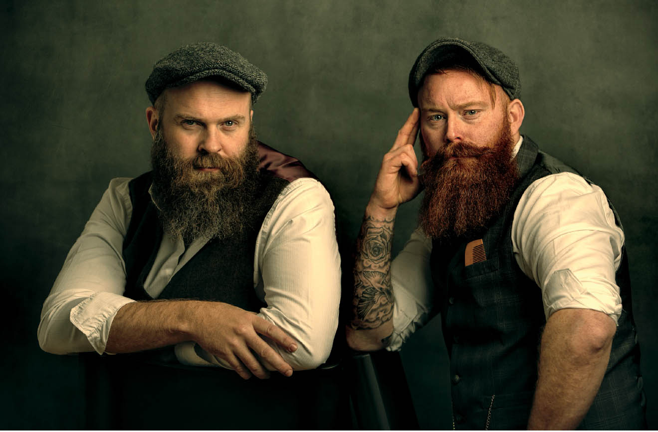
FIGURE 5.77 Final retouched image