
11 MOVIE POSTER INSPIRED
Without question, one of the biggest benefits of being involved in this industry is the people I’ve met and the friends I’ve made along the way. To this day, I have to pinch myself when I think about how I get to share the stage with folks whose books and DVDs I’ve bought, whose seminars I’ve attended, and whose online classes I’ve watched (and still do, I hasten to add). But more than that, I can call so many of them my friends. I’ve met people who are so open, genuine, and honest. Even when they’re at the top of their game, they are constantly looking to improve their craft and help others improve, too.
Being a photographer has introduced me to worlds I knew very little about, and likely never would have encountered. A perfect example of this is my friend, World Champion kickboxer turned professional boxer Steven Cook, aka Pocket Rocket, who introduced me to the world of boxing.
I first met Steven through our mutual friend Brian Worley, and from then on we started putting together regular photo shoots—personal projects for me and pictures for Steven to keep. There were times when we’d meet once a week to try out a new idea, and I’ll be forever thankful to Steven for his time and willingness to try out some of the crazy ideas I come up with, some that work and some that don’t and will never grace a webpage.
The picture we’ll be working on in this chapter actually came about after Steven recommended I see the movie Southpaw, which had just been released. I’d seen trailers online, but after our chat I went and searched on Google and the impawards.com website that I mentioned in chapter 1 to see what posters had been made for the movie. One of the posters jumped out at me and I knew straight away that I wanted to create something similar for Steven and his beautiful partner, Sofie. I took a screen grab, messaged it to Steven, and the date was set.
REVERSE ENGINEERING
When I first looked at the original movie poster for Southpaw (Figure 11.1), I immediately concluded that just one main light was used, positioned directly above the subjects pointing down at them.
We can see that the tops of the subjects’ heads are lit, but the main clue to the lighting is on their arms. The tops of their arms are lit but the undersides are in shadow, and the light along the arms is even.
The light itself is neither hard nor soft; it’s kind of in between. The shadows and highlights sort of blend in with each other where they meet. There is no hard line between the two, rather there is a very slight gradient, albeit a short one. You can see this particularly on the female character’s shoulder.
It’s possible that a reflector was used to bounce a bit of light into the shadow areas, which aren’t completely black and do show detail. Of course, this could have been altered in post-processing, but we’ll go with getting it in-camera.
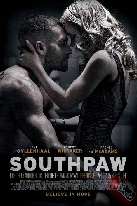
FIGURE 11.1
We can see also that the photograph was taken with a wide aperture (maybe around f/4.0) because the background is out of focus, even though it looks to be fairly close to the characters.
THE SETUP
I went with my feeling that the original picture was lit from above and set up my lighting accordingly. Steven and Sofie were positioned on the outside of the boxing ring where, as luck would have it, the walls in the gym were very similar to the walls in the original poster. Sofie sat in with her arms outstretched while I got the light into position. In Figure 11.2 you can see how the lighting is already similar to that of the original poster, with the tops of Sofie’s arms lit and the underside in shadow.
I positioned a light stand and boom inside the boxing ring, with the boom reaching out directly across the top of Sofie and pointing straight down (Figure 11.3). Once I set the exposure, I had to get both Steven and Sofie into the scene and pose them.
FIGURE 11.2
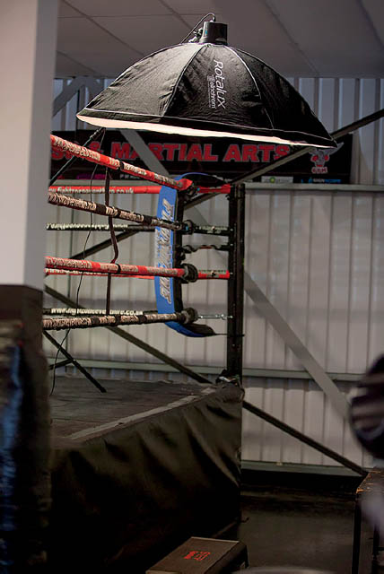
FIGURE 11.3
With the light positioned directly above Steven and Sofie, the highlights were exactly how I wanted them, but the shadow areas were a little too dark (Figure 11.4). To fix this, I positioned a reflector near them so that I was able to bounce a little bit of light. Figure 11.5 is a diagram of the setup to give you an idea of how everything was positioned.
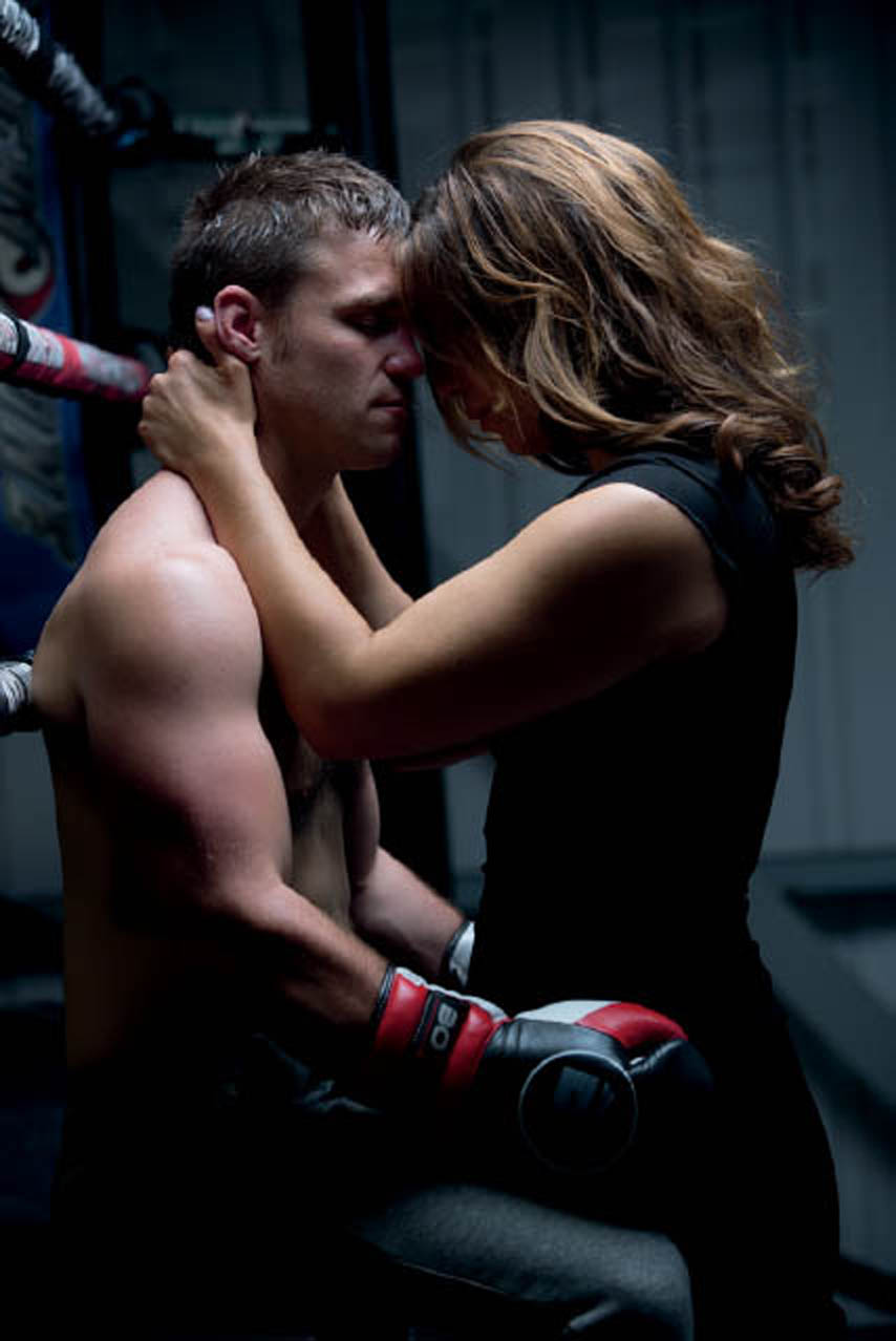
FIGURE 11.4 The highlights look great but the shadows are too dark
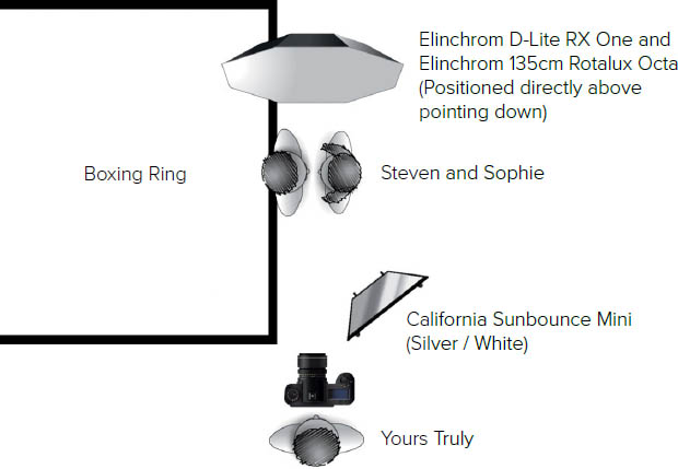
FIGURE 11.5
You can see in Figure 11.6 that the light bounced off of the reflector allowed me to get more detail in the shadows. This is the image that I ended up working on.
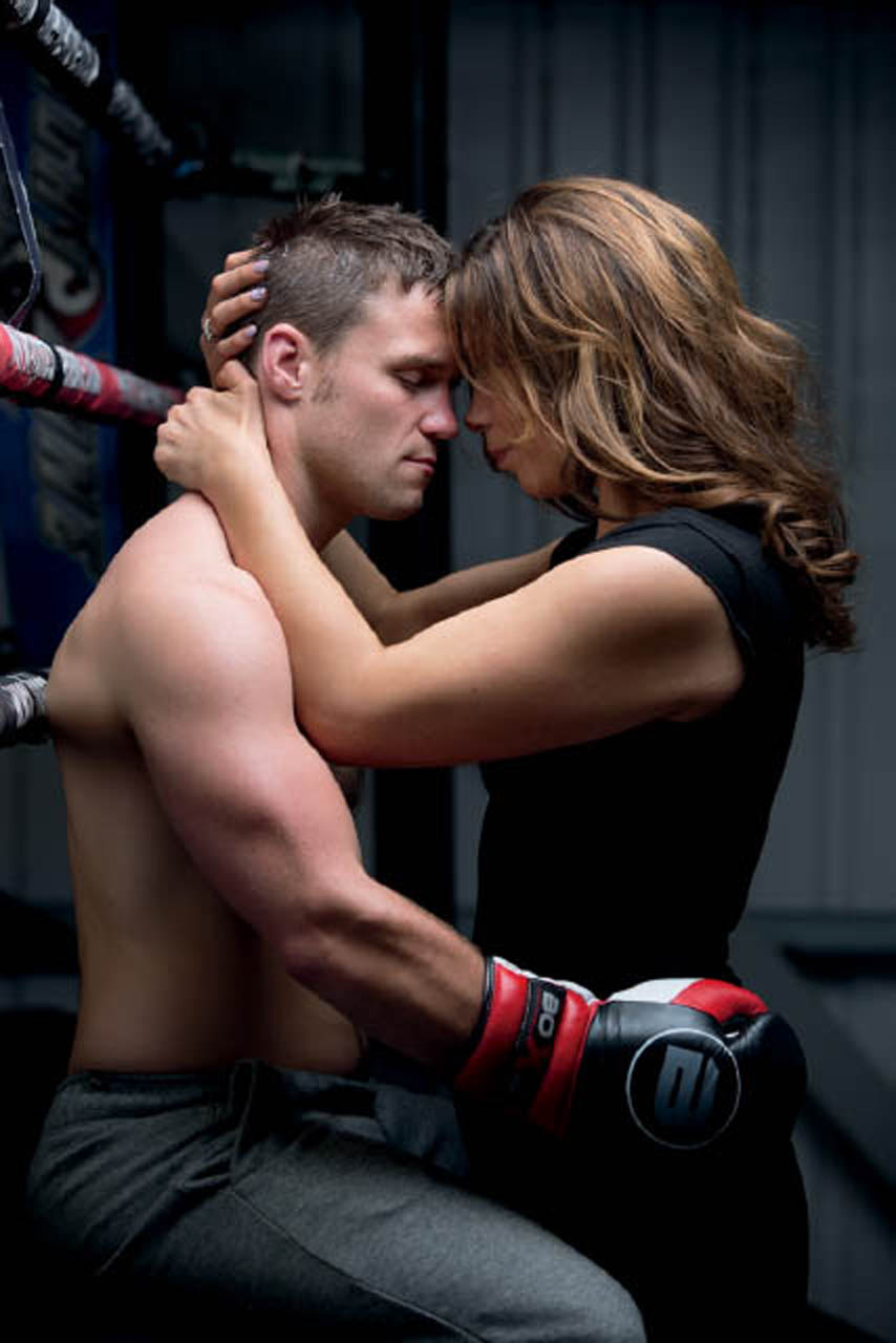
FIGURE 11.6
My camera was mounted on a tripod and tethered to my MacBook Pro. Although you can’t see it in Figure 11.4, the light modifier I used above Steven and Sofie (an Elinchrom Rotalux 135cm Octa Softbox) was fitted with just the outer diffusion panel as opposed to both the inner and outer panels. This created a light that was neither hard nor soft, but was somewhere in between.
CAMERA SETTINGS
I chose to shoot with an aperture of f/4.0 so that the gym wall was out of focus and both Steven and Sofie were sharp. Therefore, the light above (the Octa) was metered to give a reading of f/4.0 with the ISO at 100 for the cleanest possible file. A shutter speed of 1/100sec was enough to allow sufficient ambient light into the scene.
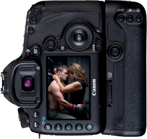
FIGURE 11.7
MODE Manual
ISO 100
APERTURE f/4.0
SHUTTER SPEED 1/100 sec.
LENS Canon 70-200mm f/2.8 L IS II USM
GEAR GUIDE
Because I was using a boom with a light directly above Steven and Sofie, I used my Elinchrom D-Lite RX One flash (Figure 11.8). Although it’s considered to be an entry-level light, this is a great addition to every photographer’s kit because it’s small, incredibly light, and comes with built-in fan and wireless receiver.
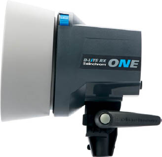
FIGURE 11.8
I also used an Elinchrom Rotalux 135cm Octa Softbox (Figure 11.9), a Sunbounce Mini silver/white reflector (Figure 11.10), and an Avenger A4041B boom (Figure 11.11).

FIGURE 11.9

FIGURE 11.10

FIGURE 11.11
SMALL FLASH GEAR GUIDE
If you are a small flash user, you could replace the Elinchrom light and modifier (or any other studio lighting for that matter) with a Phottix Mitros+ TTL Transceiver Flash (Figure 11.12) and a Lastolite 90cm Hotrod Octa Softbox (Figure 11.13).
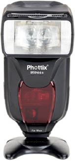
FIGURE 11.12

FIGURE 11.13
POST-PROCESSING
In all honesty, there’s not that much that needs to be done to this picture. We’ll do a little body reshaping (because of the positions Steven and Sofie were in) and some dodging and burning. Then we’ll add in a fake light source, and finally, we’ll colorize the image to make sure we capture the right mood and atmosphere.

NOTE Download the file you need to follow along step-by-step at: http://www.rockynook.com/photograph-like-a-thief-reference/
- 1. Let’s kick things off in the Develop Module in Lightroom (or Camera RAW) and work our way down the adjustments. First, we need to bring down the exposure just a touch. In the Basics tab, drag the Exposure slider left until you hit -0.80 (Figure 11.14). Because I lit Steven and Sofie from above, and even though I used a reflector, we need to bring a bit more detail back into the shadow areas by moving the Shadows slider over to the right to around +80.
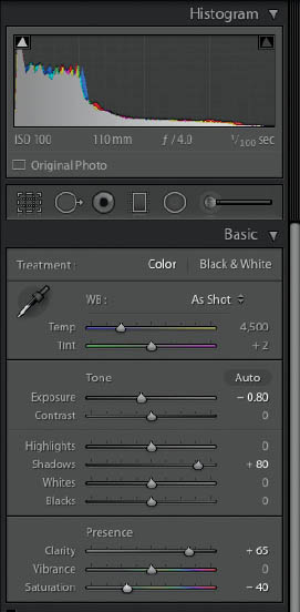
FIGURE 11.14
- 2. To start giving the picture a bit more punch (no pun intended), increase the Clarity slider to +65, and then reduce the overall saturation by dragging the Saturation slider to around -40.
- 3. Now we’ll move to the Detail section to add in some Sharpening. Increase the Amount slider to 30 (Figure 11.15), and then hold down the Option key (Mac) or Alt key (PC) as you increase the Masking slider to 80 so that the sharpening is mainly restricted to Steven and Sofie. The white areas in Figure 11.16 indicate the areas in the picture that are being sharpened.
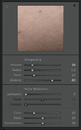
FIGURE 11.15

FIGURE 11.16 Holding down the Option key (Mac) or Alt key (PC) while dragging the Masking slider reveals a mask indicating areas that are being sharpened in white and areas not being sharpened in black
- 4. The last thing we’ll do before opening the picture in Photoshop is add an overall vignette. In the Effects tab, drag the Amount slider to the left to around -20, and leave Style at its default of Highlight Priority (Figure 11.17).

FIGURE 11.17
Figures 11.18 and 11.19 show our image before and after the adjustments we’ve made so far.

FIGURE 11.18 Before

FIGURE 11.19 After
- 5. Now let’s open the image in Photoshop so we can continue with the retouching. If you’re using Lightroom, go to Photo > Edit In > Adobe Photoshop . . . If you’re using Camera RAW, simply click on Open Image in the bottom-right hand of the screen.
- 6. In the setup for this picture, Steven was sitting down on the side of the boxing ring and Sofie was standing on a wooden box so that her head was at roughly the same height as Steven’s, which meant she had to push her hips forward to get close enough to him. Neither of these positions are the most flattering, so we’ll do a little bit of body shaping to get them back to looking their best.
Create a duplicate of the Background layer by pressing Command + J (Mac) or Ctrl + J (PC). Rename this layer to “Body Shaping.”
We’re going to the use the Liquify Filter to make some changes here and this is a filter that can very easily be overdone. Thankfully, we can use it as a Smart Filter, meaning we can always make changes at a later stage without having to redo lots of retouching steps.
Go to Filter > Convert for Smart Filters (Figure 11.20) to change the Body Shaping layer into a Smart Object (Figure 11.21).
- 7. Go to Filter > Liquify, and then choose the Freeze Mask Tool from the toolbar on the right side of the screen (Figure 11.22).

FIGURE 11.20

FIGURE 11.21 The icon in the bottom-right corner of the image thumbnail indicates that the layer is a Smart Object

FIGURE 11.22

NOTE Freeze Mask allows us to paint over areas to protect them from being affected by any adjustments we make with the Liquify Filter.
Use the Freeze Mask Tool to paint over areas of Steven and Sofie near where we’re going to make some adjustments (Figure 11.23).
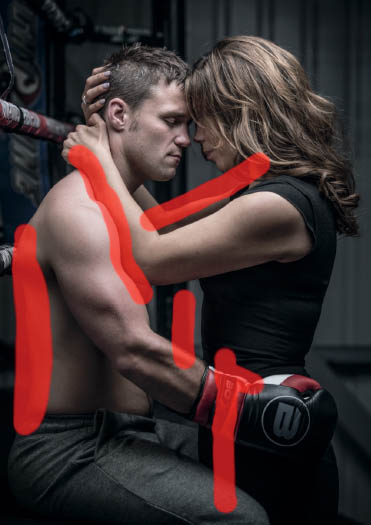
FIGURE 11.23
Choose the Forward Warp Tool (W) and push left on Steven’s waist to bring it inward a touch since he is sitting down. You can adjust the size of the Forward Warp Tool using the left and right bracket keys on your keyboard.
Reshape Steven’s trapezius muscle a touch by dragging upward with the Forward Warp Tool, and drag to the left on his triceps muscle to increase its size.
Keeping with the Forward Warp Tool, push upward on the underside of Sofie’s left arm (closest to the camera), and then push downward a touch on the top part of her upper arm. Then bring in her waist between Steven’s leg and boxing glove.

TIP Try to use the Forward Warp Tool at a size that is as large as possible. This makes the adjustments look more realistic and prevents lots of uneven bumps that you have to attempt to flatten out.
As you’re working around the image making adjustments, you can also unfreeze areas so that you can adjust them. In this case, we can use the Thaw Mask Tool (Figure 11.24) to remove the protection on Sofie’s right arm. Use the Freeze Mask Tool to protect areas like both Steven’s and Sofie’s faces and the nearest arm (Figure 11.25), and then use the Forward Warp Tool to reduce the curve on Sofie’s right arm. Click OK to exit the Liquify Filter.

FIGURE 11.24
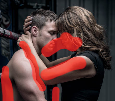
FIGURE 11.25
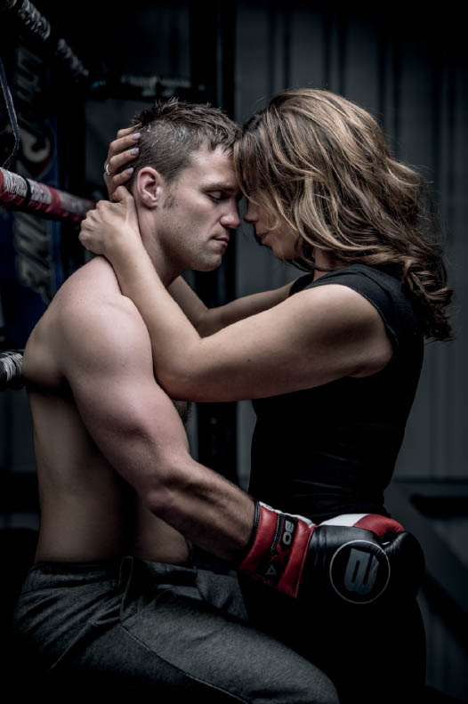
FIGURE 11.26 Before Liquify Filter

FIGURE 11.27 After Liquify Filter
- 8. Add a new blank layer to the top of the layer stack and rename it “Blemishes.” Choose the Spot Healing Brush from the toolbar (Figure 11.28), and in the options at the top of the screen, ensure that Mode is set to Normal, Type is set to Content-Aware, and the Sample All Layers checkbox is checked (Figure 11.29).
FIGURE 11.28

FIGURE 11.29
Work around the picture clicking over some of the blemishes you want to remove (or that your model wants you to remove; Figure 11.30).

FIGURE 11.30
TIP For best results, use the left and right bracket keys to resize the Spot Healing Brush so that it is slightly bigger than the blemishes you are removing.
In some areas, such as under Sofie’s arm, you may find that the Spot Healing Brush struggles to remove the scarring (Figure 11.31). In areas like this where the blemishes are close together and Photoshop doesn’t have clean areas nearby to work with, try changing the options at the top of the screen from Content Aware to Proximity Match (Figure 11.32).

FIGURE 11.31
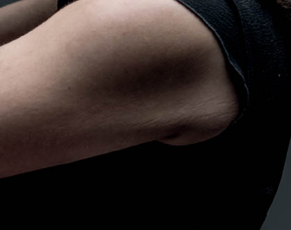
FIGURE 11.32

FIGURE 11.33 Changing the Spot Healing Brush Type to Proximity Match gives us a much better result
- 9. Click on the Levels icon in the Adjustments panel (Figure 11.34) to add a Levels adjustment layer to the top of the layer stack. Change its Blend Mode to Screen (Figure 11.35).

FIGURE 11.34

FIGURE 11.35
This brightens the entire image (Figure 11.36), but we’re just going to use this to increase the highlights in Sofie’s hair. So to hide the effect we need to invert the Layer Mask attached to the Levels adjustment layer by pressing Command + I (Mac) or Ctrl + I (PC), or by going to Image > Adjustments > Invert (Figure 11.37).
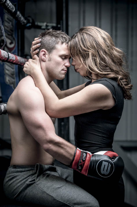
FIGURE 11.36

FIGURE 11.37
- 10. From the toolbar, choose a round, soft-edged brush (Figure 11.38) and a white foreground color and paint over the highlight areas of Sofie’s hair. This will reveal the brightening effect only in those areas (Figure 11.39).
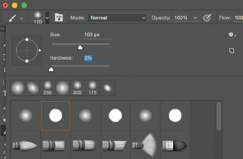
FIGURE 11.38
To help these brightened areas blend more naturally, hold down the Option key (Mac) or Alt key (PC) and click on the Layer Mask attached to the Levels adjustment. This gives us a view of the layer mask (Figure 11.40).
Go to Filter > Blur > Gaussian Blur, set the Radius to 20 Pixels (Figure 11.41), and click OK. This softens the brushstrokes we made so now the blend of the highlights is much more realistic. To return to the normal view, hold down the Option key (Mac) or Alt key (PC) and click on the Layer Mask again. Rename this Levels adjustment layer “Sophie Hair.”

FIGURE 11.39

FIGURE 11.40

FIGURE 11.41
- 11. Now let’s do some dodging and burning to give the picture a little more depth and dimension. Go to Layer > New > Layer (Figure 11.42), and in the New Layer properties, name the layer Dodge & Burn, change the Mode to Soft Light, and put a check in the Fill with Soft-Light-neutral color (50% gray) checkbox (Figure 11.43). Click OK.

FIGURE 11.42
FIGURE 11.43
- 12. Choose the Dodge Tool from the toolbar (Figure 11.44), and in the options at the top of the screen, leave Range set to Midtones, set the Exposure to 5%, and tick the Protect Tones checkbox (Figure 11.45).

FIGURE 11.44

FIGURE 11.45
Start adding brushstrokes over the highlight areas and other areas of the picture you want to brighten. Wherever you add brushstrokes to the highlights, hold down the Option key (Mac) or Alt key (PC) to switch over to the Burn Tool with the same settings and add some brushstrokes to the shadow areas. The more you brush over an area, the more the effect builds up, which is why it’s always best to start with a low Exposure settings.
To view the gray Dodging and Burning layer (Figure 11.46) so that you can see the areas you’ve worked on, hold down the Option key (Mac) or Alt key (PC) and click on the eye icon next to the layer thumbnail. This turns off every other layer, leaving only the gray one visible. To return to normal view, hold down the Option key (Mac) or Alt key (PC) and click to turn on the visibility.
Compare Figures 11.47 and 11.48 (on the following page) to see the subtle difference that the dodging and burning has made.
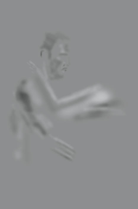
FIGURE 11.46

FIGURE 11.47 Before dodging and burning

FIGURE 11.48 After dodging and burning
- 13. Now we’ll use a technique I call the Never Ending Lighting Rig to add in a fake light source coming from above. This isn’t an essential addition, but it’s one that I tend to do quite a bit so that viewers can make sense of the lighting in the scene.
Add a new layer to the top of the layer stack and rename it “Spotlight” (Figure 11.49).
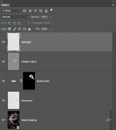
FIGURE 11.49
Grab a round, soft-edged brush from the toolbar and choose a white foreground color. Press down once with the brush in the center of the picture to add a soft, round spot (Figure 11.50). Then go to Edit > Free Transform, and while holding down Shift + Option (Mac) or Shift + Alt (PC), click and drag outward beyond the frame to increase the size of the soft, round spot (Figure 11.51). Press Return (Mac) or Enter (PC).
Use the Move Tool (V) to drag the spotlight upward so that just the softest bottom area is visible (Figure 11.52).

FIGURE 11.50
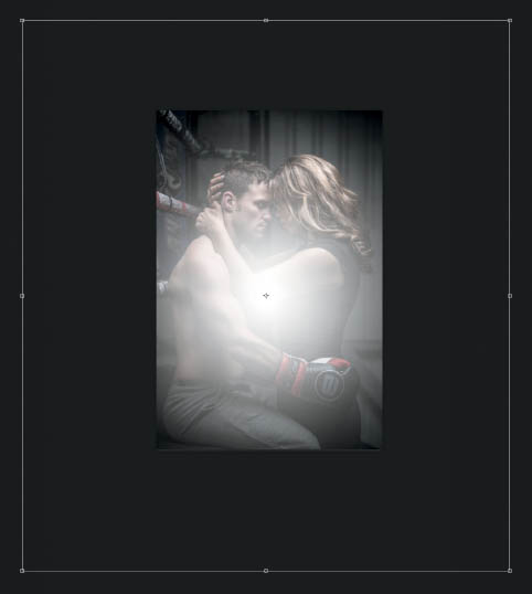
FIGURE 11.51

FIGURE 11.52
- 14. After the photo shoot, Steven requested that I remove the branding from the boxing glove, so let’s address that before we add our finishing touches.
Add a merged layer to the top of the layer stack by going to Edit > Select All, then to Edit > Copy Merged, and then to Edit > Paste. Rename this layer “Boxing Glove” (Figure 11.53).

FIGURE 11.53
Use the Lasso Tool (L) to make a loose selection around the logo on the boxing glove (Figure 11.54). Go to Edit > Fill, choose Content-Aware from the Contents menu (Figure 11.55), and click OK (Figure 11.56).

FIGURE 11.54
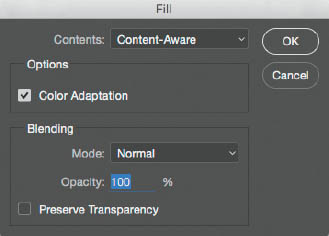
FIGURE 11.55
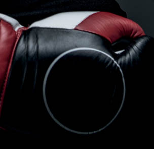
FIGURE 11.56
- 15. Use the Lasso Tool again to draw out a rough selection around the circular print on the boxing glove, leaving a section unselected (Figure 11.57).
Go to Edit > Fill, select Content-Aware from the Contents Menu (Figure 11.58), and click OK.
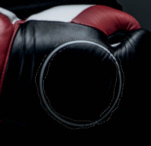
FIGURE 11.57

FIGURE 11.58
Turn off the visible selection by going Select > Deselect. Choose the Clone Stamp Tool, and while holding down the Option key (Mac) or Alt key (PC), click to sample an area next to the remaining bit of the circle, and then apply a brushstroke to cover it (Figure 11.59).
Use the Clone Stamp Tool and this Option-clicking (Mac) or Alt-clicking (PC) method to sample areas of the glove and cover the logo on the wrist section as well (Figure 11.60).
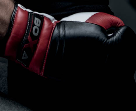
FIGURE 11.59
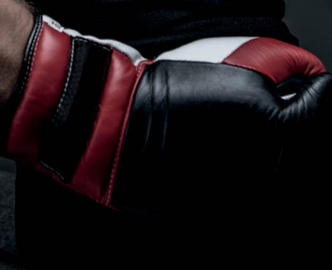
FIGURE 11.60
- 16. Duplicate the Boxing Glove layer by pressing Command + J (Mac) or Ctrl + J (PC). Rename this layer “FT” for Finishing Touches (Figure 11.61).
Now we’re going to colorize the picture. For this one, I’m going to use the Nik Colleciton Color Efex Pro 4 plugin; however, you can use any method you prefer, including the Color Lookup adjustment layer that I covered in chapter 4 (page 56).
FIGURE 11.61
Go to Filter > Nik Collection > Color Efex Pro 4 (Figure 11.62) and start by choosing Cross Processing (Figure 11.63). In the Cross Processing menu on the right side of the window, choose Y06 from the Method menu and set Strength to 80%, then click on Add Filter (Figure 11.64).

FIGURE 11.62

FIGURE 11.63
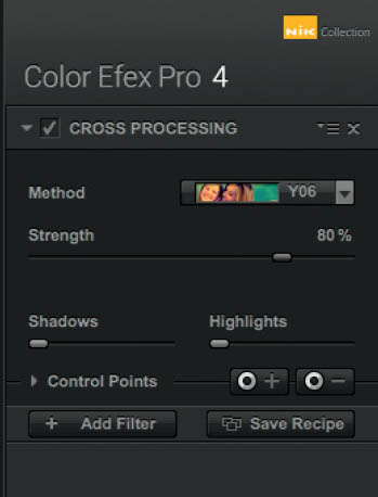
FIGURE 11.64
- 17. Click to add the Cross Balance preset (Figure 11.65), choose the Tungsten To Daylight (2) preset from the drop-down menu, set the Strength to 40%, and click on Add Filter (Figure 11.66).

FIGURE 11.65

FIGURE 11.66
Next, click to add the Colorize preset (Figure 11.67), choose 2 from the Method menu, set the Strength to 20% (Figure 11.68), and click OK (which is located in the bottom-right corner of the Color Efex Pro 4 plugin screen) to apply this entire effect and send the image back into Photoshop.
FIGURE 11.67

FIGURE 11.68
- 18. Finally, I want to add a little more contrast to the whole image. I’m going to do that with the Topaz Clarity plugin, but again, you can use one of the other methods I covered in chapter 4 (page 62) or any other method you prefer.
Go to Filter > Topaz Labs > Topaz Clarity, and in the settings on the right side of the window, increase Micro Contrast to 0.20 and Low Contrast to 0.10 (Figure 11.69). Click OK.
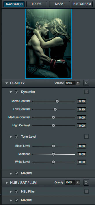
FIGURE 11.69
Press D to set the foreground and background colors to their defaults of black and white, and then click to add a Gradient Map adjustment layer (Figure 11.70). Lower the Opacity of the layer to 20% (Figure 11.71) to desaturate the image a little.
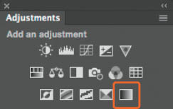
FIGURE 11.70
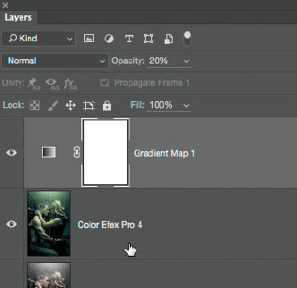
FIGURE 11.71
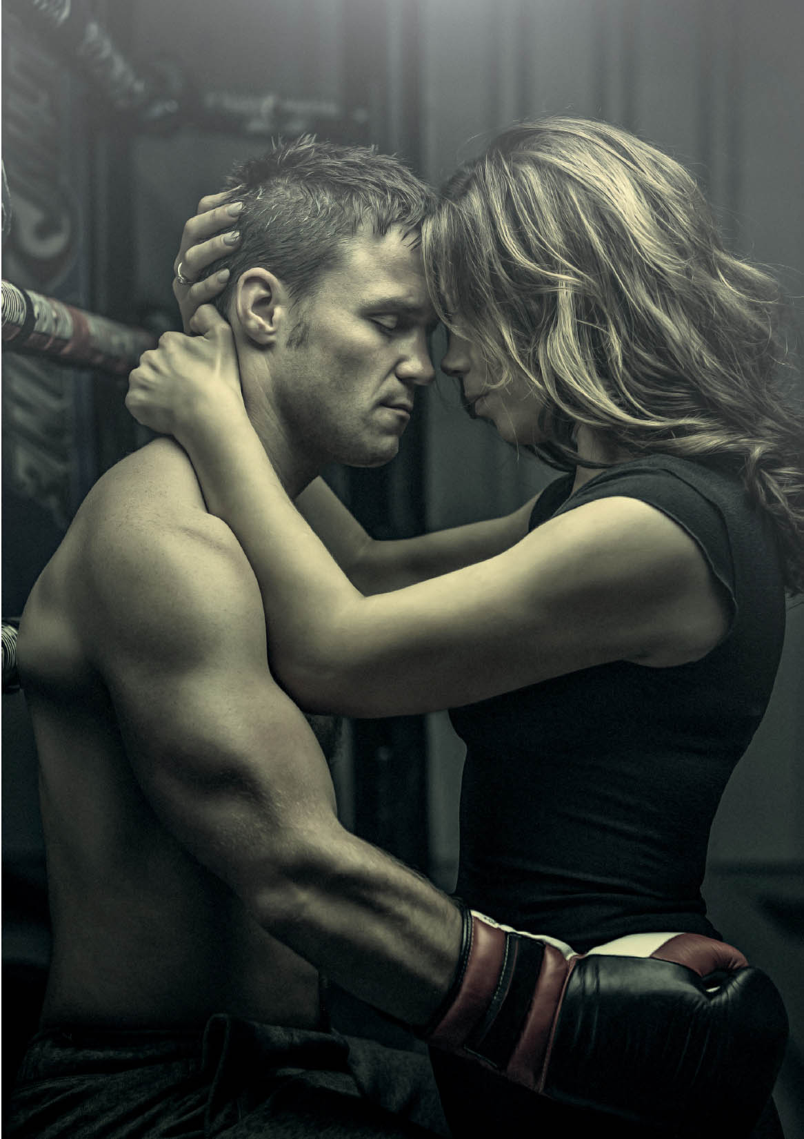
Figure 11.72 shows the original RAW image, straight out of the camera, and Figure 11.73 shows the final retouched image. You can see that I also cropped a little off the bottom of the picture.
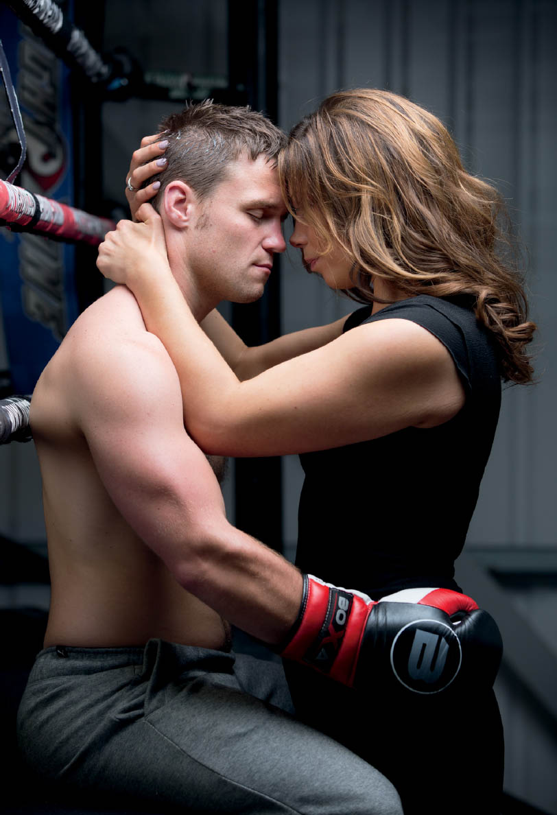
FIGURE 11.72 Original RAW image