
In This Chapter
Using foreground/background colors
Understanding color
Managing color
Setting up the work environment
Using color profiles
In order to produce great output, you must understand color and how Elements treats color. If you want to carry a laptop computer around to show off your photos, you can basically adjust color for this particular computer. However, sharing photos with other users, printing your pictures, and hosting photos on Web sites require that you know something about the way color is displayed on other devices and in photo prints.
There's a lot to know about managing color, including setting up color workspaces, managing color, and working with color profiles. In this chapter, we talk about these issues and offer some key concepts for understanding color as it pertains to Photoshop Elements.

Foreground and background colors appear in the Tools panel as large color swatches. What you see in the two-color swatches represents the current selected color for a foreground and the currently selected color for the background.

Colors appearing in the Foreground Color Swatch can be used to fill type selections, shapes, and strokes, as well as with all the marking tools. You can also use the current background color when using the Eraser tool to change background color.
A couple of keyboard shortcuts are helpful when working with the foreground and background color swatches. Frequently used keyboard shortcuts that you want to commit to memory include
D: Press the D key on your keyboard and you return to default black for the foreground color and default white for the background color.
X: Press the X key on your keyboard and the foreground background colors are reversed. You might want to use this keyboard shortcut when painting black and white areas with one of the marking tools.
You can also click the two arrows adjacent to the top right of the Foreground Color Swatch to reverse colors, or click the tiny icon adjacent to the lower right of the Foreground Color Swatch to return to default colors.
When you want to use a color for the foreground or background other than the default black and white colors, you make your color assignments using tools, panels, or dialog boxes.
All the colors available for a given color mode are accessible from the Swatches panel and the Photoshop Elements Color Picker. The range of colors shown in an image is also accessible through sampling color with the Eyedropper tool.
The Color Picker provides you with a color spectrum displaying all the colors available within a given color mode. If you're in RGB mode, you can choose from a color panel of more than 16.7 million colors.
To open the Color Picker, click the Foreground Color Swatch in the Tools panel. The Color Picker pops up in a dialog box as shown in Figure 4-1. The choices you have for selecting color and the options available to you in this dialog box include
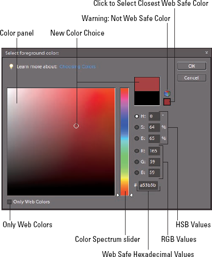
Color Panel: The large color swatch displays colors according to the position of the color spectrum slider.
New Color Choice: Clicking the color swatch selects a new color for the foreground color.
Warning: Not Web Safe Color: Not all colors display equally on both the Macintosh and Windows operating systems in 8-bit mode when you are viewing Web pages. If a color is out of the Web-safe color gamut, a warning icon appears.
Note
The Web Safe palette was introduced more than a decade ago to create a color palette that used common colors between computer systems with 8-bit video cards. It's almost nonessential today since almost all computer systems use 24-bit color.
Click to Select Closest Web Safe Color: Click this icon and the closest Web-safe-color value relative to the new color is selected.
Current Foreground Color: When you open the Color Picker, the color appearing in the Foreground Color Swatch in the Tools panel is displayed here. The Current Foreground Color Swatch and the New Color Choice Swatch show you a before/after difference between the previous color and the new color.
HSB values: This measure relates to Hue, Saturation, and Brightness. These values are the RGB equivalents for HSB.
RGB values: The numeric values for Red, Green, and Blue. As you choose other colors in the large color swatch or by sliding the color spectrum slider, these values and the HSB values change to reflect new color choices.
Only Web Colors: Check this box if you want to view only Web-safe colors.
Color Spectrum Slider: Move the slider up or down to change the hue and display a new hue range in the large color swatch.
Web Safe Hexadecimal Values: Web-safe colors are defined using hexadecimal values. The hex value is displayed here for the current new color.
To define a new foreground color, do the following:
Click the Foreground Color Swatch in the Tools panel.
The Color Picker opens.
Move the color spectrum slider to the hue range you want to use for the new color.
For example, if you want to select a blue color, move the slider up to the range of blues.
Click the cursor in the large Color Swatch to select a color.
The new selected color appears as a circle in the New Color area above the current foreground color, as shown in Figure 4-2.
Click OK.
The new foreground color selected in the Color Picker appears in the Foreground Color Swatch.

Tip
If you want to change the background color, click the Background Color Swatch in the Tools panel, and the same Color Picker opens as shown in Figure 4-1. Any changes you make in the Color Picker are applied to the background color.
Selecting color in the Color Picker is fine when you want to make a single color selection and use it once. However, if you want to create your own custom color panel and reuse colors, you want an easier method for choosing foreground and background colors as well as the ability to reuse the same colors easily.
The Color Swatches panel provides you with exactly what you need to create a personal color panel and easily access colors when painting on a canvas or filling selections on an image.
To open the Color Swatches panel, choose Window
When you open the Color Swatches panel, you see a default panel of colors. Elements provides you with a number of different color panels that you can load into the Color Swatches panel. This enables you to create your own custom color panel.
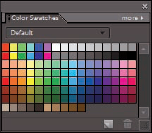
Open the Default drop-down list in the Color Swatches panel, and you find several preset color panels you can load in the Color Swatches panel, as shown in Figure 4-4. Your choices include
Mac OS: Choose this panel on Windows to load a color panel that displays color accurately on the Macintosh.
Photo Filter Colors: This swatch set is a narrow range of colors consistent with those you apply using Photo Filters. (For understanding how Photo Filters are used, see Book VII, Chapter 1).
Web Hues: This swatch set displays hues that are Web-safe colors.
Web Safe Colors: This set of swatches displays colors in a Web-safe panel.
Web Spectrum: This swatch set displays the entire spectrum of Web-safe colors.
Windows: This color set contains all the colors that display properly on Windows.

The Color Picker has all the colors you can use in a given color mode. You may want to add more colors to one of the color swatch sets when you select different colors in the Color Picker. You might also want to delete some colors from a swatch set, or you may want to save your new swatch set as a library that you can load in Elements so you can use the new custom colors.
All of this is possible in Elements, and here's how you go about creating your own custom color swatches panel:
Open the Color Swatches panel.
Choose Window

Delete colors from the Default panel.
Choose a color you don't want to appear in your custom color panel. Press the Alt key and the cursor changes to a Scissors icon. Click a color swatch with the Alt key depressed to delete the color. Continue deleting all the colors you don't want in your custom color set.
Select a new color to add to your custom color set.
Click the Foreground Color Swatch in the Tools panel. When the Color Picker opens, click a color you want to add to your new set. Click OK and the new color appears as the foreground color.
Add the foreground color to the set.
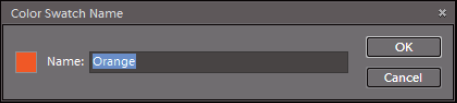
Click More in the Color Swatches panel to open a fly-out menu. From the menu choices, choose New Swatch. The Color Swatch Name dialog box opens, as shown in Figure 4-5. The color is derived from the current foreground color to the left of the Name text box. Type a name for the color swatch and click OK. The new swatch is added to the Color Swatches panel.
Add additional colors.
Continue using Steps 3 and 4 to add new colors to the Swatches panel.
Save the swatches.
Open the More fly-out menu and choose Save Swatches. A Save dialog box opens with the Color Swatches folder selected as the target folder. Be sure to not change the folder location. Type a name for your new swatches and click OK.
You have saved a swatches set without disturbing the original Default set. You can always return to the Default set by selecting another preset from the drop-down list and then going back to the menu and choosing Default. The original set remains intact.
If you created a custom color swatches set and then chose one of the presets from the Default drop-down list, the custom colors you created are not visible in the Color Swatches panel. You need to load the swatches back into the Color Swatches panel in order to use them.
To load swatches, open the More fly-out menu and choose Load Swatches. A Load dialog box appears with the target folder pointing to the Elements Color Swatches folder. Here you find all the custom color swatches you saved from the Color Swatches panel. Select a file in the Load dialog box and click Open. The custom colors swatches set opens in the Color Swatches panel.
If you want to replace colors in an existing Color Swatches panel, you can do so by selecting another menu command in the More fly-out menu. Choose Replace Swatches in this menu and the Load dialog box opens. Select a file in the Custom Colors folder, and the colors in the file you select replace the existing swatches.
If you have a photo that has colors you want to add to your Color Swatches, you can sample colors in an open image.
In the Options bar, you find a few settings for the Eyedropper tool. Click the Eyedropper tool in the Tools panel and click the down-pointing arrow adjacent to Point Sample, and the drop-down list displays three menu choices, as shown in Figure 4-6. The menu items include
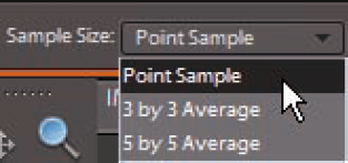
Point Sample: This selection is the default. When you click the Eyedropper tool to sample color, the pixel you click is the sampled color.
3 by 3 Average: This menu choice averages 3 pixels by 3 pixels, and the sampled color is the result of the sample point and 8 surrounding colors.
5 by 5 Average: This menu choice averages 5 pixels by 5 pixels, and the sampled color is the result of the sample point and 24 surrounding colors.
Just as you add colors from the Foreground Color Swatch to a Color Swatches library, you can sample colors in a photo and use the sampled colors to create a custom Color Swatch library.
In Elements, when it comes to color, the challenge isn't understanding color theory or definitions, but rather matching the RGB color you see on your computer monitor as closely as possible to your output. Output can be a printout from a color printer, a screen view on a Web page, or an image in a photo slide presentation.
We say match "as closely as possible" because you can't expect to achieve an exact match. You have far too many printer and monitor variables to deal with. However, if you properly manage color, you can get a very close match.
To match color in your monitor and your output, you must calibrate your monitor and then choose a color workspace profile. In the following sections, you can find all the details on how to do just that.
Your first level of understanding color is to understand what RGB is and how it comes about. RGB stands for red, green, and blue. These are the primary colors in the computer world. Forget about what you know about primary colors in an analog world; computers see primary colors as RGB.
RGB color is divided into color channels. Although you can't see the individual channels in Elements, you still need to understand just a little about color channels.
When you see a color pixel (a tiny, square dot), the color is represented as different levels of gray in each channel. This may sound confusing at first, but stay with us for just a minute. When you have a color channel, such as the red channel, and you let all light pass through the channel, you end up with a bright red. If you screen that light a little with a gray filter, you let less light pass through, thereby diluting the red color. This is how channels work. Individually, they all use different levels of gray that permit up to 256 levels of light to pass through them. When you change the intensity of light in the different channels, you ultimately change the color.
Each channel can have up to 256 levels of gray that mask out light. The total number of possibilities for creating color in an RGB model is achieved by multiplying the values for each channel (256 @@ts 256 @@ts 256). The result is more than 16.7 million; that's the total number of colors a computer monitor can display in RGB color.
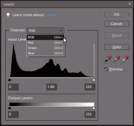
This is all well and good as far as theory goes, but what does that mean practically? Actually, you see some of this information in tools and dialog boxes you work with in Elements. As an experiment, open a file in Elements and choose Enhance
Notice that the Channel drop-down menu shows you Red, Green, and Blue as individual channels, as well as a composite RGB selection. Furthermore, the Output Levels area shows you values ranging from 0 on the left to 255 on the right. Considering that 0 is a number, you have a total of 256 different levels of gray.
Note
What's important is that you know that your work in color is related to RGB images that comprise three different channels. There are 256 levels of gray that can let through or hold back light and change brightness values and color.
Another important item to understand about channels is bit depth. A bit holds one of two values; one value is for black, the other for white. When you have 256 levels of gray, you're working with an 8-bit-per-channel image — 8 bits with 2 possible values each is 28, or 256, possible levels of gray. Multiply 8 bits per channel times your 3 channels and you get 24 bits, which is the common bit depth of images you print on your desktop printer.
Now, take a look at the Image
What does it mean when you can select the 8 Bits/Channel menu command? You can be certain that your image isn't an 8-bit-per-channel image. You may be able to select this command because some digital cameras and most low-end, consumer-grade scanners can capture images at higher bit depths. You can scan a photo on a scanner at 16 bits per channel. When you do, you end up with many more levels of gray. When you take a picture with a quality digital camera, you can capture 32-bit-per-channel images, and you end up with a file containing 32,768 levels of gray. That's a lot!
Now, here's the catch. All files need to be reduced to 8 bits per channel before you print them because that's all the information any printer uses. In addition, many tools, commands, and panel options work only with 8-bit-per-channel images. So, you ask, "What's the benefit of acquiring images at higher bit depths than I can print them?"

Figure 10.8. When you can choose 8 Bits/Channel, your image bit depth is higher than 8 bits per channel.
Note
If you attempt to adjust brightness, contrast, or other image enhancements in an 8-bit-per-channel image, you often destroy some data. You can cause some noticeable image degradation if you move adjustment sliders too far while working with 8-bit-per-channel images. When you edit your 16-bit and 32-bit images, you don't destroy data — you simply inform Elements which 256 of the total available levels of gray you want to use. The result is an image with more continuous gray tones than you can achieve in 8-bit-per-channel images.
Your monitor needs to be calibrated to adjust the gamma and brightness, correct any color tints or colorcasts, and generally get your monitor to display, as precisely as possible, accurate colors on your output. You have a few choices for which tool you can use to adjust monitor brightness, ranging from a low-cost hardware device that sells for less than $100 to expensive calibration equipment of $3,000 or more — or you can skip the hardware and use tools provided by Adobe or Windows.
Note
Gamma is the brightness of midlevel tones in an image. In technical terms, it's a parameter that describes the shape of the transfer function for one or more stages in an imaging pipeline.
We skip the high-end costly devices and software utilities that don't do you any good and suggest that you make, at the very least, one valuable purchase for creating a monitor profile: a hardware profiling system. On the low end, some affordable devices go a long way in helping you adjust your monitor brightness and color balance:
ColorVision Spyder2express: For as low as $64, you can purchase an easy-to-use, three-step calibration device to balance the color on your monitor and adjust it for optimum brightness. This device is receiving five-star ratings at online resellers, including
www.amazon.com.Pantone Huey Monitor Color Correction: This is another, low-cost system used for calibrating both CRTs and LCDs. This unit retails for $89 and sells for $63 at Amazon.com, as of this writing.
X-Rite Eye-One Display 2 (formerly GreTag MacBeth Eye-One Display 2): This device, like the Spyder2express and Huey, is an easy-to-use profiling tool that works with CRT displays, LCDs, and laptop computers. It sells for around $195 to $250. You attach the suction cup to your monitor and click a few buttons in the software application accompanying the hardware, and Eye-One Display 2 eventually prompts you to save a monitor profile. The profile you create is used automatically by your operating system when you start your computer. When the profile kicks in, your monitor is balanced with the settings that were determined when the device performed the calibration.
On LCD monitors, you adjust some of the hardware controls to bring your monitor into a match for overall brightness with your photo prints. Be certain to run many test prints and match your prints against your monitor view to make the two as similar as possible.
You have a lot to focus on to calibrate monitors and get color right on your monitor and your output. We talk more about color output in Book IX, Chapter 3. For a good resource for color correction and printing using Photoshop Elements, we recommend that you look at Color Management For Digital Photographers For Dummies, by Ted Padova and Don Mason (Wiley).
After you get your monitor color adjusted by using a hardware profiling system, your next step is to choose your color workspace. In Elements, you have a choice between one of two workspace colors: either sRGB or Adobe RGB (1998). You access your color workspace settings by choosing Edit
The options you have in the Color Settings dialog box include
No Color Management: This choice turns off all color management. Don't choose this option for any work you do in Elements. You use No Color Management when you work with files that have color profiles embedded in the photos. Most likely you won't be using these types of photos. For information related to when you might use the option, see Book IX, Chapter 2.
Always Optimize Colors for Computer Screens: Checking this radio button sets your workspace to sRGB. sRGB color is used quite often for viewing images on your monitor. But this workspace often results in the best choice for color printing, too. Many color printers can output all the colors you can see in the sRGB workspace. In addition, many photo services, such as the Kodak EasyShare services (discussed in Book IX, Chapter 4), prefer this workspace setting.
Always Optimize for Printing: Checking this option sets your color workspace to Adobe RGB (1998). This workspace has more available colors than can be seen on your monitor. If you choose this workspace, you need to be certain that your printer is capable of using all the colors in this color space.
Allow Me to Choose: When you choose this option, Elements prompts you for a profile assignment when you open images that contain no profile. This setting is handy if you switch back and forth between screen and print images.

You probably created a monitor color profile when you calibrated your monitor. You probably also selected a color profile when you opened the Color Settings dialog box and selected your workspace color. When you start your computer, your monitor color profile kicks in and adjusts your overall monitor brightness and correction for any colorcasts. When you open a photo in Elements, color is automatically converted from your monitor color space to your workspace color.
At print time, you use another color profile to output your photos to your desktop color printer. Color is then converted from your workspace color to your printer's color space. In Book IX, Chapter 2, we show you how to use color profiles for printing. For now, just realize that the proper use of color profiles determines whether you can get good color output. From here, you can jump to Book IX, Chapter 2 and understand how the color profiles are used at print time.