Fine-tuning a photo's overall brightness and contrast is the first step to improving it. That's because even well-exposed photos look better with some simple tonal adjustment. Sometimes these adjustments are large, making the photo look like a completely different image, and other times they're only minor tweaks. If a photo is important to you, check to see if you can improve it with one or more of the tonal adjustment tools covered in this chapter.
Many digital cameras have various settings that enable you to change the way the camera's sensor records images. Quite often, one of these settings enables you to increase the contrast of every photo the camera captures. Using a setting like this may help with some images, but not all of them.
Additionally, when contrast is added during image capture, it's sometimes difficult to remove when it isn't needed. Because of that, I strongly urge you to turn off any contrast settings in your camera. It's always easier to add contrast than it is to compensate for excessive contrast. The same is true for most other settings, such as sharpening. You can always add sharpening to a photo, but it's hard to remove it if it's overdone during the image capture process.
If you're shooting in the raw mode, these settings don't affect the raw file in the same permanent way they affect JPEG files; so it isn't necessary to turn them off, though I recommend you do in case you switch your camera back to JPEG at any point.
Brightness and contrast are the two fundamental qualities of photographic tonality. Since the earliest days, Photoshop Elements (PSE) has had a tonal adjustment tool named Brightness/Contrast. You access this command by choosing Enhance
Figure 6.1 shows the Brightness/Contrast dialog box.
The Brightness/Contrast dialog box provides two simple adjustment sliders. One is for increasing or reducing image brightness, and the other is used to increase or reduce the contrast in an image.
The main problem with this tool is that it's a bit too simple. Other than the standard image preview, it doesn't allow you to see exactly what is happening to the tones in an image. It's like using a dull knife to slice a loaf of bread. Sure, you'll be able to slice the bread, but the slices may be a mess when you're through slicing.
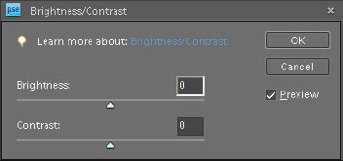
Because the Brightness/Contrast command is such a crude tool, I won't waste any more of your time discussing it — other than to encourage you to skip it and use the other commands discussed in this chapter for fine-tuning a photo's brightness and contrast.
Note
Throughout the rest of this chapter, when I mention the terms brightness and contrast, I am discussing tonal qualities, rather than the Brightness/Contrast command.
Before you get into using the Editor's more useful tonal adjustment tools, you need to have a working knowledge of histograms.
A histogram is a graphical representation of the distribution of the tones in an image. It consists of a graph that ranges from pure black on the left to pure white on the right.
The graph is formed by 256 side-by-side columns, one for each of the individual tonal values that the histogram represents. The columns start with black (0) on the left and end with white (255) on the right. In-between there are 254 other columns representing all the shades of gray between pure black and pure white.
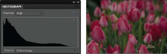
Together these 256 levels equal the sum total of the tones in an image. Figure 6.2 shows a histogram and the photo that it was generated from.
Note
Pure black is black with no detail. This could be a deep shadow that's underexposed. Pure white is white with no detail, such as a white shirt that's overexposed or a reflection from something shiny, such as a chrome automobile bumper.
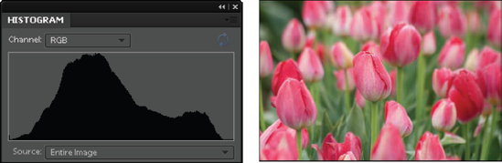
The height of a tonal column is governed by the number of pixels in the image having that particular tone. If the image includes lots of midtones, the columns around the middle of the histogram are taller. Because these columns stand right next to each other, they form a graph when viewed as a group.
In Figure 6.2, there's a big hump near the middle of the histogram. This indicates that most of the tones in the photo are midtones. Both sides of the histogram slope downward before touching either end of the histogram. This tells us that there are no deep blacks or bright whites in the photo. The image has a wide range of tonality with most of the content in the midtones. When you look at the accompanying tulip photo, this is quite plain to see.
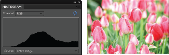
When a photo is underexposed, the entire histogram shifts to the left. The emphasis is on the darker tones and fewer highlights are represented. Figure 6.3 shows an underexposed version of the tulips.
Notice that everything is darker and that it's difficult to discern detail in the deepest shadows of the greenery in the upper left. This tonal shift is confirmed by looking at the histogram in Figure 6.3.
The darkest tones on the left, which were fully represented in the histogram in Figure 6.2, are now being pushed off the end of the graph. When this happens, all the tones that used to describe the darkest shadows are forced to black (0). This tonal loss is called clipping because the tones are essentially clipped off the end of the tonal scale.
Figure 6.4 shows what happens when highlights are clipped by overexposure. The histogram is pushed to the right and the tones that used to describe bright highlights that still held detail in them are forced to pure white (255).
This highlight data loss is easy to see in the photo where the lightest parts of the flowers are clearly being blown out, losing all detail.
The shape of the histogram's middle region is going to vary a lot depending on the photo's subject matter. Quite often you don't have much control over that shape.
The parts of a histogram that are important, and that you do have control over — especially when you're shooting — are the left and right edges because they're controlled by your camera's exposure settings.
Most dSLR (digital single lens reflex) cameras have a feature that you can turn on to display a histogram when you take a photo.
Some cameras even have a live-view function that enables you to see the histogram before you shoot. This is a great way to evaluate an exposure as soon as you shoot it. You don't even need to see the image preview to know whether your exposure is good.
If you see clipping in the shadows, increase your exposure. If you see clipping in the highlights, decrease your exposure.
Something else to consider when evaluating a histogram is the tonal key of the image. When an image is a dark scene (low-key) or a bright scene (high-key), the histogram may fool you. Figure 6.5 shows a low-key photo and its accompanying histogram.
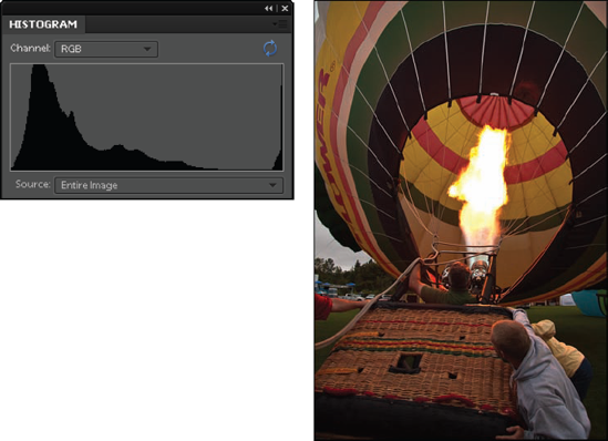
This photo was shot early in the morning, just as the sun was rising. Most of the tones in the image are dark. This is easy to see in the histogram because most of the data is represented on the left side of the histogram — except for the bright flame clipping on the right side of the histogram.
Figure 6.6 shows a high-key photo of my friend, David, shooting photos on Mount Hood, in Oregon.
Again, the tonal nature of this photo is easy to see when looking at its histogram because most of the data is on the right side. You can see a small bump in the histogram on the left, showing the dark tones of his clothing.
Just because a histogram is weighted to one side or another doesn't necessarily mean that it's underexposed or overexposed. Both of these photos were exposed correctly.
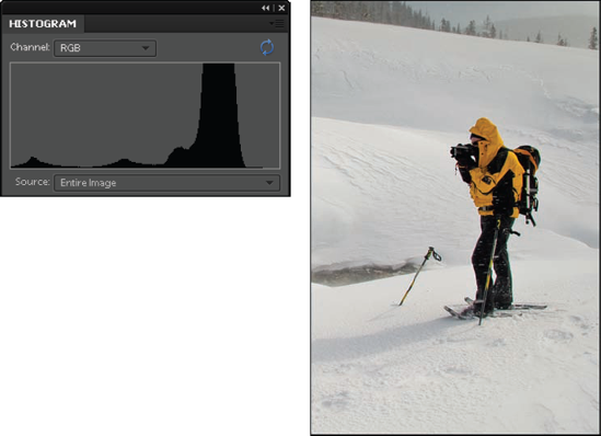
The subject matter in them is causing the histogram to look the way it does. The main thing to be looking for is whether important shadow or highlight information is being clipped. When you shoot a high-key or low-key photo, keep this in mind.
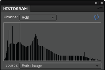
When you open a photo into the Editor, the Histogram panel enables you to evaluate the tonality of the image. To see the Histogram panel, choose Window
The first thing you notice about this histogram is that the tonal range is displayed in color. This enables you to see exactly where different color channels are falling on the scale.
Gray areas indicate that all colors overlap in those regions. You can change the way this data is displayed by selecting settings from the Channel drop-down menu at the top of the histogram.
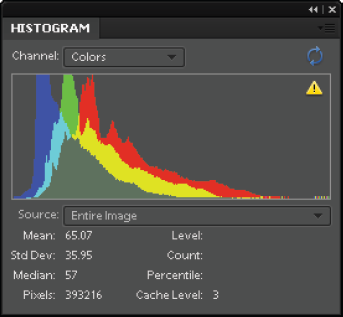
To simplify the discussion, in Figures 6.2 through 6.6 I used the RGB (Red, Green, Blue) channel display to show the combined red, green, and blue color channels as black. You can use this menu to show individual color channels, or luminosity, which is the averaged brightness values of all color channels.
You may have noticed a small, triangle-shaped exclamation icon in the Histogram panel. This icon is an indicator that the histogram is being created from cached data, which means that the very latest information from the photo isn't being used. To update the histogram, click the yellow icon, or click the Uncached Refresh button directly above it.
The real value of the Histogram panel is that it updates as you work. When you make a tonal or color adjustment, you can see its effects on the histogram in real time. When you complete the adjustment, you need to update the cached information to see the exact representation of the tonality of your photo.
All the data displayed below the histogram, such as Mean and Std Dev might be interesting to someone, but I have to tell you that in all of my years of using and teaching Photoshop and Photoshop Elements, I have never found a need for them.
The primary thing to pay attention to on a histogram is what's happening to its right and left sides: Are shadows and/or highlights being clipped?
Even with the best exposure, a scene may not contain the darkest and brightest tones you would like to see in your photo. In these cases it becomes necessary to adjust the tonality of the image by stretching the histogram to expand the photo's tonal range.
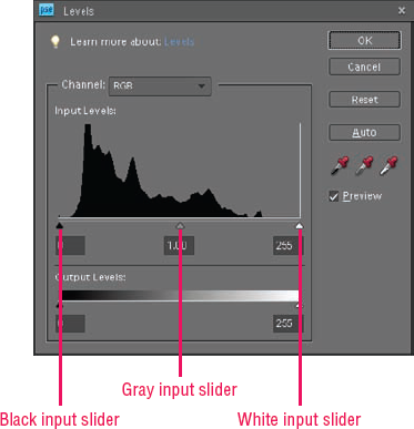
The most common method for doing this is to use the Levels command. Here's how you use the Levels command to adjust the brightness and contrast.
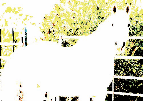
Open the White_Horse.tif practice file from the downloadable practice files on the Web site (
www.wiley.com/go/pse8aftertheshoot). Adjust the zoom level so that you can see the entire image. Notice that the contrast of the image is flat — the dark tones and the light tones are dull. This photo of Annie needs some punch.If your Histogram panel isn't showing, choose Window

Open the Levels command by choosing Enhance
The small triangles below the histogram at each end enable you to control where the ends of the histogram stop. These triangles are called input sliders. When you click and drag them inward, you modify the histogram by changing its endpoints.
The numbers below the sliders tell you exactly which tones are being affected. The slider on the left is the black input slider, and the slider on the right is the white input slider. This means that whatever values these sliders are set to become the new black (the black-point) and the new white (the white-point) when you click OK.
Warning
The Levels dialog box includes another set of sliders at the bottom. These sliders are called Output sliders because they're used to limit the tones in an image for specific printing (output) scenarios. It's best not to use them for image adjustment at this stage.
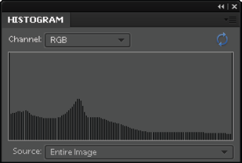
Click and drag the black input slider to the right until you get to a value of 50 and the white input slider to a value of 175, and then click OK. Now the old value of 35 becomes the new 0 (black) because values 0 through 49 are being clipped from the end of the histogram. The original value of 175 becomes the new 255 (white), clipping more than 75 tonal levels from the highlights. You can verify this by checking the Histogram panel, shown in Figure 6.9. The histogram data that originally occupied the range between 35 and 150 is now expanded to cover the range of 0 to 255. This expansion causes gaps to appear between tonal levels because there isn't enough data to cover the entire range as the tones are spread out. (More about these gaps in a moment.)
When you look at the image, it's easy to see that the contrast has increased; however, the increase is too much. The darkest and lightest tones are losing most of their detail because both the shadows and highlights were clipped by the Levels adjustment. This causes the image to become more contrasty because the range from black to white has been shortened considerably.
Choose Edit
Fortunately, there's an easy way to monitor the effects of these two sliders.
Tip
If you learn only two keyboard shortcuts, they should be Ctrl/

Open the Levels dialog box again (Ctrl/
Click and drag the black input slider to the right while holding the Alt key. Notice that the screen goes white until you get to a value of about 20. That's when some detail begins to show against the white background. This preview indicates that shadow details are beginning to clip. Figure 6.10 shows what this clipping preview looks like with a value of 40. All the colored details you see indicate that specific color channels are clipping. The black areas indicate that detail is being lost in all color channels.
Note
Because every modern Mac keyboard has an Alt label on the Option key, for simplicity's sake, I refer to it as the Alt key.
Slowly move the slider back to the left until most details disappear from the white clipping preview and then release the mouse button and the Alt key. I used the value of 20. Now you know that you have maximized the shadow detail without clipping any dark tones.
Repeat Step 6 with the white input slider while holding the Alt key. Notice that the clipping preview is black this time. Drag the slider until you see some detail appear in the preview, and then slowly back off until it just disappears — around the value of 212. Deselect the Preview check box in the Levels dialog box to hide the Levels adjustment so that you can see what the image looks like without it. Notice that the contrast looks better than the original and that the blacks and whites aren't being overly compressed.
Now that the black-point and the white-point are set for this photo and you have determined the image's contrast, it's time to adjust the overall brightness.
Adjust the overall brightness of the image using the gray Input slider that's in-between the white and black Input sliders. When you move this slider to the left, it lightens the midtones and when you move it to the right, it darkens them. However, it has little effect on the darkest and lightest tones that determine the overall contrast. Note that the Alt key doesn't provide a preview when using this slider.
When you're satisfied with the overall brightness, click OK to apply the Levels changes. The brightness and contrast adjustments of this image are complete. Notice how much better Annie now looks. If you decide to save the photo, be sure to add edited to the end of the name (White_Horse-edited.psd) so that you don't overwrite the original. Go ahead and leave this photo open because you use it in the next exercise.
Something to keep in mind about histograms and clipping is that the clipping preview is intended as a guideline. You don't always have to follow it. Release the Alt key once in a while when moving the black- or white-point sliders to see what the actual image looks like.
For example, with this photo of the horse, I might allow some shadow detail in the bushes behind the horse to clip if it helps the contrast of the main subject by providing deeper blacks. However, I am always very careful about allowing highlights to clip no matter where they are. That's because pure white highlights have no detail. When printed, they are the same color as the paper they're printed on.
Note
The Levels dialog box has an Auto button. Like most automatic things in the PSE Editor, its results are hit-and-miss. I recommend that you learn the technique I just showed you so that you know exactly what's going on with the tones in your image instead of experimenting with uneven results.
So here's the lowdown on Levels: When adjusting an image with Levels, always start with either the black Input slider or the white Input slider. Do both ends first to get the black-point and the white-point set before adjusting the image's brightness with the gray Input slider in the middle. If you begin with the gray Input slider before working with the ends, you'll most likely have to readjust it before clicking OK.
When using Levels, you have lots of control over setting the darkest and lightest tones in the image — the black-point and the white-point — that determine the overall contrast, but you don't have any control over adjusting contrast of the tones between pure black and pure white. When you need to adjust the middle tones of a photo, use Adjust Color Curves.
In the last exercise you made the photo of Annie look pretty good. Now see if you can give it an extra contrast boost in the midtones.
Go back to the White_Horse.tif practice file you worked on in the last exercise. If you're beginning with an unadjusted file, open the photo and complete Steps 5 through 9 from that exercise.
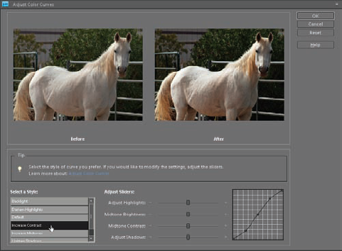
Open the Adjust Color Curves dialog box, shown in Figure 6.11, by choosing Enhance
Position the Histogram panel so that you can see it along with the Adjust Color Curves dialog box.
Choose Increase Contrast from the Select a Style menu. When you do, notice that the After preview of the horse becomes more contrasty. Also notice that the data in the Histogram panel shifted toward the outer edges of the histogram, but no clipping has occurred at the ends of the histogram. The added contrast looks good, but it's a bit too much for this photo.
Use the Adjust Sliders to fine-tune the contrast adjustment by slightly reducing Adjust Highlights and slightly increasing Adjust Shadows. Unfortunately, these sliders don't provide any numeric readout so I can't give you any exact numbers. Just adjust them until you like the After preview. Be aware that small adjustments can sometimes cause big changes to the image.
If you want to undo your changes and try again, click the Reset button or choose Default from the Select a Style presets.
When you're done, click OK to complete the adjustment. Don't close the file. Leave it open for a few more pages.
Earlier I mentioned that the Brightness/Contrast is a blunt instrument for adjusting tonality. In comparison, Adjust Color Curves is like a scalpel because you can modify individual segments of an image's tonal range. Just be careful, because it's easy to overdo these adjustments.
Be prepared to reset the image and begin again if needed.
Use Levels to set the white- and black-points before working with Adjust Color Curves for midtone adjustment. When using Levels before Adjust Color Curves, consider not adjusting the gray Input slider when using Levels so that midtone changes are handled more appropriately using the Adjust Color Curves dialog box.
If you did the last two exercises and you still have the White_Horse.tif file open, your histogram probably looks a lot like the one in Figure 6.12. So far only two things have been done to this photo — a Levels adjustment and a Color Curves Adjustment. Because of those two modifications, the data represented in the histogram has been pushed and pulled throughout the tonal range.
Each of the gaps in the histogram represents data that is no longer in a specific tonal range. This data loss is called combing. The tall spikes sticking up are called spiking. They represent tonal regions where data has been compressed.
Combing and spiking are indications that the Levels and Adjust Color Curves are destructive commands. Every time you use them, you lose data. It's very important to limit your use of them, because subsequent adjustments cause even more data loss. A way to create some flexibility is to make Levels adjustments with an adjustment layer so that those changes are isolated to a separate layer.
The easiest way to understand the concept of layers is to switch gears for a moment and think about music. When a band records a piece of music, each instrument is recorded individually. Sometimes each instrument is even recorded at a different time. A sound engineer combines all the individual tracks into the finished mix of the recording. If the drums are too loud, she can turn then down without affecting the other instruments. If she doesn't like the beat of the drums, a new recording can be made of just the drums and then added to the mix of the other instruments.
Layers work the same way in PSE. Different pieces of the image information are placed on individual layers. If something needs to be changed, it isn't necessary to redo the entire image; you need only change the layer with that information. Because of this flexibility, layers are at the heart of a non-destructive workflow.
An added benefit of using a layer for an adjustment, such as Levels, is that the layer remains flexible, enabling you to modify it at any time without affecting the overall quality of the image. The easiest way to understand a layer is to create one. Follow these steps to create an adjustment layer on the horse photo.
Open the White_Horse.tif practice file you worked on in the last exercise. If the file is still open, display the Undo History panel (Window
Note
The Undo History panel enables you to go back in time while you're editing a file. To back up to a previous history state, you simply click it. You can also undo several steps at one time. Be aware, though, that history states are volatile. They disappear when you close the file and they're no longer available when you reopen it.
Create a Levels adjustment layer by choosing Layer
Adjust the black-point and white-point sliders to set shadow and highlight clipping, and then adjust the gray slider to adjust overall brightness. Notice that there is no OK button to click. That's because these adjustments are open-ended. You can come back to this panel at any time to change your adjustments because they have not been permanently applied to the photo. Just be sure to click on the adjustment layer in the Layers panel to make it active.
In Step 2 of the previous exercise, you created an adjustment layer. You can see the actual layer in the Layers panel (Window
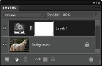
As long as you keep this layer intact, you can close and reopen this file without affecting this layer or making the changes permanent. To do that, be sure to save it as a TIFF or a PSD because both of these file formats support layers. If you save the file as a JPEG, the adjustment layer is automatically flattened into the Background layer, making the adjustments permanent.
To delete a layer, select it and click the Delete Layer button (trash can icon) at the bottom of the panel. To hide an adjustment layer's effects, click the eyeball icon next to it. Click in the same spot to reveal the layer again. To completely flatten all layers into the Background layer, choose Layer
Unfortunately, Adjust Color Curves is not available as an adjustment layer. That means that if you want to use this command after creating a Levels adjustment layer, you need to click the Background layer to make it the active layer, and then choose Enhance
If you want to use a command non-destructively, such as Adjust Color Curves, that isn't available as an adjustment layer, there is a workaround. You can use the command on a duplicate of the Background layer. To duplicate a layer, choose Layer
Just be aware that duplicating a Background layer substantially increases the size of the file. A file with a Background layer and a duplicate of it is twice as big as a file with only a Background layer. One of the beauties of adjustment layers is that they don't affect file size to this extent.
Warning
If you try to use a command, such as the Adjust Color Curves command, but it's grayed-out in the menu, it means that you're on the wrong layer. Be certain to select the Background layer when attempting to make changes to it.
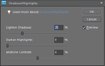
Sometimes it's difficult to effectively capture the entire tonal range in a photo because some of the scene is very bright and some of it's quite dark. You can use Adjust Color Curves to try compensating for these brightness changes. However, if you're not quite ready to work with Adjust Color Curves, there's a much easier command called Shadows/Highlights, shown in Figure 6.14, that's used to solve the problem.
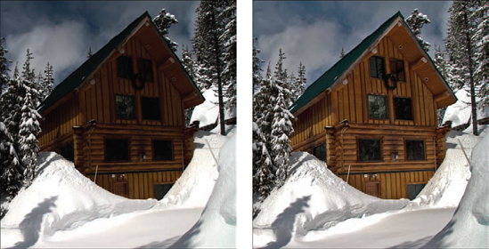
Open the Snow_House.tif practice file from the downloadable practice files on the Web site (
www.wiley.com/go/pse8aftertheshoot). If you check the histogram of this photo, you see that both the highlights and the shadows are clipping. If you use the Levels gray input slider to lighten the house and trees, the snow becomes too light. If you use the gray input slider to darken the snow, the house becomes too dark. What you need is a way to lighten the shadows and darken the highlights.Choose Enhance
Adjust the Darken Highlights slider to about 25 percent to darken the highlights.
Click OK.
If you look at the histogram for this photo before you made the Shadows/Highlights adjustment to the after histogram, you notice an interesting change occurred. Though this adjustment didn't help much with clipped tones, it moved the shadow and highlight tones toward the middle of the histogram in an attempt to balance them.
Tip
Use the Shadows/Highlights command when you have a photo of someone where his face is in a shadow and he has a bright background behind him.
Figure 6.15 shows a section of the Snow_House.tif file before and after adjustment. Though the second image isn't perfect, it looks much better than the first one.
Two things to keep in mind when using this command: First, it tends to flatten out the contrast of photos it's used on. This can cause shadows and highlights to look too gray.
Second, you often need to use Levels on the photo after Shadows/Highlights to compensate for any overall lightening or darkening. Because of that, if you think you need to use the Shadows/Highlights command, use it before using Levels so that you only apply one Levels correction. Or, use a Levels adjustment layer so you can make any Levels adjustments after you see the effect of the Shadows/Highlights command.