Photoshop Elements 8 has a wide variety of tools for adding special effects to your photos, ranging from cool text to highly stylized filters that can be applied to all or only part of an image. Because it's impossible to cover all of the possibilities here, my goal is to introduce the main concepts and open the door to creative exploration. After you finish this chapter, be sure to go back and experiment with some of the tools you learn about. Knowing how to use them will add an extra dimension to your photography, enabling you to take your photos in previously unimagined directions.
One of the most fundamental creative things you can do with a photo is to add type to it using the Type tool. For example, you can add a person's name to a photo or you can label important features about an object or place you've photographed.
The Type tool (T), which is ninth from the top of the single-column Toolbox, has four different Type tool styles stacked together, shown in Figure 12.1.
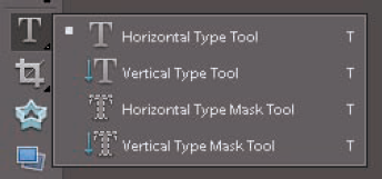
The first two tools in the stack enable you to create standard text horizontally or vertically. This text remains editable, enabling you to change its content, size, color, and so on, at a later date.
The next two tools are special type mask tools. You use them to create selections in the shape of type that can be used to cut or copy part of an image to fill the inside of the text. Because the type created with these tools is in the form of a selection, it does not remain editable after it's created.
I focus in this chapter on the standard Text tools.
Warning
Most software today comes with an automatic spelling checker that alerts you to misspelled words. Photoshop Elements (PSE) has no spell checker, so be sure to carefully check your spelling.
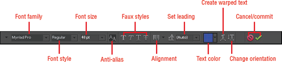
When you select either the Horizontal or Vertical Type tools, the Options bar looks like Figure 12.2. These options give you control over almost every aspect of type you add to a photo. You can apply them before type is added and modify them after the type is in place to fine-tune it.
Here's what the Type tool options are used for, moving from left to right:
Font Family. The Font Family drop-down menu gives you access to all the fonts on your system. When you click the associated arrow, a drop-down menu opens, showing each font family in font, meaning that the font is displayed with a preview of the actual font.
Font Style. Many fonts come in different styles, such as bold and italic. If styles are available for the selected font family, they appear in this drop-down menu.
Font Size. You use this drop-down menu to change the size of the font. You can choose from the menu or type a value into the box. You can even type a value larger than the largest size listed in the menu, which is 72 pt (point).
Anti-aliased. This option smoothes the edges of the type, preventing any jaggedness. I recommend always using this option.
Faux Styles. If the selected font doesn't have a particular style, such as bold or italic, you can use these options to fake the style.
Alignment. Clicking this button opens a pop-up panel with alignment options, such as left or center alignment.
Set Leading. This option controls the amount of space between lines of type. The Auto setting is usually the best place to begin. Experiment with other values to move lines farther apart or closer together.
Text Color. Clicking this color swatch opens a pop-up panel of assorted color presets. Clicking the More Colors button opens the Select Color dialog box, where you can choose any color you desire.
Create Warped Text. Use this option to make text curve in a variety of shapes.
Change Text Orientation. Clicking this changes horizontal text to vertical, and vice versa.
Cancel. If you decide you want to cancel a text operation, click this circle with a bar through it. You can also use the Esc key to cancel the Type tool.
Commit. Select this check mark to accept the text you've typed and add it to the photo.
Style. (Not shown in Figure 12.2; see the note in this section.) Opens a pop-up panel that you use to add a layer style to type.
Note
When the Type tool is active in the document, the Cancel and Commit buttons appear on the Options bar. After you click Commit, these buttons are not needed. They are replaced by the Style menu, which you can only use after type is in place.
The best way to learn to use the Type tool and many of its options is to perform this exercise.
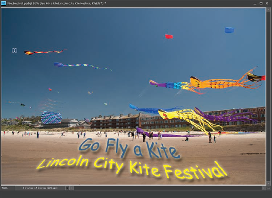
Open the Kite Festival.tif file from the downloadable practice files on the Web site (
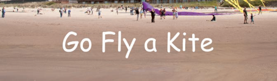
www.wiley.com/go/pse8aftertheshoot).Choose the Horizontal Type tool from the Toolbox. Choose Comic Sans for the Font Family, set the size to 30 pt, choose Center Text for alignment, and white as the text color. Click in the center of the lower portion of the photo, on the beach in the foreground. When you do, notice that the cursor becomes a flashing I-beam, indicating where the type will be added.
Type Go Fly a Kite and then click Commit. Your type should look like Figure 12.3. Look at the Layers panel; you'll see that the type is added to its own layer. This is an important feature of type because it enables you to have complete control over the type. So long as this layer remains intact, the type will be editable at a later date.
Tip
To add a paragraph, draw a selection with the Type tool and then begin typing inside it. As you do, all your text will flow inside the selection.
Choose the Move tool (V). Notice that when you do, a bounding box appears around the type. Hover over the type and notice that the cursor changes to a black arrowhead. This means that the Move tool affects only the type. Click and drag the type to fine-tune its position.
Choose the Horizontal Type tool again and triple-click on the text to select it. This should reverse the color of the type, turning it black to indicate that it's selected. If you don't see the type reverse, you may not have clicked on the type. In this case, the Type tool thinks you want to add another line of text. If that happens, click Cancel and try again. When type is selected, you can change the font, size, color, and so on, using the Options bar.
Tip
You can also click and drag across type with the Type tool to select it. You can select all type or just a section of it.
With the text selected, click the color swatch on the Set text color box to open the Select color dialog box. If you see a grid of colors instead of the Select color dialog, click on the More Colors button to open the Select a color to add to the palette dialog box, which is a replica of the Select color dialog.
The goal here is to pick a color that matches one of the kite colors. You can use trial and error to find that color using the color ramp in the Select color dialog box, but there's a much faster way.
Move the cursor away from the dialog box and notice that it changes to an eyedropper. Click the sky. Notice that blue color is sampled and chosen as the active color. Click OK to accept this color. Then click Commit to change the color of the text to the blue.
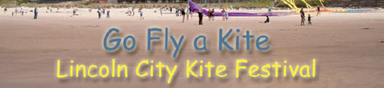
With the Horizontal Type tool still selected, click at the end of the line of text, just after the e in Kite, and then press the Return key on your keyboard to drop the cursor down one line. Be sure not to press the Enter key on your keyboard's 10-key section because it performs the same function as the Accept button on the Options bar. Now you can enter a second line of text. Type Lincoln City Kite Festival and click Commit.
Use the Horizontal Type tool to highlight the second line of text and change the Size value to 24 pt. If you can't see the new line of text, use the Move tool to scoot all the text up a bit.
Finally, select the bottom line of type once more and change its color to one of the yellow or orange colors that you see in the kites using the Select color dialog box's eyedropper. Leave this file open for the next exercise.
Tip
You can create as many type layers as you like by clicking anywhere with the Type tool and beginning a new line of text. Each of these type layers is independent and can be managed on its own by clicking on its type or selecting it from the Layers panel.
Changing the size and color is just the beginning of the customization you can do to type. You can also add drop shadows, bevels, and a multitude of other effects using the Style pop-up panel.
To open the Style panel, click the Style button that appears on the Options bar when a Type tool is active. Remember that when type is selected, this button is replaced by the Cancel and Commit buttons.
To see all styles available, click the Panel Menu button, as shown in Figure 12.4.
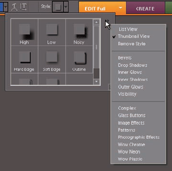
When a different set of effects is chosen from the menu's list, the main panel is populated with the styles contained in that set.
Use the Style panel to add some life to the type from the previous exercise.
Pick up where you left off with the previous exercise. Click the Style button and then open the Panel menu and choose Drop Shadows from the list. This loads the drop shadow preset thumbnails into the Style panel. Choose the Low preset thumbnail from the options to add it to the type.
Select Outer Glows from the Style panel's menu and choose Simple from the panel list to add a glow around the type. Now your text should look something like the text in Figure 12.5.
Leave the file open a bit longer so you can do a couple of more tweaks to the type to add some pizzazz to it.
Continue to explore some of the other styles available in the Style panel and its menu. As you do, notice that when you choose different styles from the style sets in the upper portion of the Panel menu, the new styles you use overwrite styles that were used previously.
However, when you choose styles from the lower section, each time you try a new style, it's added on top of the previous style. To undo a series of adjustments, use the Undo History panel or choose Remove Style from the panel's menu to undo all styles.
The Style pop-up panel offers a fast way to add a style to a type layer, but the downside is that its preset styles don't always suit your needs. They may be too strong or weak for the effect you desire.
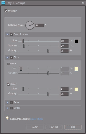
Fortunately, there's a way to customize styles after you add them by using the Style Settings pop-up panel, shown in Figure 12.6. To open it, choose Layer
When you open the Style Settings pop-up panel, any currently applied styles appear with a check mark and their settings are displayed. Use the controls for any particular setting to change it.
For example, if you want to change the direction that the drop shadow is being cast in, click and drag the bar in the Lighting Angle dial, or type a value in the text box beside it.
To add a new style, such as a stroke, select the option and then use the sliders to adjust it.
Use the Style Settings panel to change the outer glow on the type in the Kite Festival project:
Tip
The fact that the Style Settings pop-up panel is found in the Layers menu is a clue that you can apply styles to all sorts of layer content in addition to type layers. For example, you could have added a style, such as a stroke or drop shadow, to the hot air balloon you copied to its own layer in the exercise in Chapter 11. Just remember that because the Background layer is locked, you can't add layer styles to it.
There's one last thing you can do to the text in the practice file that adds some fun to it.
Return to the Kite_Festival.tif practice file and select the Horizontal Type tool. Click anywhere on the type you added in the previous steps to make the type layer active. You can tell the type is active because all of it is underlined.
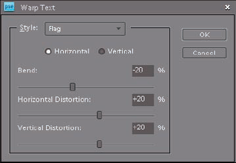
Go to the Options bar and click the Create Warped Text button that's just to the right of the Set Text color box. When you do, the Warp Text panel shown in Figure 12.7 opens.
Choose Flag from the Style drop-down menu. Notice that the text is distorted to look like a waving flag.
Reduce the Bend amount to −20 percent to lessen the effect. Then change the Horizontal Distortion to about +20 percent and the Vertical Distortion value to about +20 percent and click OK. Then click the Commit button to accept and apply the changes to the text. Your photo should now look like Figure 12.8.
Use the Move tool to do any final adjustment to the position of the text.
As you can see from these exercises, the options for working with text are practically unlimited. Though it's not always necessary to customize text to quite this degree, be sure to explore some of these options when working with type on one of your own projects.
PSE offers a wide array of filters, found primarily in the Filter menu, that you can use to create all sorts of interesting creative effects.
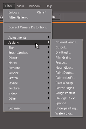
Figure 12.9 shows the Filter menu with the cursor hovering over the Artistic filter set, expanding it to show all the Artistic filters.
These filters are only available when a document is open in the Editor.
Each of the other filter sets in the Filter menu has its own expanded menu as well. Though there are a lot of options when it comes to these filters, you'll find most of the creative filters in the Artistic, Brush Strokes, Sketch, and Texture filter sets.
The Distort and Stylize filter sets are also considered creative filters, though I find that I rarely use them.
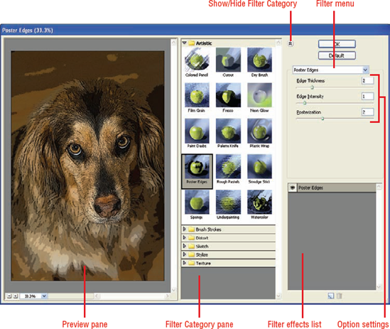
When you have selected any of the creative filters, the Filter Gallery dialog box, shown in Figure 12.10, opens.
Note
You can also open the Filter Gallery by choosing Filters
The Filter Gallery is a comprehensive dialog box that provides complete control over the creative filters through a set of panes. Here's what each pane is used for.
Preview pane. This pane displays a preview of the photo with the currently applied filter(s). Use the Zoom controls at the lower left to control the magnification.
Filter Category pane. This center pane contains a collapsible menu of each of the creative filter sets. To expand a set, click the arrow beside its folder name. When you do, a list of thumbnails is displayed, giving you a rough preview of the effect created by the filter. Click a thumbnail to apply a filter.
Show/Hide filter thumbnails button. This button enables you to hide the Filter Category pane, making the Preview pane larger.
Filter menu. The Filter drop-down menu gives you quick access to all of the creative filters, listing them in alphabetical order. It's very useful when the Filter Category pane is hidden.
Options settings. When a specific filter is chosen, contextual options for adjusting its settings are displayed here.
Filter Effects list. When you are working with the Filter Gallery, you can apply more than one filter to an image. The Filter Effects list enables you to arrange and manage those filters.
The best way to learn to work with the Filter Gallery's creative filters is to work on a project. The following exercise can help you begin using filters creatively.
Open the Mission.tif file from the downloadable practice files on the Web site (
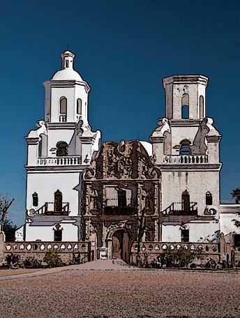
www.wiley.com/go/pse8aftertheshoot). This is another photo of the Mission San Xavier outside of Tucson, Arizona, and is similar to the photo you saw in Chapter 10.Duplicate the Background layer (Layer

Choose Filter
Warning
Filters are only applied to the actively selected part of an image layer. If you have a selection in place before opening the Filter Gallery, the filters in the gallery only affect image content within the selected area.
Set the Edge Thickness value to 4, the Edge Intensity value to 3, and the Posterization value to its maximum of 6. Notice that the edges of the building are enhanced, adding a drawing-like effect to the photo. (For the moment, use these values so that your outcome is predictable.)
Notice that every time you make a change to a filter's settings, it's necessary to wait for the image preview to update with the settings. A blue update bar below the Preview pane indicates the updating progress. Be sure to wait for the update to complete before evaluating the effect of changes.
Go to the bottom of the Filter Effects list and click the New Effect Layer button, next to the Delete Effect Layer button (the trash can icon). This adds a duplicate of the Poster Edges filter on its own effect layer. This filter layering effect is quite similar to image layers in the Layers panel; however, they are only visible in the Filter Gallery.
With the new Poster Edges filter layer still active, choose the Dry Brush filter from the Artistic filter set. Notice that the filter layer changes from a Poster Edges filter layer to a Dry Brush filter layer. This is how an additional filter layer is added. Set the filter's values to Brush Size = 2, Brush Detail = 8, and Texture = 1. This new effect is interesting, but it diminishes the effect of the Poster Edges filter layer a bit too much.
Click and drag the Dry Brush filter layer and move it below the original Poster Edges filter layer. Now the effect is subordinate to the Dry Brush layer, giving the photo more of a painted look. To see the photo without the newly added filter layer, click the eyeball icon next to the Dry Brush layer to hide it. Be sure to turn the layer's visibility back on.
Warning
It's possible to update the settings of a hidden filter layer using its adjustment sliders. Just be aware that those changes won't be visible in the preview until the layer is visible.
Click OK to complete the process and add the filter effects to the photo. Figure 12.11 shows the modified photo after applying the filters. If you feel that the effect is a bit too strong, go to the Layers panel and reduce the opacity of the new layer to blend the effects with the Background layer.
The creative combinations within the Filter Gallery are nearly limitless. Sometimes a single filter gives you exactly what you're looking for, while other times several combined filters create a one-of-a-kind look.
Take some time to fully explore these filters and make a note of your favorite filters and combinations so that you can quickly create the special effects that resonate with you and your style of shooting.
Tip
Because type layers are a special kind of layer, filters cannot be added to them unless they are simplified. To simplify a type layer, choose Layer
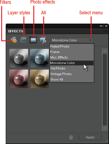
There's one more set of creative effects that you should know about: Photo Effects. To see the Photo Effects options, display the Effects panel by choosing Window
For example, after completing the previous project with the mission building, I added a brown monotone to the filtered layer using the Tint Sepia preset to give it a different look.
The Effects panel not only gives you access to the Photo Effects, but it is also another way to access filters and layer effects using the category buttons at the top-left of the panel.
The first button loads filters into the panel, the second button loads layer styles, the third button loads the photo effects, and the fourth button loads all sets of effects. To apply one of these effects, choose its thumbnail and click Apply. If you're applying a filter effect, the Filter Gallery opens.
Most people tend to gravitate toward a limited set of favorite effects. For example, I find that I generally use a handful of the huge number of Filters, Layer Styles, and Photo Effects options available.
When I'm ready to use one of those effects, it can be time-consuming to remember exactly where it is because there are so many options. Fortunately, the kind folks at Adobe created an efficient method for collecting your favorite effects.
Figure 12.13 shows the Favorites panel. To display it, choose Window
You can add effects to the Favorites panel two ways. You can right-click an effect in the Effects panel and choose Add to Favorites, or you can simply click and drag an effect from the Effects panel to the Favorites panel.
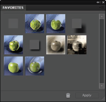
To remove an effect from the Favorites panel, choose it and click the Delete Effect button with the trash can icon on it. You can also delete effects from the Effects panel, but I don't recommend doing this because the effect will be permanently deleted.
After your favorite effects are grouped together, you simply open the Favorites panel to quickly access them.