Now that you know how to get the brightness and contrast of your photos dialed in, it's time to consider the second most important aspect of making your photos look great — color. Up until now, you may have been accepting the color you get straight out of your camera. That's about to change as I show you a variety of ways to manage and improve color. Before you get to that, though, it's worth taking a few moments to consider color theory and how it applies to you and your photography.
One of the first things to understand about color is that it's personal. Everyone has his or her own preferences. When I worked in a professional photo lab, we had lab standards for skin-tone colors.
However, certain customers wanted the skin tones in their prints to have a particular tint. Even though we didn't like the color the customer wanted, we did everything in our power to make them happy.
Some of this bias relates to personal taste, and some of it has more to do with individual color perception. Not everyone sees color the same.
In fact, your own color perception can shift as your blood sugar levels go up and down. Some people are deficient in seeing color on a red-green axis; others are deficient on a blue-yellow axis. However, few people are completely colorblind.
Note
More men are affected by color blindness than women.
Even though how people experience color can be highly subjective, the physics behind color theory is rock solid. When considering color theory, the main distinction to make is whether you're dealing with subtractive color or additive color.
Subtractive color
Subtractive color describes the way pigments, such as paints, dyes, inks, and natural colorants reflect light. When white light strikes a pigment, the pigment absorbs some wavelengths of light and reflects the unabsorbed wavelengths.
The wavelengths that are reflected are the colors you see and what give the pigment its color. This means that a subtractive color system begins with light made up of colored wavelengths. The color you see is the reflected light with some wavelengths subtracted from it — or absorbed by the pigment.
Here's an easy way to remember how subtractive color works: If you add equal amounts of red, green, and blue paint together, you get a muddy gray. It's impossible to mix any of these three colors together in a way that they create white. In order to get white, all paint needs to be removed (subtracted) from the white canvas.
Additive color
Additive color describes the way light waves combine to create color. This is the way humans see things, and it's the system used for most color management and adjustment in Photoshop Elements (PSE). This system is called additive because it begins with black (no light).
A light source adds wavelengths that have specific colors. With additive color, white is created by combining equal amounts of red, green, and blue. This can seem counterintuitive to people who are used to working with pigments and subtractive color.
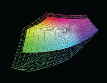
Technically, six colors are used when working with additive color — the primary colors, red, green, and blue, and their opposites (or complementary colors), cyan, magenta, and yellow. These six colors can combine in countless ways to produce the millions of colors a human can see.
Figure 7.1 shows the primary colors and their complements. When you have equal amounts of two complementary colors, you end up with neutral gray — in other words, the colors cancel each other out.
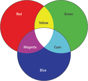
The relationship among these six colors gets even more interesting because each is composed of two component colors — and those component colors are always going to be two of the six colors.
Here's how the colors break down into components:
Red is composed of magenta and yellow.
Green is composed of cyan and yellow.
Blue is composed of cyan and magenta.
Cyan is composed of green and blue.
Magenta is composed of red and blue.
Yellow is composed of red and green.
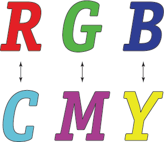
This may seem confusing at first, like an endless shell game — especially if you're used to thinking about the way pigments such as paint combine. Figure 7.2 shows an easy way to remember these relationships: The primary colors — red, green, and blue — are directly above their complementary colors (the ones that cancel them out) — cyan, magenta, and yellow.
Here's the trick to understanding this: The two component colors of any color are the two colors that are not directly across from it. For example, red is composed of magenta and yellow. Cyan can't be a component of red because it's the opposite of red (its complementary color).
When I learned this system many years ago, it completely changed the way I thought about colors and their components. All I have to do now is visualize this simple chart, and I know how all the colors relate to one another — which colors are complements and which are components.
PSE gives you a great deal of control over color. This control begins as soon as you open a photo file. To understand how that takes place, you first need to understand the method PSE uses for describing color.
The primary colors discussed here (red, green, and blue) are the colors of a color model called RGB. A color model is an abstract way of mathematically describing colors and their relationships to one another.
This common vocabulary is important when discussing specific colors within that RGB model. Otherwise, when I say "red," how do I know you're picturing the same color that I'm picturing?
Colors are further classified into color spaces. A color space, among other things, defines the gamut, or range of colors that a device is capable of capturing or reproducing.
For example, my monitor is capable of displaying only a certain gamut of colors. Many of the colors I can see out in nature can't be displayed on my monitor. However, my monitor can display colors that can't be printed on my inkjet printer. The monitor's gamut isn't as large as the spectrum that a human eye can see, but in some cases it's larger than the gamut of the printer.
These kinds of color spaces — monitor and printer — are called device-dependent color spaces. A device-dependent color space describes the range of colors that a particular device can see and/or reproduce.
Note
Devices can be subcategorized into input and output devices. A digital camera is an input device, and a printer is an output device.
The second type of color space is device-independent color space. A device-independent color space is not limited by the gamut of any particular device. These color spaces are used to describe the range of colors in color editing spaces. An editing space describes the total palette, or gamut, of colors available when editing a photo in the Editor.
The two most common editing spaces in Photoshop are Adobe RGB and standard RGB, or sRGB.
Adobe RGB. This is a large color space that is more applicable to high-end printing and reproduction.
sRGB. This is a limited color space that is intended to be common to a wide range of devices.
The main difference between these two editing spaces is that the gamut of Adobe RGB is larger than sRGB, meaning it has a much wider range of colors than sRGB.
Think about it this way: Imagine that I have two boxes of crayons. One box has 48 different colors, and the other box has 120 colors. Suppose you and I both want to do a drawing of the same scene outside.
If I give you the 120-count box and keep the 48-count box, the results of our drawings would be quite different. The greens and browns in my trees would be more limited than yours because I don't have the same range of greens and browns to work with as you do.
This is sort of the way it works in PSE. When you edit digital files, you need to standardize the way color is managed in your editing workflow. You can choose to work in a smaller color space like sRGB, or you can work in a larger color space like Adobe RGB.
The graph in Figure 7.3, created with ColorThink software, a product of Chromix in Seattle, Washington (www.chromix.com), compares the color gamuts of Adobe RGB (the wireframed shape) and sRGB (the solid shape). Notice that the Adobe RGB gamut is much larger in some areas, especially the yellows and greens.
At first it seems like a no-brainer to choose to work in a larger color space so that you're working with more colors, but that's not always the case. When you consider color editing spaces, also called color working spaces, you also must think about device color spaces — devices such as printers.
Note
Many cameras, especially digital single lens reflex (dSLR) cameras, allow you to choose one of these color spaces when capturing your images. If your camera doesn't have this choice, then it's most likely using the sRGB color space for image capture. When you shoot a photo using one of these color spaces, a color profile is attached to the photo's file. This profile acts as a translator, informing other devices in the workflow about how to interpret the photo's color.
Even though a working space may be device independent, the color of a finished print is limited to the printing device's gamut. Oftentimes that printer's limited gamut is much smaller than the PSE Editor's working space. This means that some of the colors in the file are not printable, leading to disappointments at printing time.
The real key to deciding which color space to use as the Editor's color working space is how you plan to output your files. If you're using a photo lab for printing, ask what color space the lab prefers. Most will tell you that their equipment works in the sRGB color space. If you plan to do most of your printing at this lab, use sRGB as your working space. However, if your lab is one of the ones working in the Adobe RGB color space, take advantage of the larger color space.
This is even more important when you're preparing photos for the Web. The sRGB color space is ideal for the Web. In fact, it was created with the Internet in mind. Back in the mid-90s, Microsoft and Hewlett-Packard implemented a new standard color space that was best suited to the limited gamuts of cameras, printers, and monitors. With a common color space, users could have more confidence that when they placed photos on the Web, people who viewed the images would see them the way they were intended to be seen. (Naturally, individual monitor calibration comes into play here, as well as the Web browser that's being used.)
Some people use inkjet printers for outputting prints. Most of these inkjet printers work with a limited gamut of color. However, this can be misleading because the gamut isn't limited in every color of the spectrum.
Figure 7.4 shows the color profile of an inkjet printer (the solid shape) compared to the sRGB and Adobe RGB color spaces (the wireframe shapes).
In the left image of Figure 7.4, you can see that the printer is capable of printing yellows and greens that are well outside the limits of sRGB. In the right image, you can see that Adobe RGB contains all the greens and most of the yellows this printer can reproduce.
You must think about these factors as you consider which working space to use when editing your photos because your color editing space choice really depends on how you plan to output the files.
With that in mind, here's the bottom line:
Use sRGB when you know that all your workflow is oriented to producing images for the Web or for photo labs with printing equipment that uses sRGB. Doing this helps you to better predict what your color looks like when it's time to view images online or in print.
Use Adobe RGB when you're dealing with a lab that uses the larger color space, when outputting to an inkjet printer, or when you just aren't sure what you're going to do and you want to keep your options open. You can always convert a file to sRGB if needed.
The reason it's important to understand all this stuff about color spaces is because the PSE Organizer and the PSE Editor make some assumptions in order to handle color. If you know which color space you prefer, you can set up the Editor to always use that color space when opening a photo.
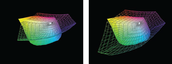
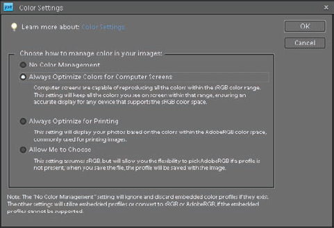
Figure 7.5 shows the Editor's Color Settings dialog box that opens when you choose Edit
Note
You can also access the Color Settings dialog box from the Organizer by choosing Edit
The Color Settings dialog box has four different settings. Each has a description underneath it. Here's some more information about how they're used.
No Color Management. When you select this color setting, any color profile attached to a file is removed when the file is opened and the monitor profile is used while the file is open. Selecting this option is usually not a good idea because it disables all color management.
Always Optimize Colors for Computer Screens. If you read the fine print under this choice, you notice that it's used when you want the sRGB color space. So it's not only useful if you're preparing photos for the Web, but it's also useful when you plan to use a photo lab that prints in the sRGB color space.
Always Optimize for Printing. The description for this option indicates that it's used when you want to work with the Adobe RGB color space. Though it says it's for printing, it's most appropriate for inkjet printing because of the large color gamut of most inkjet printers.
Allow Me to Choose. This option is a bit misleading. The only time it allows you to choose is when no profile is present. If you're using a digital camera, then your files most likely have profiles attached to them when they are created in the camera.
Tip
These color spaces are only used while files are being edited. To permanently attach the working space to the photo, choose Select ICC Profile in the Save As dialog box.
Choosing one of these options enables you to know how your photos are color managed as they're opened into the Editor. If for some reason a file opens with the wrong profile, you can change it by choosing Image
Now that you know something about color and which color space best suits your needs, it's time to learn some of the different ways you can change a photo's color using the color adjustment tools in the PSE Editor.
Because you're working with an RGB color model, your images are composed of three separate color channels. One channel represents the red/cyan content of the image, another channel represents the green/magenta content of the image, and yet another channel represents the blue/yellow content of the image.
A tone has a particular color because of a predominance of one or two of these channels. When the numeric values of a tone are the same in all three channels, that tone is considered neutral, meaning that it doesn't lean in the direction of any one color. Neutral tones are white, black, or any shade of gray.
When a photo has a colorcast, it's easiest to see in the neutral tones. For example, if someone is wearing a white shirt in a photo, but it looks reddish, then the photo clearly has a colorcast. Fortunately, removing a colorcast in Elements is easy. Just follow these steps.
Open the Sky_Tram.tif practice file from the downloadable practice files on the Web site (
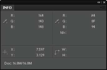
www.wiley.com/go/pse8aftertheshoot). Notice that this photo has a reddish tint to it. The tram and all the hardware around it should be gray. The tower is a light gray.Open the Info panel, shown in Figure 7.6, by choosing Window

Note
The Info panel isn't normally necessary for this procedure. I included it here so you can see what the actual color values are in the photo.
Hover your cursor over the gray arm that attaches the tram car to the transport lines; then look at the first set of R, G, and B information on the left side of the Info panel. It displays the red, green, and blue values of the area you are hovering over. (The R, G, and B values in the section on the right are for Web colors.)
You should be seeing values similar to those in Figure 7.6. These values tell you that there's more red in the photo than green or blue. There is also a bit more blue than green.
Open the Remove Color Cast dialog box by choosing Enhance
Go to the same area you measured on the arm and click with the Remove Color Cast tool to neutralize it. Notice that the red tones are removed from the photo. Also notice that now the Info panel has two sets of readings in the R, G, and B section. They should be similar to my values, which are R=164/152, G=143/152, B=148/152.
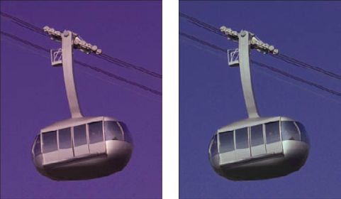
The first set shows the original color values and the second set shows the new values. Your values may be a bit different, depending on where you clicked. The point is that the new values are much closer to neutral. Figure 7.7 shows the tramcar before and after.
Tip
If you don't like the color you get with this tool when clicking one neutral area, try clicking some other areas until you like what you see. Sometimes you'll be surprised at the differences you get from one area to another.
The Remove Color Cast tool is very useful for removing a colorcast, but you need to have a neutral in the photo in order to use it. Also be aware that not all subject matter with neutral tones is the same.
For example, I have a black car, but I can't reliably use this tool to remove a colorcast in a photo of it by clicking the black paint. That's because the paint is so shiny it reflects the blue in the sky and the green in the grass, so it's natural that other colors are present in it. However, I can click one of the car's tires using the Remove Color Cast tool if any colorcast appears here.
Be careful using the Remove Color Cast tool with clothing. Even a white dress, such as a wedding dress, may be unreliable because of the optical brighteners that are added to the fabric during the manufacturing process to make it appear as white as possible. Additionally, many laundry detergents use optical brighteners to enhance the colors of clothing when they are washed.
When I first learned color correction many years ago, it took a while to make accurate color corrections. In theory, it's a straightforward process. You identify the color you don't like and you add its opposite. Though that sounds easy, the real trick is to know which color it is you want to remove.
When I was learning color correction, I wish that I had the Color Variations tool because it not only makes color correction intuitive, it also teaches you to identify the six colors used when working with color in photography. Follow these steps to learn how to color correct your photos:
Open the Blue_Boat.tif practice file from the downloadable practice files on the Web site. The color in this photo is clearly a bit too green. Though there are lots of white tones on the boats in the background, you'll find that if you click them using the Remove Color Cast tool, it doesn't quite do the trick. If you try the Remove Color Cast tool, be sure to undo its effects to return the photo to its original color.
Choose Enhance
The best way to use this dialog box is to use the color adjusted thumbnails below to identify the predominate color of the existing photo and then add the opposite of that color. In this case, the photo looks mostly like the Decrease Red (cyan) version of the thumbnails, which is the opposite of red.
Click the Increase Red thumbnail to add red to the photo. This looks better, but it needs a bit more. Click it a second time to add more red. Notice that the second click adds too much red. Click the Reset Image button to begin again.
Note
If you are working on a non-calibrated monitor, you may be seeing the color of this photo a bit differently than I describe it here. Go ahead and correct the image according to what you see.
Slide the Adjust Color Intensity slider to its lowest setting. Notice that the colors in the thumbnail previews are much more subtle. This enables you to make minor corrections. Click the Increase Red thumbnail a few times until you like the color in the After preview. The color is almost there. Now you need to add a touch of yellow.
Click the Decrease Blue thumbnail a couple of times until you like the color.
Click OK to see what the color looks like on your image. If you don't like it, press Ctrl/

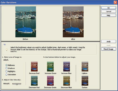
In addition to adjusting the intensity of the color adjustments, you can also change which tonal region is being affected by your changes using the options in the Select area of image to adjust.
If you see a predominant color in the shadows, but not in the rest of the image, select Shadows. Select Highlights if you see a strong color in the highlights that needs adjustment. Just don't use the Saturation option. I show you a better way to work with color saturation later in this chapter. Also, don't use the Lighten and Darken options because you can manage these tonal changes much better using Levels or Adjust Color Curves.
The Color Variations command is one of the most important color adjustment tools in PSE when you're new to color correction. That's because it enables you to visually understand and evaluate what's going on when you adjust a photo.
When it comes to color correction, skin-tone adjustment is one of the most important things to get right. That's because even if you have all the neutral tones looking great, but the color of someone's skin is off, the color won't look right.
The difficult thing about color correcting skin tones is that it's often difficult to identify which color needs correcting because it's hidden in the color of the skin. Fortunately, PSE has a really cool tool, named Adjust Color for Skin Tone, shown in Figure 7.9, that's designed to help with this problem.
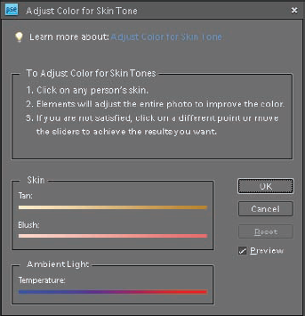
To use this dialog box, choose Enhance
Keep in mind that when you click a skin tone, all the colors in the photo are adjusted by the same amount — not just the color of the skin.
Note
The Adjust Color for Skin Tone dialog box works much like the Remove Color Cast dialog box except that it's designed to balance skin tones, rather than neutralize a black, white, or gray tone.
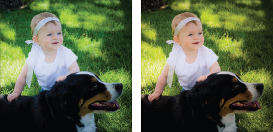
Figure 7.10 shows a before and after of a photo where I clicked the child's forehead and then increased the value of the Blush slider a bit. Notice that the skin not only looks better, but the entire photo is also warmer.
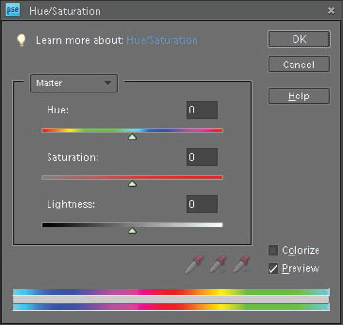
Though I feel that Color Variations is the most important color correction tool in Elements, the Hue/Saturation dialog box, shown in Figure 7.11, is my favorite because it gives you so much control over color. It enables you to change three different aspects of a color: hue, saturation, and lightness.
Here's how each of those adjustments affect a color:
Hue. The hue of a color describes the dominant wavelength of a color. It is independent of the color's intensity or its lightness. For example, a red apple and a strawberry may have the same hue, though the color of each is a bit different.
Saturation. The saturation of a color is the purity of the color. When the colors in a photo are completely desaturated, the photo becomes a black and white image.
Lightness. The lightness of a color is how dark or light the color is. When the Lightness value is increased, white is mixed with the color to lighten it. When the value is decreased, black is mixed with the color to darken it.
You can use the Hue/Saturation command two different ways. You can use it to change all the colors in a photo, or you can use it to modify a specific color range.
To begin your test drive of the Hue/Saturation command by adjusting a practice photo's global color, follow these steps:
Open the Bikes.tif file from the downloadable practice files on the Web site. The colors in the photo are somewhat dull. Use the Hue/Saturation command to pump them up.
Choose Enhance
Click and drag the Saturation slider to the right to increase the saturation of all the colors in the photo. Notice how much better the colors look when you get to a value of about +40. The reds and purples of the front bike have much more pop to them.
Click OK to complete the adjustment.
This simple adjustment makes this photo look much better. I like to add some saturation to almost every photo, especially photos that are used on the Web. Just be careful to not overdo your adjustments because when colors begin to glow, they no longer look natural — especially if there are flesh tones in the image.
Now you get to see why I love this color adjustment command. You can use it to change just some of the colors in the bike photo, as follows:
Open the Bikes.tif file from the downloadable practice files on the Web site. If you still have it open from the last exercise, undo the Hue/Saturation adjustment by pressing Ctrl/
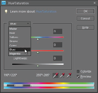
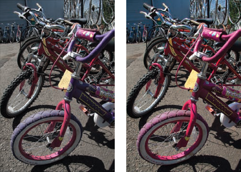
Adjust the Saturation slider to a value of about +40, as in the last exercise, to increase the overall saturation of the image. Now change the color of the purple bike without changing any of the other bikes.
Click the Channel drop-down menu (where it shows Master) and choose Blues, as shown in Figure 7.12. When Master is selected from this menu, all channels are used. Choosing a specific color limits changes to that color channel. You can see this in the dialog box. Look at the Color Range bar at the bottom of the dialog box, highlighted in Figure 7.12.
The central area of the selection on the Color Range bar shows exactly which colors are being affected by any changes. The outer areas indicate colors that are fall-off colors, meaning that they are affected less than the central area of the selection. Colors outside the selection aren't affected.
Click and drag the Hue slider to the right to a value of 75. Notice the colors of the bike have changed, but so has the color of the blue garage door in the background. Return the value of the Hue slider to 0 by typing 0 into the highlighted box above the slider.
You may have noticed that three small eyedroppers lit up in the Hue/Saturation dialog box as soon as you selected a color from the Channel menu. They are used to help you specify the exact color range you want to work with. By default, the first eyedropper is already selected.
Click the purple bike's head tube (the tube that connects the handlebars to the front fork). Click just above the circular label. When you do, notice that the indicators on the Color Range bar have shifted to the right to a range of colors that have more purple in them.
Adjust the Hue slider to +75 again and notice that the bike, as well as the purple wheel, change color, but this time the color of the blue garage door is unaffected.
Click OK to finish the color adjustment. Figure 7.13 shows a before and after of this photo with the overall saturation increased and the color of the front bike changed to a different color.
As you can see, the Hue/Saturation command is incredibly powerful. You can use it on all the colors in a photo or just a selected range of them. If you have trouble using the eyedropper to nail down the exact range you want to affect, you can use the two other eyedroppers to help fine-tune the selected color range. Here's how they're used.
Use the eyedropper with a small plus (+) sign beside it to add other similar colors to the selected color range. This is useful when some of the colors you want to affect are being changed, but not all of them. Clicking other colors with this eyedropper increases the range of selected colors.
Use the eyedropper with a small minus (−) sign beside it to remove other similar colors from the color selected range. This is useful when too many similar colors are being affected. Clicking them narrows the selected color range.
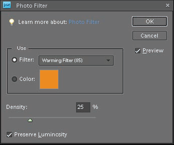
One last command for modifying the colors in a photo is the Photo Filter. When a photographer is shooting film, she oftentimes places glass or plastic filters over the lens of her camera to change the color of the light being captured.
Some filters are used to warm up the color, and others are used to cool it. A nice thing about digital photography is that you can add many of these filters to the image after you've shot it.
To open the Photo Filter dialog box, shown in Figure 7.14, choose Filter
Some of them are labeled with standard filter names, which is useful for someone who has used glass or plastic filters in the past. The second way is to click the color swatch next to Color to open a color picker that enables you to choose a custom color.
After you choose a filter preset or custom color, use the Density slider to increase or decrease its effect. Be sure to leave the Preserve Luminosity check box selected so that the filter doesn't change the brightness of the photo.
Tip
The best thing about the Photo Filter is that you can use it as an adjustment layer, enabling you to change or remove the filter at a later date.
Though this chapter is about color, it's also the perfect place to discuss how color is removed from a photo to convert it to black and white. At first this seems like a straightforward process, but there's more than one way to do it in the PSE Editor — a correct way and a not-so-correct way.
Earlier you may have noticed a command named Remove Color (Enhance
The resulting image is called a grayscale, which is another way of saying black and white. It has the same effect as using the Hue/Saturation command and lowering the Saturation value to −100. The problem with using this technique is that it doesn't give you any control over the conversion process because every color in the photo is handled the same.
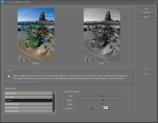
A much better approach to converting a color image to black and white is to use the Convert to Black and White command. Here's how it works:
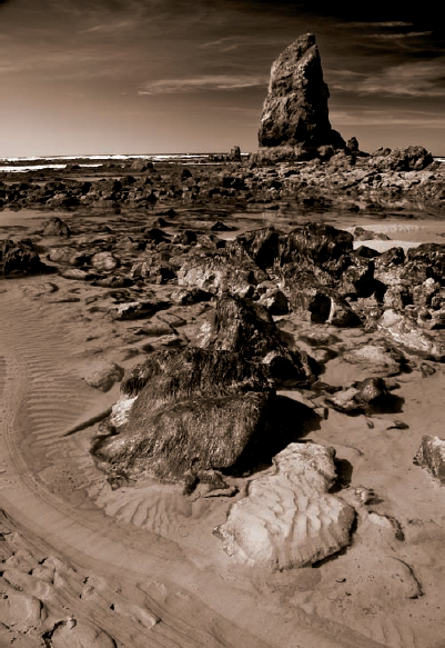
Open the Beach_Rocks.tif file from the downloadable practice files on the Web site. This photo is nice in color, but it will also make a great black and white. Before converting it to black and white, notice the predominant colors in the photo — red in the sand, green in the moss, and blue in the sky and water, which is reflecting the sky.
Open the Convert to Black and White dialog box, shown in Figure 7.15, by choosing Enhance
At first, it might seem odd to see color adjustment sliders in a dialog box titled Convert to Black and White. However, these sliders are not used to add or remove color from the image. They're used to adjust the brightness of the red, green, and blue channels as they're converted to grayscale.
Begin by choosing the Scenic Landscape preset from the Select a style menu. As you do, notice that the Green and Blue sliders move to the left, lowering their values, and the Red slider moves to the right, increasing its value. These changes result in the greens and blues in the photo getting darker and the reds becoming a bit lighter, which is usually desirable in a black and white of a landscape.
Choose the Vivid Landscapes preset and notice that the changes are even greater because this preset is designed to create an even more dramatic effect with photos of landscapes. The beach photo looks pretty good with this preset, but it could use a bit of tweaking.
Click and drag the Red slider to the right to increase the brightness of the sand. I stopped when I got to a value of 115. This value is displayed as you hover over the slider control. (You can see it on the Blue slider in Figure 7.15.)
Lower the Blue slider's value to about −30 to add some drama to the blue sky. Leave the Green slider at its default setting.
Click OK to complete the process and convert the photo to black and white. Leave this photo open so you can use it in the next exercise.
As you can see, this is a fairly intuitive method for creating your own custom black and white conversions. If you'd like to compare it to an automatic black and white conversion, save this file with a different name and then reopen the Beach_Rocks.tif file and use the Remove Color command. Then compare it to the custom conversion you created in this exercise.
One final thing I cover in this chapter is how to add a sepia tone, or any other tone, such as a blue tone, to a print. You may have already discovered it earlier in this chapter. That's because the easiest way to tone a photo is to use the Hue/Saturation command. Here's how you do it:
Go back to the Beach_Rocks.tif file you used in the last exercise. If it isn't still open, open it and complete Steps 3 through 7 of that exercise.
Open the Hue/Saturation dialog box (Enhance
Adjust the Hue and Saturation sliders until you find a tone that you like. I used a value of 30 for Hue and a value of 20 for Saturation.
Click OK. Figure 7.16 shows the final result.
Adding a tone to a print doesn't get much easier than this. Experiment to find Hue and Saturation combinations that create tones you like. Then write them down somewhere so that you can easily replicate those tones in future projects.
Note
You don't need to convert a color photo to black and white to tone it using this method.