
Chapter 17: Review of Univariate and Bivariate Inference
Life Expectancy by Income Group
Life Expectancy by GDP per Capita
The unifying thread connecting Chapters 10 through 16 has been statistical inference, or, how do we assess and manage the risks of drawing conclusions based on limited probabilistic samples? Before moving on to the final portion of the book where we continue with further topics in the practice of inference, we pause again to review the fundamental concepts, assumptions, and techniques of conventional inference methods. As in the earlier review chapters, we will use the World Development Indicators (WDI) data for our investigations. We will revisit some of the descriptive analysis that we performed in Chapter 5 to extend the investigation into the realm of inference.
As in the earlier review chapters, the objective is to recapitulate and draw connections between important concepts. The emphasis in this chapter is on the choice of techniques, assessment of assumptions, and interpretation of results. We will not review each previous technique but focus on a few needed to pursue some specific research questions. We will also see some “next steps” that anticipate later topics.
In Chapter 5, some of our investigations centered on the variability of life expectancy around the world in 2010 and some factors that might account for or be associated with that variation. In this chapter, we will apply the techniques of inference to the same data and take a closer look at the ways in which differences in national income are associated with changes in life expectancy at birth. To focus the discussion, we will restrict the investigation to just three variables: life expectancy, income group, and GDP per capita. We will treat life expectancy as the response variable and both income group and GDP per capita as potential factors.
Our eventual goal is to investigate two bivariate models (a) to determine whether there are statistically significant relationships in either or both models and (b) if so, to decide whether we can use the models to understand how differences in wealth can impact life expectancy. With a quantitative (continuous) response variable and an ordinal variable like income group, we can anticipate that we will eventually consider applying one-way ANOVA to test their hypothesized relationship. Because GDP per capita is also continuous, simple linear regression is the tool of choice for the second pair. Each of these techniques depends on particular characteristics of the sample data and how it was gathered. Hence, we will start with some basic explorations and estimation for each variable in our study.
1. Open the WDI data table.
2. To use only the observations from 2016, use the global Data Filter to Show and Include cases where Year = 2016.
3. Use the Distribution platform to create summary graphs and statistics for each of the three variables.
Figure 17.1: Distributions of Life_Exp and gdp_pc
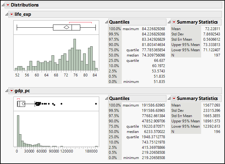
For the two quantitative variables, in anticipation of inference, we should almost instinctively look to the histograms and box plots to get a sense of symmetry, outliers, and peaks. The summary statistics provide further detail about center and dispersion.
As we see in Figure 17.1, both distributions are skewed in opposite directions, with GDP per capita being more strongly skewed with numerous outliers. The life expectancy distribution has multiple peaks, which suggests key subgroup differences.
Furthermore, we can say with 95% confidence that in 2010, the mean life expectancy was between 68.3 and 71.1 years. With the same degree of confidence, the mean income per capita (in constant 2000 US dollars) was between $6,024.91 and $9,343.06.
International agencies define the income groups, so the variation is by design. All five groups are similar in size, with between 31 and 54 nations assigned to each category.
Life Expectancy by Income Group
Both ANOVA and ordinary least squares regression provide reliable inferences under specific conditions. In the case of ANOVA, we want the response variable to be approximately normal within each subgroup of the sample and for variances to be similar for each group. For linear regression, we look for a linear relationship between the two variables, normality in the residuals after first estimating the regression line,1 and constant variance throughout predicted values of Y. We will consider the linear regression model in the next section. In this part of the review, we will examine the relationship (if any) between life expectancy and income group, and first consider whether life expectancy can be described as approximately normal.
Earlier, we noted the presence of multiple peaks in the histogram of life expectancy. Might the peaks reflect differences across income groups? Furthermore, might the strongly left-skewed distribution in the aggregate be composed of four separate, nearly-normal distributions in the four income groups?
There are several ways that we might investigate this. Here is one easy exploratory approach:
1. Open Graph Builder and drag life_exp into the X drop zone.
2. From the center of the menu bar across the top of the graph, choose the histogram tool.
3. Now drag Income Group in the Group X drop zone, producing a graph similar to Figure 17.2.
Figure 17.2: Checking Normality for Life Expectancy by Income Group
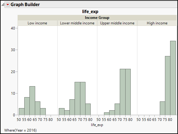
All four histograms are single-peaked, and in the higher income groups, they are left-skewed. We can also see considerable variability in the dispersion of life expectancy values, though it is difficult to judge equality of variances just by looking at these graphs. Perhaps an easier way to evaluate the assumptions is by looking at the means and standard deviations in the Oneway report from the Fit Y by X platform.
4. In the Fit Y by X platform, cast life_exp as Y and Income Group as X.
5. In the Oneway report, click the red arrow and choose Means and Std Dev to produce the revised report shown in Figure 17.3.
Figure 17.3: Inspecting Standard Deviations to Check Equal Variance Assumption
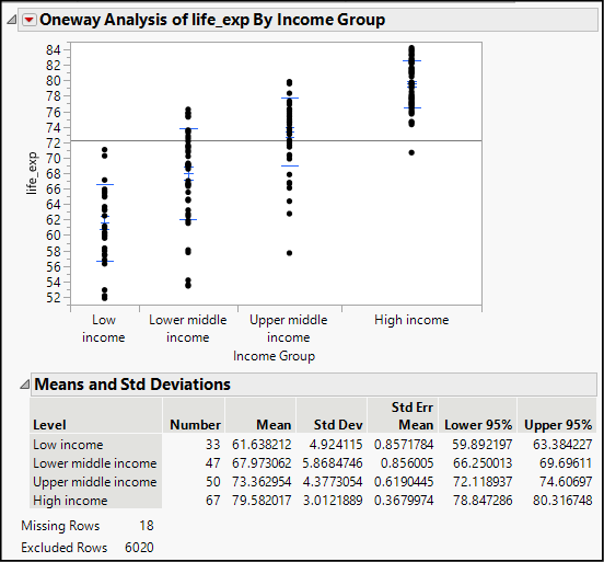
The graph shows the individual data values of life expectancy for each income group. In pale blue you should see a short line at the mean value with error bars above and below the mean. Additionally, you will see longer lines one standard deviation above and below the means. Visually, it is evident that the dispersion of the high-income group is smaller than the other groups, whose standard deviations are similar. From the table below the graph, we find that the first three groups have standard deviations between approximately 4.4 and 5.9 years; the last group’s standard deviation is only about 3.0. This should signal to us that we might anticipate problems with the assumption of equal variances as well as the normality assumption.
We can formally test for the equality of variances (refer back to Chapter 14 for more details) as follows:
6. Click the red triangle next to Oneway and select Unequal Variances.
As we did in Chapter 14, consult the results of Levene’s test, and you will see that there is statistically significant evidence at the 0.0012 level that the variances should not be considered equal. Hence, ANOVA results might be affected by the discrepancies in variance. With unequal variances, Welch’s test is a common alternative to ANOVA, and we note that Welch’s ANOVA does find a significant difference among the group means.
In this case, it is probably better to rely on the Welch test than ANOVA, but by way of reviewing the method, let’s produce an ANOVA report as well and explore where the differences in group means might occur.
1. Click the red triangle again and select Means/Anova.
2. Again, this time choose Compare Means ► All Pairs, Tukey HSD.
Figure 17.4: Visual Summary of the ANOVA and Tukey’s HSD
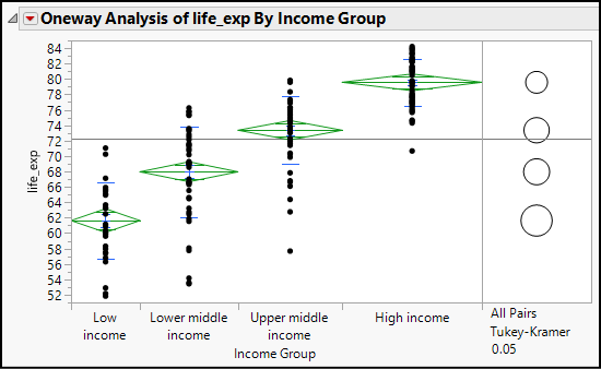
Figures 17.4 and 17.5 are selected from the One-way report and will be discussed separately. In Figure 17.4, looking at the means diamonds from left to right as well as the clicking on the comparison circles on the right side, we see that the means of all four income groups are significantly different from each other.
Figure 17.5: The Summary of Model Fit and ANOVA Table
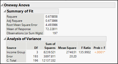
Because of the departures from constant variance and normality, we should be reluctant to draw conclusions from this report, but if conditions had been met, we would take note of the significant F-Ratio found in Figure 17.5 (indicating very little likelihood of a Type I error) and the Root Mean Square Error as a goodness-of-fit measure. The P-value of this test is comparable to that in Welch’s Test.
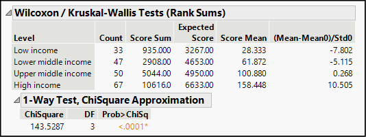
Recall from Chapter 14 that when normality cannot be assumed, we should adopt a nonparametric alternative, specifically the Wilcoxon test. Figure 17.6 displays the report from that test. In this instance, the test statistic follows a chi-square distribution (discussed in Chapter 12) and indicates that we should reject a hypothesis that mean life expectancy is the same in all four income groups.
Figure 17.6: Report of the Wilcoxon/Kruskal Wallis Test
Life Expectancy by GDP per Capita
Comparing mean life expectancy across income groups provides a rather crude approach to the relationship between long life and financial resources. We do have a quantitative measure of income, namely, GDP per capita. The variable is measured in inflation-adjusted US dollars, using the year 2000 as the base year. With two quantitative variables and a logical expectation that higher income can provide people with at least some of the preconditions for longer lives, the obvious technique to apply is linear regression.
We will initially use Graph Builder to check for a possible linear relationship.
1. Open Graph Builder, and place life_exp on the Y axis and gdp_pc on the X axis.
The resulting scatterplot is quite obviously non-linear. The default smoother rises nearly vertically on the left side of the graph, curves, and then levels off as GDP increases. Such a pattern is typical of logarithmic growth, and we can often model such a pattern by taking the logarithm of the X variable; doing so is known as transforming the variable.
Within the Graph Builder, we can temporarily transform a variable to see how such an adjustment makes a useful difference. Try this:
2. Move the cursor into the Variables panel that lists the column names, select gdp_pc, and right-click.
3. Choose Transform ► Log, as shown in Figure 17.7.
Figure 17.7: Making a Temporary Transformed Variable
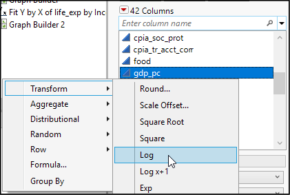
Doing so creates a new temporary variable just after gdp_pc in the variable list, shown in italics as Log[gdp_pc].
4. Now drag the temporary variable into the X drop zone, placing it just over the axis number values so that it replaces gdp_pc as the variable on the horizontal axis.
Figure 17.8: Scatterplot Using life_exp Versus Log (gdp_pc)
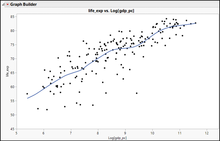
The resulting new graph (Figure 17.8) is much more linear than the initial graph. We have surely seen stronger and more distinctly linear patterns, but compared to the initial graph, we can describe this as linear. To continue with our review, let’s return to the Fit Y by X platform for more extended analysis.
5. Open the Fit Y by X dialog box and cast life_exp into the Y, Response role.
6. Hover over the variable name gdp_pc, and again apply the log transformation. Be sure to hover over the name, and not the blue triangular continuous variable icon.
7. Cast the new transformed variable as X, Factor and click OK.
8. In the Bivariate Fit report, click the red triangle and choose Fit Line.
9. Finally, click the red triangle below the graph, next to Linear Fit, and choose Plot Residuals.
In Chapter 15, we learned to interpret the series of residual graphs and the regression table, looking for potential violations of the OLS conditions. In these graphs, we find problems with both normality and equal variances (homoscedasticity); consequently, the estimates of mean square error, confidence intervals, and the t test will be in doubt, but we are still on safe ground to interpret the estimated slope. Consulting the report, we find that the estimated equation is life_exp = 33.893863 + 4.4299595*Log[gdp_pc]. To estimate life expectancy for a given country, we would take the natural log of GDP per capita, substitute it into the equation, and find our estimate.
How do we interpret these estimated parameters? In this analysis, the intercept has little real-world meaning. If we take its simplest literal meaning, the estimated intercept says that in a nation where the natural log of GDP = 0 (that is, GDP per capita is $1), life expectancy on average would be about 29.9 years, but there is no country that has such a low national income. In our data, the country with the lowest GDP per capita in 2016 was Burundi, with a GDP value of only $219.21.
The slope tells us that for each 1 unit increase in the natural log of per capita income, life expectancy increases by approximately 4.4 years. But, as we noted at the outset, this is not a linear relationship—the 4.4-year increase does not correspond to fixed increases in GDP per capita, but rather to increases in the log of GDP per capita.
Our regression line allows us to estimate that the mean life expectancy among countries with log[gdp_pc] = 6 is approximately 60.47 years. For the log of GDP to be 6, GDP per capita would be $403.43. The step from log values of 6 to 7 corresponds to per capita income of $1,096.63, an increase of more than $693. But the next step, from 7 to 8, requires an increase of $1,884.33 in income—hardly a constant rate of increase. Hence, interpretation of this regression line involves a more nuanced approach.
Before drawing inferences from sample data, it is important to select a technique appropriate to the type of data at hand, to review the conditions (if any) required by the technique, and to assess whether the data is suitable for drawing inferences. If a hypothesis test is to be done, it is crucial to know what hypothesis is to be tested. If the conditions are met and the data are suitable, we follow well-defined steps to conduct the inferential procedures and interpret the estimates and/or evaluate test results. For all the statistical tests that we have studied (and will study in coming chapters), we will want to consult the P-values and decide if the risk of a Type I error is tolerable.
Endnotes
1 Normality in the residuals can also be thought of as normality in the conditional distribution of Y at each observed value of X. Hence, the normality of Y is of some interest.