
Chapter 15: Simple Linear Regression Inference
Fitting a Line to Bivariate Continuous Data
Interpreting Regression Results
Parameter Estimates and t Tests
Testing for a Slope Other Than Zero
In Chapter 4, we learned to summarize two continuous variables at a time using scatterplot, correlations, and line fitting. In this chapter, we will return to that subject, this time with the object of generalizing from the patterns in sample data in order to draw conclusions about an entire population. The main statistical tool that we will use is known as linear regression analysis. We will devote this chapter and three later chapters to the subject of regression.
Because Chapter 4 is now many pages back, we will begin by reviewing some basic concepts of bivariate data and line fitting. Then, we will discuss the fundamental model used in simple linear regression. After that, we will discuss the crucial conditions necessary for inference, and finally, we will see how to interpret the results of a regression analysis.
Fitting a Line to Bivariate Continuous Data
We introduced regression in Chapter 4 using the data table Birthrate 2017. This data table contains several columns related to the variation in the birth rate and the risks related to childbirth around the world as of 2017. In this data table, the United Nations reports figures for 193 countries. Let’s briefly revisit that data now to review some basic concepts, focusing on two measures of the frequency of births in different nations.
In the next several chapters, we will expand our investigation of regression analysis and will return to the illustrative data tables several times. For this reason, you should work through the examples in a JMP Project. By creating and saving a project in this chapter, your workflow in the coming chapters will be more efficient. At this point, create a new project called Chap_15.
1. Open the Birthrate 2017 data table now. If any row states were previously set and saved, clear them now.
As we did in Chapter 4, let’s look at the columns labeled BirthRate and Fertil. A country’s annual birth rate is defined as the number of live births per 1,000 people in the country. The fertility rate is the mean number of children that would be born to a woman during her lifetime. We plotted these two variables in Chapter 4; let us do that again now.
2. Select Analyze ► Fit Y by X. Cast Fertil as Y and BirthRate as X and click OK.
Your results will look like those shown in Figure 15.1.
Figure 15.1: Relationship Between Birth Rate and Fertility Rate
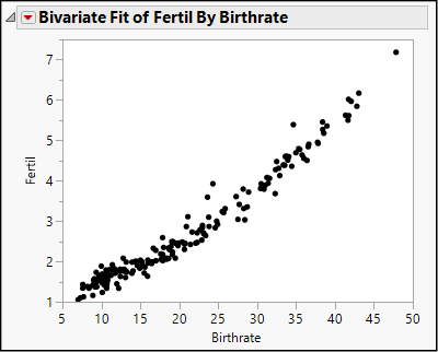
This is the same graph that we saw in Figure 4.13. Again, we note that general pattern is upward from left to right: fertility rates increase as the birth rate increases, although there are some countries that depart from the pattern. The pattern can be described as linear, although there is a mild curvature at the lower left. We also see that a large number of countries are concentrated in the lower left, with low birth rates and relatively low maternal mortality.
In Chapter 4, we illustrated the technique of line-fitting using these two columns. Because these two columns really represent two ways of thinking about a single construct (“how many babies?”), let us turn to a different example to expand our study of simple linear regression analysis.
We will return to the NHANES data and look at two body measurement variables. Because adult body proportions are different from children and because males and females differ, we will restrict the first illustrative analysis to male respondents ages 18 and up.
3. Open the data table called NHANES 2016. If row states were saved from an earlier session, clear them now. In the coming chapters, we will work through several illustrations using NHANES data.
This table contains respondents of all ages, male and female. To isolate adult males, we might be inclined to apply a data filter to the entire table, but because we will want to use other respondents in later examples, let’s wait and apply a local data filter within the context of the first regression analysis. The global data filter temporarily affects the whole data table; if you resave the data table, the row states are saved with it. A local data filter affects the rows used within a single analysis report but does not alter the underlying data table.
Now we can begin the regression analysis. We will examine the relationship between waist circumference and body mass index, or BMI, which is the ratio of a person’s weight to the square of height. In the data table, waist measurements are in centimeters, and BMI is kilograms per square meter. In this analysis, we will see if there is a predictable relationship between men’s waist measurements and their BMIs.
We begin the analysis as we have done so often, using the Fit Y by X platform.
4. Select Fit Y by X. Cast BMXBMI as Y and BMXWAIST as X and click OK. The scatterplot contains points for the entire NHANES sample. Let’s filter the rows to restrict the analysis to adult males.
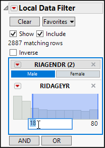
5. Click the red triangle next to Bivariate Fit and select Local Data Filter.
6. While pressing the Ctrl key, highlight RIAGENDR and RIDAGEYR, and click the dark plus sign.
7. In the Data Filter (see Figure 15.2), make sure that the Show and Include options are checked.
8. Then click Male under RIAGENDR to include just the male subjects.
9. Finally, click the number 0 on the left of RIDAGEYR and replace it with 18. This sets the lower bound for RIDAGEYR to be just 18 years. We want to select any respondent who is a male age 18 or older.
Figure 15.2: Selection Criteria for Males Age 18 and Older
We have restricted the analysis to the 2,887 rows of male respondents who are 18 years of age and older. You might have noticed that the resulting graph has far fewer points and very clearly shows a positive linear trend, but the plot is difficult to decipher because there are so many points crowded together, with many of them plotted on top of each other. As very large data tables have become more common, we need strategies for making interpretable graphs with densely packed points. Do the following to make the graph more readable.
10. Right-click anywhere in the plot region, and select Marker Size ► 0, Dot. This makes each point much smaller, reducing the overlap.
11. Right-click again and select Transparency. Within the dialog box, set the transparency parameter to 0.4. This makes dot partially transparent, so that overplotted points appear darker than single points.
This graph (see Figure 15.3, which reflects the next two numbered steps as well) illustrates the first thing that we want to look for when planning to conduct a linear regression analysis—we see a general linear trend in the data. Think of stretching an elliptical elastic band around the cloud of points; that would result in a long and narrow ellipse lying at a slant, which would contain most, if not all, of the points. In fact, we can use JMP to overlay such an ellipse on the graph.
12. Click the red triangle next to Bivariate Fit and select Density Ellipse ► 0.95.
The resulting ellipse appears incomplete because of the default axis settings on our graph. We can customize the axes to show the entire ellipse using the grabber to shift the axes.
Figure 15.3: A Linear Pattern of BMI Versus Waist
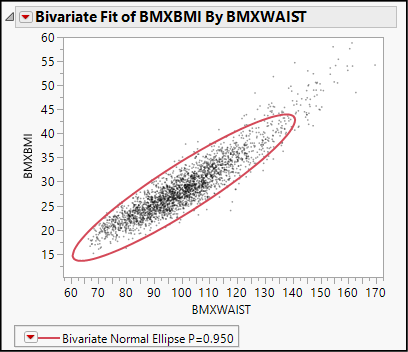
13. Move the grabber tool near the origin on the vertical axis and slide upward until you see a hash mark below 15 appear on the Y axis. Do the same on the horizontal axis until the waist value of 60 cm appears on the X axis.
This graph is a typical candidate for linear regression analysis. Nearly all of the points lie all along the same sloped axis in the same pattern, with consistent scatter. Before running the regression, let’s step back for a moment and consider the fundamental regression model.
When we fit a line to a set of points, we do so with a model in mind and with a provisional idea about how we came to observe the points in our sample. The reasoning goes like this. We speculate or hypothesize that there is a linear relationship between Y and X such that whenever X increases by one unit (centimeters of waist circumference, in this case), then Y changes, on average, by a constant amount. For any specific individual, the observed value of Y could deviate from the general pattern.
Algebraically, the model looks like this:
![]()
where Yi and Xi are the observed values for one respondent, b0 and b1 are the intercept and slope of the underlying (but unknown) relationship, and ei is the amount by which an individual’s BMI departs from the usual pattern. We envision ei as purely random noise. In short, we can express each observed value of Yi as partially reflecting the underlying linear pattern, and partially reflecting a random deviation from the pattern. Look again at Figure 15.3. Can you visualize each point as lying in the vicinity of a line? Let’s use JMP to estimate the location of such a line.
1. Click the red triangle next to Bivariate Fit and select Fit Line.
Now your results will look like Figure 15.4 below. We see a green fitted line that approximates the upward pattern of the points.
Figure 15.4: Estimated Line of Best Fit
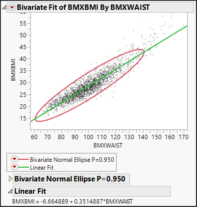
Below the graph, we find the equation of that line:
BMXBMI = -6.664889 + 0.3514887*BMXWAIST
The slope of this line describes how these two variables co-vary. If we imagine two groups of men whose waist circumferences differ by 1 centimeter, the group with the larger waists would average BMIs that are approximately 0.35 kg/m2 higher. As we learned in Chapter 4, this equation summarizes the relationship among the points in this sample. Before learning about the inferences that we might draw from this, let’s refine our understanding of the two chunks of the model: the linear relationship and the random deviations.
If two variables have a linear relationship, their scatterplot forms a line or at least suggests a linear pattern. In this example, our variables have a positive relationship: as X increases, Y increases. In another case, the relationship might be negative, with Y decreasing as X increases. But what does it mean to say that two variables have a linear relationship? What type of underlying dynamic generates a linear pattern of dots?
As noted earlier, linearity involves a constant change in Y each time X changes by one unit. Y might rise or fall, but the key feature of a linear relationship is that the shifts in Y do not accelerate or diminish at different levels of X. If we plan to generalize from our sample, it is important to ask if it is reasonable to expect Y to vary in this particular way as we move through the domain of realistically possible X values.
The regression model also posits that empirical observations tend to deviate from the linear pattern, and that the deviations are themselves a random variable. We will have considerably more to say about the random deviations in Chapter 16, but it is very useful at the outset to understand this aspect of the regression model.
Linear regression analysis does not demand that all points line up perfectly, or that the two continuous variables have a very close (or “strong”) association. On the other hand, if groups of observations systematically depart from the general linear pattern, we should ask if the deviations are truly random, or if there is some other factor to consider as we untangle the relationship between Y and X.
The preceding discussion outlines the conditions under which we can generalize using regression analysis. First, we need a logical or theoretical reason to anticipate that Y and X have a linear relationship. Second, the default method1 that we use to estimate the line of best fit works reliably. We know that the method works reliably when the random errors, ei, satisfy four conditions:
● They are normally distributed.
● They have a mean value of 0.
● They have a constant variance, s2, regardless of the value of X.
● They are independent across observations.
At this early stage in the presentation of this technique, it might be difficult to grasp all the implications of these conditions. Start by understanding that the following might be red flags in a scatter plot with a fitted line:
● The points seem to bend or oscillate predictably around the line.
● There are a small number of outliers that stand well apart from the mass of the points.
● The points seem snugly concentrated near one end of the line but fan out toward the other end.
● There seem to be greater concentrations of points distant from the line, but not so many points concentrated near the line.
In this example, none of these trouble signs is present. In the next chapter, we will learn more about looking for problems with the important conditions for inference. For now, let’s proceed assuming that the sample satisfies all of the conditions.
Interpreting Regression Results
There are four major sections in the results panel for the linear fit (see Figure 15.5), three of which are fully disclosed by default. We have already seen the equation of the line of best fit and discussed its meaning. In this part of the chapter, we will discuss the three other sections in order.
Figure 15.5: Regression Results
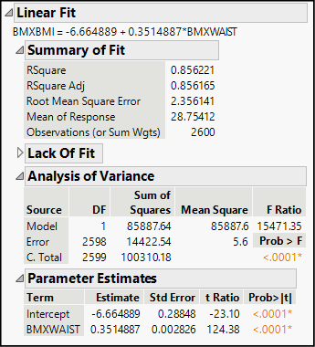
Under the heading Summary of Fit, we find five statistics that describe the fit between the data and the model.
● RSquare and RSquare Adj both summarize the strength of the linear relationship between the two continuous variables. The R-square statistics range between 0.0 and 1.0, where 1.0 is a perfect linear fit. Just as in Chapter 4, think of R square as the proportion of variation in Y that is associated with X. Here, both statistics are approximately 0.86, suggesting that a male’s waist measurement could be a very good predictor of his BMI.
● Root Mean Square Error (RMSE) is a measure of the dispersion of the points from the estimated line. Think of it as the sample standard deviation of the random noise term, ε. When points are tightly clustered near the line, this statistic is relatively small. When points are widely scattered from the line, the statistic is relatively large. Comparing the RMSE to the mean of the response variable (next statistic) is one way to assess its relative magnitude.
● Mean of Response is just the sample mean value of Y.
● Observations is the sample size. In this table, we have complete waist and BMI data for 2600 men. Although we selected 2,887 rows with the data filter, 287 of the rows were missing a value for one or both of the columns in the regression model.
The next heading is Lack of Fit, but this panel is initially minimized in this case. Lack of fit tests typically are considered topics for more advanced statistics courses, so we only mention them here without further comment.
These ANOVA results should look familiar if you have just completed Chapter 14. In the context of regression, ANOVA gives us an overall test of significance for the regression model. In a one-way ANOVA, we hypothesized that the mean of a response variable was the same across several categories. In regression, we hypothesize that the mean of the response variable is the same regardless of X—that Y does not vary in tandem with X.
We read the table just as we did in the previous chapter, focusing on the F-ratio and the corresponding P-value. Here F is over 15.471 and the P-value is smaller than 0.0001. This probability is so small that it is highly unlikely that the computed F-ratio came about through the error associated with random sampling. We reject the null hypothesis that waist circumference and BMI are unrelated, and conclude that we have found a statistically significant relationship.
Not only can we say that the pattern describes the sample, we can say with confidence that the relationship generalizes to the entire population of males over age 17 in the United States.
Parameter Estimates and t Tests
The final panel in the results provides the estimated intercept and slope of the regression line and the individual t tests for each. The slope and intercept are sometimes called the coefficients in the regression equation, and we treat them as the parameters of the linear regression model.
In Figure 15.6, we reproduce the parameter estimate panel, which contains five columns. The first two columns—Term and Estimate—are the estimated intercept and slope that we saw earlier in the equation of the regression line.
Figure 15.6: Parameter Estimates
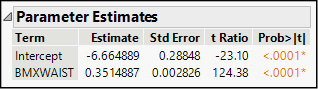
Because we are using a sample of the full population, our estimates are subject to sampling error. The Std Error column estimates the variability attributable to sampling. The t Ratio and Prob>|t| columns show the results of a two-sided test of the null hypothesis that a parameter is truly equal to 0.
Why do we test the hypotheses that the intercept and slope equal zero? Think about what a zero slope represents. If X and Y are genuinely independent and unrelated, then changes in the value of X have no influence or bearing on the values of Y. In other words, the slope of a line of best fit for two such variables should be zero. For this reason, we always want to look closely at the significance test for the slope. Depending on the study and the meaning of the data, the test for the intercept may or may not have practical importance to us.
In a simple linear regression, the ANOVA and t test results for the slope will always lead to the same conclusion2 about the hypothesized independence of the response and factor variables. Here, we find that our estimated slope of 0.351 kg/m2 change in BMI per 1 cm increase in waist circumference is very convincingly different from 0: in fact, it’s more than 124 standard errors away from 0. It’s inconceivable that such an observed difference is the coincidental result of random sampling.
Testing for a Slope Other Than Zero
In some investigations, we might begin with a theoretical model that specifies a value for the slope or the intercept. In that case, we come to the analysis with hypothesized values of either b0 or b1 or both, and we want to test those values. The Fit Y by X platform does not accommodate such significance tests, but the Fit Model platform does. We used Fit Model in the prior chapter to perform a two-way ANOVA. In this example, we will use it to test for a specific slope value other than 0.
We will illustrate with an example from the field of classical music, drawn from an article by Prof. Jesper Rydén of Uppsala University in Sweden (Rydén 2007). The article focuses on piano sonatas by Franz Joseph Haydn (1732–1809) and Wolfgang Amadeus Mozart (1756–1791) and investigates the idea that these two composers incorporated the golden mean within their compositions. A sonata is a form of instrumental music that follows a standard structure. In the first part, known formally as the exposition, the composer introduces a melodic theme in one key and then a second longer theme in a related but different key. After the exposition comes a second portion called development, which elaborates upon the basic melodies, developing them more fully, offering some variations, Finally, both themes recur in the recapitulation section, but this time, both tunes are in the same key as the opening of the piece.
Some music scholars believe that Haydn and Mozart strove for an aesthetically pleasing but asymmetric balance in the lengths of the melodic themes. More specifically, these scholars hypothesize that the composers might have structured their sonatas (deliberately or not) so that the relative lengths of the two themes approximated the golden mean. We will refer to the first, shorter theme as a and the second theme as b.
The golden mean (sometimes called the golden ratio), characterized and studied in the West at least since the ancient Greeks, refers to the division of a line into a shorter segment a, and a longer segment b, such that the ratio of a:b equals the ratio of b:(a+b). Equivalently,
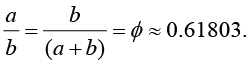
We have a data table called Mozart containing the lengths, in musical measures, of the shorter and longer themes of 29 Mozart sonatas. If, in fact, Mozart was aiming for the golden ratio in these compositions, then we should find a linear trend in the data. Moreover, it should be characterized by this line:
a = 0 + 0.61803(b)
So, we will want to test the hypothesis that b1 = 0.61803 rather than 0.
1. Open the data table called Mozart.
2. Select Analyze ► Fit Model. Select Parta as Y, then add Partb as the only model effect, and run the model.
Both the graph and the Summary of Fit indicate a strong linear relationship between the two parts of these sonatas. Figure 15.7 shows the parameter estimates panel from the results.
Figure 15.7: Estimates for Mozart Data
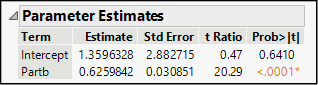
Rounding the estimates slightly we can write an estimated line as Parta = 1.3596 + 0.626(Partb). On its face, this does not seem to match the proposed equation above. However, let’s look at the t tests. The estimated intercept is not significantly different from 0, so we cannot conclude that the intercept is other than 0. The hypothesized intercept of 0 is still credible.
Now look at the results for the slope. The estimated slope is 0.6259842, and its standard error is 0.030851. The reported t-ratio of about 20 standard errors implicitly compares the estimated slope to a hypothesized value of 0. To compare it to a different hypothesized value, we will want to compute the following ratio:
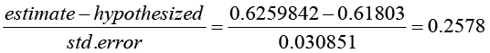
We can have JMP compute this ratio and its corresponding P-value as follows:
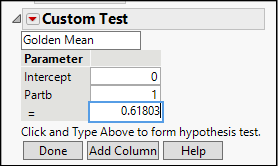
3. Click the red triangle next to Response Parta and select Estimates ► Custom Test. Scroll to the bottom of the results report where you will see a panel like the one shown in Figure 15.8.
4. The upper white rectangle is an editable field for adding a title; type Golden Mean in the box.
5. In the box next to Partb, change the 0 to a 1 to indicate that we want to test the coefficient of Partb.
6. Finally, enter the hypothesized value of the golden mean, .61803 in the box next to =, and click the Done button.
Figure 15.8: Specifying the Column and Hypothesized Value
The Custom Test panel now becomes a results panel, presenting both a t test and an F test, as shown in Figure 15.9. As our earlier calculation showed, the estimated slope is less than 0.26 standard errors from the hypothesized value, which is very close. Based on the large P-value of 0.798, we fail to reject the null hypothesis that the slope equals the golden mean.
Figure 15.9: Custom Test Results
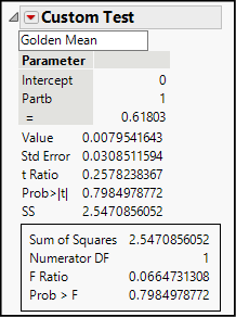
In other words, the golden mean theory is credible. As always, we cannot prove a null hypothesis, so this analysis does not definitively establish that Mozart’s sonatas conform to the golden mean. This is an important distinction in the logic of statistical testing—our tests can discredit a null hypothesis with a high degree of confidence, but we cannot confirm a null hypothesis. What we can say is that we have put a hypothesis to the test, and it is still plausible.
Before ending this session, be sure to save your project. If prompted to save unsaved documents within the project, save them all.
Now that you have completed all of the activities in this chapter, use the concepts and techniques that you have learned to respond to these questions.
1. Scenario: Return to the NHANES 2016 data table.
a. Using the Data Filter, show and include female respondents ages 18 and older. Perform a regression analysis for BMI and waist circumference for adult women and report your findings and conclusions.
b. Is waist measurement a better predictor (in other words, a better fit) of BMI for men or for women?
c. Perform one additional regression analysis, this time looking only at respondents under the age of 17. Summarize your findings.
2. Scenario: High blood pressure continues to be a leading health problem in the United States. In this problem, continue to use the NHANES 2016 data table. For this analysis, we will focus on just the following variables:
◦ RIAGENDR: Respondent’s gender
◦ RIDAGEYR: Respondent’s age in years
◦ BMXWT: Respondent’s weight in kilograms
◦ BPXPLS: Respondent’s resting pulse rate
◦ BPXSY1: Respondent’s systolic blood pressure (“top” number in BP reading)
◦ BPXD1: Respondent’s diastolic blood pressure (“bottom” number in BP reading)
a. Investigate a possible linear relationship of systolic blood pressure versus age. What, specifically, tends to happen to blood pressure as people age? Would you say there is a strong linear relationship?
b. Perform a regression analysis of systolic and diastolic blood pressure. Explain fully what you have found.
c. Create a scatterplot of systolic blood pressure and pulse rate. One might suspect that higher pulse rate is associated with higher blood pressure. Does the analysis bear out this suspicion?
3. Scenario: We will continue to examine the World Development Indicators data in BirthRate 2017. We will broaden our analysis to work with other variables in that file:
◦ MortUnder5: Deaths, children under 5 years per 1,000 live births
◦ MortInfant: Deaths, infants per 1,000 live births
a. Create a scatterplot for MortUnder5 and MortInfant. Report the equation of the fitted line and the R-square value and explain what you have found.
4. Scenario: How do the prices of used cars vary according to the mileage of the cars? Our data table Used Cars contains observational data about the listed prices of three popular compact car models in three different metropolitan areas in the U.S. All of the cars are two years old.
a. Create a scatterplot of price versus mileage. Report the equation of the fitted line and the R-square value and explain what you have found.
5. Scenario: Stock market analysts are always on the lookout for profitable opportunities and for signs of weakness in publicly traded stocks. Market analysts make extensive use of regression models in their work, and one of the simplest ones is known as the random (or drunkard’s) walk model. Simply put, the model hypothesizes that over a relatively short period of time, the price of a share of stock is a random deviation from its price on the prior day. If Yt represents the price at time t, then Yt = Yt-1 + ε. In this problem, you will fit a random walk model to daily closing prices for McDonald’s Corporation for the first six months of 2019 and decide how well the random walk model fits. The data table is called MCD.
a. Create a scatterplot with the daily closing price on the vertical axis and the prior day’s closing price on the horizontal. Comment on what you see in this graph.
b. Fit a line to the scatterplot and test the credibility of the random walk model. Report on your findings.
6. Scenario: Franz Joseph Haydn was a successful and well-established composer when the young Mozart burst upon the cultural scene. Haydn wrote more than twice as many piano sonatas as Mozart. Use the data table Haydn to perform a parallel analysis to the one we did for Mozart.
a. Report fully on your findings from a regression analysis of Parta versus Partb.
b. How does the fit of this model compare to the fit using the data from Mozart?
7. Scenario: Throughout the animal kingdom, animals require sleep, and there is extensive variation in the number of hours in a day that different animals sleep. The data table called Sleeping Animals contains information for more than 60 mammalian species, including the average number of hours per day of total sleep. This will be the response column in this problem.
a. Estimate a linear regression model using gestation as the factor. Gestation is the mean number of days that females of these species carry their young before giving birth. Report on your results and comment on the extent to which gestational period is a good predictor of sleep hours.
b. Now perform a similar analysis using brain weight as the factor. Report fully on your results and comment on the potential usefulness of this model.
8. Scenario: For many years, it has been understood that tobacco use leads to health problems related to the heart and lungs. The Tobacco Use data table contains recent data about the prevalence of tobacco use and of certain diseases around the world.
a. Using cancer mortality (CancerMort) as the response variable and the prevalence of tobacco use in both sexes (TobaccoUse), run a regression analysis to decide whether total tobacco use in a country is a predictor of the number of deaths from cancer annually in that country.
b. Using cardiovascular mortality (CVMort) as the response variable and the prevalence of tobacco use in both sexes (TobaccoUse), run a regression analysis to decide whether total tobacco use in a country is a predictor of the number of deaths from cardiovascular disease annually in that country.
c. Review your findings in the earlier two parts. In this example, we are using aggregated data from entire nations rather than individual data about individual patients. Can you think of any ways in which this fact could explain the somewhat surprising results?
9. Scenario: In Chapter 2, our first illustration of experimental data involved a study of the compressive strength of concrete. In this scenario, we look at a set of observations all taken at 28 days (4 weeks) after the concrete was initially formulated. The data table is Concrete28. The response variable is the Compressive Strength column, and we will examine the relationship between that variable and two candidate factor variables.
a. Use Cement as the factor and run a regression. Report on your findings in detail. Explain what this slope tells you about the impact of adding more cement to a concrete mixture.
b. Use Water as the factor and run a regression. Report on your findings in detail. Explain what this slope tells you about the impact of adding more water to a concrete mixture.
10. Scenario: Prof. Frank Anscombe of Yale University created an artificial data set to illustrate the hazards of applying linear regression analysis without looking at a scatterplot (Anscombe 1973). His work has been very influential, and JMP includes his illustration among the sample data tables packaged with the software. You’ll find Anscombe both in this book’s data tables and in the JMP sample data tables. Open it now.
a. In the upper left panel of the data table, you will see a red triangle next to the words The Quartet. Click the triangle, and select Run Script. This produces four regression analyses corresponding to four pairs of response and predictor variables. Examine the results closely, and write a brief response comparing the regressions. What do you conclude about this quartet of models?
b. Now return to the results and click the red triangle next to Bivariate Fit of Y1 By X1; select Show Points and re-interpret this regression in the context of the revised scatterplot.
c. Now reveal the points in the other three graphs. Is the linear model equally appropriate in all four cases?
11. Scenario: Many cities in the U.S. have active used car markets. Typically, the asking price for a used car varies by model, age, mileage, and features. The data table called Used Cars contains asking prices (Price) and mileage (Miles) for three popular budget models; all cars were two years old at the time the data were gathered, and we have data from three U.S. metropolitan areas. All prices are in dollars. In this analysis, Price is the response and Miles is the factor.
a. Because the car model is an important consideration, we will begin by analyzing the data for one model: the Civic EX. Use a Local Data Filter to isolate the Civic EX data for analysis. Run a regression. How much does the asking price decline, on average, per mile driven? What would be a mean asking price for a two-year-old Civic EX that had never been driven? Comment on the statistical significance and goodness-of-fit of this model.
b. Repeat the previous step using the Corolla LE data.
c. Repeat one more time using the PT Cruiser data.
d. Finally, compare the three models. For which set of data does the model fit best? Explain your thinking. For which car model are you most confident about the estimated slope?
12. Scenario: We will return to the World Development Indicators data in WDI. In this scenario, we will investigate the relationship between access to improved sanitation (the percent of the population with access to sewers and the like) and life expectancy. The response column is life_exp and the factor is sani_acc.
a. Use the Local Data Filter to Show and Include only the observations for the Year 2015, and the Latin America & Caribbean Region nations. Describe the relationship that you observe between access to improved sanitation and life expectancy.
b. Repeat the analysis for East Asia & Pacific countries in 2010.
c. Repeat the same analysis for the countries located in Sub-Saharan Africa.
d. How do the three regression models compare? What might explain the differences in the models?
13. Scenario: The data table called USA Counties contains a wide variety of measures for every county in the United States based on the 2010 U.S. Census.
a. Run a regression casting sales_per_capita (retail sales dollars per person, 2007) as Y and per_capita_income as X. Write a short paragraph explaining why county-wide retail sales might vary with per capita income, and report on the strengths and weaknesses of this regression model.
Endnotes
1 Like all statistical software, JMP uses a default method to line-fitting that is known as ordinary least squares estimation, or OLS. A full discussion of OLS is well beyond the scope of this book, but it’s worth noting that these assumptions refer to OLS in particular, not to regression in general.
2 They will have identical P-values and the F-ratio will be the square of the t ratio.