
Chapter 16: Residuals Analysis and Estimation
Conditions for Least Squares Estimation
Confidence Intervals for Parameters
Regression analysis is a powerful and flexible technique that we can reliably apply under certain conditions. Given a data table with continuous X-Y pairs, we can always use the ordinary least squares (OLS) method to fit a line and generate results like those we saw in Chapter 15. However, if we want to draw general conclusions or use an estimated regression equation to estimate, predict, or project Y values, it is critical that we decide whether our sample data satisfy the conditions underlying OLS estimation. This chapter explains how to verify whether we are on solid ground for inference with a particular regression analysis, then covers three types of inference using a simple linear regression. The techniques of this chapter are also relevant in later chapters.
Conditions for Least Squares Estimation
Recall that the linear regression model is
![]()
where Yi and Xi, are the observed values for one case, b0 and b1 are the intercept and slope of the underlying relationship, and ei is the amount by which an individual response deviates from the line.
OLS will generate the equation of a line approximating b0 + b1Xi so that the first condition is that the relationship between X and Y really is linear. Additionally, the model treats ei as a normal random variable whose mean is zero, whose variance is the same all along the line, and whose observations are independent of each other. Thus, we have four other conditions to verify before using our OLS results. Also, the logic of the simple linear model is that X is the only variable that accounts for a substantial amount of the observed variation in Y.
In this chapter, we will first learn techniques to evaluate the degree to which a sample satisfies the OLS conditions, and then learn to put a regression line to work when the conditions permit. We will consider all of the conditions in sequence and briefly explain criteria for judging whether they are satisfied in a data table, as well as pointing out how to deal with samples that do not satisfy the conditions.
Several of the conditions just cited refer directly to the random error term in the model, ei. Because we cannot know the precise location of the theoretical regression line, we cannot know the precise values of the eis. The random error term values are the difference between the observed values of Y and the position of the theoretical line. Although we don’t know where the theoretical line is, we do have a fitted line, and we will use the differences between each observed Yi and the fitted line to approximate the ei values.
These differences are called residuals. Again, a residual is the difference between an observed value of Y and the fitted value of Y corresponding to the observed value of X. In a scatterplot, it is the vertical distance between an observed point and the fitted line. If the point lies above the line, the residual is positive, and if the point lies below the line, the residual is negative. By examining the residuals after fitting a line, we can judge how well the sample satisfies the conditions. To illustrate the steps of a residual analysis, we will first look at the NHANES data again and look at the residuals from the regression that we ran in Chapter 15.
Because we saved the project in Chapter 15, we can now re-open that work and continue the analysis without having to repeat the steps to run the regression.
1. Open the project called Chap_15. File ► Save Project As. Before moving on, save this project as Chap_16. This will preserve the entire project from the prior chapter, and new work will be preserved in this project.
2. Locate the tab titled NHANES 2016 - Fit Y by X of BMXBMI by BMXWAIST. This contains the local data filter and regression analysis from Chapter 15. This should look familiar, but you might want to review Figures 15.4 and 15.5.
3. Click the red triangle below the graph, next to Linear Fit, and select Plot Residuals.
4. Click the same red triangle again and click Save Residuals.
The Plot Residuals option creates five graphs at the bottom of the report. These graphs help us judge the validity of the OLS conditions for inference. We will start with the linearity condition.
Like the original scatterplot that we saw in Chapter 15, these plots contain 2,600 points densely packed into a small space. For the purposes of residual analysis, we can leave them as is, or modify them slightly for clarity. As we did earlier, you can adjust the point size and transparency to make the plot easier to read.
Alternatively, right-click on any graph region and select Customize. Choose Marker and change the marker shape to an open circle and set Transparency to 0.4. The figures below reflect this approach with small marker sizes.
In the prior chapter, we discussed the concept of linearity, noting that if a relationship is linear, then Y changes by a constant each time X changes by one unit. Look at the Bivariate Fit report with the fitted line. The scatterplot and fitted line in this example do suggest a generally linear pattern.
Sometimes mild curvature in the points is difficult to detect in the initial bivariate fit scatterplot, and we need a way to magnify the image to see potential non-linear patterns. One simple way to do this is to look at a plot of residuals versus fitted values; scroll down in the report window until you find the Diagnostics Plots heading. The first graph (shown in Figure 16.1) is the plot that we want.
Figure 16.1: Residuals Versus Predicted Values Plot

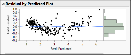
In this graph the fitted (predicted) values of BMXBMI are on the horizontal and the residuals are on the vertical axis. For the most part in this case, we see that the points are scattered evenly above and below the horizontal line at 0, without any sign of curvature. If the relationship were non-linear, we would see the points bending upward or downward. For example, think back to the first scatterplot we made in Chapter 15. (Refer back to Figure 15.1.) The plot of fertility rate versus birth rate from the Birthrate 2017 data showed a very slight upward curve. Figure 16.2 is the residual plot from that regression, and it shows such a curvilinear pattern. Notice that on the left side of the graph, corresponding to predicted fertility values from 0 to 2, the large majority of residuals are positive. Between 2 and 5, most of the residuals are negative, and then for predicted fertility rates greater than 5, the residuals are positive. Taken together, the overall trend is a U-shaped curve. As it happens, this plot also shows non-constant variance, and we will discuss that issue in a later section.
Figure 16.2: Residual by Predicted Plot Showing Non-linearity
What do we do when we find a curved, rather than a straight line, pattern? We have several options, which are discussed at length in Chapter 19. For the moment, the most important thing to recognize is that we should not interpret or apply the results of a simple linear regression if the residual plot indicates curvature. Without a linear pattern, the results will be of very limited use and could lead to very poor decisions.
Another issue related to linearity is that of influential observations. These are points that are outliers in either the X or the Y directions. Such points tend to bias the estimate of the intercept, the slope, or both.
For example, look back at the scatter plot with the fitted line on your screen (with slightly enlarged points here as Figure 16.3). Notice the highlighted points in the upper right corner of the graph and look closely at the point marked with an arrow. Point your cursor at this dot, and the hover label indicates that it represents a man whose waist circumference was 169.6 cm, or 66.8 inches, which was the largest in the sample. His BMI of 54.2 kg/m2—the eighth highest in the sample—lies very close to the line. The OLS method is sensitive to such extreme X values, and consequently the line nearly passes through the point.
Figure 16.3: Some Influential Observations

As another example, find the point that is circled in Figure 16.3. This represents a man whose waist measurement is in the fourth quartile and BMI is in the first quartile—not an outlier in either dimension. However, this point is a bivariate outlier because it departs from the overall linear pattern of the points. His BMI is low considering his waistline.
With outliers such as these, we can take one or more of the following steps, even in the context of an introductory statistics course.
● If possible, verify the accuracy of the data. Are the measurements correct? Is there a typographical error or obvious mistake in a respondent’s answer?
● Verify that the observation really comes from the target population. For example, in a survey of a firm’s regular customers, is this respondent a regular customer?
● Temporarily exclude the observation from the analysis and see how much the slope, intercept, or goodness-of-fit measures change. We can do this as follows:
1. Click the red triangle next to Bivariate Fit of BMXBMI by BMXWAIST and choose Redo w Automatic Recalc. If there is no checkmark next to Automatic Recalc, click it.
2. Now click the scatterplot and click once on the point that is shown circled in Figure 16.3 above. You will see that it is the observation in row 3,140, and it appears darkened. Clicking on the point selects it.
3. Now right-click and choose Row Exclude.1 This excludes the point from the regression computations, but leaves it appearing in the graph.
When we omit this point from consideration, the estimated regression line is
BMXBMI = -6.686835 + 0.3517473*BMXWAIST
as compared to this line when we use all 2600 observations:
BMXBMI = -6.664889 + 0.3514887*BMXWAIST
In a large sample, omitting one outlier will not have an enormous impact, but when we eliminate this outlier, the intercept decreases by about 0.02 kg/m2, but the slope barely changes. A point near the mass of the data with a large residual has little effect on the slope (or on conclusions about whether the two variables are related) but can bias the estimate of the intercept. Omitting that observation very slightly improves the goodness of fit measure R square from 0.856 to 0.857. This makes sense because we are dropping a point that does not fit the general pattern.
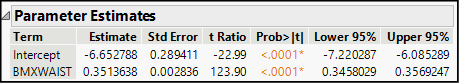
What about that point in the far upper-right corner, highlighted with an arrow (Row 1,943)? When we exclude it, the estimated equation becomes
BMXBMI = -6.652788 + 0.3513638*BMXWAIST
This changes the equation very little, although R square falls a bit farther to 0.855. These points are not especially influential, but in smaller samples, we need to watch for influential points.
The set of standard residual plots includes two ways to ask whether the residuals follow an approximate normal distribution. The first is a histogram appearing in the margin of the first graph of residuals by predicted values. As shown in Figure 16.1, these residuals form a mound-shaped, symmetric pattern.
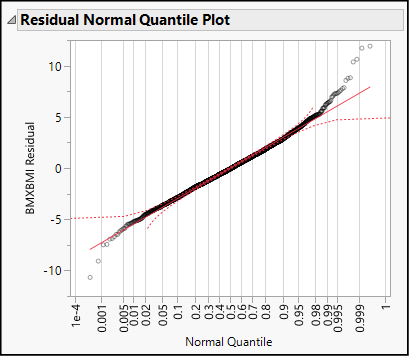
The last graph in the Bivariate Fit report is a Normal Quantile Plot. (See Figure 16.4.) Though the residuals do not track perfectly along the red diagonal line, this graph provides no warning signs of non-normality. Here we are looking for any red flag that would suggest that the residuals are grossly non-normal. We want to be able to continue to interpret the results and would stop for corrective measures if the residuals were heavily skewed or multimodal.
Figure 16.4: Normal Quantile Plot for the BMI Residuals
What happens when residuals do not follow a normal distribution? What types of corrective measures can we take? Generally speaking, non-normal residuals might indicate that there are other factors in addition to X that should be considered. In other words, there could be a lurking factor that accounts for the non-random residuals. Sometimes it is helpful to transform the response variable or the factor using logarithms. In Chapter 18, we will see how we can account for additional factors and use transformations.
Look back at Figures 16.1 and 16.2. In an ideal illustration, we would see the residuals scattered randomly above and below the horizontal zero line. Figure 16.1, even though it’s not a perfect illustration, comes closer to the ideal than Figure 16.2. In Figure 16.2, not only do the residuals curve, but they increase in variability as you view the graph from left to right. On the left side, they are tightly packed together, and as we slide to the right, they drift farther and farther from the center line. The variability of the residuals is not constant, but rather it appears to grow predictably from left to right.
The constant variance assumption goes by a few other names as well, such as homogeneity of variance or homoscedasticity. Valid inference from a regression analysis depends quite strongly on this condition. When we have non-constant variance (or, you guessed it, heterogeneity of variance or heteroscedasticity) we should refrain from drawing inferences or using the regression model to estimate values of Y. Essentially, this is because heteroscedasticity makes the reported standard errors unreliable, which in turn biases the t- and F-ratios.
What to do? Sometimes a variable transformation helps. In other cases, multiple regression (Chapter 18) can ameliorate the situation. In other instances, we turn to more robust regression techniques that do not use the standard OLS technique. These techniques go beyond the topics typically covered in an introductory course.
The final condition for OLS is that the random errors are independent of each other. This is quite a common problem with time series data, but much less so with a cross-sectional sample like NHANES. Much like the other conditions, we check for warning signs of severe non-independence with an inclination to continue the analysis unless there are compelling reasons to stop.
In regression, the assumption of independent errors means that the sign and magnitude of one error is independent of its predecessor. Using the residuals as proxies for the random errors, we will reason that if the residuals are independent of one another, then when we graph them in sequence, we should find no regular patterns of consecutive positive or negative residuals.
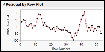
Within the standard set of Diagnostics Plots, there is a Residual by Row Plot. This is the graph that we want. Though if the sample is large, it will be easier to detect consecutive clusters of positive and negative residuals if the points in the graphs are connected in sequence. We can make our own version of the graph to better serve the purpose. This is the reason for saving the residuals earlier. The result of that request is a new data table column called Residuals BMXBMI.
To illustrate this method, we will use both our current example as well as some time series data. In both cases, we want to graph the residuals in sequence of observation, looking for repeated patterns of positive and negative residuals. There are multiple ways to accomplish this; we will use the Overlay Plot here because it enables us easily to connect residuals with lines to clearly visualize their sequence.
1. Select Graph ► Graph Builder. As shown in Figure 16.5, drag Residuals BMXBMI to the Y drop zone and SEQN to the X drop zone.
Figure 16.5: Starting to Plot Residuals in Sequence using Graph Builder

2. In the menu bar, click the Line button ![]() to create the graph shown in the left portion of Figure 16.6.
to create the graph shown in the left portion of Figure 16.6.
The graph of the BMI residuals has a jagged, irregular pattern of ups and downs, indicating independence. The sign and magnitude of one residual does little to predict the next residual in order.
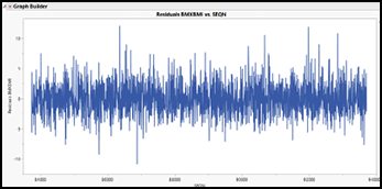
In contrast, look at the overlay plot on the right in Figure 16.6, based on data from the Stock Index Weekly data table. The residuals come from a regression using the weekly closing index value for the Madrid Stock Exchange as the response variable, and the index from the London Stock Exchange as the factor. Here we see a group of positive values, followed by a group of negatives, then more positives. The line oscillates in a wave, suggesting that there is a non-random pattern to the weekly residual values.
Figure 16.6: Two Sets of Residuals in Sequence
|
|
|
Once we have confirmed that our sample satisfies the conditions for inference, we can use the results in three estimation contexts. This section explains the three common ways that regression results can be used and introduces ways to use JMP in all three contexts.
● In some studies, the goal is to estimate the magnitude and direction of the linear relationship between X and Y, or the magnitude of the intercept, or both.
● In some situations, the goal is to estimate the mean value of Y corresponding to (or conditioned on) a given value of X.
● In some situations, the goal is to estimate an individual value of Y corresponding to a given value of X.
Earlier, we estimated this regression line based on the 2016 probabilistic sample:
BMXBMI = -6.664889 + 0.3514887*BMXWAIST
Note that our estimates of the intercept and slope depend on the measurements of the individuals in the 2016 sample. Another group of people would yield their own measurements, and hence our estimates would change. To put it another way, the parameter estimates in the equation are estimated with some degree of sampling error. The sampling error also cascades through any calculations that we make using the estimated line. For example, if we want to estimate BMI for men whose waistlines are 77 cm (about 30 inches), that calculation is necessarily affected by the slope and intercept estimates, which in turn depend on the sample that we work with.
Confidence Intervals for Parameters
Rather than settle for point estimates of b0 and b1, we can look at confidence intervals for both. By default, JMP reports 95% confidence intervals, and we interpret these as we would any confidence interval. Confidence intervals enable us to more fully express an estimate and the size of potential sampling error.
1. Return to the Fit Y by X report, hover the cursor over the table of parameter estimates, and right-click. This brings up a menu, as shown in Figure 16.7.
Figure 16.7: Requesting Confidence Intervals for Parameter Estimates

Remember: In JMP, right-click menus are context sensitive. If you right-click over the title Parameter Estimates, you will see a different menu than if you right-click over the table below that title. Make sure that the cursor is over the table before right-clicking.
2. Select Columns ► Lower 95%.
3. Right-click once again and select Columns ► Upper 95%.
The revised table of parameter estimates should now look like Figure 16.8 below. On the far right, there are two additional columns representing the upper and lower bounds of 95% confidence intervals for the intercept and slope.
Figure 16.8: Confidence Intervals for Parameters
How do we interpret the intervals for the slope and intercept? Consider the slope. Based on this sample of individuals, this regression provides an estimate of the amount by which BMI varies for a 1-cm increase in waist circumference among all adult males. The point estimate is, most likely, inaccurate. That is, we don’t really know that the marginal increase in BMI is 0.3514 per centimeter of waist circumference. It is more accurate and genuine to say that we are 95% confident that the slope is between approximately 0.346 and 0.357.
As noted above, we can use the estimated equation to compute one or more predicted (or fitted) values of Y corresponding to specific values of X. Such an estimate of Y is sometimes called Y-hat, denoted . Computing a Y-hat value is a simple matter of substituting a specific value for X and then solving the regression equation. If we want to build an interval around a fitted value of Y, we first need to look to the context of the estimate.
A confidence interval for Y|X estimates the mean value of Y given the value of X. In our current model of BMI, for example, we might want to estimate the mean BMI among men with 77 cm waists. The point estimate would be
BMXBMI = -6.664889 + 0.3514887 * 77 ≈ 20.4 kg/m2
This value, which is the location of the estimated line at X = 77, becomes the center of the confidence interval, and then JMP computes an appropriate margin of error to form the interval. In the next chapter, we will discuss this technique in greater depth. As an introductory illustration, we will see how JMP constructs a confidence band along the entire length of the estimated line.
1. In the Fit Y by X report, click the red triangle next to Bivariate Normal Ellipse and click Remove Fit.
2. Click the red triangle next to Linear Fit and select Confid Curves Fit. Repeat to select Confid Shaded Fit.
3. Enlarge the graph by clicking and dragging the lower right corner downward and rightward. This will help you see the confidence bands. Figure 16.9 shows an enlarged detail of the graph, showing the fitted line and confidence region near BMXWAIST = 77.
Figure 16.9: Fitted Line Plot with Confidence Bands

In addition to visualizing the fitted values and confidence limits, we can also save the computed values for each observed value of X.
4. Click the red triangle next to Linear Fit and select Save Predicteds. Repeat to select Mean Confidence Limit Formula.
Now look at the NHANES 2016 data table. There you will find three new columns containing predicted (fitted) values for BMI as well as 95% upper and lower confidence limits.
NOTE: In this final step, we illustrate the procedure for saving estimated values. You should notice in the data table that most rows contain values, even though we estimated the equation using only male respondents. The local data filter was instrumental in estimating the slope and intercept for the linear model, but the calculation of fitted values and confidence intervals is unaffected by the local filter.
Finally, we consider the situation in which one might want to estimate or predict a single observation of Y given a value of X. Rather than asking about the mean BMI for all men with a 77-centimeter waist, we are asking about one man in particular. Conceptually, the procedure is the same as the prior example, but it differs in one critical detail. The magnitude of the sampling error is greater when predicting an individual value than when estimating the mean value of Y.
1. Return to the Fit Y by X report. Just as before, click the red triangle next to Linear Fit.
2. Select Confid Curves Indiv and then repeat to select Confid Shaded Indiv.
3. Finally, also select Indiv Confidence Limit Formula. You do not need to resave the fitted values because they will be the same as for the confidence interval estimate.
Now look at your scatterplot (not shown here). You should see a new shaded region bounded by prediction bands, which are much wider than the confidence bands from Figure 16.9. Both shaded regions are centered along the line of best fit, but the prediction band reflects the substantially greater uncertainty attending the prediction of an individual value rather than the mean of values.
Now that you have completed all of the activities in this chapter, use the concepts and techniques that you have learned to respond to these questions. Notice that these problems are continuations of the corresponding scenarios and questions posed at the end of Chapter 15. Each problem begins with a residual analysis to assess the conditions for inference.
1. Scenario: Return to the Bivariate Fit of BMXBMI By BMXWAIST report.
a. Using the local data filter again, show and include adult females 18 and older. Perform a regression analysis for BMI and waist circumference for adult women, evaluate the OLS conditions for inference, and report your findings and conclusions.
b. If you can safely use this model, provide the 95% confidence interval for the slope and explain what it tells us about BMI for adult women.
c. If you can safely use this model, save the predicted values and mean confidence limits. Then look at Row 21 in the data table; this respondent was a 30-year-old woman with a waist circumference of 90.7 cm. Use the new columns of the data table to report an approximate 95% confidence interval for the mean BMI for women whose waist measurements are 90.7 cm.
2. Scenario: High blood pressure continues to be a leading health problem in the United States. In this problem, continue to use the NHANES 2016 table. For this analysis, we will focus on just the following variables:
o RIAGENDR: Respondent’s gender
o RIDAGEYR: Respondent’s age in years
o BMXWT: Respondent’s weight in kilograms
o BPXPLS: Respondent’s resting pulse rate
o BPXSY1: Respondent’s systolic blood pressure (“top” number in BP reading)
o BPXD1: Respondent’s diastolic blood pressure (“bottom” number in BP reading)
a. Perform a regression analysis with systolic BP as the response and age as the factor. Analyze the residuals and report on your findings.
d. Perform a regression analysis of systolic and diastolic blood pressure and then evaluate the residuals. Explain fully what you have found.
c. Create a scatterplot of systolic blood pressure and pulse rate. One might suspect that higher pulse rate is associated with higher blood pressure. Does the analysis bear out this suspicion?
3. Scenario: We will continue to examine the World Development Indicators data in BirthRate 2017. We will broaden our analysis to work with other variables in that file:
o MortUnder5: Deaths, children under 5 years per 1,000 live births
o MortInfant: Deaths, infants per 1,000 live births
a. Create a scatterplot for MortUnder5 and MortInfant. Run the regression and explain what a residual analysis tells you about this sample.
4. Scenario: How do the prices of used cars vary according to the mileage of the cars? Our data table Used Cars contains observational data about the listed prices of three popular compact car models in three different metropolitan areas in the U.S. All of the cars are two years old.
a. Create a scatterplot of price versus mileage. Run the regression, analyze the residuals, and report your conclusions.
b. If it is safe to draw inferences, provide a 95% confidence interval estimate of the amount by which the price falls for each additional mile driven.
c. You see an advertisement for a used car that has been driven 35,000 miles. Use the model and the scatterplot to provide an approximate 95% interval estimate for an asking price for this individual car.
5. Scenario: Stock market analysts are always on the lookout for profitable opportunities and for signs of weakness in publicly traded stocks. Market analysts make extensive use of regression models in their work, and one of the simplest ones is known as the Random, or Drunkard’s, Walk model. Simply put, the model hypothesizes that over a relatively short period of time, the price of a particular share of stock will be a random deviation from the prior day. If Yt represents the price at time t, then Yt = Yt-1 + ε. In this problem, you will fit a random walk model to daily closing prices for McDonald’s Corporation for the first six months of 2019 and decide how well the random walk model fits. The data table is called MCD.
a. Create a scatterplot with the daily closing price on the vertical axis and the prior day’s closing price on the horizontal. Comment on what you see in this graph.
b. Fit a line to the scatterplot and evaluate the residuals. Report on your findings.
c. If it is safe to draw inferences, is it plausible that the slope and intercept are those predicted in the random walk model?
6. Scenario: Franz Joseph Haydn was a successful and well-established composer when the young Mozart burst upon the cultural scene. Haydn wrote more than twice as many piano sonatas as Mozart. Use the data table Haydn to perform an analysis parallel to the one we did for Mozart.
a. Evaluate the residuals from the regression fit using Parta as the response variable.
b. Compare the Haydn data residuals to the corresponding residual graphs using the Mozart data; explain your findings.
7. Scenario: Throughout the animal kingdom, animals require sleep, and there is extensive variation in the number of hours in the day that different animals sleep. The data table called Sleeping Animals contains information for more than 60 mammalian species, including the average number of hours per day of total sleep. This will be the response column in this problem.
a. Estimate a linear regression model using gestation as the factor. Gestation is the mean number of days that females of these species carry their young before giving birth. Assess the conditions using residual graphs and report on your conclusions.
8. Scenario: For many years, it has been understood that tobacco use leads to health problems related to the heart and lungs. The Tobacco Use data table contains data about the prevalence of tobacco use and of certain diseases around the world.
a. Using Cancer Mortality (CancerMort) as the response variable and the prevalence of tobacco use in both sexes (TobaccoUse), run a regression analysis and examine the residuals. Should we use this model to draw inferences? Explain.
b. Using Cardiovascular Mortality (CVMort) as the response variable and the prevalence of tobacco use in both sexes (TobaccoUse), run a regression analysis and examine the residuals. Should we use this model to draw inferences? Explain.
9. Scenario: In Chapter 2, our first illustration of experimental data involved a study of the compressive strength of concrete. In this scenario, we look at a set of observations all taken at 28 days (4 weeks) after the concrete was initially formulated; the data table is called Concrete 28. The response variable is the Compressive Strength column, and we will examine the relationship between that variable and two candidate factor variables.
a. Use Cement as the factor, run a regression analysis, and evaluate the residuals. Report on your findings in detail.
b. Use Water as the factor, run a regression analysis, and evaluate the residuals. Report on your findings in detail.
10. Scenario: Prof. Frank Anscombe of Yale University created an artificial data set to illustrate the hazards of applying linear regression analysis without looking at a scatterplot (Anscombe 1973). His work has been very influential, and JMP includes his illustration among the sample data tables packaged with the software. You’ll find Anscombe both in this book’s data tables and in the JMP sample data tables. Open it now.
a. In the upper left panel of the data table, you will see a green triangle next to the words The Quartet. Click the triangle, and select Run Script. This produces four regression analyses corresponding to four pairs of response and predictor variables. Plot the residuals for all four regressions and report on what you find.
b. For which of the four sets of data (if any) would you recommend drawing inferences based on the OLS regressions? Explain your thinking. Suggestion: in each of the four Bivariate Fit reports, click the red triangle next to Bivariate Fit and choose Show Points.
11. Scenario: Many cities in the U.S. have active used-car markets. Typically, the asking price for a used car varies by model, age, mileage, and features. The data table called Used Cars contains asking prices (Price) and mileage (Miles) for three popular budget models; all cars were two years old at the time the data were gathered, and we have data from three U.S. metropolitan areas. All prices are in dollars. In this analysis, Price is the response and Miles is the factor.
a. As in the prior chapter, run three separate regressions (one for each model). This time, analyze the residuals and report on your findings.
b. Finally, compare the analysis of residuals for the three models. Which one seems to satisfy the conditions best?
12. Scenario: We will return to the World Development Indicators data in WDI. In this scenario, we will investigate the relationship between access to improved sanitation (the percent of the population with access to sewers and the like) and life expectancy. The response column is life_exp, and the factor is sani_acc.
a. Use the Local Data Filter to Show and Include only the observations for the Year 2015, and the Latin America & Caribbean Region nations. Evaluate the residuals and report on how well the data satisfy the OLS conditions.
b. Repeat the residuals analysis for East Asia & Pacific countries in 2015.
c. Now do the same one additional time for the countries located in Sub-Saharan Africa.
d. How do the three residuals analyses compare? What might explain the differences?
13. Scenario: The data table called USA Counties contains a wide variety of measures for every county in the United States based on the 2010 Census
a. Run a regression casting sales_per_capita (retail sales dollars per person, 2007) as Y and per_capita_income as X. Analyze the residuals and report on your findings.
Endnotes
1 You can accomplish the same effect by pressing Ctrl + e.