
Chapter 19: Categorical, Curvilinear, and Non-Linear Regression Models
Dichotomous Independent Variables
Seeing Interaction Effects with the Prediction Profiler
Dichotomous Dependent Variable
Curvilinear and Non-Linear Relationships
In the past several chapters, we have worked extensively with regression analysis. Two common threads have been the use of continuous data and of linear models. In this chapter, we introduce techniques to accommodate categorical data and to fit several common curvilinear patterns. Throughout this chapter, all the earlier concepts of inference, residual analysis, and model fitting still hold true. We will concentrate here on issues of model specification, which is to say selecting variables and functional forms (other than simple straight lines) that reasonably and realistically are suitable for the data at hand.
Dichotomous Independent Variables
Regression analysis operates upon numerical data, but for some response variables, a key factor is categorical. We can easily incorporate categorical data into regression models with a dummy, or indicator, variable—a numeric variable created to represent the different states of a categorical variable. In this chapter, we will illustrate the use of dummy variables for dichotomous variables, which are variables that can take on only two different values.
For our first example, we will return to the sonatas of Haydn and Mozart and some data that we first analyzed in Chapter 15 (Ryden, 2007). In the sonata form, the composer introduces a melody in the exposition, and then elaborates and recapitulates that melody in a second portion of the piece. The theory that we tested in Chapter 15 was that Haydn and Mozart divided their sonatas so that the relative lengths of the two portions approximated the golden ratio. We hypothesized that our fitted line would come close to matching this line:
Parta = 0 + 0.61803(Partb)
In this chapter, we will ask whether the two composers did so with the same degree of consistency. We will augment our simple regression model of Chapter 13 in two ways. First, we will just add a dummy variable to indicate which composer wrote which sonata.
1. Open the data table called Sonatas.
This data table combines the observations from the two tables Mozart and Haydn. The dummy variable is column 4. Notice that the variable equals 0 for pieces by Haydn and 1 for pieces by Mozart.
2. Select Analyze ► Fit Model. Cast Parta as Y, add Partb and Mozart to the model, then run the model. Check Keep dialog open. The parameter estimates appear in Figure 19.1.
Figure 19.1: Estimated Coefficients for the Model with a Dummy Variable
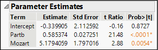
The fitted equation is:
![]()
How do we interpret this result? Remember that Mozart is a variable that can equal only 0 or 1. Therefore, this equation actually expresses two parallel lines:
Both lines have the same slope but different intercepts. If we want a model that allows for two intersecting lines, we can introduce an interaction between the independent variable and the dummy variable, as follows:
3. Return to the Fit Model dialog box, which is still open in its own tab.
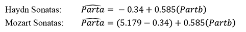
4. Under Select Columns in the upper left, highlight both Partb and Mozart in the Select Columns box and click Cross under Construct Model Effects. You will now see the term Partb*Mozart listed in the Construct Model Effects panel.
5. Now click Run.
Figure 19.2 shows the parameter estimates for this model, which fits the data slightly better than the previous model. With an interaction, JMP reports the coefficient in terms of adjusted values of the variables, subtracting the sample mean for each variable. We note that all estimates except for the intercept are statistically significant.
Figure 19.2: Results with a Dummy Interaction Term
Just as the first model implicitly represented two intercept values, this model has two intercepts and two slopes: there is a Mozart line and a Haydn line. The default report is a bit tricky to interpret because of the subtraction of means in the interaction line, so let’s look graphically at the fitted lines. We will take advantage of yet another useful visual feature of JMP that permits us to re-express this regression model using the original dichotomous categorical column, Composer.1
6. Return again to the Fit Model dialog box and highlight Mozart and Partb*Mozart within the list of model effects. Click the Remove button.
7. Select the Composer column and add it to the model effects.
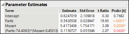
8. Highlight Partb and Composer under Select Columns and click Cross. The model now lists Partb, Composer, and Partb*Composer. Click Run.
Because this regression model has just a single continuous independent variable, JMP automatically plots the regression fit above the scatterplot of fits versus observed values. Your output should now include the graph shown here in Figure 19.3. The red line represents the Haydn sonatas, and the blue represents those by Mozart.
Figure 19.3: Estimated (Fitted) Lines for the Two Composers
In the table of Parameter Estimates, we do find discrepancies between this model and the estimates shown in Figure 19.2. Now, the estimated coefficient of Partb is the same as before, but the others are different. The t-ratios and P-values are all the same, but the parameter estimates have changed. This is because JMP automatically codes a dichotomous categorical variable with values of -1 and +1 rather than 0 and 1. Hence, the coefficient of the composer variable is now -2.708672, which is exactly one-half of the earlier estimate. This makes sense, because now the difference between values of the dummy variable is twice what it was in the 0-1 coding scheme.
Seeing Interaction Effects with the Prediction Profiler
In the prior chapter we used the Profiler to visualize the separate effects of factors in a multiple regression model. This model, containing both a categorical dichotomous factor plus an interaction term, presents a good opportunity to understand more about regression modeling.
1. Click the Response Parta red triangle, and choose Factor Profiling ► Profiler.
Figure 19.4: Prediction Profiler for Model with Interaction Term
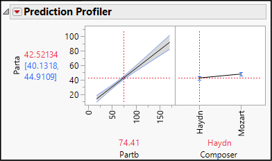
This opens the Profiler, shown with its initial settings in Figure 19.4. The vertical red line in the Partb graph is set at its mean value, and the Composer graph set at Haydn. Among Haydn’s sonatas, those with theme b averaging 74.41 measures would, on average, have a theme a approximately 42.5 measures long.
2. Now grab the red dashed line in the Composer graph and switch to Mozart.
Notice two changes: the estimated interval for Parta increases, and the slope of the line in the Partb graph becomes steeper.
This vividly illustrates the meaning of interaction: the relationship between Parta and Partb differs depending on the composer. It is not a simple matter that Mozart’s themes tended to be longer overall.
What happens when we change the settings for Partb length?
3. Leaving the right-hand red dashed line at Mozart, grab the vertical line in the Partb graph and slide it all the way to the right to a value of 171. Notice that the right-hand graph shows an even larger difference between the two composers.
4. Now slide the Partb vertical line all the way to its minimum. The difference between the two composers nearly vanishes.
Dichotomous Dependent Variable
Next, we consider studies in which the dependent variable is dichotomous. In such cases there are at least two important shortcomings of ordinary least squares estimation and a linear model. First, because Y can take on only two values, it is illogical to expect that a line provides a good model. A linear model will produce estimates that reach beyond the 0-1 limits. Second, because all observed values of Y will always be either 0 or 1, it is not possible that the random error terms in the model will have a normal distribution or a constant variance.
With a dichotomous dependent variable, one better approach is to use logistic regression.2 Estimating a logistic model is straightforward in JMP. To illustrate, we will turn to an example from the medical literature (Little, McSharry et al. 2008) on Parkinson’s disease (PD). PD is a neurological disorder affecting millions of adults around the world. The disorder tends to be most prevalent in people over age 60, and as populations age, specialists expect the number of people living with PD to rise. Among the common symptoms are tremors, loss of balance, muscle stiffness or rigidity, and difficulty in initiating movement. There is no cure at this time, but medications can alleviate symptoms, particularly in the early stages of the disease.
People with PD require regular clinical monitoring of the progress of the disease to assess the need for changes in medication or therapy. Given the nature of PD symptoms, though, it is often difficult for many people with PD to see their clinicians as often as might be desirable. A team of researchers collaborating from University of Oxford (UK), the University of Colorado at Boulder, and the National Center for Voice and Speech in Colorado was interested in finding a way that people with PD could obtain a good level of care without the necessity of in-person visits to their physicians. The team noted that approximately 90% of people with PD have “some form of vocal impairment. Vocal impairment might also be one of the earliest indicators for the onset of the illness, and the measurement of voice is noninvasive and simple to administer” (ibid., p. 2). The practical question, then, is whether a clinician could record a patient’s voice—even remotely—and by measuring changes in the type and degree of vocal impairment, draw valid conclusions about changes in progress of PD in the patient.
In our example, we will use the data from the Little, McSharry et al. study in a simplified fashion to differentiate between subjects with PD and those without. The researchers developed a new composite measure of vocal impairment, but we will restrict our attention to some of the standard measures of voice quality. In our sample, we have 32 patients; 24 of them have PD and eight do not.
Vocal measurement usually involves having the patient read a standard paragraph or sustain a vowel sound or both. Two common measurements of a patient’s voice refer to the wave form of sound: technicians note variation in the amplitude (volume) and frequency (pitch) of the voice. We will look at three measurements:
● MDVP:Fo(Hz): vocal fundamental frequency (baseline measure of pitch)3
● MDVP:Jitter(Abs): jitter refers to variation in pitch
● MDVP:Shimmer(db): shimmer refers to variation in volume
In this example, we will simply estimate a logistic regression model that uses all three of these measures and learn to interpret the output. Interpretation is much like multiple regression, except that we are no longer estimating the absolute size of the change in Y given one-unit changes in each of the independent variables. In a logistic model, we conceive of each X as changing the probability, or more specifically the odds-ratio, of Y. Fundamentally, in logistic regression, the goal of the model is to estimate the likelihood that Y is either “yes” or “no” depending on the values of the independent variables.
More specifically, the model estimates ln[p/(1-p)], where p is the probability that Y = 1. Each estimated coefficient represents the change in the estimated log-odds ratio for a unit change in X, holding other variables constant—hardly an intuitive quantity! Without becoming too handcuffed by the specifics, consider at this point that a positive coefficient only indicates a factor that increases the chance that Y equals 1, which in this case means that a patient has PD.
JMP produces logistic parameter estimates using a maximum likelihood estimation (MLE)4 approach rather than the usual OLS (ordinary least squares method). For practical purposes, this has two implications for us. First, rather than relying on F or t tests to evaluate significance, JMP provides chi-square test results, which are more appropriate to MLE methods. Second, the residual analysis that we typically perform in a regression analysis is motivated by the assumptions of OLS estimation. With MLE, the key assumption is the independence of observations, but we no longer look for linearity, normality, or equal variance.
1. Open the Parkinson’s data table.
Each row in the table represents one subject (person) in the study. The Status column is a dummy variable where 1 indicates a subject with PD. Hence, this is our dependent variable in this analysis. In the data table, Status is numeric but has a nominal modeling type.
2. Select Analyze ► Fit Model. Select Status as Y and add MDVP:Fo(Hz), MDVP:Jitter(Abs), and MDVP:Shimmer(dB) as model effects. Select with care, as there are several jitter and shimmer columns.
3. In the upper right of the dialog box, change the Target Level to 1 to specify that we want our model to predict the presence of Parkinson’s disease (that is, Status = 1). Click Run.
Notice that as soon as you specify Status as the dependent variable, the personality of the Fit Model platform switches from Standard Least Squares to Nominal Logistic.
Part of the logistic regression report appears in Figure 19.5. Next, we review selected portions of several of the panels within the results. For complete details about each portion of the output, consult the JMP Help menu. You can click the Help menu, or select the Help tool from the Tools menu and then hover and click over any portion you want to learn about.
Figure 19.5: Logistic Regression Results for the Parkinson’s Model
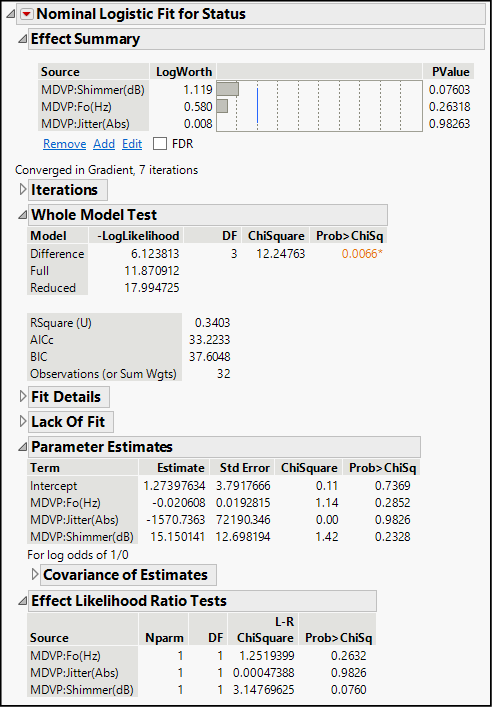
We have seen this panel in least squares regression analyses. It lists the three factors in order of statistical significance, and we see that none are significant at the 0.05 level (represented by the blue vertical line), but shimmer is significant at the 10% level.
This portion of the output compares the performance of our specified model with a naïve default model with no predictor variables. The naïve model essentially posits that, based on the sample ratio of 8/32 or 25% of the patients having no disease, there is a probability of 0.75 that a tested patient has PD. In this panel, the chi-square test is analogous to the customary F test and in this analysis, we find a significant result. In other words, this model is an improvement over simply estimating a 0.75 probability of PD.
We also find RSquare (U), which is analogous to R square as a goodness-of-fit statistic. This model provides an unimpressive value of 0.34, indicating a lot of unexplained variation. Such a result is common in logistic modeling due in part to the fact that we are often using continuous data to predict a dichotomous response variable.
As noted earlier, we do not interpret the parameter estimates directly in a logistic model. Because each estimate is the marginal change in the log of the odds-ratio, sometimes we do a bit of algebra and complete the following computation for each estimated β.:
![]()
The result is the estimated percentage change in the odds corresponding to a one-unit change in the independent variable. Of course, we want to interpret the coefficients only if they are statistically significant. To make judgments about significance, we look at the next panel of output.
The bottom panel contains the analogs to the t tests we usually consult in a regression analysis, except that these are based on chi-square rather than t-distributions. We interpret the P-values as we do in other tests, although in practice we might tend to use higher alpha levels, given the discontinuous nature of the data. In this example, it appears that there is no significant effect associated with jitter, but shimmer (variation in vocal loudness) does look as if it makes a significant contribution to the model in distinguishing PD patients from non-PD patients. We should hold off drawing any conclusion about the base frequency (MDVP:Fo(Hz)) until running an alternative model without the jitter variable. For now, we will suspend the pursuit of a better model for Parkinson’s disease prediction, and move on to our next topic.
Curvilinear and Non-Linear Relationships
Earlier in this book, we have seen examples in which there is a clear relationship between X and Y, but the relationship either is a linear combination of powers or roots or are non-linear (for example, when the X appears in an exponent). In some disciplines, there are well-established theories to describe a relationship, such as Newton’s laws of motion. In other disciplines, non-linear relationships might be less clear. In fact, researchers often use regression analysis to explore such relationships. This section of the chapter introduces two common functions that frequently do a good job of fitting curvilinear data.
We begin with a simple descriptive example of a well-known quadratic relationship. A quadratic function is one that includes an X2 term. Quadratic functions belong to the class of polynomial functions, which are defined as any functions that contain several terms with X raised to a positive integer power. Let’s see how this plays out in our solar system.
1. Open the Planets data table. This table contains some basic measurements and facts about the planets. For clarity in our later graphs, the table initially selects all rows and assigns markers that are larger than usual.
2. Select Analyze ► Fit Y by X. Cast Sidereal period of orbit (years) as Y and Mean Distance from the Sun (AU) as X and click OK.
The sidereal period of orbit is the time, in Earth years, that it takes for a planet to complete its orbit around the sun. AU refers to an astronomical unit, which is defined as the distance from the Earth to the sun. So, our response variable is the length of a planet’s orbit relative to Earth, and the regressor is the mean distance (as a multiple of the Earth’s distance) from the sun. Figure 19.6 shows the scatterplot.
Figure 19.6: Orbital Period Versus Distance from the Sun
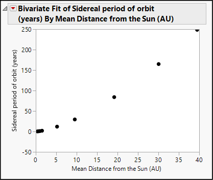
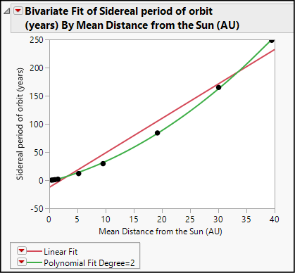
The relationship between these two columns is quite evident, but if we fit a straight line, we will notice that the points curve. If we fit a quadratic equation, we get a near-perfect fit.
3. Click the red triangle and select Fit Line.
4. Now click the red triangle again and select Fit Polynomial ► 2, quadratic.
Your analysis report should now look like Figure 19.7. Although the linear model is a good fit, the quadratic model more accurately describes this relationship.
Figure 19.7: Quadratic and Linear Models for Planet Data
We can use quadratic models in many settings. We introduced regression in Chapter 4 using some data in the data table Birthrate 2017. This data table contains several columns related to the variation in the birth rate and the risks related to childbirth around the world as of 2017. In this data table, the United Nations reports figures for 193 countries. You might remember that we saw a distinctly non-linear relationship in that data table. Let’s look once more at the relationship between a nation’s birth rate and its rate of maternal mortality.
5. Open the Birthrate 2017 data table.
6. Select Analyze ► Fit Y by X. Cast MortMaternal2016 as Y and BirthRate as X and click OK.
We have seen this graph at least twice before. Your results will look like those shown in Figure 19.8, which shows the relationship with both linear and quadratic fits. When we last encountered this graph, we concluded that it would be unwise to fit a linear model, and that we should return to it again in this chapter. Here we are.
Figure 19.8: Relationship Between Maternal Mortality and Birth Rate
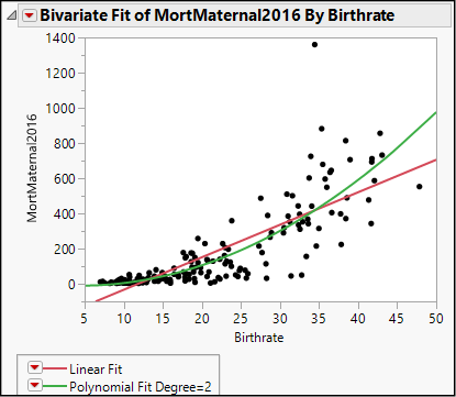
If we were to fit a line, we would find that a straight-line model is a poor characterization of this pattern. A line will underestimate maternal mortality in countries with very low or very high birth rates, and substantially overstate it in countries with middling birth rates. Given the amount of scatter in the graph, we are not going to find a perfect fit, but let’s try the quadratic model as an alternative to a line.
7. Click the red triangle to fit a line.
8. Click the red triangle once more and select Fit Polynomial ► 2, quadratic.
The goodness-of-fit statistic, R square, is similar for the two models, but the quadratic model captures more of the upward-curving relationship between these two variables. Interpretation of coefficients is far less intuitive than in the linear case, because we now have coefficients for the X and the X2 terms, and because whenever X increases by one unit, X2 also increases.
In the parameter estimates for the squared term, notice that JMP subtracts the mean (20.8442) from Birthrate before squaring. This step is referred to as centering. If you imagine a parabola formed by X2, centering moves the bottom of the parabola to zero.
Thus far we have used the Fit Y by X analysis platform, which restricts us to a single independent variable. If we want to investigate a multivariate model with a combination of quadratic and linear terms and additional variables, we can use the Fit Model platform.
9. Select Analyze ► Fit Model. Again, cast MortMaternal2016 as Y.
10. Highlight BirthRate, but don’t click anything yet. Notice the Macros button, and the Degree box below it. By default, degree is set at 2. Click Macros, as shown in Figure 19.9.
Figure 19.9: Building a Polynomial Model
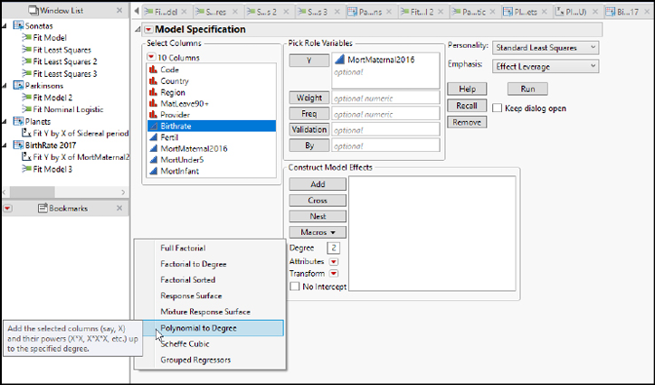
Among the macros, you will see Polynomial to Degree. This choice specifies that you want to add the highlighted variable and its powers up to and including the value in the Degree box. In other words, we want to specify a model with X and X2.
We can use this command to build a polynomial model with any number of factors. If you set Degree = 4, the model would include terms for BirthRate, BirthRate2, BirthRate3, and BirthRate4.
11. Select Polynomial to Degree from the drop-down menu. You will see the model now includes BirthRate and BirthRate*BirthRate.
12. Click Model.
The model results (not shown here) are fundamentally identical to the ones that we generated earlier. The Fit Model platform provides more diagnostic output than the Fit Y by X platform, and we can enlarge our model to include additional independent variables.
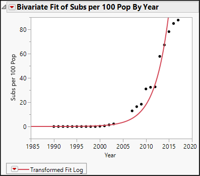
Of course, there are many curvilinear functions that might be suitable for a particular study. For example, when a quantity grows by a constant percentage rate rather than a constant absolute amount, over time, its growth will fit a logarithmic5 model. To illustrate, we will look at the number of cell phone users in Sierra Leone, a Sub-Saharan African nation that is among the poorest in the world. The population was approximately 7.5 million people in 2017, with a rate of 87.66 cell subscriptions per 100 people.
1. Open the data table called Cell Subscribers.
This is a table of stacked data, representing 215 countries from 1990 through 2018. We will start by extracting a subset table containing the Sierra Leone (Country Code = SLE) data.
2. Select Rows ► Row Selection ► Select Where. Select rows where CountryCode equals SLE and click OK.
We want to analyze only the 29 selected rows. We could exclude and hide all others, but let’s just subset this data table and create a new 29-row table with only the data from Sierra Leone.
3. Select Tables ► Subset. Click the radio buttons corresponding to Selected Rows and specify that you want All Columns.
4. In the Output table name box, type SLE Cell Subscribers.
5. Click OK.
As we did earlier, we will learn to create a logarithmic model using both curve-fitting platforms.
6. Select Analyze ► Fit Y by X. Cast Subs per 100 pop as Y and Year as X. The result looks like Figure 19.10.
Figure 19.10: Growth of Cellular Subscriptions in Sierra Leone
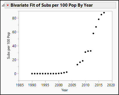
Notice the pattern of these points. For the first several years there is a very flat slope at or near zero subscribers, followed by rapid growth. This distinctive pattern is a common indication of steady percentage growth in a series of values.
7. Click the red triangle and select Fit Special. As shown in Figure 19.11, we will transform the response variable by taking its natural log and leave X alone.
Figure 19.11: Log Transformation of Y
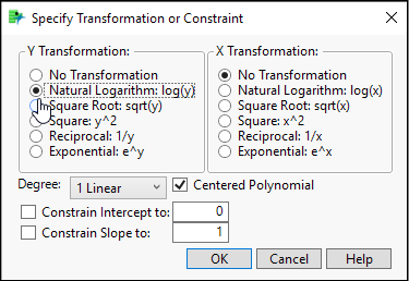
You will receive an alert message saying, “Transformation has 10 invalid arguments.” There are 10 years with zero cell subscribers, and the natural log of 0 is undefined.
The scatterplot now looks like Figure 19.12. Here we see a smooth fitted curve that maps closely to the points and follows that same characteristic pattern mentioned above. The fitted equation is Log(Subs per 100 Pop) = -662.7366 + 0.3311572*Year. The fit is not perfect but should provide a sense of how we can fit a different curved equation to a set of points.
Figure 19.12: A Log-Linear Model—Log(Y) Versus X
The coefficient of Year tells us how the logarithm of subscribers increases each year. How can we use this coefficient to estimate the annual percentage growth rate of cellular phone subscriptions in Sierra Leone from 1990 through 2017? We need to do some algebra starting with a model of steady annual percentage growth. If we let Y0 represent the initial value of Y and let r equal the unknown annual growth rate, then the number of subscribers per 100 population at any future time, t, equals
Yt = Y0(1+r)t
If we take the log of both sides of this equation, we get the following:
ln(Yt) = ln(Y0) + t(ln(1+r))
Notice that because Y0 is a fixed value, this function is linear in form. The intercept of the line is ln(Y0), the slope of the line is ln(1+r), and the independent variable is t. Moreover, we solve for the annual rate of increase, r, as follows:
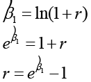
So, in this model, the estimated slope is .3311572. If we raise e to that power and subtract 1, we find the rate: e. .3311572 – 1 = 1.3926 – 1 = .3926, or 39.26% per year.
We can also estimate a log-linear model using the Fit Model platform. As we did earlier, we will transform the response variable to equal the log of the number of subscriptions. This time we will use a different strategy to transform Y because the Transform feature under Construct Model Effects will stall out if we try to take logs of zero values. Either we need to hide and exclude the zeros, or do this.
8. Select Analyze ► Fit Model.
9. Under Select Columns, right-click Subs per 100 Pop then Transform ► Log.
10. Cast the new temporary column as Y and add Year to the model.
11. Run the model.
By this point, you should be familiar enough with the results from the Fit Model platform that you can recognize that they match those reported from Fit Y by X. This command also gives us leverage and residual plots and permits the addition of other regressors to build more complex multiple regression models.
This chapter has introduced two common non-linear transformations that are often covered in a first course in statistics. Beyond quadratic and logarithmic models, there are many more curvilinear functions. Curious readers should investigate the Fit Curve platform in JMP. You will find the platform via the Analyze menu as the first option under Specialized Modeling.
Fit Curve expands upon the familiar Fit Y by X platform by offering numerous alternative curvilinear models. For each model chosen, JMP will estimate model parameters and maintain a running comparison of the model results. Although some of these functions will likely be unfamiliar to introductory readers, it is very much worth knowing that there are other ways forward if linear, quadratic, and logarithmic models do not fulfill the needs of an investigation.
Now that you have completed all of the activities in this chapter, use the concepts and techniques that you have learned to respond to these questions.
1. Scenario: Return to the NHANES2016 data table. Exclude and hide respondents under age 18, leaving both female and male adults.
a. Perform a regression analysis for adult respondents with BMI as Y and use waist circumference and gender as the independent variables. The relevant columns are BMXBMI, BMXWAIST, and RIAGENDR. Discuss the ways in which this model is or is not an improvement over a model that uses only waist circumference as a predictor.
b. Perform a regression analysis extending the previous model, and this time, add an interaction term between waistline and gender. Report and interpret your findings.
2. Scenario: High blood pressure continues to be a leading health problem in the United States. In this problem, continue to use the NHANES2016 table. For this analysis, we will focus on just the following variables and focus on adolescent respondents between the ages of 12 and 19.
a. Perform a regression analysis with systolic BP (BPXSY1) as the response and gender, age, and weight (RIAGENDR, RIAGEYR, BMXWT) as the factors. Report on your findings.
b. Perform a regression analysis with systolic BP as Y and gender, age, weight, and diastolic blood pressure as the independent variables. Explain fully what you have found.
c. Extend this second model to investigate whether there is an interaction between weight and gender. Use the Profiler in your investigation and report on what you find.
3. Scenario: We will continue to examine the World Development Indicators data in BirthRate 2017. Throughout the exercise, we will use BirthRate as the Y variable. We will broaden our analysis to work with other variables in that file:
a. Earlier, we estimated a quadratic model with maternal mortality as the independent variable. To that model, add the categorical variable MatLeave90+, which indicates whether there is a national policy to provide 90 days or more maternity leave. Evaluate your model and report on your findings.
b. Investigate whether there is any interaction between the maternity leave dummy and the rate of maternal mortality. Report on your findings, comparing these results to those we obtained by using the model without the categorical variable.
4. Scenario: The United Nations and other international organizations monitor many forms of technological development around the world. Earlier in the chapter, we examined the growth of mobile phone subscriptions in Sierra Leone. Let’s repeat the same analysis for two other countries using the Cell Subscribers data table.
HINT: Rather than starting with a subset of the full table, launch your analysis with Fit Y by X, and then use the Local Data Filter to switch countries.
a. Develop a log-linear model for the growth of cell subscriptions in Denmark. Compute the annual growth rate.
b. Develop a log-linear model for the growth of cell subscriptions in Malaysia. Compute the annual growth rate.
c. Develop a log-linear model for the growth of cell subscriptions in the United States. Compute the annual growth rate.
d. We have now estimated four growth rates in four countries (including Sierra Leone). Compare them and comment on what you have found.
5. Scenario: Earlier in the chapter, we estimated a logistic model using the Parkinson’s disease (PD) data. The researchers reported on the development of a new composite measure of phonation, which they called PPE.
a. Run a logistic regression using PPE as the only regressor, and Status as the dependent variable. Report the results.
b. Compare the results of this regression to the one illustrated earlier in the chapter. Which model seems to fit the data better? Did the researchers succeed in their search for an improved remote indicator for PD?
6. Scenario: Occasionally, a historian discovers an unsigned manuscript, musical composition, or work of art. Scholars in these fields have various methods to infer the creator of such an unattributed work, and sometimes turn to statistical methods for assistance. Let’s consider a hypothetical example based on the Sonatas data.
a. Run a logistic regression using Parta and Partb as independent variables and Composer as the dependent variable. Report the results.
b. (Challenge) Suppose that we find a composition never before discovered. Parta is 72 measures long and Partb is 112 measures long. According to our model, which composer is more likely to have written it? Why?
7. Scenario: The United Nations and other international organizations monitor many forms of technological development around the world. Earlier in the chapter, we examined the growth of mobile phone subscriptions in Sierra Leone. Let’s look at one year and examine the relationships between adoption levels for several key communication technologies. Open the data table called SDG_Technology and use the global data filter to show and include data for the year 2017.
a. Develop linear and quadratic models for the number of cellular subscribers per 100 population, using telephone lines per 100 population as the independent variable. Which model fits the data better?
b. Develop linear and quadratic models for the number of cellular subscribers per 100 population, using internet users per 100 population as the independent variable. Which model fits the data better?
c. Develop linear, quadratic, and cubic (polynomial, 3rd degree) models for the number of cellular subscribers per 100 population, using ATMs per 100,000 adult population as the independent variable. Which model fits the data best?
8. Scenario: The data table called Global Temperature and CO2 contains estimates and readings for two important environmental measures: the concentration of carbon dioxide (CO2 parts per million) in the atmosphere and mean global temperature (degrees Fahrenheit).
a. Using all available years’ data, develop linear, quadratic, and log-linear models for the CO2 concentration as Y, and Year as X. Which model fits the data best?
b. Use the Data Filter to include and show just the years since 1880, and repeat the previous question using the global temperature variable as Y. Which model fits the data best?
Endnotes
1 You might wonder why we bother to create the dummy variable if JMP will conduct a regression using nominal character data. Fundamentally, the software is making the 0-1 substitution and saving us the trouble. This is one case where the author believes that there is value in working through the underlying numerical operations. Furthermore, the 0-1 approach initially makes for slightly clearer interpretation.
2 Logistic regression is one of several techniques that could be applied to the general problem of building a model to classify, or differentiate between, observations into two categories. Logistic models are sometimes called logit models.
3 MDVP stands for the Kay-Pentax Multi-Dimensional Voice Program, which computes these measures based on voice recordings.
4 For further background, see Freund, R., R. Littell, et al. (2003). Regression Using JMP. Cary, NC: SAS Institute Inc. Or see Mendenhall, W. and T. Sincich (2003). A Second Course in Statistics: Regression Analysis. Upper Saddle River, NJ: Pearson Education.
5 If one transforms Y by taking the log and leaves X untouched, this is called a log-linear model.