In the previous chapter, you saw that all text slides come in only two options: bullets and sentences. Each of these options is quite different, with separate forms and functions. Keep them distinct.
A bullet is meant to express a core idea, so craft it in the form of a headline. Look at any newspaper, and you’ll see that a headline is not a complete sentence. Basic English grammar dictates that a sentence must contain a subject and a verb, but most headlines are not complete sentences. Generally, headlines omit the parts of speech that form complete sentences: articles (the, an, a), conjunctions (and, but, or), and prepositions (of, for, by, through).
Why are headlines written in this shorthand style? There are several good reasons. When fewer words have to be squeezed into an available space, the size of the letters can be increased, enhancing legibility. Furthermore, by providing the gist of the story in a few words, readers can scan a page full of stories in a few seconds and pick out the ones of interest.
Legibility and speed are equally important in presentation slides. When you create a text slide containing bullets, you are, in effect, presenting headlines only. Where does the body text appear? Not on any slide. As the presenter, it is your job to put flesh on the bones of the headline bullets. The presenter provides the body text. The presenter is the focus of the presentation.
This approach can make for a very crisp, clear presentation. You can summarize most of the concepts of your story (distilled in the Brainstorming process and organized into clusters) in two-to-five-word headline-style bullets. Some typical concepts from any company story might include
How long would you be able to speak about any of these concepts as they apply to your business? Probably for several minutes each, if not longer. Therefore, the optimal presentation is composed of a presenter providing spoken body text for headline-style bullets on the slides.
What about sentences? When should you use them in your graphics?
The only time you need a sentence is when you need to demonstrate verbatim accuracy. Use a sentence only when you’re citing the specific words in a quotation, like this:
While you can use full sentences for your endorsing quotations, you would do well to keep them to a minimum, and rely primarily on bullets as headlines for your text slides.
An important underlying reason for avoiding sentences on slides goes back to the basic principle of Audience Advocacy. Sentences are longer than bullets, and they usually extend over several lines. Therefore, reading them on the slide generally requires additional eye sweeps, making your audience work harder to absorb your message. Make it easy for the audience to take in your graphics. Minimize Eye Sweeps.
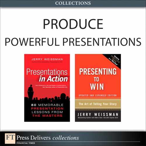
When a bullet is too long to fit on a single line, the text automatically continues on to a second line. This is called wordwrap, and it looks like Figure 7.1.
A full sentence almost always causes wordwrap, which requires an extra eye sweep . . . and more work for the audience. Shift the sentence-style bullet to a headline-style bullet by omitting articles, conjunctions, prepositions, and other unnecessary words. Minimize Eye Sweeps by restricting the bullet to a single line.
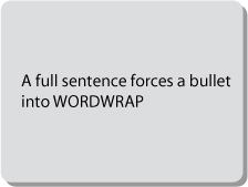
You’ll recall that I use the Problem/Solution Flow Structure in my programs and in this book. Most of the previous chapters have begun by asking you to think about presentation problems. In the same spirit, let’s look at the particularly problematic bullet slide shown in Figure 7.2.
Does this look familiar? When I show this slide during my program, the groans and laughter from the participants make it clear that slides like this are all too common. This is a true Data Dump slide, one that is in desperate need of surgery.
First, consider the two-line title. It requires an extra eye sweep. In this book, your eyes traverse a page that is only a few inches wide. In your presentations, the eyes of your audience have to travel several feet across a large projection screen. The more you make their eyes travel, the harder they have to work. Be an Audience Advocate! Replace the two-line title with a one-liner that states a single concept.
Next, notice that the subtitle, which adds new information, makes the audience do extra work not only to interpret the new information, but also to determine its relationship to the main title. Instead, replace it with a subtitle that relates easily and obviously back to the main title. Better still, eliminate the subtitle altogether. Less Is More.
Next, consider the first bullet. It has all the parts of speech that make a bullet into a sentence. This gives the audience more work to do by adding extra eye sweeps. Simplify the bullet into a newspaper-style headline. Do the same with all the other bullets and with the sub-bullets as well.
Now for a subtle, but important, point: The default in most graphics and word processing programs is to indicate a sub-bullet with a dash. This means that several sub-bullets will create a ladder of dashes. What does a dash mean to a financial person? It is a minus sign, which means a negative.
You don’t want your audience to go there. Avoid the subtle, subconscious, negative message sent by the dash. You could change the default symbol to a dot, which is an improvement, but it still clutters the slide. Get rid of the Morse-code effect of dots or dashes completely by indenting the sub-bullets. The space creates the offset; the space makes less out of more.
Finally, do we really need all those sub-bullets? The answer is usually “No.” Sub-bullets often add a layer of complexity and an extra burden for the audience without any offsetting benefit. Remember, you, the presenter, provide the body text. You’ll have ample opportunity during your presentation to amplify the details that support the headline bullets.
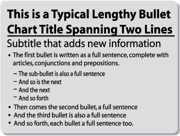
Now we have a clean graphic, as you can see in Figure 7.3.
To summarize:
- The Less Is More bullet slide contains one concept, expressed in a one-line title.
- The subtitle is best omitted.
- Bullets contain key words only, such as nouns, verbs, and modifiers. Avoid using articles, conjunctions, and prepositions. (Especially avoid using prepositions; not only do they add an extra word, they juxtapose and separate important words. Instead of writing a bullet such as “Strengths of Our Company,” rewrite it as “Our Company Strengths.”)
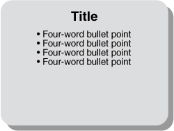
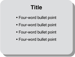
To make your bullet slide clean and crisp, try to follow the four-by-four formula: four lines down, four words across. Or, if the subject warrants, you can go up to six-by-four: six lines down, but still only four words across. A final benefit: With only one set of bullet symbols, visible at first glance, both you and your audience get a quick snapshot of the total idea.
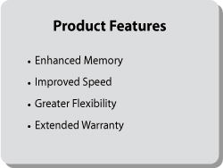
When all your bullets are parallel or similar in meaning (for example, a list of products, product features, or product benefits), the relationships will immediately be clear to your audience. However, whenever you create such a parallel list, pay particular attention to the grammatical form of the bullets. If you write each one in a different part of speech, you’ll be forcing your audience to do extra work to grasp the logic. They’ll have to reset their minds at the start of each bullet, as you do when you read the list shown in Figure 7.4.

Don’t make me think! Each of these bullets represents a different grammatical form. The first bullet is a complete sentence with a passive verb, the second bullet is a noun modified by a preceding adjective, the third bullet is an adjective modified by a preceding adverb, and so on. Grammatical terminology notwithstanding, you can feel the inconsistency.
This problem is akin to the “floating decimal” dilemma in accounting, in which a series of figures is printed with irregular decimal places. This makes the numbers very difficult to read, anathema to any bookkeeper or accountant. In bullet slides, nonparallel construction of bullets is anathema to your audience.
To solve this problem, write any set of bullets in a list in parallel (grammatically the same) form, so that the similarity and relationships of the underlying concepts are obvious, as shown in Figure 7.5.
In Figure 7.5, each of the bullets is in the same grammatical form: adjective plus noun. This parallelism in both meaning and form makes it easy for your audience to see the relationships. With this organization, you can display all four bullets at once. Your audience can absorb them quickly and then turn their attention back to you to listen as you add value.
Sometimes parallelism is not possible, so the relationships among the bullets are not readily apparent. And sometimes a single concept requires more than four bullets . . . perhaps as many as five or six or even eight bullets to fully explain one main concept. But showing a set of diverse bullets all at once is too much input for your audience’s eyes and minds. It overwhelms their reception.
The effective solution for such cases is to build the list one bullet at a time. The build is easy to do with the Custom Animation feature in Microsoft PowerPoint or any other presentation graphics program. Reveal the first line, and explain and discuss it. Then click to reveal the next line, and explain and discuss it, until you reveal all the bullets.
When building your bullets, keep in mind Perception Psychology: Audiences find left-to-right movement natural and easy. Make it easy for your audience. Build your bullets by bringing them in from left to right. In Microsoft PowerPoint, you can accomplish this by selecting Custom Animation, then Entrance, then Wipe, and then From Left. (Please see Chapter 12, “Animating Your Graphics,” for a fuller discussion of animation techniques.)
As you build, provide continuity in your narration by linking one bullet to another as you click through. By controlling the revelation of your bullets, you keep your audience in synchronization with your flow. They cannot get ahead of you. Best of all, you can add value beyond each bullet by discussing, interpreting, and providing supporting evidence.
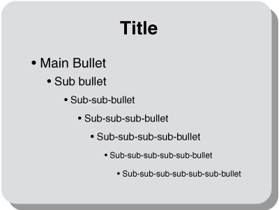
Some presenters are not satisfied with one level of bullets, so they use sub-bullets, thinking this will enable them to elaborate on their ideas. Sometimes two levels don’t seem to be enough, so they use sub-sub-bullets. Occasionally, presenters completely surrender to temptation, and they go deeper, and deeper, and deeper, and deeper . . . all the way down into the right-brain basement (see Figure 7.6). The trouble is that most audiences can’t follow the presenter’s thought patterns that far down.
Do your audience a favor: Restrict yourself to only one sub-bullet level. A single level of sub-bullets (or no sub-bullets at all) keeps slides clear, crisp, and easy to read. It avoids forcing the audience into mental contortions as they struggle to track the presenter’s internal logic. Additionally, avoid the Morse-code effect by eliminating symbols for sub-bullets. Use only an indent to create an offset. Less Is More.
Avoid the Morse-code effect by using no symbols for sub-bullets. Use only an indent to create an offset.
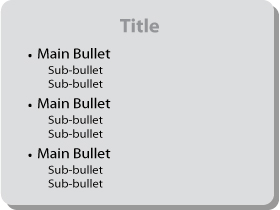
If you do use sub-bullets, put the same number of sub-bullets under each bullet, as shown in Figure 7.7. If the first bullet has two sub-bullets, then every other bullet should have two sub-bullets. The resulting symmetry creates a balanced image, as well as the message that your ideas are logical. The visual organization creates the subliminal message of Effective Management.
Now for some stylistic techniques that apply to all text slides, whether they contain bullets or sentences. These are seemingly minor points that your audience may never consciously notice, but have a definite subconscious impact on them and on how they perceive your slide, your message, and therefore you. Follow these simple and straightforward style guidelines whenever you create text slides.
This is a grammatical and stylistic point that surprisingly few people understand. The use of an apostrophe plus “s” (’s) to mark the plural form is simply bad English. An apostrophe plus “s” should be used only for contractions (words from which one or more letters have been dropped, such as I’ll, can’t, you’d, and he’s) and possessives (such as IBM’s new chairman, the company’s headquarters).
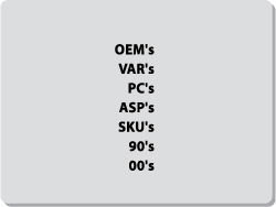
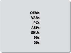
Nonetheless, many people mistakenly use an apostrophe plus “s” in plurals, especially when pluralizing acronyms or numbers, as shown in Figure 7.8.
This approach can compound the grammatical mistake by leading to momentary confusion and more work for your audience. Consider the following sentence:
The first DVD and VHS references are plural, so they don’t need an apostrophe. The second references are possessive, so their apostrophes are correct. The incorrect apostrophes will confuse the reader.
Using acronyms is risky, because they may be unfamiliar to part of your audience. If you do use an acronym, the correct way to turn it into a plural form is with a lowercase “s” and no apostrophe. The same applies to a number or to any other word that needs to be expressed as a plural, as shown in Figure 7.9.
If you do use an acronym, the correct way to turn it into a plural form is with a lowercase “s” and no apostrophe.
Actually, you can and should avoid using an apostrophe plus “s” at all in your presentations. Although an apostrophe plus “s” is grammatically correct for possessives, you can exercise literary license in the interest of Less Is More. Eliminating an apostrophe plus “s” eliminates extra characters and makes the text easier to read and comprehend. Consider the difference between “IBM’s New Chairman” and “New IBM Chairman.”
Most graphics programs, including Microsoft’s PowerPoint, provide dozens of different type styles, known as fonts. Some cost-conscious presenters seem to think, “We’ve paid for all these fonts, so we should use all of them.” The result is a slide that looks like a ransom note, as shown in Figure 7.10.
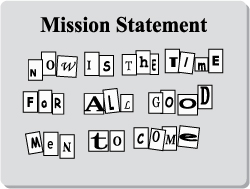
For all your text slides, resist the temptation to get too creative with font choices. Use two or, at most, three different type styles for a single presentation. The result will be a unified look and feel that conveys a clear, consistent message.
One easy way to add creative styling and remain simple is to use one font style for titles and another for bullets. Another is to use two sizes of the same font, a larger one for titles and a smaller one for bullets. You can add further styling by choosing one color for titles and another for bullets, or you can make one of your choices an italic version of the same font. Less Is More is particularly applicable when it comes to typographic choices.
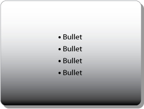
Let’s say you’ve followed the four-by-four rule for your bullet slide, and it looks like Figure 7.11.
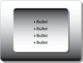
See the problem? All the bullets are bunched up in the top half of the slide, leaving the bottom half empty. This imbalanced design has the secondary negative effect of setting up an anticipation that will not be resolved. Are there more bullets? You can easily remedy this problem with proportional spacing: Distribute the bullets evenly over the entire slide, as shown in Figure 7.12.
Many business presentations are supported by a collection of slides that are only text . . . no pictorial, relational, or numeric slides at all. Not only does this border on the Presentation-as-Document Syndrome, it looks bland and boring. Twenty all-text slides in a row can produce the MEGO effect.
Furthermore, reading an all-text slide feels like hard work, even when the slide is designed according to the previous principles. Figure 7.13 is an example.

There’s nothing wrong with this slide, but it’s certainly not interesting or even visually appealing.
You can add styling to an all-text slide like this without adding or subtracting a single letter. The secret is to use the simple design tools that are included in Microsoft PowerPoint. Figure 7.14 shows an example.

By embedding text in boxes, and giving the boxes lines and shadows, you create a much more attractive and interesting version of the slide. It also makes the information easier to read. Grouping related items visually reduces the interpretive work your audience must do to follow the flow of your ideas.
Microsoft PowerPoint provides a wealth of design options for adding styling to your text slides with a vast array of shapes, colors, elements, and formats. The Office 2007 version of PowerPoint has a new feature called SmartArt graphics in which many different style effects can be applied simultaneously with a single mouse click.
You can also create emphasis by using a manual technique called reverse out, which sets off a headline from the rest of your text by reversing the background and font colors, as shown in Figure 7.15.
You can also enhance the design of the background by adding stripes, borders, edges, and cornices. There are so many interesting design options that it would be easy to get carried away. For example, one option is gradient shading, as shown in Figure 7.16.
This looks cool at first. But then you realize that it’s difficult to read the last bullet. Not to worry; there’s always another bell or whistle in the graphics toolbox. You can add a double gradient, as shown in Figure 7.17.
But now you realize that you can’t read the first bullet!
The point here is the same as with font choices: Remember the Less Is More principle. Many presenters get carried away with the plethora of fancy graphic toys available to them. Choose one or two graphics effects that will enhance the clarity and attractiveness of your slide design, and use only these throughout your presentation. Select a limited color palette, two or three colors at most, to complement the colors in your company logo, and use them consistently. For example, if you use a gold border and a royal blue headline on your first slide, then every slide should contain a gold border and a royal blue headline.
Choose one or two graphics effects that will enhance the clarity and attractiveness of your slide design, and use only these throughout your presentation.
Finally, optimize all your text slides by observing the following simple guidelines.
- Create a consistent look and feel, and maintain it throughout.
- Be consistent in your choice of font, as well as in your choice of case.
- Keep font size to a minimum of 24 or 28 points.
- Avoid abbreviations at all costs.
- Add shadows and bolding to make all text more legible.
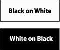
- Use sharp contrast: light text on a dark background, or vice versa.
- Insert your company logo, but don’t make it look like a neon sign; treat it instead as a watermark, with a subtle, embossed effect.
- Avoid the clutter caused by recurring slogans, datelines, copyrights, and the ubiquitous “Company Confidential” warning in the periphery of every single slide.
- Use blank space. You don’t have to fill every nook and cranny of every slide with information. Costly newspaper advertisements often use valuable white space to set off text. Look at them, see the difference, and follow their example.
You’ll notice that I haven’t mentioned the differences between serif and sans serif fonts, or text justification right, left, or center. These typographic fine points are matters of individual taste, and as the Latin proverb tells us, De gustibus non est disputandum (There’s no arguing taste).
Follow the preceding guidelines, and your text graphics will be simple, consistent, and logical, reinforcing the subliminal message of Effective Management.
In the next chapter, you’ll see how the same basic principles that create winning text graphics also apply to numeric graphics.