35. What Color Is Your PowerPoint?: Contrast Counts
The previous chapter about serif and sans serif font concluded with the Latin phrase De gustibus non est disputandum, or, “There is no argument about taste.” The phrase is even more applicable, if not indisputable, when it comes to color choice. Well, almost indisputable, for there is a single unavoidable consideration that transcends the taste of any presenter or presenter’s designer: the audience’s ability to understand the graphic.
A simple one-word rule, applicable to every element of every graphic, will make it easy for every audience to understand your every slide. That one word is contrast. A simple way to implement contrast is to reference the classic color wheel, which is divided into two halves: warm colors and cool colors. The warm colors are the yellow/orange side of the wheel, and the cool colors are the blue/green side. By choosing a warm color as the background and a cool color as the foreground, or vice versa, you achieve contrast by default.
Yellow against blue or blue against yellow provide one of the sharpest contrasts you can create, a fact borne out by the U.S. Navy. During World War II, when aircraft carriers came into large-scale use, the greatest challenge was landing the fast-moving warplanes on the decks of the bobbing ships; a challenge heightened by the limited visibility of the blue of the sky and the blue of the sea that framed the gray ships. To assist the pilots as they approached the carriers, a flight director stood on the deck’s landing strip and gave visual signals. These flight directors wore yellow life vests that made them stand out clearly against the blue sky and water.
(The colors of the life vests of other personnel were chosen more for relevance than contrast: red for ordnance, white for medical, green for maintenance, purple for fuel, and blue, the least contrast against the sea and sky, for personnel who handled the planes after they landed.F35.1)
Create your slides with sharp contrast between the foreground and background. In all the Power Presentations programs, our slides follow the fleet, with bright yellow foreground text that stands out clearly against a royal blue background.
Use any cool color/warm color foreground/background combination for your presentation. Or use white text against any dark background or black text against any light background. Boldface and shadowing your text sharpens the contrast even more. In fact, if you enclose your text in a shape, use a drop shadow on the shape to give it contrast.
One other important factor to consider regarding contrast is the gradient feature. Today’s PowerPoint and other graphics applications provide presenters with many bells and many whistles to create attractive slides. One of the most readily available and frequently used features is gradient shading. Many presenters and their designers, in their desire to prettify their slides, incorporate a gradient in their design. Admittedly, this feature provides attractive graphical texture, but it makes some elements hard to discern. As you can see in Figure 35.1, the first bullet does not contrast with the darker part of the gradient and is difficult to read. If your audience wants to look back that bullet, they would have to squint.
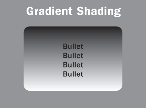
Figure 35.1. Beware of Gradient shading.
So let’s conclude with the converse of a phrase you’ve seen often in this book:
Make it hard for your audience, and they will make it hard for you.