In the past two chapters, we focused on designing slides that convey information clearly and effectively. You’ve drilled deep into many details about everything from font styles to graph labels. Now it’s time to take a step back and return to one of the earlier concepts in this book: specifically, to flow.
Every communications medium has its own techniques for helping its audience remain oriented and follow the flow. Think about text, where the reader is the audience to the writer. In a book, a magazine, a newspaper, or a printed report, the designers and editors provide the reader with many tools to help track the writer’s flow: the table of contents, the index, and the running heads along the top or bottom of the page. Even more important, the reader has the luxury of random access to the writer’s material. The reader can navigate through the text independently by visiting and revisiting the table of contents or the index, and by flipping backward and forward as often as needed to follow the overall flow. Think of Russian novels, where all those multiple names and nicknames of the characters are listed up front. Think of plays where the Dramatis Personae, or cast of characters, precedes the first scene. Through long practice, readers are accustomed to steering through the structure of written texts on their own.
Presentations are different. In a presentation, the audience can access the presenter’s material only in a linear fashion: one slide at a time, one spoken sentence at a time, and all this under the presenter’s control. Once a slide disappears from the screen, it’s gone forever. The audience doesn’t have the opportunity to flip back and forth at will to clarify the presentation’s flow.
Just as in the telling of the presentation story, the audience receives the visual content at the level of the trees. And, just as in the telling of the story, the presenter’s job is to rise up from the trees and give the audience a view of the entire forest. As always, the presenter’s job is to navigate the audience’s minds, but the presenter can also navigate the audience’s eyes.
The Flow Structures in Chapter 4 and Telling ’em what you’re gonna tell ’em in Chapter 5 can help your audience follow your flow, but both of these are purely verbal techniques. Graphics can help express flow, too. You can design your slides to convey the connections among your ideas. You can use a set of simple visual tools to create continuity and to help your audience track the overall logic of your presentation.
Before introducing these tools, however, it’s important to step back and check the flow of your presentation, to examine it as a whole, by taking a 35,000-foot overview. One valuable tool to do this is the Storyboard Form, illustrated in Figure 9.1.
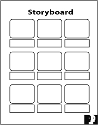
Television and film directors use storyboards to plan their end products, whether it is a 60-second commercial or a multimillion-dollar special-effects epic. They map out the camera angles of each scene and then envision how the individual scenes will combine into a whole sequence. We provide our Power Presentations clients with a paper version of the storyboard as part of our programs. (You can download a copy of this form by visiting our website, www.powerltd.com.) The Microsoft PowerPoint version of this aspect is called Slide Sorter view. Both options provide a panoramic view of your story.
This view lets you see all the slides for a given presentation at a glance, a perspective that minimizes your focus on details and offers a broader outlook of the landscape. It’s an efficient planning tool that helps you check the progression of your story. Note that there is also a small rectangular box beneath each slide image where you can enter notes on your narrative, further clarifying your flow.
Figure 9.2 illustrates how the panoramic view works. Look at your slides in the Storyboard Form. See them in groups, reflecting the Flow Structure you chose for your presentation. In this example, the presentation includes four parts: an Introduction, an Opportunity section, a Leverage section, and the Conclusion. Each section is supported by a group of slides, and within each section, every slide should fit logically into place.
When you scan slides in this view, it should become evident when some slides don’t fit where you’ve placed them. You may want to shift them to a different part of the sequence; or they may be extraneous, in which case, you might want to eliminate them altogether. The connection between any one part of the presentation and the next should also be clear. If it isn’t, you might want to rethink your sequence. You could add, delete, or shuffle slides so that the logic is evident; or you might even try a different Flow Structure.
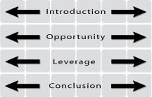
The ultimate technique for checking your flow is to read only the titles of your slides, as shown in Figure 9.3. If you can trace the logic of your entire presentation by reading these few words, bypassing the bullets, graphs, or other content, you’ve created clarity. A presentation that achieves this inner logic makes it easy for your audience to follow and easy for you to deliver. In Microsoft PowerPoint, you can use either the Slide Sorter or the Outline view to read only the titles.
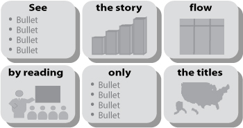
Once your verbal logic is clear, you can turn to graphics to help communicate your flow. Well-designed graphics not only convey information clearly and attractively, they also help establish the connections among ideas. Again, the panoramic view offers an excellent perspective on the flow of your presentation. If the continuity of your graphics is not apparent, it might look like Figure 9.4.
Try to scan this storyboard from slide to slide. Because no two slides look alike, the presentation begins anew with each slide, forcing you to adjust repeatedly to new content, new form, and a new look. Now think of your audience. Without the luxury of the panoramic view, they will see only one new slide at a time, and they will be forced to work even harder to adjust to each new content, new form, and new look. By the end of the presentation, they will be exhausted and, most likely, confused. Don’t make them think!
There are five proven graphics techniques that you can use to help express the flow of your presentation in your slides. Let’s look at each of these techniques, along with illustrative examples drawn from actual business presentations.
The first continuity technique, and the simplest, is the Bumper slide. This technique is drawn from the field of publishing. Look at any lengthy nonfiction book. You’re likely to find that it is divided into chapters and parts. Most often, each part is separated from the next part by a full page containing only the part number and a title.
The purpose: closure of the outbound section, and a lead into the inbound section. The advantage: The reader’s mind is cleared of the last subject and primed for the next. In a presentation, the Bumper slide signals a transition to a new section. Think of the Bumper slide as the sorbet that is served between courses of a fine meal to cleanse the palate.
Figure 9.5 shows the simplest and most effective form of the Bumper slide. It contains a single line of text (remember: Minimize Eye Sweeps by avoiding wordwrap). That one line previews the contents of the next section of the presentation. For example, you might have Bumper slides reading “Market Opportunity,” “Unique Technology,” “Industry Leadership,” and “Business Results,” each of which would serve to introduce a set of ensuing slides covering each of these topics.

To differentiate the Bumper slide from all the other slides, center the text both horizontally (left to right) and vertically (top to bottom).
A simple image or symbol could also serve as a Bumper slide. It could be your company logo, an image relevant to the theme of your presentation, or an icon that suggests the content of the subsequent portion of the presentation.
You can also use your agenda as a Bumper slide (see Figure 9.6) and, with it, track the overall outline of your presentation. For this approach, each Bumper slide displays the complete agenda with the upcoming item highlighted . . . as opposed to dimmed, which causes your audience to squint.
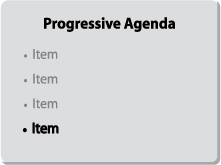
The Bumper slide tells your audience exactly where they are in the presentation, as well as where they’ve been and where they’re going. Think of this as a progressive agenda. A caution: Use this approach only with longer presentations . . . say, 30 minutes or more. In shorter presentations, if you reprise your agenda after just one or two slides, your audience will feel patronized. They might say to themselves, “I got it! You don’t have to remind me!”
In longer and more complicated presentations, your audience will appreciate these milestones. Here’s an example from the world of biotechnology:
In 1999, Dr. Jacques Essinger, the CEO of Modex Therapeutics, a Swiss biotech company focused on cell therapy, engaged me to help him and his team develop their IPO road show. The company went public the following year on Switzerland’s equivalent of the NASDAQ, the Nouveau Marche (SWXNM), and it performed very well. In 2002, Modex merged with IsoTis and now operates under the name IsoTis Orthobiologics, listed on the Zurich, Amsterdam, and Toronto stock exchanges.
In mid-2001, the biotech sector in general, and growth companies like Modex in particular, fell out of favor with investors, and Modex’s share price dropped. Jacques formulated a new strategy to acquire additional related technologies that could produce more revenues. When the acquisitions were done, Jacques called on me to help him prepare a new presentation to announce the new strategy to the Swiss financial community.
Since the focus of this chapter is graphic continuity, I’ll discuss only the heart of Jacques’ presentation, where he wanted to describe his newly expanded core business to his potential new investors, none of whom was a biotech scientist.
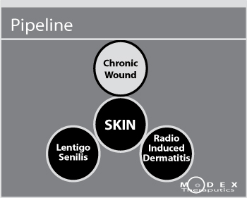
Jacques had a very crisp and strong opening sequence at the front end, and two brief sections on strategy and finance at the back end, but the core of his presentation is an exemplary illustration of the use of Bumper slides. He started by identifying Modex’s original and continuing focus on skin with a simple circle, as shown in Figure 9.7.
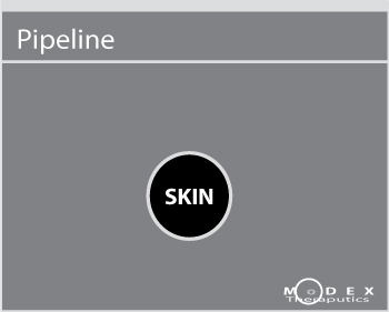
Then, using the Microsoft PowerPoint animation feature, he sprouted three smaller circles from the main circle, as shown in Figure 9.8. The movement of the smaller circles expressed the broadening of Modex’s original business model from skin to related indications. This graphic expansion thematically represented opening a pipeline to potential new revenue sources. This Bumper slide also established the agenda for the material to follow.
In his narration, Jacques described how he planned to cover each of the skin indications in the same order. If this sounds familiar, it is a composite of the Form/Function and Parallel Tracks Flow Structures, expressed graphically.
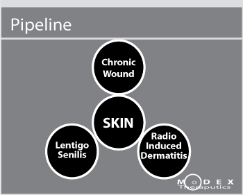
Then, using highlighting (see Figure 9.9), Jacques moved into the first indication, Chronic Wound.
Jacques then drilled down into the Chronic Wound topic for a total of 18 slides, most of them as simply constructed as the Bumper slide. For instance, he used a pyramid to describe the various layers of the market. The pyramid appeared in a five-slide sequence, and again later within the segment as a three-slide sequence. Two of the slides were pictures, two were bar charts, and two were boxes with minimal text, laid out to indicate related information. Only four of the 18 slides in this entire sequence were text. This was certainly not a Presentation-as-Document.
Now Jacques was ready to shift to Radio Induced Dermatitis, and he did this by returning to his Bumper slide and shifting the highlighting to the new circle, as shown in Figure 9.10.
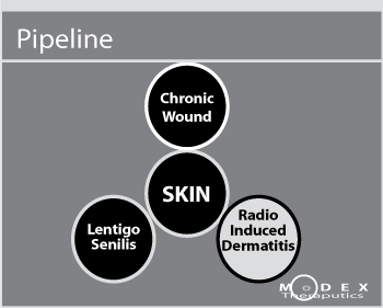
He covered the Radio Induced Dermatitis topic in a five-slide sequence. Then he came back to his Bumper slide and shifted the highlighting to the last indication, Lentigo Senilis, as shown in Figure 9.11.

Note that there are a sufficient number of slides between Bumper slides to warrant their repetitive use without appearing patronizing.
Jacques covered Lentigo Senilis in another five-slide sequence, two of which were pictures and three of which were text. By then he was done with his core business and was ready to move into the home stretch of the presentation.
While Modex’s story is a complex one with many supporting details, Jacques’ use of consistent graphics, linked and united by Bumper slides, made the story clear and easy to follow.
Indexing/Color Coding is the second Graphic Continuity technique that helps you navigate through longer presentations. While Bumper slides appear intermittently, Indexing uses a recurring object that is highlighted with different colors or shades coded to map the different sections of your presentation. This approach helps your audience track your flow with a minimum of effort on their part . . . as well as yours.
This technique is often used in extensive technical presentations that have multiple sections, each of which is covered in deep, granular detail. The best way to portray this technique is with the simple example of a four-part strategy, depicted in Figures 9.12 through 9.15.
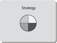
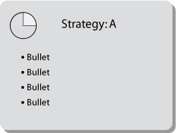
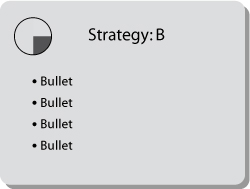
This company’s four-part business strategy is represented by a pie icon divided into four different-colored wedges, as shown in Figure 9.12. If you were the presenter, you would show this slide near the start of your presentation to describe and discuss your overall strategy. When focusing on the first strategy element (Strategy A), you would shift the pie icon to the upper-right corner and highlight one wedge, using its signature color, as shown in Figure 9.13. You would then add details about this part of the strategy in the bullets. As a result, the pie becomes clearly identifiable as an index.
The next slide (see Figure 9.14) moves on to the second part of the strategy. The highlight in the index shifts to the second pie wedge and its signature color. The explanatory bullets change, providing you with discussion points on which to elaborate.
You can already anticipate the progression of the next two slides. The highlight will shift to each of the next two wedges in turn, coming around the horn to complete the circuit. Using the Indexing/Color Coding scheme makes it easy for your audience to stay with your flow. It also creates the subtle, subliminal psychological dynamic of raising expectations and meeting them. Your audience knows that the third and fourth pie wedges will soon appear on the screen, and when the color shifts, exactly as they expected, they feel a sense of resolution and satisfaction.
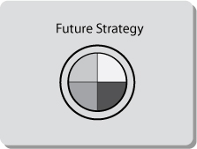
Now let’s jump ahead to the end of the circuit, where, in Figure 9.15, all four parts of the strategy are reprised in the large pie, with all the colors at their full original value. With this slide, you could summarize the strategy and then, by extending the pie with a ring, go on to describe future strategic directions, thus adding value.
This sequence of slides serves as a series of guideposts, visually supporting your narrative as you navigate through all the stages of your presentation and lead your audience to your conclusion.
The third Graphic Continuity technique is Icons. These are symbols that express relationships among the ideas of your presentation. Icons indicate these connections in a shorthand form that your audience can grasp quickly and intuitively. Since Icons are pictorial, they meet the Less Is More criterion by default. Icons also provide relief from the Presentation-as-Document Syndrome, with its extended series of text-only slides. Well-chosen Icons make an excellent presentation tool.
Here are some classic Icons and how you might use them to help illustrate the content of your presentation:
In Chinese cosmology, yin and yang (see Figure 9.16) are the dual, contrasting forces whose combination gives rise to everything that exists in the universe. For Western audiences, the yin/yang Icon simply means “two-part harmony.” You might use a version of this Icon in a presentation whose theme is the integration of two forces: for example, when explaining the benefits of a merger between two companies or when presenting your firm’s two product lines and the complementary benefits they offer.

Many people subscribe to what is commonly known as the “rule of threes,” in the theory that three is an easy number to remember. If your story contains three key elements, you can pick one of a variety of triplex Icons to express them: the triangle, the trident, the three-legged stool, three interlocking arrows, or the three-ring Icon, as shown in Figure 9.17.
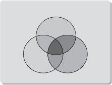
This image represents harmony among three items. You might use a version of this Icon when describing how three forces, groups, or units work together or combine in some way. For example, you could use it when presenting the story of a company that serves three distinct but overlapping markets or customer groups, such as businesses, government, and schools, or when describing a company’s three-pronged competitive strategy. If you chose this Icon, be sure to set two rings at the bottom, creating a stable image.
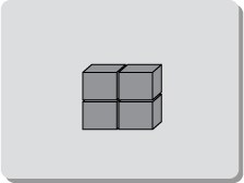
If your story contains four key elements, try the Icon shown in Figure 9.18, which suggests four-part harmony. You might use this in a presentation to describe four complementary products, four departments that work together (Sales, Marketing, Information Technology, and Customer Service), four elements in a strategic plan, or four markets in which a company operates (North America, South America, Asia, and Europe).
The pyramidal Icon shown in Figure 9.19 suggests a set of hierarchical relationships. It could represent layers of management in an organization; an array of products, ranging from those that are low-priced and mass-marketed (the bottom layer of the pyramid) to those that are high-priced and sold through specialty outlets (the top of the pyramid); or a sequence of concepts that build on a broad foundation and then on one another, culminating in the most advanced concept.
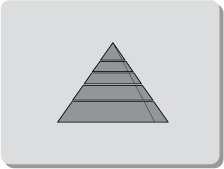
In Chapter 4, “Finding Your Flow,” you saw how a pyramid expressed a Spatial Flow Structure (please refer to Figure 4.1). In my own presentations and workshop programs, I describe the components of an effective presentation by starting with a solid story at the foundation of the pyramid, and then build up through each tier: graphics, delivery skills, presentation tools, and on to the top with Q&A skills. Think of the dozens of other Icons you’ve encountered, each with its own visual statement that can help illustrate your story.
Some companies, like Cisco, devote considerable effort to creating Icons. Given its complex technology, Cisco endeavors to make comprehension easier for its audiences by expressing that technology in images rather than text. A picture is worth a thousand words.
When Cisco launches a new product family, it carefully creates a specific graphic image to represent that family. The company expends even more effort to develop conceptual graphic images that represent industry-wide functions and processes. These conceptual Icons are so important that Cisco has established a set of specific guidelines for their creation.
Gary Stewart has been a technical illustrator for Cisco since 1991. He has overseen the creation of Icons that represent such universal networking technology elements as the router, the ATM switch, the network cloud, the firewall, the bridge, and the communication server, all shown in Figure 9.20.
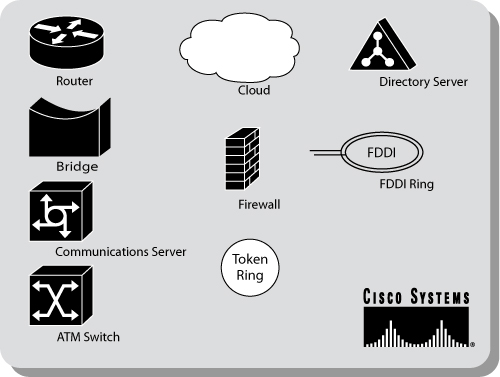
Over the years, Cisco has accumulated a full lexicon of Icons that they use in their presentations and literature. Cisco also makes these Icons available on a public domain site (www.cisco.com and search for “icons”). As a result, the symbols have become industry nomenclature as well as an enormous branding initiative for Cisco.
If there’s an Icon that captures and expresses the relationships among your ideas, consider using it throughout your presentation as a visual symbol for your audience.
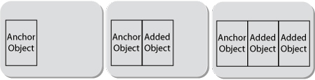
The fourth Graphic Continuity technique is called Anchor Objects, in which a recurring image appears in a succession of slides to express a continuing relationship. Where Index/Color Coding creates continuity with a recurring icon, such as a pie or a pyramid, the Anchor Object option creates continuity with a recurring image that is an integral part of the illustration. This image or object can be a photograph, a sketch, a map, an icon, a screen shot, a logo, or clip art.
Here, you begin a series of slides in which the first in the series contains the Anchor Object. In the next slide, this object remains in place and is joined by another object, establishing a relationship between the two objects. In the next slide in the series, the two objects remain anchored in place while still another object appears to join them. This visual succession expresses relationships among the objects and provides your audience with continuity.
Figure 9.21 shows how this works.
As you bring in new objects to join the Anchor, you can also create emphasis by highlighting with different colors or shading, or by adding borders. Another way to create emphasis is by enlarging any one object as a callout, or by adding depth with foreground or background elements. This next example illustrates this.
In Chapter 4, you read about Dr. Robert Colwell, one of the leaders of the engineering team that developed Intel’s next-generation integrated circuit, the P6. For the launch presentation at a technical symposium, Bob used a schematic diagram of the new chip, in basic black and white, as the Anchor Object to track the flow of his presentation.
In the slides shown in Figures 9.22 through 9.26, each slide is a visual variation on the one before. Building on the schematic diagram, Bob highlighted some of the objects by reversing the black and white, thus shifting the audience’s focus from one element of the chip’s design to another. As Bob navigated through his presentation, he also used enlarged callouts in the foreground.
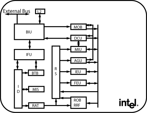
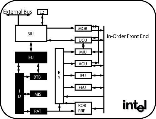
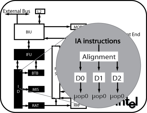
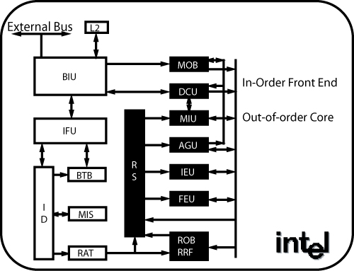
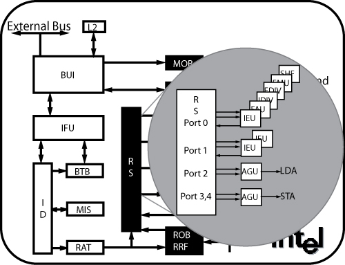
This simple graphical design provided a clear road map for a highly technical narrative. By the end of Bob Colwell’s presentation, not only did the audience of his peers have a clear understanding of all the key features of the new Intel chip design, they had gained a healthy respect for Bob and also for Intel.
Remember Bob’s postmortem: “I didn’t get any of the hardball questions I was worried about . . . I wonder if maybe potential hostile questioners were holding back, for fear of ‘losing’ the argument to somebody who appeared to have done his homework and seemed thoroughly in control of the proceedings.” Bob’s graphics certainly contributed to that perception.
The final Graphic Continuity technique is called Anticipation Space, and it is drawn from the cinema. Here’s how it works:
Imagine that you’re watching a film. In one particular scene, one of the characters is seen in close-up, his face virtually filling the screen. After a moment, the camera widens out slowly, leaving the man in the left corner of the screen. While the man remains visible, we can now see the background. The setting is a cafe, and the man is sitting alone at a table. What do you anticipate?
When I ask my clients this question, they invariably respond, “Someone or something will enter the scene.” And when I ask why, they say, “To fill the empty space on the right side.”
Of course, they’re correct. Years of watching movies and television have conditioned us to recognize that when an empty space appears on the screen, that space will be filled. In our imagined movie scene, the man’s lover would appear and take the seat across the table from him.
The same sense of audience anticipation can be created using simple graphics in a business presentation. Look at Figure 9.27.
What do you anticipate when you look at this slide? Of course, you expect the empty space on the right side of the slide to be filled. More specifically, you expect four items to appear, to correspond to the four items on the left side. Four is the only possible number. Three items would disappoint you; five would confuse you.
The only possible slide to follow Figure 9.27 is the one shown in Figure 9.28. This slide answers our questions, satisfies our expectations, and fulfills our anticipation. The subliminal message: Our company promises, and it delivers.
Anticipation Space is a simple but visually powerful technique, and another instance of subliminally managing your audience’s minds.
Here’s how one company used Anticipation Space to illustrate an Issues/Actions/Matrix/Parallel Tracks Flow Structure: The company had faltered and was attempting a turnaround. It brought in a new management team that decided to reposition the entire business model. They called on me to help them develop a presentation to describe the turnaround strategy to their employees, investors, and other concerned stakeholders.
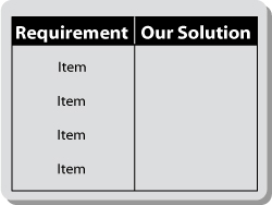
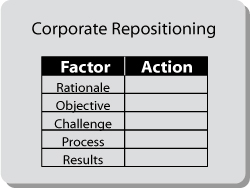
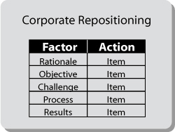
The new team identified five factors they had to address to reposition the company. For their first slide (see Figure 9.29), they designed a matrix that listed the five factors on one side, leaving corresponding blank spaces on the other side for the actions they planned to take, setting up the anticipation.
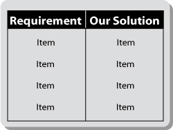
In the next slide (see Figure 9.30), they filled the empty spaces with an action item for each factor. Thus, the anticipation was resolved.
Using the same format, they continued on to another slide to discuss their corporate identity. They listed the factors they had to address on the left and then filled in the spaces on the right with actions they intended to take. On a third slide, following the same Parallel Track, they used the same format again to discuss their product positioning. Again, they listed the factors on the left and filled the spaces on the right with the actions they intended to take.
Those three slides, flanked by an Opening Title slide and a Closing Title slide, served as the basis for their entire presentation, as shown in Figure 9.31.
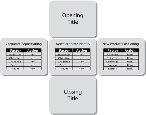
Simple? Yes, especially when you consider that the new team had arrived for their session with me with 48 all-text slides! The revised five-slide presentation served as a simple and vivid snapshot of their plan to execute their turnaround strategy.
To recap, the five Graphic Continuity techniques are:
- Bumper slides are the graphic dividers inserted between major sections of this presentation to serve as clean, quick, and simple transitions.
- Indexing/Color Coding uses a recurring object as an index, highlighted in different colors to map the different sections of a longer presentation.
- Icons express relationships among ideas with recognizable symbolic representations.
- Anchor Objects create continuity with a recurring image that is an integral part of the illustration.
- Anticipation Space uses empty areas that are subsequently filled, setting up and then fulfilling subliminal expectations.
These five simple Graphic Continuity techniques can have a major impact on the clarity and coherence of your presentations. Artfully used, they can make even a long, complicated story easy for your audience to absorb and remember.
Let me pose a question. Throughout this entire chapter, and in the previous three chapters on graphics, I haven’t mentioned Point B or the WIIFY once; while, throughout the earlier part of this book, I repeatedly stressed their importance. Where in the Storyboard, or on which slide, do you think you should put your Point B and your audience’s WIIFY?
The answer is nowhere. Point B and the WIIFY don’t appear on any slide. They are stated by you, the presenter. You tell your story; your slides do not.
I asked this as a trick question to reinforce the concept of Presenter Focus. The slides are not the presentation; they are simply presenter support. It is you, the presenter, who must grab your audience at Point A, navigate them through all the parts, and deposit them at Point B.
Imagine a company CEO, in a presentation to an audience of potential investors, showing the slide in Figure 9.32.
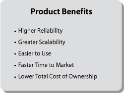
After discussing the various product benefits listed in the slide, the CEO could summarize by saying, “You can see that our product provides a rich set of benefits to our customers,” and then move on to the next slide. That, however, would be an opportunity missed.
Instead, the CEO should add: “This rich set of customer benefits produces repeat business for our company. Repeat business translates into recurring revenues. Recurring revenues translate into shareholder value, and an excellent investment opportunity.”
That statement contains both the WIIFY and Point B, neither of which appears on the slide. By coming from the presenter, the presenter leads the audience to a conclusion. That conclusion is Aha!
Let’s recap what you’ve learned about presentation graphics in the past four chapters:
The overarching principles that govern all graphics are Presenter Focus, Less Is More, and Minimize Eye Sweeps. All of these principles are particularly important in creating text and numeric slides.
Mix and match text and numeric slides with the other two major graphic options, pictorial and relational slides, to avoid the dreaded Presentation-as-Document Syndrome. Use all these elements to craft the slides that will express your story in a Storyboard Form.
The Storyboard is the 35,000-foot panoramic view of the entire presentation. Microsoft PowerPoint’s Slide Sorter view provides this panoramic aspect. The Storyboard enables you to check that the graphics convey the sequence clearly. If the transitions from slide to slide or section to section aren’t clear, consider reorganizing your slides, or crafting strong verbal transitions to make the logic apparent in your narration.
Finally, use the Graphic Continuity techniques, Icons, Indexing/Color Coding, Anchor Objects, and Anticipation Space, to help navigate your audience through your presentation. Use Bumper slides to help the flow by creating clear transitions between topics.
These tools can ensure that everyone in your audience understands exactly where he or she is at all times, as well as how any given slide fits into the overall flow of the presentation.
Figure 9.33 shows the Storyboard Flow Form. It combines the Story Form (from Chapter 5, Figure 5.2) with a Storyboard, relating all the preceding techniques in one integrated view. By combining a well-constructed story that has a clear beginning, middle, and end with the slide layout, you can see how to express your entire presentation. This is the ultimate forest view.
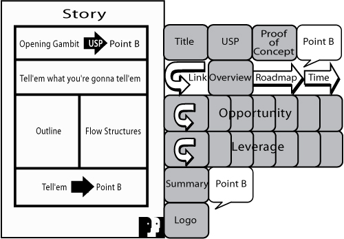
By combining a well-constructed story that has a clear beginning, middle, and end with the slide layout, you can see how to express your entire presentation.
The form provides a useful guide for putting together all your essential elements. Notice that I’ve left the slides blank. They contain only high-level concepts and dynamic inflection points so that you can focus on the flow. Here’s how it works:
- The Opening Title slide is the background for the Opening Gambit, which links to:
- The Unique Selling Proposition (USP) slide, which links to:
- The Proof of Concept slide, where the linkages culminate in a spoken Point B.
- This is followed by the all-important (and often overlooked) forward link to the Overview slide, which serves as a preview of the entire presentation. This is followed by another forward link to a statement that the Overview serves as a road map, or an agenda, which is then followed by a forecast of the time. Then, we return to the top of the road map to begin the presentation.
The narration then navigates through all the slides in the full body of the presentation. In the example in the figure, the Opportunity/Leverage Flow Structure organizes all the slides. Upon concluding the body, move to:
- The Summary slide, which recapitulates the entire presentation and concludes in a spoken Point B.
- The Company Logo slide leaves the audience with the brand image of your company, reinforcing your Point B (I see and I remember).
Here’s how Carol Case, the salesperson from Argus Insurance, applied the Storyboard Flow Form to combine her narrative with her slides:
- Over her Title slide, Carol delivered her Opening Gambit anecdote about the Argus customer whose home burned down. Then she continued with her link: “Our customer is like many customers who purchase a basic policy not customized to their individual needs. He now realizes that means being just one step away from disaster. Luckily, we at Argus Insurance have a solution.”
- Clicking to her USP slide, Carol continued: “Argus can provide you with a customized, value-added package of insurance that provides for your individual needs to protect you against serious financial loss.” She linked to her Proof of Concept over the same slide: “Maybe that’s why Argus is one of the fastest-growing insurance brokers in the state.” Continuing with the same slide, she delivered her spoken Point B: “I know that you’ll want to take advantage of the opportunity and sign up for this important coverage today.”
- Clicking to her Overview slide, Carol then linked forward from Point B: “So that you can consider signing with Argus . . .” Then she ran through the bullets of her Overview slide and concluded by saying: “Please consider this a road map for the next 15 minutes of my presentation. Let’s begin at the top.” Please notice that Carol did not refer to her Overview as a road map until the end of the slide, thus making the Overview an extension of her Point B as well as adding further continuity.
The Storyboard Flow Form provides the 35,000-foot overview of your presentation, which in turn enables you to convey a clear sense of continuity and flow to your audience. When you feel in command of your material, you communicate a sense of confidence to your audience and heighten the power of your presentation.