Company Example
- Microsoft PowerPoint
What comes to mind when you see the word “animation”? Maybe a vintage Bugs Bunny short or a more recent full-length feature, such as DreamWorks’ Shrek or Pixar’s Ratatouille or WALL-E. In the context of business presentations, animation refers to motion added to computer graphics. This movement can involve either an entire slide or the visual elements within a slide. In animation, these elements move onto or off the screen; or shift within the screen; or grow, shrink, change, or vanish.
We’ve all seen varying degrees of electronic animation in business, from the sophisticated sequences that appear on websites to the equally sophisticated presentations at industry conferences and trade shows, many of them worthy of Disney or Pixar. Often, even conventional prepackaged corporate pitches have screen effects that rival the production values of the big-tent special events.
Most of these examples of animation are created by professional graphic artists and technicians using complex software, such as Adobe Director or Flash. Professional artists also use Adobe Photoshop to render objects and images in vivid, opulent detail for animation as well as for conventional presentations.
For the rest of us, the vast universe of consumers, there is Microsoft PowerPoint, which is installed on hundreds of millions of computers that churn out 30 million presentations per day.
This ubiquitous software, launched in 1987, has been growing its market share with each successive release, and now it is standard operating procedure for business presentations. How often have you been asked to send someone a copy of your PowerPoint slides? How often have you sat next to someone on an airplane clicking through his or her slide show? PowerPoint has also reached beyond business into our daily lives. Even elementary schoolchildren use it expertly.
Yet, as a presentations coach, one of the most frequent complaints my business clients make is, “I’m not a graphic artist!” As a result, they default to the Presentation-as-Document Syndrome. But, as you discovered in Chapters 6 through 9, by simply going beyond text to pictorial, numeric, or relational images and applying the principles of Less Is More and Minimize Eye Sweeps to those images, you can create graphics that are both interesting and effective.
Creating animation for those graphics, however, can be daunting. We’ve all been in the audiences of far too many presentations that unleash all the bells and whistles of the animation in PowerPoint with a frenetic, pyrotechnic display that challenges a Fourth of July celebration. This phenomenon is like putting a 14-year-old boy behind the wheel of a Ferrari Testarossa.
This situation reached epidemic proportions in the military. Pentagon officers were launching so many PowerPoint-powered animated tanks and whirling pie charts in their slide shows that the chairman of the Joint Chiefs of Staff was driven to issue a directive demanding simplicity in Defense Department presentations.
It would seem that military personnel, as well as businesspeople . . . basically conservative segments of the population by nature . . . should be aware that flashy animation projects a negative image. And yet, business presentations that look like MTV videos are as common as car crashes in Hollywood movies . . . and just as irritating.
The reason that businesspeople perpetrate this graphic assault on their audience’s visual senses is because these presenters have learned the how-to of animation, but not the why and wherefore of its application. The computer sections of bookstores abound with worthy PowerPoint books. The Web, television, newspapers, and magazines abound with equally worthy courses and courseware that provide excellent instruction about how to operate and navigate the software. None of them, however, tells you why, where, and when to use animation, and particularly, not what effect animation should or could achieve. You’ll find those answers in this chapter.
Why use animation at all? As a conservative businessperson, you might think that animation is irrelevant, frivolous, or unnecessary. “I’m not up there to entertain people,” you might say. “When I’m making a presentation, people just want the facts, plain and simple. Fancy gimmicks will just take away from my message.”
You may be right. Any visual aid can indeed become a visual hindrance when it’s misused, resulting in distraction, annoyance, or confusion in your audience. So it is with animation. But any sword can cut both ways.
The word “animation” comes from the Latin root anima, which means “spirit” or “life,” just as the word “animated” describes a lively or energetic person. Animating the graphics in your presentation can add a sense of spirit and life to what might otherwise be a flat visual display.
Even more important, well-designed and appropriately applied animation can actually enhance your message. Just as you can create text, pictorial, numeric, and relational slides to express your important concepts, you can also strengthen that expression by adding animation to bring graphic objects on or off the screen meaningfully. The right animation can make your presentation more visually appealing, transforming it from the merely good to the truly captivating . . . and therefore persuasive.
The right animation can make your presentation more visually appealing, transforming it from the merely good to the truly captivating . . . and therefore persuasive.
The answers to the wherefore of animation can be found in intrinsic human perception and in cinema, the same sources that provided the fundamentals for the design of presentation graphics that you saw in the earlier chapters. The core principles of cinematography and editing are even more relevant in animation. What follows is an extrapolation of those well-known, innate, and well-established professional principles into a simple set of guidelines that you can apply to animate your PowerPoint presentations. We begin with the human factor.
The operative rule for designing animation effects goes back to Ludwig Mies Van der Rohe’s Less Is More principle. Simplicity is the watchword for the graphics in any presentation, and that applies to animation as well. Moreover, whenever motion is involved, we must also keep in mind the cultural, psychological, and neurological factors that influence how people perceive and process visual cues.
In Chapter 6, “Communicating Visually,” you read that psychologist and art historian Rudolf Arnheim, in his book Art and Visual Perception: A Psychology of the Creative Eye, described the tendency of the human eye to move across a visual field from left to right. This innate effect is further heightened in Western cultures. Text in Western languages (including English) is printed from left to right. These predispositions have a profound impact on how all human beings . . . including presentation audiences . . . perceive visual stimuli. Whenever our eyes move from left to right, the information we absorb feels “natural,” “normal,” “smooth,” “easy,” and “positive.” Many of the visual arts follow this same path:
- On the stage, protagonists usually move to the right (sympathetic movement), and villains move to the left (asympathetic).
- In the cinema, a pan right is positive and fluid; a pan left is negative and drags.
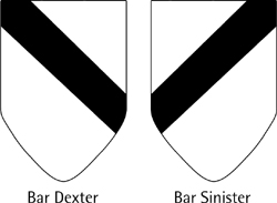
- In heraldry (the design of coats of arms), a crest that has a diagonal bar slanting down to the right is known as a Bar Dexter (from the Latin dexter, meaning right) and is said to represent legitimate members of a family. A crest that has a diagonal bar slanting down to the left is known as a Bar Sinister (from the Latin sinister, meaning left) and is said to represent a bastard. Although heraldic scholars debate the validity of these meanings, by looking at Figure 12.1, you can readily see that the Bar Dexter flows easily, whereas the Bar Sinister drags backwards.
- Even language echoes our innate preference for the right side: dexterous means skillful or capable, whereas sinister means evil or malevolent.
For these reasons, if you want your presentation audience to feel positive about your ideas, your animation should follow the natural, reflexive eye movement: left to right. Of course, if you want to send a negative message . . . say, about your competition . . . you should reverse direction, and move your objects right to left. But do it deliberately; don’t send mixed signals by delivering a positive message about you or your business by making a negative move. As you will see in this chapter, motion can induce a variety of other psychological perceptions. Because the greater part of any presentation is about you or your company, send positive messages; make the default direction of your animation left to right.
In addition to these innate emotional factors, your audience’s eyes are also driven by their highly light-sensitive optic nerves. When motion occurs on the presentation screen, the audience looks at the moving image involuntarily. If that movement is counter to the message you are trying to convey, you will confuse the audience for an instant. Such instants can build into a giant MEGO at best, or complete resistance to your ideas at worst. If the movement supports your message, your audience will stay with you . . . and be more receptive to your ideas.
In cinema, directors and editors use the camera and a montage of camera shots to express the emotional qualities of a story. The movement of subjects in front of the camera and the movement of the camera itself, along with the juxtaposition of the shots, can create either positive or negative feelings. In a romantic movie, when long-separated lovers finally come together in an embrace, the scene is likely to be filmed in long, smooth, flowing shots, conveying sensuality and abandon. In a cops-and-robbers drama, a car chase is usually captured in sharp angles and edited with short, rapid cuts, creating tension. In a western, when a wagon train of settlers moves across the screen, the camera slowly draws back from a close-up until the entire panorama of the prairie is visible, expressing the vast challenge of their journey. And in a suspenseful murder mystery, when the detective, searching for clues in a dark, empty house, suddenly hears a click, the camera quickly cuts to a close-up of a door handle, heightening the tension.
Presentation animation doesn’t offer the range and power of options available to a film director, but all of the techniques you’ve just learned can be distilled into one a simple overarching principle: Use motion to help tell your story by expressing the action in your message; use motion to mirror or evoke the feeling you want to create in your audience. To reprise Shakespeare: “Suit the action to the word, the word to the action.”
Use motion to help tell your story by expressing the action in your message. Use motion to mirror or evoke the feeling you want to create in your audience.
The tools to implement this cinematic approach exist in abundance in PowerPoint.
PowerPoint didn’t start out as fully developed as other applications in the Microsoft Office suite, but as the various generations of the program have evolved over the years, Microsoft has continually added new and improved capabilities. The latest version, PowerPoint 2007, features a complete overhaul of the program’s interface, adopting Microsoft’s new “ribbon” interface in place of the traditional pull-down menus.
However, most of the features found on PowerPoint 2007 ribbons can also be found on the pull-down menus of previous versions. This means that just about everything you can do with PowerPoint 2007, you can also do with previous versions, such as the still widely used PowerPoint 2003.
Whichever version of PowerPoint you’re using, there are two primary forms of animation: Slide Transition and Custom Animation. Slide Transition creates the effect of movement from slide to slide (interslide); Custom Animation creates the effect of movement of text and graphic objects within a slide (intraslide).
Custom Animation has four major categories of transitions: Entrance (moving an item onto the slide), Exit (moving an item off the slide), Emphasis (making an item more prominent on the slide), and Motion Paths (moving an item across the slide). When you choose a transition type, you also choose the type of transition effect you want, such as Blinds, Box, or Fly In. For each effect, PowerPoint offers multiple directional choices (Up, Down, Left, Right, In, Out) as well as multiple speeds (Very Fast, Fast, Medium, Slow, Very Slow).
Similar options exist for PowerPoint’s Slide Transition effects. You can choose from 58 different effects grouped into five categories: Fades and Dissolves, Wipes, Push and Cover, Stripes and Bars, and Random. You also get three speed options for each effect: Slow, Medium, or Fast. You can apply the same effect to all the slides in your presentation, or vary the transition effects from slide to slide.
Additionally, 19 predefined sound effects are available to accompany the graphic animation; you can even add your own sound files as audio effects. But because the focus of this chapter is visual animation, all I’ll say about sound is to invoke again Ludwig Mies van der Rohe’s surgically appropriate advice: Less Is More.
This broad array of graphic options constitutes a rich repertory of tools you can employ to animate your presentation. Take the time to surf through the menus and see how the effects play out. Your first reaction to many of them will be, “Wow! Cool!” Your second reaction may be, “But when would I ever use that?” The more extreme a particular effect appears, the more specialized the circumstances in which it might be appropriate. In the next section, we’ll discuss the whys and wherefores of some of the most frequently used effects . . . as well as some of the extreme ones. Learning to use these new tools is like learning to use the features of a new digital camera or mobile phone: It takes time, learning, and practice. Experiment with them. The results will be worth your while. Once you gain mastery, you’ll be able to take any presentation from the static to the dynamic.
Now let’s see how you can implement Perception Psychology and cinematic techniques in your presentation with PowerPoint. The best place to begin is to restate the overarching idea drawn from the cinema: Use motion to help tell your story by expressing the action in your message. Use animation to make a point, disclose content, connect ideas, or create conflict. Gratuitous animation distracts your audience. To keep this discussion at the macro level, we will focus on only a few of the many options and the actions they describe. The options happen to be the ones I use most frequently in my programs and seminars. I practice what I preach.
Please note that most of these choices exist in both Slide Transition and Custom Animation. Also note that when you animate individual text elements or objects on a slide, many of the choices are available for both item Entrance and Exit. These variations provide enormous flexibility to create dynamic animation.
To begin, open a PowerPoint presentation and select a text box or graphic. In PowerPoint 2003, you go to the top toolbar and click Slide Show. When the pull-down menu appears, click Side Transition to see the Slide Transition animations, or click Custom Animation to open the full animation menu.
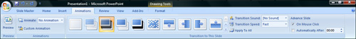
In PowerPoint 2007, select the Animations ribbon, shown in Figure 12.2. This ribbon displays the 58 Slide Transition animations; to apply a transition effect to the current slide, simply click the transition you want. You can then pull down the Transition Speed list to select the speed of the transition. And, if you want to apply this transition to all the slides in your presentation, click the Apply to All option.
Now let’s examine the animation effects you can apply to individual objects or blocks of text on a slide. Begin by selecting the object or text block you want to animate, and then either select Slide Show, Custom Animation (PowerPoint 2003) or click the Custom Animation button on the Animations ribbon (PowerPoint 2007). With either version of the program, this displays the Custom Animation pane on the right side of the PowerPoint window. From here, click the Add Effect button, and then select the type of effect you want to add. For example, if you click the Add Effect button, click Entrance, and then click Wipe, you’ll see four Wipe choices: From Bottom, From Left, From Right, and From Top. Select Wipe From Left. This is the ideal animation choice, because it flows with the natural, reflexive, left-to-right movement that our eyes find so pleasing. Consider this choice your default for all text.
This is the ideal animation choice, because it flows with the natural, reflexive, left-to-right movement that our eyes find so pleasing. Consider this choice your default for all text.
The Wipe From Left choice in Custom Animation produces the same effect as the Wipe Right choice in Slide Transition . . . both wipe to the right. For the purposes of this discussion, let’s refer to both as Wipe Right. For many presenters, Wipe Right is the only animation choice they’ll ever need. This option is available for both slide transitions and text/object animations. Unless you want to send a different visual message, as described in the following section, make Wipe Right your default choice for every click in every presentation.
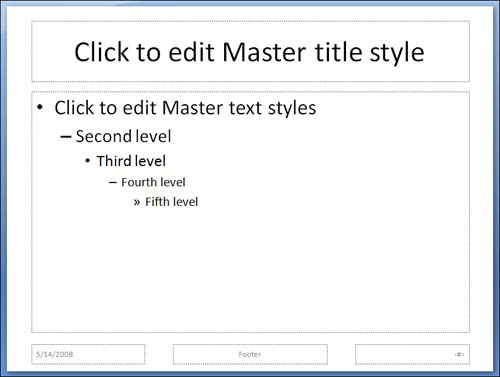
This Wipe Right option can be further reinforced by always using the title of the Slide Master as an Anchor Object. To display the Slide Master (see Figure 12.3), which controls the default formatting of all new slides in a presentation, select View, Master, Slide Master (PowerPoint 2003), or select the View ribbon and click Slide Master (PowerPoint 2007). With the Slide Master displayed, left-justify the Master Title text, and then create the title of every slide using this default. Be sure to always use the same size of font for each title, and, of course, keep each title to a single line (Minimize Eye Sweeps). With this configuration, when you run your slide show, the title of each new slide will replace the title of the outgoing slide in precisely the same place. The Anchor Object animated.
Remember the Conditioned Carriage Return from Chapter 6? Your audience is culturally accustomed to start each new slide at the upper-left corner just as they do in a book. The Wipe Right animation of the title will create the familiar . . . and positive . . . impression of turning pages in a book.
The Wipe Left option, the opposite of the Wipe Right effect, is also available as both a Slide Transition and a Custom Animation (where it is called Wipe From Right). It produces the effect of movement against the grain. Use this effect only if you want to send a negative message to your audience. The entrance of any graphic object from the right, particularly text, forces your audience’s eyes to drag backwards. I use the Wipe Left in the slides in my programs to indicate what not to do. The subtle sense of discomfort my clients feel in watching the counter movement of images reinforces the point of my message.
You can use the Wipe Left in your presentations to indicate the negative factors in your story: the shortcomings of competing products, past problems your company has conquered, or market forces that pose major obstacles for your industry.
The Fly and Peek Custom Animation effects are seemingly close cousins of the Wipe, but beware: Although they bring text and objects onto the screen, as the Wipe does, the Fly and Peek versions blur the text or the object as it moves across the screen, making the image unreadable. Of course, if you want to suggest a feeling of speed or haste, use Fly or Peek. The blurring is more pronounced with text than with pictures, so even if you want to express haste, convert your text and data into pictorial images . . . a good rule to follow for all slides. If you want your audience to take in your images comfortably or read your text easily, stay with the Wipe.
This group of Slide Transitions, like the Fly and Peek Custom Animation effects, also tends to jar the audience. The No Transition and Cut options pop new information onto the screen abruptly. These are PowerPoint versions of what is known in the cinema as the crash cut. Filmmakers use this device to create sudden juxtapositions. Use the No Transition or Cut option in your presentation if you want to express sharp contrast between two slides, such as the difference between the sleek new design of your logo and the busy and cluttered logo of your chief competitor.
The Blinds, Checkerboard, Comb, Random Bars, and Newsflash options are all very dramatic and call attention to themselves. Used arbitrarily, they could distract from your presentation, but to everything there is a season, and a time to every purpose under the sun. The Blinds, Comb, and Random Bars do make effective transitions between bar charts, and the Checkerboard does create an effective segue between tables. You’ll recognize the Newsflash effect from vintage Hollywood movies, as when the front page of a newspaper comes spiraling onto the screen. Although theatrical, you can use it in a presentation to introduce a page from a publication highlighting a favorable quotation endorsing your business, product, or service.
Use any of these flamboyant options with care. Be aware of the potential downside: Any animation that provokes an audience response of “Huh?” or “What was that?” or “I don’t get it!” only detracts from your message. When in doubt, default to the Wipe Right.
The Cover, Push, Strips, and Uncover Slide Transitions are effective variations of the Wipe in that they all introduce new images with significant but less extreme visual movement. However, keep in mind the basic rule that the direction of the motion should express the action in your message. For instance, if you bring in a new slide using the Cover Down option, it has the finality of a curtain descending . . . hardly the kind of message you want to send about your business. The Uncover Down effect, however, evokes the sense of unveiling a work of art.
The Dissolve and Fade options provide smooth, as well as tried-and-true, choices for transitions. They are familiar to everyone from their antecedents in cinema, where they are used to indicate the passage of time. In films, an outbound image gradually fades out as the inbound image gradually emerges. The images overlap in the Dissolve and dip to black for an instant in the Fade. You’ve seen these effects countless times to indicate the shift of night into day, of one season into the next, and of youth into old age.
In PowerPoint, the Dissolve and Fade are available as Slide Transitions and Custom Animation (as both Entrance and Exit effects). Consider using a Dissolve in a presentation to indicate a segue between related concepts. For example, an image of a product could dissolve into an image of the new, upgraded version of the same product. In contrast, an image of a metastasized cell could shrink or disappear, thanks to the power of a new drug. Beware of Fades, however. When images Fade In or Out, they create a sense of detachment or separation. Business presentations, however, are not detached; they deal with closely related subjects in real time. (Think about that: today’s business presentations observe the classic Aristotelian unities!) Therefore, use the Fade very, very sparingly. Moreover, Fades and Dissolves, at any speed, appear slower than the preferable Wipe and tend to drag the pace of a presentation. Choose animations that express continuity and connectivity. Remember: Grab, Navigate . . . never let go . . . and Deposit at Point B!
Here again, PowerPoint uses different nomenclature in Slide Transition and Custom Animation for the same effect. And here again, for the purposes of discussion, we will refer to all of them as Wipe Up or Down. In these choices, the motion has a direct relationship to the action. Use Wipe Up to indicate rising revenues, increasing market share, or growing profits. Use Wipe Down to indicate declining expenses, a falling error rate, or reduced employee turnover.
The Circle, Box, and Split options express either compression or expansion, depending on whether their movement is In or Out. Choose the Custom Animation that relates to the innate shape of the compressing or expanding object. Here are a few ideas:
- The Circle Out effect can express a pie chart or globe that grows, or a hub expanding out to its spoke structure. The Circle In effect can express the shrinking or condensing of a pie chart or globe. The direction of your animation depends on the message you want to deliver.
- The Box effect can express a grid or table that narrows or widens.
- A Split In can represent a multiplicity of diverse objects coalescing into a single whole.
- A Split Out can represent a central theme with multiple variations, such as a central server with many clients or a central office with multiple branches. You can also use the Split Out to create the effect of opening a curtain.
The Wheel and Wedge Slide Transitions are effective ways of replacing one image with another. Reminiscent of the iris effect from silent films, the Wheel and Wedge use a circular motion opening out or closing in to create a transition.
One particularly effective use of the Wheel option is to highlight a single word, number, or object on a slide in the same manner as you would draw a highlighting circle around a section of a document. You use PowerPoint to animate the circle by using the Wheel effect as follows:
In PowerPoint 2003, open the Drawing toolbar and create your circle or oval. Then, with the new object selected, continue along the Drawing toolbar to Fill Color, and select No Fill. Next, move to Line Color and select a bright or contrasting color. Then move to Line Style and select 6 point.
In PowerPoint 2007, the process is slightly different. Select the Insert ribbon, click the Shapes button, and create a circle or oval. Double-click the circle or oval to display the Format ribbon, and then pull down the Shape Fill list and select No Fill. Next, pull down the Shape Outline list and select a bright or contrasting color; still in this pull-down list, click Weight and select 6 point.
With this formatting completed, position the circle or oval over the word or number in your graphic you want to highlight, as shown in Figure 12.4. Now you are ready to animate your highlighting option.
With the circle or oval selected, in PowerPoint 2003 select Slide Show, Custom Animation. In PowerPoint 2007, select the Animations ribbon and then click Custom Animation to display the Custom Animation pane. Then, in both versions, click Add Effect, click Entrance, click More Effects, under Basic click Wheel, and then click OK. In the Spokes window, select 1, and in the Speed window, select Very Fast. Check the action in Slide Show mode.
You can use a similar approach to animate a U-turn Arrow. An often-needed tactic in business is a change of direction. In PowerPoint 2003, select the U-turn Arrow from AutoShapes in the Drawing toolbar. In PowerPoint 2007, you can express this action in a diagram or flowchart by selecting the Insert ribbon, clicking Shapes, and then selecting the U-turn Arrow object (in the Block Arrows section). You can then introduce the figure using the Wedge animation in the same manner as the Wheel example.
Another way to call attention to a word, number, or object on a slide is to use the Custom Animation Emphasis effects to Change Font, Change Font Style, Change Font Size, Grow/Shrink, or Spin the word or object you want to accent. (Other emphasis effects are also available by clicking More Effects.) This feature provides multiple ways to implement such highlighting. There are so many effects and colors available with this feature, it is best to browse through all of them to see which works best for you.
One of the most powerful tools on the Emphasis menu is the Grow/Shrink option. With this choice, you can enlarge or reduce any object, such as an oval or a rectangle with text inside. This will allow you to call out the object and discuss it in detail.
To do this in PowerPoint 2003, select Slide Show, Custom Animation. In PowerPoint 2007, select your object, select the Animations ribbon, and click Custom Animation to display the Custom Animation pane. Then click Add Effect, click Emphasis, and click Grow/Shrink. In the Size box, select a number greater than 100 percent, and press Enter. The object will grow. To shrink the enlarged object back to its original size, select your object again, click Add Effect, click Emphasis, click Grow/Shrink, and enter a number smaller than 100 percent in the Size box.
This technique is an advanced extension of the Anchor Objects you saw in Chapter 9, “Using Graphics to Help Your Story Flow.” All the objects remain in constant view of your audience as you work your way through the entire slide, enlarging specific objects one at a time. The audience never loses sight of the big picture as you navigate them through your presentation, discussing and adding value as you go.
Motion Paths is the most sophisticated of PowerPoint’s animation techniques. It is the one feature that comes closest to the animation capabilities available in professional television control rooms and in computer-generated animation cinema studios. With Motion Paths, you can move objects from one part of the screen to another without having to lose the object or exit the slide. This enables the motion to make all kinds of expressive statements: escalating revenue potential, declining costs, shifting strategic directions, realigning alliances, or rotating positions. To achieve these, select an object and display the Custom Animation pane. Then click Add Effect and click Motion Paths. Choose Up, Down, Left, Right, Diagonal Down Right, or Diagonal Up Right. You can also choose to draw a custom path.
Sophistication comes with a price: complexity. When you incorporate the Motion Path option in your presentation, you will soon discover that moving an object up, down, sideways, or diagonally is relatively easy. You will also discover that once you try this powerful effect, you will want to extend its variations. That’s when you will want to move beyond the basic preset Motion Paths options to Draw Custom Path with a Line, a Curve, or a Freeform. Here is where the Motion Paths effect becomes more complex. But stay the course; try, experiment, and learn. You will soon find that your efforts will produce dynamic animation that expresses your message.
Although the focus of this book is on the story and graphics rather than delivery skills, it is important, before concluding, to touch briefly on the presenter’s narrative and body language as they relate to slide show animation. This is a skill called Graphics Synchronization and is covered in great detail in The Power Presenter. For now, please keep in mind that the highly sensitive optic nerves in your audience’s eyes cause them to react involuntarily to light and motion. The instant your animation starts, all their attention suddenly shifts to the screen and away from you.
Human brains have difficulty processing multiple inputs, especially if those inputs are separate sights and sounds. Your audience is so focused on the animation, they do not listen to what you are saying, nor do they see what you are doing. Moreover, anything you do or say creates extra sensory data that conflicts with the enlarged activity on the presentation screen. Therefore, whenever you introduce animation on your screen, stop talking, stop moving, and allow the animation to complete its full course of action.
Whenever you introduce animation on your screen, stop talking, stop moving, and allow the animation to complete its full course of action.
“Action” is the operative word here. Action is the endgame. The action in animation is there to express your message. Your message is your call to action. The end result of all your action should be to elicit the best response from your audience. Remember Newton’s Third Law of Motion: “To every Action there is always opposed an equal Reaction.” If your animation action is disturbing, your audience will be distracted. If the dynamic action of your animation is synchronized with all the other elements of your presentation . . . your story, your graphic design, as well as your voice and body language . . . you can achieve the ultimate dynamic: persuading your audience to move from Point A to your Point B.