
6
Controlling Color
Daylight is considerably bluer than tungsten incandescent light. Both sources produce light that spans the entire visible spectrum, but with a different balance. Our eyes and brain adapt to these differences when we physically move from one light environment to another. If our perceptual apparatus did not adjust, people would look blue in sunlight and orange in tungsten light, and white surfaces would always take on the predominant hue of the ambient light. Video has to be physically adjusted so as to render color closer to what the human eye/brain perceives; otherwise it would give us orange and blue people. The camera’s process of normalizing color in different types of ambient light is called “white balancing.” When the camera adjusts so that a white surface is rendered as a true white with no residual hue, then the whole range of color will appear accurate and balanced.
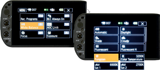
The G10/XA10 provides three methods for controlling white balance:
![]() Automatic. This tracks continuously.
Automatic. This tracks continuously.
![]() White Balance settings. With the G10/XA10, you have the ability to read and recall two manual White Balance settings and use them as presets.
White Balance settings. With the G10/XA10, you have the ability to read and recall two manual White Balance settings and use them as presets.
![]() Calibrated custom presets. You can set calibrated custom presets from 2,000°K to 15,000°K in 100°K increments along with specific settings for daylight, shade, cloudy, tungsten, fluorescent (warm white), and fluorescent H (cool white). (The meaning of the term “°K” is discussed later in this chapter.)
Calibrated custom presets. You can set calibrated custom presets from 2,000°K to 15,000°K in 100°K increments along with specific settings for daylight, shade, cloudy, tungsten, fluorescent (warm white), and fluorescent H (cool white). (The meaning of the term “°K” is discussed later in this chapter.)
This is a considerable amount of control over color balance, as shown in Figure 6.1.
Figure 6.1 Choosing FUNC > WB White Balance reveals 10 choices of automatic, programmed, preset, or manual controls for balancing color.
Automatic White Balance
Automatic White Balance (AWB) is sometimes called auto-tracking white balance. When your camcorder is in full AUTO mode, your white balance runs automatically by default; you have no other choice. In M and CINEMA modes, you have the option to intentionally select Automatic White Balance on the touchscreen. To do so, choose FUNC > WB White Balance > AWB.
If you set the white balance for AUTO, you will get a compromise that continually strives to neutralize variations of the color of ambient light in your scenes. AWB may also introduce arbitrary adjustments—for example, as someone enters or exits the frame. As lighting conditions and compositions change, the camera may alter the entire picture’s hue so that red, green, and blue are in balance in the lightest parts of your frame, which the camera assumes ought to be a neutral white or near white. Automatic White Balance may do a better job with some compositions and subject matter than with others, but it may be your best option in uncertain situations where the nature of the light may change quickly.
Manual White Balance
Instead of an auto-tracking white balance, you often want consistency of color within a shot and from shot to shot. You may record at various times during the day with the intent of cutting the shots together with as little color drift as possible. The best way to equalize daylight so that 8 a.m., 10 a.m., 12 noon, 3 p.m., and 5 p.m. render hues that appear identical to each other is to carefully white balance each one manually. Although the directionality of the light and other characteristics may vary, skin tones and other colors shot at different times of day should intercut with less color shift if each scene has been manually balanced.
To read and set a manual color balance, hold a white card or sheet of paper in the predominant light so that the card fills the frame. Next, choose FUNC > WB White Balance and scroll to and press Set 1 or Set 2. Finally, press and hold Set WB for a couple of seconds until the manual white balance icon stops blinking. The white card should now appear neutral. You have now adjusted one manual preset for light hitting the white card.
The camera will allow you to read and store two manual white-balance settings. You might manually balance for two sides of one room, or for indoors plus outdoors, and switch from one preset to another as you move with the camera. The setting of one of the two manual presets for white balance can be assigned to one of the buttons on the left bezel of the touchscreen. Choose FUNC > MENU > Tool icon > Assign Button 1 (or Assign Button 2) > WB Priority. Then choose FUNC > MENU > Tool icon > Set WB Priority and select Set 1 or Set 2. Pressing the button will now toggle between the manual preset and the current white balance value or method you have selected in the FUNC > WB White Balance panel.
Locking to a manual white balance gives you consistency and color control that you do not have with AWB. In a mixed-light situation, the choice of where you take the manual reading will determine where the balance of light will look normal. You might have bluish skylight coming through a window, plus rather orange incandescent light from a table lamp in the interior and the halogen white of a 500- or 600-watt Lowel Omni light bouncing off the ceiling as fill light. In this situation, you would get one color balance near the window, a completely different balance near the table lamp, and another where the fill light is predominant. There may even be a position where the light from all three sources overlaps, which could provide a compromise reading. Choosing where you place the white card and manually balancing for that spot can be a powerful tool in creating a look and interpreting a scene. It’s a matter of where you want “normal” to be.
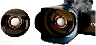
A more elegant way of taking a manual white balance is to use a BRNO baLens white-balance lens cap (see Figure 6.2). The 58mm size fits the G10/XA10 and sells for about $33 from some vendors. Simply replace your Canon lens cap and use the baLens as your regular lens protection. The cap has a white translucent dome in its center. Instead of holding a white card, stand in the light that would be hitting your subject and point the camcorder with its capped lens toward your predominant light source or in a position to receive a balance of light from multiple sources and press FUNC > WB White Balance > Set 1 (or Set 2). (Refer to Figure 6.1.) Then press and hold Set WB until the white balance icon stops blinking. This will become second nature as the last thing you do before removing the lens cap. The hemispherical dome acts as a standard that will give you more consistent readings compared to a white card. In mixed-light situations, a reading from the surface of a flat card will vary with the angular tilt, whereas a hemispherical dome averages the light from a 180° angle. The BRNO baLens is also convenient because it doubles as a lens cap and is always with the camcorder.
Figure 6.2 The BRNO baLens lens cap with its dome for reading white balance.
It is also possible to digitally filter a scene by tricking the manual white balance. For example, balancing to a yellow card instead of white would cause the camera to produce an excess of its complementary color, blue. The resulting setting can be used to intentionally filter a scene—in this case making it less yellow (i.e., bluer). Experienced videographers often carry a selection of cards with pale hues to produce custom digital filtration. Commercially made sets of color-balance cards are available, but experimenting with and making your own works just as well. Try color assortments of pastel paper from an office-supply or art supply store.
The BRNO baLens has a replaceable accessory dome that is pale blue in color, which can be used to digitally warm a scene when white balancing.
Digital filters have numerous advantages over glass filters:
![]() They cost almost nothing.
They cost almost nothing.
![]() They are not as affected by fingerprints and dust.
They are not as affected by fingerprints and dust.
![]() There is nothing in the optical path of the lens to degrade the image.
There is nothing in the optical path of the lens to degrade the image.
![]() They produce consistent results.
They produce consistent results.
![]() The process takes into account and compensates for the actual light falling on the scene while producing its filter effect.
The process takes into account and compensates for the actual light falling on the scene while producing its filter effect.
Color Temperature
One of the major ways to produce light is to heat something until it gives off energy. This is the way the filament in an incandescent lamp works, or any object that is heated to the point that it glows. For example, as a metal rod is heated, its molecules move faster and give off infrared radiation. Infrared cannot be seen by the human eye, but you can feel the radiating warmth without touching the rod. If you increase the heat further, the rod will visibly glow red, and even hotter will glow orange. Progressively more heat will cause the rod to produce a yellowish-white light and eventually blue-white at even higher temperatures.
The 19th century British physicist Lord Kelvin discovered that all substances, even a block of carbon, radiate the same colors at identical high temperatures. Among stars, red giants like Antares and Betelgeuse are cooler than our sun, which is yellow-white, and blue-white stars are much hotter, like Rigel, the brightest star in the constellation Orion. A candle flame has predominantly reddish and yellowish areas with a hint of blue in the hottest part. An oxyacetylene torch produces a blue-white flame.
Temperature is actually a measure of the energy (from infrared through the visible range and beyond) produced by molecular movement. When something is as cold as −273° Centigrade (Celsius), its molecules stop moving. At this point, no energy is emitted; there isn’t anything colder than −273°C. Lord Kelvin advocated a temperature scale based on Centigrade but instead of 0 representing the point where water freezes, the scale is offset by adding 273 degrees so that 0 on the Kelvin scale is absolute zero.
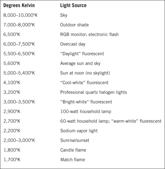
A tungsten filament of a 60-watt household incandescent lamp actually burns somewhere around 2,700° on the Kelvin scale (which again is 273° added to the Celsius scale). If you were to feed the lamp even more voltage or if it had heavier filaments and created even more heat, its color temperature would be closer to what is called “photographic tungsten light” (3,200°K) produced by a professional 500-, 600-, 750-, or 1,000-watt instrument. 3,200° Kelvin is a whiter white than the orange-white of home incandescent lamps. Hotter still is the surface of the sun, which burns at 5,000°K to 5,500°K. The combination of direct sunlight mixed with diffused light from the sky gives us photographic daylight, which is around 5,600°K. Table 6.1 outlines the color temperature of various light sources.
An overcast day or a shaded area with skylight and no direct sunlight measures from 6,000° to above 10,000° Kelvin. Obviously, skylight in the shade is not physically hotter than direct sunlight. This is because its bluer color is produced by filtration instead of a blue-hot star. The Kelvin scale is a way of measuring color equivalencies within the range of white light, and not all coloration of light is produced by heat and molecular motion. Skylight, which gets its color from atmospheric filtration, and fluorescents, which get their color from phosphors, are examples that can be given a value on the Kelvin scale equivalent to the temperature that a heated body would attain to produce comparable light. The Kelvin scale is extremely useful as a scientific way to describe and compare the apparent whiteness of a light source.
The color temperatures we often encounter in video are 2,700° to about 3,100° for household bulbs; 3,200° if we use professional tungsten lighting instruments; and 5,600° if we are using daylight or instruments to simulate daylight. We might even have higher settings if we are in indirect daylight, skylight, or overcast light. The other temperature we often deal with is around 4,100° Kelvin for cool-white and industrial fluorescents.
Warm and Cool
Our everyday experience tells us red is hot and blue is cool, but in the world of high-temperature physics it is the other way around. For tactile sensations, a red glow is already too hot to touch, and most of us have no direct experience with blue-hot objects. We associate blue with shade, with the reflection of the sky in water, and with water itself. Our skin feels cooler when we walk from sunlight into the bluer skylight of the shade. So we physiologically and psychologically associate blue with cool, whereas an actual object heated to “blue hot” would need to be thousands of degrees hotter than the 5,600°K degrees of photographic daylight.
When we talk about the Kelvin scale as a way of defining white light, it would be clearer to use the words “bluer,” “oranger,” or “redder” or “higher or lower color temperature” or to cite a specific value in degrees Kelvin than to refer to points on the scale as warm or cool, which could lead to confusion. But it is hard to avoid the words warm and cool because they come from a lifetime of visual and tactile experience. So if we talk about making a scene warmer or cooler or warm-white or cool-white fluorescent lights, we generally mean the psychologically reinforced experience of red as warm and blue as cool—not actual temperature.
Color Balance Presets
5,600°K is called “photographic daylight”—a mixture of direct sunlight blended with ambient skylight (which has a bluish hue formed by scattered light filtered by water vapor in the atmosphere). The actual color temperature of sunlight plus skylight will vary subtly from mid-morning to mid-afternoon, and vary considerably at sunrise and sunset. It will also vary in different seasons and in different parts of the world. Certain moments at sunrise or sunset can be even redder than incandescent light, and an overcast winter day might be 10,000°K.
In addition to Automatic White Balance and two manual white balance presets, the G10/XA10 provides presets based on six standard light conditions and 130 settings on the Kelvin scale. To access them, switch to M mode; then choose > FUNC > WB and select Daylight, Shade, Cloudy, Fluorescent, Fluorescent H, or Tungsten. A principal reason for using a preset is to maintain the particular color tonality of the actual light instead of automatically or manually balancing to make the light appear neutral. The best way to show a dance lit by colored gels, the actual color of daylight as it varies through the day, or the vibrant hues of sunset is to select a relevant preset color temperature. In comparison, Automatic White Balance would continually attempt to balance each of these toward neutral until it reached extremes that were beyond its corrective latitude.
For example, 5,600°K is the average hue of daylight. Because the actual balance of daylight evolves during the day, presetting for 5,600°K will capture the balance at that moment and its variations over the passage of time. The appropriate Daylight, Shade, Cloudy, Fluorescent (warm-white), Fluorescent H (cool-white), or Tungsten setting allows you to record the character of how the actual light deviates from a standard, bringing out the unique quality of the light instead of neutralizing it.
In addition to these six presets based on lighting conditions, the G10/XA10 includes the professional feature of being able to preset a light value in 130 increments of color temperature. This means you can scroll across the Kelvin scale to find the setting that balances best for your particular mixture of light and lock in the look that you want for your scene. To achieve this, in M mode, choose FUNC > WB > K Color Temperature and scroll left or right, as shown in Figure 6.3.
Figure 6.3 The K Color Temperature panel.
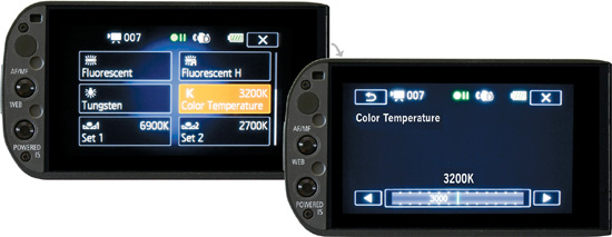
You may start off with what ought to typically balance your type of light—2,700°K (household tungsten and “warm” fluorescents), 3,000°K (designer fluorescents), 3,200°K (professional tungsten), 3,100°K–3,500°K (bright-white fluorescents), 4,000–4,500°K (cool-white and industrial fluorescents), or 5,600°K (average daylight)—and then adjust the setting left or right while watching the changes on the screen. You cannot judge accurate color entirely by your camcorder’s viewfinder, but you can probably get it in the ballpark. The ability to select from 130 incremental settings to make the scene warmer, cooler, or neutral is a powerful tool.
Fluorescents
The light from fluorescent bulbs is not produced by actually heating a filament to a high temperature. Fluorescents create ultraviolet light through a high voltage gas discharge, which is converted to visible light by a coating of phosphors inside the fluorescent tube. Cool-white and industrial fluorescent bulbs give off a light that might be rated at 4,100° Kelvin. However, there is a difference in spectrum between a fluorescent tube and a source of light produced by heat.
The surface of the sun, the filament in an incandescent lamp, and a candle emphasize a different part of the spectrum at their respective temperature but still emit light across the entire visual range. Once our eyes and brains adjust (which is the biological equivalent of white balancing), we see the entire range of colors in daylight, tungsten, or candle light. The phosphors in cool-white fluorescent bulbs produce enough of the spectrum to create the impression of white light, but segments of the spectrum are uneven or missing entirely. So even if we say that a particular fluorescent burns at 4,100° Kelvin as a reference to its equivalent color, it is not going to behave entirely like a 4,100°K incandescent lamp. The most efficient and least expensive phosphors, and the ones that last the longest, have a high green content and are missing 40 percent to 60 percent of the visible spectrum. Skin tones may not appear as healthy and as complete, and clothing and scenery may shift from the true colors we would see in sunlight or incandescent light.
To shoot in fluorescent light, you can set the G10/XA10 to Fluorescent to compensate for warm-white (which measures from 2,700° to 3,100°K) or to Fluorescent H for cool-white. You could also use the 4,100°K preset on the K Color Temperature panel, but the Fluorescent settings on the G10/XA10 have an advantage in that they try to compensate for the extra amount of green. You could also manually white balance by putting a white card in the light path, pointing the camera, and choosing FUNC > WB White Balance > Set 1 (or Set 2), and then pressing and holding Set WB until the white balance icon stops blinking. The camera will do its best to make the white card a balanced white for the specific spectrum of your fluorescent light.
There are higher-priced fluorescent bulbs that have a more complete spectrum, some of which are called “wide spectrum” or “full spectrum.” But in actuality, a mixture of phosphors cannot quite deliver a full spectrum, so bulbs called “wide spectrum” or “full spectrum” have anywhere from about 80 percent up to about 98 percent of the complete range of visible light that the sun or an incandescent bulb would produce.
A fluorescent labeled “wide spectrum” or “full spectrum” will provide a Color Rendering Index (CRI) rating on the bulb or in its catalog description. This is simply a percentage of how much of the full spectrum it provides. The CRI rating for photographically usable fluorescents ranges from CRI 80 to the highest they come, which is around CRI 98. Fluorescents below these ratings are not going to provide true colors, although you still may have to shoot with them under certain conditions because they are so prevalent.
Wide-spectrum fluorescents tend to come in color temperatures of 2,700° to match the “warmness” of household incandescent bulbs or 3,200°K to match professional photographic light, and rated at 5,500°, 5,600°, 6,000°K or 6,500°K to match daylight or indirect daylight. Color temperature is a useful approximation for fluorescents, but the important figure is the CRI rating. Color will look truer with fluorescents that have high CRI ratings once they are white balanced.
Color Bars
If you have a separate monitor for use on location or for later viewing and evaluating your images, it is important to calibrate it so that accurate judgments can be made. Calibration is done with SMPTE color bars, a standard of the Society of Motion Picture and Television Engineers. The G10/XA10 can generate and record color bars. Bars are also available from online sources as downloadable JPEG or TIFF picture files, or as video files that sometimes include an audio test tone. To access bars within the camcorder, choose FUNC > MENU > Film Clip icon > Color Bars. The G10/XA10 offers an option of bars only or bars with audio tone. You can record either of these choices as a video (MTS) file. The camcorder does not allow the option of recording bars as a photo file. (See Figure 6.4.)
Figure 6.4 Standard SMPTE color bars.
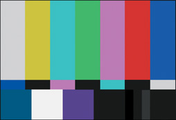
With color bars displayed on your monitor, the first adjustment is usually the brightness (also called the “pedestal” or “black level”). Look for the pattern of three small vertical dark gray bars in the lower right and adjust the brightness until only one small bar remains visible. The darkest bar is blacker than black and the middle bar is just below picture black. The remaining dark gray bar is just above picture black, which is why it should stay visible in a properly adjusted monitor while the other two disappear into blackness.
Now adjust the contrast (sometimes called the “white level”). This sets the upper limit and the overall stretch of brightness. While looking at the bright white square on the lower left, turn the level up and down so that you can see its intensity changing. Then raise the contrast until the square does not seem to be getting any brighter. Back off slightly from this setting.
The next adjustment is hue. Running from left to right, the large vertical stripes in the upper part of the SMPTE pattern are white, yellow, cyan, green, magenta, red, and blue. If your monitor has a blue-only setting or a blue gun, turn it on. These turn off the red and green signal. The bars will now be a pattern where the former white, cyan, magenta, and blue bars are all displayed as blue (because blue light is a component of each of those colors). The former yellow, green, and red bars now appear black because there is no blue content in those colors. Adjust hue (or phase, tint, or color) on your monitor so that all the brighter bars in the upper pattern have an equal amount of blue. Pay particular attention where the former cyan bar had a strip of yellow below it, and the former yellow bar had a strip of cyan below it to see that they now appear to be equally blue. Turn off the blue gun to restore color. Your monitor is now balanced for hue.
If your monitor does not have a blue gun, adjust hue until the secondary colors yellow, cyan, and magenta all seem centered—not orange/chartreuse instead of yellow, emerald/ultramarine instead of cyan, and rose/purple instead of magenta. It could be difficult to judge a precise setting for any one of these colors by itself because there may be latitude in what we might perceive as pure yellow, for example. But a setting where all three seem perfect is a findable narrow point.
The final adjustment is color saturation. This is set subjectively at a point where the colors seem full—neither washed out nor overstated. They should never get to the point where they glow like neon. Using the monitor in a dark space will demand less saturation than in bright ambient light. Many videographers prefer to make the final adjustment of color saturation while viewing the image of a human face. Whether skin tones look pallid, healthy, or artificial can be more precise than judging the color level of abstract bars.
In addition to color bars, viewing the image of a standard Kodak 18% gray card or a ColorChecker chart (formerly called a Macbeth chart) can be used for checking the accuracy of color. The ColorChecker chart has 24 patches of color: six shades of gray, six primary and secondary colors, and the others mimicing the range of natural colors of sky, leaves, flowers, and dark and light skin. Kodak gray cards retail for $16 for a pack of two plus a small card; ColorChecker charts sell for about $70. They are made to very precise specifications. Viewed on a well-calibrated monitor and visually compared to the original, these cards and charts can help you judge the trueness of color. A recorded signal of these charts is useful with field instruments or in postproduction where an RGB parade can test for color neutrality, balance, and hue, and a vectorscope can test for saturation. The RGB parade comparatively graphs the levels of red, green, and blue in a composition, and a vectorscope graphs color saturation and relative hue. Both devices are built into professional editing and color-balancing software.
Image Effects
The G10/XA10’s M mode allows you to customize color depth (saturation), brightness, contrast, and/or sharpness. To do so, choose FUNC > Image Effects > ON and adjust the settings as needed, as shown in Figure 6.5. The first three of these settings are very similar to the saturation, brightness, and contrast controls on a monitor, but unlike a monitor, the camcorder’s manual controls permanently alter the recorded signal. A monitor simply alters how the signal is displayed. In making these permanent adjustments, it would be ideal to judge their effects on a larger, well-calibrated monitor than on the camcorder’s 3½-inch LCD screen.
Figure 6.5 The Image Effects panel and its control screen.
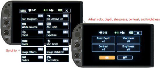
Be careful with high settings. Excessive contrast can permanently lose detail in highlights and shadows, and excessive sharpness may create artificial edges or video grain and accentuate irregularities in skin.
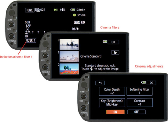
CINEMA Mode
CINEMA mode alters color, contrast, and the response curve to look more like film. It provides a choice of nine filters plus individual adjustments under each filter. Switching to CINEMA mode automatically selects a frame rate of PF24. In addition, photos cannot be recorded when the camcorder is in CINEMA mode.
The first CINEMA mode selection is FILTER 1 > Cinema Standard, a film look that allows additional controls similar to the image effects found in the manual mode. The eight other alternatives are as follows:
![]() FILTER 2 > Vivid. The Vivid cinema setting accentuates primary colors and increases saturation. It has a kind of hyper-real look with certain subjects.
FILTER 2 > Vivid. The Vivid cinema setting accentuates primary colors and increases saturation. It has a kind of hyper-real look with certain subjects.
![]() FILTER 3 > Dream. Canon describes Dream as a “magical look,” but this is a subjective description that some might see as a desaturated reality instead of a dream.
FILTER 3 > Dream. Canon describes Dream as a “magical look,” but this is a subjective description that some might see as a desaturated reality instead of a dream.
![]() FILTER 4 > Cool. Cool adds a bluish tint.
FILTER 4 > Cool. Cool adds a bluish tint.
![]() FILTER 5 > Nostalgic. Nostalgic adds a warm tone, which Canon suggests is like “old TV programs,” but here again, this is subjective. With completely different lighting or subject matter the filter may suggest a different interpretation. So, do not be guided solely by Canon’s labels.
FILTER 5 > Nostalgic. Nostalgic adds a warm tone, which Canon suggests is like “old TV programs,” but here again, this is subjective. With completely different lighting or subject matter the filter may suggest a different interpretation. So, do not be guided solely by Canon’s labels.
![]() FILTER 6 > Sepia. Sepia creates a warm, antique, faded look while still retaining a hint of the original color.
FILTER 6 > Sepia. Sepia creates a warm, antique, faded look while still retaining a hint of the original color.
![]() FILTER 7 > Old Movies. Old Movies provides an alternative cine look like old Cinemascope with grain and scratches.
FILTER 7 > Old Movies. Old Movies provides an alternative cine look like old Cinemascope with grain and scratches.
![]() FILTER 8 > Memory. Memory softens contrast.
FILTER 8 > Memory. Memory softens contrast.
![]() FILTER 9 > B&W. B&W strips the image of color and its three adjustable settings alter levels of contrast.
FILTER 9 > B&W. B&W strips the image of color and its three adjustable settings alter levels of contrast.
Cinema filters 2 through 9 provide for more limited adjustments of low, medium, or high.
Setting the AUTO/M/CINEMA switch on the upper right side of the camcorder to CINEMA instantly locks the frame rate to PF24 (not 24P) and activates a cinema filter based on the last setting used. The lower left of the touchscreen displays the filter number, 1 through 9. To change to another cinema filter, tap the lower left of the touchscreen and scroll through the nine selections.
Cinema Standard provides a film look with a response curve (gamma) that should retain more detail in the shadows and highlights. You can further adjust the setting for color depth, sharpness, contrast, and brightness by touching the Tool icon that appears on the right side of the touchscreen. Adjustments for cinema filters 2 through 9 can also be accessed by tapping the Tool icon. (See Figure 6.6.) To exit from CINEMA mode altogether, slide the AUTO/M/CINEMA switch to M or AUTO.
Figure 6.6 Cinema mode filters and adjustments.
xvCOLOR
Almost all video is limited by the NTSC and ATSC range of possible colors. “Illegal” colors beyond the range will glow, clip, fall below picture black, or look unnatural on most TV sets. However, some televisions, monitors, and projectors have allowed for an extended range of color to be displayed with an option called xvYCC, xvCOLOR, or Extended Gamut YCC. The G10/XA10 can record with the xvYCC expanded color palette. To access this setting, in M mode, choose FUNC > MENU > Film Clip icon > xvCOLOR.
xvYCC can be viewed only on monitors and projectors that have the xvYCC option, and the monitor must have its extended gamut feature switched on. DVD and Bluray discs do not support xvYCC. The source signal has to come through an HDMI 1.3 cable from a device capable of playing AVCHD, like the G10/XA10 itself or a computer playing an AVCHD file with appropriate software. You should not use this setting for video intended for broadcast, DVD, or Blu-ray, or for viewing on most TV sets and monitors.