
WHAT'S IN THIS CHAPTER?
Learning the basics of XAML
Creating a WPF application
Styling your WPF application
Hosting WPF content in a Windows Forms project
Hosting Windows Forms Content in a WPF project
Using the WPF Visualizer
When starting a new Windows client application in Visual Studio you have two major technologies to choose from — a standard Windows Forms–based application, or a Windows Presentation Foundation (WPF)–based application. Both are essentially a different API for managing the presentation layer for your application. WPF is extremely powerful and flexible, and was designed to overcome many of the shortcomings and limitations of Windows Forms. In many ways you could consider WPF a successor to Windows Forms. However, WPF's power and flexibility comes with a price in the form of a rather steep learning curve because it does things quite differently than Windows Forms.
This chapter guides you through the process of creating a basic WPF application in Visual Studio 2010. It's beyond the scope of this book to cover the WPF framework in any great detail — it would take an entire book on its own to do so. Instead, what you will see is an overview of Visual Studio 2010's capabilities to help you rapidly build user interfaces using XAML.
Windows Presentation Foundation is a presentation framework for Windows. But what makes WPF unique, and why should you consider using it over Windows Forms? Whereas Windows Forms uses the raster-based GDI/GDI+ as its rendering engine, WPF instead contains its own vector-based rendering engine, so it essentially isn't creating windows and controls in the standard Windows manner and look. WPF has taken a radical departure from the way things are done in Windows Forms. In Windows Forms you generally define the user interface using the visual designer, and in doing so it automatically creates the code (in the language your project is targeting) in a .designer file to define that user interface — so essentially your user interface is defined and driven in C# or VB code. However, user interfaces in WPF are actually defined in an XML-based markup language called Extensible Application Markup Language (generally referred to as XAML, pronounced "zammel") specifically designed for this purpose by Microsoft. XAML is the underlying technology to WPF that gives it its power and flexibility, enabling the design of much richer user experiences and more unique user interfaces than was possible in Windows Forms. Regardless of which language your project targets, the XAML defining the user interface will be the same. Consequently, along with the new capabilities of the user interface controls there have been a number of new supporting concepts on the code side of things, such as the introduction of dependency properties (properties that can accept an expression that must be resolved as their value — which is required in many binding scenarios to support XAML's advanced binding capabilities). However, you will find that the code-behind in a WPF application is much the same as a standard Windows Forms application — the XAML side of things is where you need to do most of your learning.
When developing WPF applications, you need to think differently than the way you think when developing Windows Forms applications. A core part of your new thought processes should be to take full advantage of XAML's advanced binding capabilities, with the code-behind no longer acting as the controller for the user interface but serving it instead. Instead of the code "pushing" data into the user interface and telling it what to do, the user interface should ask the code what it should do, and request (that is, "pull") data from it. It's a subtle difference, but it greatly changes the way in which the presentation layer of your application will be defined. Think of it as having a user interface that is now in charge. The code can (and should) act as a decision manager, but no longer provides the muscle.
This "new thinking" has also led to new design patterns for how the code and the user interface elements interact, such as the popular Model-View-ViewModel (MVVM) pattern, which enables much better unit testing of the code serving the user interface and maintains a clean separation between the designer and developer elements of the project. This results in changing the way you write the code-behind, and ultimately changes the way you design your application. This clear separation supports the designer/developer workflow, enabling a designer to work in Expression Blend on the same part of the project as the developer (working in Visual Studio) without clashing.
By taking advantage of the flexibility of XAML, WPF enables you to design unique user interfaces and user experiences. At the heart of this is WPF's styling and templating functionality that separates the look of controls from their behavior. This enables you to alter the appearance of controls easily by simply defining an alternate "style" on that particular use without having to modify the control itself.
Ultimately you could say that WPF uses a much better way of defining user interfaces than Windows Forms does, through its use of XAML to define user interfaces, along with a number of additional supporting concepts thrown in. The bad news is that the flexibility and power of XAML comes with a corresponding steep learning curve that will take some time to climb, even for the experienced developer. If you are a productive developer in Windows Forms, WPF will no doubt create considerable frustration for you while you get your head around its concepts, and it really requires a change in your developer mindset to truly get a grasp on it and how things hold together. Many simple tasks will initially seem a whole lot harder than they should be, and would have been were you to implement the same functionality or feature in Windows Forms. However, if you can make it through this period you will start to see the benefits and appreciate the new possibilities that WPF and XAML provide. Because Silverlight shares a lot conceptually with WPF (both being XAML based, with Silverlight essentially being a subset of WPF), by learning and understanding WPF you are also learning and understanding how to develop Silverlight applications.
Note
If you've looked at earlier versions of WPF (those that shipped in the .NET Framework 3.0 and 3.5 versions) you may have noticed that text rendered in WPF often took on a rather blurry appearance instead of being crisp and sharp, generating numerous complaints from the developer community. Fortunately in the .NET Framework 4.0 the text rendering has been vastly improved, and if this has held you back from developing WPF applications previously it is probably time to take another look. Microsoft has demonstrated its faith in WPF by rewriting Visual Studio's code editor in WPF for the 2010 version to take advantage of its power and flexibility.
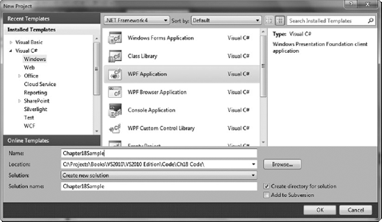
When you open the New Project dialog you see a number of built-in project templates for WPF that ship with Visual Studio 2010: WPF Application, WPF Browser Application, WPF Custom Control Library, and WPF User Control Library, as shown in Figure 18-1.
You will notice that these projects are for the most part a direct parallel to the Windows Forms equivalent. The exception is the WPF Browser Application, which generates an XBAP file that uses the browser as the container for your rich client application (in much the same way as Silverlight does, except an XBAP application targets the full .NET Framework, which must be installed on the client machine).
For this example you create a project using the WPF Application template, but most of the features of Visual Studio 2010 discussed herein apply equally to the other project types. The project structure generated should look similar to Figure 18-2.
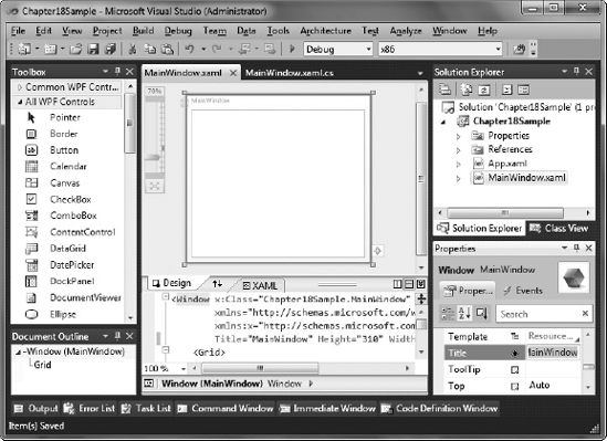
Here you can see that the project structure consists of App.xaml and MainWindow.xaml, each with a corresponding code-behind file (.cs or .vb), which you can view if you expand out the relevant project items. At this stage the App.xaml contains an Application XAML element, which has a StartupUri attribute used to define which XAML file will be your initial XAML file to load (by default MainWindow.xaml). For those familiar with Windows Forms, this is the equivalent of the startup form. So if you were to change the name of MainWindow.xaml and its corresponding class to something more meaningful, you would need to make the following changes:
Change the filename of the
.xamlfile. The code-behind file will automatically be renamed accordingly.Change the class name in the code-behind file, along with its constructor, and change the value of the
x:Classattribute of theWindowelement in the.xamlfile to reference the new name of the class (fully qualified with its namespace). Note that the last two steps are automatically performed if you change the class name in the code-behind file first and use the smart tag that appears after doing so to rename the object in all the locations that reference it.Finally, change the
StartupUriattribute of theApplicationelement inApp.xamlto point toward the new name of the.xamlfile (because it is your startup object).
As you can see, a few more changes need to be made when renaming a file in a WPF project than you would have to do in a standard Windows Forms project, however it's reasonably straightforward when you know what you are doing (and using the smart tag reduces the number of steps required).
Working around the Visual Studio layout of Figure 18-2, you can see that the familiar Toolbox tool window attached to the left side of the screen has been populated with WPF controls that are similar to what you would be used to when building a Windows Forms application. Below this window, still on the left side, is the Document Outline tool window. As with both Windows Forms and Web Applications this gives you a hierarchical view of the elements on the current window. Selecting any of these nodes in this window highlights the appropriate control in the main editor window, making it easier to navigate more complex documents. An interesting feature of the Document Outline when working with WPF is that as you hover over an item you get a mini-preview of the control. This helps you identify that you are selecting the correct control.
Note
If the Document Outline tool window is not visible it may be collapsed against one of the edges of Visual Studio. Alternatively, you may need to force it to be displayed by selecting it from the View
On the right side of Figure 18-2 is the Properties tool window. You may note that it has a very similar layout and behavior to the Windows Forms designer Properties tool window. However, this window in the WPF designer has additional features for editing WPF windows and controls. Finally, in the middle of the screen is the main editor/preview space, which is currently split to show both the visual layout of the window (above) and the XAML code that defines it (below).
If you have some familiarity working with XML (or to some extent HTML), you should find the syntax of XAML relatively straightforward because it is XML based. XAML can have only a single root level node, and elements are nested within each other to define the layout and content of the user interface. Every XAML element maps to a .NET class, and the attribute names map to properties/events on that class. Note that element and attribute names are case sensitive.
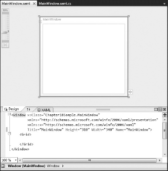
Take a look at the default XAML file created for the MainWindow class:
<Window x:Class="Chapter18Sample.MainWindow"
    xmlns="http://schemas.microsoft.com/winfx/2006/xaml/presentation"
    xmlns:x="http://schemas.microsoft.com/winfx/2006/xaml"
    Title="MainWindow" Height="300" Width="300">
    <Grid>

    </Grid>
</Window>
Here you have Window as your root node, and a Grid element within it. To make sense of it, think of it in terms of "your window contains a grid." The root node maps to its corresponding code-behind class via the x:Class attribute, and also contains some namespace prefix declarations (discussed shortly) and some attributes used to set the value of properties (Title, Height, and Width) of the Window class. The value of all attributes (regardless of type) should be enclosed within quotes.
You'll note two namespace prefixes defined on the root node, both declared using xmlns (the XML attribute used for declaring namespaces). You could consider XAML namespace prefix declarations to be somewhat like the using/Imports statements at the top of a class in C#/VB, but not quite. These declarations assign a unique prefix to the namespaces used within the XAML file, with the prefix used to qualify that namespace when referring to a class within it (that is, specify the location of the class). Prefixes reduce the verbosity of XAML by letting you use that prefix rather than including the whole namespace when referring to a class within it in your XAML file. The prefix is defined immediately following the colon after xmlns. The first definition actually doesn't specify a prefix because it is defining your default namespace (the WPF namespace). However, the second namespace defines x as its prefix (the XAML namespace). Both definitions map to URIs rather than specific namespaces — these are consolidated namespaces (that is, they cover multiple namespaces), and hence reference the unique URI that is used to define that consolidation. However, you don't need to worry about this concept — leave these definitions as they are and simply add your own definitions following them. When adding your own namespace definitions they will almost always begin with clr-namespace and reference a CLR namespace and the assembly that contains it. For example:
xmlns:wpf="clr-namespace:Microsoft.Windows.Controls;assemblty=WPFToolkit"
Prefixes can be anything of your choosing, but it is best to make them short yet meaningful. Namespaces are generally defined on the root node in the XAML file. This is not necessary because a namespace prefix can be defined at any level in a XAML file, but it is generally a standard practice to keep them together on the root node for maintainability purposes.
If you want to refer to a control in the code-behind or by binding it to another control in the XAML file (such as ElementName binding) you will need to give your control a name. Many controls implement the Name property for this purpose, but you may also find that controls are assigned a name using the x:Name attribute. This is defined in the XAML namespace (hence the x: prefix) and can be applied to any control. If the Name property is implemented (which it will be in most cases because it is defined on the base classes that most controls inherit from), it simply maps to this property anyway and they serve the same purpose. For example:
<Button x:Name="OKButton" Content="OK" />
is the same as:
<Button Name="OKButton" Content="OK" />
Either way is technically valid (although in Silverlight most controls don't support the Name attribute and you must use the x:Name attribute instead). Once one of these properties is set, a field is generated (in the automatically generated code that you won't see) that you can use to refer to that control.
WPF contains a rich set of controls to use in your user interfaces, roughly comparable to the standard controls for Windows Forms. If you looked at previous versions of WPF you may have noticed a number of controls (such as the Calendar, DatePicker, DataGrid, and so on), which are included in the standard controls for Windows Forms but were not included in the standard controls for WPF. Instead you had to turn to the free WPF Toolkit hosted on CodePlex to obtain these controls. This toolkit was developed by Microsoft over time to help fill this hole in the original WPF release by providing some of the missing controls. With WPF 4.0, however, you will find many of the controls within the WPF Toolkit are now included within WPF's standard controls, providing a reasonably complete set of controls "out of the box." Of course you can still use third-party controls where the standard set doesn't suffice, but now you have a reasonable base to work from.
Although the controls set for WPF is somewhat comparable to that of Windows Forms, you will note that their properties are quite different to their counterparts. For example, there is no longer a Text property on many controls, although you will find a Content property instead. The Content property is used to assign content to the control (hence its name). You can for the most part treat this as you would the Text property for a Windows Forms control and simply assign some text to this property to be rendered. However, the Content property can in fact accept any WPF element, allowing almost limitless ability to customize the layout of a control without necessarily having to create your own custom control — a very powerful feature for designing complex user interfaces. You may also note that many controls don't have properties to accomplish what was pretty straightforward in Windows Forms, and you may find this somewhat confusing. For example, there is no Image property on the WPF Button control to assign an image to a button as there is in Windows Forms. This may initially make you think WPF is very limited in its capabilities, but you would be mistaken because this is where the Content property comes into its own. Because the Content property can have any WPF control assigned to it to define the content of its control you can assign a StackPanel (discussed in the next section) containing both an Image control and a TextBlock control to achieve the same effect. Though this may initially appear to be more work than it would be to achieve the same outcome in Windows Forms, it does enable you to easily lay out the content of the button in whatever form you choose (rather than how the control chooses to implement the layout), and demonstrates the incredible flexibility of WPF and XAML. The XAML for the button in Figure 18-3 is as follows:
<Button HorizontalAlignment="Left" VerticalAlignment="Top" Width="100" Height="30">
    <Button.Content>
        <StackPanel Orientation="Horizontal">
            <Image Source="/Chapter18Sample;component/Images/save.png" Width="16"
                Height="16" />
            <TextBlock Margin="5,0,0,0" Text="Save" VerticalAlignment="Center" />
        </StackPanel>
    </Button.Content>
</Button>
Other notable property name changes from Windows Forms include the IsEnabled property (which was simply Enabled in Windows Forms) and the Visibility property (which was Visible in Windows Forms). Like IsEnabled, you will notice that most Boolean properties are now prefixed with Is (for example, IsTabStop, IsHitTestVisible, and so on), conforming to a standard naming scheme. The Visibility property, however, is no longer a Boolean value — instead it is an enumeration that can have the value Visible, Hidden, or Collapsed.
Note
Keep an eye on the WPF Toolkit at http://wpf.codeplex.com because new controls for WPF will continue to be developed and hosted there that you may find useful.
Windows Forms development used absolute placement for controls on its surface (that is, each control had its x and y coordinates explicitly set), although over time the TableLayoutPanel and FlowLayoutPanel controls were added, in which you could place controls to provide a more advanced means of laying out the controls on your form. However, the concepts around positioning controls in WPF are slightly different than how controls are positioned in Windows Forms. Along with controls that provide a specific function (for example, buttons, textboxes, and so on), WPF also has a number of controls that are used specifically for defining the layout of your user interface.
Layout controls are invisible controls that handle the positioning of controls upon their surface. In WPF there isn't a default surface for positioning controls as such — the surface you are working with is determined by the layout controls further up the hierarchy, with a layout control generally used as the element directly below the root node of each XAML file to define the default layout method for that XAML file. The most important layout controls in WPF are the Grid, the Canvas, and the StackPanel, so this section takes a look at each of those. For example, in the default XAML file created for the MainWindow class provided earlier, the Grid element was the element directly below the Window root node, and thus would act as the default layout surface for that window. Of course you could change this to any layout control in order to suit your requirements, and use additional layout controls within it if necessary to create additional surfaces that change the way their containing controls are positioned.
The next section looks at how to layout your forms using the designer surface, but look at the XAML to use these controls first.
In WPF, if you want to place controls in your form using absolute coordinates (similar to the default in Windows Forms) you would use the Canvas control as a "surface" to place the controls on. Defining a Canvas control in XAML is very straightforward:
<Canvas>

</Canvas>
To place a control (for example, a TextBox control) within this surface using given X and Y coordinates (relative to the location of the top-left corner of the canvas) we need to introduce the concept of attached properties within XAML. The TextBox control doesn't actually have properties to define its location, because its positioning within the layout control it is contained within is totally dependent on the type of control. So correspondingly, the properties that the TextBox control requires in order to specify its position within the layout control must come from the layout control itself (because it will be handling the positioning of the controls within it). This is where attached properties come in. In a nutshell, attached properties are properties that are assigned a value on a control, but the property is actually defined on and belongs to another control higher up in the hierarchy. When using the property, the name of the property is qualified by the name of the control that the property is actually defined on, followed by a period, and then the name of the property on that control you are using (for example, Canvas.Left). By setting that value on another control that is hosted within it (such as your textbox), the Canvas control is actually storing that value, and will manage that textbox's position using that value. For example, this is the XAML required to place the textbox at coordinates 15, 10 using the Left and Top properties defined on the Canvas control:
<Canvas>
    <TextBox Text="Hello" Canvas.Left="15" Canvas.Top="10" />
</Canvas>
While absolute placement is the default for controls in Windows Forms, best practice in WPF is to actually use the Grid control for laying out controls. The Canvas control should be used only sparsely and where necessary, because the Grid control is actually far more powerful for defining form layouts and is a better choice in most scenarios. One of the big benefits of the Grid control is that its contents can automatically resize when its own size is changed. So you can easily design a form that automatically sizes to fill all of the area available to it — that is, the size and location of the controls within it are determined dynamically. The Grid control allows you to divide its area into regions (cells) into which you can place controls. These cells are created by defining a set of rows and columns on the grid, and are defined as values on the RowDefinitions and ColumnDefinitions properties on the grid. The intersections between rows and columns become the cells that you can place controls within.
To support defining rows and columns, you need to know how to define complex values in XAML. Up until now you have been assigning simple values to controls, which map to either .NET primitive data types, the name of an enumeration value, or have a type converter to convert the string value to its corresponding object. These simple properties had their values applied as attributes within the control definition element. However, complex values cannot be assigned this way because they map to objects (which require the value of multiple properties on the object to be assigned), and must be defined using property element syntax instead. Because the RowDefinitions and ColumnDefinitions properties of the Grid control are collections, they take complex values that need to be defined with property element syntax. For example, here is a grid that has two rows and three columns defined using property element syntax:
<Grid>
    <Grid.RowDefinitions>
        <RowDefinition />
        <RowDefinition />
    </Grid.RowDefinitions>
    <Grid.ColumnDefinitions>
        <ColumnDefinition Width="100" />
        <ColumnDefinition Width="150" />
        <ColumnDefinition />
    </Grid.ColumnDefinitions>
</Grid>
Note how in order to set the RowDefinitions property using property element syntax you need to create a child element of the Grid to define it. Qualifying it by adding Grid before the property name indicates that the property belongs to a control higher in the hierarchy (as with attached properties), and making the property an element in XAML indicates you are assigning a complex value to the specified property on the Grid control.
The RowDefinitions property accepts a collection of RowDefinitions so you are instantiating a number of RowDefinition objects that are then populating that collection. Correspondingly, the ColumnDefinitions property is being assigned a collection of ColumnDefinition objects. To demonstrate that ColumnDefinition (like RowDefinition) is actually an object, the Width property of the ColumnDefinition object has been set on the first two column definitions.
To place a control within a given cell you again make use of attached properties, this time telling the container grid which column and row it should be placed in:
<CheckBox Grid.Column="0" Grid.Row="1" Content="A check box" IsChecked="True" />
The StackPanel is another important container control for laying out controls. It stacks the controls contained within it either horizontally or vertically (depending on the value of its Orientation property). For example, if you had two buttons defined within the same grid cell (without a StackPanel) the grid would position the second button directly over the first. However, if you put the buttons within a StackPanel control it would control the position of the two buttons within the cell and lay them out next to one another.
<StackPanel Orientation="Horizontal">
    <Button Content="OK" Height="23" Width="75" />
    <Button Content="Cancel" Height="23" Width="75" Margin="10,0,0,0" />
</StackPanel>The WPF designer and XAML editor have had a number of improvements since Visual Studio 2008, including stability improvements (the Visual Studio 2008 WPF designer was notoriously unstable), and most notably the designer now supports drag and drop binding.
The WPF designer is similar in layout to Windows Form's designer, but supports a number of unique features. To take a closer look at some of these, Figure 18-4 isolates this window so you can see in more detail the various components.
First you will notice that the window is split into a visual designer at the top and a code window at the bottom. If you prefer the other way around you can simply click the up/down arrows between the Design and XAML tabs. In Figure 18-4 the second icon on the right side is highlighted to indicate that the screen is being split horizontally. Selecting the icon to its left instead splits the screen vertically.
Note
You will probably find that working in split mode is the best option when working with the WPF designer because you are likely to find yourself directly modifying the XAML regularly but want the ease of use of the designer for general tasks.
If you prefer not to work in split screen mode, you can double-click either the Design or XAML tab. This makes the relevant tab fill the entire editor window as shown in Figure 18-5, and you can click the tabs to switch between each view. To return to split screen mode you just need to click the Expand Pane icon, which is the right-most icon on the splitter bar.
In the designer you'll note the zoom control in the visual designer portion of the editor space. The zoom control allows you to easily zoom in or out on the window or control being edited, which can be extremely handy when making small fiddly adjustments or to get an overview of the whole XAML layout. In this case the screen is zoomed out to 90 percent. There is a mark where 100 percent is on the zoom scale and the button at the bottom of the zoom control allows you to easily size the XAML layout so that it expands (or contracts) to fit the designer surface.
The last thing worth noting is the cookie-crumb tracker that is at the bottom of the visual designer window, to the right of the Design and XAML tabs. In this case it only has a single Window element, but you will see that as you add more elements to the window this feature becomes quite useful in determining and navigating the control hierarchy for the selected control.
Working with the XAML editor is somewhat similar to working with the HTML editor in Visual Studio. Numerous IntelliSense improvements have been made in this editor since Visual Studio 2008, making writing XAML directly very quick and easy.
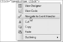
One neat feature with the XAML editor is the ability to easily navigate to an event handler once it has been assigned to a control. Simply right-click the event handler assignment in XAML and select the Navigate to Event Handler item from the popup menu, as shown in Figure 18-6.
Although it is important to familiarize yourself with writing XAML in the XAML editor, VS2010 also has a very good designer for WPF, comparable to the Windows Forms designer, and in some respects even better. This section takes a look at some of the features of the WPF designer.
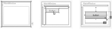
Figure 18-7 shows some of the snap lines, guides, and glyphs that are added when you select, move, and resize a control.
Note the glyph that appears on the left of the window toward its bottom-left corner in the first image in Figure 18-7. Clicking it allows you to easily switch between the window having a fixed width/height, and having it automatically size to fit its contents. When you click the glyph, the glyph will change (indicating what sizing mode it is in), and the SizeToContent property on the window is set accordingly. Clicking the glyph again changes the window back to having a fixed width/height. This option appears only on the root node.
Note
If you are wondering why the size of the window doesn't change in the designer when you click the glyph for it to size to content, the Height and Width properties of the window are replaced with "designer" height/width properties that retain these values for use by the WPF designer so that the SizeToContent property doesn't interfere while designing the form. These properties are then switched back to the standard Height and Width properties if you return to fixed-size mode.
The second image in Figure 18-7 demonstrates the snap lines that appear when you move a control around the form (or resize it). These snap lines are similar to those in the Windows Forms designer, and help you align controls to a standard margin within their container control, or easily align a control to other controls. Hold down ALT while you move a control if you don't want these snap lines to appear and your control to snap to them.
The third image in Figure 18-7 demonstrates the rulers that appear when you are resizing a control. This feature allows you to easily see the new dimensions of a control as you resize it in order to help you adjust it to a particular size.
You'll note that the third image in Figure 18-7 also contains some anchor points (that is, the two arrows pointing from the left and top of the button to the corresponding edges of its container grid). These arrows indicate that the button has a margin applied to it, dictating the placement of the button within its grid cell. Currently these arrows indicate that the button has a top and left margin applied, effectively "anchoring" its top and left sides to the top and left of the grid containing it. However, it is easy to swap the top anchor so that the button is anchored by its bottom edge, and swap the left anchor so that the button is anchored by its right edge instead. Simply click the top anchor arrow to have the button anchored by its bottom edge, and click the left anchor arrow to have the button anchored by its right edge. The anchor arrows swap position, and you can simply click them again to return them back to their original anchor points. You can also anchor both sides (that is, left/right or top/bottom) of a control such that it stretches as the grid cell it is hosted within is resized. For example, if the left side of the textbox is anchored to the grid cell you can also anchor its right side by clicking the small circle to the right of the textbox. To remove the anchor from just one side, click the anchor arrow on that side to remove it.
As previously mentioned, the most important control for laying out your form is the Grid control. Take a look at the some of the special support that the WPF designer has for working with this control. By default your MainWindow.xaml file was created with a single grid element without any rows or columns defined. Before you commence adding elements you might want to define some rows and columns, which can be used to control the layout of the controls within the form. To do this, start by selecting the grid by clicking in the blank area in the middle of the window, selecting the relevant node from the Document Outline tool window, or placing the cursor within the corresponding grid element in the XAML file itself (when in split view).
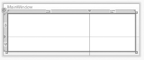
When the grid element is selected, a border appears around the top and left edges of the grid, highlighting both the actual area occupied by the grid and the relative sizing of each of the rows and columns, as shown in Figure 18-8. This figure currently shows a grid with two rows and two columns.
You can add additional rows or columns by simply clicking at a location within the border. Once added, the row or column markers can be selected and dragged to get the correct sizing. You will notice when you are initially placing the markers that there is no information about the size of the new row/column displayed, which is unfortunate; however, these will appear once the marker has been created.
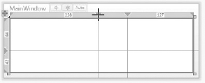
When you move the cursor over the size display for a row or column, three options appear across the top of the grid, as shown in Figure 18-9.
These options allow you to easily specify that the size of the row/column should be fixed (#), a weighted proportion (*), or determined by its contents (Auto).
Note
Weighted proportion is a similar concept to specifying a percentage of the space available (compared to other columns). After fixed and auto-sized columns/rows have been allocated space, columns/rows with weighted proportions will divide up the remaining available space. This division will be equal, unless you prefix the asterisk with a numeric multiplier. For example, say you have a grid with a width of 1000 (pixels) and two columns. If both have * as their specified width, they each will have a width of 500 pixels. However, if one has a width of *, and the other has a width of 3* then the 1000 pixels will divided into 250 pixel "chunks," with one chunk allocated to the first column (thus having a width of 250 pixels), and three chunks will be allocated to the second column (thus having a width of 750 pixels).
To delete a row or column, click the row or column and drag it outside of the grid area. It will be removed and the controls in the surrounding cells will be updated accordingly.
Note
When you create a control by dragging and dropping it on a grid cell, remember to "dock" it to the left and top edges of the grid cell (by dragging it until it snaps into that position). Otherwise a margin will be defined on the control to position it within the grid cell, which is probably not the behavior you will want.
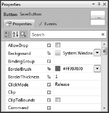
When you've placed a control on your form you don't have to return to the XAML editor to set its property values and assign event handlers. Like Windows Forms, WPF has a Properties window, although you will note that there are quite a few differences in WPF's implementation as shown in Figure 18-10.
The Properties window has had a huge makeover in terms of functionality from Visual Studio 2008. The Visual Studio 2008 version was very limited in its capabilities, requiring developers to modify the XAML directly in many cases. However, it has been vastly improved in Visual Studio 2010, reducing the need for this.
The Properties tool window for Windows Forms development allows you to select a control to set the properties for via a drop-down control selector above the properties/events list. However, you will note that this drop-down is missing in WPF's Properties window. Instead you must select the control on the designer, via the Document Outline tool window, or by placing the cursor within the definition of a control in XAML view. A thumbnail preview of the selected control (and any controls it contains) will be displayed in the top left-hand corner of the window, and the qualified type of the control will be displayed next to it.
Note
The Properties window can be used while working in both the XAML editor and the designer. However, if you want to use it from the XAML editor the designer must have been loaded (you may need to switch to designer view and back if you have opened the file straight into the XAML editor), and if you have invalid XAML you may find you will need to fix the errors first.
The Name property for the control is not within the property list, but has a dedicated textbox above the property list. Note that if the control doesn't already have a name it will assign the value to its Name property (rather than x:Name). However, if the x:Name attribute is defined on the control element and you update its name from the Properties window it will continue to use and update that attribute.
Controls can have many properties or events, and navigating through the properties/events lists in Windows Forms to find the one you are after can be a chore. To make finding a specific property easier for developers the WPF Properties window has a search function that dynamically filters the properties list based on what you type into the textbox. Your search string doesn't need to be the start of the property/event name, but retains the property/event in the list if any part of its name contains the search string. Unfortunately this search function doesn't support camel case searching.
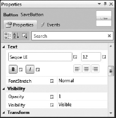
The property list in the WPF designer (like for Windows Forms) can be displayed in either a Categorized or Alphabetical order. You'll note that none of the properties that are objects (such as Margin) can be expanded to show/edit their properties (which they do for Windows Forms). However, if the list is displayed in the Categorized order you will observe a new and unique feature of WPF's property window: category editors. For example, if you select a Button control and browse down to the Text category you will find that it has a special editor for the properties in the Text category to make setting these values a better experience, as shown in Figure 18-11.
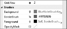
Various attached properties available to a control also appear in the property list, as shown in Figure 18-12.

You may have noticed that each property name has a small icon to its right. This is a new feature in Visual Studio 2010 called property markers, which indicate what the source for that property's value is. Placing your mouse cursor over an icon will show a tooltip describing what it means. The icon will change based on where the value is to be sourced from. Figure 18-13 demonstrates these various icons, which are described below:
A light gray icon indicates that the property has no value assigned to it and will use its default value.
A black diamond icon indicates that the property has a local value assigned to it (that is, has been given a specific value).
A yellow cylinder icon indicates that the property has a data binding expression assigned to it (discussed later in this chapter).
A paintbrush (with green paint) icon indicates that the property has a resource assigned to it.
A purple tree hierarchy icon indicates that the property is inheriting its value from another control further up the hierarchy.
Clicking a property marker icon displays a popup menu providing some advanced options for assigning the value of that property, as shown in Figure 18-14.
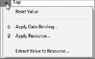
The Reset Value option simply returns the value of the property back to its default value (by deleting the attribute that assigns the value in the XAML).
The Apply Data Binding option provides a popup editor to select various binding options to create a data binding expression for that value. WPF supports numerous binding options, and these and this window are described further in the next section.
The Apply Resource option enables you to select a resource that you've created (or is defined by WPF) and assign it as the value of the selected property. Resources are essentially reusable objects and values, similar in concept to constants in code. For example, Figure 18-15 shows the popup window that appears when you select this option.
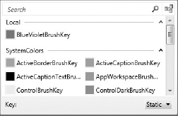
The resources are all the resources available to this property (that is, within scope and of the same type), grouped by their resource dictionary. Note the icon in the top right-hand corner of the popup window. Clicking this icon also groups the resources by which XAML file they originate from. This option can be toggled on and off.
Figure 18-15 shows a resource of the same type as this property (BlueVioletBrushKey) that is defined within the current XAML file (under the Local grouping). Because this is a property of type SolidColorBrush, the window is displaying all the color brush resources predefined in WPF that you could also choose from.
Returning to the other options in the menu shown in Figure 18-14, the Extract Value to Resource option takes the value of that property and turns it into a resource. The resource is created as a resource of the root node in the XAML file such that it can be reused throughout the file by the unique key you give it. The value of the property is automatically updated to use this resource. For example, using this option on the Background property of a control that has a value of #FF8888B7 defines the following resource in Window.Resources with the name BlueVioletBrushKey:
<SolidColorBrush x:Key="BlueVioletBrushKey">#FF8888B7</SolidColorBrush>
The control will reference this resource as such:
Background="{StaticResource BlueVioletBrushKey}"You can then apply this resource to other controls using the same means in XAML, or you can apply it by selecting the control and the property to apply it to, and using the Apply Resource option on the property marker menu described previously.
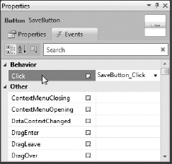
In the designer you will find that (as with Windows Forms) double-clicking a control automatically creates an event handler for that control's default event in the code-behind. You can also create event handlers for any of the control's events using the Properties window as you would in Windows Forms. Clicking the lightning icon in the Properties window takes you to the Events view, as shown in Figure 18-16. This shows a list of events that the control can raise, and you can double-click the event to automatically create the appropriate event handler in the code-behind.
Note
For VB.NET developers, double-clicking the Button control or creating the event via the Properties window wires up the event using the Handles syntax. Therefore, the event handler is not assigned to the event as an attribute. If you use this method to handle the event you won't see the event handler defined in the XAML for the control, and thus you won't be able to use the Navigate to Event Handler menu (from Figure 18-6) when in the XAML editor to navigate to it.
Data binding is a very important concept in WPF, and is one of its core strengths. Data binding syntax can be a bit confusing initially, but Visual Studio 2010 makes creating data bound forms very easy in the designer. Visual Studio 2010 helps with data binding in two ways: with the Apply Data Binding option on a property in the Properties tool window, and the drag and drop data binding support from the Data Sources window. This section looks at these two options in turn.
In WPF you can bind to objects (which also includes datasets, ADO.NET Entity Framework entities, and so on), resources, and even properties on other controls. So there are very rich binding capabilities in WPF and you can bind a property to almost anything you want to. Hand-coding these complex binding expressions in XAML can be quite daunting, but the Apply Data Binding editor enables you to build these expressions via a point-and-click interface.
To bind a property on a control first select the control in the designer and find the property you want to bind in the Properties window. Click the property marker icon and select the Apply Data Binding option. Figure 18-17 shows the window that appears.
This window contains a number of steps (similar to a wizard) that help you create a binding - Source, Path, Converter, and Options in an accordion style layout. Click on a header to open the corresponding step.
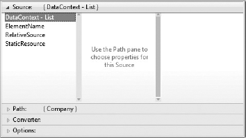
Generally when you open the window, you will be presented with the Source step that will allow you to select the binding source (in other words, the source of the data to which you will be binding). Note that this step may be automatically skipped and show the Path selection step instead (as shown in Figure 18-18) if there is already a data context set on the control (or further up the hierarchy). If you want to use one of the other types of bindings (such as ElementName), simply select the header of the Source step to change the preselected binding source. Then you can follow through selecting the options for your binding (select an option then move onto the next pane).
In the example shown in Figure 18-17, you have a Grid control further up the hierarchy to which has been assigned a CollectionViewSource resource (which points to a ViewModel object as the data source) to its DataContext property. The DataContext property's value is inherited by the controls further down the hierarchy, so when applying a data binding to a text box within that grid you can specify that the binding source is the text box's DataContext property (which is shown as having a List assigned to it). Once you have selected your binding source, you can move on to the Path step.
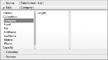
The Path step enables you to select the path on the binding source from which the value to be bound is located. For example, in Figure 18-18 the Company property (which is on the ViewModel that the binding source is bound to) has been selected.
If that property itself is an object, you can drill down and select the property on that to bind to (and so on). As can be seen in Figure 18-18, the company property (a string) has a Length property that we could bind to if we wished.
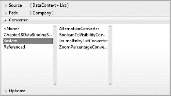
Double-click your final selection in your binding to close the editor. If required you can select a converter to use (see Figure 18-19) that will transform the bound value before assigning it to the selected property, and transform it again before a value is set back on the bound property (a very powerful feature in WPF data binding).
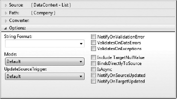
Various other binding options can also be set from the Options section as shown in Figure 18-20.
As you can see, this binding expression builder makes creating the binding expression much easier, without requiring you to learn the data binding syntax. This is a good way to learn the data binding syntax, because you can then see the expression produced in the XAML.
Now look at the drag and drop data binding features of Visual Studio 2010. The first step is to create something to bind to. This can be an object, a dataset, or an ADO.NET Entity Framework entity, among many other binding targets. For the purposes of this example you will create an object to bind to. Create a new class in your project called ContactViewModel, and create a number of properties on it such as FirstName, LastName, Company, Phone, Fax, Mobile, and Email (all strings).
Note
The name of your object is called ContactViewModel because it is acting as your ViewModel object, which pertains to the Model-View-ViewModel (MVVM) design pattern mentioned earlier. This design pattern will not be fully fleshed out in this example, however, in order to reduce its complexity and save potential confusion.
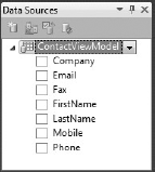
Now compile your project (this is important or otherwise the class won't appear in the next step). Return to the designer of your form and select Add New Data Source from the Data menu. Select Object as your data source type, click Next, and select the ContactViewModel class from the tree (you will need to expand the nodes to find it within the namespace hierarchy). Click the Finish button and the Data Sources tool window appears with the ContactViewModel object listed and its properties below, as shown in Figure 18-21.
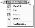
Now you are set to drag and drop either the whole object or individual properties onto the form, which will create one or more controls to display its data. By default a DataGrid control will be created to display the data, but if you select the ContactViewModel item, it will show a button that when clicked displays a drop-down menu (as shown in Figure 18-22) allowing you to select between DataGrid, List, and Details.
The DataGrid option creates a DataGrid control, which has a column for each property of the object.
The List option creates a List control with a data template containing fields for each of the properties.
The Details option creates a Grid control with two columns: one for labels and one for fields. A row will be created for each property on the object, with a Label control displaying the field name (with spaces intelligently inserted before capital letters) in the first column, and a field (whose type depends on the data type of the property) in the second column.
A resource is created in the Resources property of the Window, which points to the ContactViewModel object that can then be used as the data context or items source of the control(s) binding to the object. This can be deleted at a later stage if you want to set the data source from the code-behind. The control(s) will also have the required data binding expressions assigned. The type of control(s) that will be created on the form to display the data will depend on your selection on the ContactViewModel item.
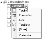
The type of control created for each property will have a default based upon the data type of the property, but like the ContactViewModel item you can select the property to show a button that when clicked displays a drop-down menu allowing you to select a different control type (as shown in Figure 18-23). If the type of control isn't in the list (such as if you want to use a third-party control), you can use the Customize option to add it to the list for the corresponding data type. If you don't want a field created for that property, select None from the menu.
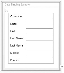
For this example you will create a details form, so select Details on the ContactViewModel item in the Data Sources window. You can change the control generated for each property if you want, but for now leave each as a textbox and have each property generated in the details form. Now select the ContactViewModel item from the Data Sources window and drop it onto your form. A grid will be created along with a field for each property as shown in Figure 18-24.
Unfortunately there is no way in the Data Sources window to define the order of the fields in the form, so you will need to reorder the controls in the grid manually (either via the designer or by modifying the XAML directly).
When you look at the XAML generated you will see that this drag and drop data binding feature will save you a lot of work and make the process of generating forms a lot faster and easier.
Note
If you write user/custom controls that expose properties that may be assigned a data binding expression you will need to make these dependency properties. Dependency properties are a special WPF/Silverlight concept whose value can accept an expression that needs to be resolved (such as data binding expression). Dependency properties need to be defined differently than standard properties. The discussion of these is beyond the scope of this chapter, but essentially only properties that have been defined as dependency properties can be assigned a data binding expression.
Up until now, your application has looked very plain — in fact it could be considered much plainer than if you had designed it in Windows Forms. The great thing about WPF, however, is that the visual appearance of the controls is easy to modify, allowing you to completely change the way they look. You can store commonly used changes to specific controls as styles (a collection of property values for a control which is stored as a resource that can be defined once and applied to multiple controls), or you can completely redefine the XAML for a control by creating a new control template for it. These resources can be defined in the Resources property of any control in your layout along with a key, which can then be used by any controls further down the hierarchy that refer to it by that key. For example, if you wanted to define a resource available for use by any control within your MainWindow XAML file you could define it in Window.Resources. Or if you wanted to be able to use it throughout the entire application you could define it in the Application.Resources property on the Application element in App.xaml.
Taking it one step further, you could define multiple control templates/styles in a resource dictionary and use this as a theme. This theme could be applied across your application to automatically style the controls in your user interface and provide a unique and consistent look for your application. This is what this section looks at. Rather than creating your own themes you will actually be using the themes available from the WPF Themes project on CodePlex: http://www.codeplex.com/wpfthemes.
These themes were initially designed (most by Microsoft) for use in Silverlight applications, but have been converted (where it was necessary) so they can be used in WPF applications. Use one of these themes to create a completely different look for your application.
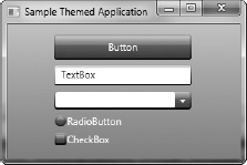
Start by creating a new application and adding some different controls on the form, as shown in Figure 18-25.

As you can see this looks fairly bland, so try applying a theme and seeing how you can easily change its look completely. When you download the WPF Themes project you will see that it contains a solution with two projects: one providing the themes, and a demonstration project that uses them. You will use the themes slightly differently, however. Run the sample application and find a theme that you like. For the purposes of demonstration choose the Shiny Blue theme. In the WPF.Themes project under the ShinyBlue folder you will find a Theme.xaml file. Copy this into the root of your own project (making sure to include it in your project in Visual Studio).
Open up App.xaml and add the following XAML code to Application.Resources:
<ResourceDictionary>
    <ResourceDictionary.MergedDictionaries>
        <ResourceDictionary Source="Theme.xaml"/>
    </ResourceDictionary.MergedDictionaries>
</ResourceDictionary>
This XAML code simply merges the resources from the theme file into your application resources, which will apply the resources application-wide and override the default styling of the controls in your project with the corresponding ones defined in the theme file.
One last change to make is to set the background style for your window(s) to use the style from the theme file (because this isn't automatically assigned). In your Window element add the following attribute:
Background="{StaticResource WindowBackgroundBrush}"Now run your project and you will find the controls in your form look completely different, as shown in Figure 18-26.
To change the theme to a different one you can simply replace the Theme.xaml file with another one from the WPF.Themes project and recompile your project.
Note
If you plan to extensively modify the styles and control templates for your application you may find it much easier to do so in Expression Blend — a tool specifically designed for graphics designers who are working with XAML. Expression Blend is much better suited to designing graphics and animations in XAML, and provides a much better designer for doing so than Visual Studio (which is focused more toward developers). Expression Blend can open up Visual Studio solutions and can also view/edit code and compile projects, although it is really best suited to design-related tasks. This integration of Visual Studio and Expression Blend helps to support the designer/developer workflow. Both these tools can have the same solution/project open at the same time (even on the same machine), enabling you to quickly switch between them when necessary. If a file is open in one when you save a change to a file in the other a notification dialog appears asking if you want to reload the file. To easily open a solution in Expression Blend from Visual Studio, right-click a XAML file and select the Open in Expression Blend option.
Up until now you have seen how you can build a WPF application, however the likelihood is that you already have a significant code base in Windows Forms and are unlikely to immediately migrate it all to WPF. You may have a significant investment in that code base and not want to rewrite it all for technology's sake. To ease this migration path, Microsoft has enabled WPF and Windows Forms to work together within the same application. Bi-directional interoperability is supported by both WPF and Windows Forms applications, with WPF controls able to be hosted in a Windows Forms application, and Windows Forms controls able to be hosted in a WPF application. This section looks at how to implement each of these scenarios.
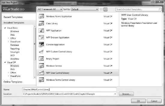
To begin with, create a new project in your solution to create the WPF control in. This control (for the purpose of demonstration) will be a simple username and password entry control. From the Add New Project dialog (see Figure 18-27), select the WPF User Control Library project template. This will already include the XAML and code-behind files necessary for a WPF user control. If you examine the XAML of the control you will see that it is essentially the same as the original XAML for the window you started with at the beginning of the chapter except that the root XAML element is UserControl instead of Window.
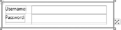
Rename the control to UserLoginControl, and add a grid, two text blocks, and two textboxes to it as demonstrated in Figure 18-28.
In the code-behind add some simple properties to expose the contents of the textboxes publicly (getters and setters):
- VB
Public Property UserName As String
    Get
        Return txtUserName.Text
    End Get
    Set(ByVal value As String)
        txtUserName.Text = value
    End Set
End Property

Public Property Password As String
    Get
        Return txtPassword.Text
    End Get
Set(ByVal value As String) txtPassword.Text = value End Set End Property- C#
public string Username
{
    get { return txtUserName.Text; }
    set { txtUserName.Text = value; }
}

public string Password
{
    get { return txtPassword.Text; }
    set { txtPassword.Text = value; }
}
Now that you have your WPF control, build the project and create a new Windows Forms project to host it in. Create the project and add a reference to your WPF project that contains the control (using the Add Reference menu item when right-clicking the References in the project).
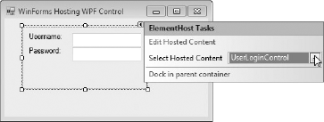
Open up the form that will host the WPF control in the designer. Because the WPF control library you built is in the same solution, your UserLoginControl control will appear in the Toolbox and can simply be dragged and dropped onto the form to be used. This automatically adds an ElementHost control (which can host WPF controls) and references the control as its content.
However, if you need to do this manually the process is as follows. In the Toolbox there is a WPF Interoperability tab, under which there is a single item called the ElementHost. Drag and drop this onto the form, as shown in Figure 18-29, and you will see that there is a smart tag that prompts you to select the WPF control that you want to host. Note that if the control doesn't appear in the drop-down you may need to build your solution.
The control will be loaded into the ElementHost control and automatically given a name to refer to it in code (which can be changed via the HostedContentName property).
Now take a look at the opposite scenario — hosting a Windows Forms control in a WPF application. Create a new project using the Class Library project template called Chapter 18 WinFormsControlLibrary. Delete the Class1 class, and add a new User Control item to the project and call it UserLoginControl.
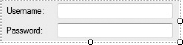
Open this item in the designer and add two text blocks and two textboxes to it as demonstrated in Figure 18-30.
In the code-behind add some simple properties to expose the contents of the textboxes publicly (getters and setters):
- VB
Public Property UserName As String Get Return txtUserName.Text End Get Set(ByVal value As String) txtUserName.Text = value End Set End Property Public Property Password As String Get Return txtPassword.Text End Get Set(ByVal value As String) txtPassword.Text = value End Set End Property- C#
public string Username
{
    get { return txtUserName.Text; }
    set { txtUserName.Text = value; }
}

public string Password
{
    get { return txtPassword.Text; }
    set { txtPassword.Text = value; }
}
Now that you have your Windows Forms control, build the project and create a new WPF project to host it in. Create the project and add a reference to your Windows Forms project that contains the control (using the Add Reference menu item when right-clicking the References in the project).
Open up the form that will host the Windows Forms control in the designer. Select the WindowsFormsHost control from the Toolbox and drag and drop it onto your form. Unfortunately at this point the designer can't help you and you need to change to the XAML editor. You need to add a namespace prefix definition on the root element:
xmlsn:wfapp="clr-namespace:Chapter18WinFormsControlLibrary;
assembly=Chapter18WinFormsControlLibrary"
And you can then modify the WindowsFormsHost element to host your control, which when run will render the control as shown in Figure 18-31.
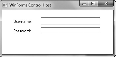
<WindowsFormsHost x:Name="windowsFormsHost">
    <wfapp:UserLoginControl x:Name="userLoginDetails" />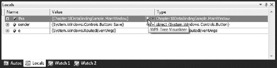
</WindowsFormsHost>Identifying problems in your XAML/visual tree at runtime can be difficult, but fortunately a new feature called the WPF Visualizer has been added to VS2010 to help you debug your WPF application's visual tree. For example, an element may not be visible when it should be, may not appear where it should, or may not be styled correctly. The WPF Visualizer can help you track down these sorts of problems by enabling you to view the visual tree, view the values of the properties for a selected element, and view where properties are getting their styling from.
In order to open the WPF Visualizer, you must first be in break mode. Using the Autos, Local, or Watch tool window, find a variable that contains a reference to an element in the XAML document to debug. You can then click the little magnifying glass icon next to a WPF user interface element listed in the tool window to open the visualizer (as shown in Figure 18-32). Alternatively you can place your mouse cursor over a variable that references a WPF user interface element (to display the DataTip popup) and click the magnifying glass icon there.
The WPF Visualizer is shown in Figure 18-33. On the left side of the window you can see the visual tree for the current XAML document and the rendering of the selected element in this tree below it. On the right side is a list of all the properties of the selected element in the tree, their current values, and other information associated with each property.
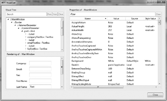
Because a visual tree can contain thousands of items, finding the one you are after by traversing the tree can be difficult. If you know the name or type of the element you are looking for, you can enter this into the search text box above the tree and navigate through the matching entries using the Next and Prev buttons. You can also filter the property list by entering a part of the property name, value, style, or type that you are searching for.
Unfortunately there's no means to edit a property value or modify the property tree, but inspecting the elements in the visual tree and their property values (and the source of the values) should help you track down problems in your XAML much more easily than in previous versions of Visual Studio.
In this chapter you have seen how you can work with Visual Studio 2010 to build applications with WPF. You've learned some of the most important concepts of XAML, how to use the unique features of the WPF designer, looked at styling an application, and used the interoperability capabilities between WPF and Windows Forms.