
The analysis of peaks is similar to that of valleys, since both are extreme values. SciPy has the argrelmax() function that finds the relative maxima. When we apply this function to daily temperature values, it not only finds hot days in summer but also hot days in winter unless we make the function consider a larger time frame. Of course, we can also check whether values are above a threshold or only select summer data using prior knowledge.
When we analyze peaks in time series data, we can apply two approaches. The first approach is to consider the highest peaks in a year, a month, or another fixed time interval and build a series with those values. The second approach is to define any value above a threshold as a peak. In this recipe, we will use the 95th percentile as the threshold. In the context of this approach, we can have multiple peaks in a sequence. Long streaks can have a negative impact, for instance, in the case of heat waves.
- The imports are as follows:
import dautil as dl
from scipy import signal
import matplotlib.pyplot as plt
import seaborn as sns
from IPython.display import HTML
- Load and resample the data:
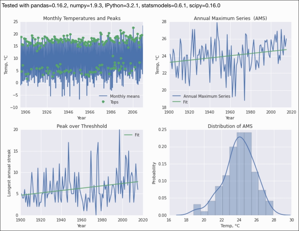
temp = dl.data.Weather.load()['TEMP'].dropna() monthly = temp.resample('M') - Plot peaks and note that hot days in winter are also considered:
sp = dl.plotting.Subplotter(2, 2, context) max_locs = signal.argrelmax(monthly.values) sp.ax.plot(monthly.index, monthly, label='Monthly means') sp.ax.plot(monthly.index[max_locs], monthly.values[max_locs], 'o', label='Tops') sp.label(ylabel_params=dl.data.Weather.get_header('TEMP')) - Plot the annual maximum series:
annual_max = dl.ts.groupby_year(temp).max() sp.next_ax().plot(annual_max.index, annual_max, label='Annual Maximum Series') dl.plotting.plot_polyfit(sp.ax, annual_max.index, annual_max.values) sp.label(ylabel_params=dl.data.Weather.get_header('TEMP')) - Plot the longest annual streaks of hot days over the 95th percentile threshold:
_, threshhold = dl.stats.outliers(temp, method='percentiles') over_threshhold = temp > threshhold streaks = dl.ts.groupby_year(over_threshhold).apply( lambda x: dl.collect.longest_streak(x, 1)) sp.next_ax().plot(streaks.index, streaks) dl.plotting.plot_polyfit(sp.ax, streaks.index, streaks.values) over_threshhold = dl.ts.groupby_year(over_threshhold).mean() sp.label() - Plot the annual maximum series distribution:
sp.label(advance=True)
sns.distplot(annual_max, ax=sp.ax)
sp.label(xlabel_params=dl.data.Weather.get_header('TEMP'))
HTML(sp.exit())
Refer to the following screenshot for the end result:
The code is in the analyzing_peaks.ipynb file in this book's code bundle.
- The
argrelmax()function documented at https://docs.scipy.org/doc/scipy/reference/generated/scipy.signal.argrelmax.html (retrieved September 2015)