Describing the relationship between categorical and continuous variables is perhaps the most familiar of the three broad categories.
When I was in the fifth grade, my class had to participate in an area-wide science fair. We were to devise our own experiment, perform it, and then present it. For some reason, in my experiment I chose to water some lentil sprouts with tap water and some with alcohol to see if they grew differently.
When I measured the heights and compared the measurements of the teetotaller lentils versus the drunken lentils, I was pointing out a relationship between a categorical variable (alcohol/no-alcohol) and a continuous variable (heights of the seedlings).
Note
Note that I wasn't trying to make a broader statement about how alcohol affects plant growth. In the grade-school experiment, I was just summarizing the differences in the heights of those plants—the ones that were in the experiment. In order to make statements or draw conclusions about how alcohol affects plant growth in general, we would be exiting the realm of exploratory data analysis and entering the domain of inferential statistics, which we will discuss in the next unit.
The alcohol could have made the lentils grow faster (it didn't), grow slower (it did), or grow at the same rate as the tap water lentils. All three of these possibilities constitute a relationship: greater than, less than, or equal to.
To demonstrate how to uncover the relationship between these two types of variables in R, we will be using the iris dataset that is conveniently built right into R.
  > head(iris)
    Sepal.Length Sepal.Width Petal.Length Petal.Width Species
  1          5.1         3.5          1.4         0.2  setosa
  2          4.9         3.0          1.4         0.2  setosa
  3          4.7         3.2          1.3         0.2  setosa
  4          4.6         3.1          1.5         0.2  setosa
  5          5.0         3.6          1.4         0.2  setosa
  6          5.4         3.9          1.7         0.4  setosa
This is a famous dataset and is used today primarily for teaching purposes. It gives the lengths and widths of the petals and sepals (another part of the flower) of 150 Iris flowers. Of the 150 flowers, it has 50 measurements each from three different species of Iris flowers: setosa, versicolor, and virginica.
By now, we know how to take the mean of all the petal lengths:
  > mean(iris$Petal.Length)
  [1] 3.758
But we could also take the mean of the petal lengths of each of the three species to see if there is any difference in the means.
Naively, one might approach this task in R as follows:
  > mean(iris$Petal.Length[iris$Species=="setosa"])
  [1] 1.462
  > mean(iris$Petal.Length[iris$Species=="versicolor"])
  [1] 4.26
  > mean(iris$Petal.Length[iris$Species=="virginica"])
  [1] 5.552
But, as you might imagine, there is a far easier way to do this:
  > by(iris$Petal.Length, iris$Species, mean)

  iris$Species: setosa
  [1] 1.462
  --------------------------------------------
  iris$Species: versicolor
  [1] 4.26
  --------------------------------------------
  iris$Species: virginica
  [1] 5.552
by is a handy function that applies a function to split the subsets of data. In this case, the Petal.Length vector is divided into three subsets for each species, and then the mean function is called on each of those subsets. It appears as if the setosas in this sample have way shorter petals than the other two species, with the virginica samples' petal length beating out versicolor's by a smaller margin.
Although means are probably the most common statistic to be compared between categories, it is not the only statistic we can use to compare. If we had reason to believe that the virginicas have a more widely varying petal length than the other two species, we could pass the sd function to the by function as follows
> by(iris$Petal.Length, iris$Species, sd)
Most often, though, we want to be able to compare many statistics between groups at one time. To this end, it's very common to pass in the summary function:
  > by(iris$Petal.Length, iris$Species, summary)

  iris$Species: setosa
     Min. 1st Qu.  Median    Mean 3rd Qu.    Max.
    1.000   1.400   1.500   1.462   1.575   1.900
  ------------------------------------------------
  iris$Species: versicolor
     Min. 1st Qu.  Median    Mean 3rd Qu.    Max.
     3.00    4.00    4.35    4.26    4.60    5.10
  ------------------------------------------------
  iris$Species: virginica
     Min. 1st Qu.  Median    Mean 3rd Qu.    Max.
    4.500   5.100   5.550   5.552   5.875   6.900
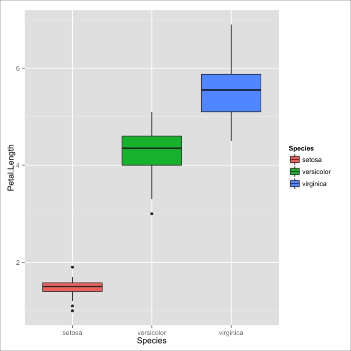
As common as this idiom is, it still presents us with a lot of dense information that is difficult to make sense of at a glance. It is more common still to visualize the differences in continuous variables between categories using a box-and-whisker plot:

Figure 3.1: A box-and-whisker plot depicting the relationship between the petal lengths of the different iris species in iris dataset
A box-and-whisker plot (or simply, a box plot if you have places to go, and you're in a rush) displays a stunningly large amount of information in a single chart. Each categorical variable has its own box and whiskers. The bottom and top ends of the box represent the first and third quartile respectively, and the black band inside the box is the median for that group, as shown in the following figure:

Figure 3.2: The anatomy of a box plot
Depending on whom you talk to and what you use to produce your plots, the edges of the whiskers can mean a few different things. In my favorite variation (called Tukey's variation), the bottom of the whiskers extend to the lowest datum within 1.5 times the interquartile range below the bottom of the box. Similarly, the very top of the whisker represents the highest datum 1.5 interquartile ranges above the third quartile (remember: interquartile range is the third quartile minus the first). This is, coincidentally, the variation that ggplot2 uses.
The great thing about box plots is that not only do we get a great sense of the central tendency and dispersion of the distribution within a category, but we can also immediately spot the important differences between each category.
From the box plot in the previous image, it's easy to tell what we already know about the central tendency of the petal lengths between species: that the setosas in this sample have the shortest petals; that the virginica have the longest on average; and that versicolors are in the middle, but are closer to the virginicas.
In addition, we can see that the setosas have the thinnest dispersion, and that the virginica have the highest—when you disregard the outlier.
But remember, we are not saying anything, or drawing any conclusions yet about Iris flowers in general. In all of these analyses, we are treating all the data we have as the population of interest; in this example, the 150 flowers measured are our population of interest.
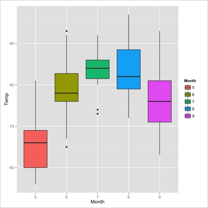
Before we move on to the next broad category of relationships, let's look at the airquality dataset, treat the month as the categorical variable, the temperature as the continuous variable, and see if there is a relationship between the average temperature across months.
  > by(airquality$Temp, airquality$Month, mean)
  airquality$Month: 5
  [1] 65.54839
  ---------------------------------------------
  airquality$Month: 6
  [1] 79.1
  ---------------------------------------------
  airquality$Month: 7
  [1] 83.90323
  ---------------------------------------------
  airquality$Month: 8
  [1] 83.96774
  ---------------------------------------------
  airquality$Month: 9
  [1] 76.9
This is precisely what we would expect from a city in the Northern hemisphere:

Figure 3.3: A Box plot of NYC temperatures across months (May to September)
