Form components such as <input/>, <textarea/> and <option/> are handled differently by React as they allow for being mutated by the users input unlike static components like <div/> or <h1/>. As we will the dynamic nature of form components combined with the determination of React components can lead to some unexpected things when you are first learning React.
Let's start by exploring the concept of controlled components by looking at the following code:
var TextBox = React.createClass({
    render: function() {
        return <input type='text' value='Read only'/>;
    }
});

ReactDOM.render(
    <TextBox/>,
    document.getElementById('view'));
Note
Source code: http://j.mp/Mastering-React-3-3-Gist
Let's now run this code and try and change the text displayed in the text box.
As you can see the TextBox element doesn't allow the text for being updated and as you type the text displayed, "Read only", doesn't change.
The reason that our TextBox element doesn't change as we type is because in React an input with its value prop set like the one below is a controlled component.
var TextBox = React.createClass({
    render: function() {
        return <input type='text' value='Read only'/>;
    }
});
What it means to be a controlled component is that the input will always display the value that is currently assigned to the input's value prop. In our code we haven't provided a way for the input's value to change so our component always displays "Read only" and it ignores incoming input from the keyboard. This is because React form components are not wired up to respond to the peripheral input like keyboards. And this is because, as we just discussed, React form components are only wired to display what is set on the input component's value prop.
Let's now see what happens when we wire up controlled components to state and props by looking at the following code:
var ExampleForm = React.createClass({
    getInitialState: function() {
        return { message: 'Read and write' }
    },
    getDefaultProps: function () {
        return { message: 'Read only' }
    },
    onChange: function(event) {
        this.setState({message: event.target.value});
    },
    render: function() {
        return (
<div>
                <input id='readOnly' className='form-control' type='text'
                    value={this.props.message}/>
                <input id='readAndWrite' className="form-control" type='text'
                value={this.state.message}
                    onChange={this.onChange}/>
            </div>
        );
    }
});

ReactDOM.render(
    <ExampleForm/>,
    document.getElementById('view'));
Note
Source code: http://j.mp/Mastering-React-3-4-Gist
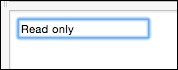
Run the code and you will see the output shown as follows:
If you try and change the values in the two text input boxes you will see that you can't change the Read only text b-ox but you can change the Read and write text box.
The Read only text box is the input with id of readOnly and has it's value set to this.props.message shown as follows:
<input id='readOnly' className='form-control' type='text'
                    value={this.props.message}/>
Note that this.props.message is given a default value of Read only from the ExampleForm.getDefaultProps method shown as follows:
getDefaultProps: function () {
        return { message: 'Read only' }
    },
Because React component props are immutable and because in our example this.props.message is only set inside the ExampleForm component that declares our Read only input box our Read only text input box can't be changed.
However, the Read and write input box with the id set to readAndWrite is set to this.state.message and it's onChange synthetic event is set to the this.onChange method shown as follows:
  <input id='readAndWrite' className="form-control" type='text'
                value={this.state.message}
                    onChange={this.onChange}/>
In the onChange method we are then taking the event that is passed in from the React synthetic event and then calling this.setState({message: event.target.value}). This call will update this.state.message reflect the input that the user sends in via a keyboard or some other input device.
    onChange: function(event) {
        this.setState({message: event.target.value});
    },
Updating state in this way will cause a rerender and when the component's render method is called it will use the current value from this.state.message allowing our component to be dynamic to update it's displayed value.
If you are familiar with two way data binding frameworks then this probably seems like a lot of work to do something in React that is really simple in frameworks that support two way databinding. However, the React team chose to follow a one way data flow model below.
Note
In React, data flows one way: from owner to child. This is because data only flows one direction in the Von Neumann model of computing. You can find the source at https://facebook.github.io/react/docs/two-way-binding-helpers.html.
React's philosophy is all about performance and maintainability. Both of those goals benefit from using one way data flows down the component hierarchy. If you are using a large complex web application then it becomes much easier to reason about the application when data flows in one direction. It gets even better when state is minimized to the smallest set of state needed and maintained as high in the component hierarchy as possible. Below is some guidance from the React team taken from the documentation about organizing data flows and state in React applications.
Remember: React is all about one-way data flow in the component hierarchy. It may not be immediately clear which component should own what state. This is often the most challenging part for newcomers to understand, so follow these steps to figure it out:
For each piece of state in your application identify every component that renders something based on that state. Then, find a common owner component (a single component above all the components that need the state in the hierarchy). Either the common owner or another component higher up in the hierarchy should own the state.
If you can't find a component where it makes sense to own the state, create a new component simply for holding the state and add it somewhere in the hierarchy above the common owner component. The source code can be found at: https://facebook.github.io/react/docs/thinking-in-react.html.
That said, I think that once you start building larger applications you will appreciate the maintainability provided by this approach and we look at more complex examples in the upcoming chapters so you will get to see a better example of this aspect of React. For now though, let's take a look at how we can organize a simple form around these best practices.
Let's take a look at a simple form now using controlled components.
var TextBox = React.createClass({
    render: function() {
        return (
            <input className='form-control'
                name={this.props.name}
                type='text'
                value={this.props.value}
                onChange={this.props.onChange}/>
        );
    }
});

var ExampleForm = React.createClass({
    getInitialState: function () {
        return { form: { firstName: 'Ryan', lastName: 'Vice'} }
    },
    onChange: function(event) {
        this.state.form[event.target.name] = event.target.value;

        this.setState({form: this.state.form});
    },
    onSubmit: function(event) {
        event.preventDefault();

        alert('Form submitted. firstName: ' +
            this.state.form.firstName +
            ', lastName: ' +
            this.state.form.lastName);

    },
    render: function() {
       var self = this;
       return (
            <form onSubmit={this.onSubmit}>
                <TextBox name='firstName'
                    value={this.state.form.firstName}
                    onChange={this.onChange}/>
                <TextBox name='lastName'
                    value={this.state.form.lastName}
                    onChange={this.onChange}/>
                <button className='btn btn-success'
                type='submit'>Submit</button>
            </form>
        );
    }
});

ReactDOM.render(
    <ExampleForm/>,
    document.getElementById('view'));
Note
Source code: http://j.mp/Mastering-React-3-5-Gist
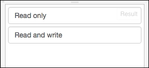
Run the Fiddle, click Submit and you will see the following output:
This code creates a simple first name, last name form by doing the following.
Create a reusable TextBox component that allows for wiring up name, value and onChange in a consistent way.

var TextBox = React.createClass({
    render: function() {
        return (
            <input className='form-control'
                name={this.props.name}
                type='text'
                value={this.props.value}
                onChange={this.props.onChange}/>
        );
    }
});- In our
ExampleFormcomponent we create a simple form for the first name and last name using ourTextBoxcomponent. We also wire up form'sonSubmitto thethis.onSubmitmethod and wire up eachTextBoxinstanceonChangetothis.onChange.render: function() { var self = this; return ( <form onSubmit={this.onSubmit}> <TextBox name='firstName' value={this.state.form.firstName} onChange={this.onChange}/> <TextBox name='lastName' value={this.state.form.lastName} onChange={this.onChange}/> <button className='btn btn-success' type='submit'>Submit</button> </form> ); } - We wire up our
ExampleForm.onChangemethod to allow our controlled components to be dynamic and to reflect our users input in the UI. Note that we are taking advantage of JavaScript's implementation of objects as dictionaries here to set the property onthis.state.form. Using this kind of approach will greatly reduce boiler plate that you need to write to wire up inputs.onChange: function(event) { this.state.form[event.target.name] = event.target.value; this.setState({form: this.state.form}) } - We then wire up
ExampleForm.onSubmitmethod to first suppress the default form behavior of HTML which will prevent a server side postback and then we show an alert with the first name and last name values that were entered into our form.onSubmit: function(event) { event.preventDefault(); alert('Form submitted. firstName: ' + this.state.form.firstName + ', lastName: ' + this.state.form.lastName); }
Now we've looked at how it works but let's take a minute to focus on how we followed React's best practices around state. The following is a quick refresher on the best practices.
For each piece of state in your application, you have to identify every component that renders something based on that state. Then, find a common owner component (a single component above all the components that need the state in the hierarchy). Either the common owner or another component higher up in the hierarchy should own the state.
If you can't find a component where it makes sense to own the state, create a new component simply for holding the state and add it somewhere in the hierarchy above the common owner component.
In the example above we applied these best practices in a way that is often called Smart and Dumb components but also called fat and skinny, stateful and pure, screens and components, and so on The approach involves dividing your components into two categories, Smart components that contain state and Dumb components that are immutable and only use props. Organizing your components in this way aligns really well with the React best practices and will make your app easier to understand and reason about.
In our example we have created the ExampleForm smart component that contains all the state for our application and the TextBox dumb component that is immutable and just provides a seam for our text input components allowing us to easily provide consistency in how we layout and wire up our text inputs. By using this approach we've moved the state out of the TextBox component and into the ExampleForm. The example form is then able to store the state for all the TextBox instances and will update the TextBox instances with any changes in state through TextBox props.
The modular design of our application makes it trivial to make our form data driven by changing our render method as shown below.
render: function() {
       var self = this;
       return (
            <form onSubmit={this.onSubmit}>
            {Object.keys(this.state.form).map(
                function(key) {
                return (
                    <TextBox name={key}
                        value={self.state.form[key]}
                        onChange={self.onChange}/>
                        )
                    })
                }

                <button className='btn btn-success' type='submit'>Submit</button>
            </form>
        );
Note
Source code: http://j.mp/Mastering-React-3-6-Gist
All we did here was replace the static TextBox component instances with code that dynamically generates the TextBox components based on this.state.form shown as follows:
            {Object.keys(this.state.form).map(
                function(key) {
                    return (
                        <TextBox name={key}
                    value={self.state.form[key]}
                    onChange={self.onChange}/>
                        )
                    })
                }
The Object.keys method will return a collection of all the property names on this.state.form and we then call map on that collection to generate our TextBox instances. From here there are many exciting things we could do. We could make our TextBox component more generic so that it takes an input type from the data that it's generated from and instead of just being a TextBox it could be a FormInput component that could be text, checkbox, and so on. There are micro frameworks, like Formsy that take this idea and add great features like validation to the mix. Speaking of validation, let's take a closer look at validation in React.
In this chapter we looked at forms but how to do we handle validating the user input? There's good and bad news on this for React users. The bad news is that this is not a concern that React address for us. However, the good news is that we have a lot of options when it comes to validation because React is focuses only on displaying and modifying the screen and not validating it. Our first options is that we could simply write our validation logic into our components or other JavaScript modules.
If we started out writing our validation logic this way then we'd likely see some patterns emerging and wan't to write some library style components, mixins and modules to reduce repetition and provide consistency. We could definitely roll our own solution to validating our apps as we saw at end of the last section where we looked at creating data driven forms. We could use generic components andor custom mixins to create our own library that would make writing forms and validation code easier. However, people have already done this and there are also open source libraries out there that can make things easier when it comes to validation. One of the key benefits of working in React is that you are working with a micro framework that only cares about view concerns and you can mix and match it with other tools allowing for a lot more flexibility than you will find in larger frameworks like AngularJs or EmberJs
There are several places in a client-server style application that we can put validation logic. If we are using a relational database we can have validation that enforces the structure of our data for data coming into the database. On the server if we are using an N-Tier architecture we can have logic in our domain model and domain services, we can also have validation logic in our repositories or Data Access Objects (DAO). No matter what patterns we are using we can add validation logic to each tier of our application. In the same way we can have validation logic at the transport layer and validating that the data coming into our REST API is valid. However, none of those concerns are things that address with our React code as React is a view concern. This means that in a Client Server application we would only be looking at how to address Client Side validation within the context of React.
Note
Note that React is very flexible and it is possible to create applications with React that don't follow a Client Server architecture. While you can build web applications with React you can also use React in Thick Client applications using technologies like NW.js or Electron. You can also use React to write native mobile applications using React Native. And that's just some of the options available at the time of this writing. I'm sure we will see many other options come and go over time. However, for our conversation about React validation options we will refer to React's area of concern as being on the Client Side.
When writing client side validations and validating a form there are two scopes that we need to be able to validate at on the client side. We need to be able to do simple field level validations and more complex form level validations. Let's now take a closer look at these two concepts.
Field level validation is validating a single input, in isolation, for simple things like whether a field is required, whether a field's length is under a maximum length or over a minimum, or whether a field satisfies a regular expression for things like emails, social security numbers, and so on.
In addition to validating a form's various fields against simple rules in isolation we also need the ability to validate our form against complex rules that consider more than one field. For example, we may need to make sure that two fields are the same when confirming an email address or password doesn't have an obvious typo. Or we could have fields that are required when another field has a certain value, like requiring filling out a shipping address when it's not the same as a billing address. There's a whole host of complex business rules that we could need to validate that would require more than one field of data to process and these more complex, multi field rules fall into the scope of form level validations.
Let's now take a look at one tool that we can use to do validations in React, the react-validation-mixin. This library takes advantage of React's mixin functionality to allow you to easily support both field and form level validations.
For this example we won't have a Fiddle because we need to use the React-validation-mixin which is easily installed using NPM (Node Package Manager) and accessed via the CommonJs require syntax. We will look in detail into setting up a React application to allow for consuming Node package dependencies in up coming chapters so I won't dive into those details here. For this code I've created a GitHub repository that you can either clone using Git or simply download as a ZIP file.
Note
The following is the repository URL:
https://github.com/RyanAtViceSoftware/MasteringReactJsValidationExample
If you haven't used GitHub before you will find the clone and download options on the right side of the page shown as follows:

Once you get the code cloned or downloaded and extracted you can run the code by doing the following:
- Execute from command prompt (Windows) or terminal (Mac)
npm install - Execute from command prompt (Windows) or terminal (Mac)
npm start - Open
index.htmlin a browser.
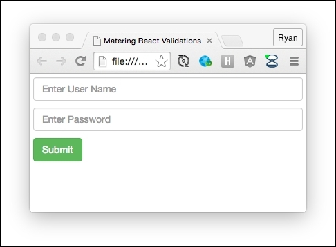
Now you should see a page like the one shown as follows:
Note
Note that these steps will run watchify that will rebuild dist/bundle.js anytime you change the code in app.jsx. The bundle.js file is what is being linked to in index.html file. This setup allows you can change the code in app.jsx and save your changes to regenerate bundle.js. Feel free to experiment with the code and just make sure that you save and then let the build finish before you refresh the browser. You can tell the build is finished by watching the terminalconsole window that you ran the npm start command in.
We have implemented several field level validation rules here shown as follows:
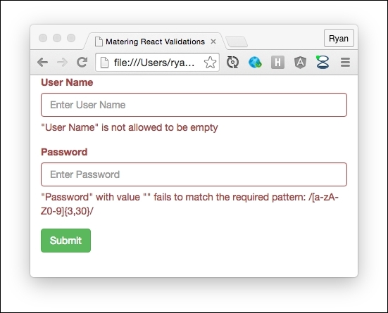
If you submit the form without adding any text to the boxes you will see the validations shown above. These validations fire when a text box loses focus so that the user isn't alerted until they've had a chance to provide valid data. Here we are getting the React-validation-mixin default messaging for a required field violation and a regular expression violation. The User Name field is indicating that it is a required field and the Password field is indicating that it is not matching a regular expression that requires that our password be between 3 and 30 characters long and only contains letters and numbers.
Next let's take a look at how this web application implements a more complex form level validation. Enter ryan for the User Name field and then badryanpassword for Password shown as follows:
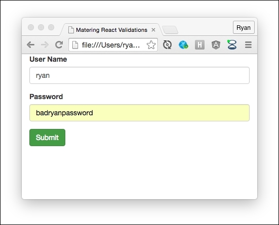
Now click the submit button and you will see the alert box shown below and the form won't be submitted.
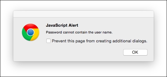
This is an example of a more complex form level validation as we are looking at more than one field, User Name and Password, and applying a rule against both of them. Note that you will also see alert boxes if you click submit and any of the field validations fail as we are re-running those rules as part of our form validations as you would want to do.
Note that the first thing we had to do was install the React validation mixin module using NPM. We won't cover those details here but you can find installation instructions on their site at. Now let's look at the code found in app.jsx file which is the only file in our solution with logic. There is also an index.html that simply allows from displaying our components and references the needed JavaScript files. However, the heart of what we need to focus on here is all in the app.jsx file so let's take a look at that code now.
Because this example is longer we will look at the code in a few parts. The first thing we are doing in app.jsx is to bring in the dependencies that our code needs using CommonJs syntax as shown below.
'use strict';
var React = require('react');
var Joi = require('joi');
var JoiValidationStrategy = require('joi-validation-strategy');
var ReactValidationMixin = require('react-validation-mixin');
We will cover CommonJs more in upcoming chapters but for now what is important is to know that require("dependency-name") allows us to pull in a dependency and assign it to a variable that we can then use in the file that we are in. Here we have pulled in React, joi, joi validation strategy and react-validation-mixin and assigned them all to local variables.
Next we create a ValidatedInput component to wrap our fields so that we can easily implement a consistent form layout and provide a consistent field API for our form through our ValidatedInput component.
var ValidatedInput = React.createClass({
    renderHelpText: function(message) {
        return (
            <span className='help-block'>
                {message}
            </span>
        );
    },
    render: function() {
        var error
            = this.props.getValidationMessages(
                this.props.name);

        var formClass = "form-group";

        if (error.length > 0) {
            formClass = formClass + " has-error";
        }

        return (
            <div className={formClass}>
                <label className="control-label" htmlFor={this.props.name}>
                    {this.props.label}
                </label>
                <input className="form-control" {...this.props}/>
                {this.renderHelpText(error)}
            </div>
        );
    }
});
All we are doing here is allowing for all the props that are applied to the ValidatedInput to be wired to our input as shown below.
<input className="form-control" {...this.props}/>Using {...this.props} allows us to easily use this component to handle all the bootstrap styles and layout while delegating the controlled component wire up to the consuming component. We are adding an input with a label that will reference the input element's name by setting the label element's for={this.props.name} value. We've also added an error that will be displayed if:
this.props.getValidationMessages(this.props.name)
Next let's look at the Demo component below which contains our form.
var Demo = React.createClass({
  validatorTypes: {
    userName: Joi.string().required().label('User Name'),
    password: Joi.string().required().regex(/[a-zA-Z0-9]{3,30}/).label('Password')
  },

  getValidatorData: function() {
    return this.state;
  },

  getInitialState: function() {
    return {
      userName: "",
      password: ""
    };
  },

onSubmit(event) {
    event.preventDefault();

    // Handle field level validations
    var onValidate = function(error) {

        if (error) {
            if (error.userName) {
                alert(error.userName);
            }

            if (error.password) {
                alert(error.password);
            }
        }

        // Handle form level validations
        var passwordContainsUserName
            = this.state.password.indexOf(
                this.state.userName) > -1;

        if (this.state.userName
            && passwordContainsUserName) {
            alert("Password cannot contain the user name.");
            return;
        }

        if (!error) {
            alert("Account created!");
        }
    };

    this.props.validate(onValidate.bind(this));
  },

  onChange: function(event) {
    var state = {};
    state[event.target.name] = event.target.value;
    this.setState(state);
  },

  render: function() {
    return (
        <div className="container">
            <form onSubmit={this.onSubmit}>
                <ValidatedInput
                    name="userName"
                    type="text"
                    ref="userName"
                    placeholder="Enter User Name"
                    label="User Name"
                    value={this.state.userName}
                    onChange={this.onChange}
                    onBlur={this.props.handleValidation("userName")}
                    getValidationMessages=
                        {this.props.getValidationMessages}/>
                <ValidatedInput
                    name="password"
                    className="form-control"
                    type="text"
                    ref="password"
                    placeholder="Enter Password"
                    label="Password"
                    value={this.state.password}
                    onChange={this.onChange}
                    onBlur={this.props.handleValidation("password")}
                    getValidationMessages=
                        {this.props.getValidationMessages}/>
                <button className="btn btn-success" type="submit">
                    Submit
                </button>
            </form>
 </div>
        );
  }
});
We start by implementing React-validation-mixin's validatorTypes property that defines our validation rules shown as follows:
var Demo = React.createClass({
  validatorTypes: {
    userName: Joi.string().required().label("User Name"),
    password: Joi.string().required().regex(/[a-zA-Z0-9]{3,30}/).label("Password")
  },
Here we are using Joi to make userName a required string with a label of User Name. We are also defining password to be a required string. We then use a regular expression so that our password must be between 3 and 30 characters that are either letters or numbers and we set the label to Password.
Next we define react-validation-mixin's getValidatorData method which returns the data that the validation rules will be applied too. In the getValidatorData method we simply return this.state and we are initializing this.state in getInitialState to return empty strings for userName and password shown as follows:
  getValidatorData: function() {
    return this.state;
  },
  getInitialState: function() {
    return {
      userName: "",
      password: ""
    };
  },
One of the things I like about react-validation-mixin is that it is very small and focused and relies on another library, Joi, for defining simple field level validation rules as we saw earlier in the code.
Next let's look at the render method that lays out and wires up our form shown as follows:
  render: function() {
    return (
            <form onSubmit={this.onSubmit}>
                <ValidatedInput
                    name="userName"
                    type="text"
                    ref="userName"
                    placeholder="Enter User Name"
                    label="User Name"
                    value={this.state.userName}
                    onChange={this.onChange}
                    onBlur={this.props.handleValidation("userName")}
                    getValidationMessages=
                        {this.props.getValidationMessages}/>
                <ValidatedInput
                    name="password"
                    className="form-control"
                    type="text"
                    ref="password"
                    placeholder="Enter Password"
                    label="Password"
                    value={this.state.password}
                    onChange={this.onChange}
                    onBlur={this.props.handleValidation("password")}
                    getValidationMessages=
                        {this.props.getValidationMessages}/>
                <button className="btn btn-success" type="submit">
                    Submit
                </button>
            </form>
);
  }
Here we are doing the following:
assigningform.onSubmittothis.onSubmitso that we can be notified when the form is submitted and execute our form level validations. <form onSubmit={this.onSubmit}>
- In
onSubmitwe are preventing the default HTML handling so the page doesn't post back and then we are able easily do form level validations as we have access tothis.stateand can execute whatever logic we like here. When a validation rule fails we are just showing an alert box but you can and should do something more appropriate in your project code. Here we are first creating anonValidatefunction that takes an error and then performs field level validations using the properties of the error argument that was passed in. We will pass thisonValidatefunction into thethis.props.validatemethod that is part of the react-validation-mixin. Thethis.props.validatemethod it will then run the validation rules we configured above and pass any errors toonValidatein the first argument which is the error argument in our code. Additionally we are callingbind(this)ononValidateso that ourthiscontext is correctly set to our component instance and not the React runtime. Now when ouronValidatecallback function is called we can easily accessthis.propsandthis.stateto do our complex validations.onSubmit(event) { event.preventDefault(); // Handle field level validations var onValidate = function(error) { if (error) { if (error.userName) { alert(error.userName); } if (error.password) { alert(error.password); } } // Handle form level validations var passwordContainsUserName = this.state.password.indexOf( this.state.userName) > -1; if (this.state.userName && passwordContainsUserName) { alert("Password cannot contain the user name."); return; } if (!error) { alert("Account created!"); } }; this.props.validate(onValidate.bind(this)); }, - Assigning the
ValidatedInputvalue to properties of our state so that our inputs will be dynamic.<ValidatedInput name="userName" type="text" ref="userName" placeholder="Enter User Name" label="User Name" value={this.state.userName} onChange={this.onChange} onBlur={this.props.handleValidation('userName')} getValidationMessages= {this.props.getValidationMessages}/> - Assigning our
ValdiatedInputinstances'onChangeproperties tothis.onChangeso that we can update the state whenonChangefires. Oncethis.onChangeis called we are then taking advantage of how JavaScript objects are dictionaries to dynamically update our state based on theevent.target.name. Here we are indexing into our state object withstate[event.target.name]. This allows us to keep our code generic and reduce boilerplate code by following the simple convention that we assign the name attribute of our inputs to the same name that we use for that input's data on our state object. This trick allows us to avoid having to write a function for each controlled component.onChange: function(event) { var state = {}; state[event.target.name] = event.target.value; this.setState(state); }, - Assigning
onBlurtothis.props.handleValidationso that when our text input's lose focus it's associated validation rules will fire. ThehandleValidationfunction was added to our component by the react-validation-mixin and provides a convenient way to validate a field via a key from an event handler. When thehandleValidaitonfunction is called our form will re-render if there is a validation error allowing us to display the error as we did in theValidatedInputcomponent we saw earlier in the code. - Assigning
this.props.getValidationMessagesto ourValidatedInputinstance'sgetValidationMessagesproperty. ThegetValidationMessagesfunction expects a call back that will be called to check for error messages that will be displayed as shown in the following code. We are simply delegating this call tothis.props.getValidationMessageswhich is part of the react-validation-mixin which will use the configured label to create a standard user friendly error message. - Adding a submit button that will cause our form to submit shown as follows:
                <button className="btn btn-success" type="submit">
                    Submit
                </button>
Now we have looked at doing simple field and complex form level validations using the react-validation-mixin. At the time of this writing there are several validation libraries available in the open source community to choose from and if you're feeling adventurous you could write your own which is a technique we will explore in the future chapters.