
User experience (UX) focuses on defining, changing, and improving how people interact with an object. This could be anything from decreasing the number of steps it takes to get a user to buy a product, to making a building easier to navigate, or improving the boarding speed of an airplane. This relates to SRE in two ways. First, we need to support the UX of the systems we support. For example, making sure the application is responsive and available, so users have a consistent experience. Secondly, our tools need to provide a good experience. Do we know how people will use our tools? Can they interact with other tools we have built? A good experience means that users of the services we build and support will enjoy using them, and be able to do what they need to without getting frustrated. A good experience is also one that respects the user's privacy and security. If a user gives us a credit card number to buy a pair of pants, they want to be charged the right amount of money and also receive the pants. They also want to know that our organization won't sell off their personal information or be easily compromised and have the user's credit card information stolen.
UX sits at the top of the hierarchy; not because it is unimportant (or the most important), but because it requires other fundamentals to be in place before it is useful. For instance, later on, we will talk about how measuring user flows can help you to determine how users use your service. If you have no way to collect that data, or if you aren't developing tools or publishing postmortems, UX has less impact. UX also sits on top of the hierarchy because software needs to be developed before you can improve its UX. That's not to say that UX should be ignored when creating software, but if most of your time is still spent responding to incidents instead of writing software, you probably should not be focusing on UX.
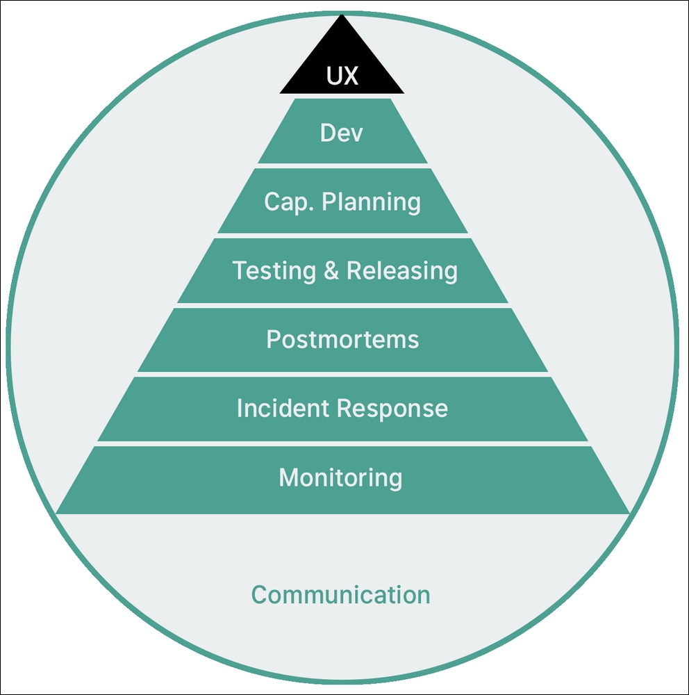
Figure 1: Our current position in the hierarchy. UX is at the very top, building on what we have learned so far.
The study of graphic design and UX focuses on improving user productivity, user happiness, and user engagement. Some aspects of graphic design, such as those related to designing advertisements, prioritize getting people to focus on things. For example, persuading people to smoke cigarettes less, to donate to a political candidate, or to buy a certain type of jeans.
This relates to SRE because, as a profession, we are often fighting to get people to focus on our priorities, or tools, or system health. As an SRE, you could be making sure developers pay attention to the alerts you send, making features you build in tools easy to find and use, or presenting work in such a way that other people understand what to complete and how. Even if you do not see an immediate connection to graphic design, designers have done great research into how much information the human brain can absorb at a glance and how to best organize important data on a page to make it visibly important.
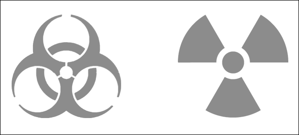
Figure 2: On the left is the biohazard symbol, while on the right is the international radiation symbol
One of my favorite examples of this is the biohazard symbol. This symbol was designed by Dow Chemical Company to make sure people stayed away from biohazard storage signs. The company had six design criteria for making sure people stayed safe (https://99percentinvisible.org/article/beyond-biohazard-danger-symbols-cant-last-forever/):
- Visually striking: If you see it, it needs to be very noticeable.
- Unique and unambiguous: It should not be reused. The example Dow chemical company gave was the Jolly Roger, or skull and crossbones. While it was used to specify poison, it also specified pirate treasure. You don't want people digging for biohazard waste!
- Easily recalled and recognizable: This stops people from using common shapes or using color as the specifier.
- Easy to stencil: It should be easy to create and apply to all sorts of surfaces.
- Rotationally symmetric: That way, no matter how it is displayed, you can tell what it is.
- Acceptable to people from all backgrounds: It should not be offensive or confusing, no matter where in the world you are or who the viewer is.
These requirements are very similar to what you might expect for a piece of software. By that, I mean they are easy to understand and, with the right tests, measurable and testable. Design systems, which are a collection of rules around a set of designs, are similar to systems for a piece of software. You use them to determine whether a design meets the project's requirements. Some design systems are much more specific, such as brand guidelines (use this color, this logo, this wording, and so on), while others require more testing to determine whether the design meets the requirements of the system, just as some pieces of software can be verified with simple unit tests, and others require more detailed integration tests.
There was also follow-up research to Dow Chemical Company's initial designs, by the US Department of Energy, to figure out how to make sure no one stumbled onto waste for 10,000 years (the length of time that much of this waste is dangerous to humans for). Some of the suggestions focused on creating intimidating architecture or creating religions that revered glowing animals to create a place that was noticeable and well-known, but that no one wanted to approach. The researchers didn't come up with a good answer but lots of ideas were sent around. This is interesting, because often, as SREs, we are working on much shorter timelines, but we have to think about how people we don't know will interact with our tools. It is very possible that an alert you write will fire and someone will react to it who does not know you because you have moved on, or the team responsible for the service has changed.
An even more apt design system, very close to the SRE world, is the design of airports, especially post-9/11 (https://99percentinvisible.org/episode/episode-32-design-for-airports/transcript). Large airports support people coming through them, usually in the worst possible moods, all day, everyday. Post-9/11, especially in the US, people spend more time between security and their gate, and less time outside of security. Airports are realizing that and increasing the number of places to sit, eat, and relax before flights. John F. Kennedy International Airport (JFK) saw 60 million travelers pass through its gates in 2015. Many of those people had never been to JFK before and, considering over half of those travelers were on international flights, there was a high possibility that millions of people came through who did not speak English well. On top of all of that, JFK suffers from weather shutdowns a few times a year due to heavy snow or strong winds.
This is not a set of problems just for JFK, though. Consider San Francisco International Airport (SFO), which is the cause of many flight delays. Like complex distributed systems, cascading failures are common in the airport world. For example, if there is heavy fog at SFO, flights back up because SFO operates with limited runways when there is poor visibility. Airlines then delay flights because they know that there will be a delay to landings, which then delays the return flights as well, which causes the airport to have to shift its timetable. Creating design systems to calm travelers, improve movement between flights, help people find their way, and help travelers to survive when their flights are canceled or delayed are all very important and require focusing on both the experience of the people using the airport, and the experience of the people maintaining the airport.
Note
A cascading failure is a type of outage when one service going down causes another service to go down, which then causes other services to go down. Cascading failures can happen because of load spikes or a change in behavior. You can imagine five servers that traffic is load balanced between. One crashes and the others cannot handle the load, and so others start to fail. The system then begins to auto-scale to handle the load, but every new server that comes up dies as well from the load. The solution to this specific problem is to shed the load, by stopping all, or a large amount of, traffic from hitting the servers. However, in general, cascading failures are scary because many things are failing and you often don't know the root cause.

Figure 3: JFK's Terminal 4 baggage claim at four in the morning, January 6th, 2018. 12 hours after this photo was taken, this area flooded, soaking thousands of bags. As this area was full of people, Delta gave people free bag delivery to their homes or hotels, so people would go home and free up space for more incoming customers.
In this chapter, we will talk about some very high-level fundamentals of design and UX, so you can easily work with your design team and apply methodology to the software you build. We will also talk about common ways to improve your application's experience and discuss some ethics around tools and software.
Design is a very large field, with a long history and many diverse sub-fields and adjacent fields. When software developers talk about design, they are usually referring to one of two things; the first being software architecture design, which we talked about in Chapter 7, Building Tools. The other is the design of how people interact with software. The part of software that people interact with is usually called the user interface (UI).
As mentioned in the introduction, the idea of studying how users interact with the UI is called UX. In the SRE world, that often shows up as defining a command-line interface (CLI), but sometimes UX is designing a website interface. Other times, it is a graphical user interface (GUI), and sometimes it is a lever or button in real life.
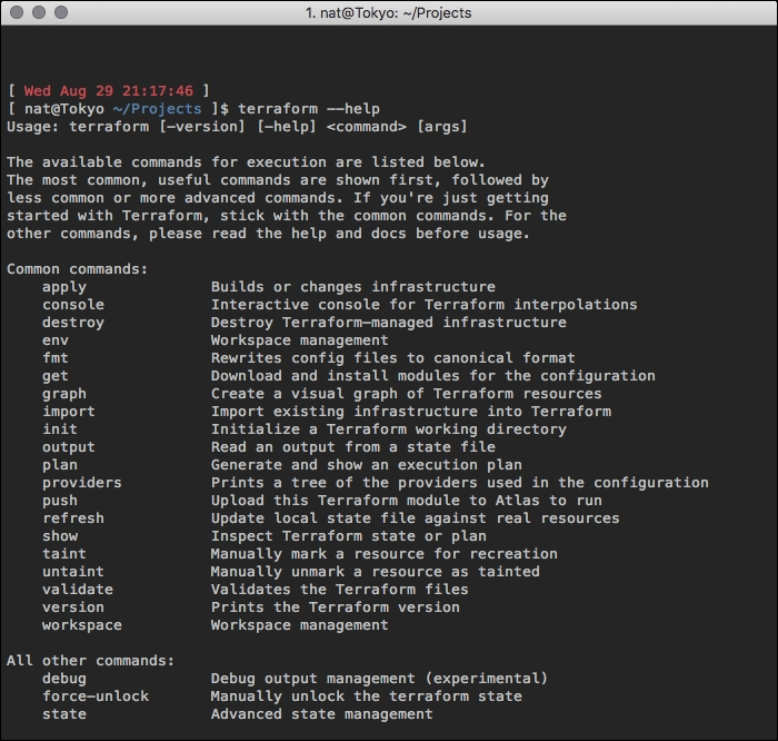
Following is the execution of terraform --help command
Here, we have the output of terraform --help. It is a common interface paradigm to make either -h, -? or --help return an output as shown in the preceding code block, so you can know the basics of how to call a program. The first line of the output, terraform [--version] [--help] <command> [args], says that the terraform command can be run with three optional arguments (optional is usually designated by square brackets). Then, you specify a command to run. If you run with the --help flag, as shown in the preceding example, it gives all possible commands you could provide. If you want to find out about the plan command, you could run it with the -help flag as well: terraform plan –help. If you were to run this command, you would see lots of output.
We can see that there are a bunch of options. Terraform, at least at the time of publishing, follows a common pattern in CLI design, where it includes each option's default value. If you do not add a flag to this command, the default values are used. You could run terraform plan -parallelism=6 and run with six parallel workers, instead of the default 10. I do not know why Terraform's default parallelism is 10, but another common design decision is sane defaults. The first time someone interacts with your software, you do not want them to hurt themselves. For example, Terraform modifies infrastructure and it could easily have defaults that would delete all of their infrastructure. This is not a good default, because rarely do users expect bad things to happen when they run a command. Now, because software is often immaterial, I know some people have trouble attributing design to it. How can a system be beautiful? In the next section, we will talk about places that you can find interaction design and UX in the real world, so that you can try to find some parallels.
If you are having trouble thinking about UX, think about entering a restaurant. How do you know what to do after you walk in the door?
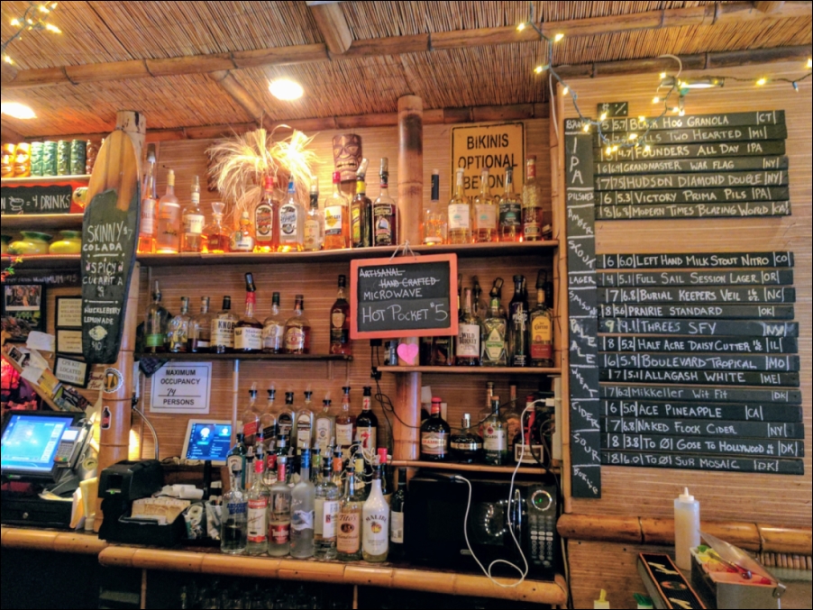
Figure 4: A bar in Brooklyn, New York
Sometimes there is a counter with a cash register, while other times there is a sign asking you to "please wait to be seated." Other times, you just walk in and stand awkwardly. Visual cues are just one way to design a system to show people how to interact with it. Another example is a siren on an ambulance or a police car. When we hear a loud, piercing sound, we know to get out of the way. Every society has a different siren sound, but they all consistently signal that we should pay attention and get out of the way.
A lot of design is learning to interpret what you are seeing, discovering why something is made a certain way, and thinking about how to improve it. You can start developing an eye for this by reading about how designers tear things apart. I have provided a few examples in the References section, but the key is to start thinking about why you do things.
Which signs at the airport tell you what the flow is from the moment you get out of your car or get off a train? Try thinking about how you would get around a new airport if you did not speak the language. Could you make it from the airport curb to boarding the plane without being able to hear? What visual signs exist for people who can't hear? What audible cues exist for people who can't read or see well?
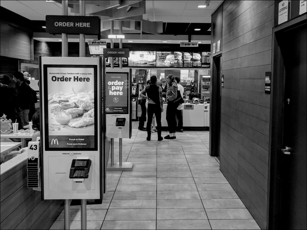
Figure 5: A McDonald's in Brooklyn, New York
Places like McDonald's are very good at this. You can usually see a large menu from the moment you enter and often signs that point to where to order are right by the front door. Employees are very explicit in making sure you don't forget to add things such as extra food or drinks to your order.
Another place optimized for UX, but with different design goals, is IKEA. IKEA is masterful at getting you to look at everything before you actually buy anything. The stores take you on a path that shows you 10 options for what every room in a house could look like. After wandering through IKEA once, the next time, go in and try and return an item. Knowing the entrance and where the stairs lead, see how your different goal changes your path and which signs stand out. Often, the returns desk is near the exit. Notice how, if you miss some signs, you will end up going through the whole store again.
Even in the digital world, you see people optimizing their design in different ways. For example, if you click a button, think about what led you to click it. If the button was in another place, would the button have been easier to find? One of my favorite examples is multi-factor authentication (also known as MFA or 2FA) code forms.
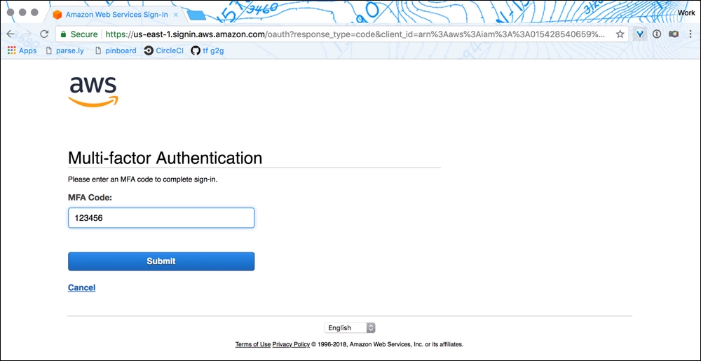
Figure 6: Amazon Web Service's MFA entry form web page in 2018

Figure 7: MongoDB Atlas's MFA entry form web page in 2018
Above, we have two web pages. One is the Amazon Web Services (AWS) page for entering an MFA. For Amazon, you type in the code and then press the Enter key or click the Submit button. The other is the MongoDB Cloud login page. On this page, once you type in your six-digit MFA code, it auto-submits the form and logs you in. It saves you having to click any buttons or touch your mouse. It is a small change, but it feels much smoother when logging in and decreases the time it takes me to get to my metrics during an outage, which is always appreciated.
Once you start training your eye to understand that design is in everything, you can begin testing designs for the things you build.