chapter 2
color theory
When it comes to makeup, one of the hardest—and most essential—concepts to understand is color. Yet I find that most people zone out when makeup artists start talking about the color wheel and how it applies to the face.
There are tons of videos and literature on color theory and beauty, but often they don’t exactly speak to makeup. I have an artist’s background, so my understanding of the color wheel and how it works comes from many, many years of studying art. Color theory in the art world is fascinating, but it’s not easy to apply it directly to makeup.
So let’s discuss the basics of the color wheel first. Then we’ll make it more makeup friendly! I’ll show you how to apply those color theory principles. We’ll let go of the classic color wheel itself and use a model more specific to our needs. You can use it to choose the colors that work best for you.
color basics
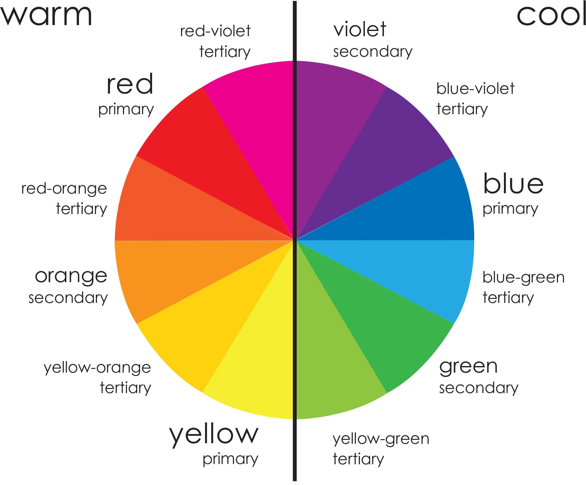
When you look at a color wheel, you’re looking at three different things: primary colors, secondary colors, and tertiary colors. Primary colors are standalone colors—blue, yellow, and red. They cannot be made by mixing other colors.
Secondary colors are mixtures of two primaries. If you mix blue and red together, they make violet. Red and yellow make orange. Yellow and blue make green. Violet, orange, and green are secondary colors.
Tertiary colors are mixtures of a primary and a secondary. Yellow-orange, for example, is a mixture of yellow, a primary, with orange, a secondary. Red-orange and blue-violet are tertiary colors too.
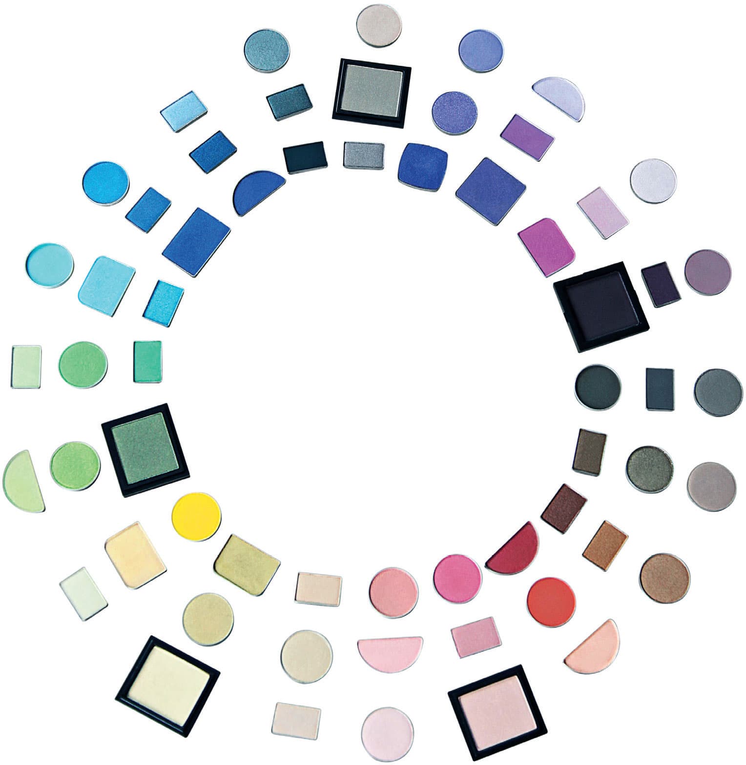
Let’s make this easier to see and understand. This color wheel made of eye shadow is more relatable to makeup and easier to understand when talking about beauty. So now when I’m referring to a color, it will be easier to see based on realistic shades that work on the skin.
There’s one more characteristic we need to discuss: a color is either cool or warm. A cool shade is blue based, and a warm shade is yellow based. You can have cool and warm versions of almost every shade.
Even colors everyone thinks of as cool can have warm shades: There are cool blues and warm blues, for example. On the color wheel, the middle and right rows of blue are cool, but in the row to the left, the addition of a little yellow creates warm blues. Likewise, the gray next to the blues is cool, but the gray on the other side of the chart is warm. It’s simply a standard gray with some yellow added to warm it up.
eye shadow
The first color choice you’ll need to make is for your eye shadow. There are three basic things to think about when choosing eye shadow. The first and most important is your eye color.
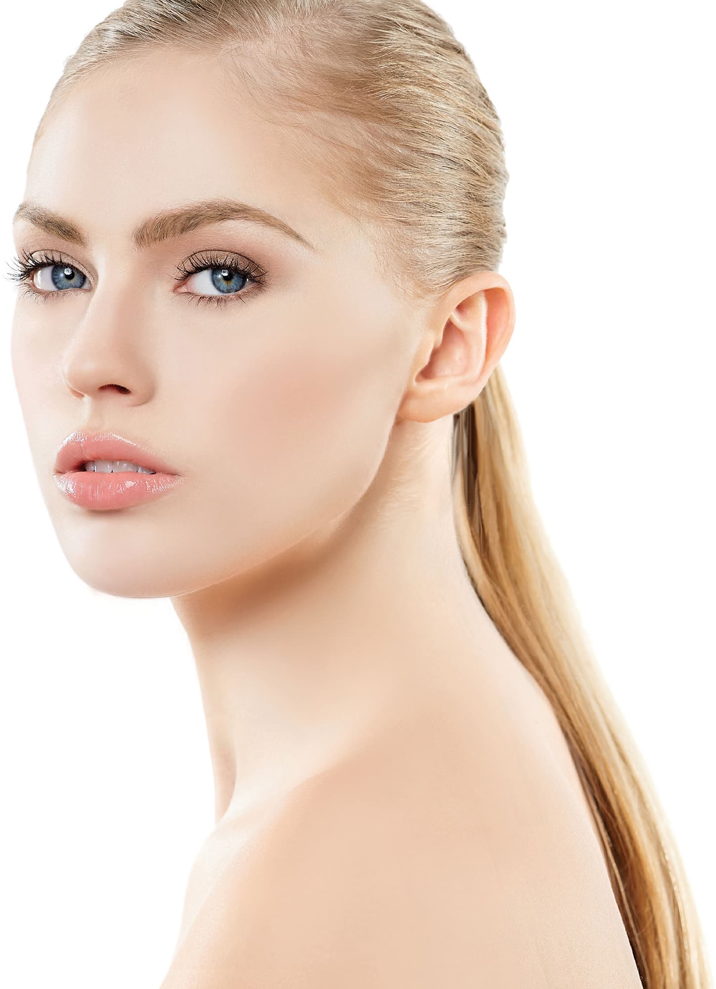
You may be used to emphasizing your eye color with clothing, which works differently. If you have blue eyes and you’re wearing a blue blouse, that blouse sits at a distance from your eyes, drawing the blue in them out and making them look bluer. But if you put that blue up next to them, it competes with them, making them look less blue. When dealing with eye shadow, you want what we call a complementary opposite: the shade across the color wheel. This was discovered by Leonardo da Vinci: Whenever you pair two opposing colors, they intensify each other.
For instance, let’s say you have any shade of blue eyes. If I were to put blue eye shadow on your eyelids, you wouldn’t know what to look at first. It would detract from your blue eyes. But if I were to put a bronzy warm color—a shade opposite blue on the color wheel—on your eyelids, it would make your eyes look bluer. You’d look at your eyes first.
So, look for a complementary opposite to bring out your eye color. Anything that’s warm will bring out blue, even a burgundy. You can test this: lay a blue in between purple and burgundy. You’ll see how the burgundy brings the blue out more than the purple because it has red added to it, making it a warmer shade.
If you have any shade of green eyes, a green eye shadow would, similarly, not accentuate your green. You want a complementary opposite instead. Purple, burgundy, or copper would make your green eyes look greener. Look for colors opposite green on the color wheel shown here for shades that enhance green.
If you have brown eyes, you can simply play with color to your heart’s content. You can use any shade you want. Keep in mind, though, that some brown eyes might have a little more gold to them. If they do, a warm, coppery shade will bring that gold out. Look across the color wheel for a complementary opposite: Purples will bring that gold out. Greens will not.
What if you have multiple flecks in your eyes? Let’s say you have blue eyes with golden flecks. You’re going to see mainly blue, and that’s what we want to bring out, so look opposite blue on the color wheel. You’ll find warm coppery shades and burgundies, colors that will bring out your blue while still enhancing the gold because these shades are complementary opposites of the gold as well. If you have green eyes with golden flecks, look across the color wheel to burgundies, warm browns, and purples. These shades will really bring out that green and that gold.
If you have hazel eyes, you’ve probably realized that they aren’t just one color. They’re a mixture of either green and brown or green and blue. If they are green and blue, you get to decide which color you want to bring out more. If you want to bring out the blue, go across from blue to the coppery shades. If you want to bring out the green, go across from green to the burgundy shades and the purple shades. If you have green-brown hazel eyes and you want to bring the green out, go directly across the color wheel from green and use your warm coppery, burgundy, and purple shades. That will make your hazel eyes pop the most.
The next thing to think about when choosing an eye shadow is skin tone. Depending on the depth of your skin tone, your shade choices can make a significant difference in the intensity of your look. For example, if you have dark ebony skin, you might choose not to wear eye shadows that are too white or light if you find they make you look ashy. Likewise, if you have fair, pale skin, you might choose not to wear dark black eye shadow unless you’re going for a very dramatic look.
Last, you might be tempted to match your eye shadow to your clothing, but be warned: it can sometimes make you look washed out. I’m not saying there aren’t times when it can work, but if you’re ever in doubt, choose a complementary opposite. It will always make you look your best. I recommend choosing eye shadows that work best with your eye color and your features, not your clothes.
These rules apply to eyeliner, too, because it is so close to the eye as well. Of course, black and brown eyeliners work on everyone, but when using colors, follow the same rules as when choosing eye shadows.
blush
The first thing to know about blush is that it’s not meant to contour or reshape your face. It’s meant to add life and color to your face. That’s why the natural flush rule of thumb for choosing a blush color works so well: What color would you flush to if you were to run around the block? You don’t want to use a shade of blush any darker than that.
Opposite are some blush samples next to skin tone swatches so you can see a range of shades that work for each category. You’ll notice that some of the shades on the ivory/beige side would look too ashy on bronze/ebony skin, and some of the shades on the bronze/ebony side would be too deep and too brown for ivory/beige. Wearing bronze/ebony shades on ivory/beige skin will just make the wearer look dead or tired. Don’t try to pull off something that’s too dark for your skin tone. You’re always better off going with something more colorful versus too dark.
For ivory or beige skin tones, a blush with a soft peach or a warm pink undertone is a great choice. For darker beige or olive skin tones, use a blush with warm undertones and a richness or intensity, so that the color shows up on your skin—tawny shades of dark coral or rich sienna, for example. For bronze/ebony skin tones, choose a blush with a rich, intensely warm undertone, such as bright apricot or a warm brick, to give your skin a natural glow. For more drama, if you have bronze/ebony skin—especially if your skin is deep ebony—you can choose a rich plum blush.
If you’re going to have shimmer or sheen to your blush, I personally prefer one with gold shimmer versus silver shimmer. I think the silver shimmer looks too reflective and ashy, which does not work on bronze and ebony skin. A blush with a gold or warm shimmer, however, works well on darker bronze and ebony skin tones, giving the skin a glow and preventing it from looking ashy.
You’ll also find that bright pops of color look amazing on your darker skin tones as well. And sometimes there are universal shades that work on all skin tones, such as a nice apricot color.
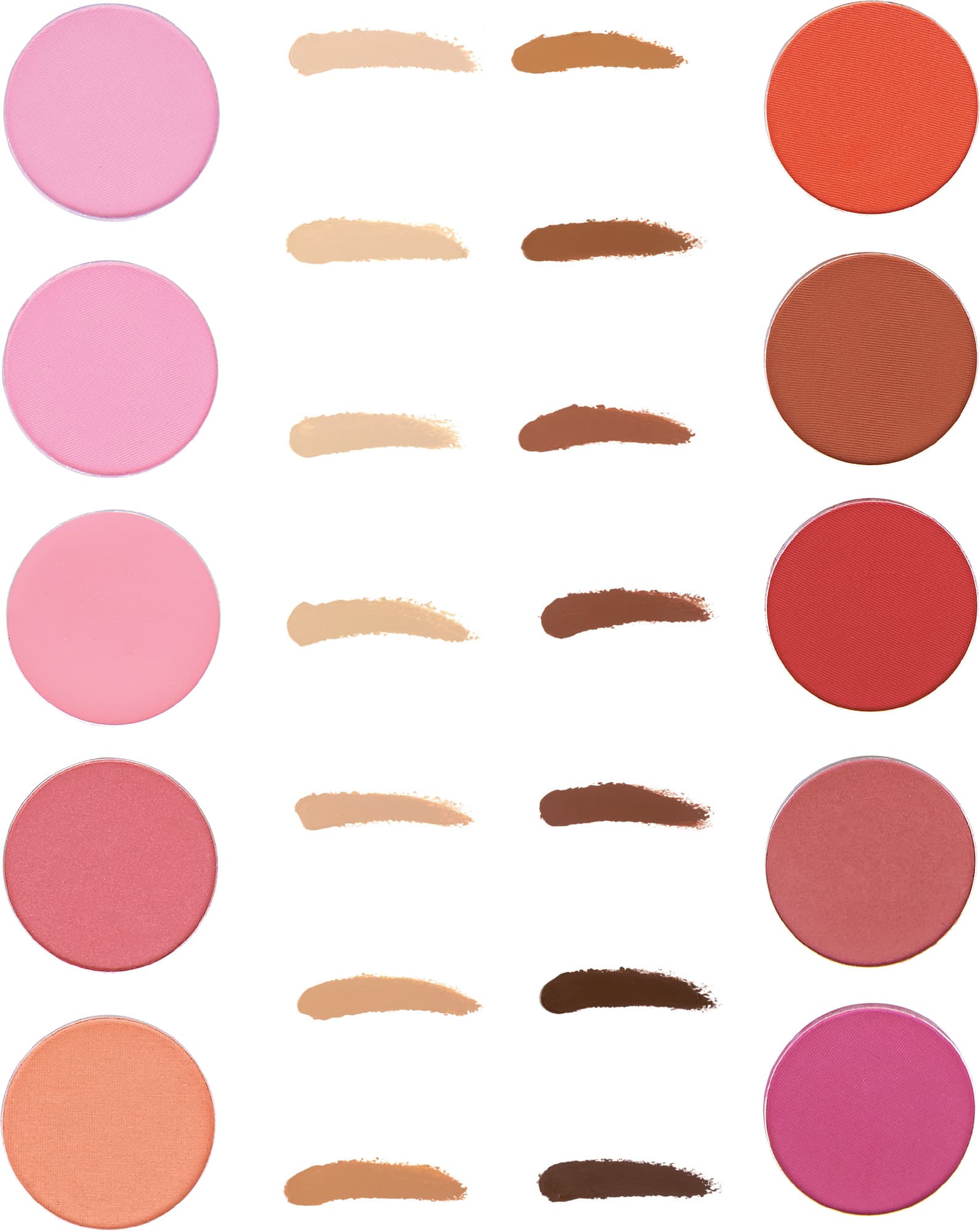
Here are some blush samples next to some skin tone swatches so you can see a range of shades that work for each category.
lip color
When it comes to color theory and lipstick, the first question is, how big are your lips? A darker shade of lipstick will make them look smaller, but a lighter shade will make them look fuller. So, if you have thin lips, the last thing you want is a dark shade of lipstick.
Also, if you have ivory or beige skin, the fastest way to age yourself is with a dark lipstick. It’s different if you have bronze or ebony skin because the contrast between your skin and the lipstick isn’t as high. The fastest way to look younger, especially if you have ivory or beige skin, is using a bright, colorful, warm lipstick; it will add life and color back to your face. If you use a more neutral shade, it could just blend in with your skin. And if you have bronze or ebony skin, a brighter color can brighten your face as well, which helps you look younger.
Your skin tone can influence your color choice too. Consider your skin’s undertones. If you have bronze or ebony skin, because it has a brown undertone, brown shades will look very natural on you. If you have ivory or beige skin, because you have no brown in your skin, a brown shade will look too dark and make you look dead.
If your skin is fair, choose a warm pink and a coral or a soft nude color with a soft pink or peachy undertone. For medium complexions, look for shades with a bit more depth. (Remember, the darker your natural lip color, the darker you can go with your lip color choices and have it still look natural.) For medium skin tones, try a deeper rose, a light apricot, or a nude color with a rich apricot undertone. Olive-toned skin is most flattered by rich, tawny shades, soft raisins, and a nude with a rich caramel undertone. Bronze definitely benefits from shades with a bit of brown in them; try a rich raisin, a tawny coffee, or a nude with a dark golden beige undertone. Ebony skin needs richer color choices; try a deep walnut, a rich plum, and a nude with a deep ginger-toned brown (because the skin color is so deep).
If you’re not sure what to choose and you want to play it safe, you can always wear something a shade or two darker than your natural lip color. It will give you definition without being too much.