Chapter 14
Showing Relationships between Categorical Dependent and Independent Variables
In This Chapter
![]() Testing hypotheses
Testing hypotheses
![]() Running inferential tests
Running inferential tests
![]() Running the crosstabs procedure
Running the crosstabs procedure
![]() Running the chi-square test
Running the chi-square test
![]() Comparing column proportions
Comparing column proportions
![]() Adding control variables
Adding control variables
Descriptive statistics (introduced in Chapter 13) describe the data in a sample through a number of summary procedures and statistics. For example, maybe you collected customer satisfaction data on a subset of your customers and you can determine that the average satisfaction for your customers is 3.5 on a 5-point scale. You may want to take this information a step further, though. For example, you may want to determine if there is a difference in satisfaction between customers who bought Product A (3.6) and customers who bought Product B (3.3). The numbers aren’t exactly the same, but are they really different or are the differences due to random variation? This is the type of question that inferential statistics can answer.
Inferential statistics allow you to infer the results from the sample on which you have data and apply it to the population that the sample represents. Understanding how to make inferences from a sample to a population is the basis of inferential statistics. This allows you to reach conclusions about the population without the need to study every single individual.
In this chapter, we begin by discussing the idea of hypothesis testing. Next we run the crosstabs procedure to assess the relationship between two categorical variables. Finally, we use the chi-square test to see if there is a statistically significant relationship between two categorical variables.
Testing a Hypothesis to See If It’s Right
Whenever you want to make an inference about a population from a sample, you must test a specific hypothesis. Typically, you state two hypotheses:
- Null hypothesis: The null hypothesis is conventionally the one in which no effect is present. For example, you may be looking for differences in mean income between males and females, but the (null) hypothesis you’re testing is that there is no difference between the groups. Or the null hypothesis may be that there are no differences in satisfaction between customers who bought Product A (3.6) and customers who bought Product B (3.3); in other words, the differences are due to random variation.
- Alternative hypothesis: The alternative hypothesis is generally (although not exclusively) the one researchers are really interested in. For example, you may hypothesize that the mean incomes of males and females are different. Or for the customer satisfaction example, the alternative hypothesis may be that there is a difference in satisfaction between customers who bought Product A (3.6) and customers who bought Product B (3.3); in other words, the differences are real.
Now, in statistics, we never know anything for certain because we’re dealing with samples, rather than populations. So, we always have to work with probabilities. The way hypotheses are assessed is by calculating the probability or the likelihood of finding our result. A probability value can range from 0 to 1 (corresponding to 0 percent to 100 percent, in terms of percentages); you can use these values to assess whether the likelihood that any differences you’ve found are the result of random chance.
So, how do hypotheses and probabilities interact? Suppose you want to know who will win the Super Bowl. You ask your fellow statisticians, and one of them says that he has built a predictive model and he knows Team A will win. Your next question should be, “How confident are you in your prediction?” Your friend says, “I’m 50 percent confident.” Are you going to trust this prediction? Of course not, because there are only two outcomes and 50 percent is just random chance.
So, you ask another fellow statistician, and he tells you that he has built a predictive model. He knows that Team A will win, and he’s 75 percent confident in his prediction. Are you going to trust his prediction? Well, now you start to think about it a little. You have a 75 percent chance of being right, and a 25 percent chance of being wrong. Let’s say you decide a 25 percent chance of being wrong is too high.
So, you ask another fellow statistician and she tells you that she has built a predictive model and she knows Team A will win, and she’s 90 percent confident in her prediction. Are you going to trust her prediction? Now you have a 90 percent chance of being right, and only a 10 percent chance of being wrong.
This is the way statistics work. You have two hypotheses — the null hypothesis and the alternative hypothesis — and you want to be sure of your conclusions. So, having formally stated the hypotheses, you must then select a criterion for acceptance or rejection of the null hypothesis. With probability tests, such as the chi-square test or the t-test, you’re testing the likelihood that a statistic of the magnitude obtained (or greater) would’ve occurred by chance, assuming that the null hypothesis is true. You always assess the null hypothesis, which is the hypothesis that states there is no difference or no relationship. In other words, you only wish to reject the null hypothesis when you can say that the result would’ve been extremely unlikely under the conditions set by the null hypothesis. In this case, the alternative hypothesis should be accepted.
 But what criterion (or alpha level, as it is often known) should you use? Traditionally, a 5 percent level is chosen, indicating that a statistic of the size obtained would only be likely to occur on 5 percent of occasions (or once in 20) should the null hypothesis be true. This also means that, by choosing a 5 percent criterion, you’re accepting that you’ll make a mistake in rejecting the null hypothesis 5 percent of the time, which most of the time you can live with.
Conducting Inferential Tests
As we mention in Chapter 13, obtaining descriptive statistics can be very important for various reasons. As mentioned in the previous chapter, one reason why descriptive statistics are important is because they form the basis for more complex analyses. In reality, when you run a chi-square test (see “Running the chi-square test,” later in this chapter), a t-test (see Chapter 15), or a regression (see Chapter 16), all you’re really doing is taking descriptive statistics and plugging them into a fancy formula, which then provides you with useful information.
Statistics are available for variables at all levels of measurement for more advanced analysis. In practice, the choice of method depends on the questions you’re interested in asking of the data and the level of measurement of the variables involved. Table 14-1 suggests which statistical techniques are most appropriate, based on the measurement level of the dependent (effect) and independent (cause) variables.
Table 14-1 Level of Measurement and Statistical Tests
Dependent Variables |
Independent Variables |
|
Categorical |
Continuous |
|
Categorical |
Crosstabs |
Logistic regression |
Continuous |
T-test, analysis of variance (ANOVA) |
Correlation, linear Regression |
In this chapter, we discuss crosstabs, which is when both the independent and dependent variables are categorical. In Chapter 15, we discuss t-tests, which is when the independent variable is categorical and the dependent variable is continuous. In Chapter 16, we discuss correlation and regression, which is when both the independent and dependent variables are continuous. We don’t cover logistic regression, which is when the independent variable is continuous and the dependent variable is categorical, because that technique is beyond the scope of this book.
Running the Crosstabs Procedure
One of the most common ways to analyze data is to use crosstabulations. A crosstabulation is used when you want to study the relationship between two or more categorical variables. For example, you may want to look at the relationship between gender and handedness (whether you’re right or left handed). This way, you can determine if one gender is more likely to be right or left handed, or if handedness is equally distributed between the genders. In this section, we provide examples and advice on how best to construct and interpret crosstabulations.
Here’s how to perform a crosstabulation using the data file merchandise.sav, which is not installed with SPSS Statistics:
-
From the main menu, choose File ⇒ Open ⇒ Data and load the merchandise.sav data file, which is not in the IBM SPSS Statistics directory.
This file contains the customer’s purchase history and has 16 variables and 3,338 cases.
-
Choose Analyze ⇒ Descriptive Statistics ⇒ Crosstabs.
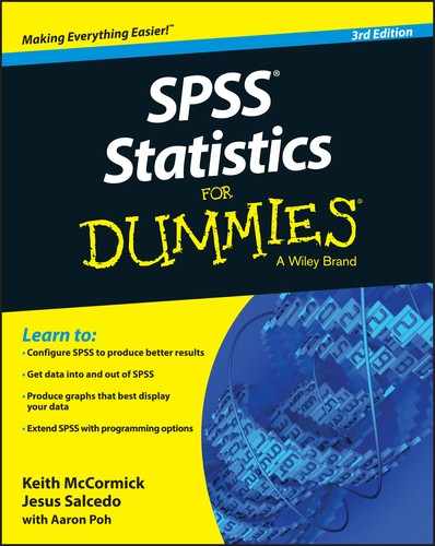
The Crosstabs dialog box (shown in Figure 14-1) appears.
In this example, we want to study whether the number (Small, Medium, or Large) of TVs (TVs_bin) purchased this year is related to customer status (Current or Churned).
You can place the variables in either the Rows or Columns boxes, but in many areas of research, it’s customary to place the independent variable in the column of the table. - Select the variable Status, and place it in the Row(s) box.
-
Select the variable TVs_bin, and place it in the Column(s) box, as shown in Figure 14-2.
As previously mentioned, crosstabulations are used when looking at the relationship between categorical variables, which is what we have in this situation.
 In this example, only one variable was added to the Rows and Columns boxes, but you can add multiple variables to these boxes, which will create separate tables for all combinations of variables.
At this point, you can run the crosstabulation procedure, but you normally want to request additional statistics, typically percentages.
-
Click the Cells button.
The Cell Display dialog box (shown in Figure 14-3) appears.
By default, the cell count is displayed (that is, the Observed check box in the Counts area is selected). Typically, you would select row and/or column percents (by clicking the Row and Column check boxes in the Percentages area). Other less-used statistics, including residuals, are available in this dialog box as well.
- Click the Column check box in the Percentages area, as shown in Figure 14-4.
- Click Continue.
- Click OK.
The Case Processing Summary table (shown in Figure 14-5) displays the number of valid and missing cases for the variables requested in the crosstabulation. Only the valid cases are displayed in the crosstabulation table.
Be sure to review this table to check the number of missing cases. If there are substantial amounts of missing data, you may want to question why this is the case and how your analysis will be affected. In this example, we don’t have any missing data.

Figure 14-1: The Crosstabs dialog box.
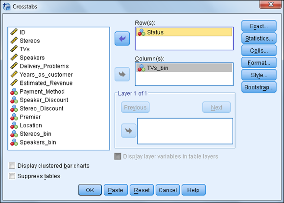
Figure 14-2: The completed Crosstabs dialog box.
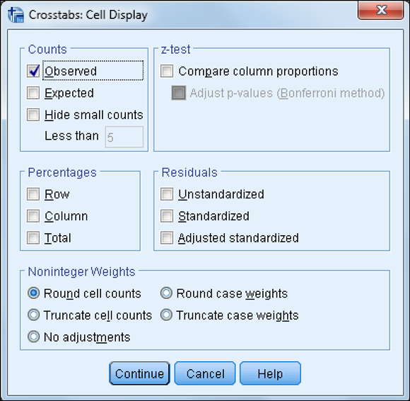
Figure 14-3: The Cell Display dialog box.
Figure 14-4: The completed Cell Display dialog box.

Figure 14-5: The Case Processing Summary table.
The crosstabulation table (shown in Figure 14-6) shows the relationship between the variables. Each cell of the table represents a unique combination of the variables values. For example, the first cell in the crosstabulation table shows the number of customers (1,093) who purchased a small number of TVs and also churned.
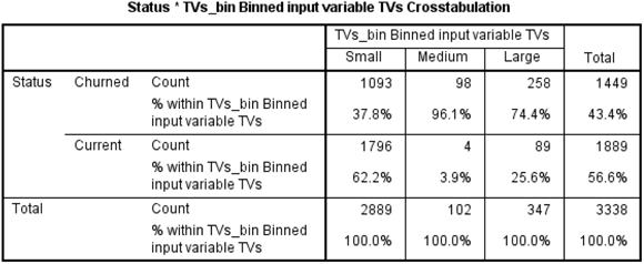
Figure 14-6: The crosstabulation table.
Although looking at counts is useful, it’s usually much easier to detect patterns by examining percentages. This is why you clicked the Column check box in the Cell Display dialog.
Looking at the first column in the crosstabulation table, you can see that 37.8% of customers who purchased a small number of TVs churned, while 62.2% of customers who purchased a small number of TVs stayed as customers. So it seems as though purchasing a few TVs is associated with staying as a customer. However, it seems that the opposite is true when more TVs are purchased — in other words, purchasing more TVs seems to be associated with losing customers, because we lost 96.1 percent and 74.4 percent of customers, respectively, who purchased a medium and large number of TVs.
These differences in percentages would certainly lead you to conclude that the number of TVs purchased is related to customer status. But how do you know that these differences in percentages are not due to chance? To answer this question we need to perform the chi-square test.
Running the chi-square test
The most common test used in a crosstabulation is the Pearson chi-square test, which tests the null hypothesis that the row and column variables are not related to each other — that is, that the variables are independent. In our situation, the chi-square test determines whether there is a relationship between number of TVs purchased and customer status.
To run the chi-square test, follow these steps:
-
Choose Analyze ⇒ Descriptive Statistics ⇒ Crosstabs.
Remember that you should have the variable Status in the Row(s) box and the variable TVs_bin in the Column(s) box.
-
Click the Statistics button.
The Statistics dialog box (shown in Figure 14-7) appears.
A number of association measures are available in the Statistics dialog box. These measures of association characterize the relationship between the variables in the table. The measures are grouped in the dialog box by the measurement level of the variables in the table. They show the strength of relationship between the variables, whereas the chi-square test determines whether there is a statistically significant relationship.
- Click the Chi-square check box, as shown in Figure 14-8.
- Click Continue.
-
Click OK.
The same case processing summary and crosstabulation tables appear as shown earlier, but the Chi-Square Tests table (shown in Figure 14-9) also appears.

Figure 14-7: The Statistics dialog box.

Figure 14-8: Completed Statistics dialog box.

Figure 14-9: The Chi-Square Tests table.
Three chi-square values are listed, the first two of which are used to test for a relationship. Concentrate on the Pearson Chi-Square statistic, which is adequate for almost all purposes. The Pearson Chi-Square statistic is calculated by testing the difference between the observed counts (the number of cases we actually observed in each crosstabulation cell) and the expected counts (the number of cases we should’ve observed in each crosstabulation cell if there were no relationship between the variables). So, the chi-square statistic is an indication of misfit between observed minus expected counts.
You can request Expected counts in the Cell Display dialog box (refer to Figure 14-3).
The actual chi-square value (here, 286.989) is used in conjunction with the number of degrees of freedom (df), which is related to the number of cells in the table, to calculate the significance for the chi-square statistic, labeled “Asymptotic Significance (2-sided).”
The significance value provides the probability of the null hypothesis being true, so the lower the number, the less likely that the variables are unrelated. Analysts often use a cutoff value of 0.05 or lower, to determine whether the results are statistically significant. For example, with a cutoff value of 0.05, if the significance value is smaller than 0.05, the null hypothesis is rejected. In this case, you can see that the probability of the null hypothesis being true is very small — in fact, it’s less than 0.05, so you can reject the null hypothesis and you have no choice but to say you found support for the research hypothesis. So, you can conclude that there is a relationship between the number of TVs purchased and customer status.
Every statistical test has assumptions. The better you meet these assumptions, the more you can trust the results of the test. The chi-square test just assumes that you have a large enough sample. Because of this, there is a footnote to the Chi-Square Tests table (refer to Figure 14-9) noting the number of cells with expected counts less than 5. If more than 20 percent of the cells have this condition, you should consider increasing your sample size if you can, or else you should reduce the number of cells in your crosstabulation table. You can do this by either combining or removing categories.
Comparing column proportions
After determining that there is a relationship between two variables, the next step is to determine the exact nature of the relationship — that is, which groups actually differ from each other. You can see which groups differ from each other by comparing column proportions. To do this, follow these steps:
-
Choose Analyze ⇒ Descriptive Statistics ⇒ Crosstabs.
Remember that you should have the variable Status in the Row(s) box and the variable TVs_bin in the Column(s) box.
- Click the Cells button.
- Click the Compare Column Proportions check box.
-
Click the Adjust P-Values (Bonferroni Method) check box.
Figure 14-10 shows the completed Cell Display dialog box.
- Click Continue.
- Click OK.
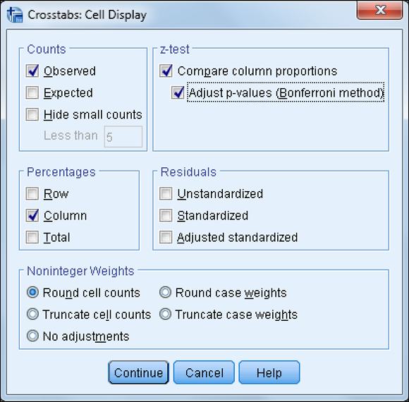
Figure 14-10: The completed Cell Display dialog box.
The same Case Processing Summary and Chi-Square Tests tables appear as shown earlier, but a modified version of the crosstabulation table now appears (see Figure 14-11).

Figure 14-11: The crosstabulation table with compare column proportions test.
The crosstabulation table now includes the column proportions test notations. Subscript letters are assigned to the categories of the column variable. For each pair of columns, the column proportions are compared using a z-test. If a pair of values is significantly different, different subscript letters are displayed in each cell.
The table in Figure 14-11 shows that the proportion of customers who purchased a small number of TVs and churned (37.8 percent) is smaller and significantly different, according to the z-test, than the proportion of customers who purchased a medium number of TVs and churned (96.1 percent), due to having different subscript letters. You can also see that the proportion of customers who purchased a small number of TVs and churned (37.8 percent) is significantly smaller than the proportion of customers who purchased a large number of TVs and churned (74.4 percent). Finally, we can see that the proportion of customers who purchased a large number of TVs and churned (74.4 percent) is significantly smaller than the proportion of customers who purchased a medium number of TVs and churned (96.1 percent). In other words, all groups are significantly different from each other.
Adding control variables
Tables can be made more complex by adding variables to the layer dimension. This way, you can create layered tables displaying relationship among three or more variables. A layered variable further subdivides categories of the row and column variables by the categories of the layer variable(s). The layer variables are often referred to as control variables because they show the relationship between the row and column variables when you “control” for the effects of the third variable. Layer variables are usually added to a table after the two-variable crosstabulation table has been examined.
To add a layer variable, follow these steps:
-
Choose Analyze ⇒ Descriptive Statistics ⇒ Crosstabs.
Remember that you should have the variable Status in the Row(s) box and the variable TVs_bin in the Column(s) box.
- Select the variable Location, and place it in the Layer box, as shown in Figure 14-12 .
- Click OK.
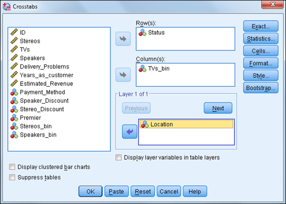
Figure 14-12: The completed Crosstabs dialog box.
You can add more than one control variable to a table by using the Next button in the layer box, but you’ll need to have a large sample size or you may quickly create tables with only a few cases, or even no cases, in several cells.
As shown in Figure 14-13, adding a layer variable creates subtables for each category of the layer variable (in this case, we have a table for international and national customers). In this example, there doesn’t appear to be a difference in the relationship between the number of TVs purchased and customer status.

Figure 14-13: The crosstabulation table with a layer variable.
Figure 14-14 further confirms that the relationship between the number of TVs purchased and customer status is not affected by location. In other situations, however, a layer variable often helps qualify a relationship, so we know that a relationship only holds in certain conditions and not others.

Figure 14-14: The Chi-Square Tests table with a layer variable.