Chapter 16
Showing Relationships between Continuous Dependent and Independent Variables
In This Chapter
![]() Viewing relationships
Viewing relationships
![]() Running the bivariate procedure
Running the bivariate procedure
![]() Running the linear regression procedure
Running the linear regression procedure
![]() Making predictions
Making predictions
The two most commonly used statistical techniques to analyze relationships between continuous variables are the Pearson correlation and linear regression.
Many people use the term correlation to refer to the idea of a relationship between variables or a pattern. This view of the term correlation is correct, but correlation also refers to a specific statistical technique. Pearson correlations are used to study the relationship between two continuous variables. For example, you may want to look at the relationship between height and weight, and you may find that as height increases, so does weight. In other words, in this example, the variables are correlated with each other because changes in one variable impact the other.
Whereas correlation just tries to determine if two variables are related, linear regression takes this one step further and tries to predict the values of one variable based on another (so if you know someone’s height, you can make an intelligent prediction for that person’s weight). Of course, most of the time you wouldn’t make a prediction based on just one independent variable (height); instead, you would typically use several variables that you deemed important (age, gender, BMI, and so on).
 This chapter does not address how to create scatterplots, because we cover those in Chapter 12. However, you need to create scatterplots before using the correlation and linear regression procedures because these techniques are only appropriate when you have linear relationships.
Running the Bivariate Procedure
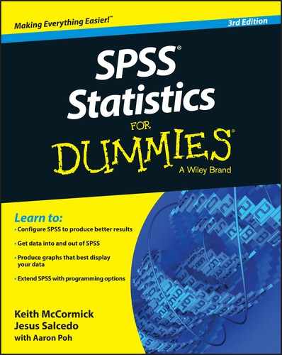
Correlations determine the similarity or difference in the way two continuous variables change in value from one case (row) to another through the data. As you can see in Figure 16-1, a scatterplot visually shows the relationship between two continuous variables by displaying individual observations. (This example uses the employee_data.sav data file.)
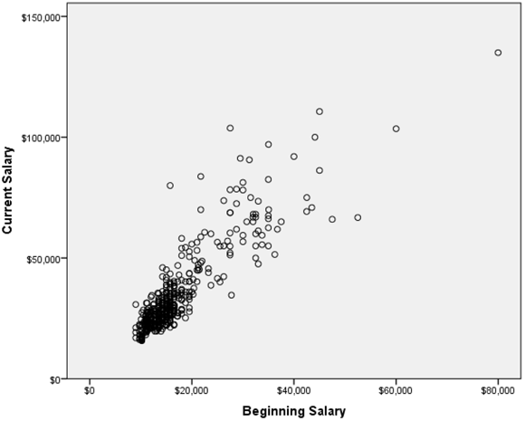
Figure 16-1: Scatterplot of current and beginning salary.
Notice that, for the most part, low beginning salaries are associated with low current salaries, and that high beginning salaries are associated with high current salaries — this is called a positive relationship. Positive relationships show that as you increase in one variable, you increase in the other variable, so low numbers go with low numbers and high numbers go with high numbers. Using the example mentioned earlier, you may find that as height increases, so does weight — this would be an example of a positive relationship.
With negative relationships, as you increase in one variable, you decrease in the other variable, so low numbers on one variable go with high numbers on the other variable. An example of a negative relationship may be that the more depressed you are, the less exercise you do.
 You can use the bivariate procedure, which we demonstrate here, whenever you have a positive or negative linear relationship. However, you shouldn’t use the bivariate procedure when you have a nonlinear relationship, because the results will be misleading.
Figure 16-2 shows a scatterplot of a nonlinear relationship. As an example of a nonlinear relationship, consider the variables test anxiety (on the x-axis) and test performance (on the y-axis). People with very little test anxiety may not take a test seriously (they don’t study) so they don’t perform well; likewise people with a lot of test anxiety may not perform well because the test anxiety didn’t allow them to concentrate or even read test questions correctly. However, people with a moderate level of test anxiety should be motivated enough to study, but they don’t have too much test anxiety to suffer crippling effects.
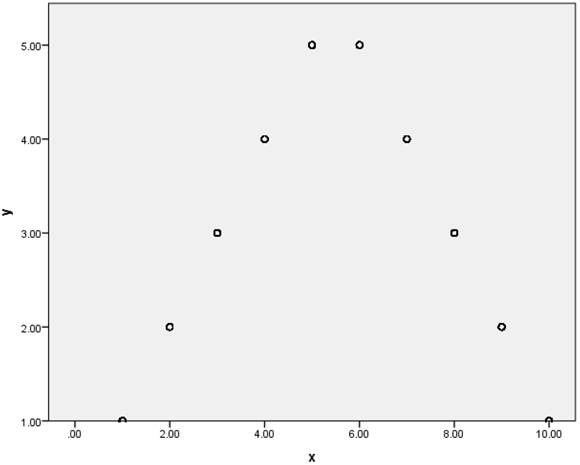
Figure 16-2: A scatterplot of a nonlinear relationship.
Notice that in this example, as we increase in one variable, we increase in the other variable up to a certain point; then as we continue to increase in one variable, we decrease in the other variable. Clearly, there is a relationship between these two variables, but the bivariate procedure would indicate (incorrectly) that there is no relationship between these two variables. For this reason, it’s important to always create a scatterplot of any variables you want to correlate so that you don’t reach incorrect conclusions.
Although a scatterplot visually shows the relationship between two continuous variables, the Pearson correlation coefficient is used to quantify the strength and direction of the relationship between continuous variables. The Pearson correlation coefficient is a measure of the extent to which there is a linear (straight line) relationship between two variables. It has values between –1 and +1, so that the larger the value, the stronger the correlation. As an example, a correlation of +1 indicates that the data fall on a perfect straight line sloping upward (positive relationship), while a correlation of –1 would represent data forming a straight line sloping downward (negative relationship). A correlation of 0 indicates there is no straight-line relationship at all (which is what we would find in Figure 16-2).
To perform a correlation, follow these steps:
- From the main menu, choose File ⇒ Open ⇒ Data and load the employee_data.sav data file.
The file is not in the SPSS installation directory. You have to download it from this book’s companion website.
This file contains the employee information from a bank in the 1960s and has 10 variables and 474 cases.
- Choose Analyze ⇒ Correlate ⇒ Bivariate.
The Bivariate Correlations dialog box, shown in Figure 16-3, appears.
In this example, we want to study whether current salary is related to beginning salary, months on the job, and previous job experience. Notice that there is no designation of dependent and independent variables. Correlations will be calculated on all pairs of variables listed.
- Select the variables salary, salbegin, jobtime, and prevexp, and place them in the Variables box, as shown in Figure 16-4.
You can choose up to three kinds of correlations. The most common form is the Pearson correlation, which is the default. Pearson is used for continuous variables, while Spearman and Kendall’s tau-b (less common) are used for nonnormal data or ordinal data, as relationships are evaluated after the original data have been transformed into ranks.
If you want, you can click the Options button and decide what is to be done about missing values and tell SPSS Statistics whether you want to calculate the standard deviations.
-
Click OK.
SPSS calculates the correlations between the variables.
Figure 16-3: The Bivariate Correlations dialog box.
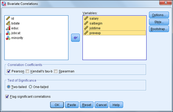
Figure 16-4: The completed Bivariate Correlations dialog box.
Statistical tests are used to determine whether a relationship between two variables is statistically significant. In the case of correlations, we want to test whether the correlation differs from zero (zero indicates no linear association). Figure 16-5 is a standard Correlations table. First, notice that the table is symmetric, so the same information is represented above and below the major diagonal. Also, notice that the correlations in the major diagonal are 1, because these are the correlations of each variable with itself.
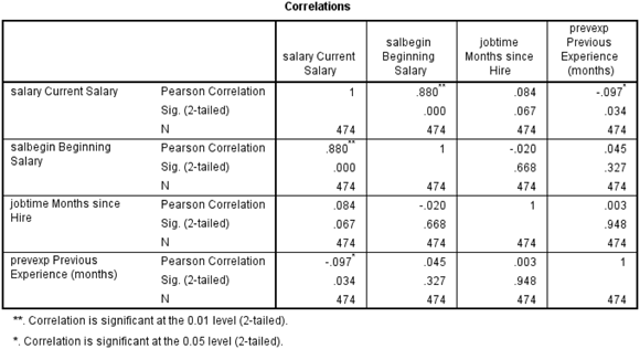
Figure 16-5: The Correlations table.
The Correlations table provides three pieces of information:
- The Pearson Correlation, which will range from +1 to –1. The further away from 0, the stronger the relationship.
- The two-tailed significance level. All correlations with a significance level less than 0.05 will have an asterisk next to the coefficient.
- N, which is the sample size.
In our data, we have a very strong positive correlation (0.880) that is statistically significant between current and beginning salary. Notice that the probability of the null hypothesis being true for this relationship is extremely small (less than 0.01). So, we reject the null hypothesis and conclude that there is a positive, linear relationship between these variables.
The correlations between months on the job and all the other variables were not statistically significant. Surprisingly, we do see that there is a statistically significant negative correlation, although weak (–0.097), between current salary and previous job experience.
 Every statistical test has assumptions. The better you meet these assumptions, the more you can trust the results of the test. The Pearson correlation coefficient has three assumptions:
- You have continuous variables.
- The variables are linearly related.
- The variables are normally distributed.
Running the Linear Regression Procedure
Correlations allow you to determine if two continuous variables are linearly related to each other. So, for example, current and beginning salaries are positively related for employees. Regression analysis is about predicting the future (the unknown) based on data collected from the past (the known). Regression allows you to further quantify relationships by developing an equation predicting, for example, current salary based on beginning salary. Linear regression is a statistical technique that is used to predict a continuous dependent variable from one or more continuous independent variables.
When there is a single independent variable, the relationship between the independent variable and dependent variable can be visualized in a scatterplot, as shown in Figure 16-6.
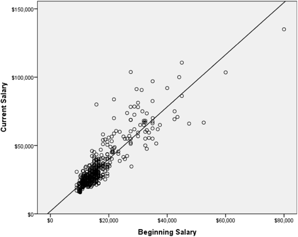
Figure 16-6: A scatterplot of current and beginning salary with a regression line.
The line superimposed on the scatterplot is the best straight line that describes the relationship. The line has the equation, y = mx + b, where, m is the slope (the change in y for a one-unit change in x) and b is the y-intercept (the value of y when x is zero).
In the scatterplot, notice that many points fall near the line, but some are quite a distance from it. For each point, the difference between the value of the dependent variable and the value predicted by the equation (the value on the line) is called the residual (also known as the error). Points above the line have positive residuals (they were underpredicted), and points below the line have negative residuals (they were overpredicted); a point falling on the line has a residual of zero (a perfect prediction). The regression equation is built so that if you were to add up all the residuals (some will be positive and some will be negative), they would sum to zero.
Overpredictions and underpredictions constitute noise in the model, and noise is normal. All models have some error. A way of thinking about R Square (discussed and defined in the next section) is that this noise is “unexplained variance.” R Square, or the signal in our model, is a measure of “explained variance.” Add them up and you get the total variance, which we just call variance — the same variance that we use for measures like standard deviation. Conceptually, it makes a lot of sense.
To perform a linear regression, follow these steps:
-
From the main menu, choose File ⇒ Open ⇒ Data and load the employee_data.sav data file.
The file is not in the SPSS installation directory. You have to download it from this book’s companion website.
-
Choose Analyze ⇒ Regression ⇒ Linear.
The Linear Regression dialog box, shown in Figure 16-7, appears.
In this example, we want to predict current salary from beginning salary, months on the job, number of years of education, gender, and previous job experience. You can place the dependent variable in the Dependent box; this is the variable for which we want to set up a prediction equation. You can place the predictor variables in the Independent(s) box; these are the variables we’ll use to predict the dependent variable.
 When only one independent variable is taken into account, the procedure is called a simple regression. If you use more than one independent variable, it’s called a multiple regression. All dialog boxes in SPSS provide for multiple regression.
 - Select the variable salary, and place it in the Dependent box.
-
Select the variables salbegin, jobtime, educ, gender, and prevexp, and place them in the Independent(s) box, as shown in Figure 16-8.
Note that gender is a dichotomous variable coded 0 for males and 1 for females, but it was added to the regression model. This is because a variable coded as a dichotomy (say, 0 and 1) can technically be considered a continuous variable because a continuous variable assumes that a one-unit change has the same meaning throughout the range of the scale. If a variable’s only possible codes are 0 and 1 (or 1 and 2, or whatever), then a one-unit change does mean the same change throughout the scale. Thus, dichotomous variables (for example, gender) can be used as predictor variables in regression. It also permits the use of nominal predictor variables if they’re converted into a series of dichotomous variables; this technique is called dummy coding.The last choice we need to make to perform linear regression is that we need to specify which method we want to use. By default, the Enter regression method is used, which means that all independent variables will be entered into the regression equation simultaneously. This method works well when you have a limited number of independent variables or you have a strong rationale for including all your independent variables. However, at times, you may want to select predictors from a larger set of independent variables; in this case, you would request the Stepwise method so that the best predictors from a statistical sense are used.
At this point, you can run the linear regression procedure, but we want to briefly point out the general uses of some of the other dialog boxes:
- The Statistics dialog box has many additional descriptive statistics, as well as statistics that determine variable overlap.
- The Plots dialog box is used to create graphs that allow you to better assess assumptions.
- The Save dialog box adds new variables (predictions, errors) to the data file.
- The Options dialog box controls the criteria when running stepwise regression and choices in handling missing data.
-
Click OK.
SPSS performs linear regression.
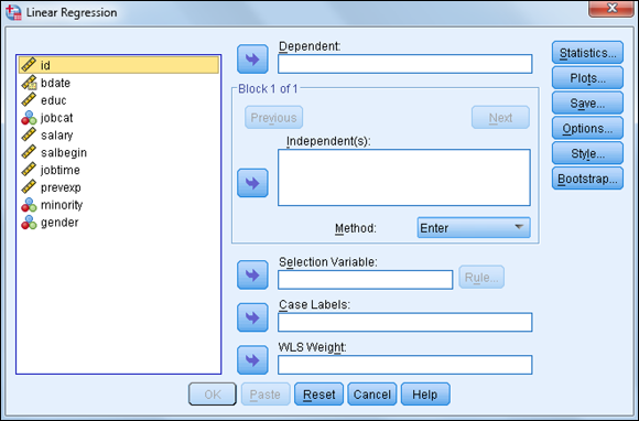
Figure 16-7: The Linear Regression dialog box.
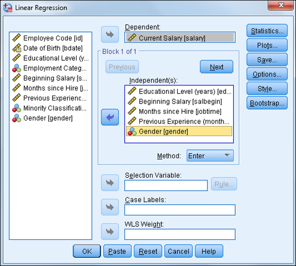
Figure 16-8: The completed Linear Regression dialog box.
Performing regression analysis is the process of looking for predictors and determining how well they predict a future outcome.
The Model Summary table (shown in Figure 16-9) provides several measures of how well the model fits the data. R (which can range from 0 to 1) is the correlation between the dependent measure and the combination of the independent variable(s), so the closer R is to 1, the better the fit. In this example, we have an R of 0.902, which is huge. This is the correlation between the dependent variable and the combination of the five independent variables we’re using. You can also think of R as the correlation between the dependent variable and the predicted values.
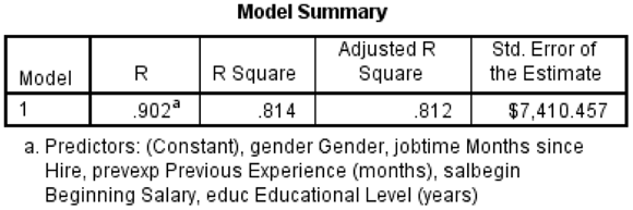
Figure 16-9: The Model Summary table.
You may notice that in most stats books, the r is lowercase, and for R Square, the R is uppercase. Make note of this when you’re deciding how to write up your work.
Remember that the ultimate goal of linear regression is to create a prediction equation so we can predict future values. The value of the equation is linked to how well it actually describes or fits the data, so part of the regression output includes fit measures. To quantify the extent to which the straight-line equation fits the data, the fit measure, R Square, was developed. R Square (which can range from 0 to 1) is the correlation coefficient squared. It can be interpreted as the proportion of variance of the dependent measure that can be predicted from the combination of independent variable(s). In this example, we have an R Square of 0.814, which is huge. This value tells us that our combination of five predictions can explain about 81% of the variation in the dependent variable, current salary. See Table 16-1 for more context of how large a R Square of 81% is.
Table 16-1 Some R Value Ranges and Their Equivalent R Square Value Ranges
|
r |
R Square |
Noteworthy |
Greater than 0.3 |
Greater than 9% to 10% |
Large |
Greater than 0.5 |
Greater than 25% |
Very large |
Greater than 0.7 |
Greater than 49% to 50% |
It’s reasonable for folks to disagree a bit about what constitutes a big correlation. For instance, if you’re a chemist or a physicist, correlations would be expected to be very high because physical objects follow natural laws quite consistently. When human behavior is involved, however, even correlations in the 0.3 to 0.5 range, which would correspond to an R Square of 10% to 25%, are quite high. Some research would report correlations in the 0.1 range, but when you square that, you realize that it’s really pretty low.
Adjusted R Square represents a technical improvement over R Square in that it explicitly adjusts for the number of predictor variables relative to the sample size. If Adjusted R Square and R Square differ dramatically, it’s a sign either that you have too many predictors or that your sample size is too small. In our situation, Adjusted R Square has a value of 0.812, which is very similar to the R Square value of 0.814; so we aren’t capitalizing on chance by having too many predictors relative to the sample size.
The Standard Error of the Estimate provides an estimate (in the scale of the dependent variable) of how much variation remains to be accounted for after the prediction equation has been fit to the data.
While the fit measures in the Model Summary table indicate how well you can expect to predict the dependent variable, they don’t tell us whether there is a statistically significant relationship between the dependent and the combination of independent variable(s). The ANOVA table is used to determine whether a statistically significant relationship between the dependent variable and the combination of independent variables — that is, if the correlation between dependent and independent variables differs from zero (zero indicates no linear association). The Sig. column provides the probability that the null hypothesis is true — that is, no relationship between the independent(s) and dependent variables. As shown in Figure 16-10, in our case, the probability of the null hypothesis being correct is extremely small (less than 0.05), so the null hypothesis has to be rejected, and the conclusion is that there is a linear relationship between these variables.
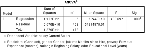
Figure 16-10: The ANOVA table.
Because the results from the ANOVA table were statistically significant, we turn next to the Coefficients table. If the results from the ANOVA table were not statistically significant, we would conclude that there was no relationship between the dependent variable and the combination of the predictors, so there would be no reason to continue investigating the results. Because we do have a statistically significant model, however, we want to determine which predictors are statistically significant (it could be all of them or maybe just one). We also want to see our prediction equation, as well as determine which predictors are the most important. To answer these questions, we turn to the Coefficients table (shown in Figure 16-11).
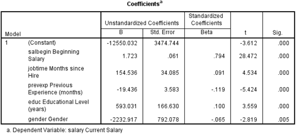
Figure 16-11: The Coefficients table.
Linear regression takes into consideration the effect one or more independent variables have on the dependent variable. In the Coefficients table, the independent variables appear in the order they were listed in the Linear Regression dialog box, not in order of importance. The B coefficients are important for both prediction and interpretive purposes; however, analysts usually look first to the t test at the end of each row to determine which independent variables are significantly related to the outcome variable. Because five variables are in the equation, we’re testing if there is a linear relationship between each independent variable and the dependent variable after adjusting for the effects of the four other independent variables. Looking at the significance values, we see that all five of the predictors are statistically significant, so we need to retain all five of the predictors.
The first column of the Coefficients table contains a list of the independent variables plus the constant (the intercept where the regression line crosses the y-axis). The intercept is the value of the dependent variable when the independent variable is 0.
The B column shows you how a one-unit change in an independent variable impacts the dependent variable. For example, notice that for each additional year of education completed, the expected increase in current salary is $593.03. The variable months hired has a B coefficient of $154.54, so each additional month increases current salary by $154.54. Whereas the variable previous experience has a B coefficient of –$19.44, each additional month decreases current salary by –$19.44.
The variable gender has a B coefficient of about –$2,232.92. This means that a one-unit change in gender (which means moving from male to female), is associated with a drop in current salary of –$2,232.92. Finally, the variable beginning salary has a B coefficient of $1.72, so each additional dollar increases current salary by $1.72.
The B column also contains the regression coefficients you would use in a prediction equation. In this example, current salary can be predicted with the following equation:
- Current Salary = –12550 + (1.7)(Beginning Salary) + (154.5)(Months Hired) + (–19.4)(Previous Experience) + (593)(Years of Education) + (–2232.9) (Gender)
The Std. Error column contains standard errors of the regression coefficients. The standard errors can be used to create a 95% confidence interval around the B coefficients.
If we simply look at the B coefficients you may think that gender is the most important variable. However, the magnitude of the B coefficient is influenced by amount of variation of the independent variable. The Beta coefficients explicitly adjust for such variation differences in the independent variables. Linear regression takes into account which independent variables have more impact than others.
Betas are standardized regression coefficients and are used to judge the relative importance of each of the independent variables. The values range between –1 and +1, so that the larger the value, the greater the importance of the variable. In our example, the most important predictor is beginning salary, followed by previous experience, and then education level.
Every statistical test has assumptions. The better you meet these assumptions, the more you can trust the results of the test. Linear regression assumes the following:
- You have continuous variables.
- The variables are linearly related.
- The variables are normally distributed.
- The errors are independent of the predicted values.
- The independent variables are not highly related to each other.