Chapter 11
On the Menu: Graphing Choices in SPSS
In This Chapter
![]() Working with the Graphs menu
Working with the Graphs menu
![]() Introducing Chart Builder
Introducing Chart Builder
![]() Using the Graphboard Template Chooser
Using the Graphboard Template Chooser
SPSS can display your data in a bar chart, a line graph, an area graph, a pie chart, a scatterplot, a histogram, a collection of high-low indicators, a box plot, or a dual-axis graph. Adding to the flexibility, each of these basic forms can have multiple appearances. For example, a bar chart can have a two- or three-dimensional appearance, represent data in different colors, or contain simple lines or I-beams for bars. The choice of layouts is almost endless. If you really get brave, someday you can learn the programming language behind the graphs called Graphics Production Language (GPL), which truly allows you to do almost anything, but we’re getting ahead of ourselves.
 In the world of SPSS, the terms chart and graph mean the same thing and are used interchangeably.
The Graphs menu in the SPSS Data Editor window has three main options: Chart Builder, Graphboard Template Chooser, and Legacy Dialogs (the other options you see are Python plug-ins). These options are different ways of doing the same job. The only reason to do charts with the Legacy Dialogs is if your boss, or professor, or co-workers tell you to. And they’re only going to do that if they’ve been doing it that way for years and changing is too much trouble. In short, don’t use the Legacy Dialogs. In this chapter, we work only with the other two.
The Graphboard Template Chooser is a better way of building graphs — and when it hit the scene, the original way of building graphs became known as Legacy. A few years later, an even better procedure for building charts was devised and added to the menu — Chart Builder. All three building methods are in place primarily for people who are in the habit of using the older procedures, but if you build a lot of graphs, you may find advantages and uses for all of them. You can get the same graphs from all three; only the process is different.
 Why two “new” menus? The story gets a little complicated. Graphboard Template Chooser can be paired up with an add-on module called SPSS Visualization Designer. (Chapter 22 describes all the modules including this one.) You don’t have to own Viz Designer to like Graphboard Template Chooser, however. You get a chance to see it in this chapter. Chart Builder allows you to generate GPL in the Syntax window, which is pretty cool, too. With Version 23, there is another way, but it’s very specialized and limited to Spatial Temporal Modeling. It’s in its own menu. There’s no way around it — they’re overlapping systems, and it can get confusing. When in doubt, we recommend Chart Builder, but most graphs can be made both ways.
Building Graphs the Chart Builder Way
SPSS contains Chart Builder, which uses a graphic display to guide you through the steps of constructing your display. It checks what you’re doing as you proceed and won’t allow you to use things that won’t work.
The Gallery tab
The following example steps you through the process of creating a bar chart, but you can use the same fundamental procedure to build a chart of any design. You can follow this tutorial once to see how it all works. Later on, you can use your own data and choices.
You can’t hurt your data by generating a graphic display. Even if you thoroughly mess up the graph, you can always redo it without fear. This is one place where mistakes don’t cost anything. And nobody’s watching.
The following steps build a bar chart:
- Choose File ⇒ Open ⇒ Data and load the GSS2012 Abbreviated.sav file, which is one of the supporting files on the book’s website (
www.dummies.com/go/spss). -
Choose Graphs ⇒ Chart Builder.
A warning appears, informing you that before you use this dialog box, measurement level should be set properly for each variable in your chart. (We have the correct measurement level so you can proceed.)
-
Click OK.
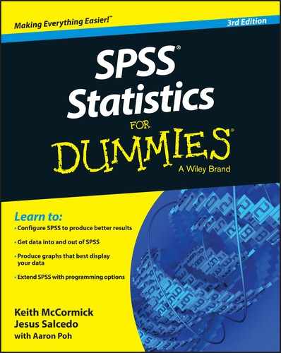
The Chart Builder dialog box appears, as shown in Figure 11-1. If a graph was generated previously, the display will be different, and you’ll need to click the Reset button to clear the Chart Builder display.
- Make sure the Gallery tab is selected.
-
In the Choose From list, select Bar as the graph type.
The fundamental types of bar charts appear in the gallery to the right of the list.
-
Define the general shape of the bar graph to be drawn.
You can do so in two ways. The simplest is to choose one member from the set of diagrams of bar graphs appearing immediately to the right of the list. For this exercise, select the diagram in the upper-left corner and drag it to the large chart preview panel at the top.
Alternatively, you can click the Basic Elements tab (instead of the Gallery tab) and drag one image from each of the two displayed panels to the panel on top, which constructs the same diagram as the bar graph.
Figure 11-2 shows the appearance of the window after the dragging is complete. The result is the same no matter which procedure you follow.
You can always back up and start over: At any time during the design of a graph, click the Reset button. Anything you dragged to the display panel is deleted, and you can start from scratch. -
Click Close to close the Element Properties window (see Figure 11-3).
This window should’ve popped up when you dragged the graphic layout to the panel. This dialog box is not needed for this example, so you can close it. If it didn’t appear but you’d like to see it, you can click the Element Properties button at any time.
- From the list on the left, select the variable with the label and name Highest Year of School Completed (Educ) and drag it to the Y-Axis label in the diagram.
-
In similar fashion, select the variable with the label and name Region of Interview (region) and drag it to the X-Axis label in the diagram.
The screen now looks like the one shown in Figure 11-4.
 The graphics display inside the Chart Builder window never represents your actual data, even after you insert variable names. This window simply displays a diagram that demonstrates the composition and appearance of the graph that will be produced.
 -
Click the OK button to produce the graph.
An SPSS Statistics Viewer window appears, containing the graph shown in Figure 11-5. This graph is based on the actual data; it shows that the average number of years of education varied little from one part of the country to the next in this survey.
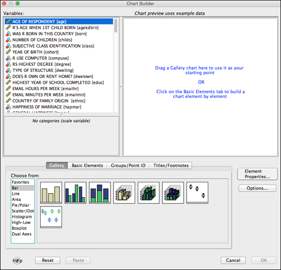
Figure 11-1: The initial Chart Builder dialog box with Bar chosen.
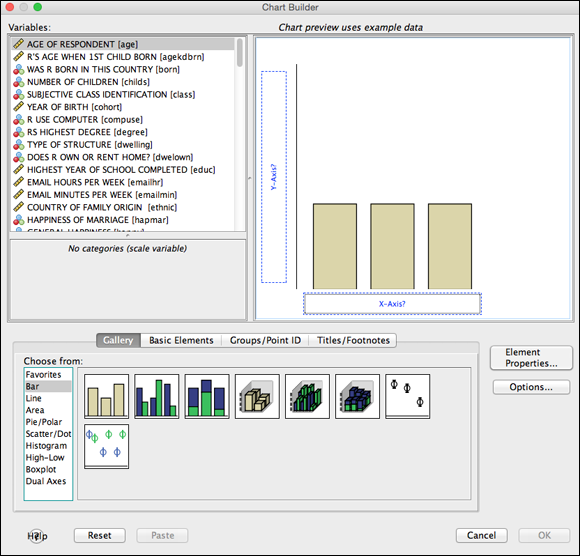
Figure 11-2: The appearance of the new bar chart is defined.
Figure 11-3: Use the Element Properties window to modify chart elements.
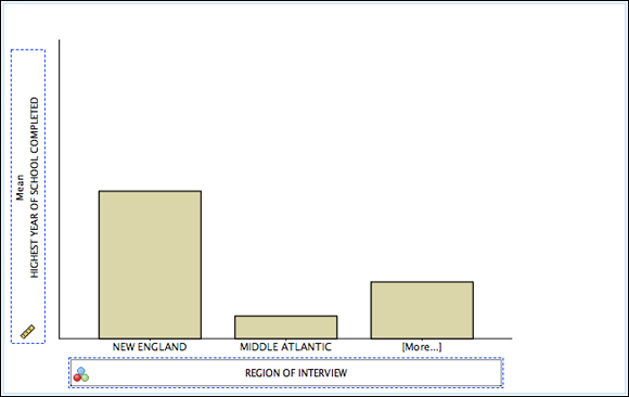
Figure 11-4: The diagram after assigning the x- and y-axes.
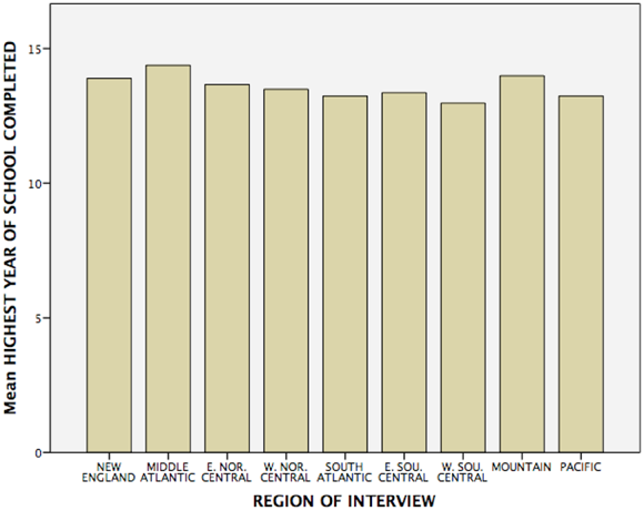
Figure 11-5: A bar chart produced from a data file and displayed by SPSS Statistics Viewer.
These steps demonstrate the simplest way possible of generating a chart. Most of the options available to you were left out of the example so it would demonstrate the simplicity of the basic process. The result could also use a little editing to the y-axis, but editing is covered in Chapter 18. The following sections describe the options.
The Basic Elements tab
The example in the preceding section uses the Gallery tab to select the type and appearance of the chart. Alternatively, you can click the Basic Elements tab in the Chart Builder dialog box and select one part of the chart from each of the two panels shown in Figure 11-6.
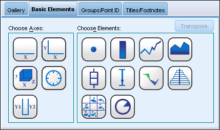
Figure 11-6: Choose the axes and elements to construct the graph you want.
The Basic Elements tab allows you to choose one element from column A and another from column B. You drag one image from each panel into the panel at the top, and they combine to construct a diagram of the graph you want.
The result is the same as you get from using the Gallery tab. The only difference is that you use the Basic Elements tab to build the graph from its components. Whether you use this technique or the Gallery depends on your conception of the graph you want to produce.
The Groups/Point ID tab
After you’ve selected the type and appearance of your chart through either the Gallery tab or the Basic Elements tab, you can click the Groups/Point ID tab in the Chart Builder dialog box, which provides you with a group of options you can use to add another dimension to your graph.
In the example in Figure 11-7, we selected the Rows Panel Variable option, which generates a multifaceted graph. The new dimension adds a separate graph for whether the respondent uses a computer. A separate set of bars is drawn: one for those who use a computer, and one for those that do not.
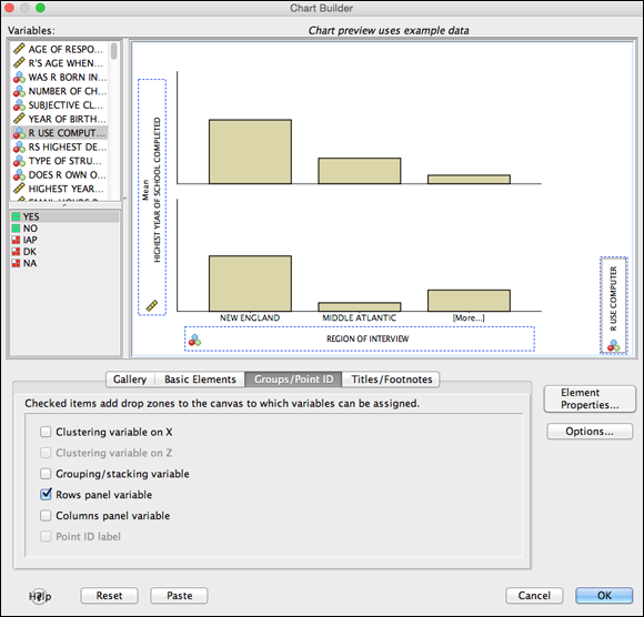
Figure 11-7: You can add dimensions to your graph.
The Columns Panel Variable option (located in the Groups/Point ID tab of the Chart Builder) enables you to add a variable along the other axis, thus adding another dimension. Adding variables and new dimensions this way is known as paneling, or faceting.
Clustering (gathering data into groups) can also be done along the x- or y-axis if the variables are the type that will cluster (or bin) properly.
The Titles/Footnotes tab
Figure 11-8 shows the window you get when you click the Titles/Footnotes tab in the Chart Builder dialog box. Each option in the bottom panel places text at a different location on the graph. When you select an option, the Element Properties window appears so you can enter the text for the specified location.
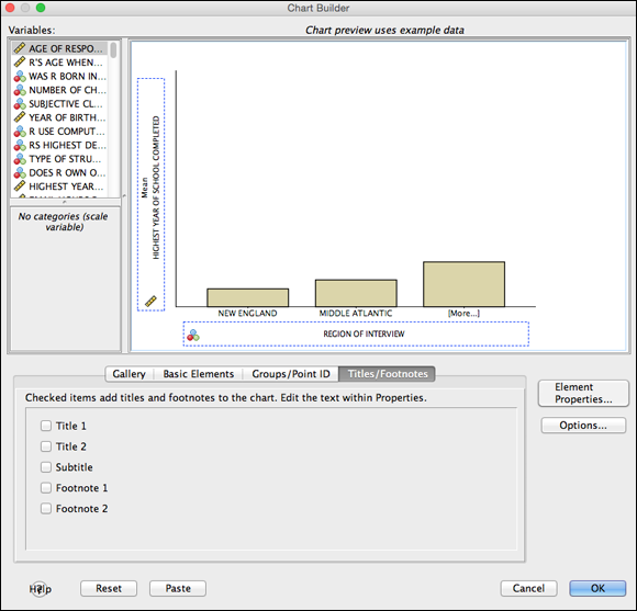
Figure 11-8: Select the chart’s text and its location.
The Element Properties dialog box
You can use the Element Properties dialog box at any time during the design of a chart to set the properties of the individual elements in the chart. One mode of the dialog box is shown in Figure 11-3; another is shown in Figure 11-9. It changes every time you choose a different member from the list at its top.
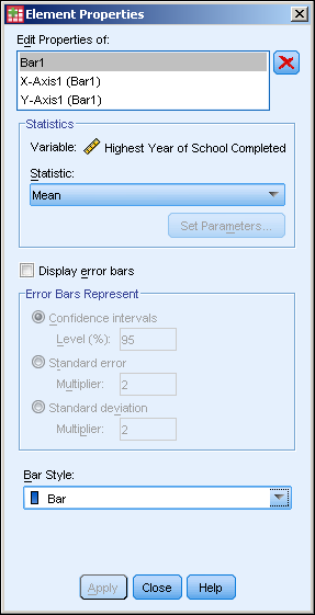
Figure 11-9: The options for an axis variable.
The dialog box often pops up on its own when you add an item to the graph’s definition. You can make it appear any time you want by clicking the Element Properties button in the Chart Builder dialog box.
Okay, the upcoming list of options is long, but four facts make them simple to use:
- All options have reasonable defaults. You don’t have to change any of them unless you want to.
- You can always back up and change whatever settings you made. Nothing is permanent, so you can make changes until you’ve finished or run out of time and decide, “That’s good enough.”
- Not all options appear at once. Only a few show up at a time. In fact, you’ll probably never see some of the possible options.
- All options become obvious when you see what they do. You don’t have to memorize any of them, but you’ll find they’re easy to remember.
The following is a simple explanation of all the possible options that can appear in an Element Properties dialog box:
- Edit Properties Of: This list, which appears at the top of the window, is used for selecting which element in the chart you want to edit. Each element has a type, and the type of the element you select determines the other options available in the window. The selected element is also highlighted in the diagram of the graph in some way.
- X: When an element is selected and the X button to the right of the list becomes enabled, clicking the button removes the element from the list and from the graph.
- Arrow: For charts with dual y-axis variables, the arrow to the right in the list indicates which of the variables will be drawn on top of the other. You can click the arrows to change the drawing order.
- Statistic: For certain elements, you can specify the statistics (that is, the type of value) to be displayed in the graph. For example, you can select Count and use simple numeric values. You can also select Sum, Median, Variance, Percentile, or any of up to 32 statistic types. Not all types of charts have that many options; the options that are available also depend on the types of variables you’re using. For certain statistics options — such as Number in Range and Percentage Less Than — the Set Parameters button is activated; you have to click it to set the parameters controlling your choice.
- Axis Label: You can change the text used to describe a variable. By default, the variable’s label is used.
- Automatic: If selected, the range of the selected axis is determined automatically to include all the values of the scale variable being displayed along that axis. This is the default.
- Minimum/Maximum: You can replace the Automatic default values and choose the extreme values that determine the starting and ending points of an axis.
- Origin: Specifies a point from which chart information is graphed. This option has different effects for different types of charts. (For example, choosing an origin value for a bar chart can cause bars to extend both up and down from a center line.)
- Major Increment: The spacing that determines the placing of tick marks, along with numeric or textual labels, on an axis. The value of this option determines the interval of spacing when you also specify minimum and maximum values.
- Scale Type: You have four different types of scale you can use along an axis:
- Linear: A simple, rulerlike scale. This is the default.
- Logarithmic (standard): Transforms the values into logarithmic values for display. You can also select a base for the logarithms.
- Logarithmic (safe): Same as standard logarithms, except the formulas that calculate values can handle 0 and negative numbers.
- Power: Raises the values to an exponential power. You can select an exponent other than the default value of 0.5 (which is the square root).
- Sort By: You can select which characteristic of a variable will be used as the sort key. It can be one of the following three:
- Label: Nominal variables are sorted by the names assigned to the values; you can choose whether to sort in ascending or descending order.
- Value: Uses the numeric values for sorting. You can choose whether to sort in ascending or descending order.
- Custom: Uses the order specified in the Order list.
- Order: The list of possible values is flanked by up and down arrows. You can change the sorting order by selecting a value and clicking an arrow to move the selection up or down. To remove a value from the produced chart, select its name in the list and click the X button; the value moves to the Excluded list. When you change the Order list, Sort By switches automatically to Custom.
-
Excluded: Any value you want to exclude from the Order list appears in this list. To move a value back to the Order list (which also causes the value to reappear on the chart), select its name and click the arrow to the right of the list.
If a value (or a margin annotation representing a value) is unexpectedly missing from a graph based your selections, look in this Excluded list. You may have excluded too much. - Collapse: If you have a number of values that seldom occur, you can select this option to have them gathered into an “Other” category. You specify the percentage of the total number of occurrences to make it an “Other” value.
- Error Bars: For Mean, Median, Count, and Percentage, confidence intervals are displayed. For Mean, you must choose whether the error bars will represent the confidence interval, a multiple of the standard error, or a multiple of the standard deviation.
- Bar style: You can choose one of three possible appearances of the bars on a bar graph.
- Categories: You can choose the order in which the values appear when they’re placed along an axis. You can select ascending or descending order. If the variable is nominal, you can select the individual order and even specify values to be left out.
- Small/Empty Categories: You can choose to include or exclude missing value information.
- Display Normal Curve: For a histogram, you can choose to have a normal curve superimposed over the chart. The curve will use the same mean and standard deviation values as the histogram.
- Stack Identical Values: For a chart that will appear as a dot plot (a pattern of plotted points), you can choose whether points at the same location should appear next to one another or one on top of one another (that is, with one point blotting out the one below it).
- Display Vertical Drop Lines between Points: For a chart that will appear as a dot plot (a pattern of plotted points), any points with the same x-axis values show a vertical line joining them.
- Plot Shape: For a dot plot, you can choose
- Asymmetric: Stacks the points on the x-axis. This is the default.
- Symmetric: Stacks the points centered around a line drawn horizontally across the center of the screen.
- Flat: The same as Symmetric, except no line is drawn.
- Interpolation: For line and area charts, the algorithm used to calculate how the line should be drawn between points:
- Straight: Draws a line directly from one point to the next.
- Step: Draws a horizontal line through each point; the ends of the horizontal lines are connected with vertical lines.
- Jump: Draws a horizontal line through each point, but the ends of the lines are not connected.
- Location: For Step and Jump interpolation; using this option adds an indicator at the actual point.
- Interpolation through Missing Values: For Straight, Step, or Jump, this option draws lines through missing values. Otherwise, the line shows a gap.
- Anchor Bin: The starting value of the first bin. This option is available for histograms.
- Bin Sizes: Sets the sizes of the bins when you’re producing a histogram.
- Angle: Rotates a pie chart by selecting the clock position at which the first value starts. You can also specify whether the values should be included clockwise or counterclockwise.
- Display Axis: For a pie chart, you can choose to display the axis points on the outer rim.
The Options dialog box
Clicking the Options button in the Chart Builder dialog box opens the Options dialog box, shown in Figure 11-10.
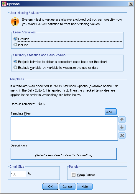
Figure 11-10: Options you can apply to a chart.
When you define the characteristics of a variable, you can specify that certain values be considered missing values. The options in the Break Variables area let you decide whether you want those values included or excluded from your chart. You can also specify how you’d like summary statistics handled. (Missing values are discussed in Chapter 4, and the different types of summary data are described in Chapter 13.)
Templates are files that contain all or part of a chart definition. You can insert one or more names of template files into the list in this window, and SPSS will apply those template definitions as the default starting points for all charts you build. You create a template file from a finished chart displayed in SPSS Statistics Viewer. You find out more on making templates later in this chapter.
Templates come in handy only when you want to build lots of similar charts. You can use the Chart Size option to make the generated charts smaller or larger, as needed.
The Wrap Panels option determines how the panels are displayed when you have a number of them in a chart. SPSS is using the word panel to refer to the rectangular area in SPSS Statistics Viewer in which a chart is placed. Normally the panels shrink automatically to fit; if you select this option, however, they remain full-size and wrap to the next line.
Building Graphs with the Graphboard Template Chooser
The charts you build by choosing Graphs ⇒ Graphboard Template Chooser are similar to those you build by using the other menu selections, but you get less guidance along the way. The way you begin is a bit different. You indicate the variable you want to use, and the menu shows you all your choices for that combination of variables.
There are two big reasons to use the Graphboard Template Chooser:
- You own Visualization Designer. Visualization Designer is discussed a bit in Chapter 22.
- You want to make maps. Maps are not possible in Chart Builder, but they’re popular in Graphboard Template Chooser. You need some way to align your data to the map, so you need a variable like State or County. If you don’t own Visualization Designer or need to make a map, it’s best to stick with just one approach, so we take only a quick peek at this option.
First, you select the variables you want to include (Ctrl+click to select multiple variables), which causes the available kinds of charts (such as bar, dot, or line) to appear onscreen, as shown in Figure 11-11. Using the tabs at the top of the screen (Basic, Detailed, Titles, Options), you can choose screens that allow you to set the options. Note the three “choropleth” options. Those are your maps, but the GSS Survey dataset has broad regions, not more specific geographic info, so mapping is not an option with this data.
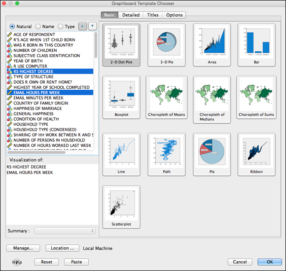
Figure 11-11: The Interactive options for constructing a bar graph.
If you get things balled up, it’s easy to restart. The Reset button removes everything you’ve entered in all the tabbed windows and restores all the defaults.
The Help button provides some information about whichever list of options is displayed at the moment.