Chapter 3
A Simple Statistical Analysis Example
In This Chapter
![]() Entering data into SPSS
Entering data into SPSS
![]() Performing an analysis
Performing an analysis
![]() Drawing a graph
Drawing a graph
The purpose of this chapter is to introduce you to the mechanics of working with SPSS. It begins with stepping through the process of entering some simple data into SPSS and continues with processing that data. This is followed by various procedures for deriving results, using a subset of the data for some calculations and other parts of the data for other calculations. Finally, the results from these different calculations are displayed in different ways.
The data for this example are simple, as are the displays that the data generate. The purpose of this chapter is not to present any great breakthrough in statistical analysis. Instead, we simply want to demonstrate the basic procedures you need to know about when you’re using SPSS.
When the Tanana at Nenana Thaws
This analysis is about an annual lottery that takes place in Alaska. Actually, it isn’t called a lottery — it’s called a classic, whatever that means.
We don’t know whether the Tanana Classic is the oldest lottery in the United States (it began in 1917), but it’s certainly the slowest. It has only one jackpot per year, and tickets for that jackpot are sold all across the state during the winter months.
The lottery is simple enough: The citizens of the town of Nenana set up a large tripod on the ice in the middle of the Tanana River. From the top of the tripod, a tight line is stretched to a clock on a bridge. When the spring thaw comes, the tripod moves and the clock is triggered, stamping the exact minute. All the people who have selected the correct month, day, hour, and minute share the pot.
Many questions come to mind. What is the most likely date? What is the most likely time of day? Is there a trend? In the analysis that follows, we’ll look at the answers to these questions and more.
By the way, the earliest the ice moved out was April 20 at 3:27 p.m. (in 1940), and the latest was May 20 at 11:41 a.m. (in 1964).
Entering the Data
SPSS can acquire data from many sources. You can instruct it to read data from a text file, a database, or a file produced by a program such as Microsoft Access or Microsoft Excel. This Alaskan example does it the simplest way possible: by typing data into the Data Editor window. (We said simplest, not easiest.)
The data consists of dates and times. SPSS has a special date format that we’ll be using later, but for now, we’ll enter the year, month, day, hour, and minute as separate numeric items. This keeps the example as simple as possible, and enables me to show you some different ways of manipulating numbers to reach conclusions.
Entering the data definitions
The first job is to define the names, labels, and data types for the various fields of data, also known as the variables. Here’s all you need to do:
-
Start the SPSS program by choosing Start ⇒ All Programs ⇒ IBM SPSS Statistics ⇒ SPSS Statistics 23.
Depending on how your software is configured, you may get an options window with OK and Cancel buttons. If so, click the Cancel button. In either case, an empty Data Editor window appears, as shown in Figure 3-1.
The layout shown in Figure 3-1 is the Data View mode, as indicated by the tab at the bottom of the window. We want to go to the other mode.
-
Click the Variable View tab.
The window now looks like the one in Figure 3-2.
You use the Variable View tab to define the names and types of variables, and you use the Data View tab to enter the values for those variables.
To enter the definitions, you type the name in the first column — the one labeled Name — and then move the cursor down one row to the position for the next name in the list. You can most easily move the cursor by clicking the destination cell with the mouse. You can also move the cursor with the Enter key and the arrow keys, but the movement may not always be in the direction you expect.
In Figure 3-3, we entered the variable definitions we use in this example.
When you move down to define a new variable name, SPSS takes a wild guess at what you want in the cells you skipped and fills them in for you automatically. Some of the guesses are right, and some are wrong. Stick with us here, and we’ll describe the fiddling around you have to do until your information matches that in Figure 3-3.
-
Type the following entries in the Name column:
- year
- month
- day
- hour
- minute
Every field has both a name and a label. One or the other is used as an identifying tag when data is displayed.
The name is normally shorter than the label. A short name is handy when you’re displaying data in a tight format (such as a column heading or a bar chart label) and when you’re writing equations in the two scripting languages supplied with SPSS. The label is intended to be more descriptive and can add clarity by being displayed as descriptions in displays such as line graphs and pie charts.
-
Skip the Type column.
In this example, all the fields are simple numerics, so SPSS guesses correctly about most of the attributes and fills them in for you. Most of the data you enter into SPSS will be numeric, although some numbers will be converted into names by SPSS. It’s hard to perform calculations with things like “moonbeam” and “sure bubba,” but it can be done. Later on, we’ll show you how to instruct SPSS to change numbers into words and phrases automatically.
SPSS has set the number of digits to the right of the decimal point (the Decimals column) to 2 for all the numbers in our example, but that’s not what we want for this example.
-
Set all the values in the Decimals column to zero.
This has to be done before you can adjust the Widths — if you don’t believe us, try it.
-
Set the first value in the Width column to 4 and the rest of the values in that column to 2.
The Width of most of the fields in this example should be changed from the default of 8 to 2 because they’re two digits long. But set the year to a Width of 4 to accommodate four digits (we don’t want to do the Y2K thing all over again). Simply click the box (cell) for the year’s Width column and type 4.
 By the way, SPSS has a nifty Date data type. We didn’t use it here because we want to show you how to work with simple numbers. You find out about dates and some other special types and formats in Chapter 4 and even more about dates in Chapter 7. At the end of this chapter, you get a sneak peak at the Date Time Wizard, something that we return to in Chapter 7.
 -
Type the following into the cells in the Label column:
- year of the contest
- number of the month
- day of the month
- hour of the day
- minute of the hour
When you type in the Label column, you’re not limited to the size of the cell that holds it. If you type a longer line, the box expands to take it all in. But don’t write a thesis; you need something that will display nicely on your graphs and tables. (You can always come back and change it later on.)
Depending on how big you’ve made your window, you may have to scroll to display columns to either side. To scroll, use the horizontal scroll bar at the bottom of the screen. (We like to expand the window to the full screen, but that’s probably because we’re easily distracted if we see other windows.)
- Skip the Values column; it’s for assigning names to specific values, and isn’t used until later in this example.
-
In the column labeled Missing, specify whether it’s okay to have values missing from this field.
For example, if you’re taking a survey on what color underwear people are wearing, you could assign a number to each color, but you’re bound to come across someone who’s going commando, so you’ll need to define a special value used to indicate a missing item. By default, SPSS doesn’t allow for missing data, and this example doesn’t have any, so the default is None.
-
Skip the Columns column.
The default column width for a data item is 8, and that’s okay for this example. You can make the columns smaller if you prefer, but you need to make sure the columns are big enough to hold your largest data item or its name. This is the amount of space that SPSS allocates when it constructs charts and tables. If you set the size too small, the data or the variable name will be cut for some displays.
-
In the Align column, specify the alignment of your data.
You can choose whether the data should be aligned on the right, shoved over to the left, or placed in the center. Choose whatever you like. This is determined by personal preference, a lousy sense of design, and bad taste.
-
Make sure the Measure column is set to Scale.
Scale is an amount or size — it’s just a regular number — and works fine for what we’re going to do. The other options are Ordinal and Nominal. Ordinal has to do with things that have a specific order. Nominal values are used to tag things as belonging to categories.
-
Skip the Role column.
The Role of all variables in this example is standard: they hold input data. They could also be tagged as Target (or output) data, or as Both, or as None. A variable can be also designated as Partition and used to divide the data into separate samples.
Figure 3-1: The Data View tab of the Data Editor window, before any data has been defined or entered.
Figure 3-2: An empty Variable View tab.
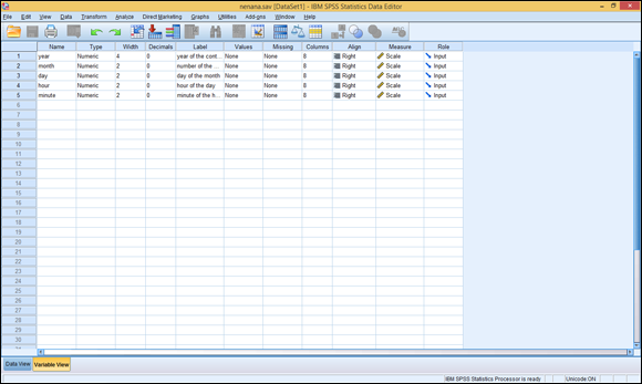
Figure 3-3: Definition of the variable names.
Entering the actual data
Click the Data View tab, which is at the bottom of the Data Editor window, and the window changes to look like the one shown in Figure 3-4. The label names you entered in the Variable View tab appear at the top of the columns. This window is now ready for you to enter numeric data.
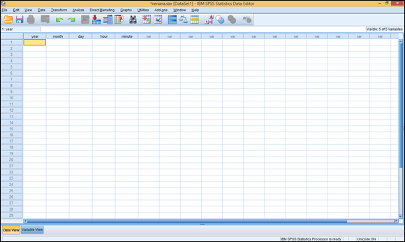
Figure 3-4: The Data View tab, ready to accept your input.
In Figure 3-4, notice the numbers down the left side of the window. This is the SPSS way of numbering rows, which are also called cases. If you use the scroll bar on the right side of the window to scroll down, you’ll see these numbers change. You can think of these numbers as a road map to the layout in the window so you can keep track of where you are.
However, don’t trust the numbers to identify your data. If you move your data from place to place in the grid, the numbers on the left don’t move with it. That means if you insert a row, delete a row, or simply sort your data in a different way, the numbers on the left will associate with different sets of values — and your case numbers will all be different. If you need to identify a case in a manner that doesn’t change when someone organizes the cases differently, you must add a field for identity and enter your own identifying numbers.
All the values that must be entered for this example are in the following list — but you can be lazy if you want to; we’ve already entered all the numbers. All you have to do is load the file that holds them by choosing File ⇒ Open ⇒ Data and then selecting nenana.sav. But even if you decide to read them in from the file, enter a few anyway so you can see how SPSS data entry works. (We talk about loading the file a little later.)
- 4/20/1940, 15:27
- 4/20/1998, 16:54
- 4/23/1993, 13:01
- 4/24/1990, 17:19
- 4/24/2004, 14:16
- 4/26/1926, 16:03
- 4/26/1995, 13:22
- 4/27/1988, 09:15
- 4/28/1943, 19:22
- 4/28/1969, 12:28
- 4/28/2005, 12:01
- 4/29/1939, 13:26
- 4/29/1953, 15:54
- 4/29/1958, 14:56
- 4/29/1980, 13:16
- 4/29/1983, 18:37
- 4/29/1994, 23:01
- 4/29/1999, 21:47
- 4/29/2003, 18:22
- 4/30/1917, 11:30
- 4/30/1934, 14:07
- 4/30/1936, 12:58
- 4/30/1942, 13:28
- 4/30/1951, 17:54
- 4/30/1978, 15:18
- 4/30/1979, 18:16
- 4/30/1981, 18:44
- 4/30/1997, 10:28
- 5/1/1932, 10:15
- 5/1/1956, 23:24
- 5/1/1989, 20:14
- 5/1/1991, 12:04
- 5/1/2000, 10:47
- 5/2/1960, 19:12
- 5/2/1976, 10:51
- 5/2/2006, 17:29
- 5/3/1919, 14:33
- 5/3/1941, 13:50
- 5/3/1947, 17:53
- 5/4/1944, 14:08
- 5/4/1967, 11:55
- 5/4/1970, 10:37
- 5/4/1973, 11:59
- 5/5/1929, 15:41
- 5/5/1946, 16:40
- 5/5/1957, 09:30
- 5/5/1961, 11:30
- 5/5/1963, 18:25
- 5/5/1987, 15:11
- 5/5/1996, 12:32
- 5/6/1928, 16:25
- 5/6/1938, 20:14
- 5/6/1950, 16:14
- 5/6/1954, 18:01
- 5/6/1974, 15:44
- 5/6/1977, 12:46
- 5/7/1925, 18:32
- 5/7/1965, 19:01
- 5/7/2002, 20:27
- 5/8/1930, 19:03
- 5/8/1933, 19:30
- 5/8/1959, 11:26
- 5/8/1966, 12:11
- 5/8/1968, 21:26
- 5/8/1971, 21:31
- 5/8/1986, 22:50
- 5/8/2001, 13:00
- 5/9/1923, 14:00
- 5/9/1955, 14:13
- 5/9/1984, 15:33
- 5/10/1931, 09:23
- 5/10/1972, 11:56
- 5/10/1975, 13:49
- 5/10/1982, 17:36
- 5/11/1918, 09:33
- 5/11/1920, 10:46
- 5/11/1921, 06:42
- 5/11/1924, 15:10
- 5/11/1985, 14:36
- 5/12/1922, 13:20
- 5/12/1937, 20:04
- 5/12/1952, 17:04
- 5/12/1962, 21:23
- 5/13/1927, 05:42
- 5/13/1948, 11:13
- 5/14/1949, 23:39
- 5/14/1992, 06:26
- 5/15/1935, 13:32
- 5/16/1945, 09:41
- 5/20/1964, 11:41
You should now be seeing the Data View tab. To enter a number, simply click a position with the mouse and then type the number that you want to put in that square.
 When we entered the data, we duplicated a row that was already there and then made changes to it. This was handy because the month and day of the new entry were often the same as the duplicated entry. To duplicate a row, select the row you want to copy by clicking the number at the left of the row. (One click selects the entire row.) Then choose Edit ⇒ Copy. Next, select the row you want to hold the duplicate data, and then choose Edit ⇒ Paste. If your target row already contains data, the new data overwrites it.
Suppose you want to insert a new row of data in front of some you already have. First, select the row that is in the position where you want to insert the new row; then choose Edit ⇒ Insert Cases to open a blank row in the position you’ve chosen. You can either copy or type new data into the blank row.
When you’re finished, you can scroll up and down and see different parts of the data, as shown in Figure 3-5.
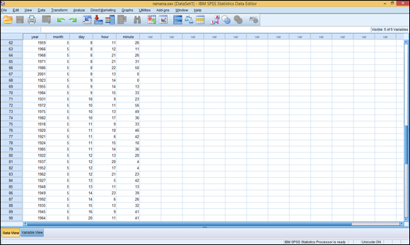
Figure 3-5: The data freshly entered into SPSS.
 When you’re entering your own data, select a filename early in the process and choose File ⇒ Save to write everything to that file from time to time. If you don’t do this, a simple computer crash could cause you to lose all your data. That sort of thing is not good for your blood pressure.
By the way, if you’ve scrolled all the way down, you’ve noticed that there’s a bottom to the list of numbered rows. Don’t worry about it. As you enter data, the bottom extends so you never hit a limit.
If you’ve elected not to enter the data by hand, and instead you want to load it from the file, choose File ⇒ Open ⇒ Data, and then navigate to wherever you stored the nenana.sav file, as shown in Figure 3-6. Depending on how your Windows system is configured, the name may be chopped off in your display and appear only as nenana. It’s not abnormal for Windows to change filenames this way. (The book’s Introduction tells you how and where you can get the files.)
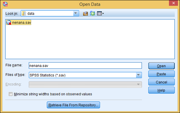
Figure 3-6: Loading an SPSS data file.
The Most Likely Hour
After you’ve put the data in SPSS, do something simple. Use the following procedure to find the mean of the hours in an attempt to determine the hour of the day when the ice is most likely to melt. This would probably be in the daytime because the sun is warming both the air above the ice and the flowing water below the ice.
To find the most likely hour (ignoring the minutes for now), follow these steps:
- Choose Analyze ⇒ Descriptive Statistics ⇒ Descriptives.
-
In the box on the left, select hour of the day [hour] (one of your variable labels) and then click the arrow button in the middle of the window.
The label moves to the right, as shown in Figure 3-7.
- Click the Options button.
- Click the Mean, Std. deviation, Minimum, and Maximum check boxes, as shown in Figure 3-8.
- Click Continue.
Click the OK button at the bottom-left of the window in Figure 3-7.
The SPSS Statistics Viewer window appears and displays information about the analysis, including the results. A detailed description of all this information is in Chapter 8. For now, expand the window to fill the screen, and use the scroll bars if necessary, to locate the result in the box at the bottom of the right panel of the window, as shown in Figure 3-9. The mean (not the average, but nearly the same thing) shows the hour as 14.60, which is between 2 p.m. and 3 p.m. That makes sense, because that’s near the warmest part of the spring day.
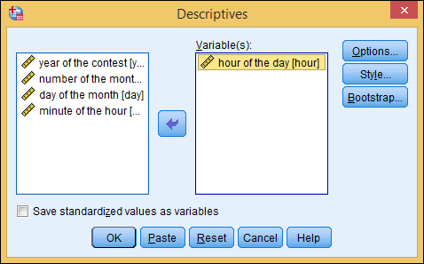
Figure 3-7: Selecting data and starting the analysis.
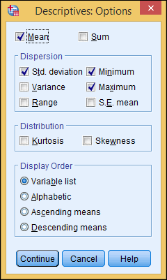
Figure 3-8: The option settings for the analysis.
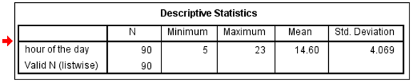
Figure 3-9: The results of the simple hour analysis.
Inside the box, the text on the far left is the label you gave to the variable. The column labeled N is the number of data items included in the calculations. You can tell from the minimum and maximum that the earliest the ice has ever let go was during the 5 a.m. hour, but it has also been known to happen after 11 p.m.
The value for the standard deviation is calculated according to the degree of variation from a perfect fit on a bell curve.
There’s more bell-curve stuff to diddle with: Go back through the same procedure again, but this time change the options in Step 4. Remove maximum and minimum and instead enable Kurtosis and Skewness. Those are not rude words (and, no, we didn’t just make them up); they’re types of statistics. As shown in Figure 3-10, the results have two new values.
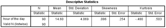
Figure 3-10: New analysis showing kurtosis and skewness.
Both values also have to do with the bell curve. Skewness represents the symmetry of the data. A positive skewness indicates that more of the data appears to the high end, or the right, on the graph. A negative value indicates a skew to the lower values. Kurtosis has to do with the flatness of the curve. If the data implies a curve flatter than the bell curve, the kurtosis value is negative. If, on the other hand, the data inscribes a curve that is more pointed on top than the bell curve, the kurtosis value is positive.
Transforming Data
The previous example looks at only the hours, but it’s also possible to include minutes. Clock arithmetic is tricky (it’s that 60-minutes-per-hour thing) but SPSS can work with it if you tell it what you’re doing.
In the next example, we combine the separate hour and minutes fields into a new field that contains both. SPSS is good at transforming data this way. To build the new field, do the following:
-
In the Data Editor window, choose Transform ⇒ Date and Time Wizard.
The window shown in Figure 3-11 appears.
- Select the Create a Date/Time Variable from Variables Holding Parts of Dates or Times option.
- Click Next.
-
Put the names of the variables into the appropriate fields.
We want only the hours and minutes, so ignore the others. You move them by selecting the one you want from the list on the left, and then clicking the arrow next to the place you want it to go. When you’re finished, the screen should look like Figure 3-12.
- Click Next.
-
Enter a name and a label for the variable. Also select a display format from the list.
To follow along with the example, type time in the Result Variable box, type hour and minute in the Variable Label box, and then select hh:mm from the Output Format list, as shown in Figure 3-13.
-
Select the Create the Variable Now option, and then click the Finish button.
You’ve created your new time data field. The result is shown in Figure 3-14.
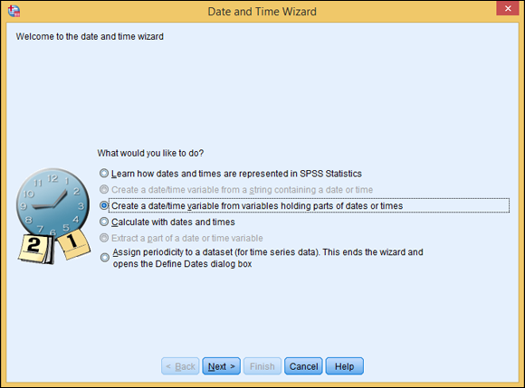
Figure 3-11: The Date and Time Wizard.
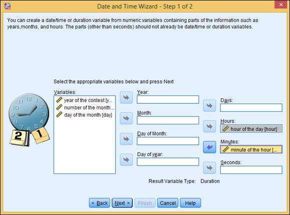
Figure 3-12: Selection of the variables from which time is structured.
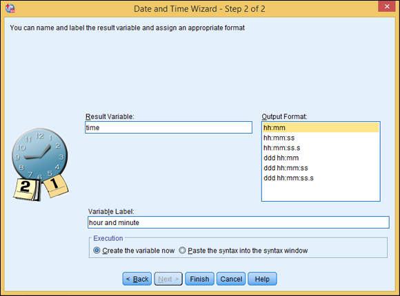
Figure 3-13: The name and display format for times.
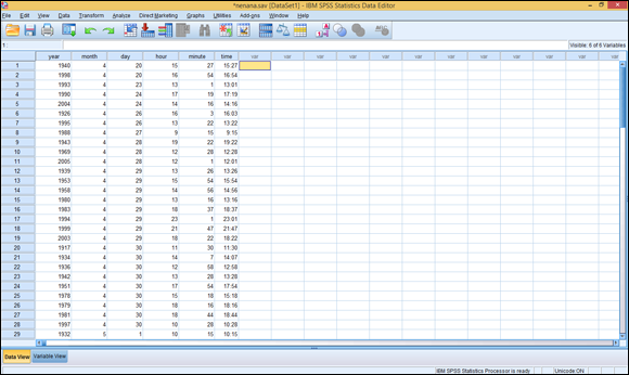
Figure 3-14: The Data Editor window with the new time field.
You may notice that after you click the Finish button, the SPSS Statistics Viewer window may appear. This window shows a log of the steps the program has performed. To continue, click back into the Data Editor window.
Now follow the same procedure as before by choosing Analyze ⇒ Descriptive Statistics ⇒ Descriptives. But in Step 2, select only the new time field so you can see how SPSS handles different combinations of values. In the results, look at the difference in the two means: When the minutes are included, the mean moves to a time a bit later (as one would expect). It’s now at 15:03 (3:03 p.m.) instead of 2-something. Whether that difference is statistically significant is up to you.
The Two Kinds of Numbers
With this example data so far, we’ve dealt with continuous variables (amounts and distances, such as age, gallons of gas, and the number of beans in a jar). The other type is categorical variables (where each value represents a category — for example, yes and no [where, for example, yes is 1 and no is 0] and types of balls [where 1 is a football, 2 is a soccer ball, 3 is a snooker ball, and so on]).
All the variables in this example — except the number indicating the month — are continuous variables. We tend to think of the months by their names instead of numbers, but you have to use the number of the month to do any calculations. If you want the name displayed, you have to assign a descriptive name for each possible value. That’s easy to do with this data because we have only two values: 4 and 5.
To add identifiers for the values, do the following:
- In the Data Editor window, click the Variable View tab and then select the cell in the Values column of the variable holding the month values.
- Click the button that appears in the cell.
-
For each possible value, enter the value and the name you want associated with it, and then click Add.
The value, with its identifier, appears in the list, as shown in Figure 3-15.
-
After you’ve added all the values you want to define, click OK.
The screen displays only part of the change. The word None is gone, and in its place is part of one of your new value definitions.
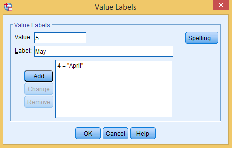
Figure 3-15: One name has been added for a value and another one is being entered.
The real result will show up in your output and help you make a lot more sense of your results. For example:
-
Choose Graphs ⇒ Legacy Dialogs ⇒ Pie.
The window shown in Figure 3-16 appears.
- Select the Summaries for Groups of Cases option, and then click the Define button.
- In the column on the left, select number of the month [month], and then click the arrow to the left of Define Slices By, as shown in Figure 3-17.
-
Click OK.
The SPSS Statistics Viewer window appears, as shown in Figure 3-18.
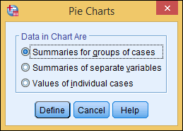
Figure 3-16: Select the type of data to be displayed in the pie chart.
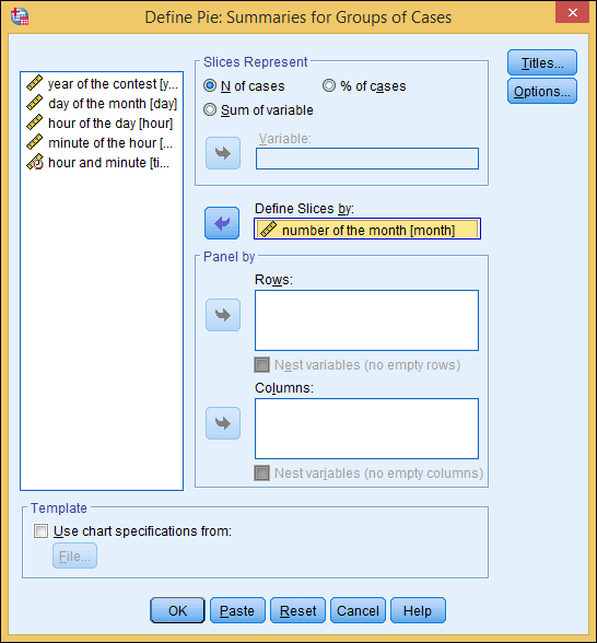
Figure 3-17: You can select the variables you want for the pie divisions.
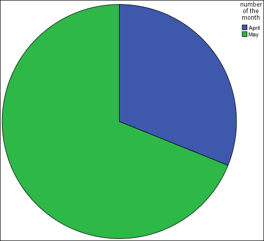
Figure 3-18: A pie chart including the names you defined for the values.
The Day It’s Most Likely to Happen
You already know that the ice is most likely to move in the warmer part of the day. A quick graph can show you whether there’s a most likely day as well. To get a quick bar graph, do the following:
-
Choose Graphs ⇒ Legacy Dialogs ⇒ Bar.
The dialog box shown in Figure 3-19 appears.
- Select the Simple bar chart and the Summaries for Groups of Cases option, and then click the Define button.
-
For Bars Represent, select N of Cases, which means the bars will represent the number of cases. Also set the Category Axis to day of the month [day] and set the Rows to number of the month [month], as shown in Figure 3-20.
The exact meanings of these terms and settings are explained in Part IV, which covers graphs.
-
Click OK.
The bar chart shown in Figure 3-21 appears. The chart shows which days in the past were most often the ones on which the ice moved. There is no obvious trend that we can see. However, you may want to experiment with different analysis displays and try to find a pattern.
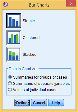
Figure 3-19: You can select the fundamentals of the bar chart you want.
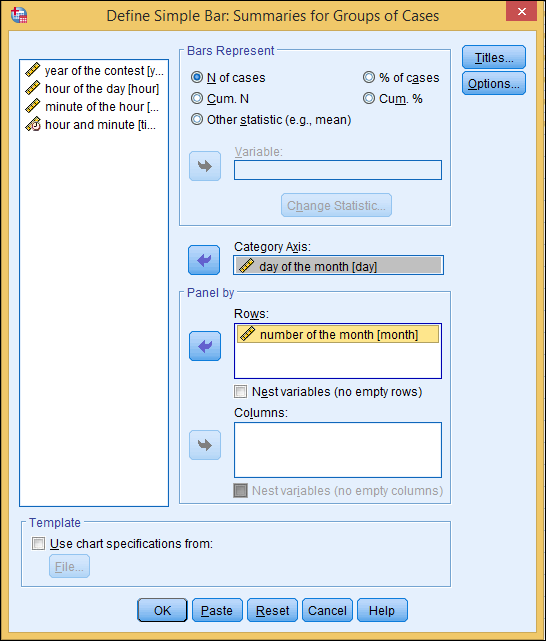
Figure 3-20: Selecting the data to include in the bar chart.
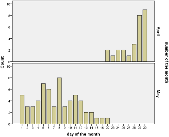
Figure 3-21: A bar chart showing the distribution of the days the ice melts.