Chapter 18
Editing Charts and Chart Templates
In This Chapter
![]() Editing graphs and charts
Editing graphs and charts
![]() Applying templates to charts
Applying templates to charts
In Chapter 12, you see how to make simple graphs and fancy graphs. This chapter explains how to edit these graphs to create a better visual representation of the information in the chart. This chapter also helps you learn how to showcase the most important information to your audience.
Although this chapter doesn’t cover every type of edit you can make to a chart, you can use the steps here as a baseline to explore additional edit options. When you get the basic idea of how to edit graphs using the Chart Builder, you can continue to explore making edits on your own.
Changing and Editing Axes
An axis on a chart or graph acts as a reference that gives information on how variables are related. In this section, we explain how to edit an axis to help better represent the information in a graph.
Changing the axis range
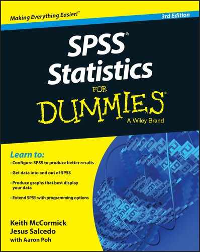
In Chapter 12, you create a differenced area graph (refer to Figure 12-17). As you can see in the graph, there is empty space between the bottom of the graph and where the information begins along the y-axis. Here we explain how to edit the y-axis so that the range of the axis begins at 50. (Refer to Chapter 12 if you need to re-create the graph.)
The following steps show you how to edit Figure 12-17:
-
In the SPSS Statistics Viewer window, navigate to the differenced area graph and double-click the chart.
The Chart Editor window appears (see Figure 18-1).
-
Click the Y button at the top of the menu bar.
The Properties dialog box appears.
- Click the Scale tab (see Figure 18-2).
- In the Range section, click the Auto check box next to Minimum, and change the number in the Custom box to 50.
-
Click Apply.
The chart in Figure 18-3 appears.
As you can see, the y-axis in this new figure is changed to eliminate unnecessary space in the graph.
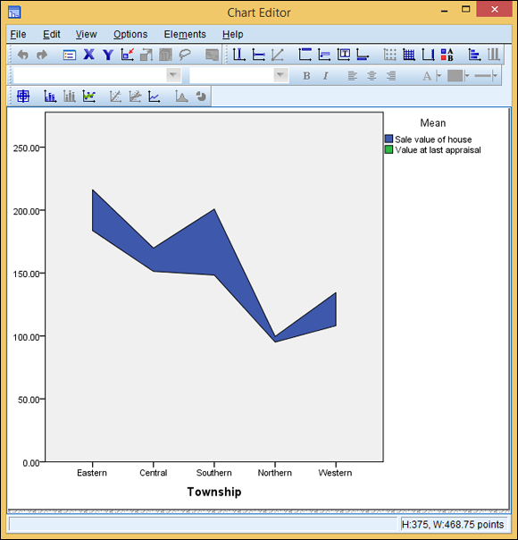
Figure 18-1: The Chart Editor window.
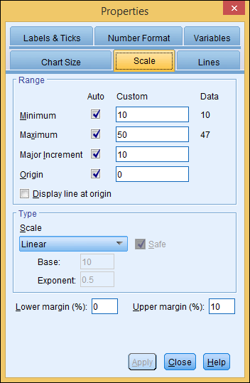
Figure 18-2: The Scale tab of the Properties dialog box.
Figure 18-3: The differenced area graph with the edited y-axis.
Editing graphs like this allows you to create clearer graphs and improve how the information is visualized.
Scaling the axis range
No plot is simpler to produce than the dot plot. It has only one dimension. Although SPSS does an excellent job of grouping the information, it doesn’t create a visually scaled chart like the one shown in Figure 12-2. Without scaling, your chart may fail to convey your information with the impact that you want. For example, notice that when you build the dot plot in Chapter 12, the information is scrunched, with too much white space at the top of the graph.
To be able to make this chart more readable, we’ll change how SPSS scales the graph. The following steps guide you through the process of editing the dot plot from Chapter 12. (Refer to Chapter 12 if you need to re-create the graph.)
-
In the SPSS Statistics Viewer window, navigate to the dot plot and double-click the chart.
The Chart Editor window appears.
-
Double-click the graph.
The Properties dialog box appears.
- Click the Chart Size tab (see Figure 18-4).
- Look for Maintain Aspect Ratio under the Size in Points section.
- Uncheck the Maintain Aspect Ratio button and change the Height to 150.
-
Click Apply.
The chart shown in Figure 18-5 appears.
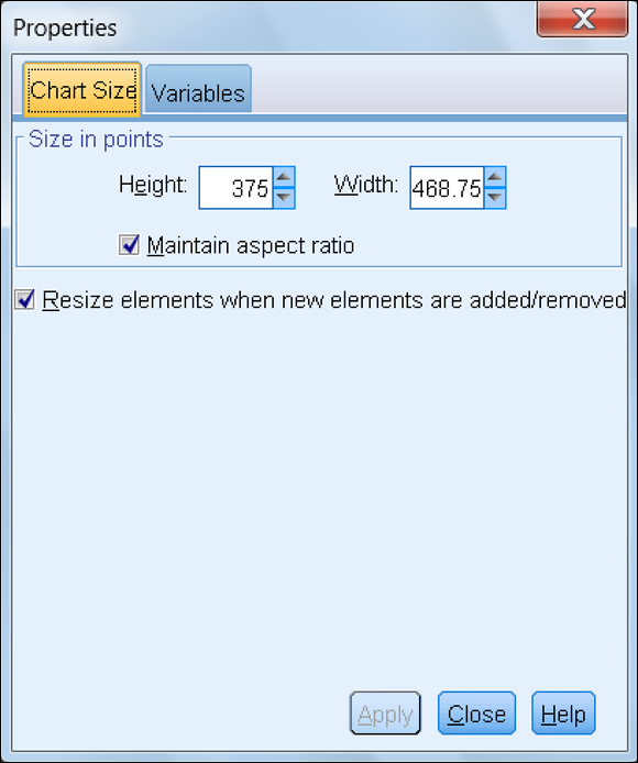
Figure 18-4: The Chart Size tab of the Properties dialog box.
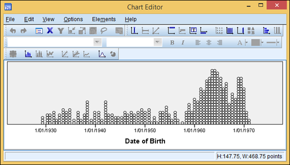
Figure 18-5: A dot plot showing the relative numbers of persons born in each year with an edited axis.
Changing Style: Lines and Symbols
When creating line graphs and scatterplots, it can be hard to differentiate between lines and data points on a graph, especially in black and white. In this section, we tell you how to change the style of data within your graphs to make it easier to visualize the information.
Editing chart lines
In Chapter 12, we explain how to make a chart with multiple lines (refer to Figure 12-9). In order to help the viewer distinguish the various lines, it’s important to modify the way they appear. The following steps can be used to edit the chart for clarity. (Refer to Chapter 12 if you need to re-create the chart.)
-
In the SPSS Statistics Viewer window, navigate to the multiple line chart and double-click the chart.
The Chart Editor window appears.
-
Triple-click one of the lines in the graph.
Make sure that only one line is selected. The Properties dialog box appears.
- Click the Lines tab.
- In the Lines section, from the Style drop-down list (see Figure 18-6), choose a new line style.
-
Click Apply.
The style you chose is applied to the line.
-
Repeat the process for the other lines.
The line chart in Figure 18-7 appears.
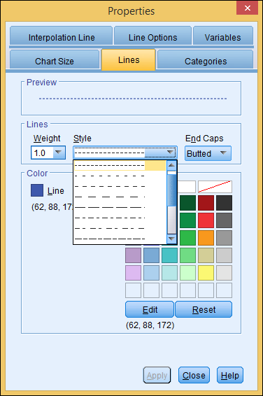
Figure 18-6: The Style drop-down list in the Properties window.
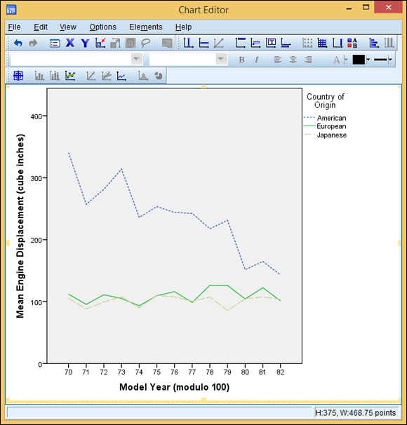
Figure 18-7: A line chart with the edited line style.
Editing data points
Colored scatterplots such as the one in Figure 12-12 are a great way to visualize information. In situations where color scatterplots are not an option (for example, you don’t have a color printer), you need to change the style of the data points so the viewer can distinguish between the datasets.
The following steps can be used to edit the chart and allow a stronger delineation between data sets in a chart. (Refer to Chapter 12 if you need to re-create the scatterplot.)
-
In the SPSS Statistics Viewer window, navigate to the scatterplot and double-click the chart.
The Chart Editor window appears.
-
Double-click one of the circles in the graph.
Make sure that only one set of data is selected.
The Properties dialog box appears.
- Click the Marker tab.
- In the Marker section, from the Type drop-down list, choose a new marker type (see Figure 18-8).
-
Click Apply.
The style you selected is applied to the graph.
-
Repeat the process for the other datasets.
The chart shown in Figure 18-9 appears.
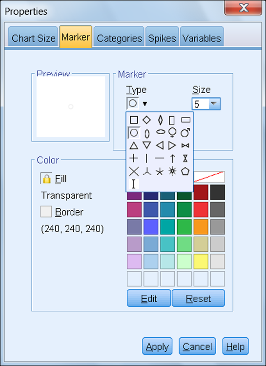
Figure 18-8: The Type drop-down list in the Properties window.
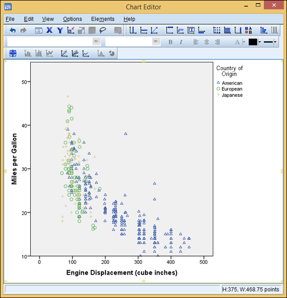
Figure 18-9: A scatterplot with the edited data point style.
Applying Templates
Templates are a great way to improve how your graph looks and feels. To save you from having to create templates yourself, SPSS comes with a set of templates for charts and graphs that you can apply to make your graphic stand out. In this section, we discuss how to apply these templates to your graph.
In Figure 12-9 of Chapter 12, we created a chart with multiple lines. Here we apply a grayscale template to add effect to a chart. The following steps show how to apply a template to a chart. (Refer to Chapter 12 if you need to re-create the chart.)
-
In the SPSS Statistics Viewer window, navigate to the line chart and double-click the chart.
The Chart Editor window appears.
-
Choose File ⇒ Apply Chart Template.
The Apply Template dialog box appears.
- Click Greyscale.sgt.
-
Click Open.
The chart shown in Figure 18-10 appears.
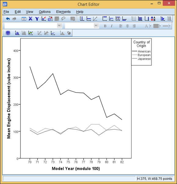
Figure 18-10: A line chart with a grayscale template.