
I’ve been a computer graphics professional since 1993. I have experience in games, multimedia, print, and film, and I’m currently employed with DreamWorks Feature Animation as a look development artist. I’ve worked for many clients, including Sting, Peter Gabriel, Dodge, Penguin-Putnam, Duncan Studio, and Disney. I’ve developed award-winning projects such as Vigilante 8; Leonardo da Vinci’s Codex Leicester; Riven, the sequel to Myst; Patriot; Monsters vs Aliens; and How to Train Your Dragon.

More is out; less is in. Pushing the low-end boundary of 3D has been a preoccupation of mine for my entire career. I tend to use limits, whether they involve polygon count or time, to achieve a more spontaneous 3D workflow. In this medium, obsession with microscopic detail tends to reign. It’s easy to spend weeks on end painting a specular map for human pore structure. In my free time, I like to counter that with a painterly approach, where form is rough and loose, and details are left to the viewer.
Getting loose with 3D as a medium is something of an oxymoron. It isn’t ordinarily an art form that is conducive to quick expression. There’s usually far too much overhead involved in the production of a 3D image. But with a little practice and ZBrush, this becomes possible.
To accomplish a finished work in four hours, it helps to know the stages and have time guidelines for each one. I break my workflow into four phases: modeling, texturing, lighting, and post.
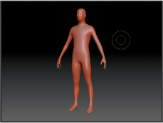
I use either ZSpheres or a prefab geometry doll as a base mesh. I’ve used both, but I tend to prefer the geometry doll. See Figure 10.1.
Using TransPose tool, I pose my base mesh, paying attention to the gesture and movement of the figure. The great thing about a study of this nature is that it’s simple to alter and tweak the gesture later; however, it’s best to try to get it right from the beginning. I spend a little time measuring with my stylus. It’s easier to add the masses and details if the relationships are already in place. See Figure 10.2.
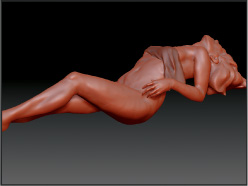
I build the forms and masses. See Figure 10.3.
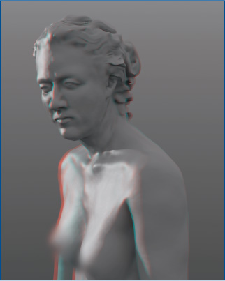
Once I’m satisfied with the masses, I add the details and gravity. These add the spark of life and realism to the model. It’s not necessary to add detail everywhere. I pick an area and focus on that, leaving the rest loose. If there are sufficient details and weight in an appropriate area, and the basic masses are correct, the viewer can fill in the details. See Figure 10.4.


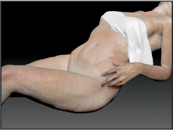
I start with a range of base colors and paint in semitransparent layers. I mimic the layers of skin, beginning with reds, purples, and blues. I build up to yellows, greens, and whites. Finally, I wash in the local skin color. My technique involves a continual process of building and tearing down to create depth and richness. I try not to click Undo. My strokes are deliberate and committed. See Figure 10.5.
I might even leave a little bit of Zadd on the brush. It can accentuate the mass of the form and better reveal the strokes. See Figure 10.6.
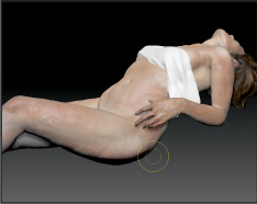
I might paint in some light and shadow, but I’m careful not to compete with the actual forms. I only accentuate them. See Figure 10.7.
I concentrate on my focal point and leave everything else loose. Viewers like contrast in an image, and in this image the level of detail varies. See Figure 10.8.


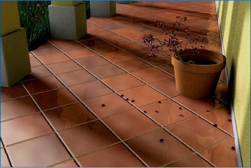
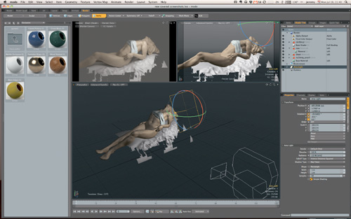
I rough in the environment to inform lighting. It should be value and form only. I might polish and texture it later, but at this stage, I simply mass it in to support the piece. See Figure 10.9.
I temporarily remove the texture from the model and assign a mid-gray color. I create a range of values that work and keep the lighting simple. It’s usually best if there appears to be just one light source and the bounce light. Of course, I try to match the actual light quality falling on the figure, so more than one may be necessary. I ensure there is no clamping to pure white or pure black, striving for a broad range of tonality. See Figure 10.10.
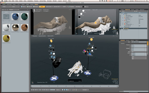
Thinking of lighting in components is valuable. I try to get each part of the total lighting contribution right and then bring them together. Often I rely on simple three-point lighting: key, bounce, and rim. I use whatever kind of shaded ambient light (Final Gather or Global Illumination) my package supports to do the ambient bounce light. I turn that off and position my key light, often a SpotLight, and do the same for the rim light.
Working with them individually helps me isolate and visualize what each part of the lighting is doing. It means I make fewer mistakes, need fewer lights, spin my wheels less, and am able to track down problems more easily when they occur. Once I am satisfied with each component, I turn it on and add it up. Then I adjust light intensities to create balanced relationships between them. See Figure 10.11.
Once the values are correct, I fold in the color component of the light. First I bring in the texture I’ve painted. Then I add color to my actual light sources. See Figure 10.12.


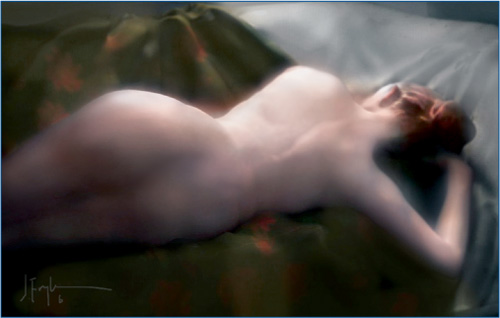
The stressful part is over! I now spend additional time on the environment and tweak the gesture and flow of the figure. I add some details I may have neglected. This works best when there is variety in amount of detail. I leave some parts strategically rough but add detail to the point of interest. It doesn’t have to be perfect. See Figure 10.13.
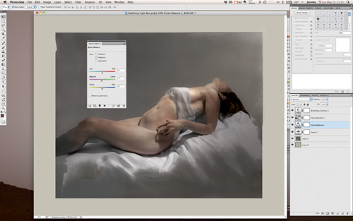
Now I render and process. I bring the final image into Photoshop for some last-minute touches. My changes at this step are simple color-corrects or glares. I add a simple background at this time as well. See Figure 10.14.
Often it’s a struggle to get everything done in a limited amount of time. But mastering this process leads to a better understanding of what’s important. It means spending less time with insignificant details and more time on the most important part of the picture: the gesture and the tone. It also means working faster and more efficiently. The result is a better, more intuitive sense of color and rhythm. Other benefits are eyes and a mind trained so that all of this seamlessly translates to more finished work.