“BigDaddy_out.”
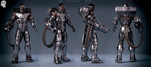
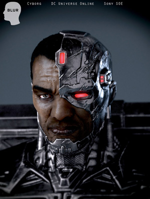
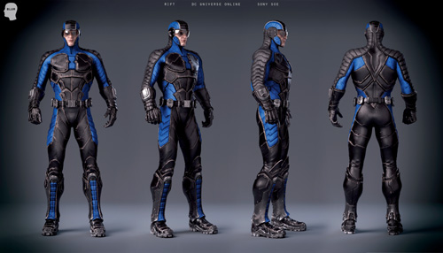
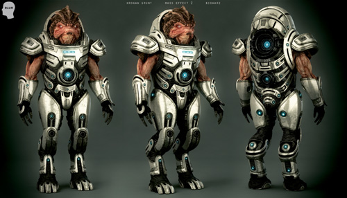
I consider myself both an artist and a craftsman, with a strong drive and dedication to my tasks at hand and a push to bring out the best in each project. I often find inspiration in the oddest of places and try to interpret and incorporate those thoughts into my daily efforts. Currently I am employed as a 3D character artist through Blur Studio in wonderful Venice, California. Over the past four years, I have had the opportunity to work on a range of projects covering game cinematics, ride films, commercials, and everything in between. The scope of these projects has given me the chance to breathe life into a wide order of unique and interesting characters from all walks of life.

I take a hands-on approach. I really prefer to jump into a character and get completely enveloped with his or her or its sense of purpose. I like to get to know my characters. Where do they come from? What is their role? The more information I have, the easier it becomes to understand them. These tidbits help spring life into their very being. I enjoy sculpting organics as much as hard surface; they require different sets of disciplines, and both are equally rewarding. I enjoy all aspects of character modeling, from the initial conceptual stage, to craftsmanship, and all the way down to final texturing. I thrive to be creative and try to challenge myself on a daily basis.
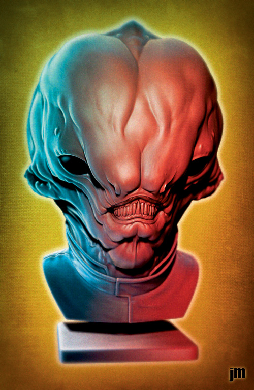
When I was approached to do something for this book, I actually struggled to think of any clever tricks I use to sculpt in ZBrush. I realized that I truly don’t often do anything fancy; I tend to keep it simple. It was then that it hit me—maybe that’s exactly what I should share! So I’m going to demonstrate how to quickly sculpt and build form with just a few select brushes and then some basic compositing tricks using some Best Preview Renders (BPRs) and Photoshop. So let’s get started on how I made Mr. “Have you seen my jaw?”
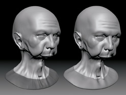
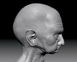
First, you are probably wondering what in the heck this is a sculpt of, right? The guy is walleyed and has no jaw! Well, here’s the backstory. I was working on an alien head for this, but I randomly stumbled upon a photograph on the ol’ Internet of this guy who was arrested in Arizona and had no jaw. I assume his missing jaw was related to cancer, a birth defect, or maybe a tragic hunting accident. Who knows! But I found it downright intriguing, so I had to bust out a sculpt of this fella.
I start with a base mesh. I tend to build up a clean uniform base mesh in XSI. I’m not opposed to ZSpheres; they have their moments, but sometimes they give me wonky geometry, so taking an extra five minutes to bust a simple base out of XSI isn’t gonna kill me time wise. See Figure 1.1.
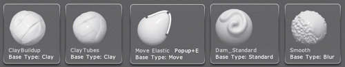
The name of the game is to keep things simple, so I use just the following brushes for this bust: Clay Buildup, Clay Tubes, Move Elastic, Dam Standard, and Smooth. See Figure 1.2.
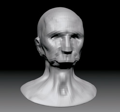
I go fast and dirty, slapping on form with the Clay Tubes and Clay Buildup Brushes. I want to be loose during this phase, not scared or timid. I focus on laying on form and building up the features and silhouette. I might try out Move Elastic here as well, because it lets me tweak the mesh pretty quickly. There’s no reason to go over three subdivisions here; I want it low so it’s easy to manipulate and smooth out. I also make sure my brush is set to Symmetry because it makes this phase go that much faster. To activate Brush Symmetry, I choose Transform, Activate Symmetry and then X, Y, or Z. See Figure 1.3.
Once I have some basic form down, I slap some eyeballs on. These are just placeholders for the time being. In this case, I use two ZBrush spheres. Once I have the base geometry where I need it, I turn off Symmetry. This is where the asymmetry starts to take shape and really breathes life into the character. At this stage, I also subdivide a few more times to be able to get the fidelity I need around the eyes. See Figure 1.4.
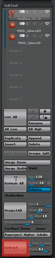
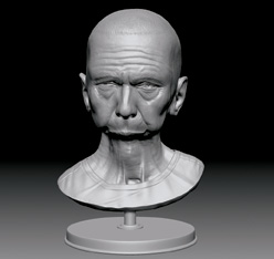
I decide to add a shirt to this guy. The easiest and fastest method to do so is to mask out the area where I want the shirt to be and extract it via the SubTool palette. See Figure 1.5.
When I click Extract, ZBrush builds a new SubTool of geometry based on my mask selection. Basically, I have a nice form-fitting shirt I can now work with. I adjust the thickness to whatever I need it to be; for this instance, I just leave it at its default setting. See Figure 1.6. Now I have a nice new SubTool to sculpt up the shirt.
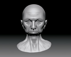
Until now, I have only been using the Clay Buildup and Clay Tubes Brushes to build up form and then smooth it out. I’m still primarily going to use those two brushes, but at this point I start to use the Dam Standard Brush to cut in tight creases where I need them. You can see in Figure 1.7 that I have started to build up some wrinkles here and there. I use the Dam Standard to create some of the tighter wrinkles and to cut the creases into the T-shirt. I also take the time to build a simple stand for the bust.
While I am in XSI, I go ahead and fashion some new eyeballs, too. They are pretty basic; I just add a little wedge to them to give the illusion of reflection. See Figure 1.8.
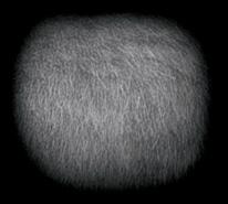
Now that some things are taking shape, I need to figure out how to manage this guy’s high-frequency details, such as pores and hair. For the hair, I decide to make a simple custom alpha shape in Photoshop. See Figure 1.9.
Tip
When utilizing alphas, it’s always a good idea to subdivide your mesh as high as your PC can handle it. The more subdivisions you have, the cleaner the alpha looks, so crank it up if you can. (Be careful, though; sometimes if you go too high, your performance is so terrible it may not be worth it.)
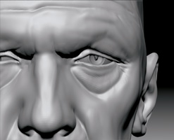
Now I import this PSD file into my alpha menu and apply it using the Standard Brush set to drag rectangle. After I carefully apply it over the scalp, it looks like Figure 1.10. For the pores, I use the variable skin alphas that come with ZBrush. I apply them the same way as the hair, but with a combination of the drag rectangle stroke and the spray stroke. I also add some eyebrows with the Dam Standard Brush. I am getting close to wrapping him up now!
Note
You can also download alphas directly from the ZBrush Alpha Library online at www.pixologic.com/zbrush/downloadcenter/alpha.
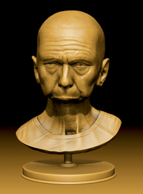
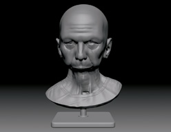
At this point, what’s left is pretty much icing on the cake: focusing on the fine details. I really try to sell the wrinkles and pores in this step. Usually after applying pores to the face, I go back through with Clay Tubes, brush at a low setting, and try to add another level of imperfection. This helps break up any monotonous pore patterns and gives the face a more realistic tone. I also decide to take a sec and update the stand. See Figure 1.11. That should do it! Now I composite him.

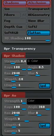
Using the same file from Technique 1, I decide to do some BPR renders. I open the Render menu, scroll down, and turn on Render Shadows and AOcclusion. Then I scroll down a little further and expand BPR Shadow and BPR AO (ambient occlusion).
Shadows can be adjusted per personal preference. The higher the number, the stronger they are. I tend to set Shadows somewhere in the middle. Because I’m gonna split these into separate passes, I can adjust them to be lighter or darker in Photoshop, so it’s not super important to nail it here.
I set Rays to 100 for the best quality, and I usually set Resolution to about 2048. Going higher than that is fine, but it takes a little longer to render.
I usually leave the Angle alone, but experimentation is fine. Generally, a low number is best for shadows, and a high number like 360 is best for AO.
The Blur setting is obvious; the higher the setting, the more your shadows are going to be blurry. The lower the setting, the sharper the shadows.
VDepth is an important one. I generally like to set VDepth to −10 and work close to those numbers, because I get way better results.
LDepth is something I generally don’t adjust.
Now onto BPR AO! In this case, I boost my Strength to 1 with the same settings for rays and resolution that the BPR shadow has. I keep the LDepth at −1 and the Gamma at 5. I want a high Angle so I can get a good occlusion pass, so I keep it at 360. I like the AO pass to be a little fuzzy, so I have it at 8. The Gamma setting is usually good left at 5. It can be adjusted further here for darker AO, but that’s not really necessary because it can be tweaked in Photoshop.
I do one last thing before I click Render. I scroll back to the top of the Render menu and turn on Create Maps. I then click the BPR button and let her rip! Once that’s done, in the top of the Render menu under the BPR button are the following passes: Beauty Render, Depth Render, Shadow, AO, and Mask. I leave the Depth settings at default on. See Figure 1.12.
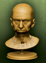
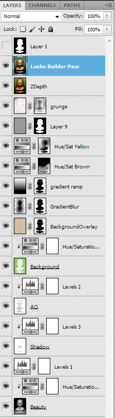
In this step, I open Photoshop and import my ZBrush goodness. I use Photoshop CS5 for this, but using a slightly older version wouldn’t be much of a hindrance. I open my Beauty pass and duplicate my Shadow and AO pass into separate layers on top of my Beauty. I set them to Multiply and then apply a levels adjustment to both my shadow and AO layers to spice them up a bit. I basically just push up the contrast a tad. I also add a Hue /Saturation level to my Beauty layer. I set it to colorize and tint it a mustard color. See Figure 1.13.
It’s a good idea to duplicate over the Mask Layer from ZBrush into a new layer on the composition. I use the Magic Wand tool to select the white in the mask and save the selection as a mask. I invert the selection and fill that layer with a green. I then color-correct it with a Hue/Saturation adjustment layer. After that, I import a nice pattern into a new layer and set it to Overlay. I don’t want the pattern to cover the bust. I just want it to overlay the pattern on the background, so I mask out that area by using the mask selection. Now, using the same masking techniques, I make two more layers, one with a gradient ramp and one as a drop shadow. See Figure 1.14.
The background is too uniform in color. I apply two separate Hue/Saturation Adjustment layers to the stack, making sure they aren’t set to a specific layer, because I want these applied to the whole image. I tint one layer brown and then fill the mask layer black, hiding the effects. I do the same again but tint it yellow this time. With both layers masked out, I can go to each one individually and paint in subtle color changes a little at a time. On the bottom, I select the Hue/Saturation layer mask to set the color to white. I carefully paint in browns at the bottom and on the other layer do the same but paint in yellows at the top. It’s a cool effect! By painting over the bust area, it starts to turn a nice orange brown and gives the bust a nice popping accent. I paint carefully and softly on the left side of the bust to give the appearance of a warm orange casting down the left side of the image. See Figure 1.15.
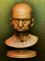
I decide to merge all my layers into a single new layer on top of my stack. With the top layer selected, I go to the menu bar, select Filter, scroll down to Other, and select High Pass. I keep it around the 4–5 range and click OK. The image should be gray and funky looking at this point. When I set this layer to Overlay, boom!. The image looks a lot different! The High Pass set to Overlay should strengthen all the details. If it’s too much, I can dial the Opacity of that layer back to the 60–70 range. See Figure 1.16.
The image is looking pretty good now, but I want to break it up a bit more. I set a grunge texture I found to Overlay and place it on top of the stack. Then I mask it out in certain areas so it isn’t overbearing. Now is a good time to apply the depth of field look utilizing the depth pass from ZBrush. Again, like I did for the High Pass, I create a new layer on top of the stack and press Ctrl+Alt+Shift+E, pasting the merged image into the new layer at the top. I open my ZDepth pass, select all, and paste it into a new alpha channel of my composition. I then go up to the menu bar and select Filter, Blur, Lens Blur, which opens the Lens Blur settings box. In the top right is a section labeled Depth Map; I click the Source drop-down and select the alpha channel I just made. I then adjust the Radius and Blur Focal Distance until I get the desired depth of field. It really pops the sculpture. See Figure 1.17.
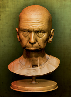
I’m pretty happy with what I have, but I still think I could spruce it up a little bit more. I think for this final shot I used the Basic Cool setting in Magic Bullet Looks with an added custom Edge Softness and Vignette. I then do a once-over to see if there is anything standing out that bothers me. I notice that my eye carbuncle is a tad overexaggerated.
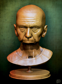
Now instead of going all the way back to the sculpture, I just do a small Liquefy to the image and make sure the area is not so elongated. It’s much faster than rerendering everything! There you have it! See Figure 1.18. Also, for reference, I’ve included a shot of my final composition in Photoshop in Figure 1.19.
Tip
I highly suggest looking into a program called Magic Bullet Looks for step 15. It’s a small application that has a ton of predetermined film-like settings you can run an image through to test different looks and feels. This is nothing you can’t attain within Photoshop, but Magic Bullet Looks is fast and fun to quickly browse a large range of settings. You can really put the last pass of razzle-dazzle on the image.