
TWO
Light and Perception

Photography literally means "painting with light". Most photographers have spent a long the learning about the mechanics of how their cameras work to record light. F-stops, shutter speed, and all the other technical terms sometimes dominate our discussions because they're critical to getting a properly exposed image. Similary, understanding how our eyes and brain work in tandem to perceive light from the world around us is key to developing our sense of composition because that knowledge helps us determine how someone will perceive our images.
Before we can start discussing how our brains perceive light, we need to look at what light is, how our eyes detect light, and how they efficiently send it to our brains.
What Is Light?
For all intents and purposes, light is a special type of wave that comes from a light source, like the sun or a flash. It bounces off objects, and eventually falls on our eyes or cameras to be turned into something meaningful.
Visible light is actually a tiny part of something larger, called the electromagnetic (EM) spectrum. See Fig 1, page 25. This spectrum contains many types of waves, ranging from radioactive gamma rays to radio signals and beyond.
We differentiate these various types of waves by talking about their wavelength. Wavelength is a measure of the distance between peaks of a wave. If you’ve ever watched surfers, you’ll notice that sometimes waves are really far apart, and other times, they’re really close together. A short wavelength means that the waves are close together. In the EM spectrum, gamma rays have very, very tiny wavelengths, hundreds of times thinner than a piece of paper. AM radio waves have very long wavelengths, around a thousand feet per wave.
Visible light only takes up a tiny part of the EM spectrum. The difference in wavelength between red and violet light, the two ends of the visual part of the EM spectrum, is less than the width of a red blood cell. Yet in that range, our eyes and cameras can perceive millions of colors with very subtle differences between tones. That’s pretty amazing! Our eyes and brains are pretty incredible, given how specially adapted they are to visible light.
Something special about cameras is that the part of the EM spectrum they record can be changed. Although our sensors are typically tuned to the same visible light that our eyes see, it’s possible to make a digital sensor that records ultraviolet or infrared light for special purposes, such as shooting at night.

Our eyes are hard-wired to record visible light, and although we can’t change what wavelengths they see, they have some pretty amazing hardware!
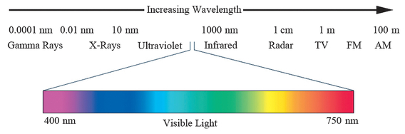
FIGURE 1 The EM spectrum with the approximate wavelengths for each part of the spectrum, in meters. All of the visible light we perceive takes up only a small fraction of the spectrum!
How Our Eyes Detect Light
Camera sensors are pretty straightforward. There’s a grid of sensors designed to detect red, green, and blue light, with the sensors next to each other. Some sensors, like Foveon, are a bit more complex, as they actually have sensors layered on top of each other. Our eyes are more complex, and capable of more, than any camera’s sensor.
Light enters our eye through the cornea, the clear front part of the eye, and the lens, a transparent disk that sits in the opening of the eye (the pupil), suspended in a ring of muscle that can shape the lens to adjust its focus. Ideally the changing shape of the lens causes light to focus perfectly on our retina.
The retina is where the eye’s light “sensors” are. As a quick aside, not all of the light that enters the eyes is recorded by the brain—some bounces back out. That’s why red-eye occurs in photos. The light from your flash bounces off the blood cells in your subject’s eyes and is reflected into the camera.
Unfortunately, not everyone’s lenses are perfect, and sometimes their focal length is just too short or long in relation to the position of the retina. That’s what makes someone near-or far-sighted. When the muscles surrounding the lens are relaxed, we’re focusing about ten feet away, and when those muscles are tight, we’re focusing up close. As we age, we are less able to change the shape of the lens to focus up close; hence, many people need reading glasses as they get older.

FIGURE 2 Rough drawing of eye, highlighting the cornea (A), retina (B), and optic nerve (C) which connects the signals from the eyes to the brain.
Unlike a camera sensor, which only has one type of light sensor, our eyes have two types, called rods and cones. Furthermore, we have three types of cones (some women actually have four), and we’ll see why that matters for color vision shortly.
Rods
Rods are very long and thin—hence the name “rods”—and we have roughly 100 million of them in each eye. They are very sensitive to light, working well in dim lighting conditions, and chances are that at some point in school someone told you that rods handle black-and-white night vision and cones handle color vision. This is not quite correct, as it’s the variation in type and sensitivity of cones compared to rods that gives us these types of vision.
We only have one type of rod in our eyes, and it’s only capable of telling if something is light or dark. It’s sort of like if you only look at a single channel in a photograph, as illustrated in Figure 3—we can tell how light or dark each pixel is, but we don’t know what color the pixel is until we add the other types of sensors. As such, if our eyes are only using our rods, the world appears to be black and white.
Rods are more sensitive and numerous than cones, so when cones stop being able to sense the light, rods take over, letting us see in less light. At night, we’re mainly relying on our rods to see light. During the day, our rods basically say to our brain, “It’s too bright for us, use the data from the cones instead.”
Cones
Cones are shorter and thicker than rods, shaped more like a cone, but there are far fewer of them in our eye (only six to seven million total). Cones are less sensitive to light than rods, meaning that they need brighter light to be able to detect the light coming into our eyes. In photographic terms, you could say that rods are so sensitive that it’s like shooting at ISO 6400, whereas cones are less sensitive and more like shooting at ISO 50.
What’s special about cones is that most people have three types of cones, and each is sensitive to a different wavelength of light. By combining the information from our yellow-, green-, and blue-sensitive cones, our brains make the world show up in color (as long as there’s enough light to be using our cones instead of our rods). Interestingly, our cones are most sensitive to greenish-yellow light, which is why emergency signs are often green, and least sensitive to blue light (blue text is hard to read, for example).
When people lack a type of cone, we say that they are color blind because they are unable to perceive a difference between a certain two colors—there’s not enough information available for them to determine some wavelengths (there are also other causes of color blindness, aside from missing cones). In extreme cases of color blindness, when a person only has one type of cone, both their day vision and night vision will only show brightness; they see in black and white. Because the yellow and green cones are defined on the X chromosome, it’s more likely for men, who have only one X chromosome, to be color blind.
How Our Eyes are Laid Out
Camera sensors not only have just one type of light sensor, they’re also laid out in a very regular fashion. Our eyes have a more complex arrangement of rods and cones.


FIGURE 3 A color image made up of three channels (A) compared to only the blue channel (B).
First, cones are concentrated in an area called the fovea, and there are almost no rods in it. The fovea is an area in the center of the retina that’s responsible for sharp vision. The cell layers in front of the retina (the ones light has to pass through before hitting rods and cones) are even shifted away here, allowing our photoreceptors to be more exposed to the incoming light, providing sharper vision.
The fovea is very small. It’s less than 2 mm across (that’s less than one-fourth the thickness of your iPhone) and provides only about two degrees of our field of view (for scale, with our two eyes, our field of view is about 180 degrees horizontally and 130 degrees vertically). Despite all that, about half of the vision- processing parts of the human brain are devoted to the fovea—the information from the center of our retinas is very important!
During the day, in good light, the fovea provides the best vision. But, what’s a little weird is that, because our fovea is primarily cones and few rods, you’ll find that your vision’s better at night and in dark places if you look just to the side. Astronomers and Boy Scouts have known this for years! Unfortunately, our vision gets blurrier further away from the fovea, making it hard to focus on objects in our peripheral vision without looking more directly at them.
Using Blurriness to Create More Engaging Images
Impressionist painters took advantage of this blurriness so that, when you see part of one of their paintings out of the corner of your eye, it looks like a solid form with a lot of detail. Yet when you actually direct your gaze to that part of the painting, the lack of detail becomes clear. Confusing your brain further, your peripheral vision still tells your brain that there is actually more detail just to the side of where you’re looking, because its less-detailed vision gives the impression that this is so. Each time you look away and then look back at the image results in your brain “filling in” a new version of the painting, making it seem more like an ever-changing scene.
Compare this to a photograph or painting where there is extreme depth of field and everything is visible. This type of image almost feels static and unrealistic because it’s always exactly how you saw it last time, with nothing to fill in.
As another example, have you ever wondered why Mona Lisa always seems to be smiling? As Margaret Livingstone found, Leonardo da Vinci took advantage of our limited peripheral vision to paint the Mona Lisa, creating her famous smile (although it’s likely he did so without realizing what he was doing!). Viewers typically look first at her eyes. Our peripheral vision is responsible for seeing her mouth. We pick up subtle shadow clues in her cheekbones, and it looks like she’s


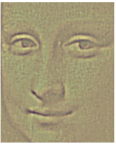
FIGURE 4 The Mona Lisa blurred to represent what our peripheral vision (left), near peripheral vision (middle), and central vision (right) see. Image courtesy Margaret Livingstone.
smiling. Yet when we focus on her mouth, our peripheral vision is no longer picking up those shadows and seeing only a hint of a smile. As you move your eyes around, her smile changes because you’re using different parts of your vision to process her smile (see Figure 4).
It’s rather amazing to consider the tricks artists have used to create amazing paintings just by taking advantage of how our rods and cones are arranged in our eyes.
Soft-focus filters can achieve a somewhat similar effect (as can tweaking in the digital darkroom, which we cover in Chapters Ten and Eleven) that takes advantage of our peripheral vision to make our images more intriguing.
How Our Eyes and Brains Record Light
If you’ve ever held down your shutter button to take a burst of photos, eventually you hit a point where your shutter slows down because your camera’s buffer is full—it can’t store the image data fast enough to let you fire at the maximum rate anymore.
Now consider your brain. Whether you look around quickly or slowly, your brain’s almost always able to keep up, processing what your eyes are seeing. Our eyes and brain have some special optimizations to let us process all the light our rods and cones are registering, re-encoding things like color, and doing some special preprocessing to emphasize parts of the scene that matter to our brains.

FIGURE 5 A color-inverted American flag and its afterimage. Stare at the dot in the flag on the left and then look at the dot on the right to see the afterimage.
Representing Color
The first way that our eyes efficiently record what they see pertains to how they store color information. Think about a normal, three-channel red/green/blue (RGB) image for a second. We mentioned before that we have three different types of cones, and the obvious answer is that the brain must have three different color channels, recording an absolute number in each channel, just like in computers. In addition to letting us represent color, this would also let us store data from the rods, as we could just add a fourth channel to store brightness. Unfortunately, the obvious answer isn’t always the correct one.
Have you ever noticed how you sometimes describe a color in terms of two colors (a bluish green, say), but there are some colors you don’t describe together at all, like a reddish-green? Plus, if you stare at a color for a while and then look at a white background, you’ll see an afterimage with the color’s complement (e.g., if you were looking at a red image, you’d see green)? If you stare at the white dot in the middle of the color-inverted American flag in Figure 5 for at least 30 seconds without blinking and then look at the black dot to the right, you can observe this effect for yourself.
It turns out that our brain does two things to process light and color. First, it separates out luminance—how bright or dark the light is—from the color part of light. Many parts of our vision system are color blind (more on this soon), and only having luminance to deal with lets them work faster. Second, the brain stores color data in what are called color opponent pairs. Specifically, it stores color in terms of how red versus green it is and how yellow versus blue it is.
As you have probably guessed, the way our brain encodes color into opponent pairs leads to some interesting effects in terms of how we perceive colors. We’ve already mentioned afterimages, the first of these effects. More applicable to photographers, though, is that placing opponent colors next to each other enhances our perception of those colors. Why is that?
To put it into camera sensor terms, the cells in our brain responsible for processing the color falling onto a particular pixel aren’t just aware of that pixel, they’re aware of the surrounding pixels, too. The technical term for this type of cell is a double-opponent cell. If the light falling onto a pixel is yellow, it will suppress the blue side of its blue/yellow scale when converting the data for our vision system. Furthermore, if the surrounding pixels are blue, the yellow pixel’s cell will emphasize the yellow side of the scale even more, enhancing the color difference. This helps optimize the data that our brains receive—we don’t care about where the color is the same, rather we care about where it changes.
These double-opponent cells also help explain afterimages. When you look at a yellow image, your yellow-sensitive receptor cells are being stimulated and suppressing your perception of blue. Over time, your brain adapts to the yellow cells being over-stimulated. When you look away, the situation changes, your brain is still expecting a higher level of yellow stimulus, blue isn’t being suppressed anymore, and you see a blue afterimage.
Thinking of cells being suppressed and activated might be a little odd, so think about it this way. Imagine that you have a group of people, with half saying “yellow” and the other half saying “blue.” When you show the group a yellow picture, the “yellow” people start shouting louder. And if the yellow picture has a blue frame around it, not only do the “yellow” people
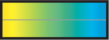
FIGURE 6 The solid gray line is the same color, but the yellow-to-cyan background gradient and our color cells’ double-opponent nature makes it seem cyanish on the left and yellowish on the right.
start shouting even louder but they start muffling the people saying “blue.” After a while, you start mentally ignoring how loud the “yellow” people are shouting. You know they’re still there, but you’re not paying as much attention to their shouts.
Then, when you take the picture away, everyone returns to their normal volume, but because the “yellow” people are suddenly quieter and because you’re mentally tuning them out a little bit, you can hear the “blue” people more easily for a moment. In fact, there’s a brief moment where you hear “blue” and not “yellow” that’s like an afterimage. The people saying “yellow” louder is like when our cells fire and become activated, and muffling the people saying “blue” is like suppressing the cells.
Another oddity with how our brains encode color data is that we have many fewer double-opponent cells, and they’re much larger, which makes our color vision lower resolution when compared to our luminance vision. It’s sort of like comparing a 5 MP sensor to a 25 MP sensor of the same size. One example of how this affects vision is watercolor painting. Often, the outline strokes are clearly done with solid, darker edges. Then, the colors are loosely painted on top, not always filling in the stroked areas. However, they appear completely filled because our brains fill in the interior regions up to the painted outlines. Similarly, if you’ve ever noticed color appearing to bleed past a line onto the surrounding area, like in Figure 7, it’s because the resolution of our color system is not high enough to precisely define the color’s boundary. We take advantage of

FIGURE 7 The inside of this shape appears slightly green, even though it’s the same white as the paper around it.
this when painting in color or masks in the digital darkroom— we don’t have to make our color brushes perfectly precise, because our brain’s color system is lower resolution.
Handling Luminance with Center/Surround
Even though color vision is more advanced—only some animals have it—our eyes’ luminance-processing system (again, luminance is how bright or dark the light is) does some even more amazing tricks with the light our eyes perceive before sending it to our brains, and this is responsible for some unique illusions.
In order to be as efficient as possible, our brains only respond to light that matters. For example, let’s imagine that you were looking at a white circle inscribed in a green circle. The part that matters is where the two meet—the area where the color changes.
Our brains have some special wiring to detect the parts of a scene where something changes. The rods and cones in our eyes are connected to other cells with a special layout. These cells are arranged into a small circular “center” and a larger “surround” ring. Essentially, what happens is that light from a particular area falls onto this ring. If the light’s the same across both the center and the surround ring, the cells say to the brain, “Move along, nothing to see here, just keep using the same data you’ve been using for the other areas.” But if the

light on the center is different from the light on the surround area, the cells become activated, start firing, and say, “Hey, the light changes here! Brain, pay attention to this part of what the eyes see.”
Remember that really weird scintillating grid image from Chapter One? It’s also in Figure 8. Center/surround explains why it happens. First, pay attention to where the white lines intersect. Because there are vertical and horizontal lines intersecting, there’s more white at those points than in the other parts of the image, where there are just single white lines between black. When our eyes look at the non-intersection parts of the grid, their cells are more activated (because
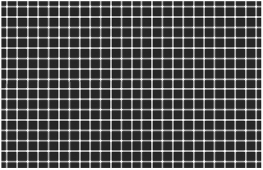
FIGURE 8 The scintillating grid is due to center/surround effects in our vision.
there’s more difference between the white and black) than when they look at the intersection part (where there’s more white). The area that causes more activation (the straight, white lines in between black) appears as brighter white to our brain, causing the white areas in the intersections to appear darker. The reason the spots flicker is because not everything is instantaneous in our brain—there is a small delay between activations, causing the less-activated regions to dance around.
One implication of center/surround is that we are very good at seeing contrast. Figure 9 contains an illustration of the Cornsweet illusion. Which side is darker? Now take a strip of paper, cover the center area, and again judge which side is darker. Our brains pay attention to the area in the middle where there’s a small gradient. Center/surround effects make it so that we “fill in” the areas where there isn’t a significant change (the area to the left or right of the center) based on what we see where there is a lot of difference and sometimes our brains fill in that detail incorrectly!
If you’ve been in snow country, have you ever noticed how during a white-out the world often appears darker? Since there is no contrast for our eyes to perceive and everything is white, center/surround causes our cells to fire less. When our light-sensing cells fire less, our brain perceives that the world is darker.
Also in Chapter One, we pointed out that our eyes are drawn to points in the image where there is some type of contrast,
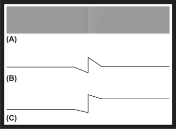
FIGURE 9 You can see the Cornsweet illusion in A, the actual luminance of the image in B, and our perception of the luminance of the image in C.
and that more of these points lead to more visual intensity in the image. Center/surround explains why we’re drawn to contrasty points—our cells are literally firing and saying “look here” to our brain. The more they fire, the more energetic the image and the higher its intensity.
Another aspect of the center/surround, similar to the Cornsweet illusion, is that the surrounding area influences our perception of inner brightness, an effect called simultaneous contrast. Consider, for example, the two inner gray boxes in Figure 10. Which is brighter? They actually have the exact same luminance, but the surrounding brightness influences our perception, and our contrast-encoding brain exaggerates the brightness difference.
Furthermore, encoding contrast information allows our eyes to see a greater dynamic range (the ratio between the brightest and darkest points). Our eyes do not have cells that can register every possible luminance level. Instead they adapt and then encode the differences between smaller areas. It’s much more efficient if our eyes say to our brain, “This area’s ten units brighter than this other one” rather than, “This area has a brightness of 1,000 units and that one has a brightness of 1,010 units.”
Painters have known for years that people’s vision depends on smaller local differences, and use this information to make their images appear to have a greater dynamic range. Rembrandt was a master of this technique, clearly seen in his painting Meditating Philosopher (Figure 11). Here, although the window appears significantly brighter than the shadows, if you actually measure the luminance of the window and of the shadows, you’ll see that it’s only ten to twenty times brighter. Since the area surrounding the window is so dark, center/surround makes the window appear even brighter, and it makes the subtle change of tonalities in the shadows seem even more subtle and dark.
Believe it or not, as a photographer, you’ve taken advantage of center/surround without being aware of it whenever you’ve used a split neutral density filter. A scene will often have a huge difference between the brightest and darkest areas, but our cameras can only capture six to fourteen stops at most, depending on the camera. We encounter this problem, for instance, when trying to take a shot at sunrise or sunset that has a darker foreground and a brighter sky. To get both parts properly exposed, we use a split neutral density filter, which is a piece of glass that’s darkened on top and clear on the bottom. Hold the dark part of the filter over the bright part of the image, as seen in Figure 12. Yet when we look at the final image, even though we’ve significantly reduced the dynamic range of the scene so that our camera could capture it, the photograph still retains the apparent dynamic range of the original scene, with a very bright sky and dark foreground.
This idea of local contrast also comes into play with high dynamic range (HDR) images. Often, people dislike HDR images because they somehow look over-processed (Figure 13). Typically, what’s going on is that the photographer didn’t choose natural settings for contrast. Something that should be brighter than something else, if you looked at the shot in the real world, isn’t brighter in the photo, and this confuses our

FIGURE 10 Simultaneous contrast is when an area takes on the complementary color of the surrounding area, as in this example of achromatic simultaneous contrast, where the inner box on the left appears darker and the inner box on the right appears lighter.
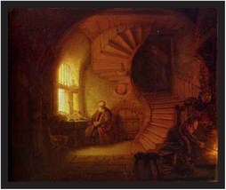
FIGURE 11 Rembrandt’s Meditating Philosopher, oil on wood, 1632, Louvre, Paris, France.
brain. It’s possible to create HDR shots that look perfectly natural just by making sure the right areas are bright and the right areas are dark, relative to each other. We’ll discuss this more in Chapter Eleven.
How Our Brains Process Light (We Think)
Clearly, center/surround does some information processing for us, reducing the amount of data our brain has to deal with. Even with center/surround, though, there is still a ton of data coming from our eyes for our brain to process. Fortunately, through a variety of experiments, some involving special machines to see which parts of our brains are active when doing certain tasks and others involving far more gory
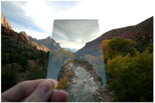
FIGURE 12 Using a split neutral density filter to capture a scene with too great a dynamic range for one image. See Chapter Nine for more information.
methods, we have a rough idea of how our brain turns light into images.
Something that makes our brain very efficient and fast is its ability to process information in parallel, meaning that it can simultaneously process multiple aspects of the light our eyes see. Specifically, data about the light gets split up and dispatched to different parts of the brain (technically this starts to happen as soon as light reaches the retina).
The first thing for which our brain processes the light data is the “where” information. The “where” system, which other mammals also have, turns light from our eyes into our perception of position, motion, depth, and organization in a scene. This system is very fast and contrast sensitive, allowing us to catch a fast-moving baseball, for instance.
The “where” system also works with the thalamus, which is roughly in the center of the brain. The thalamus plays a role in a number of functions, including regulating our level of awareness, processing input from our senses (excluding smell), and controlling our motor systems. By sending the data here first, some scientists believe that this lets us react immediately to things we see, before we’ve had enough time to fully process the information. For example, if something’s coming right at our face, we’ll duck before we think about what the thing is.
One major detail to note is that the “where” system is color blind—it only uses luminance information from our eyes.
The second system, which exists only in primates and humans, is responsible for our object and color recognition, and it’s called the “what” system. This system is fairly slow,

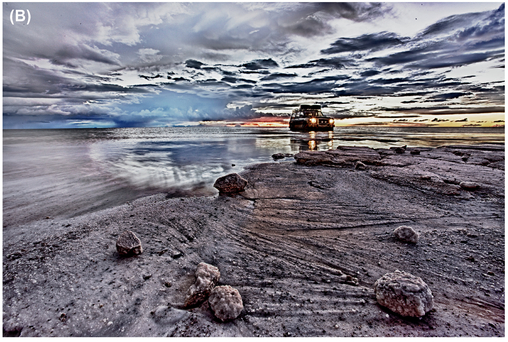
FIGURE 13 A natural-looking HDR image (A) and an over-processed one with unnatural overall contrast (B).
given it involves more complex processing. Furthermore, by studying people who have had strokes in certain parts of their brains, scientists have found that the “what” system gets divided further, into color and form (although the form system uses both color and luminance data). This division might explain why we accept black-and-white images as complete— color is somewhat of an afterthought, happening after lots of other processing has already happened to the data coming from our eyes.
We even perceive depth and three-dimensional shapes from luminance information only—as long as you don’t change the luminance, you can pick any hue you want and we’ll still be able to clearly make out and identify an object’s shape. Henri Matisse took advantage of this in a big way with his painting The Woman with a Hat, seen in Figure 14. In that painting, he used a wide range of hues to paint the woman’s face, but because the shading is correct, we still easily identify the woman and her shape.
The “what” system is also far less sensitive than the “where” system. If you look at Figure 15, a long exposure of water rushing over a crab (and with contrast reduced even more in processing), your brain will be able to identify whether something is there as well as its general shape, because you’re activating the “where” system. But you cannot tell what the object is because there isn’t enough contrast to activate the “what” system.
Our brains also do some special processing with color so that an object always appears to be the same color, regardless of what color light we’re looking at it through, be it daylight, tungsten light, or ski goggles. This effect is called color constancy.
As an example of color constancy, a banana appears yellow at midday under white daylight and still appears yellow at sunset, when the light is redder. What’s going on is that, because we are sensitive to the local differences between colors and not just the absolute value our eyes receive, our brain is able to
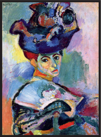
FIGURE 14 Matisse’s The Woman with a Hat, oil on canvas, 1905, San Francisco Museum of Modern Art.
figure out what color the light source is and adjust accordingly. Specifically, when looking at a scene, your brain will figure out the reddest point and then adjust the image your brain is perceiving to make that point appear red. We are able to perceive the same color for the object even as the color of the light changes.
You’ve probably taken a photograph inside and noticed that it had a yellowish tint that your eyes were unaware of. Although our brains make us blissfully unaware of the color of a light
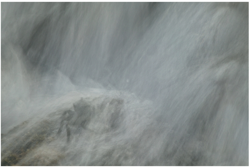
FIGURE 15 A very low-contrast shot in which your “where” system picks up on an object but the “what” system has trouble identifying what it is.


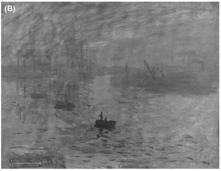
FIGURE 16 The sun appears to shimmer because our “where” system can’t pin down its exact location (A). If we desaturate the image (B), which represents the data our “where” system processes, the sun disappears. Claude Monet, Impression, soleil levant, oil on canvas, 1872, Musée Marmottan Monet, Paris.
source, our cameras are not so lucky. They record absolute levels of red, green, and blue exactly as the light hits the sensor, with no adaptation to the light source’s color. Under different lighting conditions, this can create some very weird color casts in our photographs!
To correct these color casts, photographers have the notion of “white balance” (or with film, we talk about film color-balanced for different light sources). Essentially, when you define the white balance, you are defining what color true white should be, giving the computer a value to use to “correct” the other pixels, compensating for the color of the light source. Being able to adjust the white balance after the fact is an excellent reason to shoot RAW—you might not be aware enough of the true color of your light source while shooting to think to change your white balance, but if you shoot RAW, you will be able to adjust it after the fact without losing any data.
Although this white balance correction brings a photograph closer to what our brains see, it’s still not perfect—different lighting can sometimes slightly alter our perception of pairs of colors. For example, if you look at red and blue objects next to each other under daylight and tungsten light, the red object will look slightly lighter under the tungsten light.
One side effect of color constancy, though, is that if you look at shadows under different light sources, such as daylight and candlelight, you’ll notice that they have a different color. Keep in mind that a shadow, by definition, isn’t being illuminated by the light source causing the shadow to be cast—the object casting the shadow prevents it. For example, if the sun is shining on a tree, the sun is illuminating the tree, but the tree is creating a shadow on the ground. The shadow isn’t perfectly black because it’s being illuminated by indirect, diffuse light from the rest of the environment. Because it’s being illuminated by a different light source, when we look at the shadow, we will see color contrast along the border of the shadow, giving the shadow an apparent color. If you’re manipulating an image and creating a shadow of some sort, it is very important to create the correct color in your shadow to prevent it from looking fake.
Processing Faces
In addition to being able to “see” constant colors, our “what” system is also really good at recognizing faces. Our brains even have specific areas dedicated to processing faces, making us very good at recognizing upright human-like faces (it doesn’t work as well when a face is at an extreme angle). These areas help explain why faces are so important in art over the centuries. Faces are literally a fundamental part of our minds, and a person today can relate to a portrait drawn hundreds of years ago.
In Chapter One, we mentioned that cultures across the world could consistently recognize what emotions people were expressing in photographs. Human faces really are something special, in that we don’t have to be taught to understand them (although we do develop these skills when we’re children). This universality might also help to explain the appeal portrait photography has: the photographer is able to capture a person’s true, raw feelings that they’re expressing in their face, and the image doesn’t get interpreted and biased by a painter.
Once our brain has identified something as a face, it uses every part of the light it can find associated with the face to figure out everything about the other person. For example, you’ve probably heard that the eyes are the window to the soul, but it also turns out that eyebrows appear to be very important to recognizing a face and conveying emotion, perhaps more so than the eyes. We’ve also learned that our brain makes use of a head’s shape to help identify faces. And even though you can recognize a face in black and white, our brain also uses color to help identify a face when we can’t clearly identify its shape, such as when the face is out of focus.
Over the years, artists have found that, if a person’s face is complete and detailed in a painting, we tend not to notice when other details are fuzzier. One theory about what is behind this is that we mainly look at a face and see the rest of the image via our peripheral vision. Since our peripheral vision has a lower resolution than our central vision, we don’t
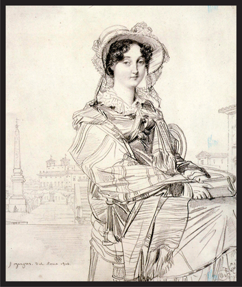
FIGURE 17 We accept this portrait as complete even though only Mrs. Badham’s face is completely detailed. Jean Auguste Dominique Ingres, Mrs. Charles Badham. Pencil, 1816, The National Gallery of Art, Washington, D.C.
have a problem with the rest of the image being less detailed. One artist, Jean Auguste Dominique Ingres, even created drawings in which the subject’s face was very detailed and high-resolution, yet the subject’s body was just a handful of vague, sketchy lines (Figure 17). For photographers, this implies that, if you want to create a good portrait, it’s important to have enough depth of field to cover the person’s face and the other places in the photo a viewer’s likely to look at, regardless of the depth of field in the rest of the person’s body. If areas like the face, are instead blurry, you’ll create a tension in the image because we want to see detail there.
Despite all the ways that our brains can recognize faces and the wide variation among people’s faces, Christopher Tyler found something absolutely amazing about how we compose portrait art. Over hundreds of works throughout thousands of years, one eye was almost always placed at the vertical midline of the image. From the Mona Lisa to George Washington on an American dollar bill to Pablo Picasso paintings, if you draw a line vertically through one of the subject’s eyes, you will almost always split the painting into two equally-wide halves.
Although we as artists always like to say that rules are meant to be broken, this eye placement is one compositional preference that we all fundamentally seem to share, whether we realize it or not. When shooting portraits, try to take at least one shot with this composition!
Understanding Action
In addition to portrait photography, photography showing social action of some kind, in which we’re watching a living person doing something, from sports to sleeping, is very relatable and understandable even if we’ve never done the action we’re watching (take a look at the image of the surfer in Figure 19 and think about how you react to it). This understanding of action creates the intensity we perceive from an image’s subject. If we see an action that we know is more extreme, such as surfing, the image has more intensity.
Why is that? Clearly there is something fundamental in our brain that helps us understand action and intent. You could easily imagine this being useful to our ancient ancestors trying to figure out if the animal they see in the distance is hunting them or ignoring them. Currently, there are two competing theories about how our brains detect and understand social action.
The first theory involves something called mirror neurons. Mirror neurons are cells that many animals have (and we think that we humans have, too) that fire both when we do something and when we see someone else doing that
FIGURE 18 When shooting portraits with one dominant subject, we universally tend to position one eye at the vertical midline of the frame.
same action. That’s a little weird, so let’s look at a specific example. If a monkey called Mark touches his nose, some of his brain cells involved with touching his nose are firing. If Mark sees another monkey, Jack, touch Jack’s nose, the same brain cells that fire when Mark touches his nose will also fire, even though Mark isn’t at the time touching his nose.
Some scientists believe that mirror neurons can help us understand others’ emotions as well as understand and relate to others’ actions. If we see someone doing something, and then our brains react as if we’re doing the action, then that should help us understand why that action’s taking place and what will happen next.
The other idea about how our brains process action is the social networking theory. The idea here is that different parts of our brain are responsible for processing different aspects of things we see, such as an area that sees motion, an area that recognizes forms, and areas that activate when they recognize emotion. These pieces are then integrated to create a mental image of a living being, one where we can relate to and understand on some level what’s going on. In this theory, we understand action because we can construct a mental representation of the other being and what it’s doing, not because we imagine ourselves doing the same action.
The full answer is probably a mix of the two, but we do know for sure that all parts of the brain’s social network function

FIGURE 19 A big-wave surfer at Mavericks in San Francisco.
together when watching and imaging a person doing something. This is important because it means that the parts of our brain that are responsible for our social interactions are also responsible for recognizing that something we see is alive and developing an understanding about what is happening.
For example, when viewing the image of a kiteboarder in Figure 20, even if you’ve never kiteboarded before, your brain is able to piece together that there’s a person in the shot, how high off the water he is, how the parts of the scene are moving, and so on, forming a mental representation of what he’s experiencing, and allowing you to understand the adrenaline rush he must be having. By providing appropriate pieces of context to our viewers’ brains (such as implied motion), we can help our viewers create the mental representation we want them to, evoking emotions, making our photography more appealing and meaningful.
Aging and Vision
Everything we’ve discussed so far in this chapter has been about fully healthy people with fully healthy eyes. Unfortunately, as we age, our vision system degrades over time, and our risk of certain age-related eye diseases increases.
A common age-related condition is cataracts, which occur when the crystalline lens in the eye starts to fog up, making it harder to see sharp details, lowering overall apparent brightness and adding a yellow tint to vision. All of these factors directly impact your images and the processing decisions you make: it’s quite possible that you could inadvertently end up over-saturating blues in your shots, making them too bright, or making them too contrasty in post-processing.
Asking for a second opinion from someone without cataracts and then figuring out how to adapt your perception of an image to what the rest of the world sees is a simple way around some of these potential perception problems. Cataract surgery is also becoming safer and more common, and if you opt to have it, you may be surprised how different your images look!
Another fairly common disease is macular degeneration, which most often affects people aged sixty or older but also occasionally affects younger people, even children. This disease causes the loss of cones in the fovea. As mentioned earlier, the fovea is the area near the center of our eye that’s densely packed with cones and responsible for sharp vision. People with macular degeneration start to lose the ability to see detail when they look at things, and over time they can lose their central vision entirely (functional blindness). Consequently, they need to learn to see using their peripheral vision, which is nowhere near as sharp. Before reaching that extreme, macular degeneration may also make a grid of straight lines appear to be wavy, and it can lower sensitivity to contrast changes, and make it more difficult to discern similar colors (e.g., light red looks very similar to light orange).
If you have been diagnosed with macular degeneration you may want to periodically check to see whether you can still discern all colors. One way of doing this to look at a color checker used to color calibrate a printer, as seen in Figure 21. If you can see the differences in all the colors, you can still accurately color adjust your images. But if some of the colors look the same, those may be colors that you are no longer seeing accurately and you may need to ask someone for help when optimizing images. Fortunately, new drugs as well as stem cell research offer hope that in the near future this disease will no longer be as potentially devastating.

FIGURE 20 How much of a mental representation can you form about what this kitesurfer’s experiencing?
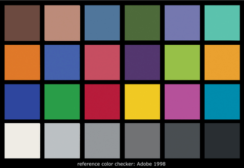
FIGURE 21 A sample calibration pattern.
Glaucoma is another common disease that affects peripheral vision. Fortunately, photography mainly relies on central vision, and if you have glaucoma it’s still possible to take great photos. Just make sure you’re really taking the time to look around your viewfinder at everything in the frame, and not just relying on your peripheral vision. As you might expect, glaucoma can make photography with fast-moving subjects quite difficult, because when shooting sports or fast-moving wildlife you have to rely more on your peripheral vision and don’t have time to look around the entire frame.
There are other fundamental, non-disease-related changes to our vision as we age, too. For one, even if we don’t have glaucoma, we start to lose our peripheral vision. We also start to lose the blue-sensing cones in our retina, making blues appear less saturated. As you age, if you start always increasing the saturation of blue in your images, have someone with younger eyes check your changes. It’s possible that the image looked fine as it was and it’s just your perception that’s changed.
When we get older, we also begin to lose other cells, such as the ones in our color-opponent processing system, making it even harder to do fine color work with images. As we suggested for people with macular degeneration, it’s a good idea to periodically look at a printer color chart to ensure that you can discern all of the colors.
There is also evidence that, even if we adjust for these physical differences—for example, by showing an older


FIGURE 22 An image with a normal blue saturation (A) and with a reduced blue saturation (B). The reduced saturation significantly changes the overall intensity of the image.
person an image with larger text than a younger person—our higher-level vision processing also takes a hit as we age. For example, it’s harder to determine depth perception via stereopsis (combining the images from our two eyes to figure out how far away things are). This can make it harder to leverage depth, an image component that contributes to visual intensity.
But there is some good news in all of this. The base-level processing that our vision system does, like figuring out which parts of a scene are darker or brighter, is not affected. Aside from some issues with color and depth, as you get older you’ll still be able to apply the principles of composition using visual intensity effectively in relation to nearly all of the components that we talk about in this book.
Next up, we’ll start looking at some of the components of the world around us and how we perceive those components, both in terms of their energy and their implicit emotional qualities.
