
FIVE
Framing

While we've spent a fair bit of time discussing the components in an image, we have yet to look at how the pieces go together. That's what framing is all about! Framing is more than just putting things next to each other, though. Each choice we make, from the lens we pick and where we stand to where in the frame the subject is, affects our perception of the image.

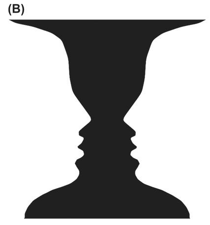
FIGURE 1 The Rubin vase, which can be perceived as two faces or a single vase.
Framing has three key components. The first is making it clear to the viewer what the subject is (or if it’s a landscape shot, which part of the landscape is the focal point). The second is creating the appropriate amount of depth in the image to make it either feel very three-dimensional or very flat, with everything seemingly the same distance from camera. The third is positioning the subject relative to the other components, picking positions that help to provide the right intensity and support the feeling you’re creating.
Figure/Ground
One of the biggest issues we see in students’ photos is that there’s no clear subject (or subjects). Sometimes, the student doesn’t even know what the subject is! A concept the gestalt psychologists (remember them from Chapter Three?) came up with is called figure/ground. This is the perceptual process in which we identify which part of the image is the subject (or figure) and which part is the background. Keep in mind that our brain uses contours and contrast (and, as we talked about before, even enhances the contrast) to separate objects, and it uses the gestalt principles discussed in Chapter Three when figuring out which pieces will be connected to the figure and which to the ground.
A classic example of figure/ground is the faces versus vases image, called the Rubin vase, seen in Figure 1. When you look at it, do you see two faces looking at each other or a vase in the middle? We’ve actually given you two versions, where we inverted the colors. Do you find it easier to see a figure in one of the images compared to the other? The issue here is that the visual intensity of the faces and the vase is nearly identical, and since there are no hints as to which you should perceive as the figure and which as the ground your perception of the two will switch back and forth.
Once you’ve settled on a figure, can you make your vision “flip” to see the other object within the same image? Because our brain appears to reinforce the perceptual groupings it made initially, switching between seeing one object as the figure and the other as the ground can be a mental challenge!
Obviously, to help the viewer easily pick the right figure, we need to make sure that the thing we want to be the figure has more energy than the background. If they have the same energy, it won’t be clear what your image’s subject is (and worse, it might create an illusion where the figure and ground swap like the Rubin vase), and if figure and ground are reversed, your viewer will pay more attention to the background than the subject. If you can’t do this while shooting, the digital darkroom chapters (Chapters Ten and Eleven) will give you some great pointers on how to achieve a good figure/ground separation in the darkroom.
However, the ground is still very important to an image. You might have heard of a concept called “negative space.” This is an artistic term used to refer to the space around and between subjects in an image. It’s considered an area for the eye to rest and helps define the shape of “positive space” or the figure. The margins and white space between words in paragraphs in this book can even be considered negative space, and it helps define the positive space, or the text. In a silhouette image, where you don’t see detail in the subject, it’s the empty, negative space that defines the shape of the subject.
If you want to get a better idea of what negative space is, we recommend an exercise that we borrowed from the book Drawing on the Right Side of the Brain. Take an image, flip it upside down, and try drawing it on paper. Because it’s much harder to identify an upside-down image, you’ll be focusing on what shapes the figure and the ground make to work out how to draw the image yourself.
The moral of this story is that in every image you need to make it clear what your subject is by providing a good figure/ground separation and giving the subject/figure more intensity than the ground, such as in Figure 2. This is true even in landscape shots—although you might think that the entire shot is the figure, there is most likely a specific part of the landscape that’s the focus.
Seeing Depth
When you stop to think about it, it’s amazing that our visual system can construct a three-dimensional view of the world around us just from the light falling onto our two-dimensional retinas. To do this, our visual system uses many different cues, some of which come from our having two eyes, which we call binocular depth cues. Fortunately for people who only have good vision in one eye, depth can be perceived very well with just one eye. We call the cues that don’t need both eyes monocular depth cues.
An advantage that photographers have over painters is that cameras can capture the perspective and depth cues that we’re seeing in a scene perfectly, instead of having to recreate them on an empty canvas. However, by being aware of what the various cues are, we can manipulate them to create more or less depth in a scene. More depth creates more visual intensity, and less depth (a flatter image) is less intense. You’ll sometimes hear people say an image has deep space or flat space. Deep space means that there’s a lot of depth, flat space means there’s little depth, and ambiguous space means that a viewer can’t determine how much depth there is in an image (as in a shot taken in heavy fog, for example).
Binocular Depth Cues
There are two binocular depth cues, convergence and binocular disparity. Because there’s a small distance between


FIGURE 2 A sample image (A) with highlighted positive (orange) and negative (blue) space (B). The negative space helps define the shape of the positive space and makes it clear what the positive space is.
your eyes, the image arriving at each eye is slightly different— this is binocular disparity. Our brains naturally synthesize those images into a single three-dimensional view, which we take for granted. An easy way to see the different images is to see if you can view your nose. With both eyes open, it’s very hard, as our brains let us “look through” our nose. But if you close one eye, you’ll be able to see your nose on the right side (from your left eye) or on the left side (from your right eye), clearly showing how each eye sees something different. Fusing those images together creates depth.
Convergence refers to the angle between your eyes when you focus on something. If you’re focused on something far away, like the other side of a room, there will be almost no angle between your eyes. If you focus on something right in front of your face, your left eye will be looking to the right a lot and your right eye will be looking to the left a lot. If you hold your finger up by your nose and try to focus on it, your eyes will converge so much that they might even cross. By knowing how far your eyes have to converge to focus on a point, your brain can recreate depth in an image.
Interestingly, 3D movies and images fool our brain’s sense of disparity to create depth. For example, many 3D movie theaters currently give you special glasses, which are polarized, and then display a separate image for each eye very rapidly, and polarized appropriately. Many people are then able to fuse these two images together into a 3D image, although for some people this just gives them a headache. There’s also some research questioning how beneficial this effect is for our visual system, given that our eyes are always converged at the same point (the movie screen), and we’re effectively training our perception to depend more on disparity and less on convergence.
Monocular Depth Cues
There are two primary groups of monocular depth cues. The first are sometimes called kinetic cues, and you see these either when you’re moving or you’re looking at something that’s moving. Things that are closer to you appear to move more in the same amount of time than things farther away. When you’re in a car or train, do you notice how things close to you pass by very quickly but things far away appear not to move at all? To achieve this effect in an image, use a slow shutter speed so that objects in motion become blurred. You’ll see more motion blur in things close to the camera and almost no blur in things far away, such as in Figure 3.
The first of the pictorial clues, which are monocular cues not based on motion, is occlusion. This is one of the strongest monocular depth cues and easy to understand. Things closer to you block things farther away. Hold up your hand in front of your face. Chances are, it’s now occluding a good part of what you can see, and it’s clearly the closest object to you. Being able to correctly identify an object’s form via clear boundaries and grouping is key to identifying depth correctly, as then you can figure out which objects are in front and which are behind.
The next depth cue is one that photographers can often take advantage of via lens choice and camera position, and that’s perspective. Parallel lines tend to converge as they get farther away, as seen in Figure 4. Perspective is easiest to see when relatively parallel, straight lines start close to the lens and extend into deep space. It’s hard to see if the lines start far away from the camera, go only a short distance, or aren’t straight (it’s tough to see wavy lines converging). Perspective is great because it is fairly easy to show (stand at a corner of a building and point your camera at it), and it creates a lot of intensity in the scene by creating depth and triangles (as discussed in Chapter Three).
Something key to note about perspective is that if we have a strong perspective in the frame, especially if it’s a single-point perspective, where all the lines tend to converge to a single vanishing point, then our eye is naturally going to want to look into the space at that perspective point. If the subject’s elsewhere in frame, your viewer will be fighting this natural urge, and might even miss the subject because perspective can have such a strong pull. If you put your subject along the perspective lines (for people who read left to right, try to put the subject on
FIGURE 3 In this relatively long exposure, the people moving closer to the camera are more blurred than the people farther away.
FIGURE 4 Parallel lines in the buildings converge toward a point in the distance.
the left side, and vice versa for viewers who read right to left because once your eye hits the vanishing point, it won’t want to leave), or even better at the vanishing point, then you’ll emphasize your subject because the viewer will naturally look there.
An object’s size in the frame helps us determine depth in two different ways. First, if we know two objects are about the same size, then we perceive the smaller one as farther away. An object ten feet away produces an image on our retinas twice as large as one twenty feet away. This is called relative size.
However, our knowledge of what the object is can come into play, too. For example, we know roughly how big a soccer ball is and roughly how big a tennis ball is. If a soccer ball appears to be the same size as a tennis ball in frame, we know that the soccer ball is probably three times or so farther away than the tennis ball (and we’re not likely to think that this soccer ball is actually really small and at the same depth as the tennis ball). This is called familiar size, illustrated in Figure 5.
An easy way to add intensity to your image via depth is to take advantage of occlusion and familiar size. Specifically, if you’re taking a landscape shot, find an object to use as a foreground framing element, like the flower in Figure 6. By having this element close to the lens, it’ll appear big in frame but the thing farther away that we know is bigger will be small, creating a very deep image. Note that for this to work, you need a wide lens, which we’ll talk about in the next section.
Our brains also naturally assume that light comes from above an object, and we use shadow and shading to infer depth. Take a look at the circles in Figure 7. All three circles are the same, except you most likely see the one that’s brighter on top as being in front of the page and the one that’s shadowed on top as being inset into the page (and the page is casting a shadow
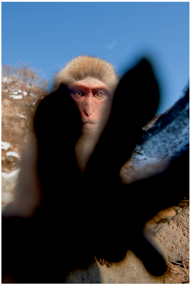
FIGURE 5 We know that the monkey’s hand is smaller than his head, and his head is smaller than the trees in the background. This lets us estimate how close the hand, the monkey, and the trees are to the camera.
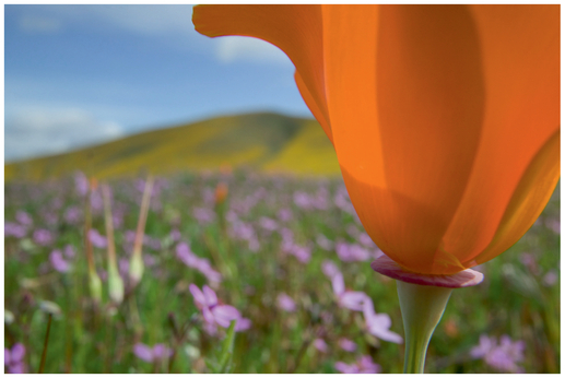
FIGURE 6 By getting close to the flower and using a wide lens, it appears larger than the hill in the background, creating a very deep image.
on it). The last circle, while barely perceptible, indicates just how small of a luminance difference our brain can perceive.
The next two types of depth cues are very similar. As things get farther away, they have less detail. For example, you might be able to see the detail on a brick wall close to the lens but unable to see the detail on bricks that are far away. This cue is called a texture gradient. Similarly, due to light scattering, there’s an atmospheric gradient that causes things farther away to be more murky and appear paler. Objects that are farther away also tend to look a bit bluer, although their exact color can change depending on the time of day and what’s in the atmosphere. The important bit of this depth cue is that things that are farther away tend to be less detailed.
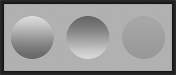
FIGURE 7 We perceive depth from shading information and are able to register very small changes.
One cue that many psychologists ignore because there’s no perfect explanation for it, but which was observed by Robert Solso, is called orientation. The idea here is that, depending on how shapes are oriented, we perceive them as either 2D or 3D (this is a bit related to the gestalt idea of prägnanz that we covered in Chapter Three). In Figure 8, adapted from Solso’s work, you’ll see the same drawing simply rotated forty-five degrees. Yet 8A looks like a kite or some type of 2D shape, whereas we clearly see 8B as a cube. Try rotating the book yourself and seeing how your depth perception changes as your orientation to the shape changes! As photographers, we should also remember that our orientation to a shape also affects how easily a viewer can identify the shape’s form. For example, if we photograph a mug but don’t show the handle, a viewer might not realize it’s a mug.
The last monocular depth cue we’re going to discuss is a very simple one. Things higher up in the frame tend to be farther away. Nearly every period of art, from prehistoric to Impressionist to some modern art, has used elevation as a depth cue, and this seems to be hard-wired into our brains, as children draw their art this way without ever being taught about depth.
How much you leverage each of these depth cues in your image is up to you. If you have an image with very low overall intensity (square shapes, horizontal lines, limited colors), try doing things to add depth to it. For example, put your camera close to a wall to create a strong perspective depth cue, or see whether you could incorporate any occluding items in your shot. Adding depth adds intensity. Furthermore, as we’ll
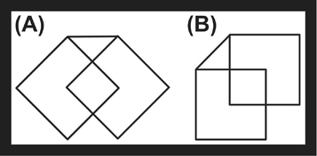
FIGURE 8 The orientation of this graphic affects whether we perceive it as a 2D shape (A) or a 3D cube (B).
discuss next, the lens you pick can inherently add depth to or flatten your image.
Lens Choice and Depth of Field
While we’ve talked about a number of components thus far in this book, you might feel a bit frustrated because sometimes those components, such as colors in a scene, are either out of your control or very difficult to control. Fortunately, lens choice and depth of field are both components that you can easily control, as they’re affected by the lens you put on your camera and the aperture value you set on that lens.
Field of View
To understand lens choice, the first concept you have to grasp is field of view. Field of view refers to how much of the world the lens can see. You’ll sometimes hear photographers talk about lenses as being wide or narrow (the latter is sometimes also called long or telephoto). They’re referring to the field of view.
Wide lenses can potentially have a very, very wide field of view. Some fisheye lenses even have a 180-degree field. To envision how much of the world that lens might see, stand with your arms lifted up and out to your side. A lens that wide will capture everything between your arms in an image. Conversely, a long lens might only have a field of view that’s only a few degrees. A super-telephoto lens has roughly a five-degree field of view, for instance. Figure 9 shows the field of view for a few lenses using a top view of a camera, as well as roughly what part of a scene different lenses would image.
If you stand in the same spot and take the same shot with a wide and then a narrow lens, as in Figure 10, you’ll notice two key differences. With the wide lens, you see much more of the world but everything is smaller in the frame. With the narrow lens, you see much less of the overall world, but the things you do see are much larger and more detailed in the frame.
By moving your camera closer to or farther from the subject, you can make the subject the same size in the frame, but the

FIGURE 9 The field of view for a few different lenses, shown in relation to the camera (A) and as approximately what you see in a scene (B, not to scale).
wide lens still creates a different look than a narrow lens. Consider the two shots in Figure 11. In each, the subject is roughly the same size. One was taken with a narrow lens from farther away, and the other with a wide-angle lens up closer. The key difference is how much of the rest of the world you see in each image. Again, even though the subject’s about the same size in each photo, in the shot with the narrow lens, you see less of the surrounding world than in the shot with the wide lens.
Lenses with a wide field of view create a lot of depth in an image and add more intensity to a shot. A narrow field of view creates less depth and provides less energy. This is due to the relative distance from the lens to the subject and from the subject to other objects.
To get your subject filling the frame with a wide lens, you have to be close to it, say a foot away. Now, the distance from the subject to the next object in frame might also be a foot; with a wide lens that means the far object will appear significantly smaller in the image as it’s twice as far from the lens as the subject, and our pictorial depth cues will tell us it’s much farther away. Conversely, if we’re using a long lens, we might be able to fill the frame with the subject from ten feet away. The second object is now eleven feet away from the lens, and it won’t appear significantly smaller than the subject in the image. Our pictorial depth cues tell us that the second object isn’t that much behind the subject because, relative to our camera’s longer distance, it’s not creating less depth compared to the wide lens (Figure 12).
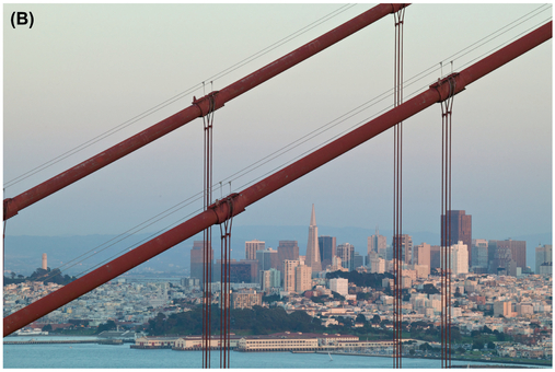
FIGURE 10 Taken from the same spot, you can see the difference in fields of view for a wide lens (A) and narrow lens (B).
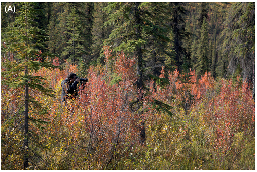

FIGURE 11 The same subject shot at roughly the same size in frame with two different lenses: a narrow lens (A) and a wide-angle lens (B).

FIGURE 12 The relative distance (indicated in red) of the camera to two different objects with a wide lens (A) and a telephoto lens (B).
Unfortunately, when we talk about lenses, we don’t talk about them in terms of field of view but rather in terms of their focal length. What makes this confusing is that, due to different sensor sizes, such as crop sensors or larger, medium-format sensors, the same focal length number might refer to an entirely different field of view on a different camera. Essentially, focal length is a measurement of the distance from your lens to the sensor, measured in millimeters. All the focal length numbers we present in this book, unless otherwise noted, will be for a full-frame, 35 mm sensor (36 mm × 24 mm). Practically, lenses with focal lengths of 35 mm and under are considered wide-angle lenses, 35 mm to 85 mm is for standard lenses, and 85 mm and up is for telephoto lenses.
You might be thinking that you should always try using a wide lens and getting close to your subject to create a lot of energy in your images; however, that isn’t always the right choice.


Wide-angle lenses often cause weird distortion around the edges, where straight lines aren’t perfectly straight, and for some types of photography, such as portrait photography, wide lenses don’t produce attractive results.
To understand why portrait photographers don’t use wide lenses and why cellphone portraits never look attractive, think about relative distances for a second. To fill the frame with someone’s face, we’d have to get fairly close to the subject. Now, the distance from our camera to the tip of the subject’s nose is about the same as the distance from the tip of the nose to the face. That leads to weird distortion where the nose is much bigger in frame than we expect it to be compared to the rest of the head.
Many portrait photographers prefer to work with a narrow-angle lens and to get farther away so that the distance from the lens to the tip of the subject’s nose is much greater than from the nose to the face, and so that there’s less noticeable distortion. Figure 14 has essentially the same portrait shot with different lenses.
Also, getting close and using a wide-angle lens sometimes just isn’t possible, such as when you’re at the zoo or trying to photograph hunting lions in the wild. If you shot with a wide lens from farther back, you would have more depth in the image but your subject would be so small that it wouldn’t stand out. In those cases, it’s much better to use a long lens, which magnifies part of the image due to its narrower field of view. Figure 15 shows you what this looks like.
Lastly, something to consider when picking a lens is the size your subject is going to be in the frame, and how this contributes to the feeling you want in the image. Typically, you want the subject to be large and dominate the frame. But if the image is more about the relationship between the subject and the environment, it’s okay for the subject to be small. If you’re trying to create a sense of loneliness in the image, it’s fine to have a very small subject. Just remember that, as the subject gets smaller, you really need to make sure that its visual intensity is increasing so that it’s clear that the subject really is the subject and not part of the background.
Depth of Field
Related to lens choice is the depth of field that you choose to have in an image. Depth of field refers to how much around your point of focus is also in focus. A very shallow shot means that very little is actually in focus—everything aside from your focal point gets blurry quickly (Figure 16A). A very wide depth of field means that a lot of the image, both in front of and behind the point you focused, is in focus (Figure 16B).
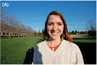

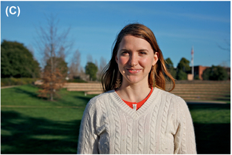

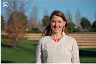
FIGURE 14 Here are similar portraits at 16 mm (A), 35 mm (B), 50 mm (C), 80 mm (D), and 105 mm (E). Note how the wider shots are distorted, and the narrower shots, especially C and D, give the most attractive and least distorted results.

FIGURE 15 In this photo of animals taken with a wide lens (A), you can’t really see what’s going on, despite having lots of depth visually. Compare this with the same subject shot using a very long telephoto lens (B).
FIGURE 16 A shot with very shallow, limited depth of field (A) and a shot with very wide depth of field (B).

FIGURE 17 The same shot with the same focal length but at f/4 (A) and f/16 (B), creating different depths of field.
As you might know, within your lens are aperture blades that close to change your depth of field. We’ll discuss aperture in terms of f-numbers, which are ratios of the focal length to the size of the opening of the lens. Because they’re ratios, f-numbers have a consistent meaning across lenses. Lenses have a physical limit for the smallest f-number (largest opening) they can have, and more expensive (and some fixed focal length) lenses tend to have larger apertures.
Depth of field has a range associated with it, meaning that an area in front of and behind your focal point will be in focus (technically we consider the sharp range to be the range where the blur on the image is less than the circle of confusion size, which is where the blur becomes perceptible and the image stops appearing sharp). Wide apertures and small f-numbers give a very shallow depth of field. Narrow apertures and large f-numbers give a large depth of field.
The exact range that’s sharp in an image is a function of your f-number and how close you are to the subject. You can get a preview of the depth of field you’ll get by pressing the depth-of-field preview button on your camera. This stops down the lens to the specified f-number, showing you what’ll be in focus (your viewfinder image will also get darker since there’s less light coming into it while the lens is stopped down and the aperture blades aren’t wide open).
There is also a special point you can focus at, called the hyperfocal point, which makes it so that everything from a certain distance in front of the focus point until infinity will be
FIGURE 18 This shot has good bokeh because the background is very soft, with no sharp edges.
sharp. There are multiple charts online and apps for your smartphone that give you hyperfocal calculators to determine that exact point and how much in front of it will be in focus for your lens.
A shallow depth of field is beneficial since it helps isolate the subject by reducing the details in the rest of the image, which lowers the overall energy. Wide depth of field contributes to a high visual intensity because it leads to more distinguishable points in the frame.
Of course, some of the effect of shallow depth of field is dependent on your lens’s bokeh. Bokeh refers to how your lens renders the out-of-focus area. Good lenses give a soft bokeh, where out-of-focus objects have indistinguishable edges and are nicely blurred. Low-quality lenses often have poor bokeh and out-of-focus objects still have sharp edges. There are other factors that affect bokeh, including spherical aberration, but this simplification is good enough for now. In terms of visual intensity, poor bokeh is often frustrating because you’re trying to limit detail in the ground and draw attention to the subject using a shallow depth of field. However, the lens is still keeping the edges of objects in the background sharp, and our brain goes right to those edges. The only thing you can do in this case, short of buying a new lens, is to use other techniques to lower the overall intensity of the image.
A common misconception is that depth of field is directly tied to focal length, and that longer lenses have less depth of field. This is incorrect. Depth of field is a function of your aperture value, your focal length, and how close you are to the subject.
If you’re at a specific aperture value and shoot a subject using different focal lengths, moving each time so that the subject always stays the same size in frame (Figure 19), your overall depth of field will also stay the same. (The distribution of the range and how much in front and how much behind the subject is in focus shifts as you move, though. When you’re closer with a shorter lens, roughly 70 percent of the range will be behind the focal point and 30 percent will be in front of it, and when you’re further back with a long lens, about 50 percent of the range will be in front of the focal point and 50 percent behind it.) Your perception of the depth of field might change due to the image’s changing with the different focal lengths, but the actual depth of field doesn’t.
If you stand at the same spot and use a longer lens, your image will appear to have a shallower depth of field because the subject is the same distance away, but you’re using a greater focal length, and the subject now takes up more of the frame at a higher magnification. In addition, because narrower lenses enlarge the background relative to the foreground, they might appear to have a shallower depth of field since the blurred background is enlarged.
Smaller sensors, however, automatically give you more depth of field than larger sensors. With cellphone cameras and many point-and-shoot cameras, it’s nearly impossible to achieve a shallow depth of field. This is because you have to use a lens with a much wider field of view for the subject to be the same size as with a full-frame camera. For example, if you put a 24-mm lens on a full-frame camera and frame a shot, a person standing next to you with a compact camera might need to be at 8 mm to frame the same shot. Because both of you are at the same distance from the subject and at the same aperture value, this difference in focal length leads to the other person having a much wider depth of field (roughly three times more). Even wide open at f/2, many cameras with very small sensors only give a depth of field equivalent to f/8 or f/11 on a full-frame camera.
Assembling the Frame
After you’ve picked a lens, the next decision you need to make is whether you’re taking a horizontal or vertical shot. Many people tend to shoot a lot more horizontals because that’s how our eyes see (they’re next to each other), it’s what we’re exposed to in movies and now on widescreen televisions every day, and that’s typically how our camera’s ergonomics are set up. But each choice has meaning. A vertical shot emphasizes height whereas a horizontal shot emphasizes width. Furthermore, some objects (such as a person or a building) are more vertical, and if you shoot with a vertical frame, you’ll be able to fill more of the frame with the subject. In fact, a horizontal frame is called landscape orientation because landscapes are usually wider and a vertical frame is called portrait orientation because faces are usually more vertical.
Next, once you’ve selected vertical or horizontal, chances are that the only thing you’ve ever read or heard about where to put stuff in the frame is to follow the rule of thirds. The rule of thirds says that if you divide your image into thirds both vertically and horizontally, you should put your subject where the lines cross indicated in Figure 20. While artists have known for hundreds of years that we find these positions in a frame pleasing, there are many other positions in the frame that you should consider placing your subject to influence the visual intensity of your image.
Let’s start first by looking at the intensity contributed by certain positions in the frame. In 1967, two Swedish psychologists, Gunnar Goude and Inga Hjortzberg, conducted an experiment in which they placed a black disk on a white square. They put the disk at various positions and asked the subjects to judge how strongly they felt that the disc was going to move in a particular direction. You can see their results in Figure 21. The length of each vector at each point


FIGURE 19 Here are four shots at 28 mm and f/4 (A), 105 mm and f/4 (B), 28 mm and f/16 (C), and 105 mm and f/16 (B) that keep the subject (the scoop) about the same size. Note how the depth of field/amount of blur is similar in each, even though the field of view changes.
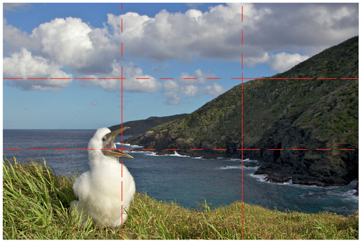
FIGURE 20 The bird’s head in this image is roughly at a rule-of-thirds point indicated by where the dotted red lines cross.
indicates how strongly the subjects felt that the disk was going to move in that direction.
The important thing to take away here is that, when the disk was at the center, to observers it felt balanced and static. When it was at a rule-of-thirds point, it felt like it was going to move along a diagonal (so in an oblique line) with moderate energy, and when the disk was near an edge, it felt like it was going to move with a lot of energy. In other words, if you want the subject’s position in frame not to add significant energy to the scene, put it toward the center. If you need to increase overall intensity, move the subject toward the edges. Placing the subject at the rule of thirds points adds a moderate but pleasing amount of energy to the shot.
For subjects that have a natural motion (Figure 21), such as a person or animal or a nonequilateral triangle, you also need to take its potential for motion into account. If you have a person running left to right, if they’re at the left edge of frame, they have a lot of room to move and the image will be about what’s going to happen next in their motion (and of course, the more to the left the person is, the greater the intensity because the more speed he can accumulate over the frame). If the person’s at the right edge then there’s energy because he’ll leave frame very quickly, but not quite as much as if he were at the left edge, because very soon he won’t be part of the image. In this case, the image is about what the subject’s passed, and you typically need more intensity in the other parts of the image.
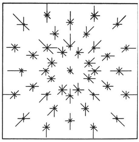
FIGURE 21 How much a disk tends to move at different points in a frame. From Gunnar Goude and Inga Hjortzberg, En Experimentell Prövning ..., Stockholm University, 1967.
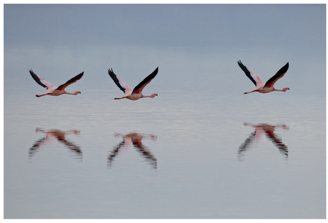
FIGURE 22 These flamingos have a very clear left-to-right direction because we see their heads and know that they’re flying straight. The one at the left has a lot of room to move—the whole frame. If you cover the two on the left and look at just the one on the right, the image has lower intensity, since that flamingo is about to exit the frame.
Another study by Herbener, Tubergen, and Whitlow (1979) found that positions in frames also have inherent semantic meaning. If the subject’s higher up in frame, the image is more active and more “potent.” And when the subject moves away from the center, there’s more emotional tension in the image.
Another way to find a pleasing position for elements in an image with moderate energy is to use the golden ratio. This is a specific ratio, defined numerically by the constant phi, or 1.618... (technically, two numbers are in the golden ratio if the ratio between the sum of those numbers and the larger of the two numbers is the same as the ratio between the two numbers). The reason it’s special is because many artists and philosophers believe that humans naturally find this ratio pleasing, and it shows up repeatedly in nature. For example, in 2003 (confirmed in 2008), Volkmar Weiss and Harald Weiss suggested that the golden ratio underlies the clock cycle of our brain waves. There are many other examples of the golden ratio in nature, ranging from the ratio of the diameter of Saturn to the diameter of its rings to the magnetic resonance of spins in certain crystals.
The golden ratio can be used to construct a rectangle, the golden rectangle, and extended to create a grid (Figure 23). Part of the reason the rule-of-thirds points are appealing is that they’re very close to the points defined by a golden rectangle, but it’s easier to divide something into thirds than to draw 1.618:1 ratios. Following on from the previously mentioned theories where positions in the frame away from the center create emotional tension, some people feel that the golden ratio points have an “ideal” tension.
It’s also possible to create triangles using the golden ratio that we find pleasing to compose with. First, draw a diagonal line in the frame going from one corner to another such as the bottom left to top right. We’ll call that line 1. Then, extend a line from the other corners to this bisecting line, such as from the top left to that first line. We’ll call that line 2. Now pay attention to where line 1 and line 2 meet. We want to make the ratio of one side to another be the golden ratio, such as
FIGURE 23 The golden rectangle, dividing a rectangle based on the golden ratio, and defining intersection points.
you see in Figure 24A. We visually find it pleasing if you place your subject roughly where lines 1 and 2 meet, as you see in Figure 24B.
Around the year 1200, a mathematician, Fibonacci, discovered that, with a specific sequence where each number is the sum of the two previous numbers (1, 1, 2, 3, 5..., where 2 = 1 + 1, 3 = 1 + 2, 5 = 3 + 2, and the next number in the sequence is 5 + 3 = 8), you can approximate phi. But what’s more interesting to us photographers is that you can visually represent the Fibonacci sequence with the grid in Figure 25 A, and you can also draw a spiral using the grid, as seen in 25B. Many objects in nature, such as a nautilus shell, have this type of spiral. Some software packages even include such spirals as an overlay alternative to the rule of thirds.
If you put your subject right around the root of the spiral, the inner point where the spiral starts, and then keep the key pieces contained within the spiral, you’ll create a pleasing, moderate-intensity composition. If you want a way to arrange objects in your frame that creates a moderate and unobjectionable amount of energy, then this is a great framing technique to use. But remember, if your image has a low overall visual intensity, you’ll probably want to put the subject closer to the edge to add energy, and if it has a high intensity, you’ll want to put the subject toward the center to reduce the intensity.

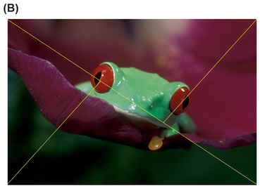
FIGURE 24 Forming triangles to guide composition using the golden ratio (A) and composing an image (B) so that its focal point(s) are where diagonal lines bisect the overall image diagonal into the golden ratio.
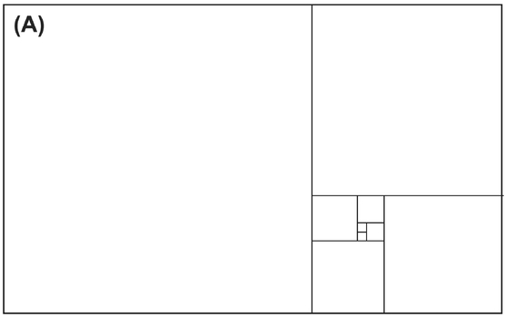
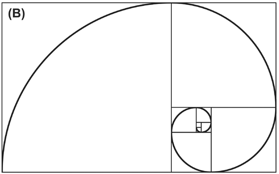
FIGURE 25 A Fibonacci grid (A) and a spiral drawn on top of it (B).
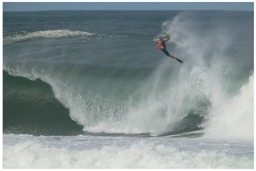
FIGURE 26 The water in this image is fairly similar and we recognize that it’s one thing, making for a large “light-weight” area. The body surfer, although small in the frame, has high intensity due to his color and body shape and because he’s in the air.
Visual Weight
You may have heard people talk about visual weight before. Visual weight is simply the idea that certain elements in frame attract our attention more than other parts. As we discussed in Chapter One, research into perception has shown that areas that convey information (especially eyes, faces, and text) always attract our attention, as do natural figures. In addition to the higher-level objects, larger objects, unstable objects, unusual objects, more saturated colors, warmer colors, darker tones, and more complex objects tend to be “heavier” and command our attention more.
Some writers talk about how it’s important to balance all the objects in the frame, for example when you have a large, dark area, you should counterbalance it with a small, bright area, because humans find balance pleasing. We find it easier to think about visual weight using a visual intensity perspective. If you have a large, “light-weight” area with low energy (that area could be a light or dark color—if it’s all a uniform color, as we’ve discussed, our brain skips over most of it), you need a “heavy” area with high visual intensity to up the overall energy in the image so that it’s not too boring.
We recommend that you don’t worry about the balance aspect of visual weight and look at it more as being about an awareness for where we’ll look in the image, which you can then combine with visual intensity. If you have too many heavy spots that pull the viewer’s attention, then the image is probably too visually intense and the viewer will look away. If there are no heavy spots then the intensity is probably too low and the viewer will look away.
The way your eye moves between the heavy spots can affect an image’s visual intensity. Movement into and out of space has more energy than if the heavy spots are at the same visual depth. Movement along oblique lines has more energy than if the heavy spots are lined up horizontally or vertically. Even the overall shape between the heavy spots affects visual intensity—does it form a square, circle, or triangle? It is also worth noting that a symmetric arrangement of your heavy spots leads to lower energy than an asymmetric arrangement.
Relationships between Objects
As we’ve briefly mentioned here and there, what you choose to show (or not show) in your frame creates implied relationships to the viewer. Furthermore, this happens at a higher level, where we mentally create connections (e.g., two people appear to be looking at each other, and that interaction is important in the image), as well as a lower level (e.g., a blue object is much calmer than a red object, and perhaps there’s an emotional relationship between the two where one’s intense and the other’s calm). The relationship between objects can also affect the visual intensity in the shot (e.g., the eye line between two people creates an oblique line, which increases the visual intensity).
You see how framing creates relationships all the time in movies when people are talking to each other. When characters are supposed to feel isolated and disconnected, they’re often framed so that they’re the only person in frame. But when we, the audience, are supposed to feel a connection, the subject’s framed in an over-the-shoulder shot, with part of the person the subject’s talking to (usually the shoulder, neck, and head) also in frame, creating an implicit connection.
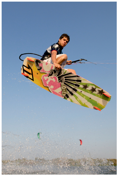
FIGURE 27 The ground gives us a little bit of context as to how high the kite-boarder is, but since it’s not relevant otherwise, we only need to show a tiny bit of it in the frame.
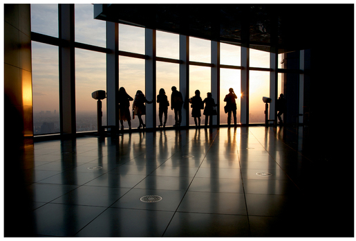
FIGURE 28 Even though these people are fairly close together, the strong vertical dividing lines make them appear to be separate and different groups rather than a single large group.
Another simple example is how you split the frame with the horizon. In some basic photo course, you probably heard that you should never put the horizon in the middle of the frame. That’s not true. Shifting where the horizon is changes what you’re emphasizing in the image. If the horizon’s in the middle, you’re saying that the ground and the sky are equally important. If the horizon’s almost at the very top of the frame, then you’re emphasizing the ground but saying the sky matters a little bit. If there’s no sky in frame, then you’re saying that the sky isn’t at all relevant to the photo. The same is true in reverse—if you don’t see any ground, then you’re saying it’s not relevant to the photo. Figure 27 shows a photo where the ground only matters a little bit.
Also, contrary to what some photographers teach, your frame doesn’t have to be divided perfectly into thirds (two-thirds ground/one-third sky or vice versa). Divisions like that are really a function of what you want to emphasize visually and how much intensity each contributes. Just be aware that a fifty-fifty split in the frame contributes a low amount of energy, and the further you get away from that fifty-fifty split, the more energy the frame division creates. This is true for the horizon and sky split, as well as for every division.
Another powerful example is when you’re dividing the frame somehow between the points you look at. For example, if one subject is in a bright area and another in a dark area, it creates a boundary between them and implies a difference. Or perhaps there’s a big shape, such as a support beam or wall in a building, such as in Figure 28, framed between the two subjects.
You can take this even further by framing the subject within another frame, tightening the space in the image, sometimes even creating a claustrophobic feel (this technique is called frame within a frame). For example, if the subject’s in a window or doorway and looking out, he seems small and lonely compared to the rest of the world.
Similarly, if there’s a strong line directly behind a subject, it will often appear to be connected to the subject, creating an unusual shape and link. Be careful of these when photographing people, as it’ll often end up looking as if there’s a lamp pole or tree growing out of someone’s head because of the relationship between these two objects in the frame. Chapter Nine gives examples of how moving your body will let you separate out the tree (or other object) from the person’s head (and similar).
Many of our students tend to not to like to move around, and they’ll often take every photo from their natural standing height. This also creates implicit relationships to objects that usually are not what the students intended! Specifically, when you’re shooting down at something, you’re often making it feel less important, short, and placing it against the ground plane where it might not stand out clearly. If you’re shooting up at an object, you’re making it feel tall, important, heroic, and emphasizing its form by (usually) shooting it against the sky, where it stands out more. Sometimes, though, fashion shooters will shoot at a slight down angle since the natural shape of a woman’s face responds well to a slight down angle (men look better at a slight up angle), and that pleasant effect is more important than making the subject seem heroic.
Also, shooting up at something tends to create a triangle with the tip at the object’s most important point (often where the head is), creating a more energetic shape than the rectangle you’d get from just shooting straight across at the subject.
FIGURE 29 The outer doorway creates a division between the inner door and the rest of the image, which is further enhanced by the different lighting in the two rooms.

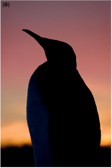
FIGURE 30 Shooting slightly down on a front-lit king penguin (A) compared to shooting up at the same penguin from the other side so that he’s backlit (B).
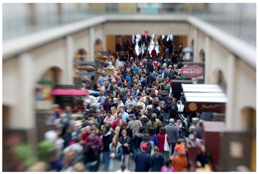
FIGURE 31 Shooting down at a crowd helps reveal how many people are in it.
Shooting down can be effective when you want to show a mass of people; when you are above them, you get a vantage point from which you can see the crowd, such as in Figure 31. Since people are all roughly within a similar height range, it’s often tough to tell how many people are in a group if you shoot across at a crowd. Keep in mind that the crowd will often read as a lower-energy texture, and you’ll need to do something to add intensity to the image.
Don’t be afraid to shift your perspective to achieve the shot that you’re trying to achieve! Move left or right, get down on your stomach, or stand on a ladder.
Cropping
The boundaries of the frame are as important as the contents, as they imply how the image connects with the rest of the world. For example, is the frame edge completely open to sky, making the image feel like it continues on for a long time? Or is one of the frame edges part of a wall, creating a more closed and contained feel?
Typically images that feel like they continue on have more energy than ones that feel closed, but this is usually not an important contributor to an image’s overall intensity. However, since the frame’s edges are important to the storytelling aspect of a photo and often ignored in composition, we feel it’s worth discussing.
What you want to avoid is the sense that your frame edges are arbitrary; you want the edges to feel intentional. The main way to do that is to make sure you’re cropping any objects off intentionally instead of clipping them accidentally.

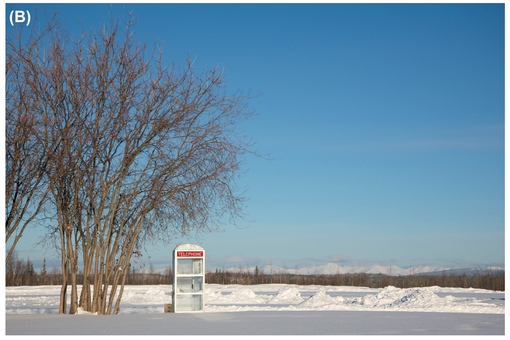
FIGURE 32 The trees at the left create a boundary (A), implying that the contents of the image (snow and an open area) don’t continue in that direction. By including a little more on the left side, we open the frame up (B), because now we see a continuation of the content to the left.
In Chapter Three, we discussed how our brain is really good at completing objects. If you have a shape on the edge of your frame that would complete just outside of the frame (look for strong converging lines), either change your frame so that the object will complete farther outside of the frame or so that you’re cutting off the object where its lines are parallel or diverging.
If we perceive that the shape completes just outside of the frame, your frame is clipping the object. That creates unease in the viewer’s mind, since they want to see it complete but can’t. By moving the frame edge so that either we don’t know where the shape completes or it completes far outside of the frame, we accept that the frame is complete. Figure 33 shows an example where the top left area feels clipped and how a crop improves the image.
Similarly, you usually don’t want the edge of your subject just brushing the edge of the frame, as the subject appears to merge with the edge. Instead, either provide some negative space around the subject to separate it from the edge or get in tighter so that you’re intentionally cropping off part of it.
It’s easy to fix these problems via a simple crop. In both cases (converging lines at the edge of frame and the subject merging with the edge), typically just losing a few pixels around one edge of the frame will fix the issue, and in fact that’s how we created the “good” versions in Figures 33 and 34.
Cropping is a very powerful tool beyond fixing these problems, though. We often use it to eliminate parts of our image that are fighting for our attention or contributing too much energy to the scene. Or, if we need to shift an object in the frame (e.g., move it off to the side to add more energy), a crop often does the trick. Cropping will also make the subject larger in frame, helping it to become clear, such as in Figure 34.
One of the most convenient reasons to have a high-resolution camera is so that you can crop more, if needed, and still get a very usable, high-resolution image. It is possible to take this too far, though. We’ve known photographers who crop out 90 percent of the image, giving them a great image with a clear subject, but an image size that’s suitable only for emailing to a friend or posting to the web but not printing. If your only intent is to post photos for friends to see, then this is fine, but if you intend to make prints, enter your images in competitions, or just do more with them, then you need to do the work while shooting (get closer, use a longer lens, etc.) to get the framing you want. Some competitions even prohibit you from cropping more than 20 percent of your image.
When you’re cropping your shot, consider using a different aspect ratio crop (aspect ratio is the ratio of an image’s width to its height). The 3:2 aspect ratio we’re all familiar with is popular because it’s what 35-mm film has. Other cameras use different aspect ratios, for example some film medium format cameras with a 1:1 square aspect ratio, digital-medium format cameras with a 4:3 aspect ratio, or panorama cameras with 3:1 aspect ratios. A panorama image that you assemble yourself could have an even bigger aspect ratio. Your TV probably has a 16:9 aspect ratio, and many movies are shot at a 2.39:1 ratio.
The point is that no single aspect ratio is correct. Pick an aspect ratio that helps you emphasize the subject (or an aspect of the subject that you find interesting, such as its width) or that helps you achieve the visual intensity you need for a shot. More extreme aspect ratios do tend to have higher visual intensity and a square has the lowest, so do be aware how a crop changes your perception of intensity.
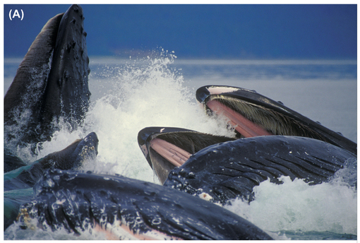
FIGURE 33 In the first image (A), we’re just clipping the tip of the whale at the top left corner of the frame, and that clip draws our attention since our brains realize the tip is just out of frame. Cropping in farther feels more natural (B), since the tip of the whale’s mouth is now well out of the frame .
FIGURE 34 A simple crop turned this image from an okay shot (A) to an exciting one (B).
