
TEN
Improving Visual Intensity with Digital Manipulation

In this chapter we focus on how you decide what an image needs. Often people have an immediate reaction to a picture that they like or don't like it, but they're not sure why. Further, they may be at a total loss to figure out what to do to improve the image to make it pop. In this chapter we show you that, by applying the basic principles of our visual intensity approach, you'll know exactly what your image needs. That means you won't waste time with countless trial-and-error adjustments. You'll work more efficiently and create stronger images at the same time!
Selecting Images
After you download files onto your computer, the first decision is whether to keep or delete each image. It’s far too easy to keep way too many images and then be overwhelmed when you look through trying to find one to share, use in a competition, print, and so forth. It will be much easier if you delete the images that aren’t good. In Chapter One we recommended that you don’t aggressively delete images while shooting or immediately upon downloading because it’s likely that on your initial pass-through you’re still emotionally caught up in what you were hoping to capture. That makes it more difficult to be objective about what you did capture. But on your second passthrough, whether a few days later, or ideally a couple of weeks later, you’re more likely to be able to evaluate them objectively. The images you were hoping to capture might not be as strong as you’d like, but an image of something else might be outstanding. We can’t tell you how many times we change our ratings on our images on our second or third pass-through. We suggest aggressively deleting images that just aren’t that good on the second passthrough. Nonetheless, sometimes it’s hard to know which images have the potential to be good, and which are unsalvageable or not worth the time it would take to improve them.
We recommend that you begin by checking the basics of the images and use the following guidelines to help determine which to keep and which to delete.
- Is the exposure correct, or at least close enough that you can correct it using software without revealing excess noise?
- Are the areas that you want to be in focus tack sharp? Although you can sharpen an image digitally, that doesn’t fix an image that’s not sharp to begin with. (We’re aware that there are some software programs that claim to sharpen soft images, but we’ve not seen one yet that creates the same results as an image taken correctly with tack-sharp focus on the areas that are intended to be sharp.)
- If your image involves a person or animal, is their head position, facial expression, and body position good? These things can’t be readily changed in most images, although Photoshop’s Puppet Warp tool does enable you to reposition some subjects. Head positions, and particularly eye lines, discussed in Chapter Three, add to the visual intensity of the image. Facial expressions and body positioning may trigger emotional reactions and thus higher-level components that may also contribute to the energy in an image.
- Is the image free of excessive digital noise? If you’re not sure, try running the image through your favorite noise-reduction software to see how it looks .
- Are you attracted to the image, whether for sentimental reasons or just because you find yourself drawn to it? It’s okay to keep images that are less than ideal if they mean something to you, but keep in mind that you may want to keep them private.
- Is the image unique for some reason? If so, you may opt to keep it even if it has other flaws.
If an image doesn’t make the cut, delete it. It’s tempting to save a lot of “almosts” since digital storage space is relatively inexpensive. However, doing so will ultimately create more work for you as you search for your best images, and useless images will force you to buy more storage space prematurely.
Developing a Game Plan
We’ll assume that you’ve edited your images and are looking at images that have potential but need to be optimized. We can’t stress enough how vital it is to make a game plan before you start to adjust an image. Otherwise you’re likely to spend far too much time making adjustments and then undoing them, as you try all sorts of things in a somewhat random fashion to improve the image. If you take the time to create a game plan, you’ll save yourself time and frustration.
First Impressions Count
To create a game plan, we recommend that you follow this approach. Begin by evaluating the image using the VI (visual intensity) concepts. The first step is to gauge your immediate reaction to the amount of energy in the image.
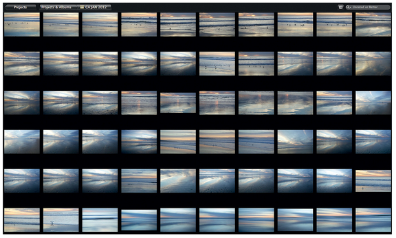
Figure 1 It doesn’t make sense to save countless versions of the same image. Instead carefully evaluate them and keep the best two or three.
Does the image seem a little boring or dull (too little total energy) or is it too busy (too much energy)? This should be a gut-level reaction you have to the image, not a carefully thought-out intellectual response! At this stage you don’t need to articulate why you’re reacting that way to the image. Instead, what you’re after is a reaction to the visual intensity of the image. Is the image pleasing, dull, or overly stimulating? This gives you the overall mindset for the direction in which you need to take the image, that is, whether to increase or decrease its energy level. For example, look at the images in Figure 2. In one the energy level is too low and the image is boring. In another the energy is too high. There’s so much going on that you don’t know where to look. The energy in the last image is more moderate and chances are that you think it’s a better image.
The second step is to take note of how your eye travels through the image and where it lands. As we look at any image, we are initially drawn into it by some component, as discussed in Chapter One. Often our eye then travels around the image, finally concentrating on one area. When you look at your image, is your eye going where you want it to? Even more importantly, is it landing where you want it to so that you, as the viewer, are focusing easily on the subject? You’d be surprised how often you might be forcing yourself to look at the subject but your eyes want to go
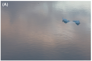
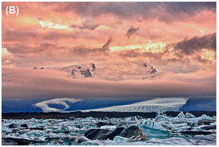

FIGURE 2 You know instantly at a gut level whether an image has low (A), high (B), or moderate (C) visual intensity.
elsewhere. Now is the time to let your eyes go where they want, because that’s where other viewers’ eyes are likely to go when they look at the image. Knowing where your eye wants to go will help you make adjustments to the image that will guide any other viewer’s eye to look where you want them to look. In Figure 3 the petal on the right leads your eye out of the frame, and some of the dark areas along the bottom and left side compete for attention rather than letting you easily focus on the center of the flower, with its sharp stamen.
As discussed in the early chapters of this book, our eyes are drawn to areas of contrast, whether this is luminance (light/dark) contrast, contrasting colors, varying textures, different shapes, or areas with differing degrees of detail. Sometimes these elements naturally guide the eye to the subject and sometimes they accidentally work against us to steer the eye away from the main subject.
Third, note what types of contrast are at work in your image and whether there are any types of contrast that are driving your eyes away from the main subject. As you optimize the image, you may need to increase one or more types of contrast on your subject and/or decrease visible contrast in what should be background supportive elements of the image. For example, in Figure 4A our eyes have trouble staying on the subject because there’s too much detail in the background, with contrasting shapes, lines, and tones, even though it was shot with a shallow depth of field. If we want to improve this image, we’ll need to tone down the background and then add some light to the subject to help separate it from the background. We’ll also sharpen the subject to increase the contrast between the detail of the subject and the out-of-focus background.
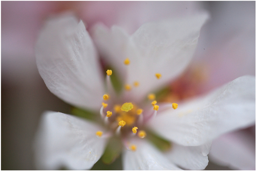
FIGURE 3 Unfortunately, one petal leads the eye out of the frame in this image.

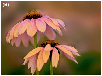
FIGURE 4 By toning down the background of the original image (A) by blurring it, and increasing the detail and luminance contrast in the subject, we made a far stronger image (B) with slightly less overall energy.


At this point you should have a rough idea of the direction you need to take to optimize the image. For example, you might decide the image lacks energy but your eye does go to the subject, in which case you might need to increase the overall visual intensity of the image, while being careful to make sure the background doesn’t suddenly attract too much attention. Or perhaps the image lacks enough energy and, to make matters worse, your eye doesn’t land on your subject. In that case, you’re going to need to take steps to increase the visual intensity of the entire image and particularly the main subject, while making certain that the background doesn’t start to overpower the main subject. Or perhaps the image has enough energy but your attention doesn’t stay on the subject. Then you may need to slightly increase the visual intensity of the main subject while decreasing the energy associated with the background. (That’s what we did with the flower.) It’s also possible that there’s just too much energy in the image as a whole and you don’t know where to look. In that case, you’ll need to decrease the overall visual intensity and make adjustments to help the viewer find where to look. As vague as that might sound, it actually provides you with a good framework to begin working on your image.
We suggest that you reread the previous paragraph. The step it describes is essential. It needs to become automatic when you look at an image before you work on it. It’s the foundation for all your digital adjustments.
Determine What Specific Adjustments to Make
The next step is to look more carefully at the image and decide what elements are contributing to the overall energy level. That will help you determine not only why the energy might be too low or too high, but will offer clues as to what you can do to change the energy level to make the image more pleasing.
Tonal Adjustments
If the image feels a bit flat or dull, check the histogram to see how much of the tonal range (tonal contrast) you’re using.
Setting White and Black Points
Many images look best when they use the full tonal range of contrast. In most image editing software, this involves setting the white and black points of the histogram to correspond to the lightest and darkest pixels in the image. (The white point determines how light the lightest pixel in your image is and similarly the black point determines how dark the darkest pixel in your image is.)

FIGURE 6 Holding down the Command key in Aperture shows a clipping preview that makes it easy to accurately set the white point.
You can do this in Camera Raw, Lightroom, or Aperture, as well as in any program that has a levels or curves type of adjustment.
To set a white point in Camera Raw CS6 and Lightroom 4, use the White slider to set the white point, and the Black slider to set the black point. (Use the Exposure slider to control the overall exposure of the image.)
In versions of Camera Raw prior to CS6 and Lightroom prior to LR4, use the Exposure slider to set the white point and the Black slider to set the black point.
In most programs, holding the Alt/Option key (Command key in Aperture) while setting the white and black points will turn the display temporarily black (or white) to make it easier to see when you begin to clip pixels (turn pixels pure white or pure black), as shown in Figure 6. Normally, you want very few if any pixels to be pure white, and similarly very few to be pure black, so you’ll back off the setting just slightly.
In Aperture, we first use the Exposure slider to set the overall exposure of the image, and then set the white and black points. We use either the Black Point slider to set the black point or the black point control in Levels. Then we use the Levels white point control to set the white point.
Setting the Black (Point) slider in Aperture affects primarily the darkest pixels. If you want to darken the image slightly, setting the black point by using a Levels or Curves adjustment will do more than using the Black (Point) slider, because Levels and Curves adjustments affect a wider range of pixels.
In Photoshop, Aperture, and most other programs, you can also set the white and black points in Levels or Curves by moving the small white or black triangle in the tool’s dialog underneath the histogram at the ends, so that it corresponds with where the data in the histogram begin and end.
There are some slight differences in the results depending on the tool you use. When you make a Levels adjustment, the change in tonal values is spread evenly across all the pixels in the image. That may or may not be the effect you’re after. If you use Curves and make adjustments other than at the ends, the pixels that are closest in value to the point you adjusted are affected more than pixels that are more distant in value. So if you add a point on a Curve adjustment that’s perhaps one-eighth of the way up from pure black, the really dark pixels are affected more than a pixel that’s halfway to white. In other words, Curves adjustments affect some pixels more than others, which ultimately gives you more control over the results, but is a little harder for some to use. However, with a bit of practice we find that most of our students are comfortable using Curves adjustments.
One tool is not universally better than another. Instead, it depends on the image and what you’re trying to accomplish. The difference between the various alternatives is the extent to which other pixels within the image are lightened or darkened. We normally set our white and black points in the RAW converter and then may use curves to make finer adjustments to part of the image.
No matter which approach you choose, expanding the tonal range in the image to use most of the histogram will increase the image’s energy by increasing its luminance contrast.
Although not all images need to use the entire range of tonal values, most will benefit from having some very light to white and some very dark to black areas. Some images that are moody may have very few pixels in the darkest or lightest portions of the histogram. Others that are foggy or moody, such as Figure 8, may need no tonal values that are black or nearly black, but may benefit from having some areas that are extremely light. Many cameras expose foggy pictures so that there are no extremely light or dark values and the result tends to be a gloomy, heavy feeling. To lighten the feeling, you’ll need to modify the exposure to add light tones. You can do this in your RAW converter by setting the white point as described earlier, or with a Levels or Curves adjustment in any software that lets you modify the tonal values.
Moody images can also be quite somber, and in those cases will have many dark tones but few, if any, very light tones. Usually a moody image will have lower energy because it uses less of the tonal range.
Mid-Tone Contrast
Most images will nonetheless look best when the full tonal range is used and there is adequate mid-tone contrast. Mid-tone contrast is an often overlooked but essential element in successful images. Many times people tend to consider the overall contrast in the image and they’re satisfied when there are some black or nearly black values and some white or nearly white values. But adequate contrast among the mid-tones is also vital. Properly adjusting your mid-tone values will go a long way toward making your image pop, as shown in Figure 9.
By making a Curves adjustment in Photoshop, or any adjustment in other software that lets you increase the mid-tone contrast, you can increase the amount of energy in the image without blocking up shadows or blowing out highlights, which might happen if you were to increase overall contrast. (Note that the Clarity slider in Camera Raw and Lightroom as well as the Definition slider in Aperture slightly increasing mid-tone contrast as well as slightly increasing saturation.) Our current favorite tools to increase mid-tone contrast are CEP’s Dynamic Contrast slider in Pro Contrast as well as the Tonal Contrast filter.
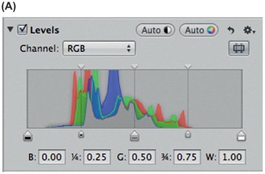
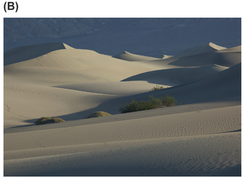

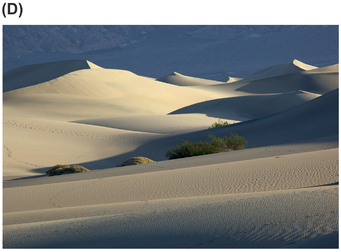
FIGURE 7 (A) Initial histogram and levels control (in Aperture) and (B) initial image. By setting the white and black points (C), we significantly increased the luminosity contrast, which in turn added tremendously to the visual intensity of the final image (D).


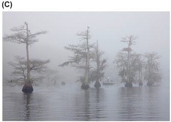
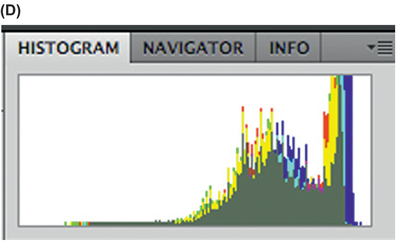
FIGURE 8 Initially this image (A) uses only part of the tonal range (B). Although we don’t need to use the full tonal range for it, use do need to lighten it so that it’s moody, not gloomy (C) and (D).

FIGURE 9 (A) Initial image. (B) Note the apparent increase in detail and thus visual intensity in this image, achieved by increasing only the mid-tone contrast. We used the Dynamic Slider in CEP’s Pro Contrast filter.
Lighting on the Subject
Check the lighting on the subject itself. By slightly brightening it and/or slightly darkening the background, and possibly decreasing the contrast of the background, you can draw attention to the subject just like we did earlier in Figure 4.
There are numerous ways to go about modifying the lighting in an image. Most require making selective adjustments so that each adjustment only affects part of the image. In Camera Raw, Lightroom, and Aperture you do this by brushing on (or off) an adjustment, while in Photoshop and Elements you do this via layer masks. The brushes are “smart,” in that they can often detect edges and are applied to the image where you want. Nik software, such as Viveza and CEP, also makes it easy to do this using Control Points. (You add a Control Point to the image and the software creates the mask for you with minimal effort on your part. Then you adjust that area differently from the rest of the image.) In Chapter Eleven, we cover some additional techniques for relighting an image, such as the Render Lighting Filter. Here we’ll focus on more basic ways to increase or decrease the lighting in selected areas of an image.
Dodging and burning is a time-honored way of darkening some areas and/or lightening others. As you do so, you’re emphasizing details in some areas and subduing others, which rebalances the energy both from luminosity contrast and from detail and texture contrast. When done with a light touch, this is a highly effective technique for drawing attention to your subject. You can also use it to create a custom vignette.

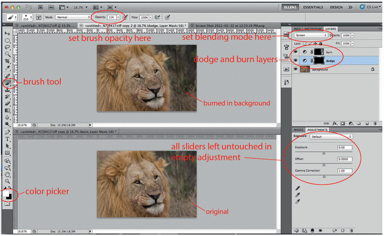
FIGURE 10 Dodge-and-burn method in Photoshop.
In Figure 11 we used Nik Software’s Viveza to draw attention to the leopard. We placed Control Points on the leopard and increased its brightness, as well as making slight increases in saturation and warmth. By increasing the warmth slightly as well as saturation and brightness in Viveza, we can create a feeling of sunlight. In other programs you can make similar adjustments affecting brightness, saturation, and warmth one at a time. Doing so increases the energy of the image on the subject, thereby drawing more attention to the subject and helping to separate it from the background. Note that the adjustments don’t have to be huge changes. Often small, subtle adjustments get the job done with a more natural and realistic result.
Color Adjustments
Color, as discussed in Chapter Four, plays a huge role in the overall energy of an image. Color can be warm or cool, saturated, muted, pastel, accurate, or creative. Some colors are more energetic than others. As you optimize an image, you are faced with numerous decisions about color. For example, you can correct color casts, alter the white balance to make the image warmer or cooler, saturate or desaturate colors (or remove them altogether and create a black and white image), and/or modify hues. Your choices will impact the overall visual intensity of the image as well as possibly guiding the viewer’s eye toward (or away) from your subject.
One of the first color steps to improve the color in an image is to determine whether there is a color cast that’s creating negative energy within the image—meaning that it increases the visual intensity in a bad way. The image shown in Figure 12A has such a strong color cast that it’s difficult to get beyond it and look at the image itself. Removing the
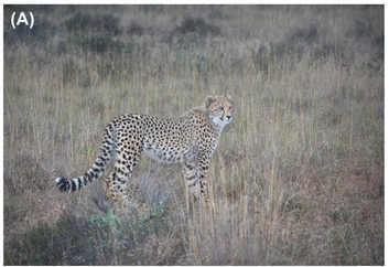
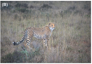
FIGURE 11 (A) Initial image. (B) By placing control points on the leopard and increasing the brightness, saturation, and warmth slightly, we were able to increase the visual intensity of the subject and draw attention to the leopard in a subtle, natural way.

FIGURE 12 (A) Initial image. (B) We used the White Balance eye dropper tool in Aperture on a flamingo’s beak to correct the unpleasant color cast.
color cast will enable you to adjust the color saturation so that the visual intensity is pleasing rather than unpleasant. One of our favorite ways to remove a color cast is to use the White Balance eye dropper tool available in Camera Raw, Lightroom’s Develop Module, and Aperture, as well as the gray eye dropper in Levels and Curves in Photoshop. By selecting the eye dropper and clicking on something that should be a neutral gray within the image (that is to say, it should be pure gray, whether light gray, dark gray, or in between, without a hint of another color) the software remaps all the colors in the image accordingly. With subtle color casts, this approach tends to work well. We also like the Correct Color Cast slider in CEP’s Pre Contrast filter. For fixing an extremely strong color cast, Photoshop’s Selective Color adjustment can be helpful.
When removing a color cast, in some cases you’re after truly accurate color, but in other you may prefer to leave or even to create a small color cast to warm or cool the overall image. As long as you’re using a color-calibrated monitor you can make subjective decisions based on visual preferences. Restoring a pleasing color cast to the image may increase the overall visual intensity, as it did in Figure 12B, but because it removes the unpleasant energy of the color cast, you are willing to look at the image longer.
Color also affects the overall mood of the image. Keep in mind that blues and purples tend to be cooler while oranges, yellows, and reds tend to be warm. On the whole, warmer tones tend to be perceived as having more energy, so if your image uses warm tones, you may need to slightly reduce the energy elsewhere in the image. It’s possible to shift the hue of the entire image to make it warmer or cooler and to change the overall energy. Similarly, you can simply modify the hue or saturation of a specific color to change the energy within the image. You can do this in most programs by taking advantage of any sliders that enable you to modify the hue of specific colors in the total image. For example, in Photoshop you can use Hue/Saturation and adjust the hue overall or in specific colors, or you could use Selective Color or Color Balance. The Hue/Saturation tools enable you to modify specific colors throughout the image. Selective Color is similar but gives you more precise control over the modifications to each color. Color Balance helps limit the color modifications to the highlights, mid-tones, or shadows.
Figure 13 shows an image with the warm colors of sunset and the same shot without the warm colors. (The warm colors were added using the Graduated Filters in CEP.) We think both images are sucessful but there is a noticeable difference in their energy levels. The all-blue version (which has less color contrast energy) is definitely moodier but works even though it has less overall energy and visual intensity. The “blue” hour of sunset captures a particular quiet mood, and if that’s what you’re after you want to keep the visual intensity a bit lower. It’s certainly possible that in some situations you may prefer the cooler tones, but keep in mind that you may want to take other steps to adjust the mid-tone contrast within the image or overall contrast or brightness and so forth to add some energy, if you don’t want quite as moody an image.
Working with the colors in an image can modify both its overall energy and draw attention to a particular part of the image. Fortunately or unfortunately, there are no hard and fast rules, only guidelines to help you express your vision as effectively as possible.
When you look at the image, does the overall color appear pleasing or does it need some help to pop? Do all the colors need help or do just some specific colors need to be more or less saturated? Remember that increasing the color saturation will increase the overall energy of the image, whereas more pastel tones have less energy. Removing color and creating a monochromatic black and white (or sepia) image removes one type of energy (color) but may make the image contrast (or lack thereof) even more apparent. This means that you may have to make tonal adjustments in order to create the visual intensity that you’re after.
In Figure 14 we slightly increased the saturation of the entire image along with strengthening the color contrast within it. The image went from a bit dull and lifeless to strong, while retaining its time-weathered appearance. We used CEP’s Color Contrast to accomplish this, but again, you can use any tools that enable you to adjust the properties of the colors and the contrast in your image.
Facing an image with too much energy in Figure 15, we opted to remove the color, and changed the image into a black-and-white monochrome by using Nik Software’s Silver Efex Pro 2. We also used it to vignette the edges. These changes decreased the visual intensity and created a moodier image reminiscent of a bygone era, which is well suited to the subject matter. Entirely removing a single source of energy—in this case, the color component (which is the one most likely to be removed entirely)—means that the visual intensity of the image is dependent on fewer components. When there is too much energy to begin with, this can solve the problem. But for images with more moderate levels of energy, removing the color component may mean that you need to increase the energy from other sources, most commonly the luminosity contrast. One reason we particularly like SEP 2 for monochrome conversions is that the sliders enable us to amplify whites and blacks and increase soft contrast. Thus we can increase the mid-tone contrast without losing highlight and shadow detail. This is often a very pleasing way to augment visual intensity, perceived details, and gradations of light without the luminosity contrast becoming so obvious that it’s like getting hit with a two-by-four.

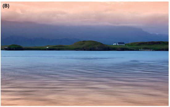
FIGURE 13 The same image (A) without and (B) with the warm colors of sunset.

FIGURE 14 (A) Initial image. (B) A slight boost in the saturation retains the mood of the image but adds enough energy to make it more appealing.
Other Issues
Cropping
As mentioned in Chapter Five, where you place your subject in the frame is vitally important, since certain areas of the frame contribute more energy than others. Placement can increase or decrease the impact of the subject. But sometimes while photographing, other issues come into play. For example, perhaps your camera doesn’t have focusing points toward the sides, and so to use autofocus you find yourself composing with the subject more centered. Or perhaps you did use one of the peripheral focusing points but you’d like the subject even farther to the side. Or maybe you composed the image slightly off center but realize that it needs to be more symmetrical to feel balanced. If you need to add energy to the image, you can change the framing by cropping, or conversely by adding canvas on one or two sides. Doing so changes the relative placement of the subject within the frame.
All the major image-editing software programs have tools for croping an image. Some have overlays for the rule of thirds, golden spiral, golden ratio, and so on that can be helpful as you plan the crop. Even though we often use positions slightly more extreme than the rule of thirds would indicate, because doing so adds to the visual intensity of the image, we still find the rule of thirds overlay helpful.


FIGURE 15 (A) Initial image. (B) Creating a sepia monotone reduced the overall energy to a more pleasing level.
Sometimes people get caught up in believing that they must crop to a certain size, whether to maintain the aspect ratio of the shot or to fit a certain frame size. We believe that, when possible, it’s best to crop so that the image has the most impact.
In Figure 16, the crop makes it far easier to focus on details in the cat’s face and fur. Without the crop, the background area with all its colors has too much energy and takes away from the visual intensity of the cat. Of course, ideally you’d do this in-camera, but sometimes you have to do it in the software.
We prefer to crop in non-destructive ways, meaning that we like to have the flexibility to return to the file at a later date and modify the crop. Cropping is nondestructive by default in Aperture, Camera Raw, and Lightroom, and is even possible in Photoshop! Photoshop CS6 is set up for non-destructive cropping by default, but you can force it to be destructive if you check the option to delete pixels in the tool options bar at the top of the interface. (We recommend you leave it unchecked.) In Photoshop, to access the entire pre-cropped image at a later time, choose Image > Reveal All or choose the crop tool and then click and drag one of the corner handles on the image if you’ve not yet closed the file. To preserve the ability to access the uncropped image, you must save the image in a format that preserves layers, such as a TIFF or PSD file. If you save it as a JPEG, the crop will become permanent.
Rotating
Consider rotating your image to increase or decrease visual intensity. Recall Chapter Three and how oblique lines have far more energy than horizontal lines. By rotating an image slightly or dramatically, you can increase or decrease the energy in the image. One of the things we particularly like about Apple’s Aperture software is the ability to quickly and easily rotate and crop an

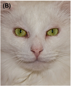
FIGURE 16 (A) Initial image. (B) Cropping this image took a so-what image and made it far more captivating, giving it much greater visual impact.

image. Often this leads to new and effective compositions. Photoshop CS6 also lets you rotate the image using the crop tool to easily see how much of the image will be preserved. Other programs such as Elements, Lightroom, and older versions of Photoshop enable you to rotate an image, but you must decide ahead of time how much rotation to apply. The beauty of Aperture’s and Photoshop CS6’s approach is that you can see the results as you’re rotating the image and determine the rotation visually by what looks good.

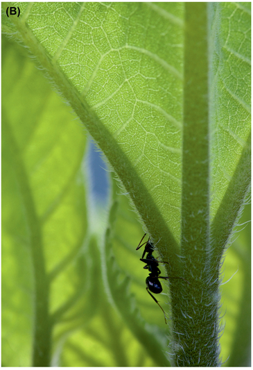
FIGURE 17 —(A) Initial image. (B) Slightly rotating the image so that the major lines of the leaf became vertical, which reduced the number of oblique lines, decreased the overall visual intensity to a more pleasing level. In addition, the rotation placed the ant in a more energetic position in the frame, which attracts more attention to it.
Distracting Elements
Check to see if there are distracting elements in the image. Strong compositions need clear, easily identifiable subjects with supporting elements in the background. No element in an image is neutral. Either it’s contributing to the image in a positive way or it’s detracting from it.
If there are elements that are distracting—or not actively contributing to the image—consider removing them. Common approaches to removing them include using the cloning or healing tools, or in some cases applying a vignette. Keep in mind that a vignette can be an area near the edges that gets darker than the rest of the image, or it can get lighter, more transparent, or more blurred. Basically, a vignette means that the areas closest to the edges have less visual intensity and energy, and thus guide your eyes inward toward the areas that have more energy.
Taking the time to remove distracting elements can significantly improve your image. We’ve often said that careful clean-up work with cloning and/or healing is imperative, but sloppy work results in an image that’s quickly and scornfully identified as having been “Photoshopped.” Telltale signs of careless clean-ups are repeating patterns and sudden areas that don’t fit in within the surroundings. Photoshop’s Content Aware Healing has gone a long way to making this task easier, but it still involves time and zooming in to 100% magnification to be certain that your changes blend in and appear natural.
Some background elements cannot practically be removed, but may need to be toned down so that they can play a supportive role rather than competing with the main subject for attention. You can tone down the background or a background element in a variety of ways, including by slightly darkening it, selectively decreasing the contrast in the background, blurring it, and/or selectively decreasing the color saturation in the background. These actions will reduce the overall visual intensity of the image while helping the viewer see your subject.
In Figure 19A, a shot of the peloton at the Tour de France, the distracting background makes it difficult to focus on the riders. We used Nik Software’s Color Efex Pro 4 Vignette Blur filter to blur the edges and decrease the energy in the background. We could have opted to use a vignette to darken the background, but doing so enough to reduce the energy of the background made it feel too heavy. Since in this case we needed to significantly reduce the energy in the background, we opted to go with a blur vignette to create a selective focus effect. On the other hand, most of the time when we use a vignette we do it subtly, barely darkening the edges—just enough to make the viewer’s eyes naturally seek out a subject that is slightly brighter. In most cases, we prefer subtle vignettes rather than something that looks like a cut-out from a craft store. You want the attention and energy to be associated with the subject, not the effect that you apply!
When it’s your own image, there is a tendency for you to see what you expect to see and what you’re looking for, so a distracting background may not seem that awful to you. But another viewer, who is not emotionally invested in your particular image, may find that it’s hard to focus on the subject because she keeps being drawn to the background. So if you even begin to wonder if a background is distracting, chances are that it is!

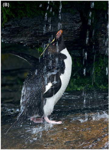
FIGURE 18 (A) Initial image. (B) Removing the blurry tail feathers of another penguin along the left edge and the bit of rock in the bottom left corner make this a far stronger image. The original image has too much visual intensity due to these distracting elements.

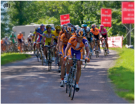
FIGURE 19 (A) The original image has a lot of distracting detail in the background. (B) A vignette blur reduces the visual intensity of the image to a more pleasant level by decreasing the background detail, texture, and luminosity contrast.
Summary: Putting It Together
Before optimizing your image, we suggest you look at it and develop a game plan to create the optimal amount of energy within your image. Chances are that you’re going to need to do several things to help draw as much attention as needed to your subject and to give the overall image the amount of visual intensity and impact that you envision. We recommend the following steps:
- Look at the image and decide whether your first impression is that it has too much energy, too little energy, or that the overall energy level is good.
- Check to see where your eye travels through the image and where it lands.
- Check the exposure and histogram to evaluate how much of the tonal range is being used. For most images, you’ll need to adjust the exposure so that the complete tonal range is used. Keep in mind that moody images may require less tonal range.
- Evaluate the mid-tone contrast in the image. If the image needs more energy, consider making a Curves type of adjustment in Photoshop, or another adjustment that increases mid-tone contrast. To draw attention to the subject, consider selectively applying the adjustment to the subject alone.
- Evaluate the color in the image. Consider increasing (or decreasing) saturation or vibrance or adjusting the overall hue or white balance, when appropriate, to increase (or decrease) the visual intensity of an image. If there is an objectionable color cast, remove it. This may slightly decrease the visual intensity of the image, but doing so will enable you to work with the saturation or vibrance adjustments to adjust the energy contributed by color.
- If the image initially has too much energy, consider removing the color and creating a black-and-white or sepia image. This will increase the importance of the tonal contrast in the image but remove the energy contributed by color.
- Consider the subject placement within the frame. Objects closer to the sides tend to have more energy. To increase the visual intensity of an image with a smaller subject, you may want to crop the image, or conversely add canvas to place the subject off center. With a larger subject, you may want to follow the same approach to place a key element of the subject, such as their eyes, at a power point in the image. Subjects that are centered often appear more static and calm, contributing less energy to the image.
- Experiment with rotating the image to increase or decrease the visual intensity. Doing so may impact the visual story of the image.
- Remove or reduce all distracting elements by cloning, vignetting, or selectively adjusting the background to reduce contrast within it.
- Increase detail, particularly in your subject, using Clarity (Photoshop, Lightroom, Elements), Definition (Aperture), Color Efex Pro 4 > Detail Extractor (Nik Software plug-ins), or Topaz Adjust 5 to increase the visual energy in the image, or decrease detail to reduce visual intensity. There are numerous software plug-ins that allow you to reduce detail in various ways, and we’ll cover those in more detail in Chapter Eleven, since they tend to involve more creative interpretations of your images.

FIGURE 20 (A) Initial image One. (B) Revised and improved image One.
Let’s look at a couple of images and create a game plan for them.
Image One
Game plan: Initially the visual intensity seems a bit too high because of the distracting piece of the plane wing, but the intensity in the rest of the image seems a bit low. There is a distracting color cast from the window tint that we need to fix, and then we need to increase the mid-tone contrast slightly.
We cropped out part of the plane wing because there was more sky than we felt we needed, and then used the clone and healing tools to remove its remnant. Although there are many tools you could use to address the mid-tone contrast as well as the color cast, we used CEP > Pro Contrast > Remove Colorcast and Dynamic Contrast to do both. As a final touch we applied a small amount of CEP > Polarizer filter.
Image Two
Game plan: The initial overall visual intensity seems moderate, but when we look more closely the image itself seems to lack mid-tone contrast and impact. In fact, the luminosity contrast is too low. The additional intensity that we initially note is from the seagull, which adds too much energy to the composition.


FIGURE 21 Initial image Two. (B) Revised and improved image Two.
It’s distracting. The game plan is to remove the seagull using the Patch tool in Photoshop. Then we’ll add mid-tone contrast, address the hint of a color cast, and slightly boost the colors.
Although there are many tools that you can use to increase mid-tone contrast, including Curves, we often find using CEP more efficient. We applied the Pro Contrast > Dynamic Contrast and Correct Color Cast sliders. We also applied a small amount of CEP’s Tonal Contrast (set to Balanced Contrast) to further energize the mid-tone detail. We used the saturation slider within the Tonal Contrast filter to help boost the colors. The final image has greater visual intensity from the additional visible detail and the luminosity contrast.
