
EIGHT
Putting It All Together: Classic Good Imaqes and Visual Intensity
Some of the best lessons you can learn are from comparing your work to that of known masters. We’ll look at some extraordinary works in this chapter, from fine art to photojournalism and lots in between. All of these images have been generously contributed by photographers who are among the best at their specialties. We’ll highlight the visual intensity and energy of each image as it pertains to the elements of composition that we’ve discussed so far. As we delve into the story that each image conveys, we’ll see how the visual principles discussed in the earlier chapters are exploited to help tell the story in each photograph. It’s our hope that by spending some time looking at these images and understanding what makes them work so well, you’ll be more able to view your own images similarly, noting what works and what doesn’t.

Art Wolfe
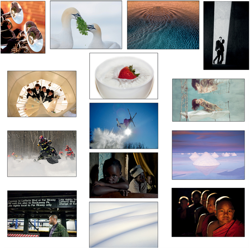
Art Wolfe’s gorgeous image of salt piles in Bolivia is unique in its dramatic use of triangles, a high energy shape. Not only are the salt piles triangular, the overall pattern of the piles is a triangle. The repetition of the triangular shape creates a sense of depth in the image that adds energy. With so many triangles in the image, it would have been easy for the visual intensity to have become overwhelming but in fact we’d rate the overall energy level of this image as moderate. By locating the salt piles close to the center of the image, the shape energy is tempered slightly by the low level of energy contributed by their placement. Splitting the frame with the horizon so that nearly half the image is taken up by a triangle-free sky also lowers the overall intensity.
Our eyes are attracted to the texture of the salt piles rather than the textureless background and foreground. The remainder of the image lacks any extremes of tonal contrast that might have competed with the salt piles. The overall darker sky helps it to recede even though the colors are more dramatic than those in the foreground. The fact that the salt piles are pale, consisting of very little color, separates them from the background. Their high luminosity makes it clear that the piles, rather than the more colorful water, are the subjects. Since the overall color palette is limited and the colors in the sunset are almost complementary, the energy from the color component is moderately low. This careful balance of the high energy of the salt piles with the low energy of the surrounding elements results in an outstanding image.
John Paul Caponigro
Abstract images force you to rely on shapes, colors, lines, and textures, as well as your imagination, in order to tell their story. While it’s not clear what the subject actually is as an object, it’s clear where the subject in the image is in this captivating image by John Paul Caponigro. Even though the texture in the water, created by dramatic luminosity contrast, is somewhat energetic, all of the lines in the image converge to a circular point near the top of the frame, creating a clear figure/ground separation. The background beyond that point has far less texture, luminosity contrast, and energy, even though that part of the image is a bright orange. The decrease in texture adds a sense of depth and dimensionality to the image. The elliptical subject area is so elongated that it’s almost a triangle, creating a shape that has the contained feeling of a circle but the energy of a triangle. A strong oblique line leading into the image guides you to that point, also adding energy. By placing the focal point near the color transition and where our attention naturally goes, John Paul further emphasizes the subject. In addition, by placing the subject closer to the edge of frame, rather than at a rule of thirds point or the center, he has increased the subject’s intensity. The amount of orange in the image is perfectly balanced by the amount of its color opponent, blue, in the frame (see Chapter Four), which helps contain the energy from the color components. Limiting the color palette to two colors also prevents the saturated colors from becoming overwhelming. If a full spectrum of intense saturated colors had been used, it’s likely that the visual intensity of the image would have been too high—and rather than being a dramatic, striking image, it could have become chaotic. Instead, by carefully controlling which elements have the most energy, a strong, visually compelling abstract image has been created, with a fairly high, but still pleasing level of visual intensity.

Steve Simon
In most images the person largest in the frame and closest to the foreground is the primary subject and must be in focus. However, in this image Steve Simon masterfully creates a dynamic situation in which we first gaze at the out-of-focus child in front, who is the largest figure in the frame, and then at the in-focus older woman farther back. The eye line of the child in front meets and holds the viewer’s eye, which adds energy and commands attention, whereas otherwise we would most likely quickly skip over an out-of-focus person even if they are in front. Our eye travels back and forth between the two, which adds a sense of depth and dimension to the image, and then to the third figure, another child, at the back. By carrying our eye between the three figures, we know that the story is about the relationship of the older woman and these two children. The lighter window area behind the front child further serves to direct our attention there, while the woman’s lighter-colored clothes also direct our attention to her. The light falling on the corner between them creates the greatest luminosity contrast within the image and is fairly harsh. Its placement adds to the sense that there is tension between them. The oblique lines and brightness of the gold curtains adds both color and luminosity energy to direct attention to the rear child, as does the light falling on his face. The expressions on all their faces tell us that the situation is serious. The overall visual intensity of this image is moderate and the image is quite compelling. However, if the front child had been looking elsewhere, the overall intensity of the image might well have been too low and the image would not have been nearly as successful.
Mallory Morrison
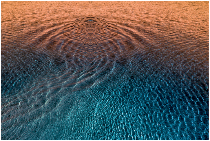
Mallory Morrison’s image of a woman hovering above a bed presents us with an unexpected subject, one who appears to be floating in mid-air, and as such there is extra energy in the image from the element of surprise and cognitive dissonance. To see a woman suspended horizontally above a bed in apparent defiance of gravity grabs our attention and this is further enhanced by the reflection that draws our attention to the top of the image. We then reconcile her position and the reflection with the fact that she must be underwater, but are faced with more cognitive dissonance because she’s wearing a dress. Thus the irony of the subject component contributes considerable energy to this image. Mallory wisely limits some of the other potential components of visual intensity in order to maintain an overall pleasing level of energy. Indeed, most of the lines associated with the bed are horizontal or vertical so they add only limited energy. Further, the subject of the image is contained within the bed and its reflection, creating a smaller, more confined and less energetic subspace. The color palette is also limited and contributes only a small amount of energy. If any of these components contributed more energy to the image, it would have been easy for the visual intensity to have become too high. The woman’s position in the lower part of the frame along with her reflection in the top half provides energy from placement as well as from detail and textural contrast. If you imagine the image without the reflection, the visual intensity would be too low. The additional energy from detail and texture in her dress and hair emphasize that she is the main subject by increasing the energy associated with her. Lastly, it’s important to the success of this image that the lighting and water movement were carefully controlled so that there were no unintended hot spots from above-water light sources to create distractions and no ripples creating extra lines and shapes that might similarly have resulted in distractions.

Arthur Morris
Arthur Morris’s romantic portrayal of a gannet presenting a branch to his mate is an inviting image that evokes a variety of positive feelings in the viewer. In terms of visual intensity, it’s in the low–moderate range. When capturing nearly white birds (or any subject) on an almost-white background, there is danger that the image could be too low in intensity to hold the viewer’s interest, but clearly that is not the case here. In fact, there are numerous elements that add carefully placed energy, making the image a winner. For example, the gannets’ eyes are circular shapes with a smaller contrasting circle in their center, which tend to attract attention (as discussed in Chapter Three) and contribute moderate energy. More importantly, the two birds are positioned so that there is a strong imaginary oblique line between their eyes. In fact, the head angles are slightly tilted so that we can see the gannets gazing at each other. This oblique eye line brings considerable energy to the image. It’s further accentuated by the contrasting black areas surrounding the gannet’s eyes and on their beaks. This is the only area of the image with strong luminosity contrast and so it adds energy exactly where we need to be looking. Had these been birds with strong designs lower down on their bodies and plainer heads, our eyes may have been slightly less focused on the eye contact. The greenery, which connects the two birds, is the area of strongest color energy, and helps direct us back to the interaction between them. In addition it has the finest detail, which increases the energy in that part of the image. There is a hint of warmth due to the golden tones on the backs of the gannets’ heads and this adds to the warm feeling of the image. What many viewers may be less conscious of initially is the importance of the negative space between the two birds, which nearly forms a heart shape. As we mentioned in Chapter Three, our tendency is to complete familiar shapes and so we perceive that area as a heart. The shape completes the image so that we perceive a loving interaction between the two birds. The energy from these components balances the very limited color energy and depth cues, and results in a very successful image.

John Ricard
When John Ricard sets out to create a portrait of a person, he first spends time deciding how to photograph them in a way that captures what he perceives to be their essence. His portraits are highly individualized images, often in unique settings. For example, in this image he wanted to convey that the subject is a writer. John views writers as fairly lonely individuals and wanted to convey that. When we first look at the image, it seems to be moderately high in visual intensity. There’s a lot of luminosity contrast, and the foreground is separate from the background, where there seems to be a lot of people. As we look more carefully, we notice that the subject is placed off center in a place with a moderate amount of energy. The light is illuminating his face and neck, helping separate him from the black wall and giving him some energy. However, he’s looking through the windows, apparently at the other people, who seem to be in groups, and he’s visually separated from them by the various walls and shapes in the image. He’s on the outside of the activity. We follow his eye line and are aware that he’s alone, whereas others are together. John cleverly set up this situation to evoke the feeling of loneliness. We feel the energy in the background and that it is different from the energy of the subject. But we return to the subject because we can see more details and texture in his face and clothing. The red and white oblique lines in the lower left have a moderate amount of energy and point us to the subject. Above we see letters and can identify some of the words. They are at the same spatial depth as the subject, creating a connection to him, but they make no sense to us by themselves. This adds some dissonance, which also adds energy. However, the purpose of placing the subject in the same spatial plane with the words that we don’t understand is to subtly communicate that words are a major part of his life and that they may at times separate him from others. By carefully controlling so many details in this image, John Ricard has created a compelling portrait of a writer that communicates far more than the stereotypical head shot.

Lindsay Adler
www.lindsayadlerphotography.com
At first glance, analytically it might seem like Lindsay Adler’s image has very low visual intensity. She’s created a very flat space in which there’s almost no depth. By using a frame within a frame, she’s restricted the actual image frame to a very narrow, vertical band. And by converting it to black and white, she’s eliminated all energy from color. Yet when you look more closely you appreciate the subtle details that she’s cleverly included, which add intensity and make the image interesting. For example, the subject is very close to the bottom left edge of frame, giving him an energetic position. The extreme luminosity contrast also adds energy as the image is either very bright or very dark, with few tones in between. However, she has captured these highlight and shadow areas with texture, which again adds energy. Furthermore, the narrow rectangle isn’t precisely a rectangle. One of its edges, the one the man’s walking toward, is at an oblique angle, creating a strong, unstable line through the image. It feels like the space could expand as the man walks toward it, or perhaps that it will move along with him.
Since his position is active with one foot in the air, we mentally think about walking, which adds intensity to the shot, as opposed to if he were standing on two feet, in a very static pose, appearing to be going nowhere. Here he seems to be in motion and in the spotlight, with a subtle message that he’s on the move. Often portrait photographers use a variety of lighting techniques to avoid harsh shadows, but here Lindsay has deliberately created a harsh shadow. This in effect duplicates the man, giving him far more impact. By having him place his hand in his pocket while wearing a shirt sleeve that is massively bunched up above his hand and peeking out of the jacket, we have a sense that, although he might be moving with purpose, he’s also fairly casual and relaxed. However, his expression conveys tension and almost defiance as he appears to be looking almost but not quite at the viewer. Because he’s looking out of the frame, his eye line creates depth, adding to the overall intensity of the image. By adding energy subtly, Lindsay created a very successful image.

Freeman Patterson
Sometimes simplicity leads to a sense of elegance, as it does in Freeman Patterson’s landscape extraction. At first glance we’re not completely sure what we’re looking at. We see that it’s a series of rather sensuous curves, but is it sand, snow, folds of fabric, or what? When we look closer we see evidence that it’s sand. There’s very little to give us an indication of the size of these dunes except for evidence of some sand texture in certain places. The sand texture that is visible in scattered areas throughout the image serves to move our eye around, as do the bright white areas where the sun appears to be triking the sand. Primarily the image gets its energy from a series of oblique lines. The fact that these lines are not quite parallel and that they are not evenly spaced increases that energy. Further, on closer observation, these oblique lines create a repeating series of shapes that are nearly triangular, which also contributes energy to the image. Since the lines get closer together as they go higher in the frame, we get a sense of depth, even though there are very few clues to indicate how deep the space actually is. The sand texture that is visible in scattered areas throughout the image serves to move our eye around, as do the bright white areas where the sun appears to be striking the sand.
Most monochromatic images use the full range of tonal values to take advantage of as much energy as possible from luminosity contrast. But this image uses barely more than half the tonal range, which obviously limits the amount of energy from this contrast. In fact, though, the purity of the white tones in the image is important and adds to the sense of simple elegance while also providing some energy. There is little color energy except for the bluish tone of the shadows, which emotionally creates a sense of peace and perhaps a sense of cold. Given the minimal amount of energy contributed by the color component and the fact that the full range of tonal contrast is not used, it would seem likely that the overall visual intensity of the image would be too low to be interesting. But by leveraging the energy from other sources, Freeman has instead created a very peaceful image, with low–moderate overall visual intensity, which seems like a visual counterpart of the soothing sounds of waves on a beach.

Nevada Wier
There is no doubt where your eyes will land when you look at this compelling image. Nevada Wier has masterfully crafted this photograph using limited depth of field and superb lighting techniques. The fact that we can see the first child clearly, and the next one almost clearly, leads our brains to automatically continue the pattern and to interpret the shapes defined by the harsh back/top lighting in the rear of the image as more children. The second-closest child is still a bit dark, not quite in focus and is looking out of the image, away from the viewer. His eye line might lead our eyes briefly out of the image, but because more detail is clearly visible in the front child we continue on to him. There is beautiful warm glowing light on his face, as opposed to the harsh back/top light defining the shape of his head and shoulder. Thus, although the luminosity contrast changes from the rear of the image to the foreground, it’s one of the major sources of energy in this image.
The eyes of the front child are inescapably intense. His eyes do not connect to the viewer but instead seem to be locked onto something in the distance or even at another time and place. This eye line extending beyond the image, in addition to the limited depth of field, expands the sense of depth, adding to the visual intensity.
Although the color palette is limited, the warm color cast and reddish robe of the front child also energize the image, as do the details of his face and the texture in the robe. His placement in the right third of the image, rather than a central location, also adds energy. An imaginary line connecting the tops of the children’s heads and then their shoulders creates a nearly triangular shape that is resting on a corner, making it unstable and adding energy to the overall image design. Thus, despite the fact that much of the image has little detail and is quite dark, the overall visual intensity of this captivating image is moderate.

Kirk Paulsen
http://kirkpaulsen.smugmug.com
Images of athletes somersaulting in the air have significant impact and energy simply due to the subject matter. We’re not used to seeing people upside down in midair! Therefore, you have to be careful to control the overall visual intensity of these images and not let them get overwhelming. Kirk Paulsen did just that in this well executed image that’s far more dramatic than images that are simply the inverted athlete and sky, but nonetheless it stays within a pleasing range of visual intensity. The backlit explosion of snow is visually impressive and leads up to the athlete. Its textured, irregular shape, with distinct bits of snow visible, as well as the overall angle suggest a powerful burst of action that adds significant energy to the image and complements the story told by the skier’s position. The extreme luminosity contrast provided by the bright sun leads us right to the skier who is above the sun. Because Kirk stopped down, the sun is rendered as more of a starburst than a circle. This starburst shape is more energetic and points to the skier. Seeing her above the sun, as well as the tops of distant trees, gives us clues as to how high she is in the air and increases the sense of action.
Fortunately, other components are less energetic, limiting the overall intensity of the image to keep it within a pleasing range. For example, the image has limited depth cues—we can’t be sure how far away the trees are and they’re the primary source of depth information. The overall color palette in the image is limited to primarily shades of blue, with the only variation being the skier’s pants, which are a bluish-red and put slightly more energy on the skier. The vignetting around the edges of the image helps guide the viewer’s eyes toward the subject. The skier is nearly centered in the image, a location that inherently has less dynamic energy. In this case it’s effective because it helps to balance the other sources of energy, including her position in the air and her crossed skis. Had there been more details—perhaps more ground, more background, and more colors—it’s likely that the visual intensity could have become too high. But as-is, it’s an image that’s as attention getting as the freestyle action!

Charlotte Lowrie
Images of food are designed to make us salivate and hunger for the food, but many tend to be fairly static. Charlotte Lowrie took a very different approach when creating this tempting photograph. Although strawberries and cream are commonly served together, Charlotte opted to capture the strawberry dropping into the cream. This is something we don’t often see. Capturing the action of the berry impacting the cream immediately adds significant energy to the image. Further, she’s used a round bowl. This shape, as we discussed in Chapter Three, adds a moderate degree of energy. However, the triangular shape of the strawberry, echoed by the nearly triangular shape of the displaced cream, add even more energy. The strawberry itself is a vivid, saturated red that contrasts dramatically with the white cream, bowl, and background, and adds color energy.
Charlotte has skillfully minimized the energy from other sources to maintain a visually pleasing image. For example, much of the image is white or nearly white and the background itself is pure white. She’s controlled the lighting so that there are minimal shadows—just enough to create some depth to establish the shape of the bowl and the height of the splash of the cream. The color palette is extremely limited—in fact less than 10 percent of the image has any color. Similarly, texture and details are visible in less than 25 percent of the image. By limiting these sources of energy, she has maintained the overall visual intensity of the image at a very comfortable level. Because the color, texture, and details are limited to the subject itself, all our attention goes right to the seemingly perfect, tasty berry, as she intended. But by placing that berry almost in the center of the image—a spot which contributes the least energy—she has created a very successful image.
Peter Burian
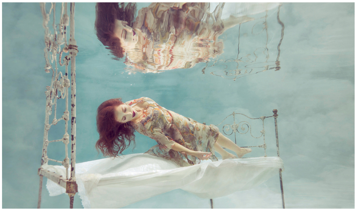
Photographing events where action happens seemingly everywhere, nearly simultaneously, can be challenging. To create an image that conveys the story of multiple competitors but which is not chaotic or overly visually intense can be a tall order. Peter Burian successfully does just that in this impressive image of snowmobilers. First, he has positioned himself so that he was able to concentrate on capturing a single rider in the foreground, with other riders farther back and at various positions on both sides of the frame. This helps tell the story of the ride and creates a sense of depth. By slightly limiting the depth of field, the front rider is separated from the others and emphasized, and so is identified as the subject of the image; at the same time, we can clearly see the other competitors as well as gain a sense of the environmental conditions. We can see all the details on the front rider’s snowmobile and the tire tread pops out since it contains the most texture contrast in the image. If all the riders and the trees were captured in perfect detail, they would visually compete with each other and we wouldn’t know where to look. Partially limiting the depth of field causes the trees in the background to read as a softer texture that our brain glides over, rather than as a detailed forest that competes for attention.
By placing the riders fairly high in the frame, Peter has emphasized the feeling of action and has also captured more snow in the foreground. In fact nearly one-quarter of the image is almost pure white, with little texture and no color, and that helps control the overall visual intensity of the image. It also helps the action to stand out. Interestingly, the rider and his snowmobile together form a triangular shape that is tipped to one side, and there’s a larger triangle formed if you draw an imaginary line connecting all the snowmobiles, adding to the energy of the action. This balance of action and simplicity helped Peter create a great shot during a chaotic event.

Clay Blackmore
Wedding photographers are faced with the task of repeatedly photographing groups of people in similar situations in ways that don’t just result in another stereotypical shot. Creating dramatic, unique images is what separates top wedding photographers such as Clay Blackmore from the masses. In this image which has moderate visual intensity, Clay breaks with convention and has us looking down on the groomsmen. The unique perspective immediately adds interest but runs the risk of making them look small and unimportant. However, spirals are inherently energetic shapes that add a sense of motion, and in the case of stairs spirals can add considerable depth. In this case that depth is emphasized by the converging lines of the pole at the center of the steps carefully placed so that it begins at the bottom of the image and continues on toward the center, pointing to the groomsmen. Additional lines formed by the chains radiate up from the steps and help point to the groomsmen. By their position on a spiral staircase, the groomsmen are contained within a smaller area limiting how much of the image we focus on. Further, the groomsmen are all looking directly at the viewer, which adds even more depth and draws attention to them. By using these various components, Clay has taken advantage of the unusual perspective and ensured that we focus on the groomsmen as the subjects of the image.
Given all this shape energy, it was a smart move for Clay to limit other sources of visual intensity. By using a wide-angle lens from a distance, the groomsmen are rather small. In addition, since much of the photograph is quite light, most of the luminosity contrast is limited to roughly 20 percent of the image taken up by the groomsmen and is used to draw attention to them. In addition, there is very little color in the image. The only clear color is in the small turquoise Tiffany gift boxes scattered on the steps. Because they contain the only color our eye goes to them and they contribute to the story: we know that this is an elegant wedding. In addition, one box has been unwrapped and is closest to the youngest groomsmen, whose expression conveys that he’s not so sure about what’s going on. That adds a subtle touch of humor to the image. The only other hint of color is that much of the white is actually a warm off-white, which conveys a subtle emotional message of calm warmth, very appropriate for a wedding, without adding too much energy!

Art Becker
Sometimes the most effective way to tell a story is to capture only a piece of it and let the viewer deduce the details. Art Becker has cleverly shown us just a small piece of a scene, creating an image with moderately high but still pleasing level of visual intensity. He has honed in on the ends of three trumpets capturing two complete circles and one partial circle. These are shapes with a moderate amount of visual energy. We have the sense that these instruments are part of a performance but the background is sufficiently blurred to provide few cues about depth or location. However, the reflections on the trumpets, particularly the closest one, reveal enough detail to let us know this is a sporting event with a fairly large crowd in attendance. The details are not clear enough to overwhelm the image; instead they supply just enough information to help tell the story. If the photographer had shot the image from the other direction, with the trumpets against the stands, the people in the background would have added too much energy to the image because we would be looking at all the detail and even if he used a limited depth of field, the color and shape contrasts would still draw our attention.
The trumpets form an oblique line that implies movement and brings energy to the image. In addition, Art has framed the scene so that the portion of the performers we see forms a triangle at the left side of the image. This is an energetic shape consistent with the feeling of being part of a performance. Indeed, the trumpets seem to be tipped up as if they are being played and the position of the hand on the front trumpet reinforces that. Although the background is blurred, the luminosity contrast in it forms a series of lines at a contrasting oblique angle that serves to reinforce the impression that the trumpets are tipped upward in motion. The negative background space also forms a triangle. Given the amount of shape energy in this image, Art has wisely limited the energy from texture and detail. Color energy plays a role, given the warm orange color of the background, but limiting the color palette and color details also helps keep the overall intensity of this image with in an effective range.