
Maria: What about inherited styles? Are the points inhe rited with them?
Professor: No. Inherited styles do not bring any poin ts no matter how many points
an ance sto r’s style may bear. So inherited properties will always get overridd en by a
style that applies to the e le ment directly. Of course, if there’s no directly applied style,
it still holds that the nearest anc estor wins.
In any case, most of the basic ru le s of cascading are logical so you won’t need to go
into much detail unless you are up to building r eally complex style rules.
4.9 Relative Sizes
Professor: Remember earlier this morning when we briefly touched on the question
of font size. You used pixels because I told you to and because we hadn’t yet cov-
ered the other measureme nt units. In our last meeting I mentioned that a pixel is an
absolute unit measuring approximately 1/1 00 of an inc h. Although pixels are great
for c ontrolling graphical ob je ct sizing and positioning on a p age, there are cases when
they become impractical.
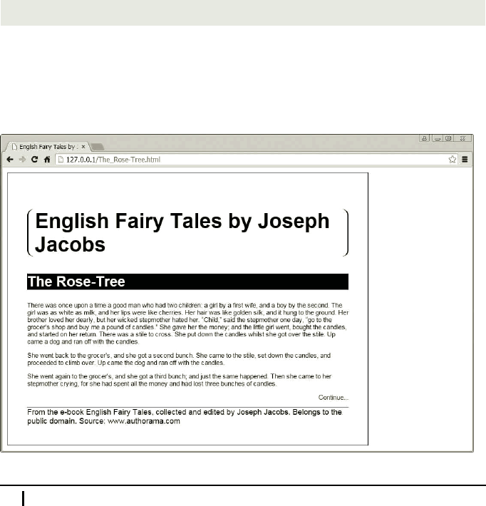
In your last h omework you set font sizes of the <h1>, <h2>, and <footer> elements.
Now let’s try to add the next declar ation to the style for the <article> ele ment:
font-size: 10px;
The <h1>, <h2>, and <footer> elements retain the font sizes that you have set be-
cause the declarations are more specific than that of the <article> element, which
is their parent. Paragraphs, however, don’t have their own style and they inherit font
size of 10 pixels. Hence we get the output as seen on this screenshot.
66 Meeting 4. More Contr ol over Style
This is not what you would normally expect, though.
Maria: Why are you saying that? Everything looks exactly as y ou said it would.
Paragraph text got smaller and everything else retained its previous size.
Professor: You’re right. Yet, that’s not the result you would want when you set the
font size of an article. If nothing else, the footnote font is now larger than the para-
graph font. Ideally, I would want at least the ratios of the font sizes to be preserved
when I set the article ’s base font size, which means that the la rgest font stays the
largest and the smallest stays the smallest. Such behavior is also integrated in the
browser’s default style sheet.
By default, the browser font sizes are defin ed relative to the basic font size. More
specifically, each fon t size is calculated relative to the font size of its par ent. If you
remove all the font-size declarations from your homework style sheet and only
specify the font size for the article, you will notice that no matter how large or small
you specify the font, the fon t size ratios are preserved. And the good news is that you
can ch ange these ratios.
There’s a measurement unit called em. The name c omes fro m typography, where 1
em was tr aditionally define d as the width of the capital “M” in the current typeface
and size. In modern computer typography the term em is preserved but represents the
height of the font in question instead. One way of using this measurement unit is for
setting the elem ent’s font-size property relative to the font-size property of its
parent. For example, if you want to have main headings twice as large as the “normal”
text, you write a rule like this one:
h1 {
font-size: 2em;
}
If you now put an <h1> element inside an element whose font-size property is set
to, say, 15 px, then this <h1> element will have a font size of 30 px.
A short question for you. Consider the following chunk of HTML code:
<body>
<h1>This is so <strong>Important</strong></h1>
</body>
If we app ly the following styles to the above HTML, what will be the font size, in
pixels, of the word “Imp ortant”?
body {
font-size: 15px;
}
h1 {
4.9. Relative Sizes 67
font-size: 2em;
}
strong {
font-size: 1.1em;
}
Maria: It is 1.1 times larger than that of the h eading, which is two times larger than
that of the b ody. Its size is 33 pixels.
Professor: Well done!
Ems are not used only for fon t sizes, though. You can size any dimension yo u like
using this unit. That said, the size is calculated a little differently than it is for a font.
Instead of the inherited value of the font-size property, the basis for calculation is
the computed value o f the font-siz e prope rty of the e le ment on which ems are used.
In CSS terminology, a computed value is a value that is used for inheritance. It is
obtained either from directly specified or inherited values.
For example, let’s add the following declaration to the above style for the <h1> ele-
ment:
border-bottom: 0.2em solid;
What do you think will be the thickness of the border be low the heading?
Mike: It will be 20 percent of the heading’s font size. The computed value of th e
heading’s font size is two times that of th e body—two times 15 gives 30 pixels. The
border thickness will be 20 percent of tha t, which is six pixels.
Professor: Great! I see that you have absor bed the basic philosophy of the em unit,
so we are ready to proceed to percentages.
Once you understand ems, you will probably have no difficulties understanding per-
centages as well. For one thing, percen ta ges used w ith the font-size property work
in exactly the same way as ems do. Just keep in mind that a value of 100 percent, for
example, means the same thin g as a value of 1 em, or, a value of 80 p ercent me ans the
same thing as a value of 0.8 em . Rem ember th at the format of the <pe rcentage> data
type is a <number> immediately followed by the perc ent sign (%). For example:
font-size: 90%;
For sizes other than font sizes, however, percentages work a little differently. Ems
calculate sizes based on the computed value of the font-size property of the element
on which they are used. With percentages things are somewhat more complicated. You
must kn ow separately for each value the percentage of what it takes. When applied
to the width prop erty, f or example, percentages are calculated based on the width of
the containing block. The weird thing is that vertical margins, for example, are also
calculated based on the width of the containing block and not its height as you might
expect. Some properties don’t even accept percentages, as, f or example, the b order
68 Meeting 4. More Contr ol over Style

property, which can only be sized using a <length> value or keywords thin, medium,
or thic k. Fortunately, all that info rmation is available in the CSS reference at the end
of this book. You simply look up the property you’re interested in, and you can also
read whether it a ccepts percentages and how they work fo r that spec ific property.
Note that, even though you can use percentages with several length properties, the
< percentage> data type is not the <len gth> data type. The latter is composed of a
< number> and a len gth unit like p x, or em.
Maria: You mentioned a containing block. Somehow I’ve got the impression that it
is not the same as a parent.
Professor: You’re perfe ctly right. A containing block is just what it says it is: a block
that contains an element. It can either be the element’s paren t or some more distant
ancestor. I will tell you how you can figure out which element represents th e ele ment’s
containing blo ck next time, when I w ill tell you about positioning.
I still owe you an expla nation about th e differences be tween the two styles on page 60
that set fo nt-size and font-style properties for a whole page. For seem ingly the
same purpose, we first used the asterisk and then the bo dy element selector.
If you use a single ele ment selec tor, then the style is applied only to elements of a
single type. So, using the body selector, we set the font only on the body. Because
the body is an ancestor of all the other elements on a page, the set font is propagated
throughout th e page via inheritance. Some font properties, however, are modified on
certain elemen ts by the web b rowser’s default style sheet. For example, the rule for
the <h1> element is defined in some browsers a s follows:
h1 {
display: block;
font-size: 2em;
font-weight: bold;
margin: .67em 0;
}
This means that you get different font sizes—and sometimes weights, or colors—for
different parts of you r page. But they are all based on the same font applied to the
body, which gives a page a uniform appearance.
The asterisk selector, however, selects all the elements on a page. T he r ule is applied
directly to each and every elem ent on a pag e, overridin g any othe r sty le s set by the
browser. Consequently, with the asterisk selec tor we sized all the text on the page to
16 p x, even headings.
Maria: You said that the asterisk selector h ad a zero specificity value. How can it
override a rule that uses an element selec tor, which has a higher specificity?
Professor: The default browser’s style sheet is less important than author style sheets,
so that even an asterisk selector w ill override the default browser rules.
Any more questions? Otherwise we’re done for toda y.
4.9. Relative Sizes 69
..................Content has been hidden....................
You can't read the all page of ebook, please click here login for view all page.