
5.6 Hiding Elements
Professor: You can also take an element out of th e flow with the display property
set to none. Th is makes an element completely disappear from the page, while other
elements reposition themselves accordingly. Hiding part of the content is useful in
many ways. You can, for example, hide a portion of some long text and make it
accessible on ly on demand, or you c an hide a sub-menu of a navigation system and
make it visible only after the visitor has selected the corresponding top menu item.
Mike: How do you do that?
Professor: You put the removed element back in the flow by setting its display prop-
erty back to block or inline. You can allow the visitor to trigger that change either
through some JavaScript code or the :hover pseudo-class. We will cover pseudo-
classes later today.
Another way of hiding an element is by means of the vis ibility property, which
can be set to hidden or visible. Unlike the none value of the displa y property,
hiding an element through the hidden value of the visibility property leaves the
element in the flow and it only leaves an empty space where the element would have
been if it had not bee n hidden.
5.7 Flo ated Elements
Professor: Two more pro perties that control the eleme nt’s position are float and
clear. I guess that th e concept behind these two properties is one of the least intuitive
and henc e the most misun derstood concepts in CSS. I’ll try to illuminate the basics so
you have a firm foundation from which to study and explore the subject on your own.
You can flo at an element either to the left or right b y declaring float: left; or
float: ri ght; respectively. You cannot float an element to the center, th ough. Be-
cause the concept is basically the same for both floats, left and right, we’ll only focus
on left floats. So wha t happens if you float an element to the left?
• The floated element is first positione d according to its normal doc ument flow.
Then it is shifted horizo ntally all the way to the le ft until its left margin ed ge
touches the left edge of its containing block or the right margin edge of another
floated element. Technically, that takes th e element out of the flow, althoug h not
completely. Text and inline elements still respect its presence.
• All the conten t that appears ab ove the floated e le ment in the browser window is
unaffected .
• All text and inline elements that appear at the same h eight or below the floated
element flow alongside its right margin edge and wrap below it.
• Because the floated element is not in the flow, a ll the block elements position
themselves vertically as though the float didn’t exist. However, text and in-
line content of those block elements will reflow to make room for the floated
element.
5.6. Hiding Ele ments 85
• Because the floated element is not in th e flow, its containing b lock does not
respect its height.
• If ther e is not enough room for the floated element h orizontally, the element will
move downward, until it finds enough horizontal space for itself.
• Floating an element implies the block layout and hence changes the computed
value of the inline element’s display property to block. One practical impli-
cation of this is that you can set a w idth and height of floated elements.
• You should always set a width of floated elements, otherwise the results can b e
unpredictable. That is not necessary fo r images, however, which get their width
implicitly from the physical width of the actual image.
• Vertical margins of floated elements do not collapse.
Maria: That’s a long list.
Professor: No one expects you to learn it by heart. Instead, you’ll use it as a ref erence
when needed.
Let’s start out with the same HTML code as in our last example:
<body>
<div id="one">1</div>
<div id="two">2</div>
<div id="three">3</div>
</body>
We also use the same style:
div {
width: 40px;
height: 40px;
border: 1px solid;
padding: 5px;
margin: 5px;
}
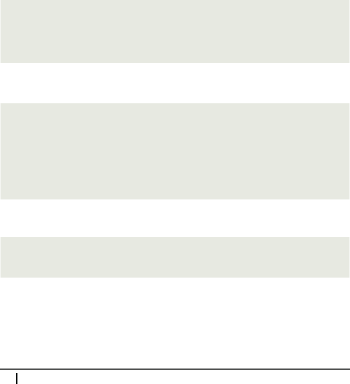
The next ru le floats the first two <div> e le ments to the left:
#one, #two {
float: left;
}
Do you see wha t happ ened?
86 Meeting 5. Understanding CSS Boxes
What a mess! Yet I think you’ll be able to explain it.
Mike: Let me try
....
The first two boxes are stacked against th e left side of the window. More precisely,
the left margin edge of the first box touches the left content edge o f the document,
which is the containing element of all three boxes. The left margin edg e of the second
box touches the right margin edge of the first b ox. Both boxes are placed lower by
the width of their top m argin becau se ma rgins of floa te d elements don’t collapse. The
third box is placed as though the first two didn’t exist because they have been ta ken
out of the flow.
Professor: Excellent! Any ide a what happened to the num ber three?
Maria: You said that text always leaves space for floated eleme nts. I suppose the third
<div> is too narrow for its text to be able to flow at the right side of the second box.
So it was forced to overflow its box downwards.
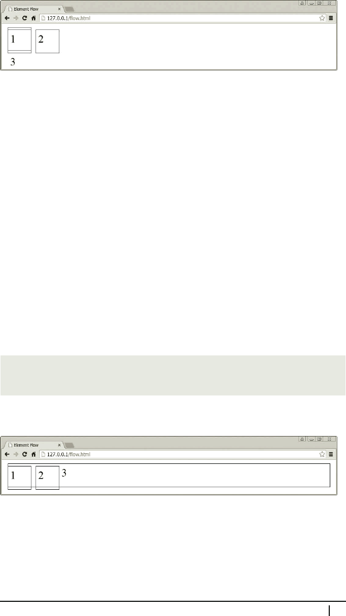
Professor: Exactly! Are you saying that the number three will move up and to the
outside of the right edge of the seco nd block if you make the third <div> wider?
Maria: I think so.
Professor: OK, let’s try and see if that is really so:
#three {
width: auto;
}
Indeed , we get exactly the result that you predicted.
It is possible to move the third b ox down by using the clear property. Basically, if
you clear an elem ent, that elemen t will m ove downwards past any floated elements
that appear before it in the HTML document and are floated to the same side as is the
value of the clear p roperty of the cleared element. Note that you can clear floated
as well as non-floated elements. If you want to know more precisely how the clear
property works, then you can check the CSS reference on page 362.
5.7. Floated Elements 87

So let’s clear the third box:
#three {
width: auto;
clear: left;
}
Here’s how it looks.
Notice that this move collapses margins, although in a somewhat differ ent way than
we’re used to. Ag ain, see the description of the clear property in th e CSS reference
if you want to know the details.
Mike: What is the practical use of floated elements? I suppose we can use it for
wrapping text around images and ta bles.
Professor: Indeed, and it’s really time that we finally do it. As a matter of fact, the
ability to flow text around images really goes back a very long time. So it’s no big
surprise that it is also quite straightforward to use. Take, for example, the following
HTML code with some text and an image:
<h1>The Windmills of Europe</h1>
<p>
Praesent augue leo, blandit dapibus nulla in, vulputate volutpat
leo. Etiam luctus augue eu est accumsan, sed suscipit eros
dapibus. <img src="/images/windmill.jpg"> Nam varius, nulla eget
imperdiet vulputate, risus lacus vehicula nisi, eu dictum purus
mauris sodales est. Ut consectetur tortor neque, sed rutrum...
</p>
The CSS portion of the example is extremely simple:
img {
float: left;
height: 6.5em;
margin: .45em .4em .25em 0;
}
p {
line-height: 1.2;
}
88 Meeting 5. Understanding CSS Boxes
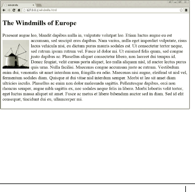
What makes text flow around the image is th e float: left; declaratio n. T he mea-
sures used for the vertical margins and image height were selected so that the top and
bottom edge of the image align with the x and base line o f the text, resp ectively.
Maria: What are these lines?
Professor: The base line marks the line on which characters sit, while the x line marks
the top of lower-case letters like, for example, a letter x. He nce the name.
You can set the height of an image and its top margin to match these lines by trial and
error. First, you set the top margin so that the top edge of the image approximately
aligns with the x line of the text and set the image height to a lign its botto m edge
with the base line of the text. You may want to zoom in on the page while doing that,
which you can do by pressing Ctrl+(+) on the keyboard. To zoom back out, yo u
press Ctrl+(-). After y ou have successfully aligned both edges, you set the bottom
margin so that the sum of the image height and both vertical margins is a multiple of
1.2 em, which is the normal line spacing. Once you have the vertical dime nsions set,
you can alter the image height by simply adding to or subtracting from it multip le s
of 1.2 em. Recall that it is important that you use ems in or der to keep the “ vertical
rhythm of the page,” even if the viewer resizes the font.
I specified the line-height property to make sure that text sp acing will always be
120 per cent of the font size. The next screenshot shows the final result.
Also observe the vertical position of the floated image. The top of the image is po-
sitioned at the same he ight where the word “dapibus” occurs, which correspo nds to
the position of the image in the HTML code . Indeed, everything that is above that
position stays unaffected by floating the image to the left.
If you put more pictures in your a rticle, y ou may have some trouble if they get too
close to each other. You can see this happening on the next screenshot.
5.7. Floated Elements 89
..................Content has been hidden....................
You can't read the all page of ebook, please click here login for view all page.